A good user interface is about more than just pretty graphics and stylish fonts. It’s about all the “little things” that add up to a professional, compelling brand presence. It’s about creating websites that users actually look forward to browsing and using. So what kinds of user interface tweaks can you make that can improve your conversion rates — sometimes considerably? Let’s take a closer look:
Calls to action
*Yaaawn* This again? Seriously? I know what you’re thinking, but there’s a twist. Oftentimes, particularly with the influx of mobile users, having a large clickable (or tappable) area on your call to action buttons is crucial to getting them clicked. While many buttons are entirely graphics, there are some hold-outs that still embed small link text as opposed to a more responsive and user-friendly option.
Small links may look slim and sleek on a desktop, but are squint-worthy exercises in frustration on a smartphone.
And, if you’re concerned about load time, you can swap that image out for a more sophisticated CSS button that mimics its graphical cousin, such as the kind generated from Pure CSS.
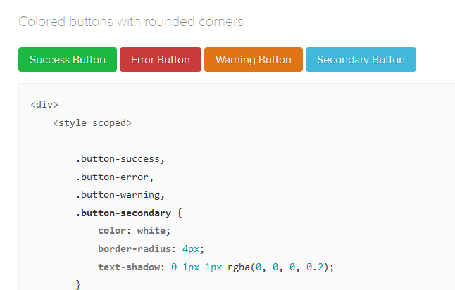
PureCSS lets you design buttons using CSS and gives you the code to copy and paste.
Error messages
How do error messages factor into the user experience? We’ve been taught as good little conversion optimizers that friendly error messages are the way to go. But why include error messages at all when you can make your site more forgiving of errors in the first place? How many times have you seen messages like these?
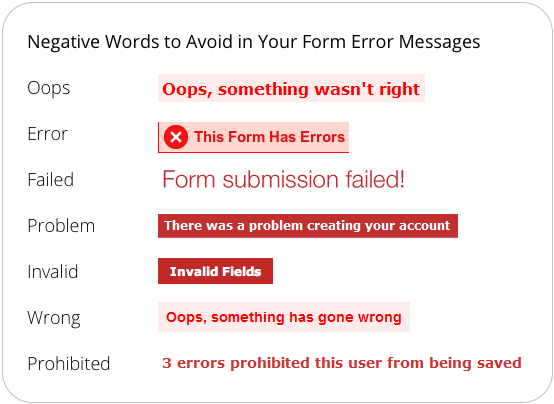
Phrases to avoid when designing your forms.
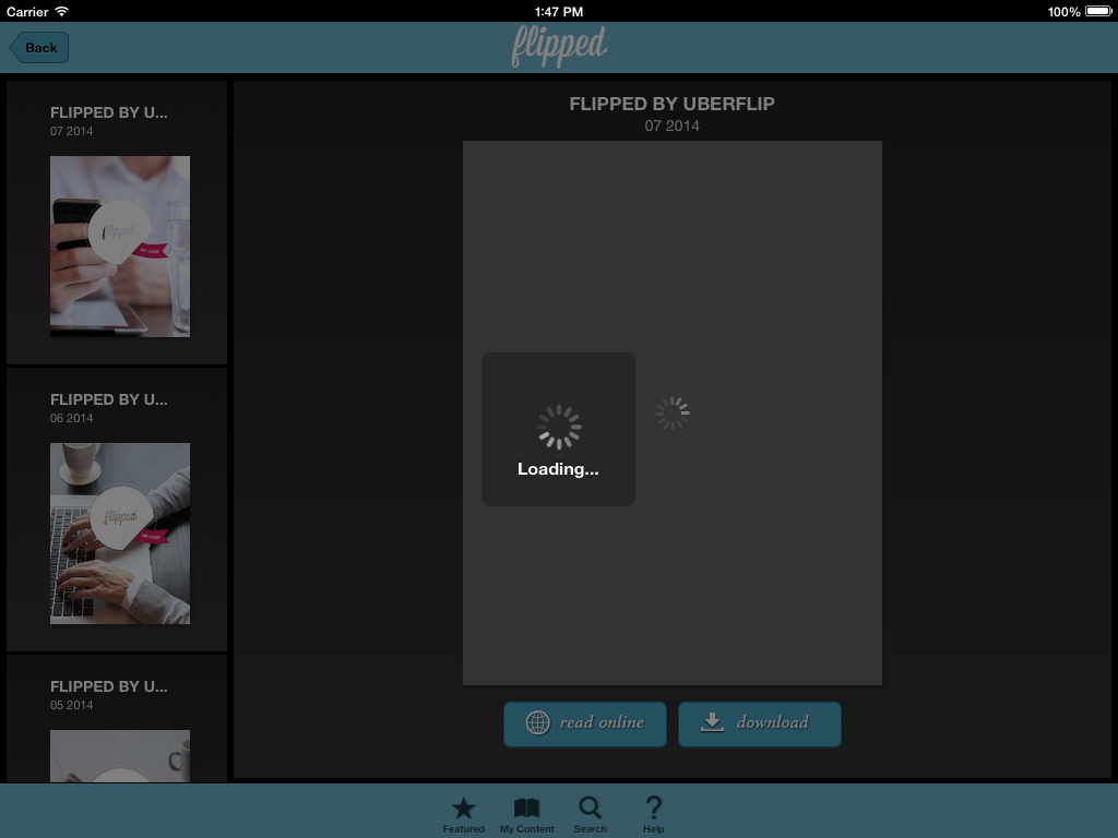
Now, what do I mean by “forgiving of errors”? For example, if you’re testing out a flippable interface that allows the user to swipe to read pages similar to a book, and they’re clicking or pressing arrow keys instead, why not take the extra steps to make those actions doable within the context of your interface as well?
Clicking or pressing to navigate is second-nature to us as an internet-browsing species. User interfaces shouldn’t punish us for trying to learn them.
Why assume that an error message makes it okay for the user to mess up when you can eliminate the possibility of messing up to begin with?
Build around results, not wants or needs
A common focus in the user interface designing process is asking yourself “What does the user want?” or “What does the user need?” and then constructing around those wants or needs. However admirable the objective, it’s misdirected.
People want results, and they want to know they’re on the right track to achieving those results. Including things like forward-focused step-by-step navigation can help them get in, get out, and get on with their lives.
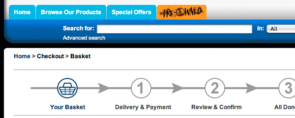
Unfortunately, design prowess doesn’t matter much to the end user (if it matters at all). They’re only interested in getting things done with as little frustration as possible. The easier you can make the process, the more appreciative the end user will be and the more likely they’ll come back and tell their friends about their positive shopping experience.
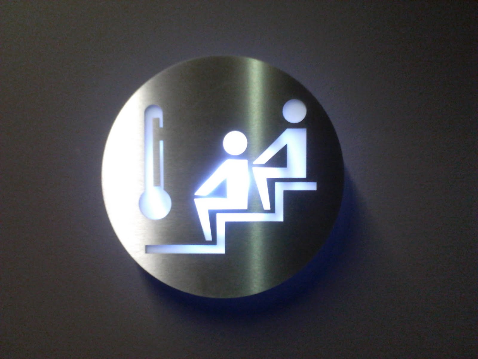
Use icons (but only this kind!)
Icons help give users a point of reference — particularly when navigating a site or when scrolling and scanning over a page. Small, identifiable tidbits like these are meant to inform the reader at a glance, but sometimes they can do more harm than good. Here’s an icon for a sauna … or what to click when you’re trapped in a freezing stairwell.
It might sound boring, but those common, everyday icons might be the best choice — especially if you’re serving an international audience where more creative icons might not be immediately clear, like these:

What do you think these might mean? Security? Awards? Power? Favorites? Jewelry?
Not quite.
If you’re going to use esoteric icons, make sure to label them clearly so that there’s no misunderstanding exactly where clicking them will take you. Remember, icons should be used to supplement your navigation, not replace it.
And speaking of images …
Use sliders sparingly
Sliders (also known as image carousels) are hugely popular with many modern websites for several reasons. They’re trendy. They let you pack a lot of information above the fold and let you highlight key areas of focus such as specials or sales.
But many times they scroll so fast and try so hard to fit everything in that they end up defeating the original purpose of sharing information that’s meant to get attention. Sometimes users find it difficult to keep up with them, much less navigate through them.
Find the slider navigation.
Instead, make it simple to navigate. Decrease the number of slides and use text concisely to communicate your ideas clearly with fewer words.
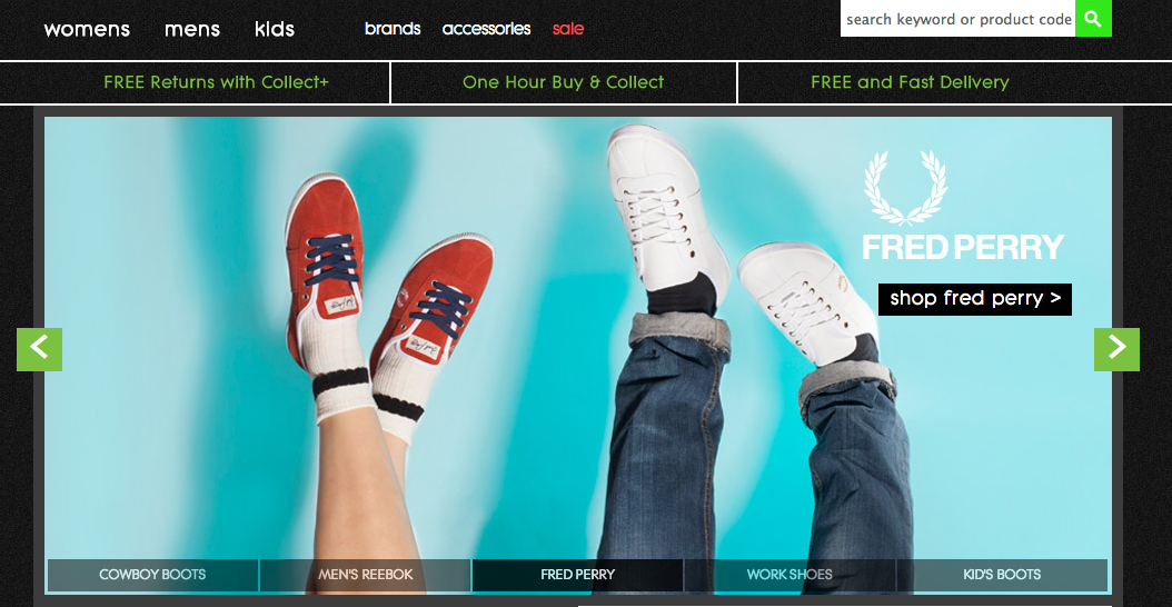
Finally, consider if you actually need to use a slider or if a static image would be better suited to your target audience. As with all our suggestions, you’ll want to run a split test between both ideas to determine what works best for you.
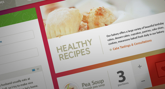
Don’t forget the white space
White space is often an afterthought in user interface design. After all, for many designers, it’s just screen space that needs to be filled. And when you’re working with limited screen space (such as designing for mobile), it can be tempting to fit as much as possible into that small space.
White space combined with clear images and short, to-the-point text gets your point across far better than trying to pack everything into a tight, closed space.
But proper use of white space increases focus and leads the eye to key visual elements, headlines, and other areas of your site that you want visitors to focus on. It presents your site as more welcoming, open, and accessible — all perceptions that you want to encourage.
What are your thoughts?
Got something we missed here?
What are some user interface tweaks that you’ve made to improve your own conversion rates?
About the Author: Sherice Jacob helps businesses improve website design and increase conversions with user-focused design, compelling copywriting, and smart analytics. Learn more at iElectrify and get your free conversion checklist and web copy tune-up.
Comments (1)