
Does beautiful design matter?
If you look at the success of some of the most popular sites on the web, it seems to be a mixed verdict.
Yes, many have had beautiful designs for years, but for some well-known sites, aesthetics promptly took a back seat to form and function… and stayed there.
And surprisingly, their visitors don’t seem to care.
It’s usually either because the site started with a homely design, and just never upgraded. Or because the ideas, companies, or people behind the sites hold enough credibility a fancy design isn’t important.
Here are some such sites, as well as lessons we can learn from them.
Craigslist
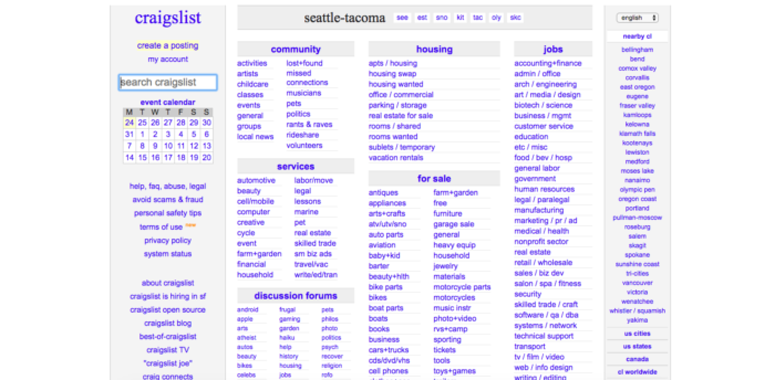
Craigslist has remained relatively unchanged since 1995, only expanding to include more cities and countries.
What makes Craigslist so popular is how straightforward the categories are.
In fact, you probably know someone who landed a job, found an apartment, or discovered something valuable on the platform.
You click to your city, find what you want, and finish the transaction.
No banners, no fancy logo, nothing. It’s this kind of get-in, get-out experience that keeps people flocking back to the classifieds site time and time again.
What we can learn from Craigslist
If you have a lot of information on your website, ask yourself, “How can I organize all this so that it makes sense to the visitor?”
To this day, Craigslist remains popular because the categories are so intuitive, and it only takes you a few seconds to find what you want.
You don’t have to subscribe, fill out a questionnaire, or dig around to find what you’re looking for.
It just works. Sure, it’s ugly, but Craigslist operates by the “if it ain’t broke, don’t fix it” model.
Its design has barely changed in decades, and as long as it continues to grow, it probably won’t change for years to come.
That’s the benefit of organizing your site the right way from the beginning.
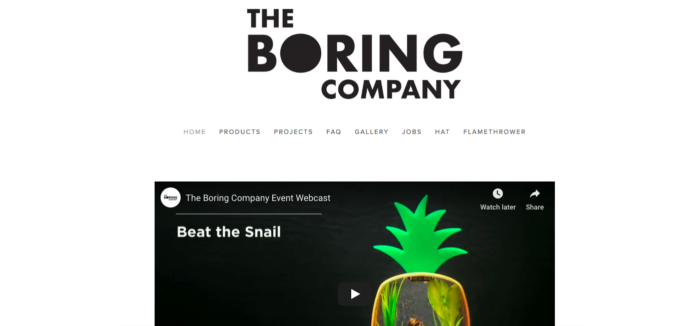
The Boring Company
Elon Musk is the creative genius behind companies like PayPal, Tesla, and SpaceX—businesses with gorgeous, sleek, cutting-edge sites.
But for his project The Boring Company, which is using tunneling to solve traffic problems—among other products like “not flamethrowers” and hats, Elon hasn’t created a lush site.
The entire home page is a stark logo, navigation bar, and a photo flanked by two YouTube videos. For the full effect, here’s the entire site.
What we can learn from The Boring Company
When you have a project that doesn’t need outside funding, you don’t need to impress anyone.
Elon knows that and isn’t afraid to put the bare minimum on The Boring Company’s website.
There’s plenty of explanation on the FAQ page, the videos and images do a superb job at breaking down the innovative tunneling process, and there’s nothing more to be said.
We can all take a lesson from the co-founder of PayPal and learn when to stop adding to our sites.
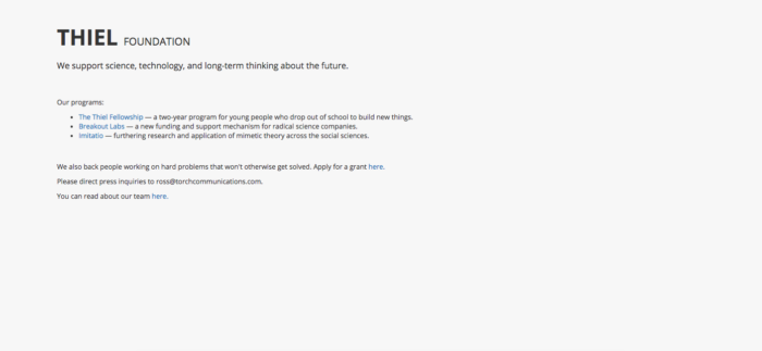
Thiel Foundation
While we’re discussing PayPal, let’s turn to the other co-founder who walked away with billions—investor Peter Thiel.
His Thiel Foundation has a startling simple site, with just a few paragraphs of text and links to his other projects.
Sure, there are a few more pages than just this—an overview of the team and a grant application form—but it’s mostly just dark grey text on a light grey background.
What we can learn from the Thiel Foundation
The Thiel Foundation website is a lesson in supply and demand.
The money behind the Thiel Foundation is sought after by the best entrepreneurs in the world, and the prestige that goes with those grants is nothing short of legendary.
Instead of spending pages hyping up the fund, Peter Thiel knows that his reputation speaks for itself.
When you’ve built a brand that solves problems, demands respect, and exudes quality and prestige, you don’t need to waste time on a fancy site design.
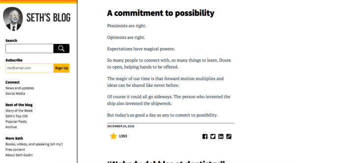
Seth Godin’s blog
Seth Godin is one of the most highly respected authorities in the marketing industry, and his blog is a hub for industry-changing thoughts that frequently go viral.
Yet his site isn’t fancy. It isn’t pretentious. In fact, aside from an updated headshot, it’s barely changed at all since 2003.
For example, Seth’s most recent blog posts dominate his home page. Meanwhile, almost all other industry leaders have replace a blog listing to a static page.
For example, the home page on NeilPatel.com isn’t a list of posts but a welcome message.
Yet despite a counterintuitive site design, Seth Godin is hugely successful. Why?
What we can learn from Seth Godin’s blog
At the end of the day, people visit Seth’s blog for his insight. He’s famous for the unique, eye-opening daily posts he’s been writing for nearly two decades.
When you’ve become famous for something, the best solution with your website is to provide the value upfront.
That’s why the first impression on NeilPatel.com focuses on SEO training and marketing, and that’s why Seth’s blog emphasizes his thought leadership.
When you give people what they’re looking for, the finer points of design don’t matter so much.
Berkshire Hathaway
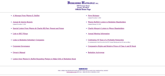
Just about everyone knows that Warren Buffett is one of the world’s most famous billionaires, consistently ranking in the top five richest people alive.
But his investment company Berkshire Hathaway has one of the most outdated sites online. In fact, at first glance, you might assume it’s a site from 1995, except for recent posts and updates.
It’s just a plain text list of documents with no graphics. Even the logo is just plain text in Times New Roman.
What we can learn from Berkshire Hathaway
The lesson behind Berkshire Hathaway is simple: it’s not a marketing website.
The site doesn’t have ambitions to impress companies looking for investment. It’s not out to wow prospects or gather leads.
For the most part, Buffett’s site only exists to fulfill the legal requirement of publishing documents. SEC filings, reports, shareholder letters and the like form most of the content on the site.
There’s a potent lesson here for all kinds of business owners. If you’re spending hours improving your site, ask yourself if you’re doing it to impress prospects—or just yourself.
If you run a business that happens outside of the web like Berkshire Hathaway, investing in the perfect redesign might just be a waste of time and money.
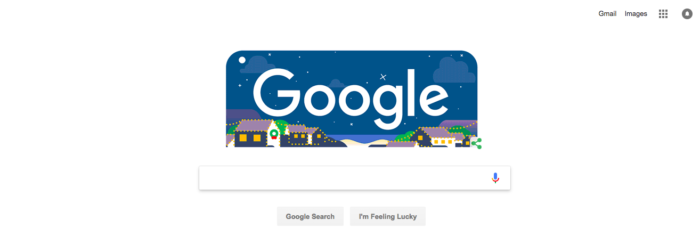
Can we really call Google “ugly?”
Well, maybe or maybe not, but it’s certainly spartan.
Over the years, countless competitors have tried to spring up with more stylish, feature-rich layouts.
But Google has so far beaten them all, remaining the undisputed king of the search engine hill.
In fact, Google seems to take pride in its minimalist designs. And why not?
It’s one of the most popular websites in the world, and their revenue has been steadily increasing for the last decade.
Something seems to be working.
What we can learn from Google
Remove the clutter.
Back when Google first started, its simple design was one of its biggest selling points.
Everyone was used to the packed, portal-style homepages like Yahoo, and they were actually relieved to see such a simple page.
And it’s a lesson that applies to a lot more than just search. Like the earlier examples, sometimes a user visits your site looking for one thing.
Give it to him or her, and you’ll win over a visitor for life. Making the site fancy, adding new features, or trying to impress someone with a bleeding-edge design can hurt you in the process.
Google’s design has barely changed in the last 20 years. In fact, there are fewer features on the home page today than in 1998.
The important thing is to keep it simple and focus on what matters.
Conclusion
So should you immediately start scrutinizing every image on your site and turning all your links into a 90’s shade of blue?
Well… no. Don’t do that.
You should, however, focus on function first. Figure out what your users are there to do, and then help them do it.
For Craigslist, that answer is “find a buyer or seller.” For Google, it’s “search.”
Those sites remain laser-focused on what matters most to their visitors and ignore everything else.
Spending time or money updating a website that works just fine isn’t a good use of money if it doesn’t improve the user experience or bring in more sales.
So, ask yourself—why did your visitors come to your website? And how can you create a design that helps them?
You might find the answer isn’t a beautiful site design, but keeping a look others might call “ugly” to achieve your company’s goals. And at the end of the day, that’s all the web is for, anyway.
What “ugly” design choices could improve your site?
About the Author: Sherice Jacob helps businesses improve web design, performance, and conversions at iElectrify.com.
Comments (79)