Have you ever noticed that the text on some websites seems to be a part of the design?
It’s clean and spacious, contributing to a minimal feel. Or it’s a grungy font, fitting in with the company’s hip image. Or it’s just a little bigger than usual, making the website seem a little more usable.
Today, typography is even more important with the prevalence of mobile devices. Currently, over 42% of US website traffic comes from mobile devices.
That’s a problem for typography because the rules on mobile are different.
Sure, the screens are smaller. But in addition to less digital real estate, mobile devices actually shrink font sizes from how they’d display on desktop computers.
And you can’t just alienate two of every five visitors.
Thankfully, good typography makes your site easier to use on both desktop and mobile devices. And in this guide, you’ll learn how to use beautiful text to make your site stand out.
Use typography to communicate your message
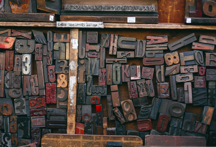
The reason letter shapes were first carved out of stone was to share a message.
No, typography isn’t as sexy as web technologies like HTML 5, augmented reality, or AI chatbots. No, it’s not at the forefront of your branding like a logo.
But it is important.
How many times have you gotten irritated with a website because the typography was illegible? Maybe it was too small, maybe it was one of those indecipherable handwriting fonts, or maybe it was spaced too closely together.
Whatever the case, you left, and their chance to communicate with you was gone forever.
All of their hard work to build the website was invalidated, simply because of a few poor typography decisions.
Don’t let the same thing happen to you.
You might feel like a kid in a candy store looking at a bunch of shiny new letter forms. You might think, “I’ll take one of these, and one of these, and one of these …” and before you know it, you have a stomachache.
To avoid going crazy with all the new font choices, learn a few basic rules of typography.
They will help guide your choices and show you how to set beautiful type on your websites.
Combine two fonts for best effect
Combining too many different typefaces on one page gets visually messy. Pick just two typefaces: one for your headlines and subheads, and another for your body text.
If you use Google Fonts to choose fonts for your site, it provides automatic pairings based on the fonts you choose.
Your body text font is the most important. The bulk of your information will be communicated here, and you want people to stick around, right?
So pick a font that’s easy to read.
Find one with a large x-height: this is the space between the baseline letters sit on, and the bowls of lower-case letters like b, h and d. The larger and more open the x-height of a font, the easier it is to read.
When choosing a body text font, be sure to look at on-screen text-sized samples. Don’t pick your body text typeface based on a 48 pt. sample. Look at it small, and make sure it’s readable.
Your headlines and subheads will be shorter, so the font you choose for them can be a little fancier. If you choose a display font, this is where it would go.
While fancy fonts usually aren’t ideal design choices, even a decorative font can work in a large, readable headline.
How to choose the best font combinations
When you’re looking at two typefaces to use together, check their letterforms. It’s best to combine typefaces that are either very similar in form, or very different.
With the occasional exception of display-type fonts mentioned above, almost all fonts are either serif or sans serif. Serif fonts have small decorations at the end of the letters and look more classic and traditional.
Meanwhile, sans serif fonts (meaning “without serif”) are cleaner and more modern.
Combining a serif and sans serif font is a popular combination, but there’s plenty of room beyond this basic design.
To use an example with web-standard fonts, setting your body text in Georgia and your headline text in Arial Black works.
They’re obviously different, and the contrast between them adds interest, and makes it easier for your reader to skim from headline to headline.
Setting the same page with Georgia for body text and Times New Roman for headlines would be a big mistake. Times New Roman is a serif font that’s too similar to Georgia, and doesn’t provide enough contrast.
They’re different, but not different enough.
On the other hand, using Georgia for your body text and Georgia Bold for larger headlines works. They’re similar enough to go together.
Sound too complex? Don’t worry. There are plenty of tools to help.
One DIY example is Canva’s font combinations tool, where you can get a matching pair from a font you select.
But if you don’t know where to start, head over to FontPair. They list dozens of curated combinations, ready to pull into your next project.
In addition to plenty of basic combos, this is also the place to find more interesting font combinations to use on creative projects.
It takes some of the risk out of the way since others have used the combination before.
Focus on readability
Once you’ve chosen your new fonts and are ready to set them on your page, remember a few typographic rules to make the reading experience as pleasant as possible.
Larger is Better: Think about your target market. If your site appeals to people over 40, consider setting your type on the larger side of what you might think. It’s easier to read, and doesn’t cost you anything to present this way.
Dark on Light: Use dark type on a light ground for comfortable reading. If your site is for a nightclub or a musician, people aren’t really visiting it to read it, so go ahead and use light type on a dark ground if you must. For those of us who want our visitors to read though, dark type on a light background is best.
Avoid Justification: Justified type is aligned along the left and right sides. It’s most often used in newspapers, where column widths are narrow. In order to justify lines of type, spaces are inserted between words to push them to either side.
I know lots of folks like the look of justified type. The reason I don’t like justification is that the spaces inserted are random, and vary from line to line. This makes for an uneven reading experience.
It’s always best to establish an even, predictable “rhythm” to your lines of type, and flush-left typography does a superior job of offering a smooth, even read.
Conclusion
Smooth, even, predictable typesetting is what you should aim for because it will communicate best with your reader.
Choose no more than two fonts so you establish a visual style that’s memorable. Utilize either similar or contrasting styles, and make your choice obvious. Set your type with readability in mind.
There’s a lot more to the mastery of typography, for sure. Many professional website designers have several complete books on the subject.
But this will get you started. If your primary concern is communicating with your reader, these tips will make sure your text is clear and easy to read.
And really, that’s what’s most important.
About the Author: Pamela Wilson has designed with type for 25 years, and she shares her know-how at the Big Brand System.
Comments (11)