
The heart of your web site is the homepage. It’s the gateway to every other page. It stands to reason that mistakes on this web page can kill your conversion rate.
When people search for specific keyword phrases on a search engine, they’re essentially looking for the right information, and they want it fast.
Yet, a statistic shared by Crazy Egg revealed that 63% of marketers choose website optimization based on their intuition, not on tried-and-tested best practices.
In the past, having an attractive web site and pretty page content was all that you needed for the search engines. But, today we’re playing a far different game. These days, your homepage must convert visitors into customers if you want to score high on the search engine results.
That’s why more marketers are paying attention to the homepage when it comes to website optimization in order to increase conversion rates.
Getting visitors to your web pages is relatively easy compared to converting them into customers.
What does all this mean? In a nutshell, it’s crucial to focus on your homepage when it comes to website optimization and search engine optimization in general, and to stop killing your conversions through neglect or ignorance.
If you’re wondering how to improve your conversion rate, look out for these 7 homepage mistakes and avoid them at all costs.
Mistake #1: Adding Company News to the Homepage
Keeping your audience informed about recent developments in your business will further increase the trust they have in you and relevance can also help with recognition from the search engines.
Company news items help attract investors and customers. According to etoro, business news is critical because it can influence your market.
Do you know why CNN reaches over 7.5 million people and generates millions of pageviews each month?
Well, one of the main reasons is that CNN is adept at giving the latest information about entertainment, politics, and business, both locally and at the international level. This works for them on many levels; from being the ‘go to’ for news to better search results on the major search engines.
So, without a doubt, company news is important for both your customers and your search engine results. But, it shouldn’t be on your homepage.
A lot of software companies give updates on a regular basis, but they do it through their blogs. A typical example is Evernote. Each time a new feature gets added to its software, the company announces it on the Evernote blog.
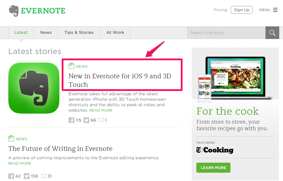
Evernote also has a navigational menu item for “news,” but it doesn’t display news on the homepage.
Why not? Simple: because homepage news items can kill conversions.
Imagine a potential customer visits your site from an organic search, intending to subscribe to your email list or buy your product. But, when they arrive on the homepage, they find only your company news blurbs.
Of course, your company news may interest or even excite them, but that won’t matter. Why? Because the primary purpose of your business is to consistently attract customers and increase revenue – not to get people interested in your news.
On your site homepage, you want to eliminate distractions – even seemingly benign ones. If you’ve built an active community around your blog, then share your company news as a blog post or create a new landing page for it. This gives you the chance to expand on the search engines, to use more keyword phrases, connect more search terms, and to build more web pages.
Mistake #2: Cluttered Homepage With Unnecessary Text and Images
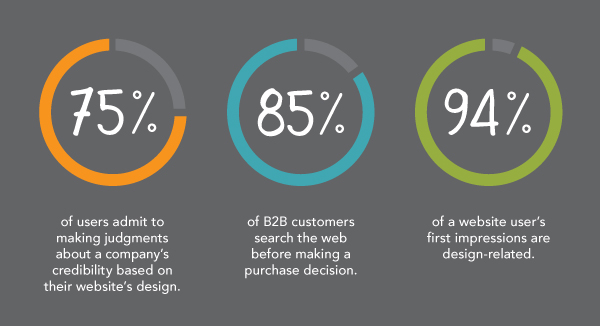
A research study by Kinesisinc found that 75% of your site visitors form judgments about your business based on your web site design and 94% of a user’s first impression of your business is design-related.
With that in mind, it’s high time you declutter your homepage. Having too much text and too many images on your homepage can actually hurt your conversion rate, even if everything else is in line – from your meta descriptions to your title tags – if your homepage is over the top, then you may be confusing customers.
The question then becomes: “How much is too much?”
You may think this could reduce your chances of higher search engine results because of fewer keyword phrases, but that’s not the case. In other words, concise web page copy helps with website optimization your page for conversions.
Admittedly, there’s some professional disagreement about this point among copywriters. While some people believe that “short and sweet” copy converts better, others believe that the more copy a page has, the better your odds of converting a visitor into a customer.
The reality is that both sides have a point. When it comes to your homepage, you have to make sure that there’s enough text with relevant keyword phrases and correct search terms, so that search engine spiders can index it in the search results. But, too much text distracts your visitors from the core goal.
On your homepage, you’ve got to consider your site visitors above all else, even above the search engines. Giving them a great experience should be your top priority.
In addition to clearing your homepage of superfluous text and images, you should also avoid advertising that will only compete for your visitor’s attention and send them away from your message and onto new search results and web pages.
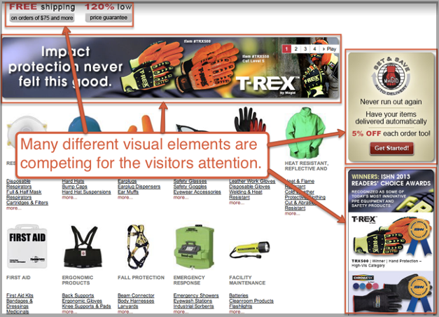
Use only relevant images and make sure that they help you convey your homepage message more effectively, instead of distracting viewers from the page’s purpose. Remember, your visitors are human and their brains process visual information 60,000x faster than plain text.

When do images overpower the homepage? There’s no hard and fast rule, but the moment your image begins to compete with or draw attention from your headline, subtitle, bullet points or the solution that your product provides, it’s time to pull back a bit.
Chris Ducker understands how to combine compelling copy and trust-building images on his homepage, without coming off as overly promotional to either the customer of the search engines.

Why is Chris’ homepage so effective? I believe he’s doing a lot of things right. As a renowned blogger, his authority also plays an important role for both the customer and the search engines. But, the most striking element on this homepage is the human picture.
Although I haven’t been using my personal picture on my homepage – just in my sidebar – I’ve seen successful digital marketers use this approach for a long time.
Mistake #3: Too Many Calls-to-Action on the Homepage
Are you making it easy for your customers to move from Point A to Point B? I strongly believe that you should pay adequate attention to this one objective on your homepage.
The easier and more quickly your customers can find exactly what they’re looking for on your web site, the more readily you’re providing them immense value.
Too many calls-to-action on your homepage can kill your conversions which in turn will flatten your search engine success. That’s because presenting too many options leads to customer paralysis.
Your CTA is the tipping point between bounce and conversion. In other words, your CTA will lead visitors either into your funnel or off your site entirely.
Get to know your customers and what they want rather than pouring all your energy into keyword phrases, search engine optimization, and search result success. That’s the simple way to avoid choice paralysis. Are your target audience members beginners or are they more experienced? Have they purchased from you in the past or are they predominantly fresh leads?
What exactly do you want your customers/site visitors to do when they get to your homepage? Should they try your free demo or view your special pricing plans? Do you want them to purchase your product right off the bat, or would you rather they subscribe to your email list first?
Remember that when it comes to converting customers, the secret to more sales and repeat purchases is as simple as understanding exactly what your customers want and giving it to them.
Dr. Robert Cialdini, Professor of Psychology at Arizona State University, published a research study on customer paralysis. The study examined the donation process of the American Cancer Society. Specifically, he looked at how a minute change delivered a terrific result.
The research revealed the importance of analyzing why people say “no” to offers.
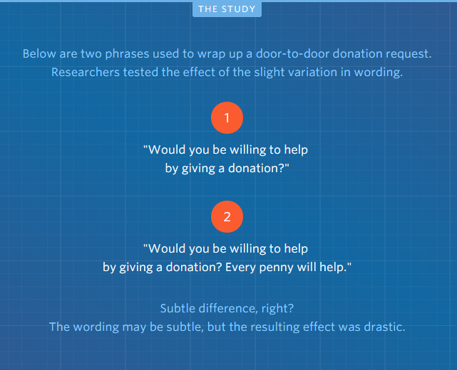
What was the result of the study?
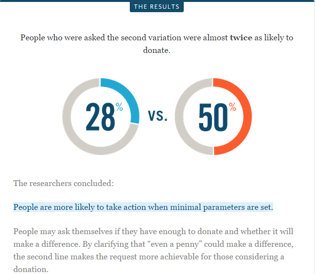
In the same vein, too many calls-to-action on your homepage will dilute your page’s effectiveness. D
It can also make your visitors unhappy because you’ve failed to meet their needs. Oddly enough, too many choices leave your customers feeling stranded and they’ll end up doing nothing.
Of course, you can have the same CTA appear a few times on your homepage if it’s a long one. But, you should never confuse people with several CTAs like this:
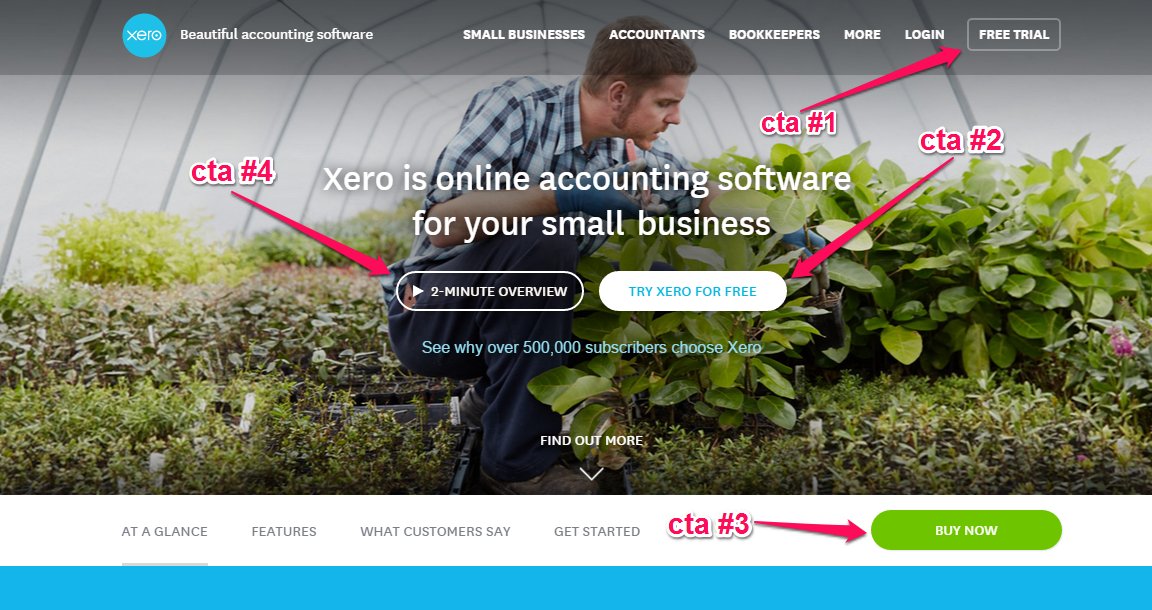
Xero is a popular accounting software tool, but its homepage is a little cluttered. Yes, hundreds of accountants trust Xero because it’s an effective, amazing tool that makes life easier for them and they do have a strong search engine presence.
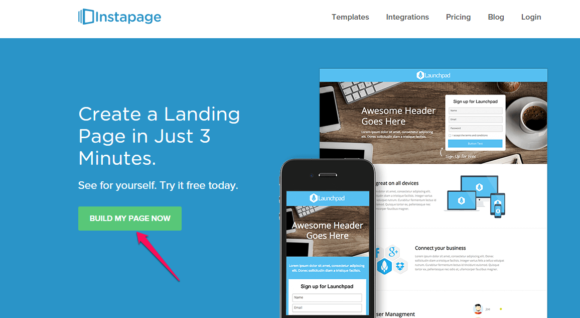
However, if you’re just starting out or you haven’t built a strong brand for your business or had any major search result success, your homepage should be simple, clear and direct, with a single major call-to-action. Here’s an example from Instapage:
When you use a call-to-action on your homepage, make sure that you tell users what they’ll get. When they can visualize and expect a specific type of value, they’re more likely to click the CTA button.
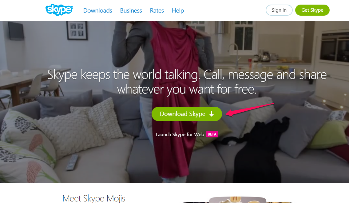
A typical example is Skype. You get to download Skype and nothing more.
Avoid using generic calls-to-action on your homepage. For instance, instead of using “submit,” change the text on your button to something more compelling.
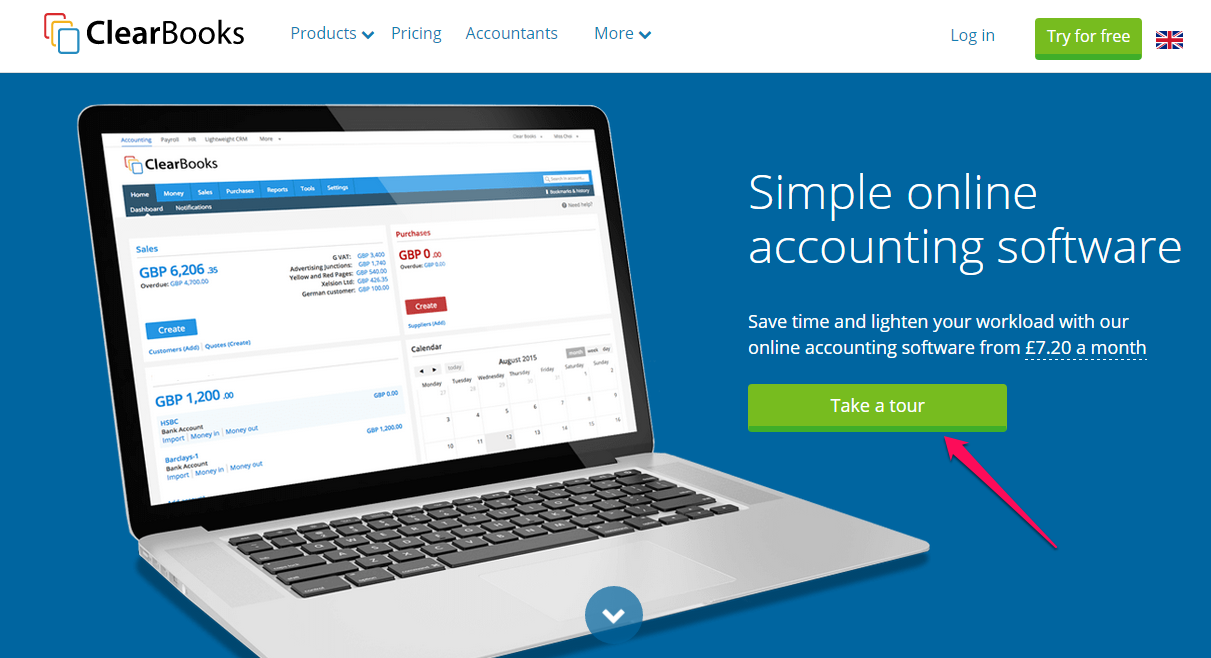
Clearbooks uses the phrase “take a tour” on its CTA to encourage prospects to click.
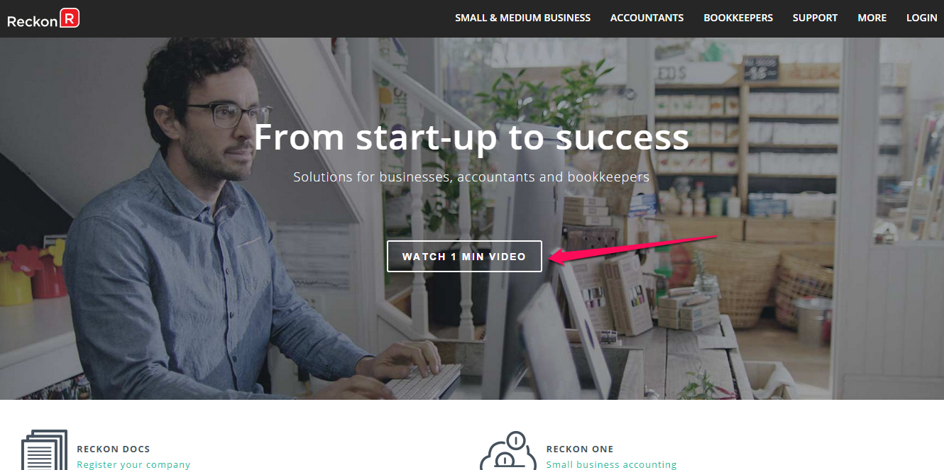
Reckon tells the user that the introductory video will only last 1 minute. When the button is clicked, the customer gets to watch the 1 minute video before moving on.
Remember that the location of your call-to-action matters. You may want to split test a few options – right side vs. left side, above-the-fold vs. below for better website optimization.
Again, there’s no single rule that’s set in stone. The CTA that works for me may not work for you. That’s why split testing is the only way to ascertain what works and what hurts.
Mistake #4: Not Giving Your Blog Priority
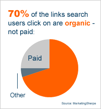
87% of organic search results are blog posts and 70% of the links users click on are organic search results, not paid. Search engines love blogs more than a static website.
If you’re not giving your blog priority on the homepage, then you’re making a big mistake when it comes to the search engines. In my experience, it’s very difficult (if not impossible) to build an active community around your site without a frequently-updated blog.
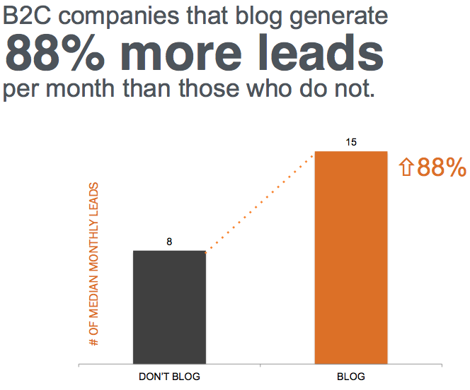
Blogging is an indispensable tool for every business and not just because of the search engines, but because customers love them too. Whether you’re a B2B or B2C marketer, you can blog your way to more leads, more brand recognition and more sales along with higher search result success. Statistics show that B2C companies that blog, for example, generate 88% more leads per month than those that don’t.
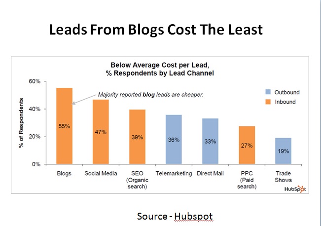
Other forms of inbound marketing – social media marketing, for example – can be very effective, too, but, ultimately, blogging is more cost-effective. In fact, a majority of content marketers who were surveyed reported that blog leads are cheaper than social media and search engine optimization combined.
Through blogging, a company can establish trust with potential customers. I successfully grew several software companies with my partner Hiten Shah over the last decade through blogging and now we have a great search engine presence. By blogging consistently, we’ve generated over 800,000,000 wallet-out leads, both to our own sites and to those of our clients.
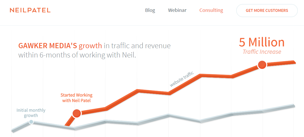
I’ve also worked with Gawker Media to grow its traffic to 5 million within 6 months. I’m not saying this to brag about my search engine success, but to help you understand just how powerful blogging is and what it can do for your own business.
Don’t make the mistake of hiding your blog link on your homepage. It’s so frustrating when you’re excited about a brand and eagerly visit its homepage – only to search in vain for a navigational link to the brand’s blog. If a user has to scroll to the footer section to find the blog link, you’re undoubtedly losing valuable leads.
Site visitors and customers should be able to find your blog easily on your homepage. This is a great tip for better website optimization.
That’s one thing that differentiates Shopify from other SaaS companies – it puts a lot of emphasis on blogging. That’s because the company knows that blogging is a major factor in its success, not only for the search engines but for piquing customer interest.
No matter what product you’re offering for sale, buyers have to make the decision to buy. On the internet, these buyers may have never heard of you before, they have hundreds of meta descriptions, title tags, and search engine results to choose from. Yet, even then your blog content can speak for you. If you invest in creating useful content, you’ll find potential customers taking the right actions, based on your blog articles alone.
When you make your blog a priority, it means that you can get feedback from your customers. According to Seth Godin,
Taking feedback doesn’t have to be the same thing as resolving feedback.
Collecting feedback in the form of questions, complaints and suggestions is crucial to your business. You may not resolve all of those issues at once, but it’ll give you a direction to follow when you create your content.
In their book, Problogger: Secrets for Blogging Your Way To Six Figure Income, authors Darren Rowse and Chris Garrett said that the secret to building a strong brand online is not simply advertising and pandering to search engines, but rather community building through a blog.
Blogging goes beyond writing. Your content has to be strategic so that it can lead visitors into your funnel, make them aware of the problems/challenges they’re going through, build their interest, help them evaluate what they want and get them to buy. That’s the true essence of blogging.
Mistake #5: Homepage That Loads Very Slowly
How fast is your site homepage? If your page is slow to load, it’ll hurt your conversions. Even the giant search engine Google recognizes site speed is important to users and has long been on a mission to make the web faster.
Does your site load quickly or is it as slow as a snail? A search engine like Google is obsessed with site speed for one simple reason: because your users are, too. In truth, Google will always follow your user’s behavior, because users are the reason why search engines exist.
Google has made it clear that it’s using site speed as a web ranking factor – although it won’t weigh as much as the page’s relevance when it comes to search engine results.
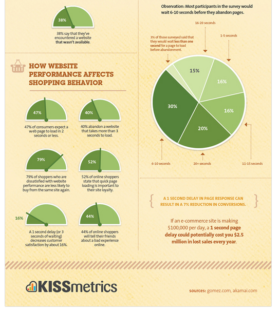
According to KISSmetrics, a delay of even a single second in a page’s load time can lead to a 7% reduction in conversions. What does that mean in concrete terms? Well, if an e-commerce site is bringing in $100,000 a day in sales, that 1-second delay could potentially cost the site $2.5 million in lost sales annually.
So, the bottom line is to make your site load up insanely fast and ensure that your content is relevant to your users.
So, how do you find out your homepage’s load time?
Follow these simple steps:
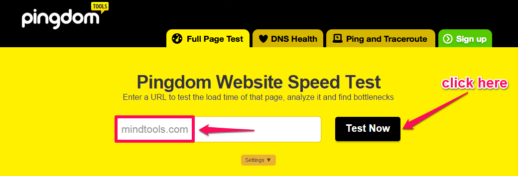
Step #1: Go to Pingdom Website Speed Test Tool. Plug in your site URL (e.g., mindtools.com) and click the “Test Now” button:
Step #2: Analyze your site load time. Although the tool checks the speed of your site, not just the homepage, this will still give you an idea about whether or not you need to work on your site speed.
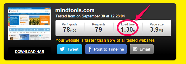
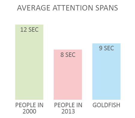
From the screenshot above, you can see that the load time for Mindtools.com is 1.30 seconds. This is great because the average load time is 2 seconds. That’s important to know, because the average user’s attention span is 8 seconds – that’s 1 second less than that of a goldfish.
Do you know what slows a site down? According to Econsultancy, here are some of the more common offenders:
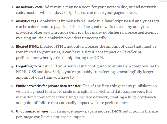
Once you’re able to fix these problems, your site speed should greatly improve and so will your revenue and your search result placement.
It could be that your homepage isn’t converting visitors into buyers because it doesn’t load quickly. Consequently, potential customers click the back button without thinking.
If your homepage load time exceeds 2-3 seconds, use the resources below to improve it:
- How to Make Your Site Insanely Fast
- How to Improve Your Page Load Speed by 70.39% in 45 Minutes
- 11 Low-Hanging Fruits for Increasing Website Speed (and Conversions)
Mistake #6: Autoplay Audio or Video Content
Audio and video on your homepage can increase your conversions and boost your search engine results. If you want to stop telling weak stories and begin to influence buying decisions, podcasts or video marketing could help.
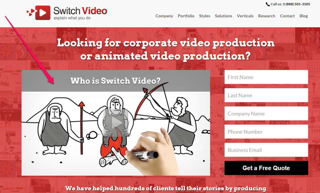
In this age of intense competition, you can use podcasts or videos on your homepage to create an even stronger impression on your users, the way Switch Video does. Take a look:
Podcasting, which is basically a recurring format of audio content, is growing rapidly and marketers are embracing it. According to Kapost, “a podcast is more like a TV show that offers a weekly reason for listeners to come back and allows hosts to break content up into key talking points to expand on throughout the show.”
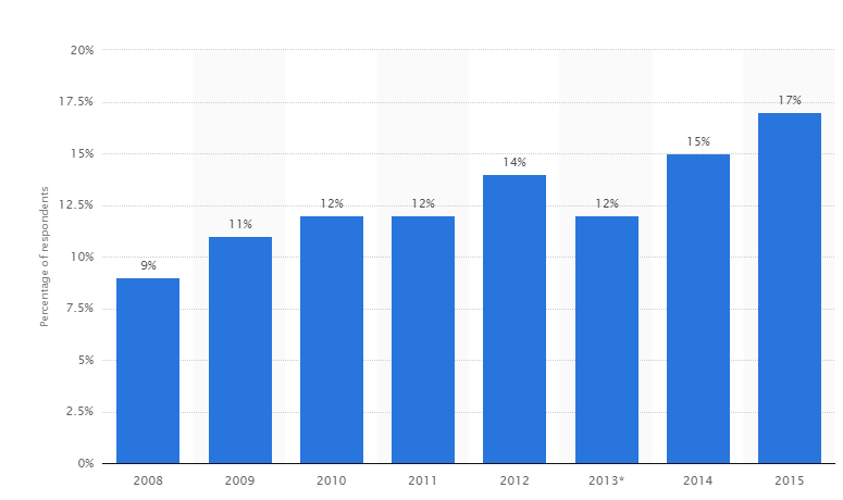
Recent statistics tell us that while only 3% of marketers currently use podcasting in their marketing plans, over 30% have a desire to learn how to create podcasts. What’s more, 23% have plans to increase their podcasting efforts in the coming year. And, 17% of U.S. adults have listened to a podcast in the past month.
But while video and audio are highly effective marketing tools, you’ve got to be careful how and where you use them.
Have you ever visited a homepage only to hear sound playing seemingly from nowhere? If so, then you know how distracting and even annoying this can be. If your user has loaded several tabs in their browser window, it can be a mad hunt to find which tab is responsible for the autoplaying video or audio file.
It annoys customers, because they hate it when decisions are made on their behalf. Your customers want to make decisions themselves. The choice of playing a video, audio or any media clip is theirs. That’s why autoplay audio or video can kill your conversions and reduce your website optimization.
Podcast experts such as John Lee Dumas, James Shramko and others produce a lot of audio and video content. But, they make sure that if users want to see the video or listen to the audio, they have to click the play button.
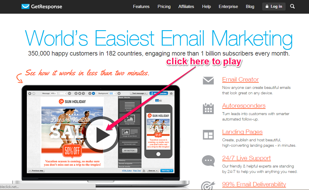
Getresponse uses an introductory video on its homepage, but it allows users to play it. There is no need to autoplay and annoy users.
Some people might argue that autoplay doesn’t annoy site visitors. Even if some visitors don’t mind, enough will that it’s simply not worth the risk.
YouTube has an autoplay feature as well. On the right side, you can set the Autoplay feature to “off” before you embed the video on your page.
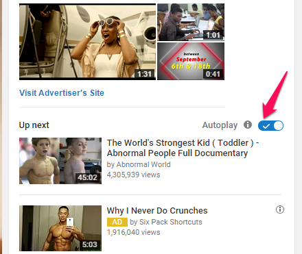
That also will take effect the next time you visit YouTube while you’re logged in to your account – the videos will no longer autoplay and you’ll have to click the play button.
Most marketers prefer to use video on their homepage, which means that you could stand out if you start using a podcast. Apple has surpassed 1 billion subscriptions for podcasts and that figure is only growing.
Bottom line: give users the control over the video they watch and the podcast (audio clip) they choose to listen to.
Mistake #7: Poorly Designed or Overlapping Navigation Elements
Your navigation is your user’s gateway to all of the important pages on your site.
And, as a result, when you fail to optimize your navigation menu correctly, your conversion rate suffers. Even the most stylish navigation menu won’t help if it doesn’t appeal to the user.
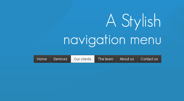
Everything about your website is connected to and affected by the navigation.
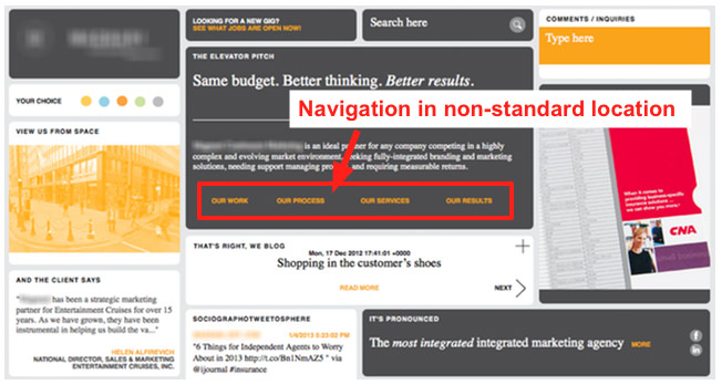
First and foremost, your visitors expect to find horizontal navigation across the top or vertical navigation down the left side. So, don’t put your navigation menu anywhere else if you want better website optimization. Non-standard locations may showcase your creativity, but they’ll frustrate and annoy your users.
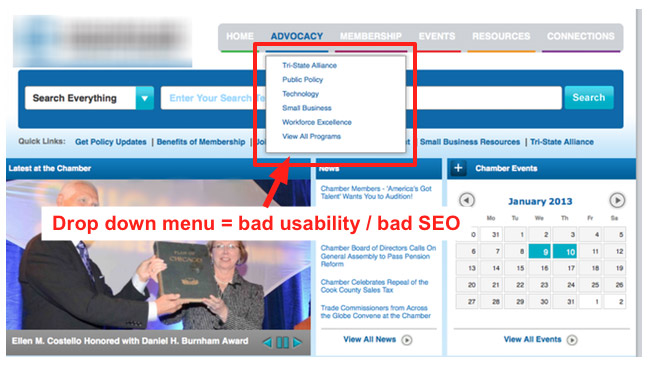
Drop-down menus are also annoying, according to usability studies from NN Group. The reason why most people hate drop-down menus is that they’re typically designed for the site owner’s convenience, rather than user experience.
Keep user psychology and behavior in mind when you’re creating your site’s navigation and layout. You might expect your users will move the mouse more than they move their eyes. But, in reality, it’s the other way around – users move the eye more than the mouse.
An overlapping navigation menu simply means any navigation menu that interferes with your content. A drop-down menu obscures your content, which is why you should avoid it if you want to make the right impact and boost your conversions.
Amazon, eBay, and other top shopping brands may have tons of items on their navigation menus, but you shouldn’t. They can survive because most people already trust those brands. No matter how awkward or overwhelming their navigation options might be, consumers will continue to use them.
As with so much that we’ve already discussed, there’s no single hard-and-fast rule about the size and scope of your navigation menu. However, a good rule of thumb is to restrict your menu to 4 – 6 items. This usually converts fairly well for most sites and blogs and works for website optimization.
Conclusion
In order to increase your conversion rate and get better website optimization and search engine optimization, then you must split test your homepage elements such as headlines, call-to-action, subtitles, videos, navigation menu, etc.
If you study your Google Analytics properly, you’ll notice that your homepage receives more traffic than other pages. It’s true for QuickSprout.com and NeilPatel.com – it’s true for just about every site.
This means that you should pay more attention to your homepage optimization.
An effective marketing campaign is one that puts the user’s needs at the forefront and proves you can meet those needs.
Your homepage must be designed for the user, not for aesthetics and not simply for search engine optimization. When users come to your site, they may have been enticed by your design, but if they don’t find what they need and want, they’ll leave.
For Google, user experience (satisfaction) is the #1 ranking factor. If your site can provide a top-notch experience for the users, no matter how they came to your site (SEO, referral, social media, advertising, etc.), you’ll begin to see a rise in organic traffic, an increase in sales and growth in your customer base.
So where do you go from here? Simple: design your homepage for the user and consistently create useful and interesting content that will address their needs and nurture a relationship.
Which of these homepage mistakes have you made in the past? Did you notice a drop in your conversion rate? Do you have any other website optimization tips?
Comments (86)