“Simplicity is the ultimate sophistication.” – Leonardo da Vinci
User manuals should be obsolete. Think about their purpose:
They tell you how to set up and run a product you just bought. Most of them are an ugly black and white color, have poor diagrams, contain paragraphs of text, and are printed on cheap paper. They can be a hassle and don’t welcome the user to the product. They can get everything off to a pretty poor and frustrating start.
What if everything just worked right out of the box? How many products have you encountered that do this? For the ones that did work right out of the box, they probably ended up being great products. They didn’t need manuals. Yes, for some products, you can throw away the manual because you’ll never need to learn how to perform a function. Everything is right in front of you and it’s all intuitive.
Indeed, during the Mac vs. PC advertising series, Apple highlighted the fact that their products work right out of the box:
The vast majority of people don’t like user manuals. Why? Because when people open their product, there’s an initial excitement of “getting right into it.” Manuals blunt that excitement. Apple makes a good case for their products with this advertisement.
Now, obviously, I’m not saying that all user manuals are unnecessary. Car manuals, home appliance manuals, and aircraft manuals are just a few that are quite necessary. But for things like electronics, there really shouldn’t be a manual. And, certainly, if there is one, it shouldn’t be as long as the novel length that comprises modern manuals.
So how does this relate to the web and SaaS products?
For some web products, the onboarding process is the manual. Beyond the onboarding, the user should know how to run things. I believe businesses should not spend a lot of time explaining how to run their product or answering “how do I do x” questions.
A business should focus on simplicity and consistency across the design. I have given up on a countless number of products because I couldn’t figure out how to run them. I’ve also had many frustrations trying to figure out how to perform a certain function. I’m sure you’ve had similar experiences.
This is why simplicity is vital. Too many well-intentioned businesses have shut down because they didn’t build a simple product. And making a simple product is really difficult. Products are becoming increasingly more complex, and keeping design simple is becoming more important and necessary.
So in this blog post, we’ll be discussing some tips for simplicity and some metrics to determine whether your product is simple or not.
Simplicity by Minimizing Features
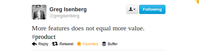
More features in a product can mean more problems for a company. Many times, adding features takes away from the core of the product. It takes time to build the new feature and maintain it. And, of course, it can add a lot of “fluff” but rarely any value for the majority of users.
But not all features add fluff and complicate the product. There are exceptions where a feature is built because of overwhelming user demand. For example, the first iPhone never had a copy/paste feature. With the introduction of “iPhone OS 3.0,” they added the much desired copy/paste.
Products become better when they add features that enhance core functionality or make a user’s life easier. For example, adding Chat to Facebook was a good idea because communication is social, and Facebook’s core function is to serve as a social network. No need to use AIM, MSN, or any other separate instant messenger.
The idea of limiting features to enhance UX (user experience) is supported by many popular startup investors. Dave McClure emphasizes killing features. Angel investor Mike Maples says that “focusing on just one or two features is really important.” Maples also notes that startups that perfect their one feature are usually the startups that win.
Eric Ries sums it up perfectly in a TechCrunch column:
“Because new features add overhead to products (generally making them more complicated), a new feature has to provide so much benefit to customers that it’s worth incurring this overhead. There is no such thing as a ‘neutral’ new feature. ‘The same’ means worse.”
Don’t Neglect the Onboarding Process
A lot of SaaS companies don’t put enough effort into onboarding new users. How many times have you signed up for a product and been stuck because you didn’t know how to do something?
I believe the first set up for a user is really important. There are questions that will be answered, such as:
Is the company there to help them?
Is the onboarding process helpful? Do they even have one?
The user will know the answers to these questions after they’re set up and will have an idea about the relationship between the business and the customer. It also sets up the customer’s expectations for the business.
For the onboarding process, you can see what works best for your business, but one of my favorite onboarding methods is to use “steps.” This means that after the user has signed up, they are taken to the product page. The user then goes through steps, each showing different functions and how they work.
If you’d like to see a great onboarding process, check out this article.
Is Your Product Simple?
You know your product backwards and forwards. You can cruise through it all and know how to use every feature. To you, everything is simple. But what about your customers? Do they think it’s simple?
Let’s examine some methods you can use to gauge a customer’s opinion of your product.
Customer questions
Do you get a lot of “how do I do x” questions?
If you’re receiving an unusually large number of questions from users asking how to run a specific task, chances are the product is too complex.
After receiving a certain amount of these types of questions, you’ll get a sense of what users are specifically having trouble with. You can then take this feedback and brainstorm a suitable remedy.
Surveys
Sending out surveys periodically can help gauge user experience. A simple question like:
Have you ever had any difficulties navigating our software?
Will work great.
You may also want to leave a comment box for this question. While a Yes or No answer will help, it’ll be better if they leave comments.
Remember that when conducting surveys, keep the number of questions to a minimum. No more than 5 questions per survey is a good idea. Respect people’s time and ask only a few questions. Don’t ask every question imaginable, only the ones that’ll give you actionable insights.
Usability Testing
Hiring people to give constructive feedback on your product can be a big help. User Testing provides a service like this. You can use them in addition to the other feedback that you get from users.
Don’t forget or discount the feedback you will get. Take it all in and make any necessary changes.
As you can see, the only way to truly know if your product is simple is to listen to what your users are saying. They’ll give you feedback. You just have to be willing to listen, learn, and iterate.
For more details on getting great user feedback, check out Jason Evanish’s blog post.
Some Inspiration – Companies that Keep Things Simple for Users
“It’s really complex to make something simple.” Jack Dorsey

Facebook has pretty much every feature that the user needs and has asked for. When they add a feature, like Timeline, most users quickly adapt and employ it. People seem to navigate the site with ease and never have any difficulties.
And Facebook doesn’t stand still. There’s no product inertia. They are constantly iterating their product. And users are adopting and embracing the fluidity of the Facebook product. It is mastery of product by Zuckerberg and team.
What you can learn from Facebook:
Listen to Mark Zuckerberg talk about Facebook. He knows the ins and outs of how Facebook users use the product. He names metrics, user behavior, and various other stats like nobody else.
The lesson: Know your users, how they interact with your product, and any issues they have. You’ll make a better product because you know your users and have better knowledge when iterating.
Craigslist

Despite its flaws, Craigslist remains one of the most popular sites on the internet. I believe that is due, in part, to its simplicity. There’s not much gadgetry on the site, which makes everything really fast. Further, Craigslist focuses on its core functionality of enabling people to buy and sell stuff online. It’s really a minimum viable product gone mainstream.
What you can learn from Craigslist:
Stick to the core function. Anything else can be a distraction for users.
Hipmunk

Hipmunk has become my go to place to search for flights and hotels. The simplicity and lack of banner ads are what make it great. It displays all the flights and hotels on one page and minimizes the images. It makes browsing for flights much easier.
Compare the difference between Hipmunk and other travel engines and you may notice more of a focus on delivering results.
What you can learn from Hipmunk:
Make only what’s necessary, and eliminate the unnecessary. Put the attention on the product. Focus on the user first, and then all else will follow.
It’s not easy to make a simple product, but these companies have done it. I’m sure you can name a few of your own favorites as well.
Is there anything you would like to add? Put it in the comments!
And one last thing. Let me leave you with some good quotes:
“My goal is to simplify complexity.” -Jack Dorsey
“That’s been one of my mantras — focus and simplicity. Simple can be harder than complex: You have to work hard to get your thinking clean to make it simple. But it’s worth it in the end because once you get there, you can move mountains.” -Steve Jobs
“The quest for simplicity has to pervade every part of the process. It really is fundamental.” -Jony Ive
“I want to figure out how you could combine simplicity, which is basic human life, with this thing — technology — that’s out of control.” -Marissa Mayer
About the Author: Zach Bulygo is a blogger, you can follow him on Twitter here.
Comments (24)