Everybody loves choices, right?
We all love having the opportunity to choose between different items on the menu at our favorite restaurant.
I love browsing the store for new clothes.
It’s usually fun to have many different options to choose from.
Except when you’re trying to convert new customers.
It turns out that giving your visitors too many choices on a product page, for instance, can have negative consequences.
Too many choices lead to friction.
Friction leads to more bounces.
And that hesitation usually results in fewer sales.
Removing friction, on the other hand, almost always boosts conversions.
For example, reducing the number of form fields from six to three can deliver a 66% average conversion lift.
The problem is that you probably have different products for sale on your site. You probably are trying to sell those products to different audiences, too.
All of these potential combinations create more variables.
And these variables create more complexity of choice.
So selling multiple products to multiple audiences can dilute your results.
Thankfully, there are ways to still sell your product to different customers without watching your ROI float down the drain.
First, I’ll explain why this commonly backfires.
Then I’ll show you exactly how to prevent it in each case.
Why selling to different customers often backfires
The New York Times reported on a study about the “paralyzing problem” of too many choices.
Here’s what happened.
The first day, they set up a stand at a local grocery store to offer jam samples.
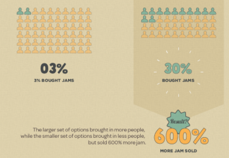
Initially, they offered 23 different varieties of jam for customers to try.
That large number of options piqued a lot of people’s interest.
60% of the people who passed the stand stopped to try their jam.
So far, so good, right?
But when they closed up their stand for the day, they found that only 3% of people converted and bought their jam.
That sounds pretty similar to the average conversion rate for most websites when you think of it.
Pretty awful, right?
The next day, they found some good news, though.
They went back to the same grocery store stand but reduced the number of jam samples down to six (from 24).
The flavors were all the same as the day before. All they reduced was the number of options.
The result?
They saw a 30% higher conversion rate that resulted in 600% more product sold!
Reducing choice is a proven factor in generating more conversions.
It reduces a lot of the tension people already experience while buying.
Here’s how to sell to different customers at the same time without bombarding them with too many choices.
1. Create offer-based ads for specific customer segments on Facebook
Just 42% of marketers report finding success on Facebook.
That sounds crazy when you think about it. Facebook advertising is one of the best ways to grow your business right now.
But many marketers are still having trouble measuring ROI.
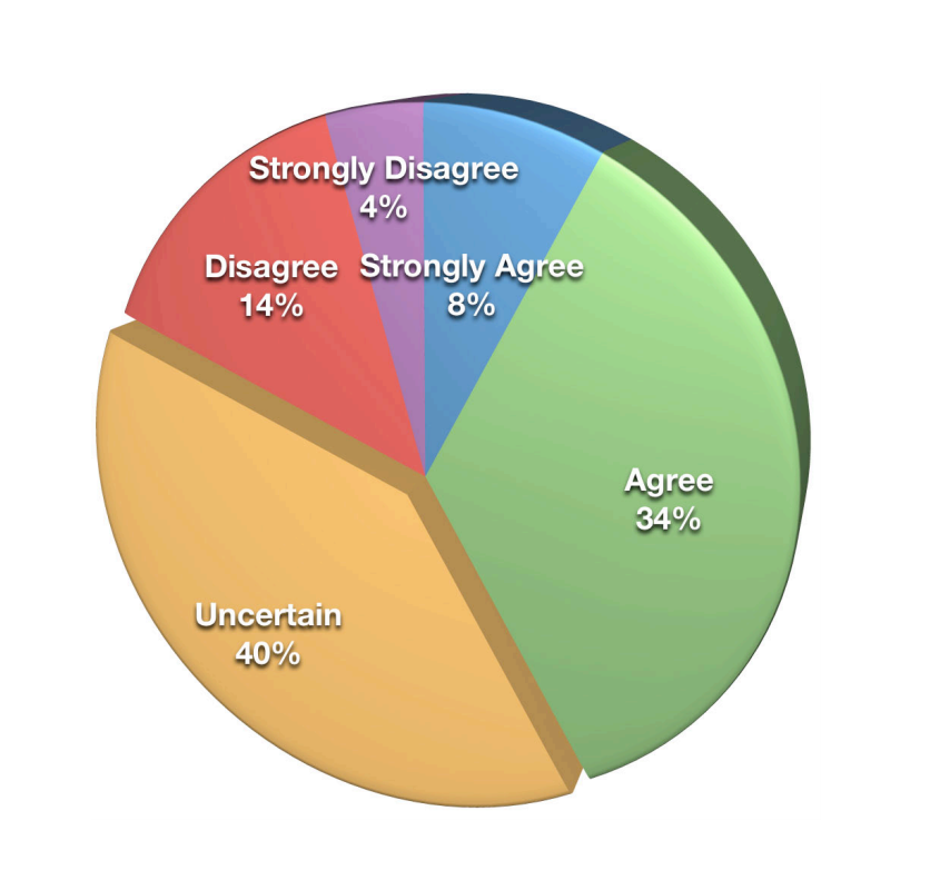
Here’s what these survey respondents replied when asked if “things were going well.”
The majority of marketers were “uncertain.”
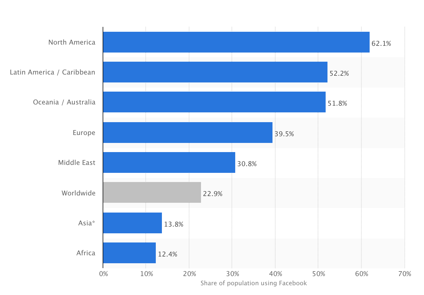
Obviously, Facebook can be amazing if you know what you’re doing. It’s one of the best ways to reach billions of people to buy your products.
There’s no shortage of customers on Facebook to acquire, retarget, and convert.
But that volume can also become a problem.
There are too many segments. There are too many advertising options to use.
Here’s how to sell to all of your different customer segments without risking a drop in sales.
Start by segmenting your offers into each funnel stage.
In this example, I’ll show you how to create a Facebook Ad for targeting traffic that’s already landed on your site.
The trick is to then re-work your messaging based on who these people are.
Let me show you what this looks like so it makes sense.
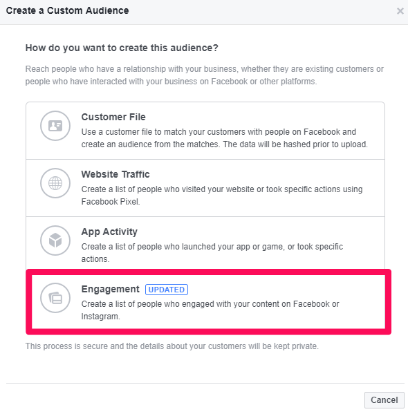
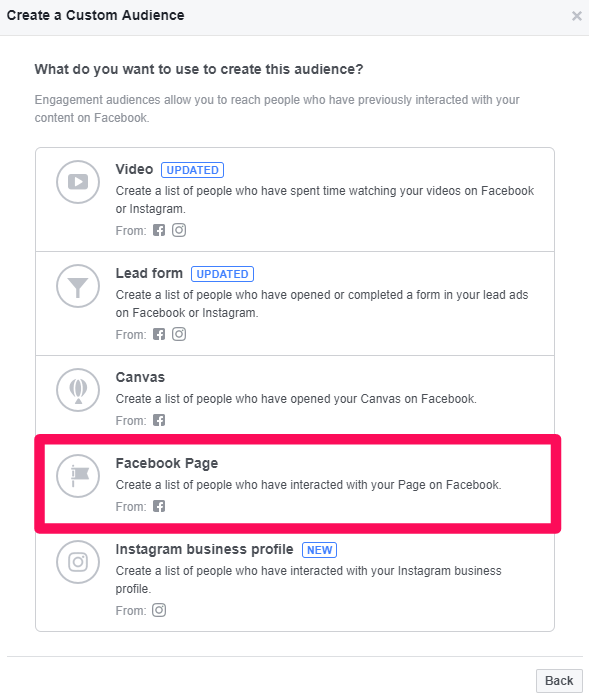
Step #1. Create a custom audience based on engagement with your Facebook page.
This custom audience is perfect for B2B companies, for example. These websites typically don’t see that much website traffic.
And you only need to promote your business to a few people when each client is worth thousands of dollars each.
Next, click “Facebook Page.”
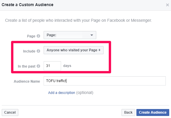
Step #2. You can target brand new visitors who just heard about you by narrowing this audience down to people who’ve visited your page in the last month.
You can call the name anything memorable. It’s just for your own internal use.
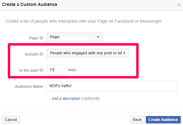
Step #3. You can use specific interactions or engagements to target people in the middle of the funnel.
For example, these are people who’ve left comments on some of your recent posts or shared them with their friends.
That interaction is a signal that they’re ready to hear more about you.
2. Speed up customer research with self-selection
Let’s say that you sell a software product to two very different companies.
One might be a scrappy startup. The founding team or single marketing-focused hire might use it on a day-to-day basis.
The other might be an enterprise client. They have teams of people who want to use the product.
The tricky part is that each company is using the product for very different reasons.
The scrappy startup might want to grow ASAP. They’re looking to get more customers and increase their return on ad spend.
The enterprise client, on the other hand, is looking for a tool that makes their internal team more efficient. They’re interested in saving time.
That’s not the only thing that’s different, though.
The price each is willing to pay is also completely different.
The scrappy startup needs to keep costs down to one or two seats max. The enterprise company wants 25-50 seats and is less price-sensitive.
Do you see where I’m going with this?
Companies run into problems all the time because they’re being pulled in all directions. Many of my own companies have gone through this same issue.
Fortunately, there is one trick I’ve learned over the years.
One of the easiest ways to reduce hesitation on a pricing page is to help customers self-select.
In other words, make their choice easier by simply recognizing their ‘name’ and ‘scenario’ from the others.
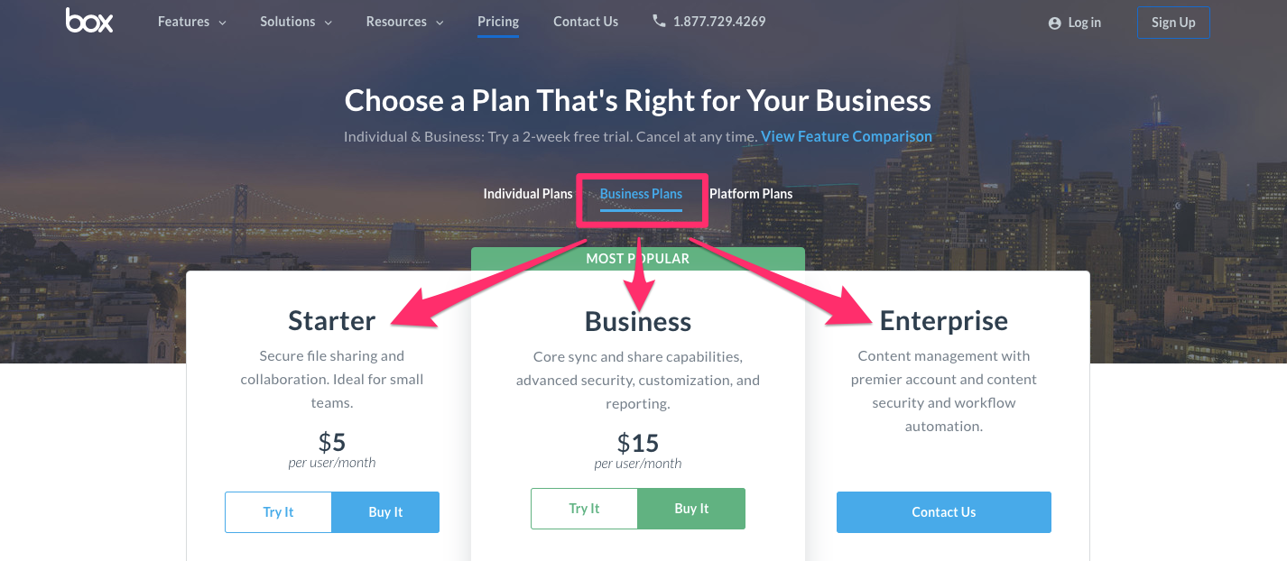
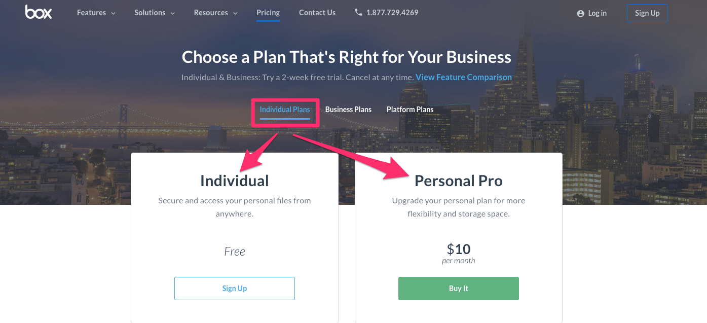
Box does an incredible job of reducing the headache of a typical pricing page.
They allow different customers to segment each plan by their business type.
If you’re looking for a business-wide option, you have three plans tailored to your needs.
If want to choose an individual plan, you probably don’t want to go through all of the Business and Platform plans that don’t apply to you.
Thankfully, you can flip over to the Individual section in that case.
See how effective this is?
Realistically, Box has potentially a dozen different pricing options.
Obviously, that would kill your conversions. Instead, they allow users to segment themselves.
For example, let’s say you’ve got three typical customer segments:
- Individuals
- Startups
- Fortune 500 companies
You don’t want to force all of their plans onto a single page. That’s only going to confuse visitors.
And more confusion leads to more people leaving your site without converting.
Instead, simplify your product page and make it easy for a user to decipher the options.
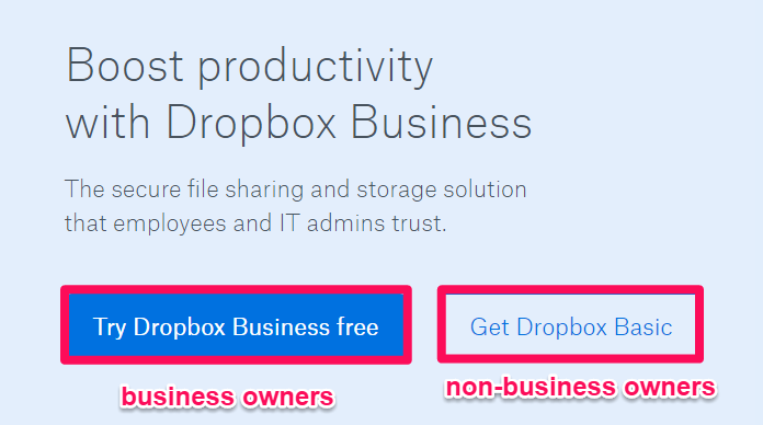
Dropbox has a similar strategy to reduce the likelihood of overwhelming new potential customers.
They offer services to both individuals and business owners.
So they use the homepage to instantly funnel users to different pricing pages based on their intended uses.
Another example is the QVC homepage. I bet you didn’t see that example coming, did you?
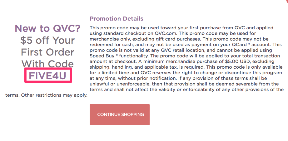
QVC tracks first-time visitors vs. returning ones who’ve visited multiple times.
New, first-time visitors will get introductory offers to help them take action.
Now they can see how many new customers used these coupons. They can even see what these new customers are purchasing.
That means they’ll be ready the next time a new customer visits their site.
QVC can immediately reduce their endless number of product options to display just a few frequently-purchased ones.
That reduces friction and increases sales at the same time.
3. Keep conversion paths consistent
Keeping conversion paths consistent results in a better user experience.
It reduces the choices someone has to make on your website.
That means they won’t lose track of their conversion scent.
Basically, you want everything on your landing page to guide users to the next step.
That might not be a purchase just yet.
The point is to simply keep these people moving in the right direction.
You don’t want to present a roadblock or speed bump that might knock them off course.
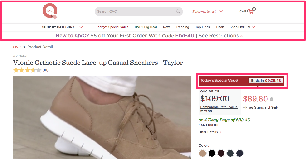
Once again, QVC gives you a perfect example.
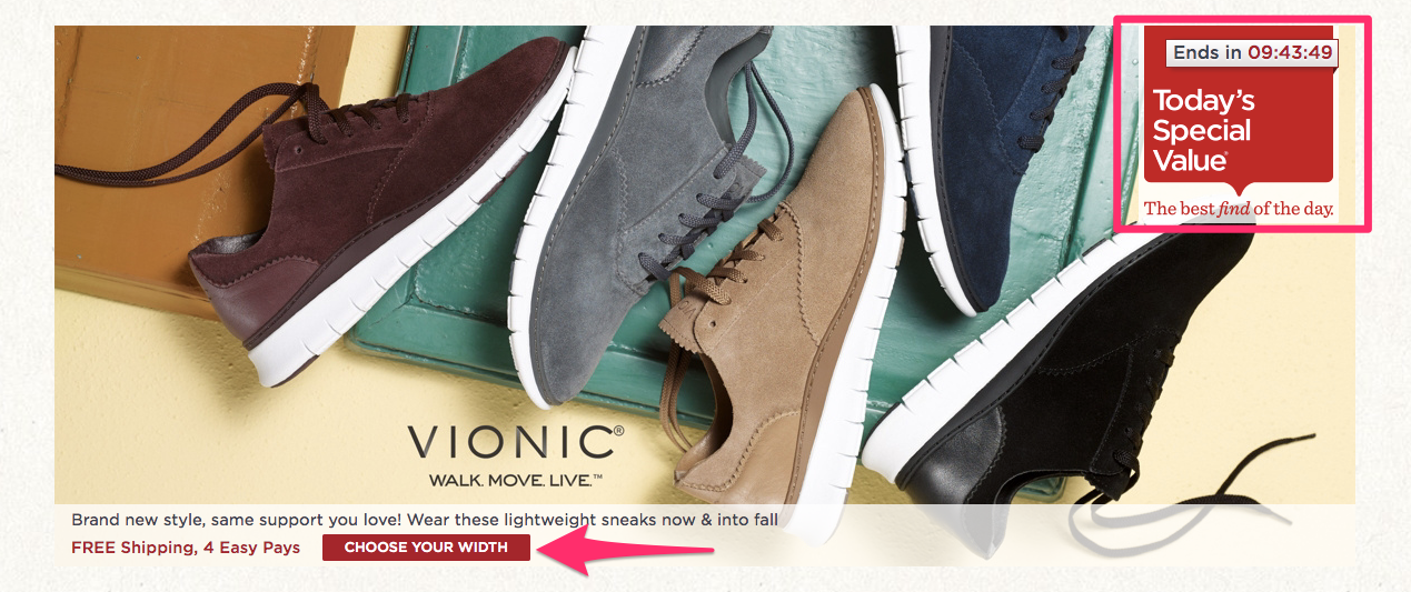
For example, they use a countdown timer to create urgency.
That moves people forward through the conversion process without leaving too much time to overthink anything.
Once you’ve clicked through to the next page, the user experience and layout stay consistent.
The timer even still appears on the page to maintain the urgency.
They practically funnel you directly to their product page.
The path is outlined for you. And the little triggers or signals help prod you along in the process.
4. Personalize suggested products on your website
Choices are all too abundant.
For example, take a look at your main website navigation right now.
How many different links are you giving people, including drop-downs?
There’s probably a dozen different options just in that one section of your site.
Now imagine someone trying to browse the products on your site.
Too many other choices to click and view only end up distracting people away from your objective.
Let me give you an example.
Let’s say you wanted to buy some new shoes, but had no clue what you wanted.
You don’t know what style, color, or brand you prefer yet. So you head to Zappos to check out some options.
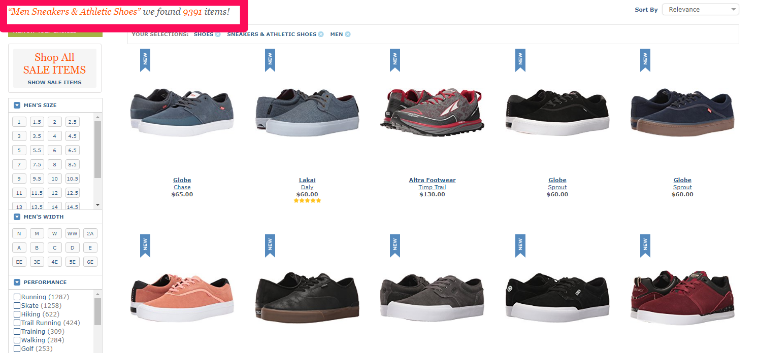
Next thing you know, you’re browsing a page with thousands of options. 9,391 to be exact:
Yikes. You’re likely going to get overwhelmed, and your search will stop dead in its tracks.
Instead, Zappos found a way to circumvent this problem.
They didn’t want to overwhelm people like you right now.
Take a look at what they did to help solve this problem.
They segmented their products by “Featured Favorites.”
These products narrow your choices from over 9,000 to now just a handful of options.
Now you’re much more likely to convert because you can actually decide between these choices.
You don’t have to sift through 9,000 pairs of shoes to find the one perfect option.
Make sure you personalize the buying process on your site. Give users recommendations or direct them to popular products to help reduce choices.
5. Popups for the right customers
Average website conversion rates are terrible. We know this problem all too well.
Driving new, high-intent visitors can also be a challenge. It’s hard to capture their information before they bounce forever.
I see the same mistake being made by marketers all the time.
I even made some of these mistakes while building my own businesses.
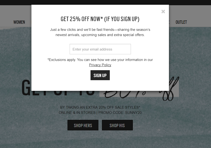
For example, when you land on most sites, you get hit with the instant popup that offers you a discount in exchange for your email address.
You often see this on e-commerce company websites.
What’s wrong with this approach?
The problem is not the popup. Those work fine.
The problem, instead, is the approach.
For example, what if this user already wants to buy?
What if they already signed up for your email list? Or what if they have already received offers directing them to the site?
Now, you’ve just sent them a completely irrelevant message.
You have also thrown another distraction into the mix. That’s one more second for someone to reconsider their decision.
Let’s turn the tables around for a second.
What would happen if that was you visiting the website?
You would probably close the popup ASAP without even blinking.
Your basic human instinct is now to click out of these before they even load.
Why? Because you’re new to the site.
You’re not even sure if you like this company just yet.
So you sure as heck aren’t giving up your precious email address to get spammed for stuff you might not even want.
If users aren’t ready to buy, don’t offer them a discount.
Thankfully, there are ways to combat this problem.
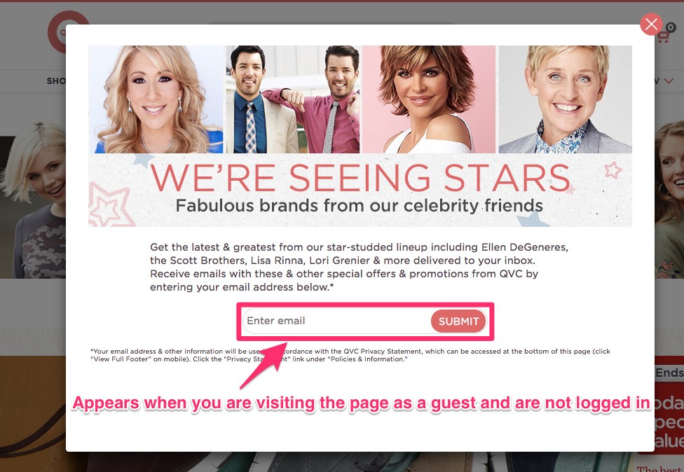
For example, QVC uses a popup that detects when users aren’t logged in.
Instead of targeting them with a useless discount, they ask you if you’d be interested in news about products from celebrities that are featured on their site.
This content-based offer works because it’s not as threatening. You can warm people up first.
You’re giving visitors news and valuable information rather than begging them to buy on the first visit with a useless discount.
Here, I’m going to show you how to create easy, effective popups for your own site that will actually work.
You can create these with Sleeknote.
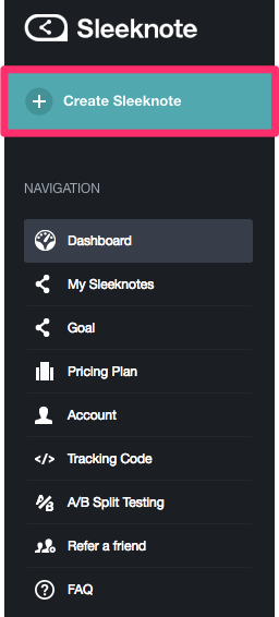
Step #1. Simply sign up for a free account and, in your dashboard, select “Create Sleeknote.”
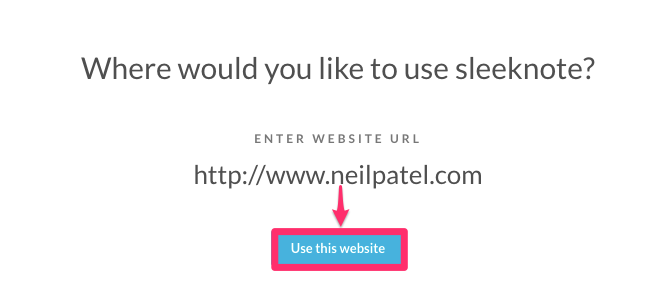
Step #2. Next, enter the page URL where you’d like the popup to appear.
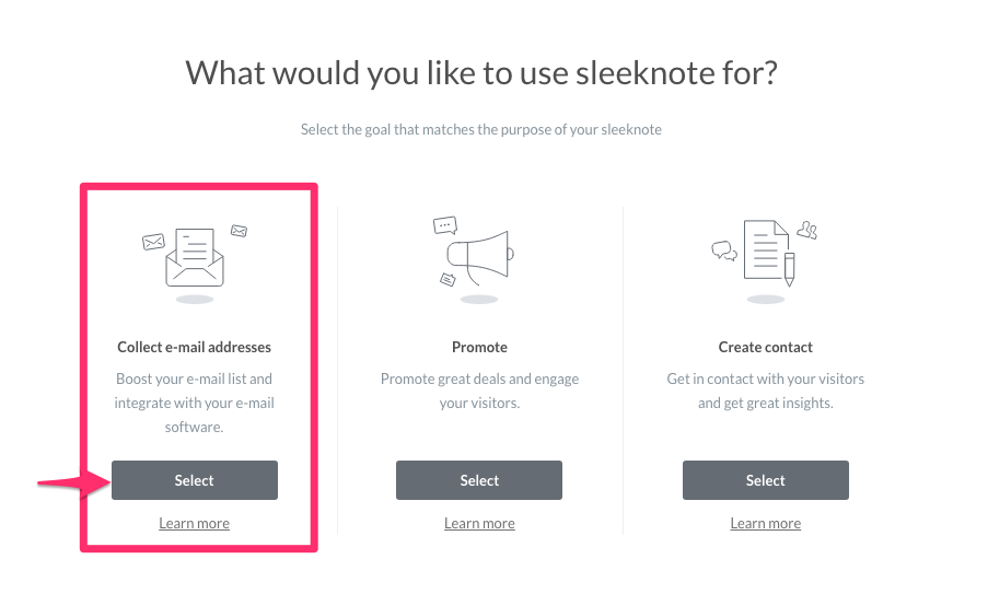
Step #3. Then, instead of promoting deals and coupons to cold traffic, choose “Collect email addresses.”
This way, you aren’t delivering irrelevant content to users who have no desire to buy your product yet.
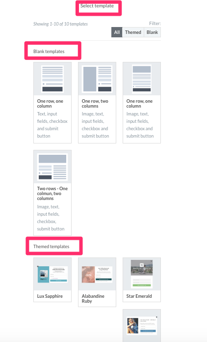
Step #4. Next, you can select a basic template to create one from scratch. Or you can start with a themed template.
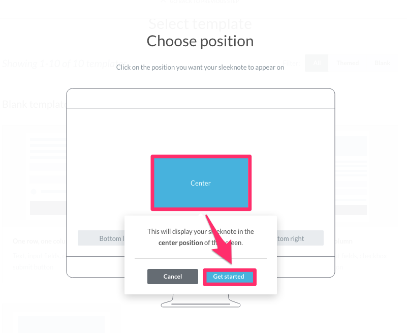
Step #5. Choose the position on the screen where you want the popup to appear.
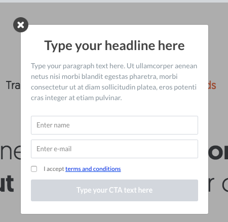
For example, here’s what the center looks like:
Step #6. Now you can preview the popup to see what it will look like when a potential customer lands on your page for the first time.
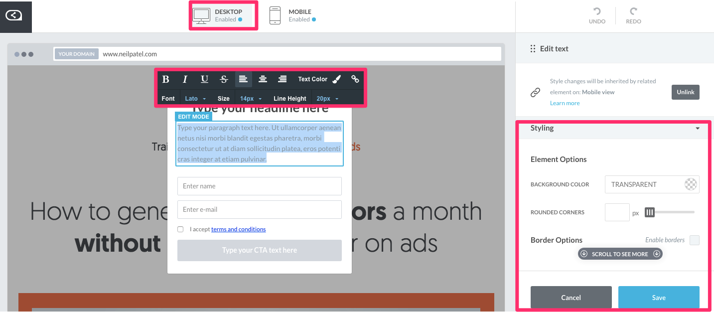
Make sure to edit the text and headline to communicate a compelling offer that makes sense.
Remember, you need to segment these offers by intent!
You can also optimize for mobile and desktop traffic.
And you can adjust the styling to match your current site’s branding.
Hit save and watch the conversions roll in.
6. Find common ground with your value proposition
Last but certainly not least, make sure to keep your value proposition as straightforward as possible.
You should be able to explain the value each customer will get from your product.
How will it ease their pain? What will it solve? What processes will be easier with your product or service?
The trick to creating content that converts is to start with a broad approach.
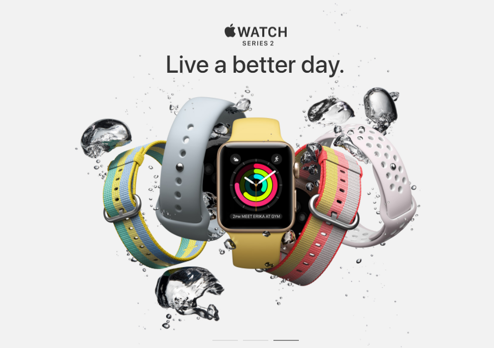
For example, check out this value proposition from Apple:
This product has tons of different ‘types’ or potential variations.
It even has tiered pricing for different models like most SaaS apps!
But they don’t say: “Fitness lovers will live a better day.”
This broad positioning helps it apply to more than one audience.
Your pricing page is the time to segment your offers, not dilute your value proposition.
Anyone from the business owner to the fitness junkie can enjoy the product. So the value proposition makes sense for all of them.
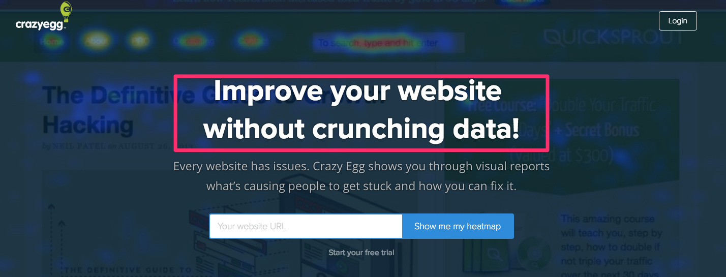
Here’s what the value proposition looks like on the Crazy Egg homepage:
Anyone with a website can find value despite the plan options available for different users.
Don’t sell too hard on the value proposition.
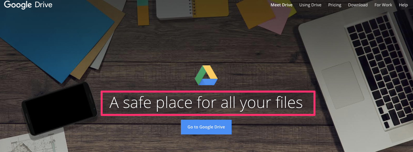
Keep it simple, like this one from Google Drive:
It’s simple. But it also communicates the right value that can apply to any customer segment.
For example, saying something like “Keep your confidential files safe” could actually backfire.
Why? Because not every customer is using Google Drive for confidential files.
But every customer is using Google Drive as a safe place to access their files.
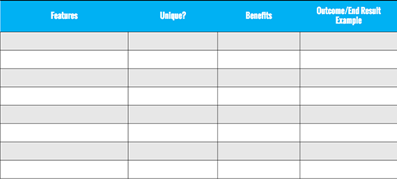
The best way to simplify your value proposition for every customer segment is to lay out the features and benefits.
Then, your goal is to translate those features and benefits into outcomes for each end-user.
Use this chart to map out the value you provide for every customer segment. Find common ground and use that benefit to extract a value proposition that sells.
Conclusion
Selling to every customer segment is a daunting task.
That only becomes tougher when you have multiple products to sell.
The danger is that you might overwhelm customers with too many choices.
And too many choices will destroy your conversion rate.
Instead, you need to get creative and find ways to segment your offers.
Hopefully, that’s possible without spending months creating new landing pages for every single potential customer.
Try creating specific offer-based ads for custom audiences on Facebook.
You can send different product variations to different customers directly.
Otherwise, using a value proposition that highlights shared benefits will help you satisfy all customer segments.
Just remember to reduce choices, reduce friction, and make it easier for prospects to find the right product for them.
What techniques have you used to sell to different customers without jeopardizing sales?


Comments (0)