Images are powerful. They can tell a story, persuade, inspire, and much more. When used correctly, they can even help you sell a product. For instance, adding a photograph to a restaurant menu can increase sales of an item by as much as 30%.
When it comes to running an e-commerce store, images are not optional. Before buying, shoppers like to check out an image to get a visual sense of the product. And the image can make or break the sale.
So in this post I want to give you some tips on what makes great product photos and how you can take them yourself. (Please note: in this post, I use the words “images” and “photos” interchangeably.)
Principles of Good Photos
I’m going to run through some factors that help create great product photos, including:
- Surroundings
- Environment
- Details Matter
- Show the Product Being Used
Surroundings – When taking a product image, what do you have surrounding it? Is it a white background, with just a focus on the product?
It’s important to ask these questions because what is around a product matters more than you may think. Do car companies show their luxury cars by a swamp, covered in mud? No, because the swamp image and mud would become associated with the car in the consumer’s mind. So, it’s about two images, the background and the product, and how the product looks when placed in different settings.
Let’s use Schwan’s and how they display their products as an example. Selling food online is a little difficult because you lose a key sense, smell. Also, consumers can’t sample the product. So the photos have to make up for those shortcomings.
Schwan’s has one of the highest conversion rates of all e-commerce sites, and their skill at using images to sell certainly is a key factor in achieving that success. Here is the image they use to sell their ham:
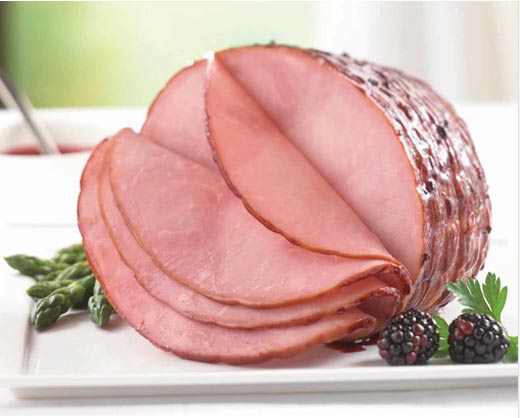
Some key qualities in this image: The first thing you notice is the ham. The perfectly cut slices make it difficult to say no. This could turn someone from a prospect to a buyer.
Second, the asparagus (which is not included in the order) adds a complementary healthy green vegetable to the image.
And, third, blackberries are at the forefront.
Adding the other foods to the image helps put a taste in people’s mouths. Instead of using asparagus and blackberries, what if Schwan’s had placed 5 pounds of raw beef next to the ham? Would that make it seem as appetizing? Do you think it would hurt their sales of ham? I sure do. The point is that how you exhibit a product is very important.
Environment – At one point in time, Square had this as their homepage:
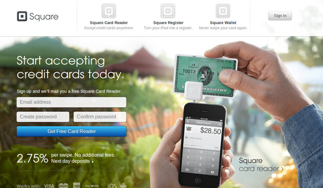
It’s a great above-the-fold design, but let’s focus on the image:
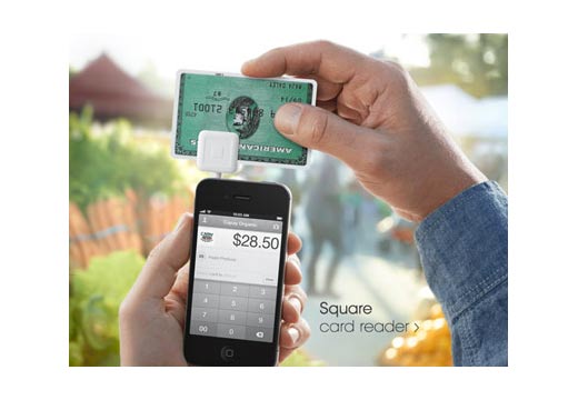
The image does a number of things. Let’s run through them:
- It shows the product at work. We can see that Square lets people process credit cards using their mobile phone. This is done by using the app and attaching a card reader to their phone.
- A big benefit is that it’s completely mobile. We see, by looking at the product in the environment in which it will be used, that people are processing a credit card on a mobile device. This is totally unique, as consumers are used to seeing a large, archaic point-of-sale device being used indoors. Thus, it positions the Square product as being simple, innovative, and elegant. And, the image is targeted as well. Small businesses that need a mobile payment system view the homepage and know that Square fulfills this need.
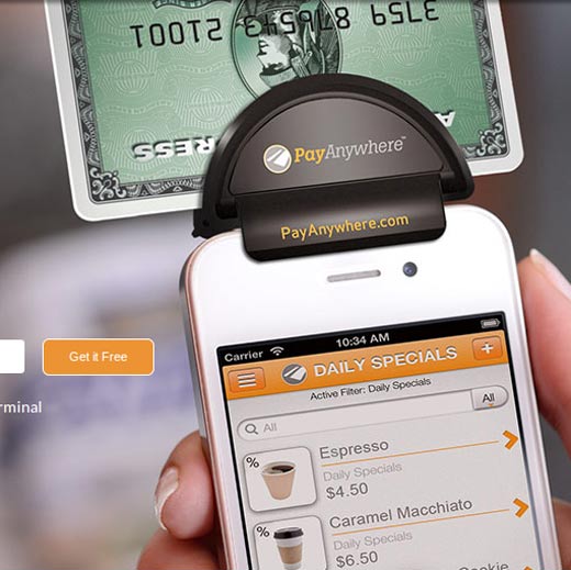
Many of Square’s competitors have similar images. Here is Intuit GoPayment:

And, here is PayAnywhere:
Details Matter – People can’t touch or hold your product in an e-commerce store. They can only look at it. It’s much like having a product behind a glass window. Shoppers don’t know how it feels, or how it makes them feel, until it’s theirs.
So the goal is to make the visitor feel as if they know exactly what it is like to touch and hold the product. This is especially true for clothing and any kind of mechanical tool.
Check out all of the images DODOcase uses for their classic iPad case:
The images are taken from multiple angles. Here are a few:
When you want to use your iPad and case for reading:

Another angle showing the self-supported standing position:
 Kindle Fire HDX product page:

With this image (and the many more on the product page), visitors can get an understanding of the Kindle Fire HDX UI. They can see how it looks in both the landscape and portrait mode.
A lot of companies now allow visitors to hover over an image so they can zoom in and view the details of the product.
In order to show the product in as much detail as possible, many companies give a 360 degree rotating view. If you don’t know how to set up a 360 degree rotating image, there’s a simple workaround. Just take a picture from all angles of the product. Amazon does this with many of their products (and adds the ability to zoom).
Show the Product Being Used – As we’ve seen with the Square and mobile payment example, it’s important to show your product working and being used.
HOM Furniture has a queen bed frame for sale. Instead of showing only the bed frame and the barebones of what comes with it, they show the final product and give it context.
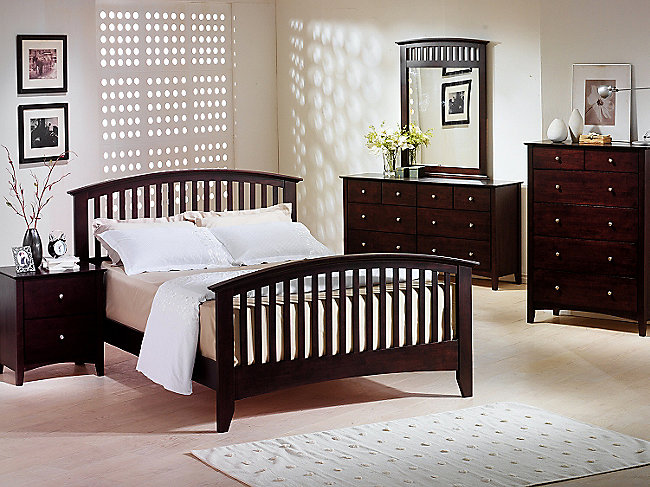
Do you think putting the bed frame in a bedroom makes the product more attractive than just a plain shot?
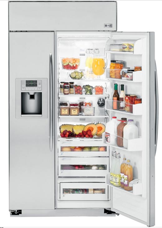
When selling something like a refrigerator, showing the product in use presents a clear benefit. People can imagine how much food they can put into it. GE shows this with an array of pictures for their Profile fridges:
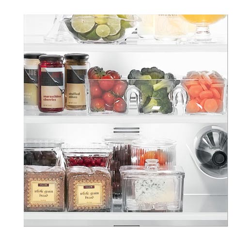
And if people want a little detail, they can hover over the image and see what food items fit in this fridge and which do not:
Apple says that how a product makes someone feel is what matters most. In many of their ads, they show people using their products. The emotion they’re experiencing is clear.
Netflix does this as well. Below is an image that was well circulated in Netflix advertisements and on their website:

This is what Netflix is about. It’s the end user experience of their service. This is not an image of a person selecting a movie or writing a review for a movie. It’s about sitting on the couch with the family watching a movie. Netflix is showing their product being used and how it makes people feel.
Taking Product Photos
If you’re looking for tips on how to take professional product photos, I’ve collected a list of resources to help. Don’t put another product photo on your website until you read these articles:
Is Awful Product Photography Losing You Sales? – Shopify provides some tips for taking product photos. Factors considered are lighting, colors, level of detail, etc.
Improve Your E-Commerce Design With Brilliant Product Photos – Smashing Magazine gives their list of sites with great product photos. Then they delve into how to make your own great photos.
How to Take Gorgeous Product Photos – A short but insightful article on getting a camera and studio set up for product photos.
10 Tips for Effective Product Photography – A wonderful article detailing tips to get the most out of your product photos.
How to Take Great Product Photos for Your Online Store – A detailed article that covers cameras, studios, and editing.
Final Words
There are a lot of factors involved in running an e-commerce site: design, copy, product photo(s), website speed, security, navigation, selection, pricing, and much more. Out of all of these factors, product photo(s) is one of the most important. People look at a product before buying, so the quality of the photo becomes a selling point.
I hope this article has given you some ideas and helpful advice for using product images on e-commerce websites. Let me know of any feedback or additional tips you may have in the comments.
About the Author: Zach Bulygo is a blogger, you can find him on Twitter here.
Comments (24)