We’re constantly testing and tweaking our landing pages to maximize our conversion rates.
We know a page that converts at 15% instead of 10% can mean hundreds of thousands of dollars in increased revenue for our business.
This article will discuss the rising importance of personality and trust in brand communication, particularly in landing page optimization. I’ll give you five strategies for presenting a user-friendly landing page and a personable business that you can apply to improve your conversion rates. We’ll go through techniques that can give your website that certain “something” which gets a visitor to convert.
Before we push on, I’ll quickly preface these recommendations with this: As with any landing page variable, the ones I’ve included in this article are simply tests I’ve seen work in the past, and they may work for your business.
Landing page optimization is a continuous exercise of testing. It is pitting control against variation until you’re satisfied (which you never should be).
I do give case studies for each of the variables I recommend, so you know I’m not just stabbing blindly in the dark. Just remember, these are unproven hypotheses until you test them yourself.
Add personality and trust to your landing page
When we meet someone new, we unconsciously process minor, inexplicable cues. For no specific reason that we are aware of, we either like the person or we don’t.
An example of this unconscious decision making is the fact that we tend to trust someone who is confidently poised, has an open air, and speaks calmly, slowly, and directly. We are less trusting of people who appear weak, closed off, and (here’s where it gets a bit crazy) not very good looking.
Landing pages are no different.
When someone lands on your landing page, the decision to stay takes between three and eight seconds. This decision is made half consciously and half unconsciously. Half of it is based on the value that is communicated quickly and clearly, and half of it is based on those indefinable factors that just “connect” with your landing page traffic (or don’t).
Here’s what I mean:
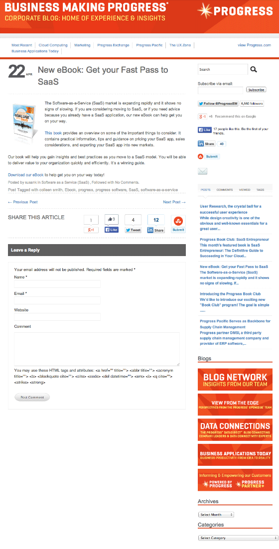
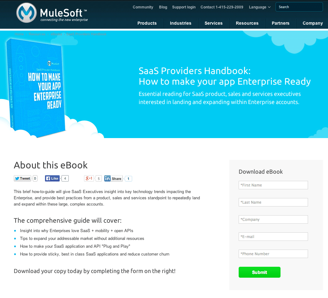
Below are two lead generation page examples from Software-as-a-Service companies (SaaS). Which would you engage with first?
Site A:
Site B:
These pages had about five seconds to convince us to keep looking and convert.
Can you quantify each and every one of the variables that make you prefer Site B over Site A? Or is it something more complicated?
Your landing page needs this je ne sais quoi – that indefinable something that puts you a notch above your competitors.
Let’s check out five strategies that add personality, increase trust, make your page a friendly one, and overall, can increase your page’s conversion rate and your business revenue.
1. Use friendly Colors
Color psychology is the exploration of how color impacts our perceptions, reactions, and emotions. In marketing terms, it’s about using color tactically to increase engagement, cause a desired action, and create an emotional connection or specific feeling related to your business or your product.
Color triggers the most innate part of our selves. We see green and are calmed because, in the days before supermarkets, green meant water and life. We see the color red, and genuinely, our heartbeat speeds up, causing us to act more quickly on our feelings.
Or did you think it was just a coincidence that HubSpot’s A/B Test of CTA button colors resulted in red outperforming green and conversion rates increasing by 21%?
Color can make your landing page friendly and increase your click-through rate. The right color scheme puts your landing page visitor at ease and is the basis for a good first impression.
It’s all about what you want to communicate with your landing page – the “look” you’re going for. Here are a few recommendations based on color psychology:
The Professional Look: Shades of gray, white, and black – green for CTA
- Black and gray evoke sophistication and sincerity when used in partnership with a crisp white (avoid beige, brown, and tans, as they’ll wash out your page).
The Youthful, Startup Look: Dark blue, light blue, gray, and white – orange for CTA
- Blue is (across both genders and all age-groups) most people’s favorite color. It is said to create the sensation of trust and security. Lighter blues are calming, while darker blues denote professionalism and sincerity.
The Environmental, Eco-Friendly Look: Green, white, and brown – red or orange for CTA
- As I mentioned above, green communicates health and wellbeing. More recently it has started to indicate the eco-friendly movement and environmentalism.
The Female-Focused Look: Purple, white, and beige – orange or yellow for CTA
- Purple is the favorite color of 23% of women, and 0% of men. It communicates womanhood, maternity, and comfort. Interestingly, it increases in popularity as women get older.
The Male-Focused Look: Black, red, and gold – red for CTA
- Solid black landing pages with vibrant reds communicate strength and permanence, appealing to masculine sensibilities.
Each of these color schemes requires you to know your business’s target market. This also is an essential part of language in landing pages (something I’ll discuss in Section 3 below).
One of the biggest mistakes you can make is to use the wrong color scheme, particularly when optimizing CTA buttons. The right amount of contrast can focus your visitor’s attention, while too much contrast can increase bounce rates or even outright scare your landing page traffic.
For instance:
2. Include images of people
Let me share an anecdote to communicate the value of a picture on your landing page conversion rates:
In South Africa in 2003, Harvard economist Sendhil Mullainathan ran a study in which he worked with a bank that sent out letters offering short-term loans. They varied the interest rate offered and also varied a number of cues designed to trigger psychological responses, such as a smiling photo in a corner of the letter.
It turned out that having a picture of a wholesome, happy female in a corner of the letter had “as much positive impact on the response rate as dropping the interest rate by four percentage points.”
I’ll let that sink in for a second.
Images of people communicate trust better than any word, unique selling point (USP), or other images possibly can. The idea of a “faceless corporation” is a real one, and one you do not want to cultivate.
But, like with all landing page optimization, we can’t just throw any smiling woman on our page and decide we’re good with the results we get. We have to optimize, not just test.
Optimizing your page’s image means finding the right image for your business’s target market.
Here are five variables to test when optimizing your landing page image:
I. Smiling or serious: Do you want to communicate sincere professionalism or happy professionalism?
II. Eye Direction: As eye-tracking studies showed more than a year ago, eye direction matters. Do you think it’s a coincidence that the landing page’s smiling young man is looking directly at their USP?
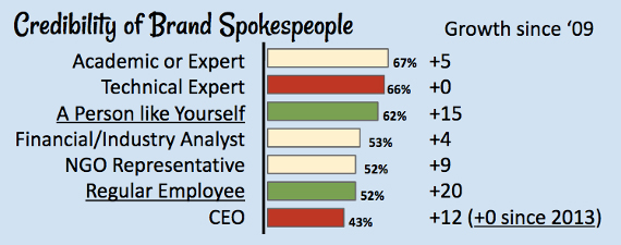
III. Model and Stock Photos or Real: Most case studies indicate that photos of real people improve conversion rates (often by up to 50%) over stock or model images. This is likely because we have a high level of empathy and trust for “people like us” (see “Credibility of Brand Spokespeople” in Section 4 below).
IV. Groups or Single Focus: Group shots can work better than individuals, but (like so much of landing page optimization) it really depends on your own business and testing. A recent case study found that the conversion difference between one smiling individual and another was actually negligible. But the difference between a group of professionals and a single man or woman? You’ll have to test it for yourself.
V. Album or Single Image: If you do go the album route, as many successful businesses do, remember it’s absolutely essential that each image have its own relevant USP. You also can use a revolving album of three or four images in place of your page’s benefit list. Then again, a single focus (and single USP) may work better for your business.
A very popular (and recent) route for businesses in landing page optimization is to get a great quote from an actual customer and then feature both the quote and that customer’s smiling face as the focus of their page. See more on this below.
Quick Case Study:
HighRise Marketing, a CRM and personal organization company for small businesses, tested a full-page picture of a customer with the customer’s testimonial. The customer testimonial (as well as cutting the length of their page in half) more than doubled their landing page’s conversion rates.
I’ll get more into the value of customer reviews below, but I’ll come out publicly now and say I’m in favor of testing this option. Customer testimonials (especially ones in which a USP or value proposition is embedded) are fast becoming the most important variable on landing pages. Used in conjunction with an image of a real person, they can have a substantial influence on conversion rates.
3. Focus your tone and language
The language your business uses on its landing page frames your tone. To create a personable, relatable, friendly landing page, you need to focus your message on the visitor’s needs and wants.
The point of your landing page is not to sell your product, but to sell your visitor on your product.
Here is the difference between the two:
Selling your product is talking about the amazing things it can do, its capabilities that none of its competitors have, and its availability today for the low, low price of $29.99.
Selling your visitor on your product is talking about the amazing changes it can bring in their life; how much more time they will have to do the things they love; and how the capabilities it has that none of its competitors’ products have actually make it more intuitive to use.
A few examples of how to sell on benefits instead of features:
- “12 GB of data” vs. “Space and battery life for over 2,000 of your favorite songs!”
- “Using the Google API, we tap into the Ad Display Network, showing your brand’s ads on over a million sites” vs. “Getting your business the results you need by showing your ads where and when it most benefits you.”
- “No CSS or HTML required to integrate our CRM directly with your website” vs. “No coding required! Publish to your site in a single click and save yourself time.”
A few more tips:
- Make it Personal: Your landing page should be about your visitor in terms of language (use “You”) and it should create a personable and friendly tone (use “We”).
- Focus on Value: Instead of “Buy now!” try “Get access to leads.” Instead of “Book an appointment” try “Get the time slot you want!” Home in on what the visitor gets, not what they should do.
- Positive Reinforcement vs. Negative Avoidance: The case studies are divided on this one. Does your target market respond better to “Increase click-throughs!” or “Decrease bounced traffic!”? Test it!
Here’s an example from our good friends at CopyBlogger and their client “Schedulicity.com”.
Their CTA control read “Try Schedulicity Free,” and here’s what they tested:
Not only does this CTA button text focus on benefits for the visitor, it also uses the personal pronoun “my.”
It improved conversion rates by 24%.
A page converting 10% of visitors would have been improved to converting 12.4%, possibly resulting in hundreds of thousands of dollars in increased revenue over the course of a year.
4. Make your business friendly by featuring yourself
AdRoll’s landing page has remained exactly the same for more than eight months now (and for a SaaS company, eight months is a long time). To landing page optimizers, this indicates that they’re quite happy with the conversion rates they’re seeing. It also means that they have tested other landing page iterations and been unable to improve their conversion rates.
The page’s primary feature is a two-and-one-half-minute video from their CEO, Adam Berke, in which he gives a short breakdown of how AdRoll works and the ROI it offers.
Videos explaining products are becoming very popular in the landing page world. They showcase the human side of your business, again combating that “faceless corporation” I mentioned before.
Here are a couple of statistics from Edelman.com’s recent “trust barometer executive summary” which details how credible consumers believe each brand spokesperson is:
A few more ways to showcase yourself or your employees on your landing page:
- Make your contact details obvious: This is a no-brainer. A contact address or phone number should be evident on your page.
- Test a short “About Us” section on the page: A couple of solid sentences about your business’s mission or origins can work with your USP to set your business apart from competitors.
- Include product description recordings: This is something we’re actually testing at the moment: my voice speaking over a screen-capture describing how each of our tools works. SaaS and B2B businesses may find success featuring something similar, especially on long-form landing pages.
- Integrate a live chat popup: If your service is somewhat complicated or may need explaining, I recommend a live popup (include a headshot and the name of the customer support agent as well). Even if your service isn’t that complicated, I recommend testing live chat. Make it unobtrusive but clear (try a tab the same color as your page’s CTA button).
It’s worth mentioning at this point that all of the strategies above will add complexity to your landing page. Many target markets respond better to simplistic landing pages. Test one, or all, of these new variables for yourself to see if it increases conversion rates for your business.
5. Tap into customer testimonials
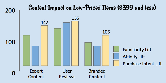
I mentioned above that customer testimonials are becoming one of the most important parts of landing pages. Here are a couple of numbers from Nielsen that back up that assertion:
You’ll notice that intent to purchase is stronger after reading a user review than it is after hearing from an expert. Edelman (in Section 4 above) showed how we value the word of “people like us.” This report seems to agree.
Remember, however, that these statistics are relevant only for items priced at less than $400. The word of an expert becomes paramount when the product or service being considered gets above $1,000.
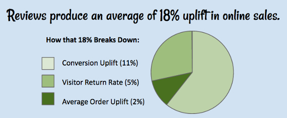
No matter the source or format of the review, hopefully we can agree that they are absolutely essential for your landing page’s success. Econsultancy found these results:
But let’s get into a real-world example:
Dutch bicycle store FietsPunt wanted to improve the conversion rates of their product pages (the part of their website with the highest bounce rates).
Initially, they tried social endorsements, showing their Facebook Fans in a widget below the product. The addition had no effect.
Without losing hope, FietsPunt’s testers kept pushing, and added a “Trust Pilot” widget which showed the most recent customer reviews of each product.
The test was run for 15 days to 16,000 visitors. With a 99% statistical probability, it beat out the control by 36.73%.
The increased revenue from this small change resulted in about $122,660 a month, or almost $1.5 million yearly.
Conclusion
Hopefully, this has given you a few insights and inspirations to start your own testing. These strategies are about focusing your landing page on your consumer: making them comfortable with the right colors, increasing trust with friendly language and a customer testimonial, and making your business approachable by featuring yourself.
I’d love to know if you’ve tested any of these strategies or variables before, or if you have been inspired to test them in the future. Which ones? Why? And, if you’ve tried them, what were your results?
Start the conversation below, and let’s help each other!
About the Author: James Scherer is a content marketer and blogger for Wishpond, an internet startup whose tools make online marketing simple from beginning to end. He is the author of several e-books, including “The Complete Guide to Landing Pages.” Connect with him on Twitter.




Comments (27)