Every year, Google makes around 500-600 changes to their search engine.
And every year, entrepreneurs, SEOs, and everyone else have to scramble to catch up with whatever they change.
But now and then, Google shows us their hand.
One such instance is with mobile-first indexing.
Since 2016, Google has been experimenting with methods that will allow them to implement mobile-first indexing for their search engine.
They haven’t been too quiet about it either.
But with a recent update, the long wait is finally over.
Google has started migrating sites that follow mobile best practices over to mobile-first indexing.
And while Google has promised to tell everyone when their site has switched, you shouldn’t be waiting around to adjust your content strategy.
If you’re a business that relies on content marketing to succeed, you need to be aware of how these changes are going to affect you.
So to ease your mind and give you direction, I’ve put together the best tips and tactics to help you create a mobile-first content campaign.
But first, I want to give you a clear picture of what mobile-first indexing really means for your content campaigns.
What is mobile-first indexing?
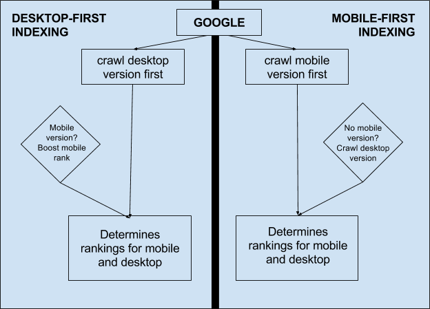
The easiest way to conceptualize mobile-first indexing is to think of your website as two different entities that work together as a whole.
On the one hand, you have a desktop site.
On the other, you have your mobile site.
When a search engine crawls your website, it recognizes that there are two “distinct” versions of it and weights them accordingly.
Since the creation of search engines and the invention of mobile web browsing, Google and other search engines have been more focused on your desktop site.
But with mobile-first indexing, Google has shifted its focus to put a greater emphasis on your mobile site.
In other words, your mobile site is going to be viewed as the primary version instead of your desktop site.
Which means in theory, if you’ve already created a mobile-friendly site you shouldn’t have much to worry about.
But when it comes to content, you need to do more than just be mobile-friendly if you want to take advantage of a mobile-first index.
For one thing, it’s likely that your website infrastructure will be more important than ever due to the fact that mobile browsing can quickly become muddled or confusing.
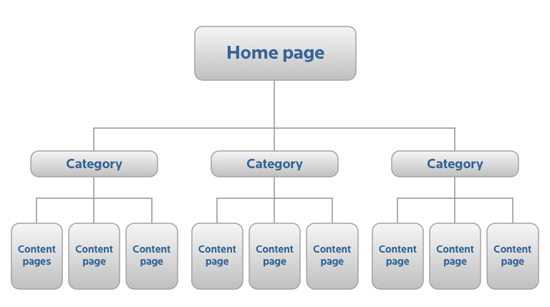
A flat architecture like the one depicted above makes your content easier to access, which means it’s also easier for search engines to crawl and index.
And all of this plays a role in your content by providing a better user experience and boosting your SEO.
But beyond the technical aspects of making an easy-to-browse site, why is it important for you to create mobile-friendly content for a mobile-first index?
Google’s announcements should have been enough to turn your head in the first place.
But that presents a deeper question.
Why is Google deciding to switch now?
To answer that, you have to look at some hard data on mobile use.
Simply put, it’s skyrocketing.
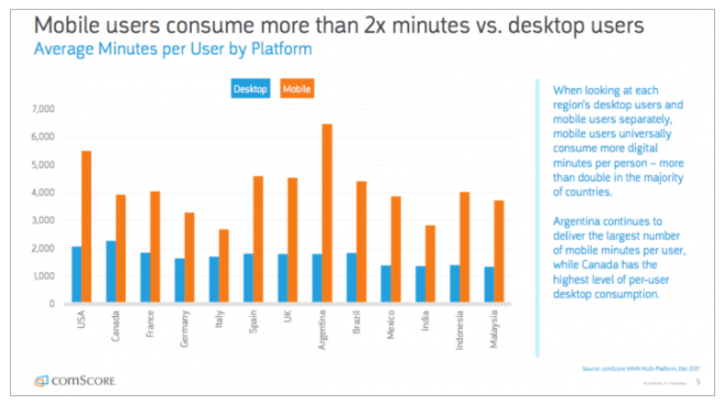
According to the cross-platform researchers from comScore, users are spending almost twice as much time browsing on a mobile device than a desktop.
It isn’t just an American trend. It’s a worldwide movement.
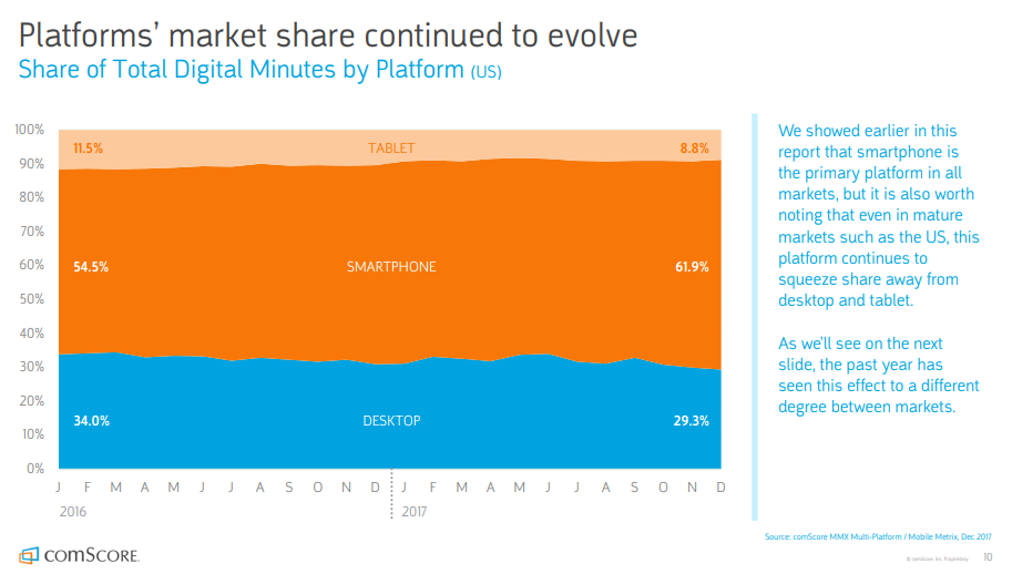
And when you look at the overall device market share, mobile devices are starting to push out desktops in a major way.
Since 2016, smartphones have gained an additional 7.4% of the total market share for web browsing devices.
That means mobile devices are absolutely taking over the scene when it comes to content consumption as well.
And if mobile devices are becoming the standard for users, it only makes sense that Google would choose now to transition to a mobile-first index.
But what does this mean for creating content on your site?
It means if you want to avoid getting blacklisted, you need to start taking steps now to create mobile-specific content that Google can rank highly.
In the past, when Google’s algorithm has undergone a major change like this, you see some top brands suddenly disappear from the front page.
So what can you do to start preparing for this major change?
First, you need to find out what content is the best to create.
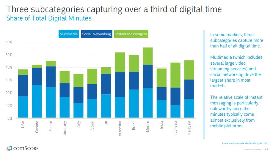
With almost a third of mobile content coming in the form of social posts and “multimedia” content, not everything is going to perform like you’re used to on a desktop.
Finding which content you should focus on and then optimizing it for mobile is the only safe method that will help you get ahead when the changes finally come.
I want to show you some mobile content creation methods you can use that will help you generate content that performs well on mobile from every angle.
And to start things off, I want to talk about your blog.
Mobile Method #1: Create easy-to-read content
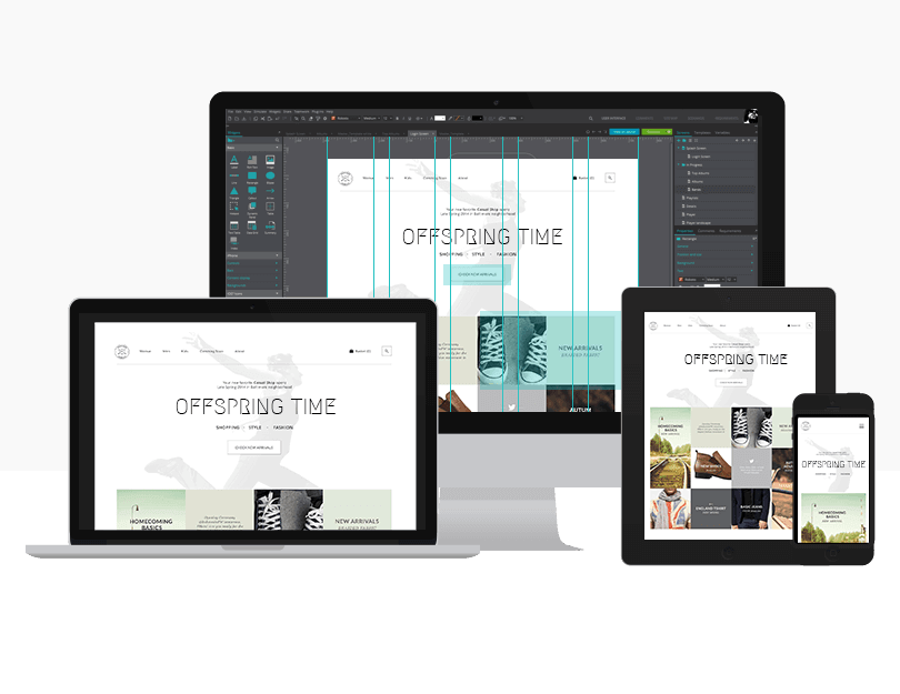
First, you have to understand that creating mobile-friendly content is about more than just responsive design.
Don’t get me wrong. Responsive design is a great start.
And you’ll definitely need one as mobile-first indexing rolls out more.
But you can still create poor mobile content on a responsive site.
I see it all the time.
Creating mobile-friendly content may require a bit more effort, but it’s ultimately worth your time and attention.
For example, the traditional “F-shaped” blog content no longer seems to work well, simply because mobile devices have less space on their screen.
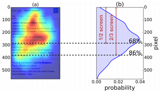
You’ll notice that based on this heatmap, users on a desktop tend to move from top to bottom and left to right in a fairly predictable pattern.
But a mobile site often doesn’t include the same header style as a desktop, which means this model isn’t very practical anymore.
Instead, it’s been determined that mobile users tend to look in the upper-center part of their screen.
So from their first glance, your mobile visitors expect a different type of formatting for your blog content.
It’s also been confirmed by Google that expandable text boxes are also a mobile-friendly feature.
That means you can collapse your lengthy content to a more browser-friendly user.
And if someone wants to read more, it won’t get in the way of their user experience.
Then as you dig a little deeper into mobile-specific content creation trends, you’ll find plenty of other pieces of advice as well:
Use short paragraphs
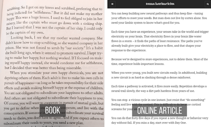
The old-school format of large blocks of text has disappeared online.
Instead, we’ve transitioned to a different style of writing that emphasizes shorter, one-thought paragraphs that focus on how thoughts flow.
With at least 55% of mobile users using blockwise scrolling, your paragraphs will dictate whether your content is actually read.
Implement whitespace
Whitespace is the element of your design where, in one sense, no design actually exists.
But this actually has a very important function, because it helps draw the eye to certain spaces on the screen.
With mobile having less screen real estate, it’s easy to overlook how whitespace can be used.
In one case, Xerox was able to use whitespace to increase their purchase percentage by 33%.
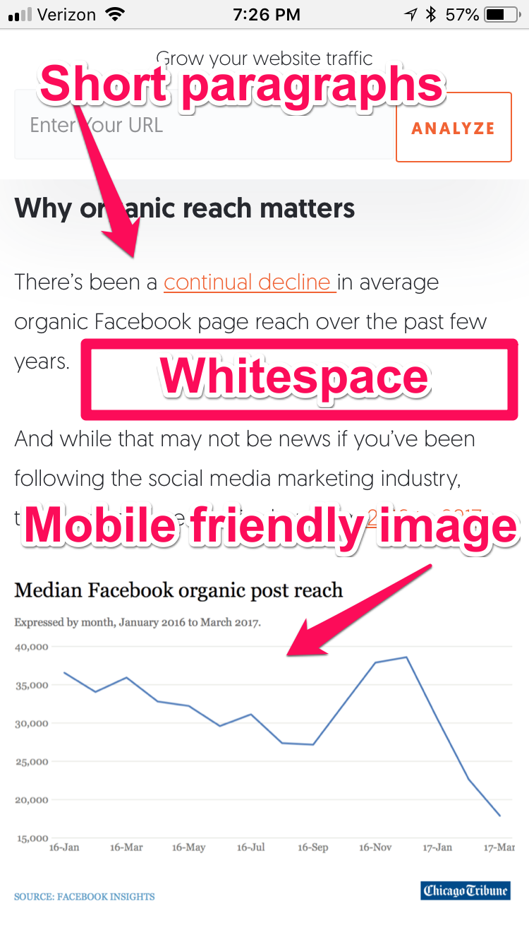
Danielle Duggan from Blue Corona shared this awesome example of what whitespace looks like on mobile content:
Notice how there’s a little room to breath in between each element on the page?
This allows your attention to move from thought to thought without distraction.
Remember to use whitespace in your own content to help users stay focused on your copy and images.
Include subheads
Leaving your content as a blank map might sound adventurous, but it’s more likely to backfire.
Instead, consider including subheads to help your user navigate your site and its content with ease.
In one case study, California Closets increased submissions by 115% on a landing page simply by improving their headings and subheadings.
Don’t leave user experience to chance.
The more you help users have to navigate your content on mobile, the better off you’ll be.
Add a summary of your content
When mobile users come to your site, they expect a quick experience.
That same principle applies to your content.
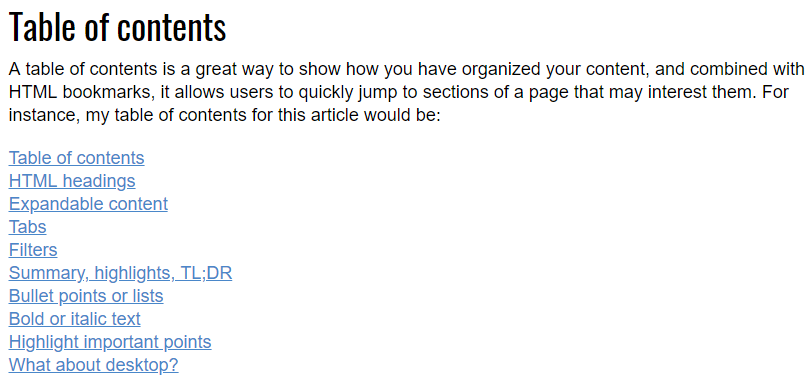
And one of the best ways to help them find what they came for is to include a summary or table of contents.
This allows them to digest and find what they need in your post.
And when they find what they want, they’ll keep coming back to your content in the future.
Use mobile-friendly images
When you add images to a blog post, you need to make sure that they will be responsive across all devices.
But you also have to consider that putting images in your content increases the risk that it might slow everything down.
In those cases, you need a way to make your images smaller without sacrificing quality.
Consider educating yourself on the steps to optimize images in your blog posts and mobile web pages to help everything load quickly.
When possible, add a list or bullets
List-based articles, also known as listicles, are one of the most popular content formats on the web.
The reason they’re so popular is because they’re easy to read, digest, and share without having to dig too deep.
It’s what makes an article like this from Buzzfeed so popular.
When possible, creating a list like this will help you engage with your readers on mobile devices.
Since it’s short and sweet, you can keep their attention and possibly even convince them to share.
To some degree, all of these are more design elements than they are about your content.
But the point here is that using these elements correctly can elevate good content that no one would read due to poor mobile formatting.
Just look at how I implement some of these content design ideas on my own mobile site:
When used well, design helps create flow and will make your content easier to read.
If you just use paragraph blocks and leave no whitespace, people will get bored because they can’t skim.
And we’ve known that readers primarily skim since 1997.
At this point, you may be wondering if all of this advice is data-backed and provable.
To answer that question, you have to look into what other brands have done with their content and see how it’s changed over time.
For example, Volume Nine recorded their success when they did a website redesign for a brand called Limelight Hotels.
The project involved a redesign of the website’s content, which included creating new silos for the content to be stored in as well a mobile-friendly refresh.
Once all of the changes had been made, and the content started being shared, the results were fairly dramatic.
All told, Limelight saw a 421% increase in organic page sessions due to all the changes that had occurred.
So while these might come across as minor changes, they can have a major impact on the performance of your websites moving forward.
As Google transitions to a mobile-first index, they’re going to value content that mobile users truly read and interact with.
And if the format is off, it could spell disaster for your existing content.
So take a few weeks to refresh your old content and make sure it looks good on a mobile device.
Make sure that you revamp your keyword research too, as the types of search queries on mobile are different than those on desktops.
If you start with these tips, you should see more traffic and better results in the coming months.
Mobile Method #2: Don’t neglect video
One of the biggest trends in marketing for the past few years has been the surge of video marketing.
That means you can almost guarantee that mobile video is going to play a role in the upcoming changes.
So devising a way to create a mobile video content campaign should be at the top of your to-do list.
As it stands, video marketing is a proven way to create powerful content that helps your business grow and engage with your audience.
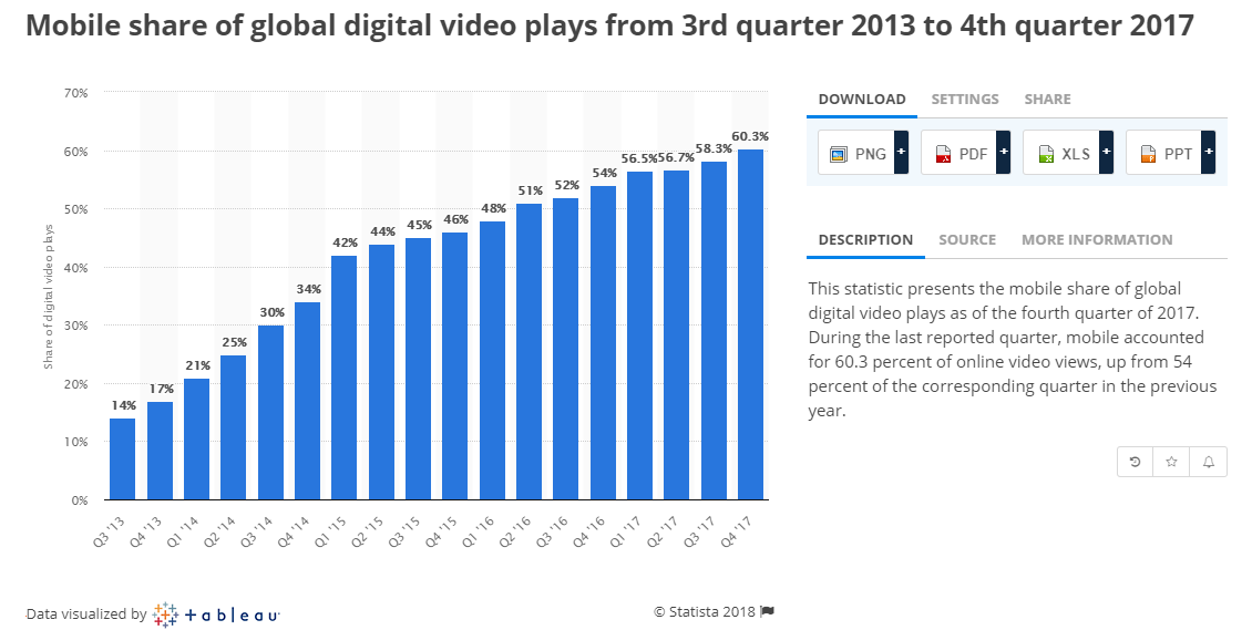
According to data shared by Statista, by the end of 2017 more than 60% of video plays were coming from mobile devices.
More new users are picking up their smartphones and tablets to watch video with each passing month.
And there are a few points that we can pull out of this fact.
First of all, if you’re not using video marketing, now is the time to start.
And secondly, the world will likely never go back to watching more video on their desktop devices.
With the growth of smartphones and now the dominance of mobile video, brands need to start developing ways to implement video that plays well on a variety of devices.
And that means starting by ensuring that your video is crawlable and indexable for mobile sites.
So you need to pay attention to your video SEO efforts in a big way.
Elements like where you host your video, embedded vs. non-embedded video, and where the video is featured make a difference in how Google views your site.
Margot da Chuna from Wordstream recommends making sure you embed only one video and try to make it the focal point of your page if possible.
She showed off this example:
This displays how one brand achieved a video-friendly format on their own site.
And when you check out their mobile site, you’ll notice that a video is prominently displayed on their homepage there as well.
Now, when a user visits their site on either mobile or desktop, they can see a well-optimized video.
And they’re not the only ones exploring the intricacies of mobile video.
Streaming giant Netflix has recently been experimenting with short, 30-second previews on mobile devices as well.
They’ve also been playing around with vertical video formats as well to help optimize for mobile devices.
If you’re already familiar with the desktop service Netflix offers, you’ll recognize these familiar features.
Offering them on mobile is just one of the ways that Netflix is leading the mobile-first video charge.
But what about for website owners who aren’t as technologically savvy?
If you just want to stick to the basics, then it’s recommended to stay within certain formats like WEBM or HTML5 for sharing on mobile devices.
But depending on the camera type, you could see a wide variety of different file formats when you finish your video.
While some video editors will reformat the file for you in post-production, that’s not always a guarantee.
Plus, what do you do with the older video that you would like to keep?
In these cases, I recommend finding a free video converter like VLC Media Player to change formats for you.
Or, you can find another video converter from a trusted source.
Whichever service you go with, this process will allow you to upload a video and change its format to be more mobile-friendly.
So when your visitor comes to your site, they aren’t put off by a video that won’t play or is poorly formatted.
You also need to spend time ensuring that any video you do put on your site doesn’t slow your website down.
This particular piece of information is tracked using paint timings.
In essence, it measures how long it takes for your video to be displayed or “painted” on a user’s screen.
If it takes too long, you need to find a way to lower your time to first paint.
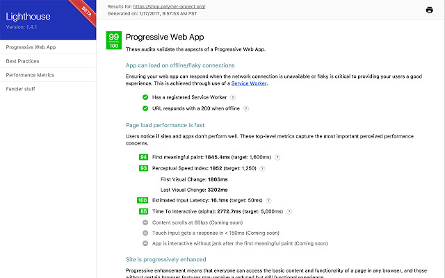
To measure your own performance, try installing and using the Lighthouse SEO Chrome extension from Google.
This will allow you to run a full check of your page’s SEO and give you a clearer picture of how quickly your video loads for a user.
You’ll get a detailed report of time to paint and other indexes, which will allow you to optimize your video accordingly.
As with all things, creating mobile-friendly video content is a process.
But if you use the right format and track your performance accordingly, your content will be better positioned to help rather than hurt.
Mobile Method #3: Load speed matters for content
If you’ve done much research on SEO, you should already be aware that speed matters for your desktop website.
Load speeds have a proven effect on bounce rates, and it’s generally accepted as an SEO basic.
But very recently, Google also announced site speed matters for mobile as well.
According to their announcement, loading speed will be a ranking factor in mobile searches starting in July 2018.
That means the content you create needs to be able to load quickly on a mobile device.
And by extension, that probably means you may have to make some changes you’ve been putting off.
But there’s one more wrinkle to consider with load speed that a mobile-first index introduces.
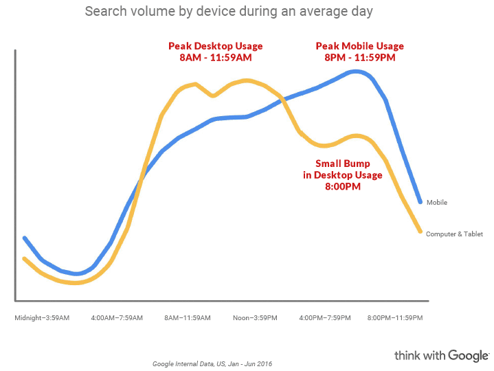
With the onset of mobile-first indexing, time-of-day searches are more important than ever.
According to the most recent data from Google, mobile and desktop usage fluctuates throughout the day.
So now you should not only worry about the speed of your site but what device they’re coming from at certain times of the day.
Depending on the time of day, your user will have different needs in terms of site speed and convenience.
So finding a way to keep things fast across the board is absolutely vital.
But how do you tell if your site is too slow for mobile devices?
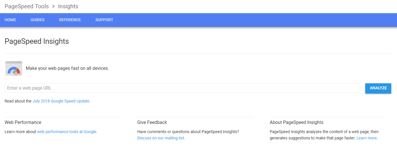
To answer that question, you’ll want to head over to PageSpeed Insights.
This is a free service by Google that gives you a complete breakdown of how fast or slow your website is.
To test if your content is performing well on Google, all you have to do is input the URL of a blog post or two and see what the results say.
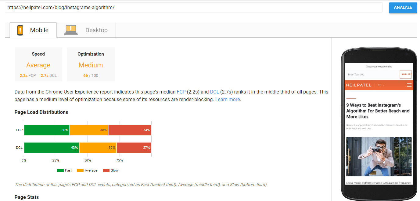
For example, here’s are the results of a recent blog post on my site:
According to Pagespeed Insights, this blog post has a fairly average load time.
Since it’s full of images and is fairly long, I’d say that’s a good starting point.
It’s a great example of how PageSpeed Insights can give you insight into your page’s performance almost immediately.
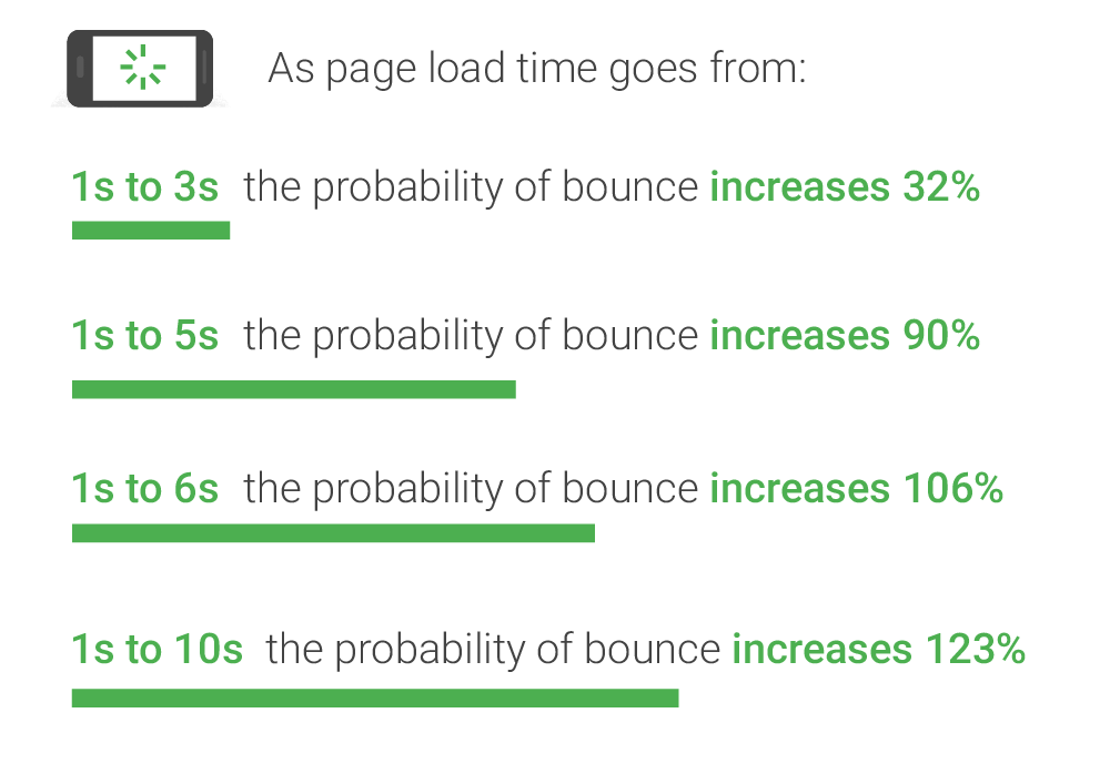
And if I wanted to make it even better, I could aim to lower my bounce rate according to Google’s mobile load time benchmarks.
By using the page stats from Pagespeed Insights, I can find ways to improve my blog post even more.
Because with each passing second, an unoptimized blog post increases the possibility that a mobile user could leave your site.
If you want to improve the chances your posts will rank high on a search engine, then you have some work to do.
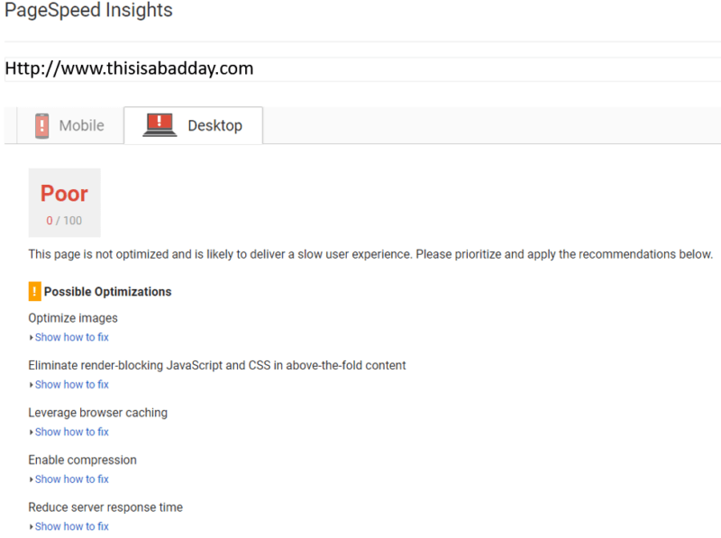
But worse pages have recovered, as evidenced in a recent case study shared by Search Engine Land.
This was the result that they got:
This page dropped from a score of 40 to a gut-wrenching zero and was part of a wake-up call that got the brand’s SEO back on track.
To add to their woes, they were also seeing a year over year tank in traffic due to this poor performance.
By focusing on two primary efforts, they were able to pull themselves from this rut and return to normal.
First, they focused their efforts on only their WordPress CMS.
This allowed them to optimize their content and improve overall load speeds.
And second, they used WordPress to help them compress as many files as possible, again improving their load speeds.
After a few months, their traffic normalized and their crisis was over:
So improving your site’s loading speed should be at the top of your list for all of your content.
And if you want to decrease your load time, I recommend starting with this video:
Using tools like PageSpeed Insights and removing unnecessary website elements are great ways to cut down on your mobile load times.
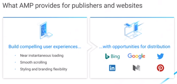
But if you want a direct way to increase page speed, you can take advantage of the open-sourced project called Google AMP to help make your site faster.
AMP stands for Accelerated Mobile Pages, which tells you a lot about the project from the very beginning.
In short, AMP seeks to help any website owner find a path that enables their web pages to load quickly and smoothly for users.
By building on three core components, AMP helps create functional and fast mobile sites for anyone who wants to use it.
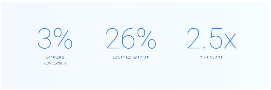
By optimizing your site with AMP pages, you can decrease the load time of your content and start seeing more conversions.
In TransUnion’s case, they were able to lower their bounce rates by 25% while more than doubling time on site.
Simply by using AMP to help increase their mobile loading speed, they saw a 3% increase in conversions.
It’s a clear case where improved mobile speeds led to positive ROI.
And if you want to actively push your content on a mobile device, you can also use a Progressive Web App, or PWA.
These allow you to create a reliable, fast application that engages with your audience and helps bring users back to your website.
For example, The Financial Times has used a PWA to help optimize the user experience and load times since 2011.
Since their PWA functions by being installed on the user’s phone, you can even read some of their content while offline.
Even Forbes has jumped on board, and have seen a drastic increased in the number of mobile sessions and increase time on site.
With mobile-first indexing on the rise, these PWAs are arguably in a better situation than almost anyone else.
Load times are faster and engagement is higher, which means Google is very likely to rank them favorably.
In short, the more time you can shave off your content with any method, the better off you’ll be.
By using Pagespeed Insights, Google AMP, and even a unique PWA, you can push ahead with your content and stand out on a mobile-first index.
Mobile Method #4: Use mobile pop-ups responsibly
If you use lightbox or pop-up overlays on your website, there’s a good chance you see some good results because of it.
More and more, marketers are using these devices to help them capture customer information in addition to traditional CTAs and landing pages.
If you’re unfamiliar with what that looks like, here’s a pretty typical example:
Chances are that if you don’t use one of these on your site, you’ve seen them floating around popular websites.
That’s because they work.
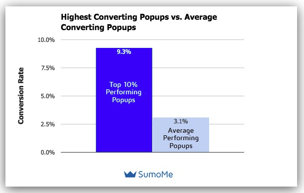
On a desktop website, these pop-ups average a 3.1% conversion rate, which is fairly impressive given it’s usually a cold sell.
But these statistics focus on desktop sites, which typically have a wider screen and make a tool like this less intrusive.
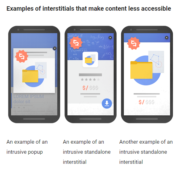
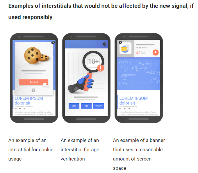
In the case of mobile devices, Google has been making efforts since 2016 to minimize what they consider to be intrusive pop-ups on mobile.
Their concern is that these pop-ups or “interstitials” make content on mobile devices less accessible.
To their credit, some websites do use these tools a little too interpretively, and it’s created a fairly negative stigma around them.
But Google does allow exceptions, provided you can use a pop-up overlay responsibly.
The major difference in these two approaches is that the later adds to or enhances the content, while the former detracts from it.
So finding a way to utilize the second approach with your content looks like the way to go.
But do mobile overlays really work?
To test it out, the conversion team at Optinmonster decided to conduct some tests with their overlays on a client site.
By following the guidelines given by Google, they were able to achieve an impressive 3.8% mobile conversion rate.
That’s higher than the average rate of a desktop site.
And the actual overlay design itself is a fairly simple one:
By staying out of the way of the content on the mobile site and attempting to provide something of value, they were able to devise a method that allows you to use pop-up overlays tactfully.
So when considering a mobile-first index, it’s worth looking into this potential workaround if you use a pop-up overlay.
It’s clear proof that the ability to adapt and improvise can serve you well with the upcoming changes.
Conclusion
I think we can stop saying that the “world is going mobile” now.
The world is mobile already.
And Google is taking steps to make sure everyone knows it.
With the onset of mobile-first indexing, it helps to know what trends are leading toward this direction.
More users than ever are consuming a wider variety of content via mobile devices than ever before.
So to keep your site on Google’s nice list, you need to start creating mobile-specific content.
Start by making your content easy to read with some basic formatting changes.
Then devise ways to create mobile-friendly videos that your audience will want to view and share.
Don’t forget to optimize load times either, or else your content may never see the light of day.
And finally, rethink your approach with tools like mobile pop-ups.
At the end of the day, the success of the content you create depends on how much effort you put into creating it.
With the right approach, you can weather these changes to Google’s algorithms and fight your way to the top of the search engine results page.
What’s your number one concern about the switch to mobile-first indexing?


















Comments (10)