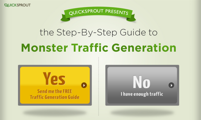
On my website, Quick Sprout, I used to have a popup.
The reason I used this popup was simple: Conversions!
I used it to drive signups for my SEO analyzer, to boost my mailing list subscriptions, and to build my Facebook fan page.
It was ridiculous how those popups converted!
I’ve made a bunch of changes to that site (Quicksprout.com). And one of the changes was dropping the popup.
No popups here!
And none here on the mobile version either!
What’s going on?
Do I hate popups? Nope, I love popups.
In fact, if you check out my homepage on a non-mobile device — voila, a popup!
But if you’re on your mobile device, no popup.
There’s another difference.
On desktop, the video is on auto-play. You don’t press play. It starts automatically.
But on mobile, you have to click to make the video play.
What’s going on here?
Simple: I’m getting super strategic about interstitials.
My old Quick Sprout site was using a type of interstitial that Google doesn’t like for mobile. So I fixed it.
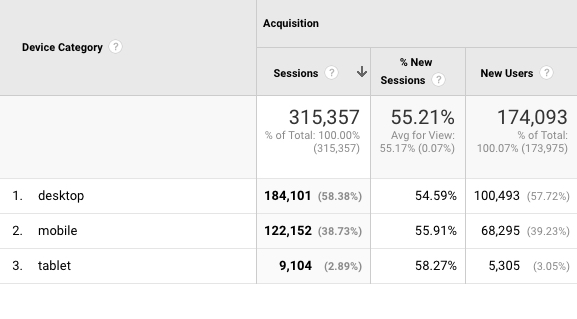
On my site, NeilPatel.com, I’ve optimized the page for my thousands of mobile users. Right now, more than half of my new sessions come from mobile users.
As a result of the changes I’ve made, neither of my sites have lost rank. Instead, they’ve increased.
I owe this improvement to the amount of content that I publish and to the way I’ve optimized for mobile.
And specifically, it’s due to the changes I’ve made regarding interstitials.
Learn how I collect 743 emails per day and generate 195,013 visitors a month through mobile interstitials.
So what’s up with….what did you call them…interstitials?
If interstitials sound like Ανακοίνωση (Greek) to you, let me explain.
You know those popups that require you to hit an X or a cancel button before you can see a site’s content? Those are called interstitial popups.
Google recently announced that they would be stricter about interstitials. Interstitials could ruin a mobile experience, so they decided to penalize them, basically.
From their official blog post:
“To improve the mobile search experience, after January 10, 2017, pages where content is not easily accessible to a user on the transition from the mobile search results may not rank as highly.”
Google wants to make sure that all content is easily accessible on mobile devices. Interstitials usually make content tougher to access.
Have you ever uttered curse words for accidentally tapping on an ad and going to the app store to download Candy Crush Saga?
That’s what Google is working to combat!
But here’s the thing: Interstitials can be really effective! That’s because they capture a user’s attention.
Yes, they do annoy some people. And, no, I’m not a fan of the Candy Crush Saga interstitial either.
In the right context and created the right way, however, interstitials can skyrocket your conversion rates!
To be clear, I’m not totally against interstitials, and as it turns out, neither is Google. There are a couple of “catches” in Google’s announcement that gives interstitial users like me and you some leeway.
In this article, I’ll share those catches with you, and I’ll also show you how to set up interstitials that won’t cause you to sink in the SERPs.
Good vs. bad interstitials
Like I said, Google doesn’t hate interstitials.
The problem is that interstitials as a category get a bad rap for blocking out content.
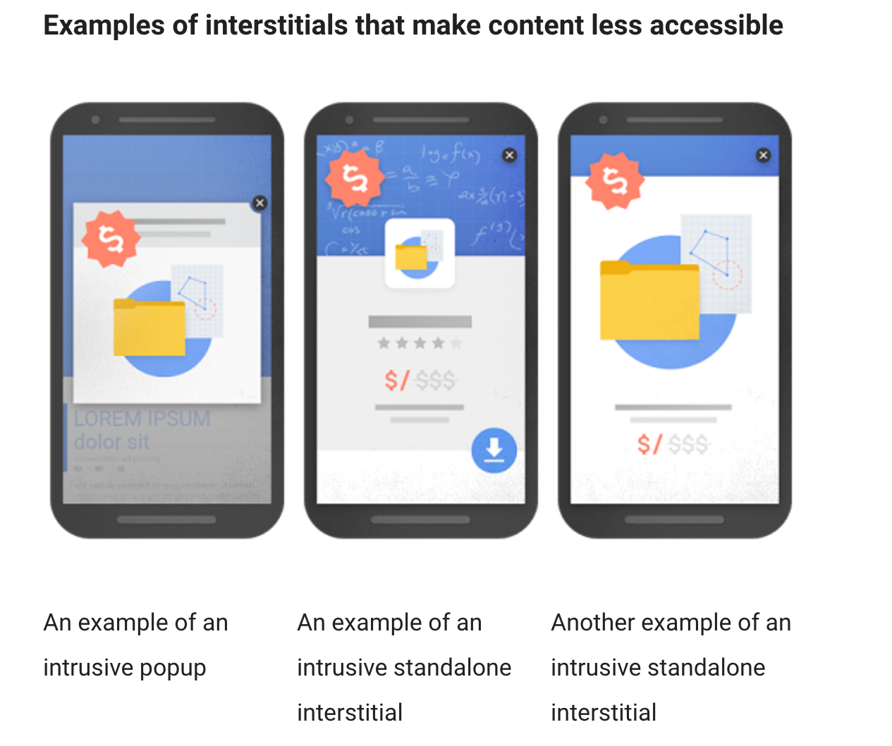
Most interstitials tend to look like these types of popups, as Google shows on their blog post:
You can see how these block out most of the content and make mobile browsing way more difficult.
These types of interstitials are what Google wants to penalize. So if your interstitials are making content hard to access on mobile, you’re likely to get slapped on the wrist.
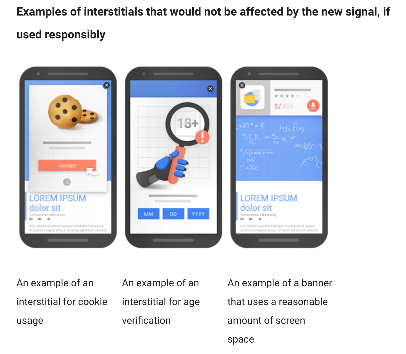
Now here are some types of interstitials that Google will not penalize:
These interstitials have legitimate reasons for being there. And here’s where it gets really interesting.
Notifying users of cookie usage or requiring age verification aren’t that good for your conversion rate.
Interstitials like these merely notify your visitors of something that you’re legally required to do.
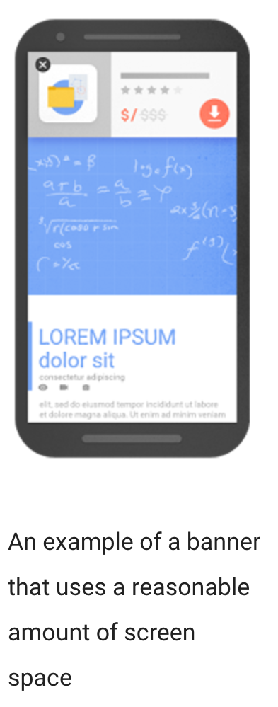
However, the third example is a bit different: “An example of a banner that uses a reasonable amount of screen space.”
Aha!
That means interstitials can still be a strong part of your marketing strategy.
But small banners aren’t the only types of interstitials that are okay. In fact, there are several more that you can make use of on your site. (I’ll explain in a minute.)
How big of a deal is the update?
When Google releases a new algorithm update, it changes a lot of things. Remember Panda? Penguin?
Those were bloodbaths.
This interstitial policy, on the other hand, seems a little more lenient.
As of this post in early 2017, it doesn’t seem like the entire interstitial policy has completely rolled out in full force yet. So far, the overall effect is fairly minimal.
Glenn Gabe of G-Squared Interactive posted on Twitter that some sites were experiencing a ranking drop of 10+ spots.
@rustybrick For the ones I picked up, they dropped by 10+ spots. But still not seeing widespread impact. I believe it’s still rolling out.
— Glenn Gabe (@glenngabe) January 13, 2017
Ten spots is a lot. But remember Penguin? Sites got torched to the ground.
A few days later, Gabe posted another Tweet that showed a site with intrusive interstitials ranking fine.
Regarding needing a fresh crawl to see impact from the mobile popup algorithm, many of the urls I’m checking have been crawled after 1/10/17 pic.twitter.com/qaWRc2rUWK
— Glenn Gabe (@glenngabe) January 18, 2017
Right now, it’s hard to tell exactly how this update will affect sites since it’s still in its infancy.
I’d suggest being better safe than sorry. Google may get tougher on intrusive interstitials in the future, especially since they’re pushing the mobile-first index.
It might not hurt to keep more intrusive interstitials around, but it may come back to bite you in the future. The best idea is to start using more mobile-friendly interstitials to make sure your site gets the thumbs up from Google.
Types of good interstitials
Let’s go over the different types of good interstitials that Google will most likely not penalize.
Search Engine Land points out that gated content may justify an interstitial. This might include members only content (where members have to log in) or content behind a paywall.
Most interestingly, John Mueller of Google Switzerland shared some useful advice during a Google Webmasters Hangout back in October.
Here’s Mueller speaking during the Hangout (around minute 18):
Or embed: <iframe width=”560″ height=”315″ src=”https://www.youtube.com/embed/gS4_JH-QqSg” frameborder=”0″ allowfullscreen></iframe>
Here are the highlights from Mueller’s advice.
First, he gave some detailed insight into what Google will penalize and what it won’t:
At the moment, [exit intent interstitials] wouldn’t count. What we’re looking for is really interstitials that show up on the interaction between the search click and going through the page and seeing the content…What you do afterwards, like if someone clicks on stuff within your website or closes the tab or something like that, then that’s kind of between you and the user.
Second, Mueller said that the interstitial policy applies to just mobile and not desktop. However, since Google has started to roll out their mobile-first index, it’s wise to stop running intrusive interstitials on mobile for good.
That said, as of now, you can still run full-screen interstitials on desktop only without getting penalized. Google may penalize those in the future, though, so think carefully about your choice.
So let’s recap. Here are the types of interstitials that get an okay from Google:
- Banners that take up a reasonable amount of screen space
- Interstitials notifying users of legal matters, such as cookie usage or age restriction
- Content behind a gate, login screen, or paywall
- Exit intent interstitials
- Interstitials that appear when someone clicks on a button or link
This is great for marketers and SEOs everywhere.
You can get all the effectiveness of a full-screen interstitial without annoying Google (or your users). It’s these kinds of interstitials that I’ll be talking about for the rest of the article.
But remember to make sure your interstitials serve a purpose and aren’t there solely for marketing purposes.
Overall, you need to think about the user experience. Ben Silverman of Brafton has this to say about interstitials:
Be honest with yourself. Think about the intention of your pop-up, how users engage with it, and how it complements – or disrupts – the flow and experience of your site. Inaccessible content means a bad mobile experience for your user and a damaged ranking from Google.
For example, this interstitial from Copyblogger doesn’t hinder the user’s experience at all:
A good interstitial should fit right into the flow of your user’s experience. It shouldn’t deter your visitors from visiting your site, interacting with your site, or enjoying your site.
Now that you know what kinds of interstitials are okay with Google, let’s talk about how to decide which kinds of interstitials will work for your site.
Which interstitials are right for you?
I have to be completely honest with you. If you’re thinking about using all the types of good interstitials, I’d recommend thinking twice.
Just because you can use all of these interstitials doesn’t mean you should.
You should only use the interstitials that play an integral role in your marketing strategy. In other words, if you can go without it, you probably should.
My point here is that your interstitials should be appropriate and fulfill a purpose. Don’t use interstitials just for the sake of using them.
With that in mind, let’s look at the different types of interstitials. Think about which ones will help your marketing strategy and which ones are unnecessary.
Small banner interstitials. These are the popups that take up “a reasonable amount of screen space.”
You’re probably wondering, “What does Google think is reasonable?”
Here’s the example Google gave:
I’d say that’s a pretty good rule of thumb to use. If your interstitial ends up being a little bigger than this example, I’m sure Google won’t mind.
Here’s a popup from Apartment Therapy that’s pushing the size a little bit:
You probably don’t want to make yours that big. While it’s not technically obscuring all of the content, it is a half page interstitial that blocks out about 50% of the content.
So don’t get into the habit of using half-page popups. Keep it as small as possible.
One way to do that is to convey only the most necessary information. This example from Convince & Convert keeps it short but sweet:
It doesn’t take up a lot of screen space, yet it retains its impact. This is what you want to achieve with your popups.
Your interstitials can still be convincing and engaging without being long. This is where some copywriting skills will come to the rescue.
If your copy is strong, then the actual size of the popup won’t matter too much. If you can draw your visitors in, that’s all that matters.
Legal notice interstitials. Since these popups are purely functional, they’re usually not that good for increasing conversions. But that doesn’t mean you can’t leverage their power.
BBC Good Food uses a cookie consent interstitial to reinforce their commitment to the user experience:
While this is subtle, it’s a nice touch. It’s a polite notice written in plain English instead of stuffy legalese, and that goes a long way toward making visitors happier.
If you have to comply with a legal notice popup, this is the best route to take. Let your visitors know that the notice is for their benefit, and they’ll respect you for it.
Gated content. Interstitials that notify users of a gate, login screen, or paywall should be used sparingly.
While these are technically “good” interstitials to Google, if you use them on every single page of your site, your readers are going to get fed up pretty quickly.
I recommend only using interstitial gates in a handful of situations. If there’s a members only section of your site or content behind a paywall (and if that paywall is for your entire site, like the Harvard Business Review), you can use an interstitial.
When you’re just using content gates, use an interstitial only for your main lead magnet. You don’t want to overuse these. And in general, gating a ton of your content might drive readers away.
I’d suggest causing interstitial gates to only open when a visitor clicks something. That way, you’ll be in the clear.
Exit intent interstitials. As with gated content, exit intent interstitials have their time and place. But this is an interesting topic because exit intent popups don’t work on mobile.
And since Google is primarily using the mobile versions of websites to rank them, it might seem like you could use all the exit-intent popups you want.
Not so fast! Google still does take your desktop site into account. So even if you have the best mobile site in the world, your desktop site will also factor in.
That said, exit intent popups can be great. But they require a lot of experimentation. You have to determine which pages work best, what copy performs well, and how the design affects your conversion rate.
I had a lot of success using exit-intent popups on the Kissmetrics blog. The reasoning is simple: Blog readers like your content, so they’re likely to opt-in to your offers.
If someone just finished reading an article they love and they see an offer to grab a free lead magnet, they will probably take you up on it. It’s simple, but it works.
On-click interstitials. These are also good choices for lead magnets. Since these interstitials are initiated by the user, they’ll be okay with Google.
Conclusion
It’s not the end for interstitials. Instead, it’s a new beginning.
Popups will be an important part of every marketer’s strategy for the foreseeable future. But we’re also moving toward a mobile-dominated world.
That means you have to be more careful about mobile popups than ever before. It’s wise to still use them, but use them as needed. Don’t overdo it.
Google may get more intense about penalizing mobile popups, so we’ll have to wait and see what the future holds.
I recommend taking time now to make your site super mobile-friendly, which includes using interstitials wisely.
If you have several intrusive interstitials, get rid of them now so you can keep your ranking.
Don’t make common mobile SEO mistakes. With just a little work, you can make your site awesome for mobile, satisfy your readers, and rank well on Google.
How are you going to use mobile interstitials?










Comments (18)