Competition is inevitable. We’ve come to accept that since, ultimately, it provides greater benefit to consumers.
Now, digital competition enables e-stores to alter prices faster than a stationery store clerk can grab a pen. Products can be managed with elaborate content management systems, there are no “lines” for purchases, supply chain management catalyzes business operations, CPC ads are mini-billboards, and every smart device allows eCommerce to reach us, no matter where we are.
According to eMarketer, global B2C eCommerce sales topped $1 trillion in 2012, and growth is continuing to increase rapidly:
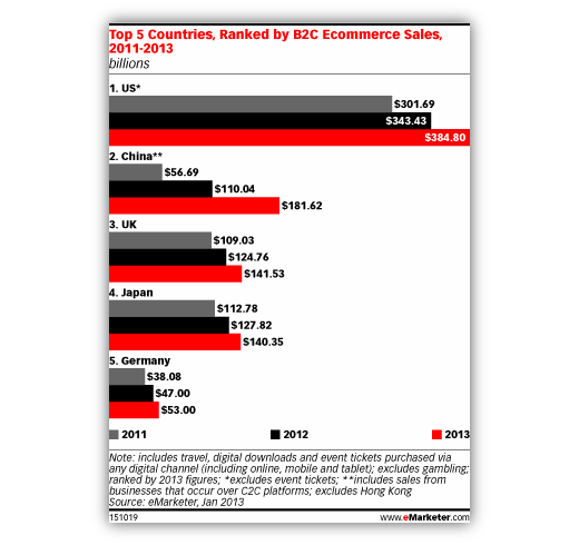
Even though eCommerce accounts for only a tiny slice of the overall retail pie, there is no questioning the convenience and exponential future of eCommerce.
What’s more, eCommerce has created a world where product innovation transforms behavior, consumer experiences are virtually tailored, and brands decorate our social media.
But let’s get back to competition.
To stand a chance in the digital eCommerce arena, there are dozens of logistical operations, marketing tactics, and communication strategies that need to be utilized. Could you imagine wielding a tiny advertising-branded katana against a competitor’s massive inbound-marketing-infused gladiator axe?
The following are eight vital eCommerce “katas” – practices that will beef up eCommerce efforts and help fuel revenue.
#1 – Mobile ECommerce
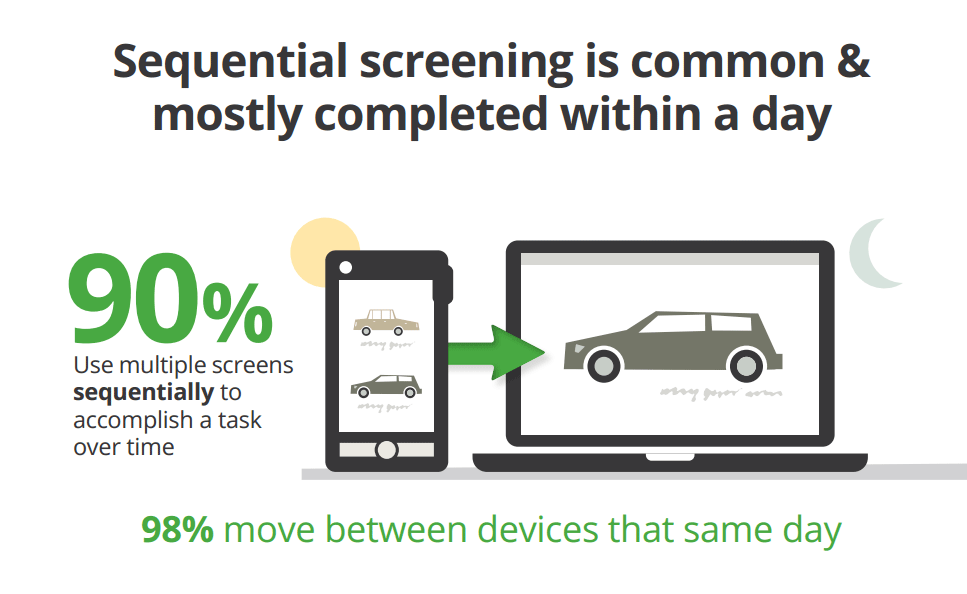
As web users become increasingly familiar with mobile eCommerce, there are ripe opportunities for internet marketers and conversion optimizers to extend product reach.
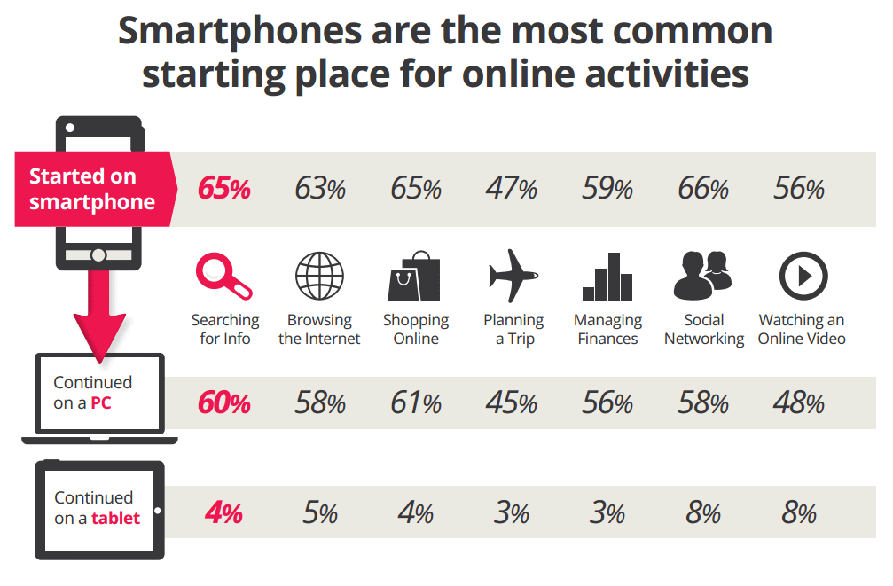
Currently one in every ten eCommerce dollars is purchased from a mobile device, and that number is rising. Mobile eCommerce is expected to reach the $25 billion mark this year, and many businesses are taking advantage of it with strategies such as:
Spicing up product descriptions with mobile-compatible video – Initial and rather obvious setbacks of a mobile eCommerce store are physical limitations (display size, audio, and readability). Fortunately, we can optimize our mobile content to offer the same media as our original site by practicing responsive web design. Using HTML5 standard tags to include videos increases the likelihood that a potential customer can view in comfort.
Taking advantage of mobile speed – Mobile eCommerce can inspire quick-decision shopping (such as Amazon’s one-click ordering), which can be either a positive or negative experience (if the buttons are broken or too small to tap). So, strategically plan and implement exclusive discounts and offers for mobile visitors, incentivizing them to commit to purchase or save the product for a later follow-up on their desktop.
Optimizing for tablet and smart phone expectations – When a business is setting up eCommerce tracking, it is essential to establish campaigns for every medium and device being served. ComScore reports that, although tablets are responsible for more spending per device, smart phones rule the eCommerce realm due to their practicality in everyday life. Having separate themes and designs for tablet and smart phone users can provide a more refined and personalized experience, resulting in higher conversion rates.
Additionally, tablet users expect to see the full-sized desktop version of your site, as opposed to the more concise mobile version.
Developing an app – A mobile-friendly HTML5 site can “technically” perform with functionalities matching that of an app. However, investing in app development will give your customers a more substantial and unique experience, with the added branding and credibility of App Store placement and coverage. An app further validates a business to consumers, but may not be the ideal choice if budgets are tight.
Strategically planning mobile advertising – Targeting a mobile market calls for a carefully planned advertising campaign. The popular method, or rather goal, is to develop mobile content (which is essentially a form of an advertisement – i.e., Scarecrow) that people will feel compelled to share. It could be an exclusive discount, a game, a video – anything that can be “consumed” fairly quickly.
Here are two examples of excellent mobile eCommerce:
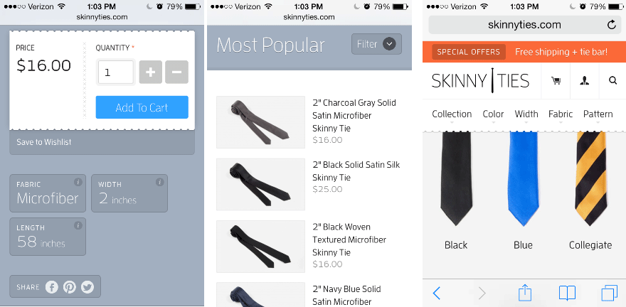
Skinny Ties is one of the most visually pleasing and functionally simple mobile eCommerce stores I could find:
- Extremely simple navigation and display
- Information is concise, images are consistent in size and quality
- Product purchase fits everything on one screen: 3-item product descriptions, with the ability to save to a wish list and share on social media
Amazon Mobile
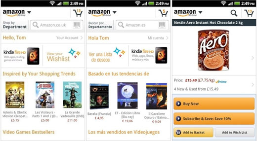
Best of the best – Amazon’s mobile eCommerce:
- Not just an HTML5 site – complete App development
- Complete integration of clean browsing, product descriptions, pictures, reviews, lightning deals
- Complete account integration, such as wish lists, order tracking, 1-click orders, subscribe and save options, and history
- Multi-language support
- Additional features such as price comparisons, barcode scanning, and picture snaps
The nature of an eCommerce store calls for a responsive app manifestation. It seems that many eCommerce stores haven’t figured out potential customers are viewing their site in a smart phone browser. If that experience hasn’t been constructed, they’re losing business, plain and simple.
How do I implement mobile eCommerce?
Option 1) Have an app built in-house or outsource to a freelancer
Option 2) Utilize a site like Bigcommerce to essentially manage every facet; however, you’ll need to have a flexible budget for this option
Option 3) Learn HTML5 and code it yourself!
Bonus tactic – a recent emerging strategy -Amazon introduced their associate programs to Android and Kindle Fire about a month ago, which means eCommerce stores can form strategic partnerships/deals with relevant apps and smart-optimized websites.
Finally, try to avoid these common mistakes in smart phone sites.
#2 – SEO Organization
Have you ever heard of an inverted index? How about rich snippets?
These are just a few of the elements involved in proper eCommerce SEO organization.
Let’s say we’ve got an eCommerce site with hundreds of thousands of pages – that’s a lot of indexing! For starters we’ll want to:
- Plan out content and product templates to help automate the on-page SEO process (titles, descriptions, alt tags, headers, etc.). It should make the manual process of entering the finite details easier. Invest in detailed keyword research and analysis, both internally and for competitors.
- Plan out an analytics campaign with your preferred tools (Google Analytics, etc.) for all of your targeted keywords, being certain to set up conversion funnel paths and categorical goals.
- Make sure there are absolutely no signs of duplication. Create completely unique product and page descriptions, with relevant and descriptive keywords every time. Duplicate content is one of the most prevalent problems large eCommerce sites face.
- Plan out your site architecture in a very logical and practical fashion. Do not create dozens of multi-level folders. Make sure internal links reflect the results of keyword research.
- Make sure your sitemap is on par with the level of depth of sites like Amazon and Newegg. In fact, create multiple sitemaps for each category which helps monitor proper indexing. Don’t forget the image sitemap.
- Similar to Amazon’s product pages, incorporate videos, unique review and rating systems, and product examples to make your page stand out from competitor monotony.
- Mark up everything with rich snippets.
- Determine which pages should rank higher and utilize the rel=”canonical” tag to achieve this.
- In the same vein, carefully plan your link structure to be concise, clear, and harmonious.
- Do everything in your power to increase page load speed.
- Create custom 404 pages.
- Create a blog.
- Create a forum.
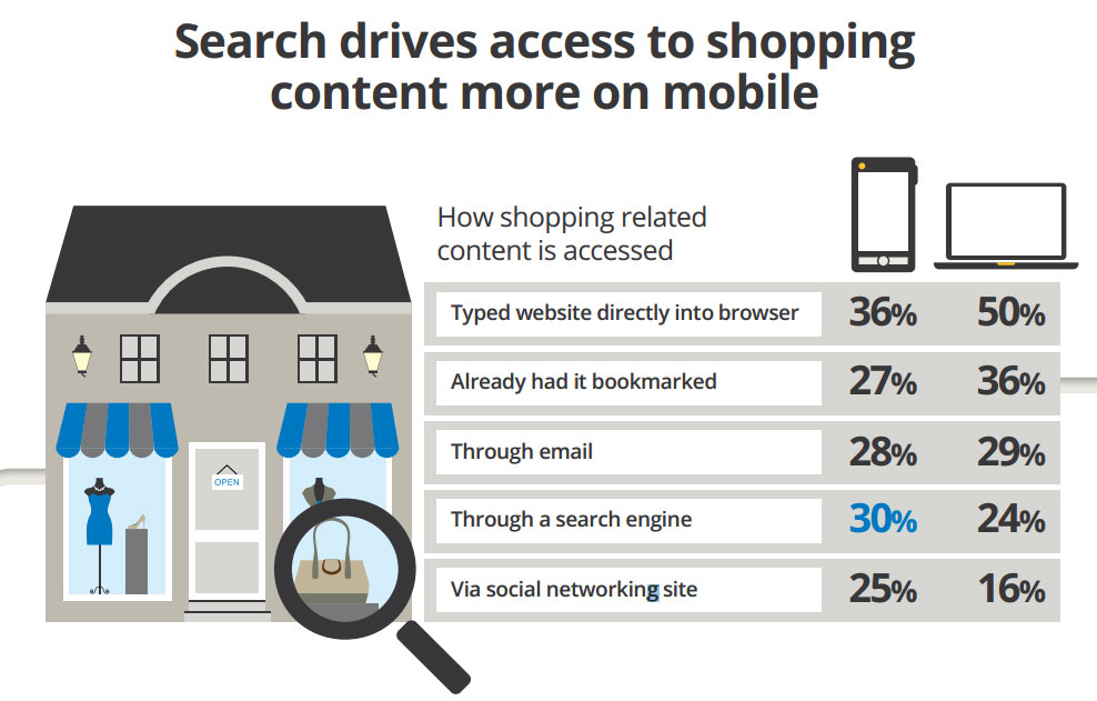
Image via
Don’t forget about mobile SEO organization; you know, the basics of:
- Getting indexed
- Increasing load time
- Hosting on a mobile subdomain and using rel=”canonical” and pointing to the original desktop page
- Creating an easy-to-share functionality
- Redirecting properly
- Alt-text for images
Most importantly, take advantage of the mobile experience. As Bryson Meunier said,
“But they can and do index and interpret the mobile web, and if you leverage the specific properties of mobile devices (e.g., scanner, camera, GPS, accelerometer, etc.) to help users do what they need to do faster, people will take notice and share. When that happens, Google takes notice, and ranks the content higher than more lackluster competitors.”
Additionally, we must always consider local search ranking factors.
Something as simple as listing correct store locations, product categories, and avoiding keyword stuffing are vital factors that ultimately impact business revenue. From small to large eCommerce, local SERPs have much more potential for maximization, at least for now.
Now, let’s discuss onsite search behavior and offsite SEO:
Onsite Search Behavior
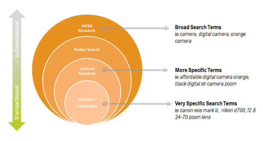
Image via
SEO organization can be thought of as housekeeping. Your room should definitively not be used as a benchmark… There are a few core search paths visitors follow in their journey:
Initial location – Visitors arrive with a predetermined motive; they know the product they want and they go headlong searching for it. Organization problems arise when a search is broader, say, for something like “shirts.” Well, what kind of shirts? Red shirts, blue shirts, V-necks, t-shirts? All of the available options should be displayed, and they should be based on relevancy results from previous data. Think about it: if 30% of users who searched for “shirts” refined their search to “t-shirts,” then t-shirts must be in your eCommerce SERPs for “shirts” and a sitelink for normal SERPs.
Validation seeking – This is the phase when information seekers are at their prime. They’ve almost found the product they’re looking for, but there a few uncertainties they’d love to put to rest, such as customer reviews, ratings, pertinent details (such as batteries not included), hidden costs, real-life size, quality, and expectations. All of these details need to be present and well organized.
Price – Price is one of the most decisive customer purchase factors. Making sure prices are always competitive, clear, and concise (not filled with hidden fees) is imperative today, especially with search and compare aggregate sites.
Also, be aware of the 10 most common shopping personality profiles. This will help you craft tailored page elements and messages to your most typical shopper, which simultaneously creates a pleasant search experience.
Offsite SEO
Ranking for brand names and product keywords is a continuous effort that directly impacts revenue. The most successful eCommerce methods for offsite SEO are a clever combination of inbound marketing and technical SEO.
Social link building – Use awesome content, such as a fun video series like Will it Blend? Focus on creating content that lives on a subdomain blog or brand new domain with your brand as part of the title. I’m not going to preach “quality content” here because that horse is long dead. The reality is that your content is determined by your in-house marketing team or out-of-house agency.
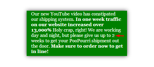
The trend I’ve seen recently in terms of wildly successful inbound marketing is to create a risky, almost outrageous, video with an equally outrageous website. Examples include the Dollar Shave Club and more recently, Poo~Pourri. And when I say outrageous, I mean outrageously awesome.
Standard link building – Anything from product reviews and customer testimonial videos to press releases and strategic partnerships is, well, standard for any eCommerce site looking to raise visibility in SERPs.
There are hundreds of expert opinions that weigh in on determining the most influential search ranking factors. Allocating time and resources to compete for those ranking factors can only help your business (if done smartly) avoid risks and consequences associated with black-hat SEO.
The reality of SEO for eCommerce – There are many intricate details and processes involved. For a concrete, in-depth guide, check out Chris Kilbourn’s Ultimate Guide to SEO for E-Commerce Websites.
#3 – Increasing Page Speed
In our tech-savvy society, we expect everything to happen almost instantaneously.
We expect videos to buffer, images to send, and purchases to confirm, all in a matter of seconds. So when people have such strict expectations, the difference between a 2-second load time and a 1.8-second load time is huge, especially for eCommerce.
Louis C.K. understands what’s really going on, though, and exclaims in one of his routines about how we expect too much from our phones:
“Give it a second! Could you give it a second? It’s going to space. Could you give it a second to get back from space? Is the speed of light too slow for you?”
As much as I agree with his sentiment, the strange reality is that, yes, the speed of light can be too slow for people, and it’s a common concern.
The ideal loading time users prefer is less than 3 seconds.
Yet hundreds of eCommerce sites, small and large, fall short of meeting the majority expectation. While the janitorial code work might seem daunting, especially for shaving fractions of seconds, it’s the continued and collective maintenance that ultimately pays off.
There are a few reasons why eCommerce sites have not decreased their load time:
- 75% of all eCommerce websites do not use content delivery network (CDN)
- 13% of all eCommerce websites do not enable keep-alive
- 22% of all eCommerce websites do not use text compression
Now, here are 7 tips for increasing load time:
- Optimize images – Images over 30K in size cripple loading times, especially if there’re in abundance. Attempt to get the size below 30K without compromising the image quality. The rule of thumb seems to be: large high quality images (60K – 100K) and smaller images (30k max). ImageOptim (Mac only) and TinyPNG (cross-platform) are good image compression tools.
- Set an Expiration Date for Cache – Caching can make loading times slower. Attempt to set an expiry date to utilize the local network opposed to the main network.
- Enable Keep-Alive – Ensure your host domain can enable keep-alive for the maximum number of resources allotted.
- Remove unnecessary coding script – Be sure to remove all “dead” coding. These coding types easily slow down loading times significantly. This is a standard clean-up task.
- Minimize HTTP Requests – Consolidate as many images and files with processes such as pipelining and CSS spriting. Use a CDN to load all of your “sprited” images. This increases speed because CDN servers are faster and HTTP requests are split between the CDN subdomain and your site domain.
- Remove Duplicate Scripts – At times, a website might accidentally produce duplicate scripts. Although it might not show on the webpage, it will appear in loading times. Be sure to analyze scripts to mitigate any chances of this happening.
- Toss Outdated Pages – Utilizing Webmaster Tools, routinely check for 404 errors. If you’re doing section revamp, make sure internal links don’t break if anything gets renamed or disconnected.
One of the common page speed discussions is the scale of compression and progressive rendering. Basically, Google’s Page Speed Insights suggest minifying all HTML, CSS, JavaScript, with the goal of having an entire page load all contents quickly enough to appear seamless to the end user. Ultimately, factors such as browser preferences, file sizes, and where on the page you load scripts affects the efficiency.
Again, don’t forget about mobile. Bryan McQuade (Google’s Page Speed team lead) has an excellent guide for making mobile pages render super-fast.
#4 – Conversion Analysis with PPC, Heatmaps, and Customer Validation
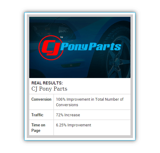
In this section, I will present an eCommerce conversion analysis case study that is a result of a consultation I sought with one of my Internet Marketing Managers, Scott Redgate. The eCommerce site we’ll be covering is the mustang parts company, CJ Pony Parts.
PPC
While PPC ads are standard for primary keyword visibility, they can be strategically tailored after analyzing user interactions. In this case, CJ Pony Parts’ customers were seeing a prominent coupon code option during the buying process, resulting in visitors leaving in search of a code before returning to the checkout.
To remedy this, the following PPC ad was created:
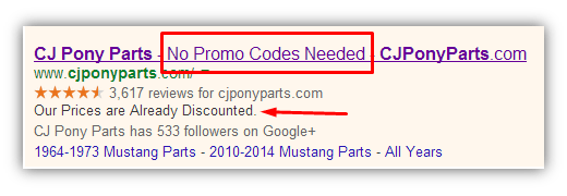
This PPC ad helped fuel a return on investment that was 176 times greater than the cost.
Heatmaps
Identifying the value of page elements, such as CTA buttons, images, and search bars, is vital for making site changes to enhance usability and happiness, and to meet customer interactions.
A heatmap report on the old CJ Pony Parts homepage showed the following:

The search bar was hiding in the upper left corner and was relatively small compared to surrounding page elements. This finding was the basis for the creation of a fresh design, optimized for a better user experience:

Customer Validation
A few customer barriers noted were a lack of trusted, third party logos, such as:

These were added to the homepage, reinforcing customer validation. To support security in the checkout page, the following logo stream was added:

Along with:

On top of the enforced validation, one usability barrier was identified during the checkout phase:
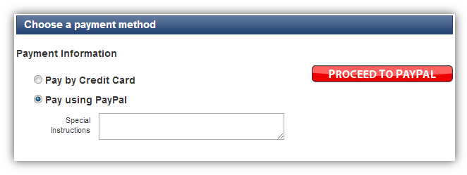
There was too much whitespace leading to the Proceed to PayPal button. A simple realignment of payment information fixed this:
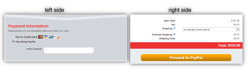
By redesigning the checkout page and organizing the process into payment information on the left and a finalized CTA on the right, usability was maximized.
Scott also suggests we pay attention to the following eCommerce page elements:
- Reduce the clutter of passive sidebar product filters to on-hover display
- Reduce product quantity display if heatmaps show visitors are not scrolling all the way through
- Identify the most attractive page elements and make them stand out better than items that offer no visitor value
- Make checkout buttons, icons, and associated information (such as item quantity) very minimal
- Reposition action buttons that receive little traction
- Optimize blank searches (when a user hits the search button without a query) to display products, not just a “please refine your search” message
- Consider adding a progress indicator to checkout pages
- Recite customer testimonials during the checkout phase, underneath the cart list, to give that extra bit of reinforcement
- Since 91% of the top retailers fall between the 21-28 input field range, make sure you aren’t overwhelming potential customers with overflowing input fields
The collective internet marketing strategy provided the following results:
#5 – Data Testing with Abandoned Carts and How to Reduce Rates
Every moment leading up to customers pressing that “confirm purchase” button, there’s a chance they’ll leave the transaction entirely. Maybe they never intended to make a purchase in the first place or maybe they weren’t expecting remarkably high shipping fees. At any rate, shopping cart abandonment stands to be a primary concern for all eCommerce platforms.
According to the Baymard Institute, 67.35% of fully stocked shopping carts are abandoned by customers on average.
That’s about two out of every three carts.
Unbounce notes:
- 57% of shoppers that weren’t ready to purchase were there to estimate shipping costs
- 56% of shoppers aren’t ready to purchase but want to save their selection for later
With these statistics in mind, what are some ways we can reduce shopping cart abandonment?
A Cure for Shopping Cart Abandonment, Part 1 – Reducing Shopping Cart Abandonment
Be transparent about shipping costs – Don’t leave customers guessing about shipping costs until the final transaction page. Instead, automatically update cart totals with standard shipping costs, additionally allowing users to select and save alternate shipping options without committing to anything. Alternatively, one popular strategy is to set a threshold, such as $50, so that when anyone spends over that amount, shipping becomes free.
Be cool, registration is overrated – Don’t require customers to login in order to make a purchase. Imagine being forced to sign up for a membership every time you bought something in a physical store. That wouldn’t fly. Registration is just a roadblock on the path to checking out. You’re getting the email anyway during checkout, so bring up registration later down the road, not on the first date.
Allow social integration – Customer reviews, seller ratings, videos, product-content samples/previews, and social sharing buttons can be factors that drive or deter a purchase. Integrating these features is necessary, though, as we’ve come to expect and generally rely on peer influencers, as opposed to company descriptions – it’s a natural shopping process.
Put us at ease – Don’t be afraid to guarantee anything. We want to know our payments are secure, that prices are cheap, that we will be satisfied. Don’t make us go through seven pages of learning details just to check out. And if you can’t guarantee something, such as running out of stock, let us know!
Be unique and flexible – Hopefully, your emails are responsive and optimized for mobile. With the unrelenting rise of mobile marketing, shopping cart abandonment notifications can be mobile tailored, allowing eCommerce to reach potential customers on the go.
Be human – Simply asking potential customers why they’ve decided to abandon their cart can provide actionable information. Give them incentive to answer, such as a discount on the product(s) in their cart.
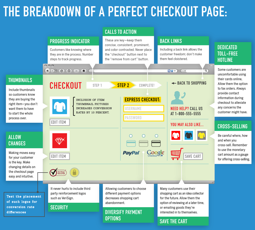
Create a perfect checkout page – Competition forces us to constantly improve. Meeting the standards of a great checkout page is necessary for eCommerce. The goal should to be a perfect checkout page. Here’s the breakdown of a perfect checkout page via Monetate:
#6 – Purchase Funnel Testing
A Cure for Shopping Cart Abandonment, Part 2 – Testing
We’ve covered the popular strategies, but there’s one thing we’re forgetting…
Testing.
Are discount notifications more effective as an exit script that pop up or as a categorically tailored email?
Are potential customers following up to purchase items they’ve saved? Maybe we should send them a friendly, personalized reminder about their wish lists, but which is more effective: weekly or monthly email reminders?
Maybe it’s something as simple as testing Live Chat copy:
“Hi [name]! Can I help you with anything?” vs. “Hey [name], here’s an exclusive discount for [product in their cart]”
To plan and execute effective tests, we’ll need to equip ourselves with a toolset.
- Google Analytics and Content Experiments – Our goal is to create custom reports by assigning event tracking and creating goals for user action items. Content experiments allow us to redirect entry pages to our new test page and track the variation conversion data.
- Crazy Egg – Heatmaps, sectional value of pages, and link value collectively help identify shopping cart abandonment problems.
- Olark – Live chat integration can only help reduce shopping cart abandonment and solidify the legitimacy of an eCommerce business.
- Hellobar – For the small to medium eCommerce sites without the code chops or time, Hellobar is an awesome way to test copy, discount, and product value, even uniquely per page.
In-house design tests – Intuition is often frowned upon – given the plethora of data tracking and analysis tools available – however, benchmarking a competitor or consultant could provide the perfect test.
From eye tracking software to deep analytics tracking, having a dedicated data and design team is essential to reduce shopping cart abandonment rates.
Below are purchase funnel testing tips and strategies:
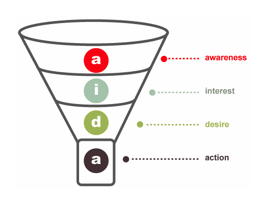
Image via
Identifying pain points
Now equipped with a toolset, we can examine our data for pain points. These are the pages and actions where visitors leave the site / abandon the cart.
Pain points are sometimes as clear as day, especially if your live chat or contact form is readily available. Potential customers often leave feedback when they’re especially upset with a functionality, site issue, or missing expectation.
An additional and recommended way to identify pain points quickly is pay for user tests and focus groups. With user test groups, we can run A/B and multivariate tests based on previous results.
Testing tailored content as solutions to pain points
In the Liftopia case study revenue was increased by 24% by adding cross-sell options (such as “Similar Products”) to the landing page where visitors were already in the “desire” stage. Liftopia was using SEM ads to acquire potential customers, but wanted to see more ROI because of the high quality traffic – the pain point. The cross-sell options were tailored to the expectations of the visitors, thus resulting in higher conversions because their desires were met.
HubSpot recommends taking advantage of inbound marketing strategies to fuel and improve eCommerce purchase funnels. For example, by analyzing search query data, we can create content that better meets the needs of potential customers who are simply “interested” as opposed to “desiring.”
Testing the journey with user preferences
Purchase funnel testing is similar to books and comics where readers have the choice of how the plot turns out (i.e., turn to page 5 for “this” or turn to page 23 for “that”). Over the past five years, social listening has become a fundamental role in the operations of business and media. For example:

How does this relate to eCommerce?
Products can be tested with user preferences. All you have to do is ask and make it easy to answer.
Implement a feature that helps your site get smarter by simply asking users if the landing page product or pain point feature is what they expected or useful.
The goal is to create a situation where users mold the purchase funnel to their liking.
And yep, don’t forget about mobile! Here are some great tips in an EyeForTravel interview about optimizing mobile purchase funnels, such as testing what mobile UX designers thought were cool but turn out to be confusing for end users.
#7 – Assigning Values to Everything
When we determine the value of something virtual, such as a button, a style, or call-to-action words, we must rely on designers and marketers to bring about the change needed to amplify those values.
There are two essential forces that influence how we assign value in eCommerce:
- Our industry (i.e., luxury, sports, games, etc.)
- Our visitors
Our industry dictates experiential values.

Consider the following luxury clothing eCommerce sites:
- Gucci – high-resolution product images, beautiful homepage media, and all interactions are performed within a product slider (eliminating the need to scroll down)
- Makr – incredibly minimalist UX, strategically “clean” use of whitespace, and simple product categorization display
- Hermes – imaginative design, great use of whitespace, unique design style, and an exemplary sitemap
These websites transport us into the lifestyles their products cater to. Of course our brand must dictate a unique experience as well, but it must still connect with the lifestyle of our industry because that’s exactly what potential customers expect.
Visitor interactions dictate virtual values.
Think about all of the information users can interact with:
- Product previews, descriptions, photos, videos
- Customer reviews, ratings, feedback videos
- Category breakdowns
- Action items such as Add to Cart, Save for Later, Add to Wishlist, Email to a Friend, Share on Facebook
- Product filters (“Customers who viewed this also viewed…”; “Related to Items You’ve Viewed”; “Inspired by Your Browsing History”)
Essentially, all of this information is educating the user in some way. Education is a form of influence. Determining which items are the most and least effective influencers allows us to assign value.
This is why we also must assign value to abandoned carts. Users obviously had an interest in the product and they now have it sitting in their cart. That has value.
While session values are segmented and indicative of many process improvements, it’s ultimately lifetime value that helps power higher-level goals.
One way to organize the value of these items is to simply set up custom reports. Assign values to goals created for educational clicks and abandoned carts. While this report won’t be indicative of anything concrete, it provides instrumental data about potential worth. Make this report more of a sandbox where you can test and organize potential values.
Seasons are an additional, essential force.
While niche product eCommerce sites may not see value in maximizing seasons, the imparity is obvious. A virtual holiday was even created:
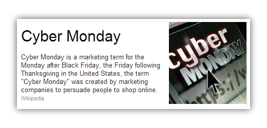
From Thanksgiving and Halloween to Christmas and New Year’s Eve, holiday seasons are the most optimal period to boost sales.
Some people want to avoid the physical in-store rush and traffic. Others simply enjoy the convenience of purchasing bulk online.
Credit cards are out and your site must be ready for the hug of death (basically, a traffic boost that overloads your servers).
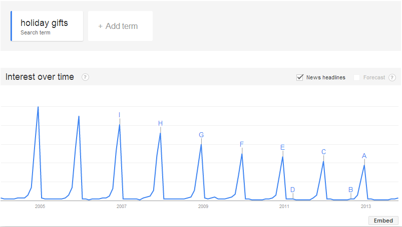
(those humps = hugs of death)
Also, this particular upcoming holiday season apparently started already on September 30th and has six fewer shopping days between Thanksgiving and Christmas.
So how do we prepare for holiday seasons?
- Allocate budget to compete for increased ad bids
- Utilize holiday keywords and advertising copy, making sure to multivariate test
- Take advantage of “holiday rush” by creating very limited time discounts, making use of a countdown timer
- This year is “Thanksgivukkah” (Thanksgiving and Chanukah fall on the same day) which leaves room for creative advertising
- Create holiday sitelinks for SERPs
- Offer a variety of gift wrap and card choices to accompany purchases
- Strategically plan out holiday discounts (such as site-wide) and selective product deals (make use of your data to determine which products will be in highest demand)
- Increase page load time and optimize servers (see above)
- Set up tests to run during holiday sales, altering prices and discounts based on popularity
- Create special product filters based on the actual holiday. If your products are completely unrelated to holidays (such as “designer pens”) it’s worth having a chat with your product devs, marketers, and designers.
- Don’t be afraid to guarantee on-time holiday shipping
- Create an after-purchase widget that allows customers to share to social media, something along the lines “Just got my [holiday] gift from [eCommerce site]”
- Tailor all promotions, such as social media campaigns, email marketing, mobile ads, etc.
Yahoo’s advertising section has a nice toolkit for holiday search.
Also, don’t forget about birthdays. Create an exclusive birthday discount for customers who’ve signed up for an account. Alternatively, you can inform new visitors of the birthday discount as incentive to sign up.
Some additional thoughts on eCommerce site values
In a Catalyst interview with Liz James (Agency Account Executive at Google), some very illuminating points were brought up. Liz stated that approximately 92%-94% of the retail market is still done offline.
She explained: “True retail success is not as much about the transactions online – it’s more about education throughout the purchase process and thus connecting to the users where they are every day.”
However, it’s important to note that many eCommerce business models don’t have a walk-in store. This is why assigning monetary value is a fundamental starting process on the road to improvement.
After assigning values, we ultimately want to boost them, which equates to a flexible marketing budget that many eCommerce sites may not have. Remedy this by ordering values and their required budget (the amount needed to amplify, change, test, etc.) by level of severity and ROI.
Finally, user acquisition costs and average retention rates will always fluctuate during these revamps. This isn’t a reason to stop measuring them, though; in fact, it’s even more important because you’ll be able to see direct impact.
8) CTA and Goal Testing
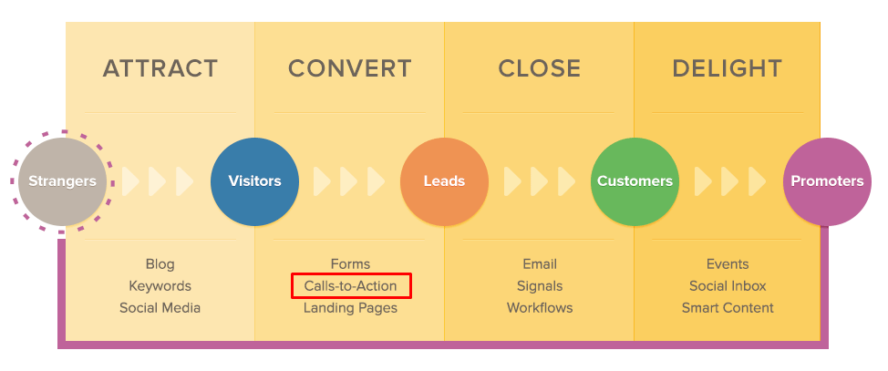
Image via
Calls-to-action are everywhere. They are completely unavoidable, both online and offline, and manifest in forms you may not even be aware of. They are, quite simply, buttons that turn visitors into leads, and leads into customers.
Here’s one we’re all familiar with:
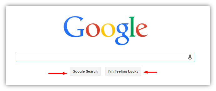
We have only two options, and they’re both CTAs. Fortunately, for Google, all they want from us is our time and clicks. Yep, time and clicks, that’s Google’s life-force…
All right, let’s look at an actual eCommerce site:
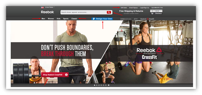
ECommerce sites are generally split into standard CTAs and special CTAs.
Standard CTAs include:
- Categories and product filters (i.e., Men, Women, Kids, Sports, Classic)
- Gift cards, Login / Signup
- See cart
- Phone number / Contact us, About
Special CTAs include:
- Shop [niche product item]
- Design/Customize your own
- Unique features such as Amazon’s 1-click purchase
- Unique memberships such as Amazon’s Prime
Standard CTAs are necessary for basic user navigation, while special CTAs help increase conversions and separate one eCommerce site from a competitor.
We can capitalize on both types of CTAs with various types of testing.
I found a very cool discussion about fake button testing on Quora.
Jackie Bavaro, Product Manager at Asana, explains how her team built a fake “Sign up with Google” button that brought up the message “This feature is coming soon, thank you for your interest” to test if, indeed, their potential customers would want single sign on.
They ran the experiment for only one day, which provided plentiful data.
After deciding to build the single sign on feature, two findings proved this test to be effective, yet slightly ambiguous.
- Cannibalization (differentiating which users weren’t signing up the standard way) made the results murky.
- Standard sign ups had a higher rate of adoption. Even though single sign on got more people to sign up, those who used single sign on had a lesser rate of adoption.
While fake button testing is a great way to gauge engagement and interest, some other test strategies include:
Multivariate testing – This allows us to craft different CTA messages based on who is seeing it, which we can determine with the values we’ve previously assigned. Examples include:
- User Type = Customer, CTA message = “Consult Us”
- User Type = Lead, CTA message = “Try the free demo”
- User Type = First-time visitor, CTA message = “Watch intro video”
Session CTA testing – A first-time visitor decides to download a free resource, and now they are logged as a lead. But since that resource has already been downloaded, it would be redundant to keep showing it, so instead, we’d alter the CTA message to something further along the purchase funnel, such as a trial.
Another good example of session CTA testing is when a returning customer hits the browser. Simply thank them for coming back and show them a product that relates to their browsing history.
Human testing – We often think of visitors as just that – visitors – nothing more. Fiverr is a great example of using human-CTA-messages:

Look, it’s another human! And he’s a super seller, that’s pretty cool, how’d that happen?
This is how we focus on humans and not visitors.
Some additional CTA goals and strategies to consider
- Clearly explain the benefit of downloading something in less than 20 words.
- Get in users’ bookmarks! Create a CTA button for that.
- Utilize the KickStarter incentive program with pledging amounts. Up-sell potential customers by offering greater benefits for greater spending.
- Don’t overwhelm users with more than two primary CTAs.
- Recommend personalized products to users. Create CTAs that give users the option to have personalized product suggestions.
Also, HubSpot has an excellent guide on creating effective CTAs.
Final thoughts
These practices collectively fuel what has become commonly regarded as the “eCommerce experience.” Essentially, it’s about working on the inbound experience, the search experience, and the shopping experience.
About the Author: Jesse Aaron is a community manager at WebpageFX, has a passion for homebrewing, and writes on a variety of topics on his blog Mashbout. Follow Jesse on Google Plus.
Comments (24)