Let’s face it. People often come to your page not knowing anything about you. Can you guess how much time you have to grab their fleeting attention?
8 seconds!
Some argue that, based on the vast number of sites we see every day, quicker judgment calls are being made, and the actual time is somewhere around 2-3 seconds.
Great! Your visitors have the attention span of goldfish.
There are several characteristics of a landing page that converts. Remember that a video should be only a small part of your marketing approach and should never be seen as a cure-all miracle tool.
You simply can’t assume that you’re going to be the next Dollar Shave Club, and you can’t expect everyone to fall in love with your product or service at first glance. Viral as a marketing strategy is unrealistic.
But there are some ways to help your video be seen and remembered. The most important is to make custom videos that are tailored for, and complement, the content on your landing pages.
Obviously, there are issues with this, namely, the time, money, and energy required for such a thing. But if you have a good in-house video team, you can (fairly) easily tackle this, in my opinion. And it will be worth it!
The reason for a landing page, according to Unbounce, “is to expand upon the message of the advertisement or link and convince the visitor to ‘convert’ into becoming a customer by taking a specific action.”
So how do you help increase trust, credibility, and understanding before your prospective customer impulsively clicks the little “x” on the browser tab of your campaign?
1. Create custom videos for different types of visitors
Who is in your target audience and what type of video would resonate with them? Are they the type who would prefer an animated explanation or would they rather see the CEO on camera speaking about it? Do they need to see a personality or just know the facts?
By tailoring your content to a particular type of visitor, you’re addressing the questions and needs of a specific, potential customer. That just so happens to be why your particular landing page exists in the first place. Your video should be scripted so that it answers the visitor’s questions very quickly.
In other words, you should speak to an enterprise level executive differently than you would an average consumer. The executive is going to be looking for more intricate details and will care about things the average consumer won’t.
Be sure to have a video for each audience on a completely separate landing page with copy that answers their particular questions. Speaking to the right audience and being authentic will really increase the trust factor.
2. Keep videos short
Visitors to your landing page simply want quick answers. Try to convey the benefits of your website, product, service, or idea within 45-90 seconds. Ask for only one action from the visitor, and be absolutely clear about the action you want them to take.
Lack of clarity here can destroy your conversions, since most people are prone to not make a decision if given too many options. Think of it like an exam: would you prefer multiple choice questions that require process of elimination or true/false questions that make the correct answer more attainable?
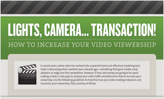
Refer to this infographic for more information: How To Increase Your Video Viewership
3. Design around the video
The design of the landing page can do wonders for engagement. Design around the experience and attract the eyes. Keep the page simple by removing your sidebars, headers, and anything else that could clutter and pull focus away from your goal.
Remember, your landing page has one purpose – to cause the visitor to take a desired action (such as signing up, buying, opting in, or something else).
By simplifying the page, you’ll be able to shift the focus onto the video, which should be tailored to make that action happen.
Highlight value with a visual-friendly experience that guides the visitor to conversion. Consider having a simple graphic that prompts the visitor to click “play.” You can do this with the video thumbnail (which should be optimized as well) or the page content around the video.
By giving the visitor a great experience and building trust through a video, the time they stay on the page will increase dramatically, giving your message more time to sink in.
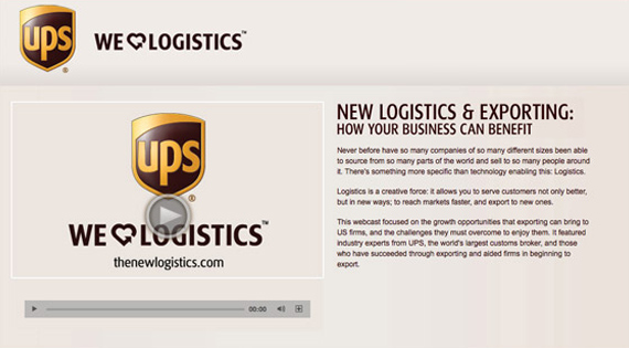
Option to watch video or read lengthy text. You’re pretty much forced to click play. Appeals to emotions with “We [HEART] Logistics”
Since your video is the focal point for the landing page, be sure to adjust the size and proportions to fit the space. Try to have the video “above the fold” in most cases. Also, include something that will draw visitors to click “play,” something that catches their eye just enough to scoot that cursor closer to the magic button.
Create a clear headline that draws the visitor in. This feature is often ignored, but is very important. Make it Useful, Unique, Ultra-specific, and Urgent.
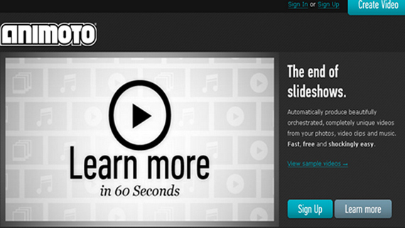
Clear value proposition: End of Slideshows
4. See it from their perspective
Which would you prefer: to watch a video that quickly explains the benefits of a product or read a lengthy chunk of text about it? If you’re like most, you’ll choose the video. Now what about this: would you rather watch a 2.5 minute video or a 1 minute primer so that you could quickly learn if a product or service actually would add any value to your life?
Be sure not to automatically autoplay your video. This is the best way to get a visitor to bounce off your page. There are a few minor exceptions to this rule, but don’t think you’re the exception. Instead, look into usability guidelines for when this actually can help you increase conversions, and do some tests as well.
As it stands, you’re very close to your product and may think every benefit is worth hearing about. Don’t assume that your busy visitor will agree with you.
5. Produce high quality video
You have only a few seconds to capture your visitors. If your video doesn’t look like it’s high quality, neither will your product. Use a camera that shoots in High Definition and make sure you have a quality audio setup. Consider adding graphics, and try thinking outside the box with this one. Clip art and low resolution web images are not your friends. Be sure to read this article on “How to Create Your Own Promo Video for Under $100“.
Many people will say you can get by with recording on a cell phone or cheap camera. They may be right, but consider the value you need to portray. Most products (and humans) need to be shot in quality light with quality audio and editing. Remember, what you put into something affects what will come out of it.
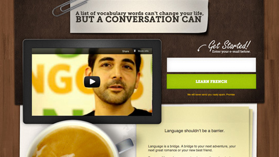
Headline appeals to emotions. Clear call to action: “Learn French”
6. Give value proposition and ask for action
Know your customer’s problem and tell them how you would fix it. Be sure to bring clarity to the purpose of your video, both in the written script and visuals (or on-screen performance). The viewer needs to be engaged and believe what you’re saying, so be authentic. Once you’ve piqued their interest, you can try to convert with a clear call to action at the end of your video.
Depending on what kind of campaign you’re running and what action you take, you should look into using a professional paid video host, like Wistia. With this, you can capture email addresses or include links to push visitors to the next step in your sales funnel (from right where they are). They’re much more likely to click on the video than off the video.
7. Optimize and track analytics
SEO isn’t extremely necessary for short term marketing campaigns, but if your landing page is geared toward lead-generation or sales, then you need to optimize your video. There already are a lot of video SEO tips out there, so, for now, just know you need to do keyword research relevant to your specific campaign, implement it into your video, and submit a video sitemap to Google.
Know who’s watching your video and how long they watch it. Start by studying your page analytics and know why people are coming to your page. Different visitors have different goals so you have to write your video (and page) content to meet those goals.
After your video has been implemented and has had a few hundred hits, study its analytics to see if it’s meeting visitor goals. Know what works and what doesn’t, and optimize based on feedback from your viewers.
Conclusion
If something’s not working, re-edit the video, or re-shoot it if necessary. Often, what you think is finished could be improved by another revision.
There’s a lot you can do to get the most efficiency out of your campaign’s video landing page. Provide the visitor with a simple user experience that makes it a no-brainer for them to click “play.” Tell a great story that totally wins your customers over, and close the deal with a solid call to action.
Your customers will not only know who you are, what you do, and how you do it, but, because of your quickly attained credibility and ease of understanding, you will be the only choice as far as they’re concerned.
About the Author: Eric Hinson is the Founder and CEO of Explainify, which specializes in short, engaging, remarkable explainer videos for businesses that want results.
Resources:


Comments (6)