It sounds so good.
You create an infographic. It drives traffic. Builds links. Raises brand awareness.
Unfortunately, it doesn’t always work like that.
Many infographics are languishing in the dark corners of the web. Ignored. Lonely.
What can you do to avoid that fate? How can you ensure your infographic generates shares, links, and traffic?
We’ve collected the 19 most common mistakes that make infographics lackluster, neglected, and miserable. Avoid these mistakes and you have a good chance of making your infographic popular.
Let’s start with eight warning signs you’ve picked the wrong idea.
How to avoid choosing the wrong infographic idea
1. You’re self-indulgent. You’re talking about your own products or services. But the hard truth is that nobody is interested in you. Don’t be a sleazy salesman!
Instead, share interesting statistics about your industry, use humor to entertain, or provide in-depth buying advice such as:
- Explain the key features people need to consider when buying your product;
- Comment on your industry’s history or future;
- Show how your product is made;
- Share bizarre or fascinating facts about your industry;
- Compare products to help people make a choice;
- Show geographic, gender, or economic differences in the use of your product.
Don’t take yourself too seriously. Show some personality and have some fun.
2. You’re not original. Of course you should learn from the successes and failures of other infographics. Create your own swipe file with a private Pinterest board or Evernote:
- Include infographic designs you like;
- Save quotes and fascinating facts from a variety of resources;
- Create a collection of good headlines;
- Include inspirational blog posts and articles on various topics;
- Keep track of your own ideas for infographics.
Avoid being an infographic thief by taking inspiration from a wide variety of sources. Be inspired by graphic designers, artists, bloggers, scientists, or writers.
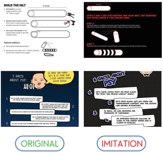
Don’t imitate. Don’t copy outright.
Generate your own ideas. Develop your own style.
3. You forgot your target audience. Don’t develop your infographic just to build links. Instead create a great infographic your target audience loves. Links are a by-product of creating awesome content.
To create an infographic for your audience:
- Imagine your target audience;
- Consider their pain points and dreams. How can you help?
- Think about other stuff they find interesting. Can you link your topic to something else?
- Be helpful to your audience. Entertain your audience – not just yourself.
4. Your idea is too complex. You should be able to explain your infographic in one sentence. You should have one overarching idea.
Of course you can break down your big idea into sections. You can view one topic from different angles or include a number of tips or mistakes – as long as they all contribute to your one big idea.
The most popular infographic simply explains how color affects purchases. This simple idea generated over 18k shares!
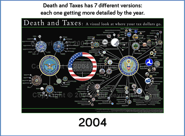
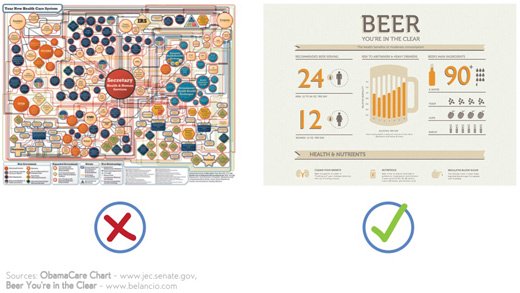
5. Your infographic is superficial. Are you just scratching the surface or are you providing in-depth information?
Read widely about your topic. Don’t use a scattergun approach to your idea; instead try to go deeper.
Have you seen the Death and Taxes infographics? Jess Bachman provides an in-depth overview of the US budget.
6. You seem like a blabbermouth. An infographic isn’t just a visualization of statistics and data. You have to have something to say.
Think about your big idea and the audience you’re targeting. Will they find your stats interesting? Will your audience feel better or take action after viewing your infographic?
Don’t share stats and data just because you have them.
7. You’re too predictable. Are you lulling your audience to sleep? You need to surprise people to make them pay attention:
- Avoid obvious information;
- Find bizarre or unexpected facts;
- View your topic from an unusual angle.
8. You don’t have an outreach plan. Even the best infographic won’t magically go viral. You have to work hard.
Think about your target audience – which blogs are they reading? How can you get featured on these blogs? And how can you maximize social sharing?
A few tips:
- Be polite and build relationships with influential bloggers to increase the chances that your infographic is featured on other blogs.
- Personalize all your outreach emails. Include a blogger’s name and explain why you think the blog’s audience would find the infographic interesting, useful, or entertaining. Ideally, you can refer to a post or infographic that received a lot of shares or comments on the target blog.
- Use Click to Tweet to add tweetables in your blog post to make it easier to share key facts of your infographic.
- Ensure your infographic looks beautiful on Pinterest to maximize re-pins. Don’t forget to include a link back to your site.
How to create an irresistible infographic design
You got a fantastic and original idea for your infographic. How do you make it look good? How do you make your design stand out?
Below follow five mistakes you certainly need to avoid.
9. Your infographic is too long. The attention span of your viewers isn’t endless, so don’t keep going on and on. Limit your infographic to 8,000 pixels.
Compress your image so it’s under 1.5MB. You don’t want to lose readers because your infographic takes too long to load, do you? ImageOptim (Mac only) and TinyPNG are good image compression tools.
10. Your graphics suck. You can’t just turn a blog post into an infographic by adding a few images. Develop an eye-catching design:
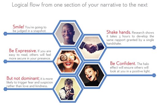
Create a logical flow that draws your reader’s eyes from one section of your narrative to the next.
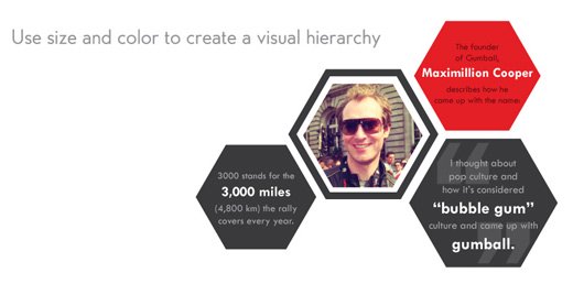
Most people scan rather than read text online. Use size and color to create a visual hierarchy. Draw attention to your most important information.
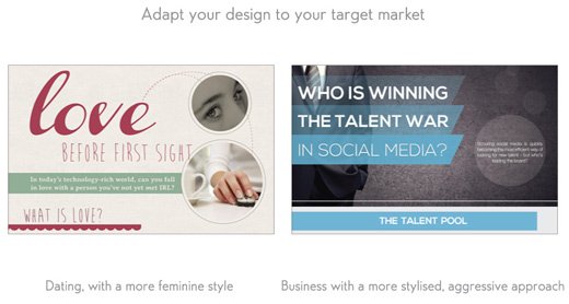
Adapt your design to your target market. An infographic about fashion needs to make a different impression than a visual about equity release mortgages.
11. Your font choice is poor. Don’t select all your favorite fonts, because it makes your infographic look messy. Limit your choice to two font types; and pay attention to readability:
- Have large sub headlines;
- Ensure the font size for your paragraphs and data labels is big enough; don’t make people strain their eyes to read your text;
- Choose readable fonts.
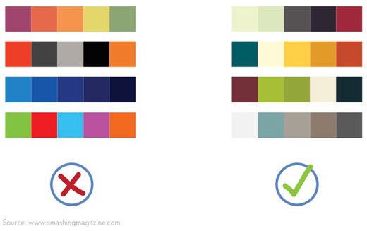
12. Your design looks like an amusement park. You can’t mix different styles. Ensure your images, color choice, and graphs all match the overall tone of your infographic.
Limit your color palette. Use Kuler or Color Scheme Designer to create your palette.
Ensure all graphs have a similar style.
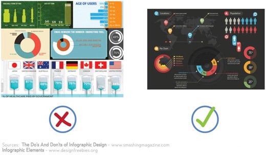
Create some white space.
13. Your images are too small or pixelated. Well, that’s obvious isn’t it?
How to write compelling copy for your infographic
It’s an easy mistake to make: Discounting the importance of your infographic copy.
But isn’t just about good looks.
Would you like your infographic to be shared on Twitter? You need a good headline.
Do you want people to pay attention to your whole infographic? You need good sub headlines.
Below follow six mistakes you should avoid when writing copy for your infographic.
14. Your headline doesn’t grab attention. Keep it short, and promise your reader that they’ll learn something. A good headline attracts attention and makes people curious to find out more.
Excellent headlines include at least one power word – a strong, emotional word.
Three good headline examples:
I. The Viral Marketing Cheat Sheet includes two power words – viral and cheat – and promises a quick overview to help you create viral content. Who doesn’t want to go viral?
II. Fact or Myth? The Truth Behind Common Health Knowledge. This headline makes you curious to find out whether your knowledge is wrong. Also, myth and truth are powerful words.
III. 15 Grammar Goofs that Make You Look Silly. This is an outstanding headline. Why? Nobody wants to look silly, so everyone will check they don’t make these mistakes. This headline also addresses the reader directly using the word you; and it uses the power words silly and goofs. Lastly, starting a headline with a number always creates interest. No wonder this infographic was tweeted over 5,000 times.
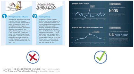
15. You’re verbose. An infographic is not just a graphical representation of a blog post. You have to find the right balance between words and images or graphs.
Use simple language and tighten your text. Include a few sound bites – statements that almost sound like proverbs. Or use strong emotional words.
The Science of Social Media Timing includes key takeaways such as best time to tweet, best tweeting frequency, and best time to share on Facebook. The text is tight; and the information is extremely useful.
This infographic about what makes someone leave a website includes powerful statements such as: Complex or inconsistent navigation can cause users to feel helpless, confused, or angry. And: Suffocating your visitor with ads that pop flash, and fill the entire browser will only serve to enrage them.
16. Your facts are wrong. It’s so easy to pick up a few interesting facts from the web and then find out that you didn’t get it quite right. It happened to Enliven in their otherwise powerful infographic about rape.
- Use reputable sources;
- If possible, confirm your facts by consulting two independent sources;
- Get someone else to check your facts. Do you know many newspapers employ specialized fact checkers?
- Quote your sources, because it increases your credibility;
- Ensure your stats are recent figures;
- If it sounds too good to be true, it probably is.
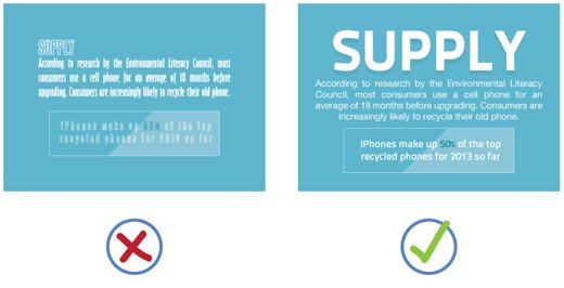
17. Be specific and add concrete details. Being wishy-washy is a sure sign your infographic sucks. Specific details add credibility.
Numbers and percentages are the most commonly used details for an infographic. But you have other options:
- The Science of Timing infographic gives specific advice on when to tweet and how often;
- The Evolution of the Web infographic presents specific details on web development events such as: the world wide web consortium (W3C) was formed in 1994 and Flash was introduced by Macromedia in 1996.
18. Your tone of voice doesn’t match your topic. Some infographics cover serious topics; others take a more humorous view on industry issues.
Don’t make fun of serious issues. And don’t sound stilted and corporate when you’re having fun. Make sure your graphics and your tone of voice match your topic.
Don’t forget to check your grammar and spelling, because grammar goofs and spelling errors undermine your credibility.
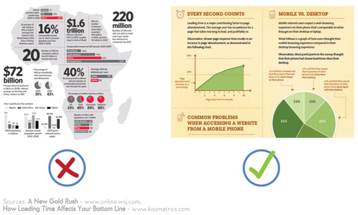
19. You don’t have sub headlines. Sub headlines draw your readers to other parts of your infographic. Make your readers curious to found out more.
Treat sub headlines like headlines. Give readers an incentive to read on:
- How Loading Time Affects Your Bottom Line includes good sub headlines such as Common Problems When Accessing a Website from a Mobile Phone and How Website Performance Affects Shopping Behavior.
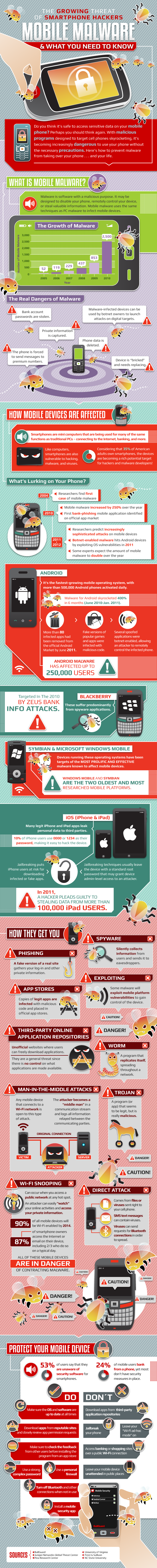
- This infographic about mobile malware includes good sub headlines such as The Real Dangers of Mobile Malware and What’s Lurking on Your Phone.
The truth about creating a popular infographic
Will avoiding these pitfalls help you create a hugely popular infographic?
The truth:
No strict guidelines exist for creating fantastic infographics. No blueprint exists that you can follow step-by-step to guarantee your success. But you can avoid common, silly mistakes. Be disciplined. And don’t take any short cuts.
Generate great ideas. Create wonderful designs. And write well.
And the most important lesson? Focus on your target audience. Entertain them. Be useful. Let your passion shine through and you’ll find a raving audience.
About the Authors: This post was created by Neo Mammalian Studios and Henneke Duistermaat. Neo Mammalian Studios is an infographic design agency on a mission to delight with visual information. Henneke Duistermaat is a marketer and copywriter who makes dull companies charming and persuasive. Sign up to her Enchanting Marketing newsletter for free content marketing and copywriting tips.
Comments (27)