For many small companies, a double or triple digit revenue increase within a few weeks is likely the result of either a new product launch or a big endorsement from a popular figure.
But, increasing revenue also can be the result of changes a company makes to its website. And, lucky for us, some of the businesses that have done this have shared the changes they made and the resulting revenue increase. So, in this blog post, you’ll learn how 7 companies increased their revenues by making changes that cost them little to nothing. You’ll be able to replicate what they did and reach for the same success.
Let’s get into it…
1. Aligning Pricing with Customer Success Doubles Revenue
Server Density provides server monitoring. Their original pricing wasn’t aligned well with new customers. The bigger customers got bigger discounts:
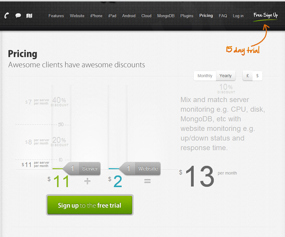
Notice the text:
Awesome clients have awesome discounts
This is a great way to send smaller customers away to competitors. Not just that, but it’s also complicated pricing. As the author of the article about this company’s experience explains:
- It costs $11 per server plus $2 per website
- Except if you have more than 10 servers, it costs $8 per server plus $2 per website
- Except if you have more than 50 servers, it costs $7 per server plus $2 per website
They changed their pricing to reflect more of a SaaS tiered model:
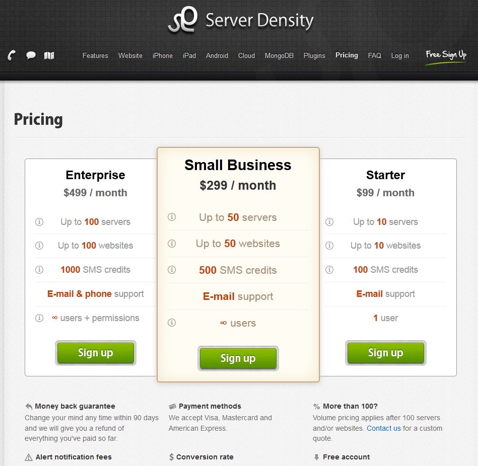
A few differences in this pricing that the author points out:
The minimum buy-in is now $99. This helps ensure that customers are serious and willing to pay. If you mark your price too low, you’ll run into a couple of problems. The first is that some of the low-paying customers are not very profitable, and you may lose money on them.
It’s okay to lose money or break even on some products and make up for it with other offerings, but if there is only a loss, it’s obviously not good for business. Sony famously lost money on every Playstation 3 console they sold but recovered the costs on each video game sold. The Playstation 4 will be profitable, probably due to the pressure of Sony’s consistent financial losses for the past few years.
The second problem is that some of the low-paying customers may not be serious. They may not pay their bills on time, and the effort and output you put into their account may not be beneficial since you could be concentrating on bigger accounts. It could end up being a zero sum game or worse.
In short, sometimes it’s not worth putting a large amount of effort into a customer if you’re making very little money from it. If people really want your product, they’ll be willing to pay more than $13 a month for it.
The pricing is simplified. Instead of balancing between servers and websites, you just choose a plan that fits.
Results:
Original pricing:
150 free trial signups off of 2161 visitors, a 7% conversion rate
New Pricing (Plans):
113 free trial signups off of 2153 visitors, a 5% conversion rate
At the end of the trial:
Original Pricing:
23 credit cards added off of 2161 visitors, a 1% conversion rate
New Pricing (Plans):
18 credit cards added off of 2153 visitors, a .8% conversion rate
Revenue (where it really matters):
Original Pricing:
$420 monthly revenue added off of 2161 visitors, ~$0.19 a visitor
New Pricing (Plans):
$876 monthly revenue added off of 2153 visitors, ~$0.41 a visitor
While the original pricing got more trial signups and credit cards, the new pricing won where it really matters – the company’s bottom line.
The Big Takeaway:
When in doubt, simplify.
Let’s say you run a SaaS company and one of the visitors to your website is named Bob. Bob loves everything he has heard about your company and what you offer fits his needs. He’s interested in using your service and wants to sign up but cannot figure out the pricing. He won’t contact you because he’s afraid of receiving a sales pitch. So, instead, he gives up and signs with one of your competitors that offers simpler, clearer pricing.
Keep pricing simple and don’t give the biggest discounts to the customers that have the fattest wallets and the most money to spend.
2. 75% Discount Increases Sales 1470% and 548% More Revenue
Valve develops and sells video games, one of them being Left 4 Dead. On a weekend in February 2009, Valve had a sale on the game. They typically don’t run sales, believing that too many price changes confuse and anger customers. But this sale was wildly successful.
While the details are a little vague, it appears that Valve had one or multiple sales over the holiday season. Their sales figures for these sale(s) were as follows:
10% sale = 35% increase in sales
25% sale = 245% increase in sales
50% sale = 320% increase in sales
75% sale = 1470% increase in sales
One Hacker News commenter figured the revenue increase broke down as follows:
10% cut = 22% increase in revenue
25% cut = 159% increase in revenue
50% cut = 110% increase in revenue
75% cut = 293% increase in revenue
This sale led to a combined 584% increase in revenue!
The Big Takeaway:
It’s clear that discounts increase sales; this has been well established. However, be sure to proceed with caution if you decide to discount. There can be a downside to discounting too much or even once. If you discount only once, know that customers will ask for more. Apple is a company that rarely discounts their products. Even if they do, it’s not well publicized (with the exception of Black Friday 2012).
There’s the obvious disadvantage for brands that discount – customers will shop with you only when you have discounts. A company like Kohl’s is always running a promotional discount. Many of their customers likely shop because they see a discount, even if the discounted price actually is equal to the retail price of a retail store like Target.
Other companies not like Kohl’s offer discounts at seemingly random intervals. In this scenario, customers are more likely to shop only when they get a discount. They might “wait” until you have another sale.
The other big issue with discounts is customers may ask for them even when you’re not running any. This can happen with brands that run discounts and those that don’t.
The main lesson: Tread carefully when discounting. It can boost sales temporarily but lead to issues after the discounts are final.
For more on discounting SaaS products, check out this post.
3. Removing Drop-down Menu Increases Revenue 56.43%
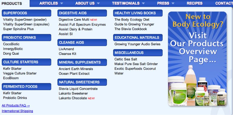
Body Ecology is an e-commerce store that sells diet products. They employed a drop-down menu to help narrow down the customers’ choices:

Notice that the drop-down menu gives only text links to products. It doesn’t display a picture of the product.
Body Ecology wanted to see if removing this drop-down menu and replacing it with a products page would increase order conversion. This is the replacement:

And a comparison:

The product page beat the drop-down menu by 56.43%, resulting in a total increase in revenue of $8,880 over a two-week period.
At the time of this writing, Body Ecology has restored their drop-down menu but included a link to their product overview page:
The Big Takeaway:
Providing more succinct details (in the form of pictures and text) is a step forward for user interface.
Typically, the most beautiful websites communicate with gorgeous, descriptive pictures that people can just stare at and “take it all in.” Pictures are shown in great detail and consume a large portion of the webpage. Websites with pictures also seem to be easier to navigate. You just look at something and say “I want that” and click on it.
This case study shows the power of pictures. It also helps to have descriptions next to the picture to tell the story. Body Ecology’s product overview page also includes descriptions for each category of product, helping the user navigate to find just the product they are looking for.
4. Making Four Key Changes to this E-commerce Website Increased Revenue 300%
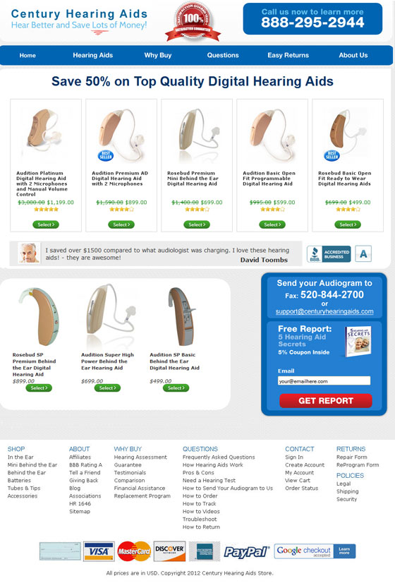
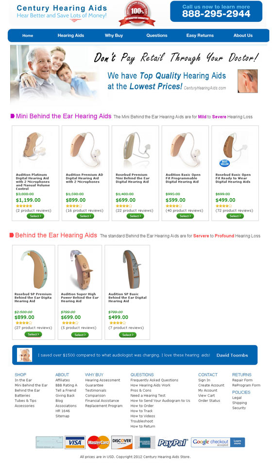
Century Hearing Aids was suffering from low conversion rates. This was their homepage:
One of the first mockups they made looked like this:
There are many small changes, but we’ll focus on the four that are highlighted in the article:
Establishing Trust
Some highlights of the changes:
Minimal Design – The subscription form was removed and the main focus was changed to filtering visitors to the products they’re interested in. Now, visitors can select from “In the Ear” to “Behind the Ear” and “Open Fit.” This is a significant upgrade over viewing random uncategorized products.
Image above the fold – The new image shows an older man being able to hear his family. It is a little bit of a cheesy stock photo, but it relates to the visitors (who are likely 55+).
Show off quality – Despite being small, hearing aids are full of technology and they can cost in the thousands of dollars. This can be quite an investment, and hearing aid users want to be sure they are getting a quality product. (They don’t want to pay $900 and have the piece break 3 months later.) With the new design, Century Hearing Aids added the headline:
“Don’t Pay Retail Through Your Doctor! We have Top Quality Hearing Aids at the Lowest Prices!”
They didn’t want to emphasize discounts because that could make the products seem like bargain basement hearing aids. Using the words “Top Quality Hearing Aids at the Lowest Prices!” signals that they have quality hearing aids at good prices. It may be only words, but combining those two signals (quality products and low prices) together shows people that Century Hearing Aids might be a good place to put their money.
Adding Number of Reviews – In the first page, the only review shown was how highly it was rated. In this new page, they added the number of reviews, something that helps with social proof.
Restoring Bigger Selection
Century Hearing Aids had removed their “in-the-ear” hearing aids because they had low profit margin. Some customers coming from a PPC were searching for “in-the-ear” but unable to find any, leading to conversion issues for Century Hearing Aids. After adding these products, they experienced a significant boost in revenue and profit.
Optimizing Traffic Source
Previously, the company was not bidding on the best keywords. They were bidding to get traffic rather than to get people intending to buy. They adjusted the keywords to target more buyers.
Adjusting Visitor Flow
The new homepage doesn’t show products, but, instead, categories of products that people can select; then, they can narrow down their selection from there. The new homepage:

Clicking on one category lets the visitor view products:

These changes over a period of four months improved conversions by 220%, revenue by 300%, and profits by 3,000%.
The Big Takeaway:
Periodically, give your site a thorough audit and patch any weaknesses. It’s an effective tool for conversion rate optimization.
It’s easy to get too zeroed in on something and lose sight of the big picture. This is why it helps to take a step back and look at your business from a bird’s eye view, surveying the total operation. This case study provides a lesson that “plugging holes” in your business can impact your bottom line.
Find out why customers aren’t buying and cover those holes. Thoroughly examine your marketing programs and see if they’re effective and how they can be improved.
Business owners think that “if I just buy this product, then my revenues will double.” But, often, it’s beneficial to first look at your business and see what needs attention. Answering questions like these can help:
- Why don’t some customers buy?
- Where do people drop off in their visits on my website?
- Do people know how to use my website? How do they feel about it? Do I need to get some insight?
- Are the keywords I’m bidding on consistent with intent to buy? Or are they vague?
- Do visitors feel safe ordering from my business? How can I build trust?
5. Responsive Design Adds 188% in Revenue
Think Tank Photo (TTP) makes equipment and accessories for photographers. After seeing more and more of their visitors come from mobile devices (13% of all traffic, a 3x increase from the previous year), they decided to implement responsive design.
After implementing responsive design, transactions from mobile devices increased 96% from the previous year. The mobile users browsed more pages (page views increased 224%), and revenue increased 188%.
The Big Takeaway:
Taking design advantage of users on mobile devices improves their experience, which can increase revenue.
But there’s an overarching idea here, and that’s consistency. What is important is consistency among brand experience and a consistency of excellence. Take Apple products for instance. Each product has the same look and feel, which delivers a consistent experience of excellence.
It’s the same with the web – you want the same experience using a mobile device that you have using your computer. You shouldn’t have to experience a worse design because you’re on mobile. This is why, I hypothesize, that many brands using responsive design see an increase in engagement and an improvement among all the KPIs. It’s the consistency that people experience and the usability that makes the difference.
If you’re looking for more evidence that responsive design improves your bottom line, check out this article.
6. JetBlue Used These Emails to Achieve 1,640% Higher Revenue than Plain Promotional Emails
JetBlue took inspiration from online retail with their new email marketing program. You see, online retail companies have achieved success by sending “trigger emails” when a visitor puts products in a shopping cart but then doesn’t finish the purchase. So, with JetBlue’s new campaign, they send emails when visitors don’t finish booking a flight on the JetBlue website.
Before blindly sending trigger emails, the team at JetBlue first considered a few things and answered some questions:
1. How will this impact the brand?
Some trigger emails can be too invasive if they give the entire browsing history of the visitor. Others don’t give enough information (aren’t personalized) and don’t make the email very clear because of this. JetBlue wanted to get it just right, so they avoided the two extremes and stuck with giving a “medium” amount of information.
2. What are the email goals?
The two messages JetBlue wanted to get across were booking abandonment and some key attributes of the JetBlue brand. The two goals they settled on:
- Encourage visitors to return to JetBlue’s site to finish booking
- Encourage visitors to join or log in to JetBlue’s TrueBlue loyalty program
3. What drop-off areas will trigger the emails?
With online retail stores, if a customer leaves products in the shopping cart and doesn’t return for a couple of days, they’ll get an email asking them to finish their order. So what will trigger the JetBlue emails? The team identified four drop-off points that will trigger an email:
Flight selection – If a customer leaves a page after seeing available flights for a specified departure and arrival city
Seat selection – If a customer chooses a flight but leaves the seat selection area
Ancillary – If a customer leaves a page after seeing additional services like car rental and hotels
Payment page – If a customer closes a page when JetBlue asks for payment
JetBlue sends these emails to visitors who are subscribers of their mailing list.
4. What will the email design look like?
Instead of generic emails sent to all visitors who dropped off at the same point, JetBlue created four designs based on two attributes of the audience. The two attributes:
Attribute 1 – The visitor’s destination
If JetBlue knew the visitor’s destination city, then the email mentioned the city in the subject line, headline, and text.
If JetBlue didn’t know the destination city, then the email was generalized. In all of these emails, the top half of the email listed the benefits of flying with JetBlue and it included a CTA for the person to book the flight.
Attribute 2 – Loyal Membership Status
The bottom half of the email featured information on JetBlue’s TrueBlue loyalty program. If the visitor was a member, the bottom half of the email would feature:
Headline: “The Benefits of TrueBlue”
Bullet points listing the benefits
“Learn More” button that directs the user to more information about the program
If they were not a member, the bottom half of the email would feature:
Bullet points listing the benefits
“Join Now” button linked to the TrueBlue page
One of these headlines:
“Join TrueBlue and Earn Points on Your Next Flight to <If JetBlue knew the destination city, they’d enter it here>”
“Join TrueBlue and Earn Points on Your Next Flight” <If JetBlue didn’t know the destination city>
These emails earned 150% higher open rates, 170% higher CTR, and 200% higher conversions than JetBlue’s standard promotional emails. These emails also generated 1,640% more revenue.
The Big Takeaway:
Relevant, personalized emails perform better in all areas than generic emails.
People’s inboxes already are flooded with generic emails. Few (if any) address them in a personalized way in the subject line. Trigger emails help make emails ultra-personalized.
Everyone has their limits (their personal bubble) on what constitutes an invasion of personal privacy. This is why it’s crucial to hit the right amount. If you’re too personalized in what you reveal in the email, it’ll be a big turnoff for people. Worse, they might tell others that you run a “creepy” business. Err on the side of caution with these emails.
The emails shown above can give you some ideas for getting started with trigger emails. Here are a few more tips for personalizing emails and optimizing open rates, CTR, and ultimately conversion:
-Use first name in subject line. Say something like:
<Name> we lowered prices on <products they recently searched for>
Or:
Hey <Name>! Check out best sellers in <product category they recently viewed>
Or:
<Name> – Check out our new articles on <subject area they recently viewed on your site>
The key is to not be redundant. Don’t have every email show their first name and don’t have each one show the same subject line sentence. It gets to be a little robotic, too automated, and non-personalized.
-Mention a product category they recently viewed in the subject line.
See what’s new in <product category>
Check out our new feature in <product feature they use>
<Discounted price on product viewed> this weekend only!
If you use Facebook Connect, you can mention someone they know in the subject line. You’ve probably noticed LinkedIn frequently does this with connections and Facebook does it if a user has been inactive. Messages with the following types of subject lines should convert well:
See what your friend <enter name> bought on <enter store>!
<Enter friend name> just gave a review on <any product reviewed in ecommerce>
<Enter friend name> just <did important action>
Use a CTA in the message.
Subject line: We need your feedback on <product category or feature they recently used>
Message:
We need to know how we’re doing in <product category or feature they recently used>. Please answer this one question:
What is the one thing holding you back from purchasing <item in product category or entire SaaS product>?
<Checkmark box> Price
<Checkmark box> Don’t know enough about the product
<Checkmark box> I don’t know enough about your business
Subject line: How was the speed (or other top issue of your e-commerce or SaaS product) of <enter business>?
Message:
Hey <name>!
We were curious about how the <speed, other issue> was in your recent visit. Please let us know by selecting an option below:
<option>
<option>
<option>
Subject line: Tell us the one thing we can do to improve your experience
Message:
<name>,
We’re always working on making a better product, but we can’t do that without feedback from customers like you. Please let us know how we can make the <enter company name> experience better for you:
<Text box>
<submit button>
The CTAs may not increase revenue in the business, but they keep the relationship between the business and the consumer close. Many companies send out emails every day asking readers to buy a product or perform a certain action that benefits the business. Few actually stop and ask for feedback. Doing this may help improve brand image.
7. Ad Retargeting Increases Revenue 106%
Corel Software has employed retargeted ads in the past and experienced success with it. But they wanted to see if they could make it even more effective, so they tried something called Hyper Retargeting. Here’s how they implemented Hyper Retargeting:
Step 1: Make sure your site will work with hyper retargeting
Retargeting works only with customers who visit a site a number of times in the buying cycle. It’s not for websites where the customer visits once and makes a purchase (i.e., ordering a pizza). Retargeting reminds the customer to come back and visit the site.
Step 2: Map the buying cycle
For each product you want to promote, answer these two questions:
- How long does it take the customer to sign up after their first visit or to make a purchase?
- How many times does the customer visit your site before purchasing?
Then figure out the steps the customer goes through before they make a purchase. For example:
- They visit your homepage without bouncing (staying for 25 seconds)
- They sign up for the trial
- They continue with the purchase
Step 3: Segment your audience
After getting the steps, then you can segment the audience. For example:
Segment 1 – The prospects visited your homepage without bouncing
Segment 2 – The prospects signed up for a trial
Segment 3 – The prospects continued with the purchase
With segments 1 and 2, you can target them and send them messages encouraging them to take the next steps.
You don’t want to flood your audience with ads. You want to find the optimal time that corresponds with how long they’ve been in your buying cycle. For instance, you can segment the prospects by the following time periods:
- 0-7 days – prospects are shown the most ads
- 8-15 days – prospects are shown a modest number of ads
- 15+ days – prospects are shown a few ads
Step 4: Create the ads
Each ad must correspond with where the prospect is in each step. Corel Software recommends that, at any one point, “you should have at least one A/B test going for each one of your audiences.”
These are ads they used to get visitors to sign up for a free trial.
These are ads they used to get visitors to buy a product.
Over 30 days, from a year-over-year perspective, the revenue has increased 106% by implementing hyper retargeting.
The Big Takeaway:
Just because a visitor has left your page doesn’t mean you’ve lost the sale. And you can improve the odds of converting that visitor into a customer by implementing retargeting. People visit a lot of websites every day, and some of them leave with the intention of coming back (thinking “this is good, I’ll come back later”) but end up forgetting.
Ad retargeting (and hyper retargeting) helps remind the visitor of their visit in hopes they’ll come back. And as this case study shows, it’s typically very successful in bringing visitors back and converting them into customers.
Ad retargeting can stretch beyond SaaS and e-commerce. Even content sites can use it to increase page views and visitors. If, for example, you run a site like Bleacher Report and see a visitor browse your NFL page, you then can send the visitor ads related to your NFL page. The ad can show the latest NFL news and/or enticing headlines that make the NFL fan want to click and view the story. You can even take it a step further and notice if the viewer visits a specific team page, and then retarget them with ads that contain stories about that team.
Bonus!!
Here are two bonus articles. They don’t give revenue increases (if applicable) but provide good insights.
Keeping Lower End Plan and Higher End Plan Prices Close May Increase Orders for the Higher End Plan
Sacha Greif wrote an eBook on UI design. His case study was featured on Jason Cohen’s blog. Greif did his due diligence on pricing and ultimately settled on:
Normal Edition: $5.99
Deluxe Edition: $12.99
At book launch, Greif gave a discount of around 50% on both the normal and deluxe edition. This made the price for the normal edition $2.99 and the deluxe edition $5.99. Greif submitted the book to Hacker News, and, at its peak, it achieved 2nd place and garnered 22,000 visits in one day. The book sold 1,476 copies and earned $6,663 in revenue in the first 48 hours. Why was this pricing such a success? One Hacker News commenter notes:
“For me the pricing model is perfect for something like this. $2.99? That’s right in my ‘don’t even think about it’ impulse range. $5.99 for additional features? I’m already paying $2.99. It’s not much more AND I get more stuff. Bravo!”
The Big Takeaway:
Closely tying the low-end pricing to the high-end may increase signups for the high-end.
In salesmanship, there’s something called suggestive selling. If the customer is buying a product, let’s say a cell phone, the salesman may suggest the customer also purchase a car charger to go along with the phone. The customer’s internal dialogue may track along these lines:
“Well I’m paying $550 for this new phone. What’s the big deal? It’s only another $30. Plus, I’ll get to charge my phone on the go. Yeah, let’s buy it.”
And they utter:
“Okay, I’ll take it.”
And just like that the store earned another $30 simply by suggesting another product. Suggesting only the car charger (without any other purchase) may decrease the chances of earning a sale. It’s all about perspective. The $30 itself may seem expensive for a car charger, but when placed next to the excitement and price tag of a new phone, it’s almost a no-brainer.
The above eBook case study isn’t exactly the same as suggestive selling, but they are pretty similar. It’s like the salesman saying:
“Instead of buying the normal edition of my book for $2.99, why not get the deluxe edition for $3 more? It comes with much more content.”
The customer thinks:
“I’m interested in this book and think I could learn from it. The normal edition is $2.99, so what’s another $3? I’ll get the best edition since it’s only a few dollars more.”
So next time you’re formulating your pricing, take a moment to think: “How big should the pricing gap be between each plan? Should I keep the pricing close together or separate them?”
The $300,000,000 Button
A popular anonymous e-commerce company (some have theorized it’s Best Buy) increased revenues by $300 million just by changing a button.
After customers put products in their shopping carts and hit checkout, they’d run into a simple form.
It had two fields (email address and password), two buttons (login and register), and one link (forgot password), so lack of simplicity wasn’t the issue here.
The issue was that people did not want to register. One person shopping the e-commerce store said, “I’m not here to enter into a relationship. I just want to buy something.” For consumers, registering means entering into a relationship that’s difficult to get out of.
Even return customers didn’t care for the form. Many couldn’t remember their email address and password combination. The form had good intentions, but it was blocking a lot of sales.
So what was the fix?
Removing the Register button and replacing it with a Continue button. The Continue button had this accompanying message:
“You do not need to create an account to make purchases on our site. Simply click Continue to proceed to checkout. To make your future purchases even faster, you can create an account during checkout.”
Results from this simple change?
A 45% increase in customer purchases that equaled a $300 million increase in revenue in the first year.
The Big Takeaway:
Not every consumer wants to be in a relationship with every e-commerce store where they shop.
People are rightfully skeptical of registering or giving email addresses out to businesses. Many consumers work around this by having a second “just for spam and newsletters” email address. They register for sites using this second email address so all contact goes through that email and doesn’t go into their personal email.
Many consumers resentfully sign up and hate receiving newsletters. I myself have had people say to me “I get all these newsletters that I just don’t care about. When I try to delete my name from their list (unsubscribe), it never works or it’s too confusing.”
It’s these low quality newsletters that send people away and drive the resistance to registering. Many companies now let users proceed with a purchase without having to register. This is a step in the right direction and one that more companies should adopt. Knowing customers’ fears and pain points is a positive.
Final Thoughts…
The one thing all of these case studies did was either improve user experience or make a product a better deal for customers. The user is the ultimate decider.
Let me know your feedback on this post by commenting below.
Replicating these tests certainly does not guarantee that you’ll achieve the same revenue improvement, but there’s no harm in trying.
Happy testing!
About the Author: Zach Bulygo (Twitter) likes marketing, finance, and learning about different businesses.
Comments (20)