Blogging is one of the most powerful marketing strategies I know of.
It’s great for building authority, ranking on Google, and, of course, lead generation.
But you can’t just set up a blog and assume it’ll do all the hard work on its own. That would be awesome, but it just doesn’t work like that.
If you want to have an awesome blog, you need to spend some time making it awesome.
Today, I want to talk about getting leads through your blog.
Blogs can be amazing for lead generation.
Just check out this case study where one blogger increased leads by 250% using blogging.
Blogs can engage your audience with comprehensive content that brings a ton of value to the table. And that can turn your readers into customers.
But there’s a problem. Most B2C blogs don’t get very many leads.
I’ve had so many people ask me, “Neil, why isn’t my blog converting anyone?”
I’ve seen this happen thousands of times, so you’d think that there are thousands of reasons why blogs don’t convert.
In reality, there are only a few reasons.
So if your blog isn’t getting any leads, it’s probably because of one of these 4 reasons. Let’s jump in and see why your blog isn’t giving you the results you want.
1. You’re trying too hard to get leads
Some blogs actually try so hard to get leads that they turn people away.
Often, this is because there are too many popups.
First off, let me say that I’m a big fan of popups. They work super well if you use them right.
But many blogs don’t.
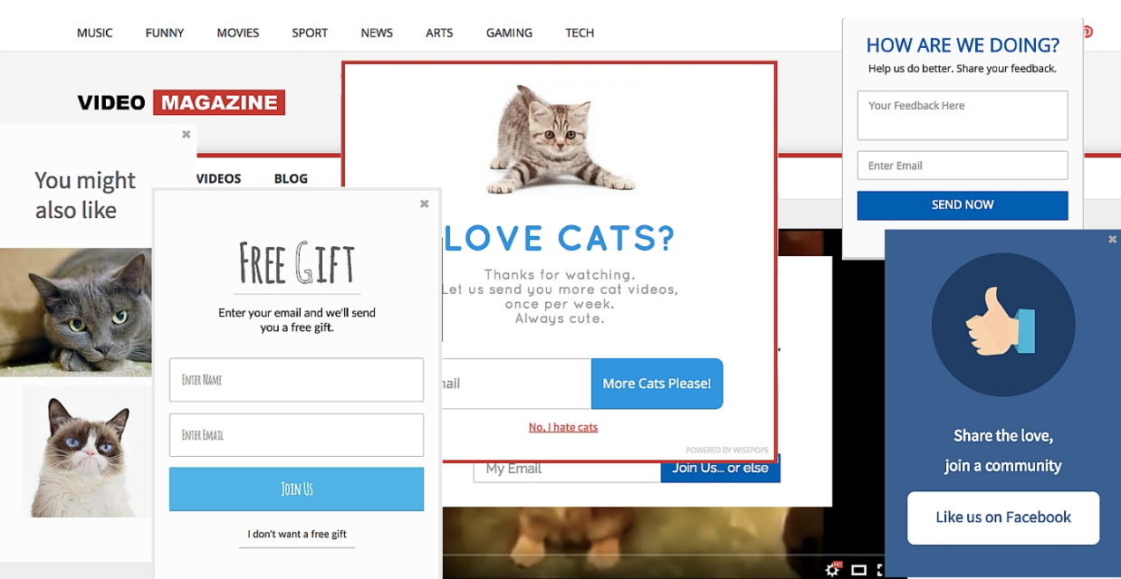
How many times have you seen blogs that look like this?
It’s way too much!
It doesn’t want to make you visit the blog again or even stay on the page.
This page is working too hard to try to get your attention and convert you.
But it just results in confusion and annoyance. What are you supposed to do first? There are so many popups that it’s distracting.
This is a great example of how not to use popups.
Or maybe you go to a site and see a popup immediately, even before you see the content!
This Authority Hacker article showed me a full-screen popup before the header image even loaded. I couldn’t see any of the content without clicking out of the popup.
Ironically, the article is about popups. Go figure!
It’s a heck of a lot better to use fewer popups and to use them strategically.
There are two types of popups that I recommend: The exit intent and the Hello Bar.
You know when you’re about to leave a site and then get a popup? That’s what an exit-intent popup is.
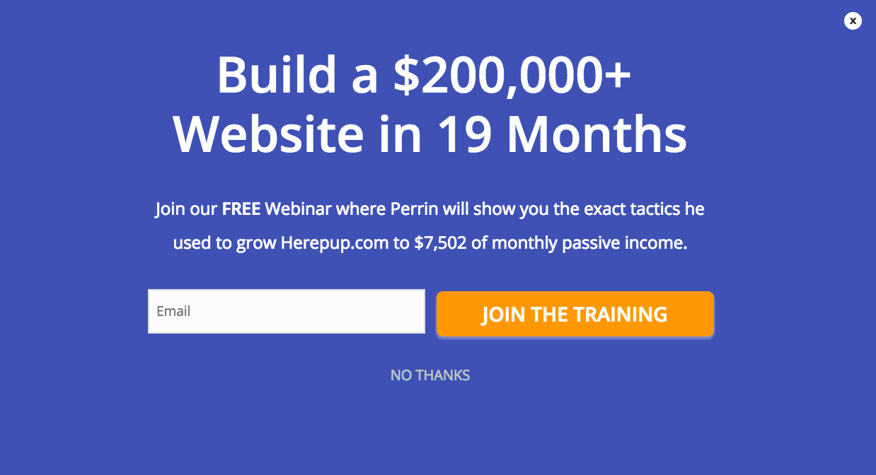
To see what one looks like in action, go to my blog homepage in an incognito window. Then move your cursor out of the page like you’re going to close it.
You’ll see a full-screen popup.
This converts extremely well and there are a few reasons why.
First, it offers value.
If someone’s leaving my site, I need to give them something valuable in order for them to stay.
So I make a specific offer that’s packed with value. In this case, it’s a free webinar.
You need some sort of amazing offer or else your visitor will close out the page and possibly never return.
The second reason this works is that it’s impossible to ignore.
Lots of sites use smaller exit-intent popups, but sometimes people can miss them because they’re small.
Using a full-screen popup like this makes sure that everyone sees it. That increases your chances of converting your visitors.
Finally, exit-intent popups just work.
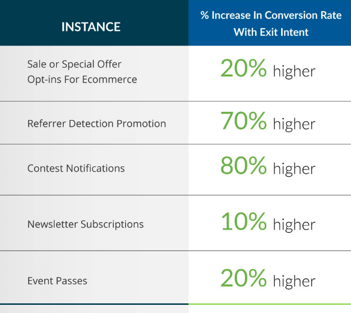
All kinds of businesses in all different niches use exit-intent popups and generally, they convert really well.
The other kind of popup I use is the Hello Bar.
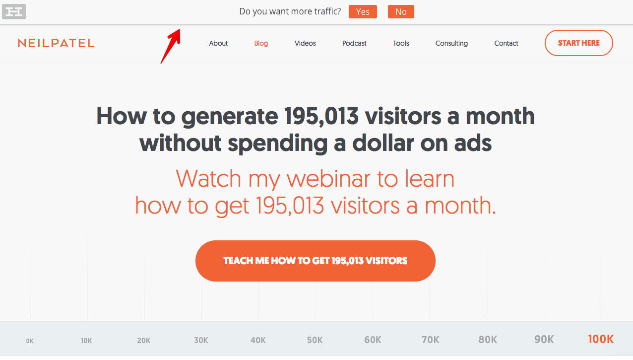
You’ve probably noticed this at the top of my website.
It’s a small horizontal bar that captures emails.
Even though this is always on my site, that’s okay because it’s smaller and not annoying. It just sits at the top, and it doesn’t beg for you to click on it.
I make sure to use the popup to engage with my readers by asking a question. This has also converted well even though it’s much different than an exit-intent popup.
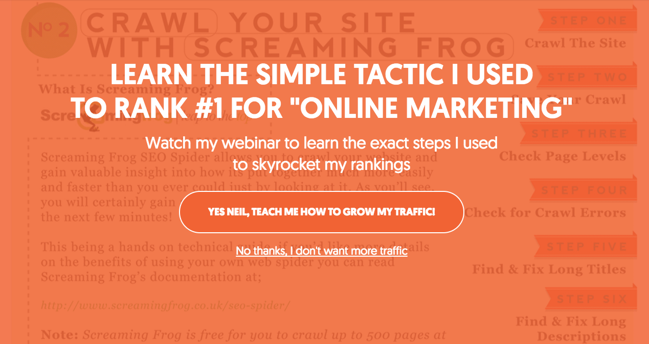
Other sites use the Hello Bar differently. You can set it up to ask for the visitor’s email right away.
That’s what’s great about the Hello Bar. There’s no one right way to use it. You can try out different things and see what works for your site.
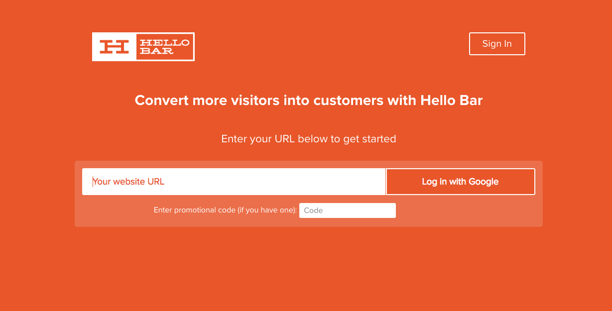
All you have to do to get started is go to HelloBar.com and enter your URL into the bar.
It’s a free tool, so you can start using it today and have it up and running in a matter of minutes.
These kinds of popups won’t bother your users and they’ll make your site look a lot nicer, too.
2. Your content is lacking
The foundation of every good blog is content.
Which means that if your blog isn’t generating leads, the content is most likely the problem.
Take a step back and be honest with yourself. Is your content solving problems for people? Is it giving your readers new and useful information?
Don’t feel ashamed if you find out your content is so-so. It’s easy to improve it and I’m going to show you how.
First, I’ll cover some common mistakes that people make.
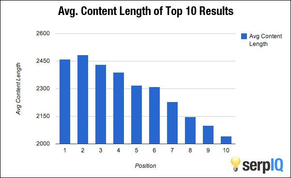
Lots of blogs publish content that’s just too short. I’ve found that if you want to create super valuable content, you need to write a lot.
On average, the top 10 results in Google are all long-form content pieces:
Yet I still see lots of blogs that are only publishing a few 500-word articles a month.
If you want your content to be good for SEO and convert your readers, you have to go long form.
Backlinko found that, on average, the first Google result is 1,890 words long.
However, I’ve gotten great results with super long-form content. I’m talking about articles that are more than 3,000 words long.
Your content doesn’t have to be that long, but you should get used to writing long-form blog posts.
If you don’t have a lot of writing experience, don’t worry.
It took me a long time to write well. I’m dyslexic and I never took any writing classes. But I kept at it, and now I think I’m a pretty good writer.
As long as you keep writing and keep looking for ways to improve, your blog will become better and better.
Another big problem I see with content is a lack of depth.
There are so many articles that are basically overviews of a topic. I don’t know about you, but I don’t want to read those. I want to read content that goes deep.
I’ve even seen 2,000-word articles that just gloss over the topic.
Length doesn’t matter if the content itself is shallow. So you could potentially waste your time writing these huge articles if you’re not diving deep into the topic.
Basically, that means covering as many relevant topics as possible.
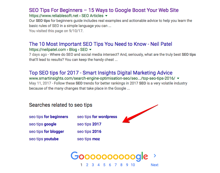
There are many ways to find topics, but one of my favorites is to use the “searches related to” section of Google. It’s all the way down at the bottom:
But you also need to have comprehensive coverage of those topics.
In short, write about as many connected topics as you can and go deep into each of those topics.
It sounds like a lot, and it does take some time to get down, but it’s so worth it.
And while you’re at it, you might as well optimize your content for SEO.
3. You don’t have a compelling lead magnet
This sounds obvious, but you have to give your users a good reason to convert.
Are you doing that right now?
If you’re just asking for an email without anything in return, you’d be lucky to have anyone convert.
Lots of blogs do this and it’s a big mistake.
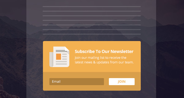
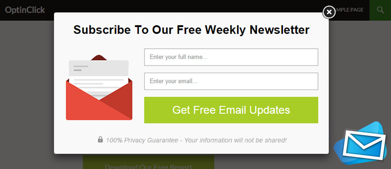
I bet you’ve seen lots of generic email opt-in forms like this one.
The problem? There’s not a compelling reason to convert.
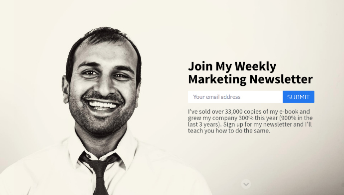
Now compare this to Sujan Patel’s spin on the “join my newsletter” opt-in.
Normally, I think this kind of approach can be boring, but Sujan nails it. He gives you a reason to join his list.
You need to offer something valuable if you want your readers to convert.
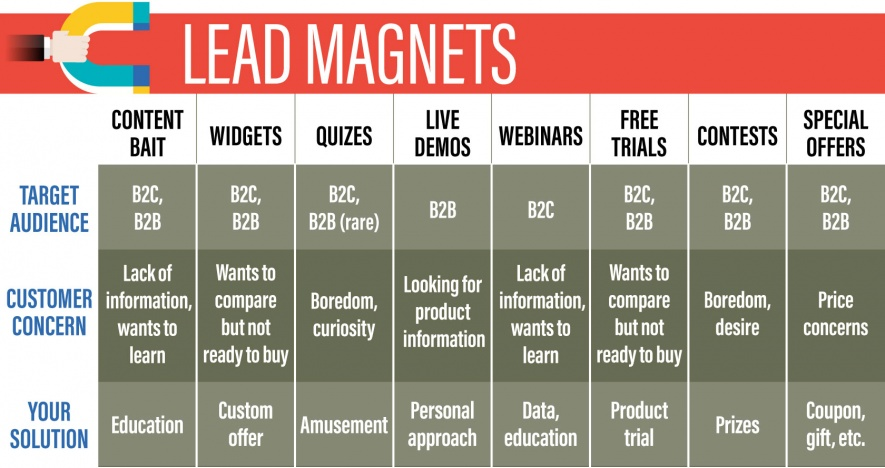
I’m talking about a lead magnet.
Your lead magnet is the content or information that persuades readers to convert.
In the example above, Sujan uses his newsletter as a lead magnet.
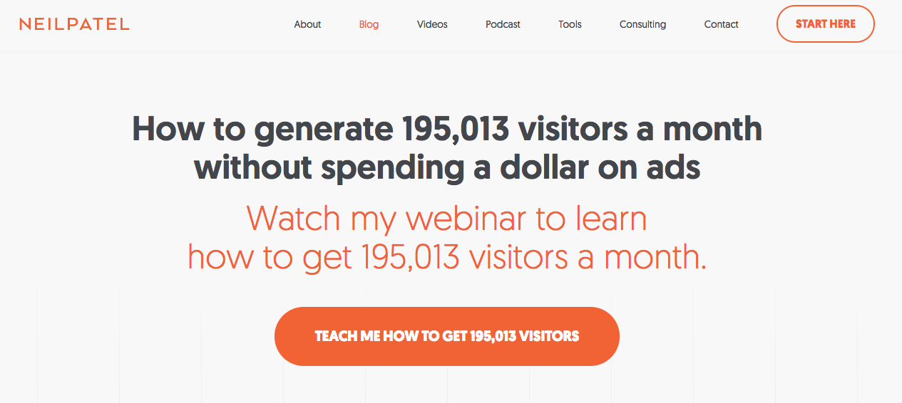
Personally, I use a webinar as my lead magnet.
Lead magnets can convert like crazy and bring in hundreds of new leads every month.
But you can’t just throw a lead magnet onto your site. You have to find the right lead magnet for your audience.
If you use the wrong type of lead magnet, you won’t get conversions.
You need to figure out what kind of information your audience wants. Then you have to build a resource that gives them a ton of value.
I’m a big fan of creating custom lead magnets that are based on your audience’s interests and needs.
I use a webinar because I know my audience is after lots of deep content.
Will a webinar work for everyone? Absolutely not.
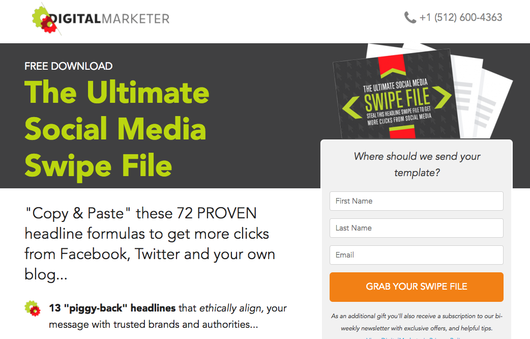
Digital Marketer created an Ultimate Social Swipe File that contains 72 headlines written specifically for social media use.
Why didn’t they go with something like a webinar? I’m guessing they found that their audience liked much shorter content, and there’s nothing wrong with that at all.
Your perfect lead magnet is what your customers want.
So reach out to your audience. Survey them. Get inside their heads, and then give them the perfect content for them.
4. Your opt-in form isn’t cutting it
Even if you have an awesome lead magnet, you still might not get the number of leads you want.
If that happens, it’s probably your opt-in form.
Most of the time, bad email opt-in forms are bad because they’re generic.
This isn’t horrible or off-putting, but it’s boring.
It’s also vague. Why should you join the newsletter? What kind of content is in the newsletter? There’s no information here.
Other opt-in forms are horrible and off-putting.
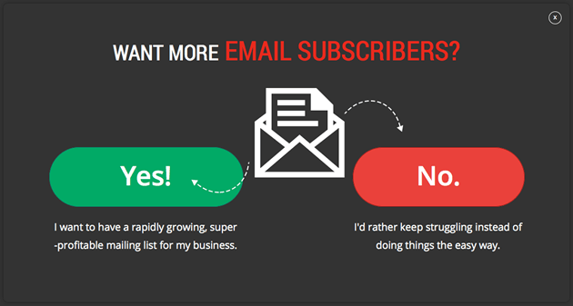
Take a look at this opt-in form.
You obviously don’t want to choose “no,” but you may not be interested in the lead magnet.
This tactic tries to pressure people into getting the lead magnet. As you can imagine, this doesn’t usually lead to high conversion rates.
Even the best lead magnet in the world won’t do anything if the opt-in form doesn’t convert.
You should spend a lot of time figuring out exactly what your opt-in form will say and look like.
To get the best results, your opt-in form needs to have a couple of important characteristics.
First, it should be short. (In most cases, that is.)
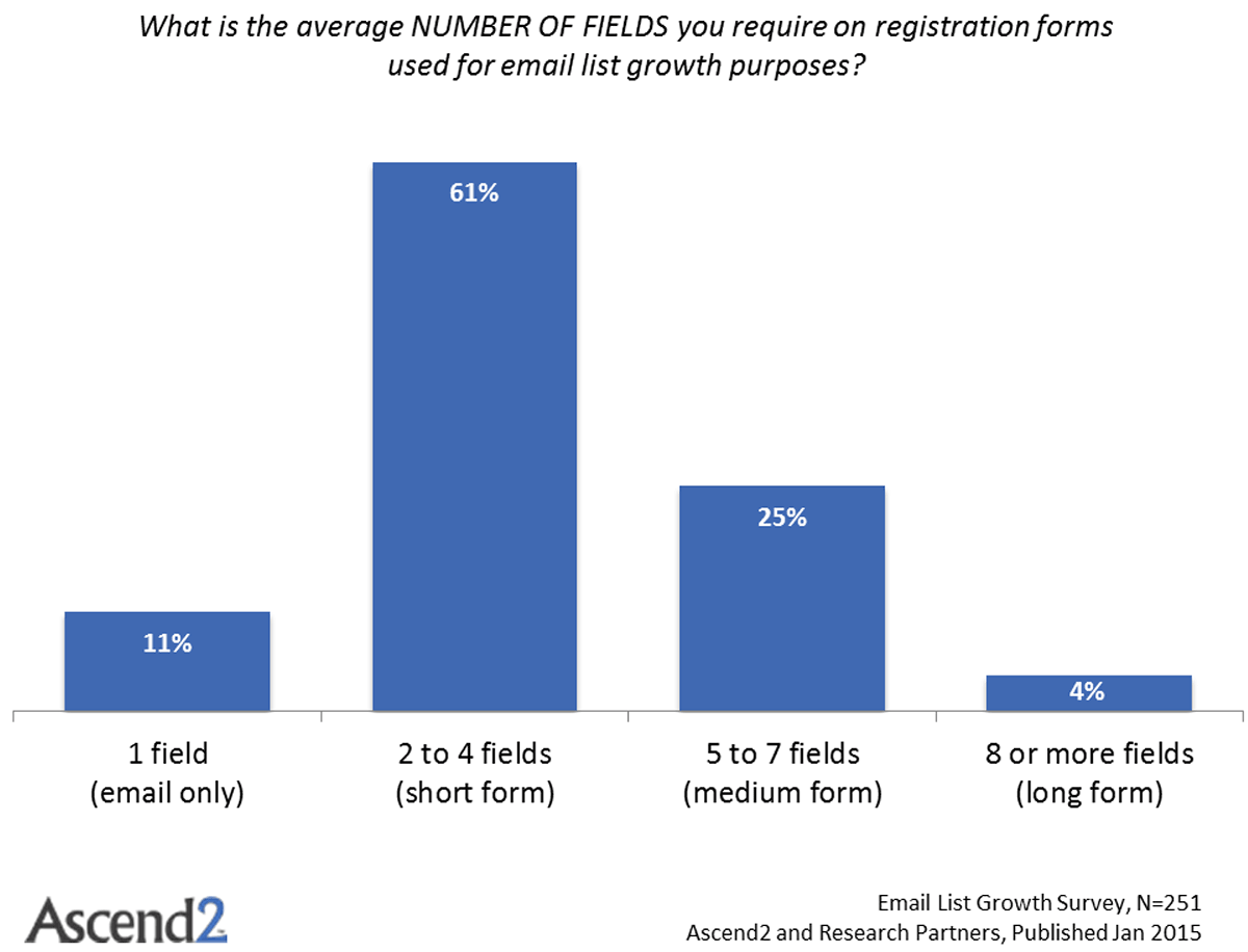
If you’re offering a standard lead magnet like a PDF download, webinar, newsletter, or swipe file, keep the opt-in form to about 2 to 4 fields.
Like I said, this length is fine in most cases.
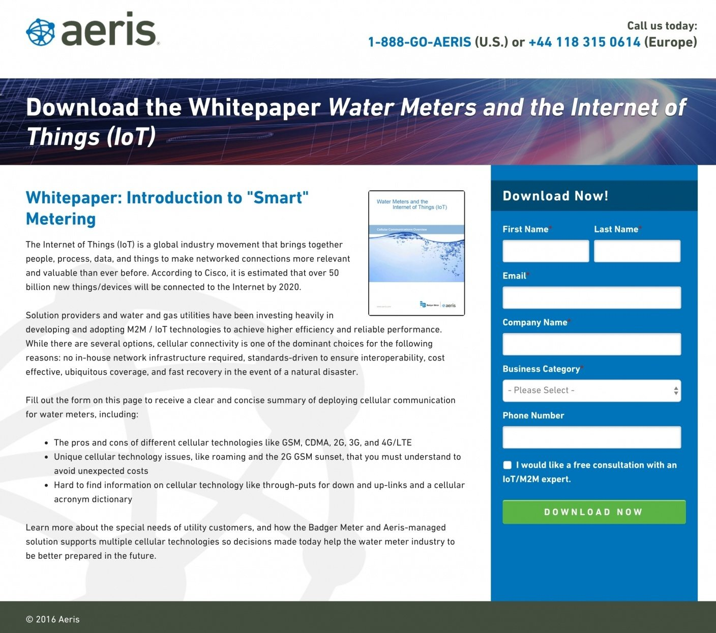
But sometimes, you may want to gather a lot of data. Maybe you’re selling to enterprise clients and want really specific info.
In that case, aim for 5 to 7 fields. That length is the second best for conversion rates (see the graph above).
Here’s an example from Aeris.
It’s definitely longer, but it’s not so long that it’s intimidating.
Notice how the longer form is balanced out by a ton of info. You get super-specific details about the white paper, and that makes you feel like it’s worth your time to fill out the long form.
Second, your opt-in form should be specific.
It doesn’t matter how many fields you have if you don’t tell your readers exactly what they’re getting and why they should want it.
Focus on the value you’re offering. What can you help your customers do? What goals can you help them achieve?
Use language that’s specific to your audience. And don’t talk at them by using lots of salesy words. Keep it conversational.
Don’t forget your CTA either. The right CTA can boost your conversion rates.
It’s much better to use specific CTAs like “Reserve your free e-book” instead of something bland like “Join” or “Download.”
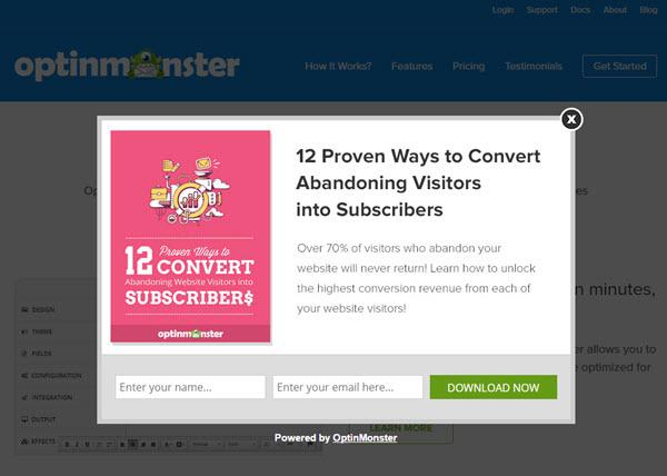
Here’s a great example from Optinmonster:
It’s short (just 2 fields) and specific about what you’re getting. The copy gives you a reason to want the download. If there’s a weak spot in this opt-in, it’s the generic CTA.
So, in summary, your opt-in form should be short and specific. Focus on value and let your customers know that you’re giving them what they want.
It’s also a good idea to regularly A/B test new ideas to see if they convert better.
Conclusion
I’ve been blogging for a long time and I’ve had the chance to learn from some of the best bloggers on the planet.
But my blog wasn’t always a huge success.
In fact, a lot of my failures have been the result of my blog not performing well.
Over the years, I’ve missed out on thousands of leads because my blog needed improvement.
That might be happening to you right now.
If it is, don’t think that your blog is doomed. You can always salvage a blog if you know what to do.
There a lot of important elements that make up a blog and you have to pay attention to all of them if you want to succeed.
It sounds like a lot of work, but it gets easier with time.
And it’s even easier if you start doing the right stuff early on. That way, you won’t have to fix any mistakes down the road.
That’s what happened to me. I made all of these mistakes and had to spend time fixing them. I don’t want that to happen to you.
If you’re seeing low conversion rates on your blog, there’s a 90% chance that one of these 4 reasons is the culprit.
Every month, I see these problems pop up over and over.
It doesn’t matter if the blog is big or small. It doesn’t matter what the business’s budget is. These problems can happen to any blog.
If you’re serious about improving your blog’s conversion rate, start here. Ask yourself if your blog has one (or more) of these issues.
You’ll have to take a cold, hard look at your blog and be brutally honest with yourself. But if you fix the problems now, you’ll start getting lead after lead before you know it.
How is your blog converting? Are you experiencing any of these problems?


Comments (2)