The product page may be the most important page on your website. It’s the point at which the user decides whether they’re buying or walking. And while the shopping cart gauntlet looms beyond, the product page is where the magic of an ecommerce sale begins. The thing with product pages, however, is they’re part basics and part nuance. More importantly, it’s often these nuances that are overlooked, and can kill the conversion rate of your product page.
In this post we look at eleven often overlooked page elements that can be the secret heroes of your conversion success story. Forget these eleven, and you can forget about a website that really drives revenue.
Element #1 – Clear, Differentiated Pricing Information
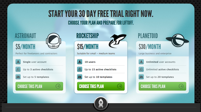
Have you ever checked out a product online and been unsure what the difference between the Silver and Gold plans were? Did Pro seem a little too much like Basic? Without pricing tables or pages that create a clear difference in value between product options you’re not going to sell much of either.
So how does one go about differentiating their product SKUs and service tiers? The most effective methods can be boiled down to a simple philosophy – focus on the benefits, instead of features, and highlight the differences. The best pricing tables allow you to quickly ascertain the value you’ll personally get out of each option, and discern the differences between each, rather than get bogged down squinting at row upon row of checkmarks.
A great example of clear pricing information can be seen at Launchlist – each tier of the service has its own personality, and it’s easy to see the differences between the feature set of each package.
Element #2 – Customer Confidence
Despite the fact that so many transactions are carried out online, the lack of personal interaction in this medium means that even the smallest thing that’s out of place on your ecommerce pages can rapidly erode customers’ trust in your product and business.
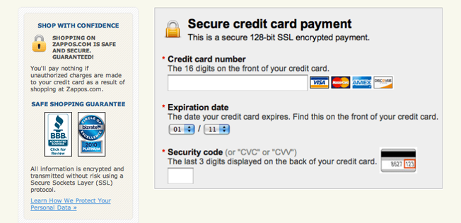
There are many ways to build this trust though, and almost all are fairly easy to implement. For instance, if you use an SSL certificate to secure your transactions (and you really, really should be if you’re processing credit card info), show it! Many consumers know to check for secure web pages when proceeding with a purchase, so they’ll be looking for that all-important padlock icon.
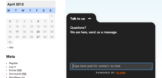
Clearly articulate your refund policy upfront, so your customers can buy knowing that they have recourse if things don’t go according to plan. List an actual phone number and address. Or even offer live chat on your site, to help address pre-sales questions one-on-one.
Finally, set expectations as to when and how customers will hear back from you. It’s a simple thing to communicate, but goes a long way towards preventing people from feeling like they’ve been left hanging, not knowing whether their questions have been received.
Element #3 – Unconventional Social Proof
It’s no secret that social proof helps drive conversions and sales, but it often takes the form of TechCrunch logos and endorsements from celebs or, *gasp*, web-celebs.
Take the road less-travelled with your social proof: use real people in your testimonials and images, skip the logo pond and share one key case study or client anecdote.
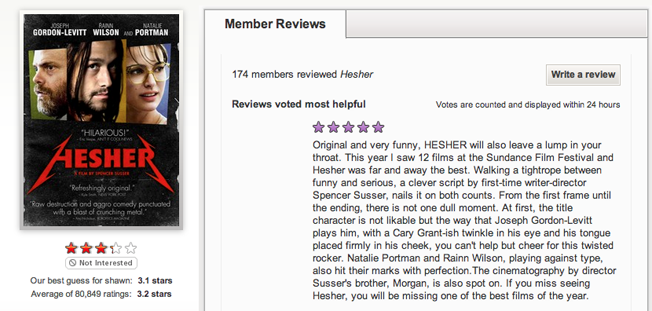
Incorporating social proof into your product pages is a way to complement and reinforce the positive influences on your visitors for a given product. It can take many forms, ranging from customer testimonials, to star ratings, to simply exposing the number of units of that particular product left in your inventory.
Netflix is famous for their movie ratings algorithm, which crowdsources members’ ratings as a whole, and uses it to predict a personalized rating for each subscriber. There’s something undeniably compelling about knowing that a particular movie is likely to be one you really enjoy, based not only on previous movies you’ve personally watched, but also because other members with tastes similar to your own loved it too.
Element #4 – Tell Me And Show Me
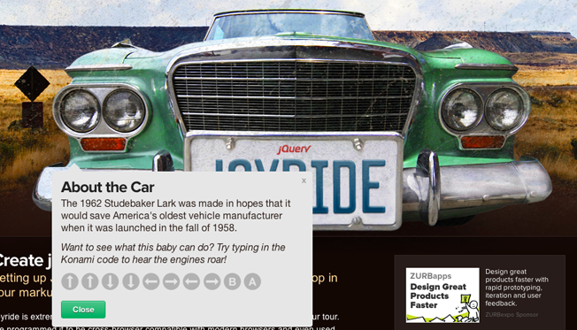
Too many product pages provide too little insight into what the customer is actually buying. This is particularly true of software product pages – if you’re selling a piece of software, show it in action via a demo. The most exemplary cases of this are often seen “eating their own dog food,” i.e. use the function of the product to sell itself.
Take a look at the wonderful product tour for Joyride – a plugin meant for building product tours. Immediately, they’ve communicated the core benefit of their product by using the product’s function itself to demonstrate just how well it helps to guide users through a tour.
Element #5 – Get Ready For Your Close-Up
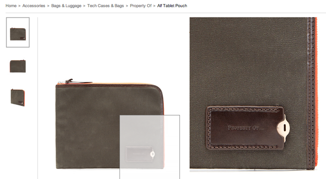
Sure, most product pages have a nice big image of the item in question. But what if you want to see the back of it? The underside? What if the detailed stitching pattern is what’s important to me as a customer? Ask yourself, “How can I get close up and personal with the product to really experience it before I buy?”
Offering a good selection of images for tangible products allows your visitors to get as close to touching and getting familiar with a product as digitally possible. Best-in-class online retailers like Park & Bond, and Fab.com take this philosophy a step further, allowing visitors to zoom in super-close on each of a variety of artfully-shot high-res images for each product.
Element #6 – Choices, Choices, Choices!
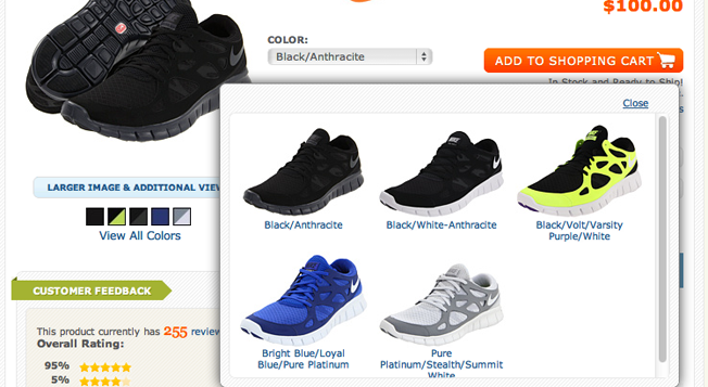
Similar to the point about showing multiple product images, an element that’s often neglected is showcasing variations of a product. For example, is there a version of the product with a special attachment? Do some models come with a telescoping arm, or are there different materials and finishes available to choose from?
Remember that the image(s) you put on your product page are all the customer has to go on when making their decision, so if they can’t view the exact item they’re looking to get, they may have some trepidation in going through with the transaction.
Zappos understands this point well, so they make sure not only to show lots of images of the products (from almost every conceivable angle), but they also show every available color combination for each pair of shoes. They even allow you to sign up for a notification email if you don’t see a particular color combination that you’re looking for – that way, even if they don’t get the sale now, they can at least contact you if they do eventually stock those fabulous neon pink Chucks that you have your heart set on.
Element #7 – Invest In The Writing
One staple of the typical product page is the features and details section. Often, most stores will simply list off points in a clutch of bullet points and call it a day. Yawn.
Rote listings put the burden on the visitor to determine what the actual benefits are of the product in question. You end up making them do the heavy intellectual lifting as the responsibility falls to them to compare and contrast the feature sets of your product with your competitors’.
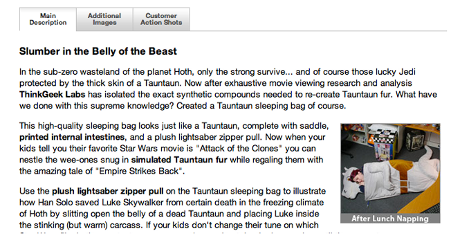
Honing in on the true benefits of your product is more helpful, as it addresses the most important question in the visitors’ mind: why should I buy this? This is accomplished with good copywriting on the product page. A well-written blurb of copy can help make a product stand out, as well as even entertain your visitors.
Don’t believe that the copy is worth investing in? Groupon, with its brain-meltingly huge IPO last year, distinguishes its offers by hiring teams of aspiring comedians to write the copy. Thinkgeek also takes care to infuse each and every product listing with spirited copy that entertains its discerning target audience.
Element #8 – Page Loading Speed
Funny enough, one element that frequently gets overlooked in the design of product pages isn’t even on the page – at least, not visibly. The speed with which a page loads can be a critical determining factor as to whether your visitor lays down their credit card, or decides to bail completely. This means it pays to keep load speed in mind when designing your product pages, especially if you’re planning to have a lot of large images, rich interactivity or other media.
According to a recent study, users make up their minds about a website in less than 3 seconds, which means that the longer you make them wait for the page to load, the less of a chance they’ll likely give you to capture their attention. Don’t keep them waiting too long!
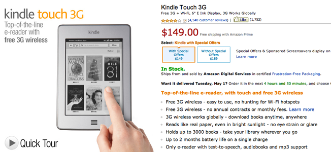
The big daddy of online retailers, Amazon, has product pages that load incredibly fast – an absolute must, when a delay of even a couple of seconds means thousands of lost potential customers.
Element #9 – A Clear Next Step
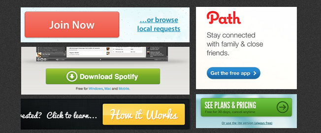
This should be the biggest no-brainer in the history of the Internet, but too many product pages clutter up their pages with excessive calls to action. View customer photos, view pricing, view our knowledgebase, get customer support, talk to a representative, read reviews. Without good design, these calls to action all blend into a confusing mess, and make your user feel like they’ve just been blindfolded and spun around. Now, which way to that pinata?
While it may be tempting to utilize your product page with many actionable next steps as possible, remember that focus and clarity is the key to truly guiding your user to your main conversion goal. Typical methods for designing a good call to action include using high-contrast buttons, treatments or callouts that are unique to the overall design of the page, as well as giving the actionable elements plenty of breathing room to make them stand out.
Element #10 – The Soft Sell
Is your product all or nothing? If you’re selling software or a service without a soft sell opportunity you’re missing out on conversions. Can you give away a free trial? A free month of service? Can visitors set up a free account, download the software for free and activate later, or play with a demo version (also sometimes known as a sandbox)?
Often times, users might not be willing to make the commitment in buying your product right away. Therefore, you need to get them hooked with a smaller sell that takes little commitment on their part. By creating steps that extend the relationship and get the user to commit to a smaller action (even if it’s not the ultimate commitment), you’re building the bridge to the ultimate sale.
Element #11 – Wayfinding
Quick, how many steps lie between your product page, and your transaction confirmation page? If you don’t know, then it’s probably too many. A convoluted and laborious funnel is a sure-fire way to kill conversion.
If the customer is on the checkout page, then get them to their final purchase as quickly and efficiently as possible. Don’t make their purchasing effort seem like an arduous journey that can leave them second guessing their purchasing decision along the way.
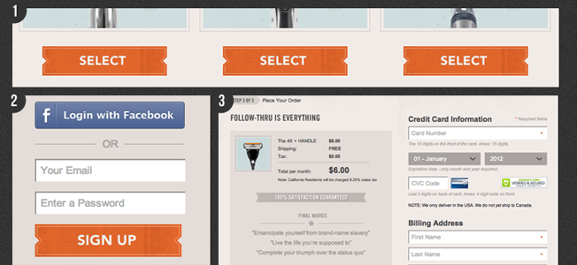
The Dollar Shave Club has an easy purchase funnel that, once you hit the “select” button to purchase their product, immediately signs you into your account and jumps you to their one page checkout screen. No annoying registration confirmations, no five-step checkouts, just a simple log in and checkout process.
On another note, resist the temptation to distract your users with anything that’ll take them away from your purchasing funnel. Don’t shuttle them off to an obscure part of your site just because they happened to click on one of your recommended similar items. Don’t interrupt them with a link to your latest blog post. You’ve worked hard to get your visitors to this stage, so let them finish the transaction before you take them anywhere else.
Conclusion
Product pages can be a delicate dance, where one misstep can cost you the trust of your dance partners, a.k.a. your visitors. Take the time to nail all of these elements though and it’s highly likely you’ll be reaping significantly higher conversion rates as well as enjoying a better bottom line.
What have we missed? Are there any other product page elements you feel don’t get enough attention on most ecommerce sites? Let us know in the comments!
About the Author: Jason Amunwa is the Director of Products at digital-telepathy, a user-experience design studio that created SlideDeck, the WordPress slider plugin that lets you create awesome content sliders in minutes with no code, as well as Hello Bar.

Comments (11)