If you’re doing everything right to promote and drive traffic to your e-commerce website and you’re not getting the revenue you expect, you’re not alone.
Many clients come to me with the same problem.
Thankfully, there’s no mystery to it.
If you look at the analytics, you’d probably realize that visitors are dropping off between landing on your website and completing checkout.
The more people drop off during this user flow, the lower conversion rate you get.
To increase your conversion rate and retain more customers, you need to optimize your e-commerce website.
Here are 12 critical features you can’t afford to overlook:
Navigation
You can’t make any sales if your website’s visitors can’t find what they want.
Your site’s navigation is often the first place shoppers look if they have a specific product or category in mind.
A navigation that is confusing, too complex, or difficult to understand will cost you sales and customers.
There’s no one-size-fits-all solution for e-commerce website navigation.
The best way to design a website menu depends on the nature of your products and how your customers organize information.
Here are some ideas to consider:
Replace the drop-down menu with a menu page.
If you have a large number of products, a drop-down menu that lists everything can be overwhelming.
If Apple has to include all its products and services available in a drop-down menu, its website would have a very clunky and confusing navigation.
Not only would that work against the brand’s minimalist image, but it’d also be hard for customers to find what they need.
Instead, Apple opts for a clean top navigation with no dropdown or secondary menu item:
When visitors click on a top navigation item, they’re directed to a menu page that lists options within the category:
Doing away with a complicated drop-down also helps streamline the mobile user experience, which is increasingly important as more consumers are shopping on mobile devices.
Streamline the drop-down menu.
If you have a lot of items under just a handful of categories, streamlining your drop-down menu can be the way to go.
It’s also a great strategy if your products are better shown visually than described with text.
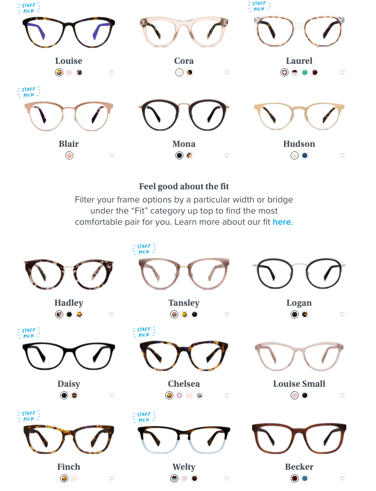
Warby Parker has only two major categories — eyeglasses and sunglasses. When visitors click on a top menu item, it expands to show the two subcategories: men and women.
That’s it!
Once you choose a subcategory, you’re taken to a page that shows all the products in a layout optimized for a browsing experience.
This works well for the brand because of the nature of the products. Listing the product names in a drop-down menu won’t do much to describe the items.
Add a fat footer.
To optimize your top navigation for conversion, you need to eliminate distractions.
That means you can’t cram all the necessary links that aren’t product-oriented into the main navigation.
A fat footer allows you to make the important information available to customers without distracting them from the shopping experience.
Order menu items strategically.
People tend to pay the most attention to items at the beginning or the end of a list thanks to the serial position effect.
Drive your visitors to the most important links (e.g., featured products) by placing them at the beginning or the end of your navigation menu.
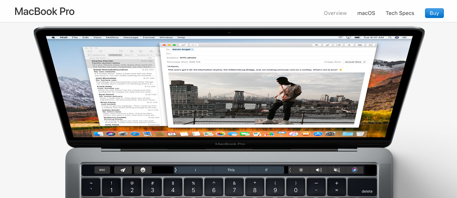
Use a “sticky” buy button.
It can be a frustrating experience for customers to find the “buy” button on a long sales page.
Add a “buy” button as a persistent element in the fixed header so visitors can easily proceed to checkout whenever they’re ready to place the order.
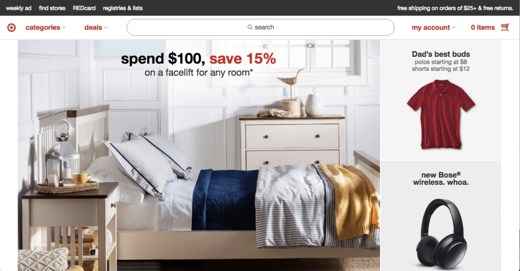
Add a special offer callout.
Limited-time or -quantity special offers are effective ways to drive conversion and increase sales.
Display your special deals prominently by adding a callout right under the navigation bar to leverage this prime real estate to promote the offer.
Site search
Consumers don’t have the patience to figure out where things are on your site.
85% of shoppers abandon a website due to poor design, while 83% leave because it takes too many clicks to get to where they want to go.
If you want to increase conversions, you need to make sure visitors can find what they want on your e-commerce site.
Optimizing your site search can help increase site usage, improve conversions, get more returning customers, and boost retention.
Make the search bar prominent.
If you have many items in your online store or if most visitors come to your site knowing what they’re looking for, then the search feature is the fastest way for shoppers to find what they need.
Make sure your search box is large and positioned prominently on the site, such as right underneath the primary navigation.
Improve search feature usability.
Not all search features are created equal, here’s how to make yours smarter:
- Support search by product name or model number.
- Account for misspellings and typos with autocorrect.
- Return results even if users don’t enter the exact product name or description used on the website.
- Support searches with symbols and abbreviations.
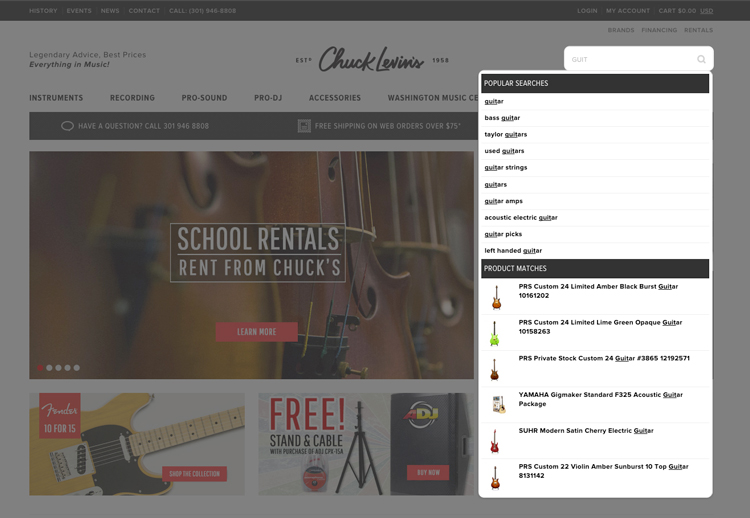
Implement enhanced autocomplete function.
Make search faster and easier for shoppers by presenting phrase and product matches in a dropdown list as they type.
Add visual representations of specific products. When users click on them, skip the search results page and take them directly to the product page to streamline the shopping experience.
Optimize search result and product category pages.
Your search results should prioritize the most relevant results based on the search term entered.
If you have a large product selection, it’s critical to have a robust filtering feature to help shoppers narrow down their choices (by brand, size, color, etc.) so they can find what they want quickly and easily.
You can use a similar filter function on a product category page to enhance the shopping experience:
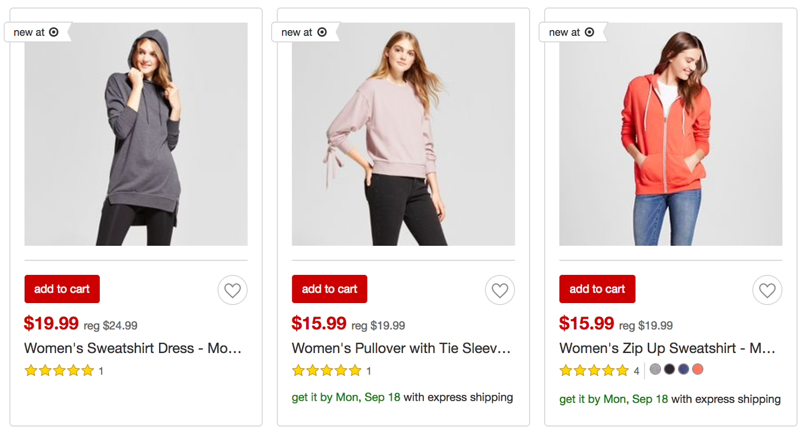
Display product images, prices, color options, and ratings on the search result and product category pages.
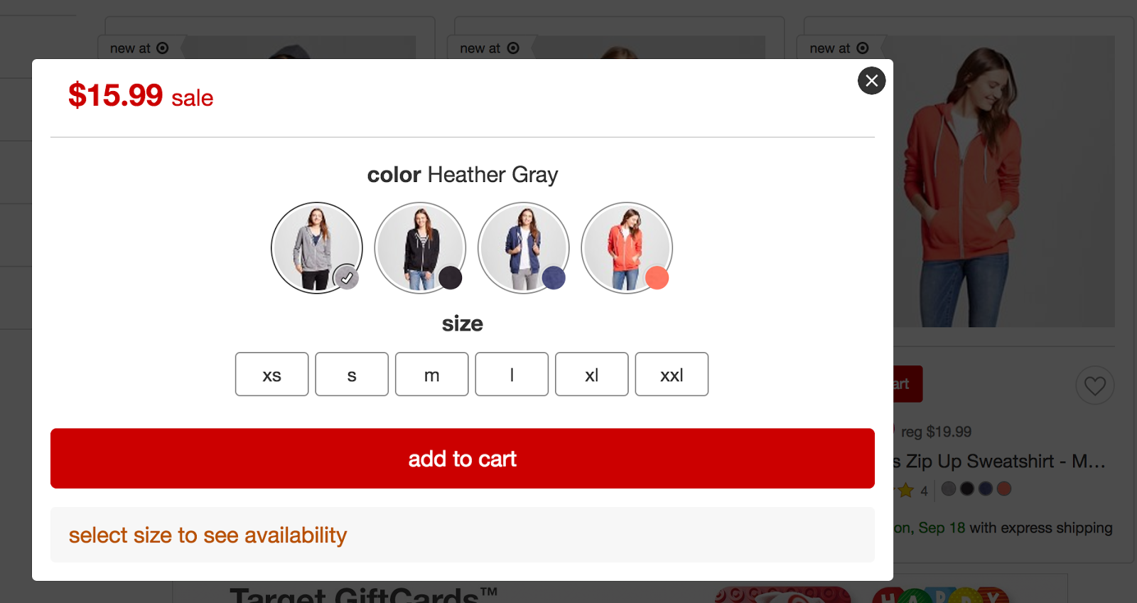
Include an “add to cart” button next to the thumbnail, which triggers a lightbox for shoppers to select product attributes and add the product to their shopping carts.
Not only can visitors add an item to the cart without having to wait for a product details page to load, but they also don’t have to find their way back to the search result or product category pages to continue shopping.
Product view
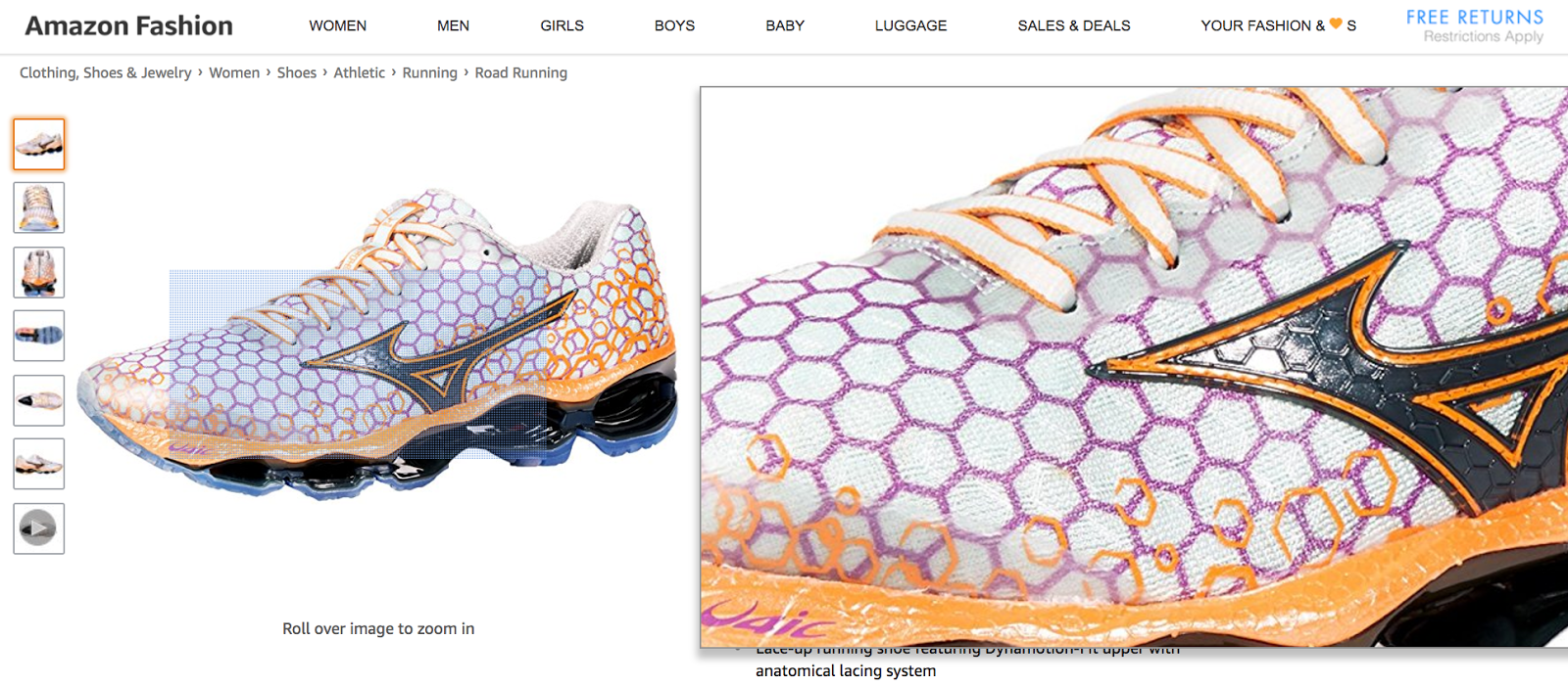
Since your visitors can’t touch and feel your products, you need to make sure that the media you use on the product pages are doing the items justice.
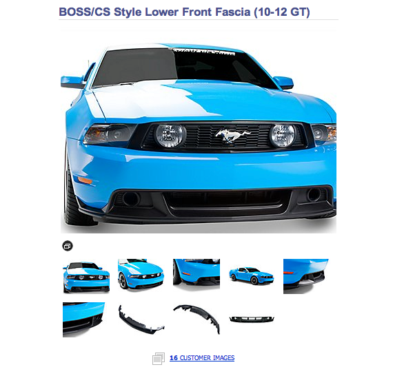
Start with high-quality photos that depict the product from a variety of angles at different levels of detail.
Make sure your photos are of high enough resolution to support a zoom feature to show texture and details.
Optimize your images to reduce load time. Images that take too long to load can result in a drop-off rate of 39%.
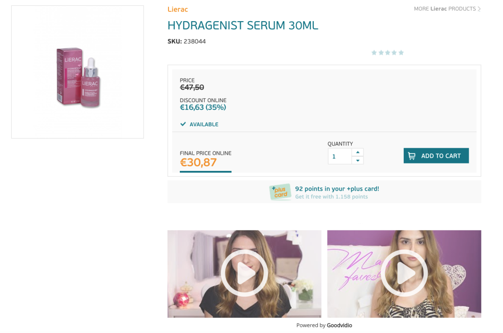
Besides images, consider using demo videos or explainer videos to show your products in action.
When visitors enjoy a video, their purchase intent is increased by 97%.
You don’t have to generate all the content yourself either.
Encourage customers to submit visual content or source your images and videos from social media, which perform double duty as social proof, which will help increase conversions.
Omnichannel personalization
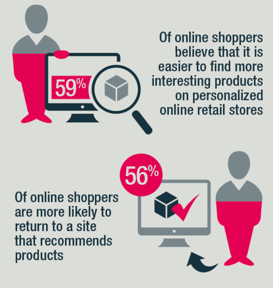
A survey found that 86% of consumers’ purchasing decisions are affected by website personalization.
Display items most relevant to visitors based on their browsing behaviors, purchasing history, habits, and preferences.
You can analyze a shopper’s interaction with the site and offer product recommendations based on purchases made by past shoppers who exhibit similar patterns.
Take the opportunity to offer suggestions based on the products visitors are browsing so you can upsell and cross-sell to increase average order values.
By delivering a personalized experience, shoppers are more likely to make a purchase and return to your website in the future.
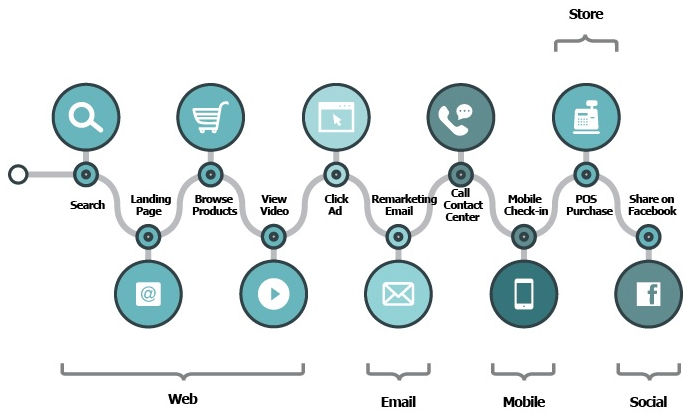
In addition to product recommendations, you can augment the customer experience with personalization strategies in other customer touch points and drive traffic back to your e-commerce website:
- Use personalized email campaigns to drive traffic back to your site. Emails can be triggered based on a visitor’s interaction with the website to deliver the most relevant content and offers.
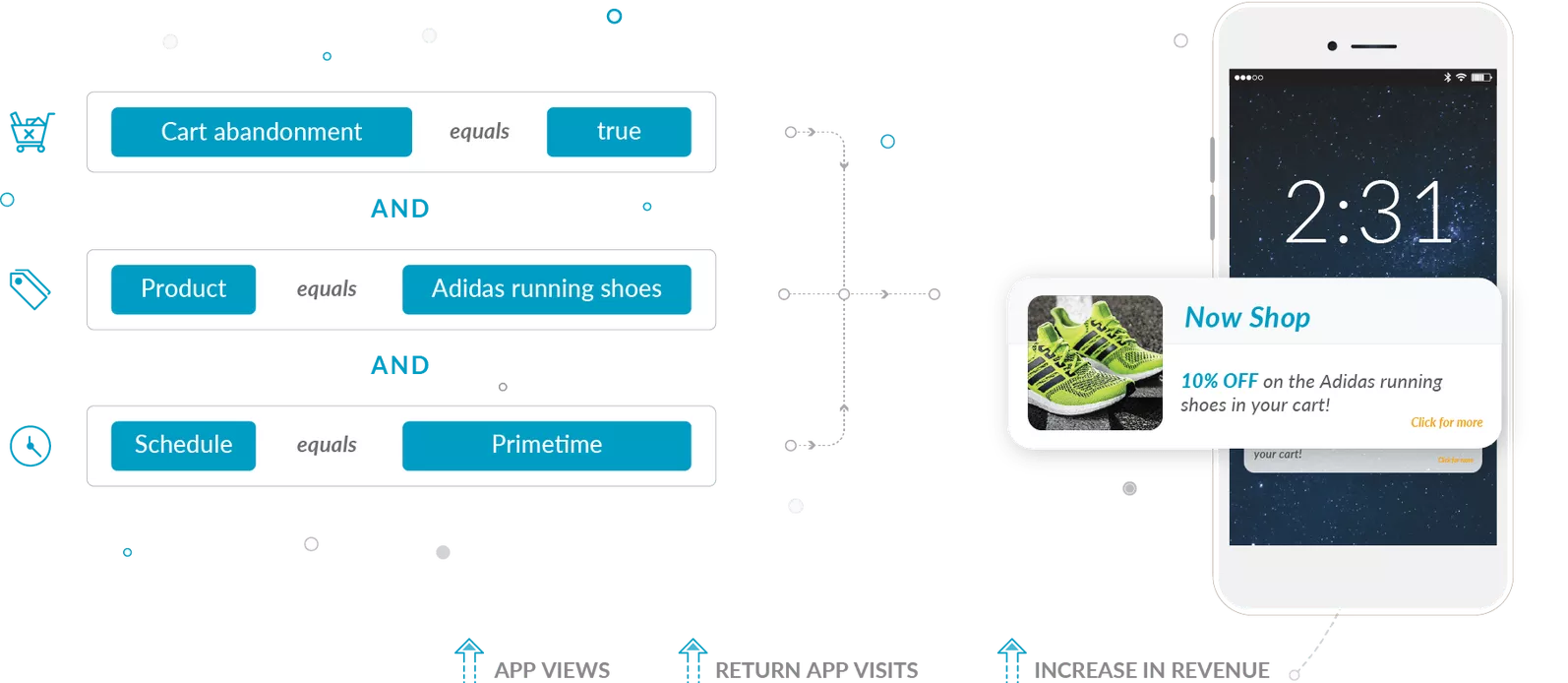
- Implement mobile personalization with push notifications that are triggered by a visitor’s browsing behavior.
- Launch remarketing campaigns using Facebook dynamic ads that display items to shoppers who have already visited a specific product page.
Quiz
An e-commerce website with a large product selection can be overwhelming for first-time visitors.
Since it’s their initial visit, you don’t have any past interactions with which to guide the generation of personalized recommendations.
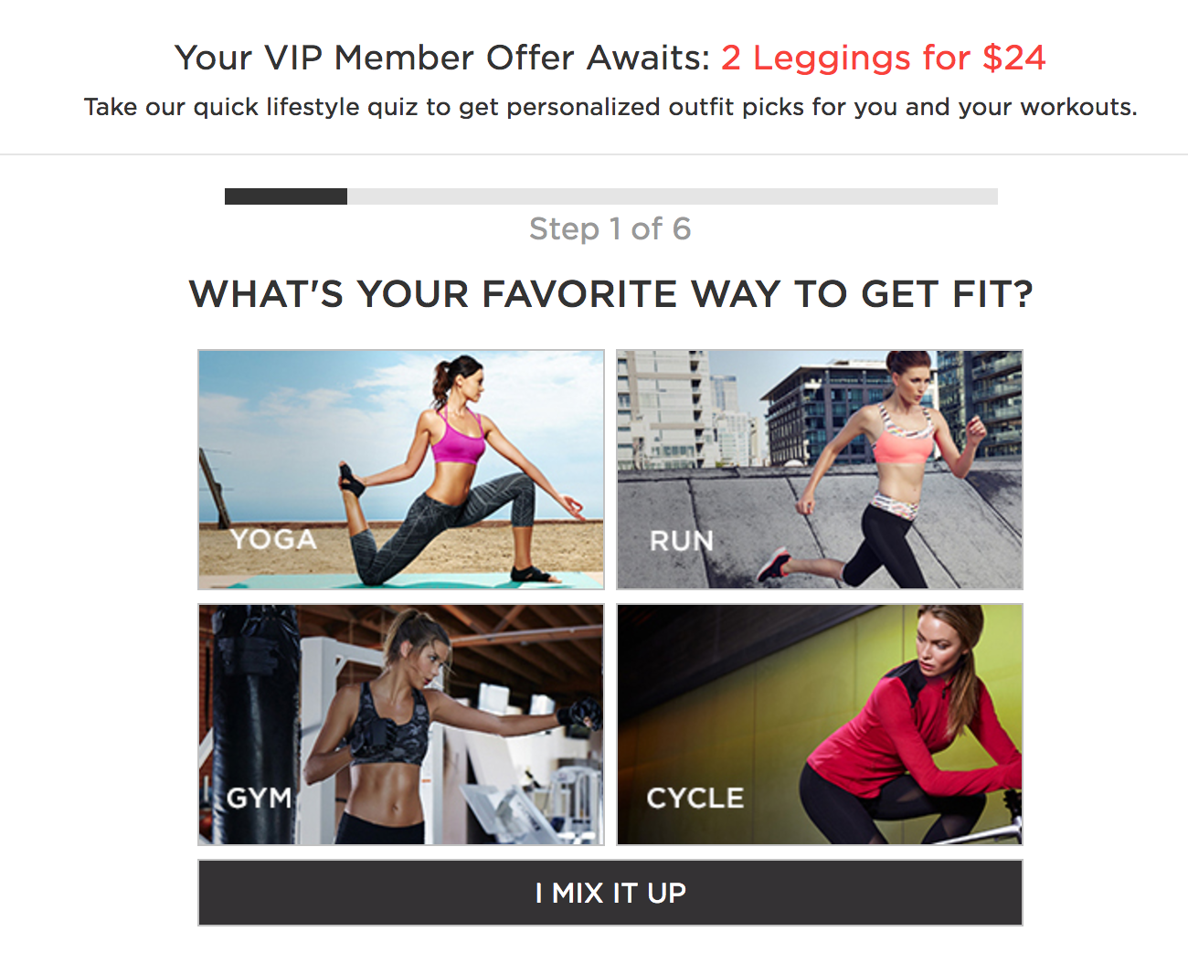
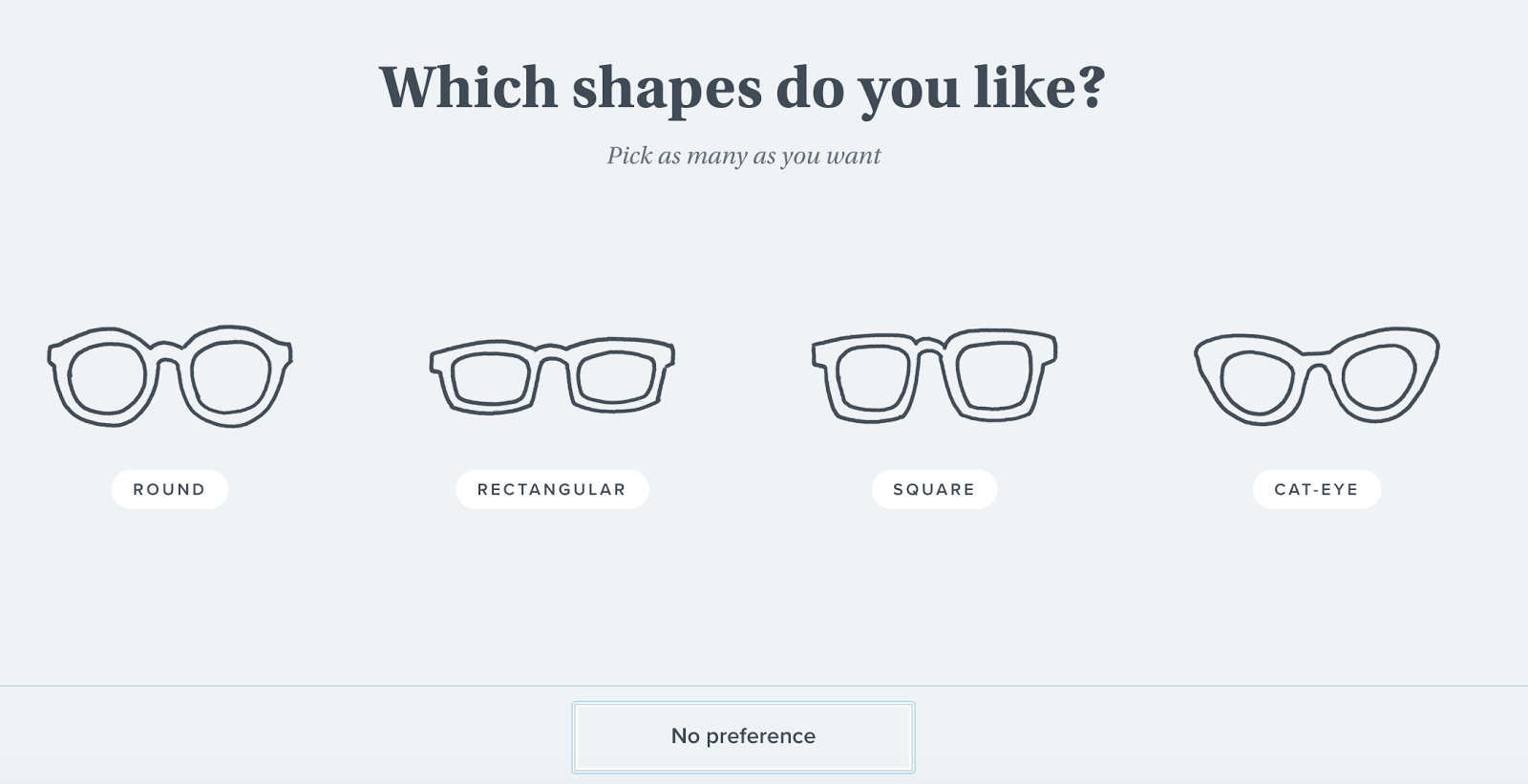
Quizzes are a great way to help customers wrap their heads around your product selection and find what they need easily. Plus, you can deliver a personalized experience right off the bat.
Not only are you reducing the sense of overwhelm and frustration, but you’re also educating the visitors about your products and creating an engaging experience.
Ratings and user-generated reviews
One study showed that 69% of respondents rely on apparel reviews, household goods reviews, and personal care item reviews to make their purchasing decisions.
These ratings and reviews are trusted by consumers much more so than the merchants’ product descriptions.
They offer the social proof some shoppers need to make an informed decision. They also set expectations to help lower return rates.
There are a few ways to increase conversion with ratings and user-generated reviews:
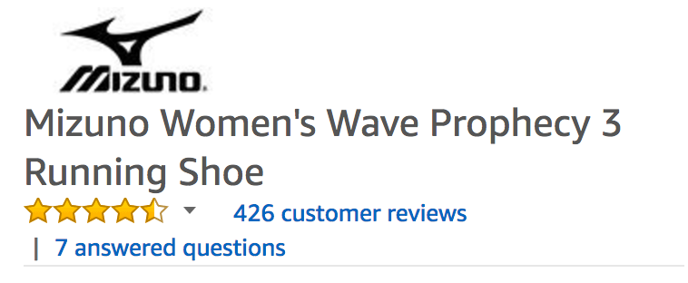
- Include an average rating at the top of the product page— good ratings will entice shoppers to continue reading about the product.
- Highlight credibility of the reviews by stating how they are collected, showing credentials of the reviewers, encouraging reviewers to use their real names, and noting that the reviewers have indeed purchased the product from your site (such as by adding “verified purchase” next to the review).
- Encourage reviewers to leave high-quality comments by inviting visitors to vote if a review is helpful.
- Ensure review submission is mobile friendly. Allow reviewers to submit a review with just a few taps and swipes.
- Enable the submission of multimedia content, such as photos and videos.
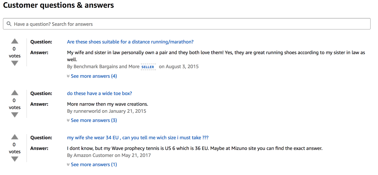
- Offer a Q&A feature alongside product reviews. Pew found that the ability to ask questions is a top decision factor for consumers. Encourage other customers to chime in and make sure your staff is monitoring the interaction.
Blog
Adding a blog to your e-commerce site helps improve SEO, drive quality traffic, educate visitors about your products, stay top of mind, and nurture relationships with your customers.
To optimize your blog for e-commerce conversion, make sure to:
- Set up your blog on the same domain as the e-commerce site so both will benefit from each other’s “SEO juice.”
- Do the proper keyword research and optimization to get found by search engines.
- Put the link to your blog in the navigation so visitors can find it easily. It also signals to Google that the blog is an important section on your website.
- Use tags that overlap with your product categories and subcategories for easy searching.
- Promote your posts on social media and newsletter to stay on your customers’ radar by sharing valuable information.
Wishlist
A wishlist is a convenient feature that allows customers to set aside items they’re considering.
By helping them narrow down their choices, they’re more likely to make a decision.
But that’s not all.
To create a wishlist, visitors need to create an account for your online store.
This gives you the opportunity to offer relevant promotions and to gather customer data to improve user experience and increase sales:
- Alert customers about special offers available to the items on their wishlists.
- Deliver targeted content based on the items they show interest in.
- Identify retail trends and seasonal activities to improve demand forecasting.
- Understand what your customers are looking for and offer similar products.
In addition, make it easy for your customers to create wishlists on other platforms. For example, enable “Pin It” buttons so visitors can share your products on their Pinterest wishlists.
Customer self-service
When consumers have a question while making a purchasing decision, they want to get an answer right away.
More and more consumers prefer to “self-serve” so they can find the answers on their own without having to wait for a customer care representative to get back to them.
Companies that implemented self-service customer support have seen an average of 30% increase in conversion rate while cutting support ticket volume and associated costs.
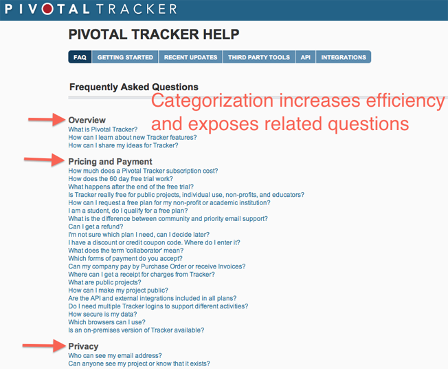
FAQ pages, knowledge bases, and support forums are just a few ways to offer “self-service” support to customers.
Customer Support
One advantage that brick-and-mortar stores have over e-commerce sites is that customers can interact with a salesperson in real time to get their questions answered and facilitate decision-making.
To increase your conversion rates, you need to make sure shoppers can have access to assistance in a friendly and timely manner.
Improve your contact page.
Your contact page should list multiple channels through which customers can get support, such as social media, email, and phone.
Also, include links to your FAQ page, return policy page, knowledge base, or community forum for customers who prefer to “self-serve.”
Add a tap-to-call button.
Optimize your mobile website with a tap-to-call feature so shoppers can get in touch with your customer support team right away while shopping on your site.
Implement live chat.
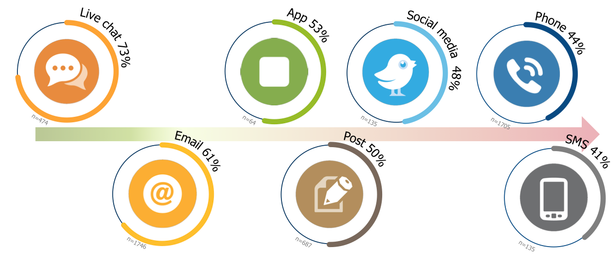
Picking up the phone and jumping through hoops in order to speak to a human being is becoming less and less popular among consumers.
Live chat, on the other hand, allows shoppers to get immediate assistance without leaving the product page.
In fact, customers who use live chat report the highest satisfaction levels.
When customers get their questions answered while they’re still on your website, they’re more likely to complete the transaction.
Companies that use live chat increase their conversion rate by 45% while dramatically reducing their customer support costs.
Support appointment setting for a brick-and-mortar store.
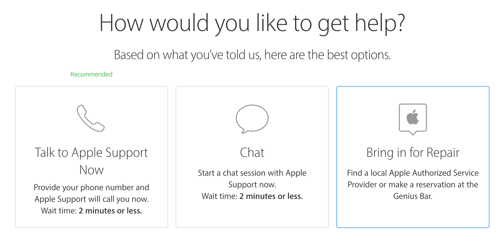
If you have a physical store, you can allow customers to book an in-store appointment via your website (like Apple’s Genius Bar.)
Checkout
The average cart abandonment rate for e-commerce websites is 69.23%.
That means that over two-thirds of shoppers who put items in their carts do not complete the checkout process.
That’s a lot of money left on the table!
Make it easy for your customers to complete the checkout process by designing a seamless user experience that’s fast and easy to use.
By optimizing your checkout flow, you can reduce cart abandonment and increase your conversion rates:
Add advanced payment options.
Some consumers prefer payment methods other than credit and debit cards.
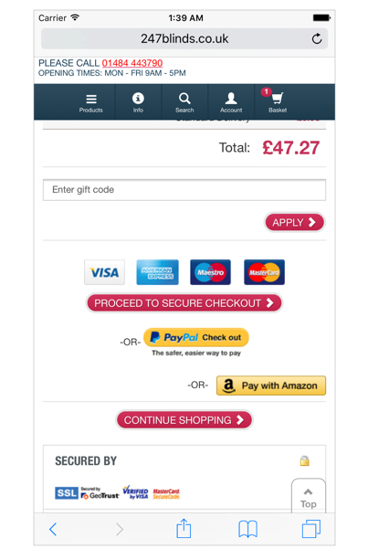
Consider adding Amazon Pay, PayPal, and Google Wallet as payment options to deliver a convenient experience for your customers.
These options are particularly helpful for visitors who are checking out via mobile devices. They don’t have to type in as much information, making it fast and easy to complete the transaction.
Include a shipping cost calculator.
Unexpected shipping costs are the number one reason for shopping cart abandonment.
An extra $10 may not sound like a lot, but people don’t appreciate surprise charges presented to them at the end of a checkout process.
Consumers like transparency. Make it easy for them to find your shipping cost and policy pages.
If your shipping charges vary based on the products or the buyer’s location, include a shipping cost calculator at the beginning of the checkout process.
Offer delivery options.
Offer a few delivery options and provide accurate estimated delivery dates so customers feel comfortable knowing that their orders will arrive when they need them.
If you have a brick-and-mortar store, you can also include an in-store pickup option.
Many shoppers prefer to research online and complete the transaction in person. 72% of young shoppers tend to research online then purchase in a store.
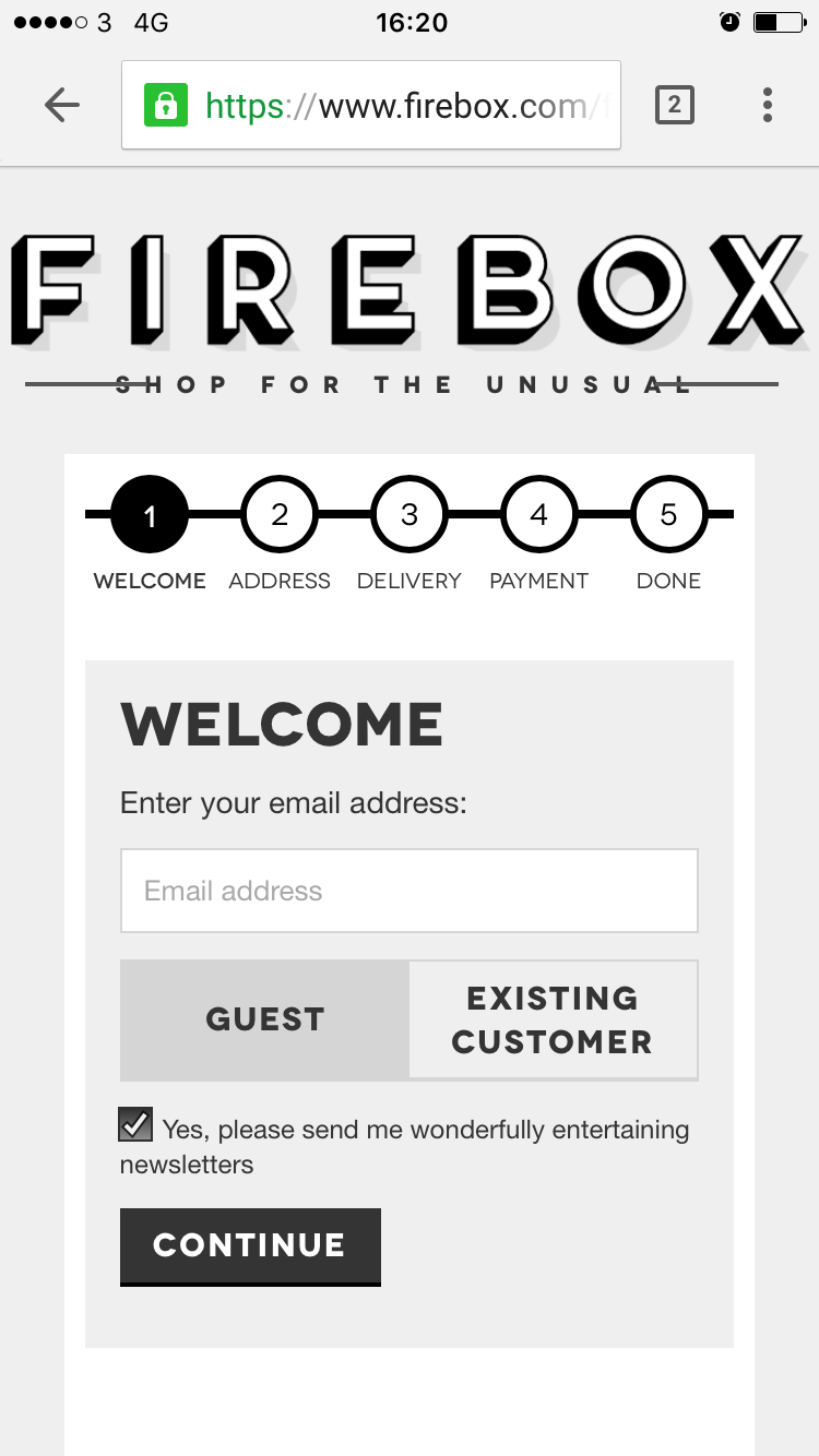
Include a progress bar.
According to a study, 20% of shoppers abandoned their shopping carts because the checkout process was too long and confusing.
Besides reducing the required fields to only information necessary to complete a transaction, you can also increase transparency with a progress bar.
By showing customers where they are in the process, they won’t feel stuck in an endless checkout ordeal that appears to be time-consuming and confusing.
An effective progress bar should be prominently displayed, clearly labeled, simple in design, and visually aligned with your brand’s identity.
Use autofill.
Enable autofill in your forms so your customers don’t have to type in all their information at checkout.
This convenient feature will streamline the checkout process to make it faster and easier, especially for customers shopping on mobile.
Indicate security features.
With the many security breaches in the news these days, consumers are wary.
Make sure your SSL certificate is up to date and displayed as such on the address bar:
Offer customers two-factor authentication for added security. In addition to a username and password, a user is required to enter a system-generated code sent via email or text in order to sign in.
Last but not least, display trust seals on your checkout page, ideally next to the field in which customers enter their payment information, to inspire confidence.
Account management
Repeat customers tend to make more purchases with higher average order values.
Implement a user-friendly order and account management feature to deliver an outstanding customer experience so your loyal customers will stick around.
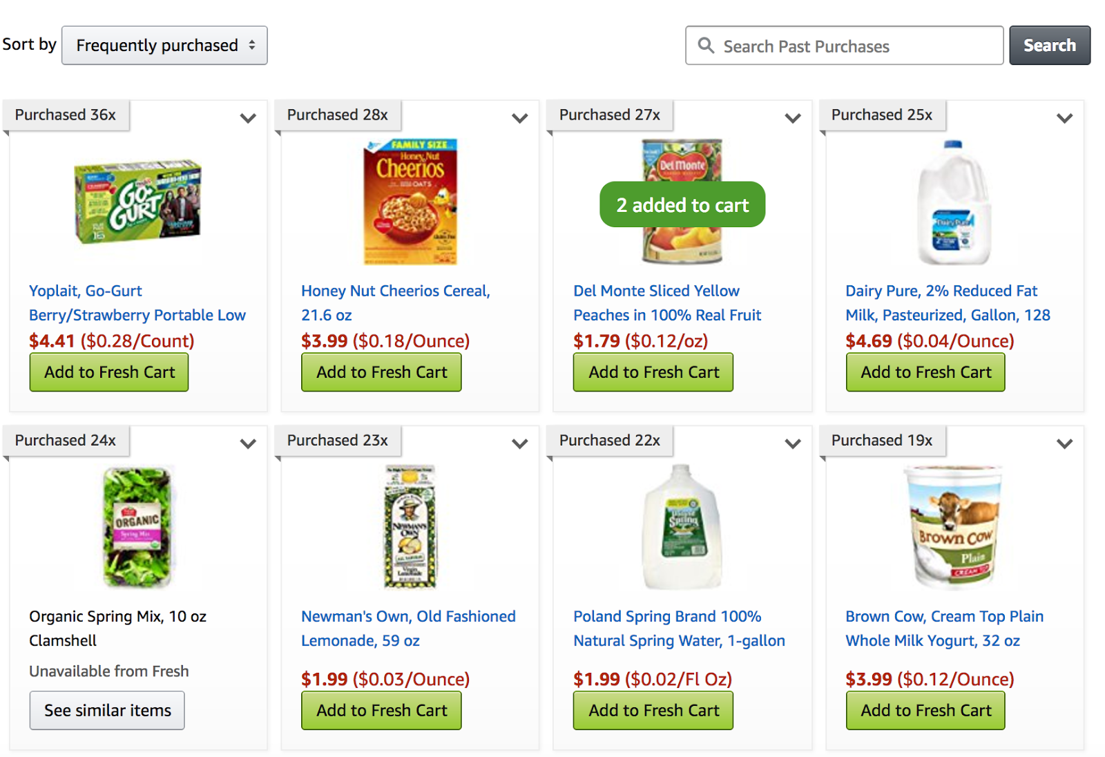
Feature a past purchases list.
If your customers tend to make recurring purchases, make it easy for them to reorder by making a list of past purchases accessible via their accounts.
You can also use an email personalization strategy to send out a reminder when it’s time to reorder an item.
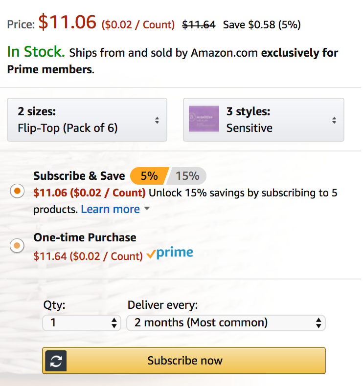
Offer subscriptions.
Encourage shoppers to subscribe to products they need to replenish regularly at a discounted price. They can set it and forget it while you can generate recurring revenue.
Make return easy
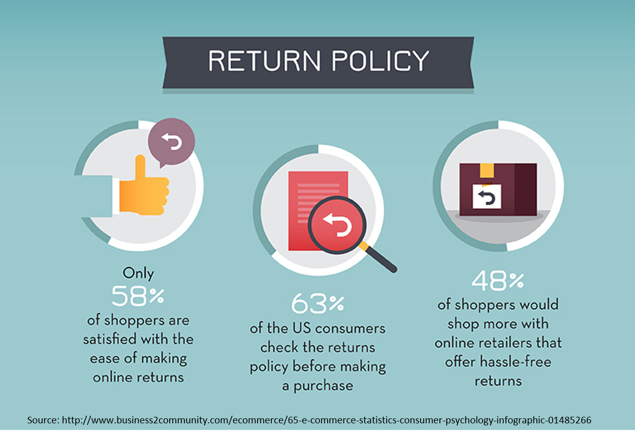
66% of shoppers review a retailer’s return policy before making a purchase.
Having a clear and customer-friendly return policy has been found to increase conversion rates.
Offer flexible return options, including different shipping methods and in-store returns, to make the process as convenient as possible for your customers.
Consider setting up a centralized online return portal to manage all the returns and to deliver a consistent and convenient user experience.
Conclusion
At the end of the day, it’s your customers who matter.
Focus your time, efforts, and budget on optimizing features that deliver a speedy and convenient customer experience.
Design every single detail — from finding an item and learning about the product all the way to completing the transaction and managing an order — from a customer-centric perspective.
It could be scary to make changes to your existing site, especially if it’s doing okay.
How do you know a new design will convert before you roll out the changes?
Usability testing can help you fine-tune the user experience before implementing the updates.
After the changes go live, keep an eye on your metrics to make sure the new features are performing as expected.
What features will you be optimizing on your e-commerce website?










Comments (6)