Your FAQ page represents one of the most valuable moments in a conversion funnel. Nowhere else does a visitor so deliberately indicate that they want to know the details of your product or service.
Are you guilty of neglecting this important page? A page, that when given the proper attention, can actually boost your conversions and more importantly your:
SALES!
Well if you are guilty of neglecting this aspect, then here is the short answer:
You can improve your FAQ pages by…
- Streamlining navigation through questions
- Prioritizing clarity over precision in language
- Connecting the answers in FAQs to other steps in the sales funnel so that no visitor goes uncaptured
But as we all know, the devil is in the details. So let’s go over how you can improve your FAQ pages for more sales and conversions, while making your customers happy in the process!
Make Navigation Through Your Questions and Answers Frictionless.
Most FAQ pages fail simply because they are hard to use. People expect to ask questions and get immediate gratification. In a retail store, a user can glance at signage, read product labeling, or flag down a salesperson to hassle. Replicating this ease of information access is a competitive advantage. Here are three ways your application can be as easy to navigate as possible:
- Batch questions together by category to increase efficiency and answer user questions before users even realize they need to ask.
When it comes to the UX for FAQs, users’ sole goal is to get the answer to their questions. Finding exactly where a company addresses a given question can be a major snag in this process.
By batching questions together by category, such as “Pricing and Payment”, “Accounts”, or “API”, with large headlines for each category, the design presents information in an easily understood, systematic matter. This increases efficiency for the visitor. Also, if the visitor discovers a question that they may have forgotten to check for, you prevent future uncertainty and bolster trust that your product’s support will be comprehensive.
Even though Pivotal Tracker’s FAQs contains nearly 100 questions, using category labels makes questions easy to find.
- Group questions together at the top of a page for easy scanning; duplicate them with answers further down.
Some applications provide answers immediately below where the question is asked. In doing so, it becomes hard to quickly see which questions are answered and whether there is a specific response for the question you have in mind because the page gets cluttered very quickly.
By duplicating the question content, first with a list of questions at the top of the FAQs page and secondly with the full question text paired with the answer, an application prevents friction to finding the question you already had in mind.
By not interrupting questions with the answers right away, the Pivotal Tracker UI makes it easy to peruse questions efficiently.
- Provide permanent and specific URLs for returning to the exact place where a question is answered.
It’s likely that someone reading your FAQs page is doing important evaluative research on your product. They will likely need to record and share their findings with others.
As a result, merely having one, uniform FAQs URL is insufficient. Instead, by linking to div elements with the “#” followed by the element’s ID, you can provide visitors with an easy copy and paste URL to share as needed.
Notice how Pivotal Tracker has a unique URL for each answer and places a visitor immediately where they need to go when visiting that link.
Prioritize Clarity in Your Answers’ Language over Excessive Precision.
One of the most common struggles with FAQ pages is the desire to answer everything, and do so with excruciating detail. The rationale is that this approach ensures a user will have his question answered somewhere. Being extremely precise also helps ensure that your answer is “technically right”.
But FAQ pages very quickly can become boring and hard to process using this approach. Avoiding this as much as possible will encourage users to actually read your answers and engage in a way that makes them more informed about your product, and therefore, more likely to buy.
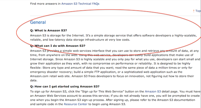
Notice how Amazon could emphasize how technically advanced AWS is. They could fluff things up with precise infrastructure jargon, but instead Amazon chooses to define Amazon S3 as “storage for the Internet”. Keeping it simple.
Your answers will only raise more questions. Use these questions as opportunities to plug a prospect into the rest of your funnel.
The FAQs page should never be a black hole. UX designers should aim to connect FAQs with unique next steps to usher a visitor into the sales funnel.
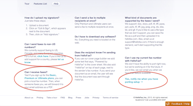
For example, an answer to a FAQ may list the platforms on which an application is available. It would be a missed opportunity to not link each of those platforms to the unique download URL, such as the iTunes link. Or if you are rolling out a feature down the road, you should collect some relevant information about a user to enable you to re-engage, as HelloFax does below with notification info for when they launch a fax porting feature.
HelloFax recognizes that certain questions may lead to requesting service in a non-US location, learning more about pricing, or inquiring about porting a fax number. Rather than ignoring what the user may want to do, they place the visitor in a position to be captured by the sales funnel by linking to pages that simultaneously drive lead generation and help the visitor get resolution.
A Short Summary of Tips for Improving FAQs
- Label questions with higher level category names
- Place questions together near the top of the page
- Tailor URLs for individual questions
- Simplify your language even it means leaving out certain details
- Provide options to take action from within the question modules
FAQ pages are increasingly falling to the wayside in favor of ‘Features’ pages, explanatory landing pages, and comprehensive videos. Nevertheless, users will always need a straightforward repository for all of the detailed questions they may have. Knowing how to make that experience pleasant while filling the sales funnel will be increasingly critical as users grow more discriminate of web application feature sets. Applying these three techniques to your FAQs page will transform visitor attention into qualified leads.
Some Good Reads and Resources:
- Speckyboy Design Magazine: Essential Help and FAQ Usability Tips
- Noupe (Smashing Magazine): FAQ Pages: Best Practices and Examples
- The Dabbling Mum: Designing Effective FAQ Pages
- TJK Design: The Perfect FAQ Page
About the Author: Jason Shah is an entrepreneur and user experience designer who advises a handful of early stage startups. Follow his blog for tips on optimizing what your users see, feel, and think and catch his latest updates on Twitter.


Comments (18)