What is the manner in which you read an English newspaper?
The typical left to right in a row pattern, right?
Most languages are written in this direction and you can mimic the direction of reading text written in English.
But, do you know that there are languages, including Urdu and Persian, written from right to left?
Traditionally, even Chinese was written in vertical columns, as it’s composed of words rather than characters.
Now, let’s come down to reading English web pages…
Do you read the full text on every web page that you visit?
Rarely.
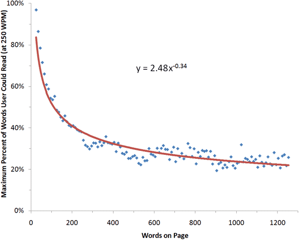
In their 2008 study, NNGroup found that:
“On the average Web page, users have time to read, at most, 28% of the words during an average visit and 20% is more likely.”
So, we’ve established that internet users mostly scan web pages, omitting many words.
But, what is the exact manner of reading the content and at what location do users spend the majority of time on a website?
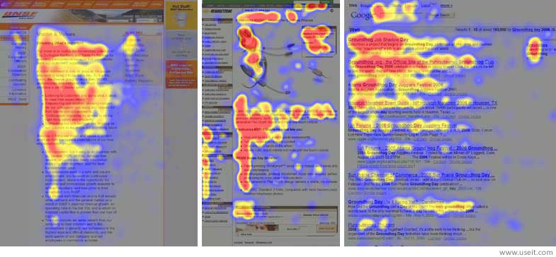
In 2006, NNGroup conducted eye-tracking visualizations on different types of web pages: an about page, product pages on eCommerce websites and the search results page.
They found that users typically read web pages in this manner: two full horizontal stripes followed by a vertical movement.
That is roughly an F-shaped pattern.
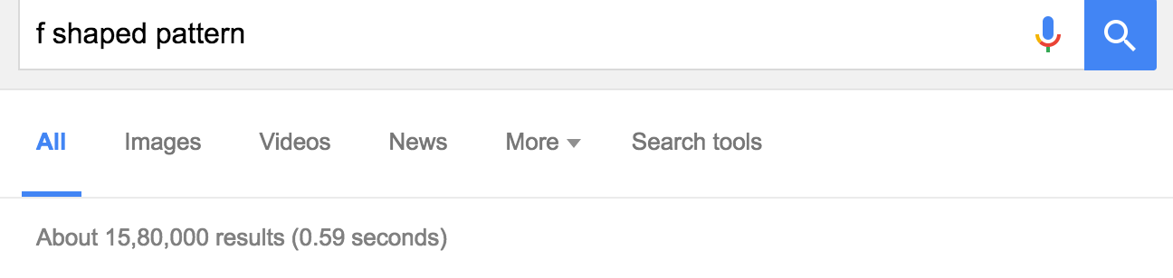
The implications of this reading behavior has been written about and has extensively influenced website design. Just look at the number of results for the keyword “f shaped pattern,” in the screenshot below.
There are a couple of major fallacies in accepting the F-shaped pattern in 2016:
- The study was conducted by Nielsen in 2006. Our reading habits, search engines and technology have tremendously evolved in the last 10 years. Mobile and social media are now the staple content consumption mediums.
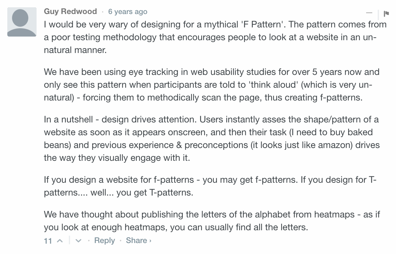
- The “F-shape” wasn’t really pixel-perfect behavior. In the study itself, it was found that users also read in an E or inverted L shape. Further, as Guy Redwood points out here, the testing methodology forces people to look in an unnatural manner.
In this article, let’s examine the reading pattern that currently holds true for web users. Wherever possible, I’ve also shared tips on planning your web content and web design strategy according to these newer viewing habits.
Let’s start by looking at the locations that get the maximum attention on smaller screens.
Which parts of the screen command maximum user attention on smartphones?
Reading web content on the smaller screen is an altogether different experience than reading on desktops. Besides gazing, a mobile user also has the chance to physically interact with your web content by tapping (which, for example, is part of what makes social media so tactile and engaging on mobile).
So, unlearn your assumptions from previously read eye tracking studies. Focus on forward-thinking web design strategies.
I’ve compiled a few results from mobile case studies to help you understand how we all consume web content on mobile and how we interact with search engine results.
Let’s start with understanding…
Our reading habits on the smaller screen
The German Research Center for Artificial Intelligence (GRCAI) conducted a study on 18 users to find out how users read text passages on a mobile touchscreen device.
Eye Gazing technology was used to record the reading interaction (gaze and touch). They deciphered the following reading pattern among the participants.

It’s clear that the left side of screen gets major attention. Further, the study classified the readers into these three categories (with an average accuracy of 10 words):
- 22% of readers followed a fullscreen pattern – they read a web page almost completely before scrolling to access new content,
- 22% of readers followed a linewise pattern – scrolling almost instantly to keep new information flowing and tending to focus on a single or few lines on the screen, and
- 56% of readers followed a blockwise pattern – changing parts of the screen with every scroll.
A major caveat of the study is the accuracy of the readers in the aforementioned three categories. Moreover, readers also switched reading patterns during the course of the study.
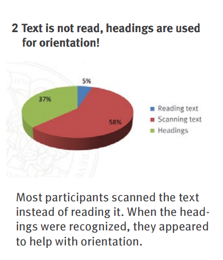
Parts of the above study findings are in line with the iPhone reading eye-tracking investigation that was conducted by SensoMotoric Instruments for finding out how users read and navigate mobile news applications and websites.
- Scanner – 58% of users scanned content,
- Navigator – 38% only read the headlines,
- Reader – Only 5% actually read the content.
If a majority of your audience visits your blog from mobile, then you need to rethink your web content strategy. Here are 3 tips for crafting engaging content for the smaller screen:
1. Stick with essential info – It’s 108% harder to understand content when reading on mobile. So don’t overload your posts with irrelevant information. Mobile users have little patience and lesser visible context. Short-term memory also comes into picture – so eliminate fluff.
2. Go long with accordions – A mobile user will get overwhelmed with long content on the first screen. But, the solution isn’t to ditch long-form content altogether.
Make your writing tighter, well-formatted and entertaining. And, prioritize your information with progressive disclosure, using accordions.
3. Above-the-fold is the most precious piece of real estate – On the smaller screen, it’s extremely important to keep the user’s attention from the onset. The immediately visible part of the screen, including your headline and introductory paragraph, should be compelling.
Shorter headlines work better, as they would be clearly visible above-the-fold and can be viewed in a snap.
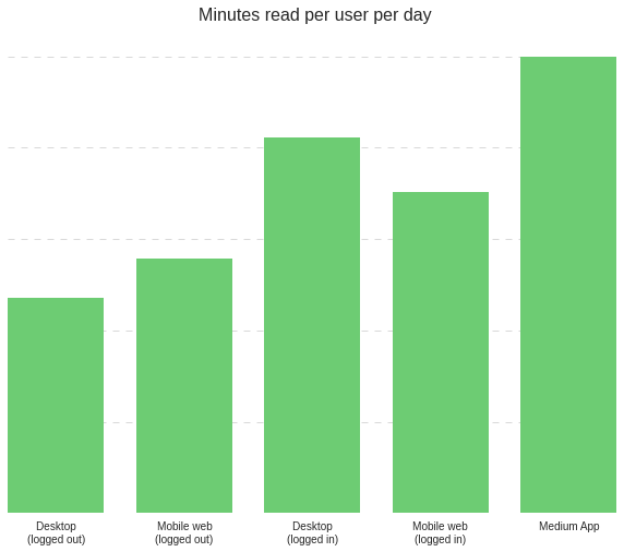
Content websites, like Medium and Shoutmeloud, report huge engagement on their mobile apps. A typical Medium App user spends 25% more time reading per day than their desktop users.
And, Shoutmeloud reports staggering engagement and increasing traffic every month on its Android app.
So, while it’s a good idea to develop an app for your blog – an average American smartphone user is downloading zero new apps per month – the app boom is over.
I would recommend that you:
Weigh your potential ROI carefully before dedicating budget towards developing an app.
Next, let’s understand how users interact with search engines on smartphones.
User-SERP interaction on mobile
You no longer need to enter the full search term query in search engines to access results. Google shows “answer-like” search results from the moment you start typing.
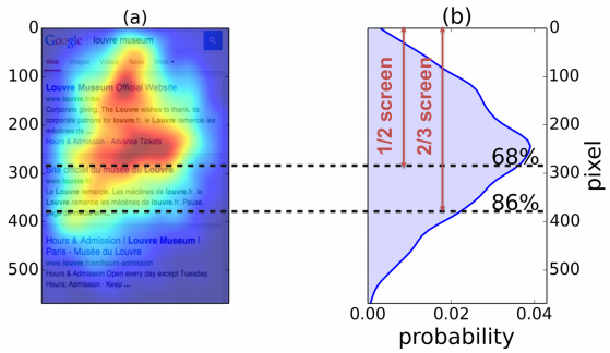
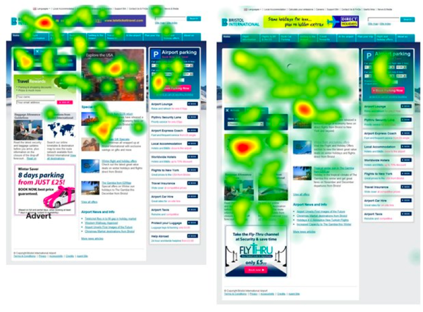
On desktops, the user attention is focused on the top left corner and moves in a vertical orientation. But, on mobiles:
The user attention is focused on the center and top half of the screen.
86% of attention is given to the top ⅔ of your screen.
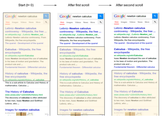
Also, unlike desktops, where the first search result gets maximum attention:
Mobile users tend to perform short scrolls that render higher visibility and user attention to the second or third result across more view ports and for longer time than the first SERP result.
The combined study by Google and Emory University also explored the relevance of search results and user satisfaction. A major component of Google search results is now the knowledge graph. Here are the major findings related to it:
- Users are more satisfied with answer-like search results shown through the knowledge graph (KG) and Google Instant.
- If the KG results are relevant, then the visibility and traffic sent to the results below it are significantly lowered. Users scroll less and increase the value of the websites ranked higher in search results.
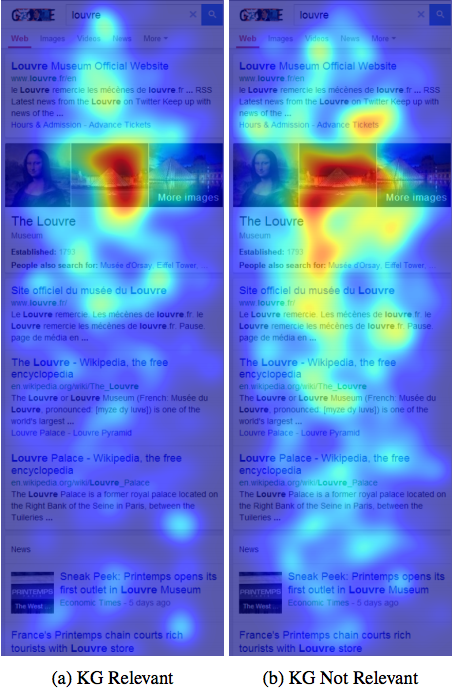
The conclusion of the paper reads:
“Increased scrolling past answer and increased time below answer are signals of user dissatisfaction with answer results.”
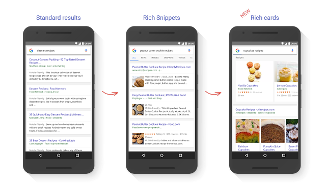
So, a stellar mobile user experience and nailing user intent are critical for gaining visibility in mobile search results. Further, I would encourage you to leverage schema markup for displaying more engaging, visual and stand-out rich cards, in the mobile search results whenever you appear.
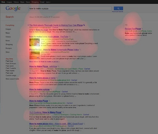
How do desktop search results stack up in terms of user engagement?
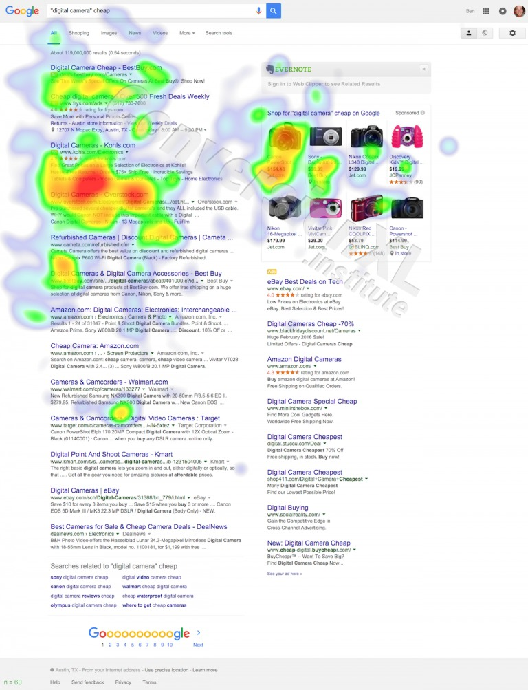
For providing users with relevant and engaging content that serves their goals, Google has started showing rich snippets. This means integrating reviews, photos, social media posts and videos along with black text and links to web pages.
So, do these rich results command extra attention of users?
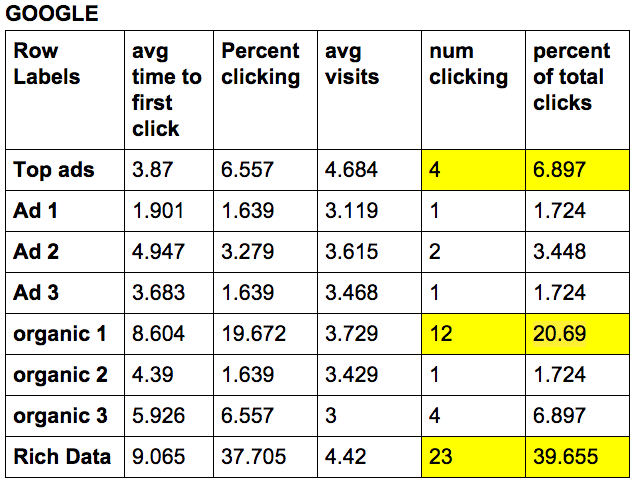
ConversionXL found that they get 39.65% of their clicks from these results – even more than the percentage of clicks that the organic result gets at 20.69%.
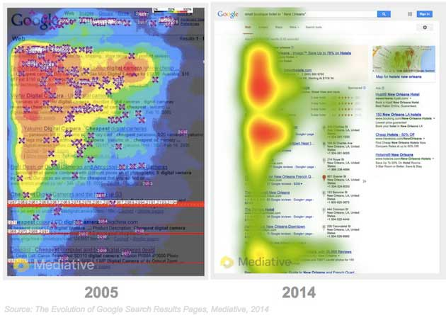
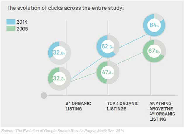
Meditative also found similar results in their eye-tracking case study comparing the evolution of Google search results from 2005 to 2014.
They concluded that the first organic result in 2014 received the same amount of clicks as 2005- 32.8%. But, the time spent on the top result has decreased in favor of the new SERP elements. Increased use of smartphones has conditioned us to scan more vertically than horizontally.
They also found that relevant graph search results command great user attention and dwarf that of the subsequent listings.
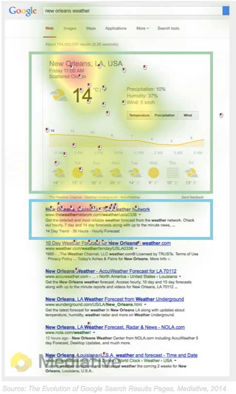
They also found that higher search engine ranking now means more clicks. The space above the 4 organic listings commands 67.6% of clicks.
Overall:
We like viewing more search result listings during a session, but spend less time viewing each one.
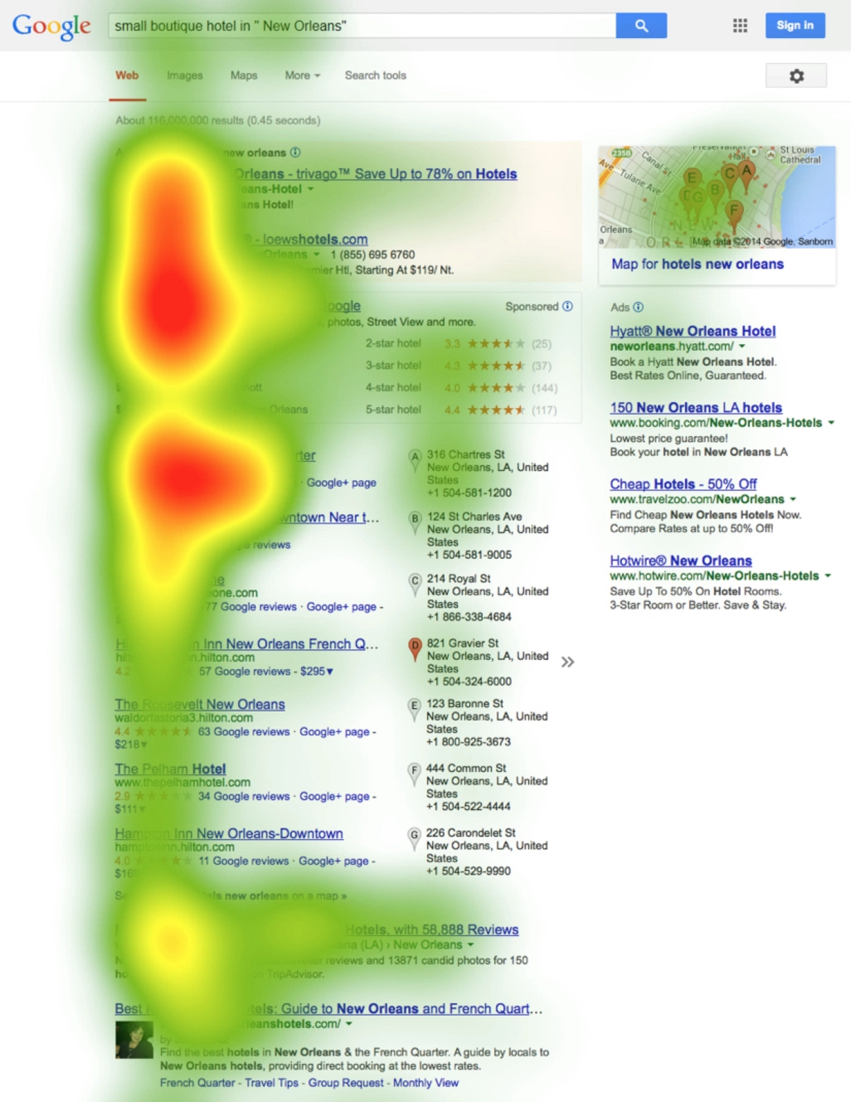
ConversionXL found that users explore almost the entire SERP to find info. Many users even consider the rich text on the right before considering the actual organic results.
The F-shaped pattern while using search engines is no longer valid.
My actionable tip for leveraging this changed behavior:
Find out the SERP enhancements that have taken over the search results in your industry.
The search giant now dynamically changes its web design layout based on the search term query. It’s getting smarter every day at understanding user intent and serving relevant content.
Even if you can’t get to the top of organic search results for the search term and keyword, getting to the top of the “chunk” can be effective in gaining eyeballs.
And, if your target search term or keyword deserves video content, then the regular organic search listings (even the #1 spot) won’t be able to compete with the video thumbnail.
The region above-the-fold of the screen continues to get major user attention
There have been many articles written denying the importance of the fold. A study by usertesting.com found that less web content above-the-fold encouraged user exploration.
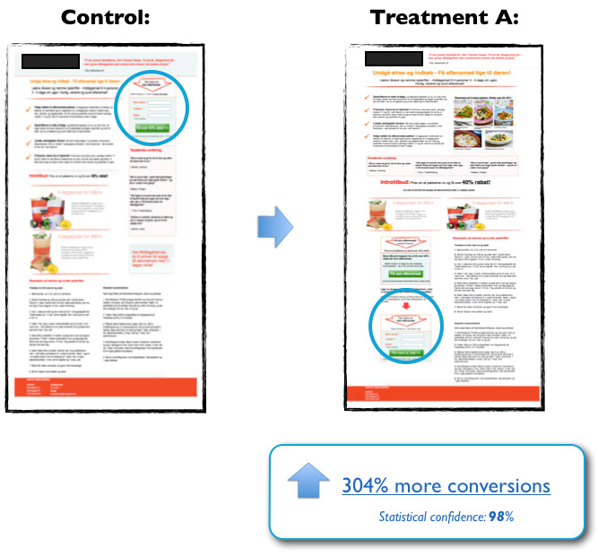
In another A/B test by ContentVerve, moving the CTA below-the-fold increased conversions by 304%.
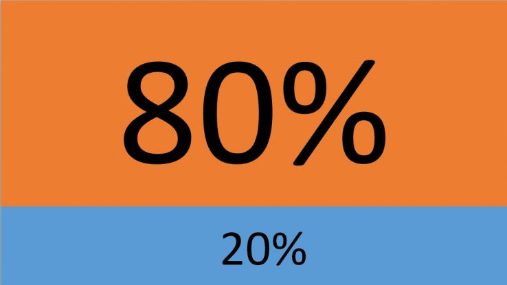
It’s clear that above the fold isn’t the only place a user will spend time on a web page. But, even in a scroll-friendly world, Peep Laja found that 80% of our attention is grabbed by content above-the-fold.
Regardless of the screen size, what appears at the top of a web page will always influence user experience. The difference in how users treat information above vs. below the fold is 84%.
I don’t encourage you to place a CTA above-the-fold if your value proposition is complex. For uncertain first-time visitors, it won’t make much sense. Your CTA placement should depend on your product complexity, among other factors.
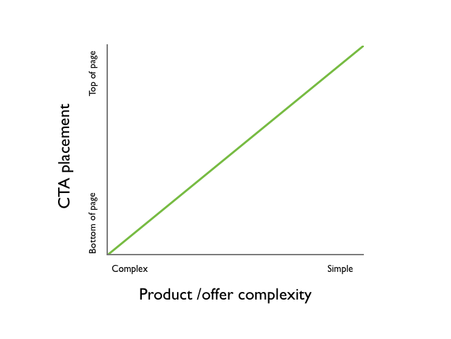
Instead, use compelling web content and visuals to encourage users to scroll. Interesting information, at the top of the page, that builds a story gives users a good reason to navigate to the bottom of your website.
For recommendations on compelling below-the-fold design, read this article by Shanelle.
Now, let’s arrive at the location on the web page that garners the most attention:
Left half of the webpage.
In their 2010 study, Nielsen found that users spend 69% of their time viewing the left half of the page.
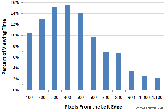
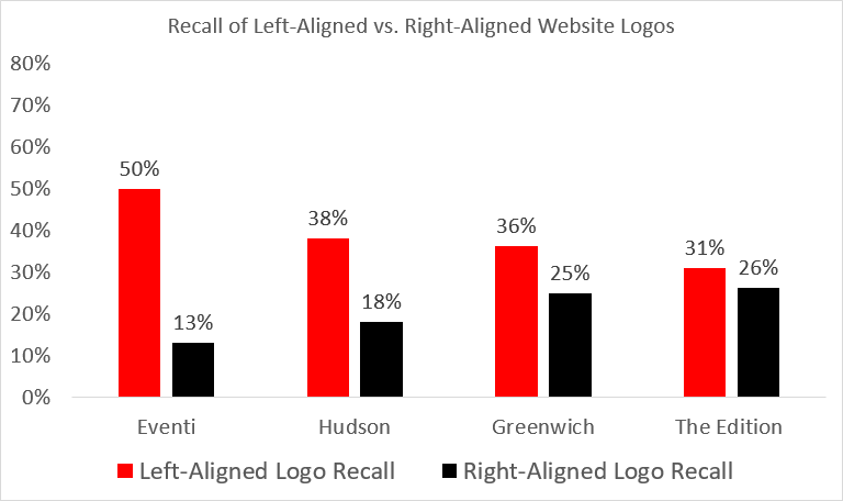
There isn’t an updated study that I can find that supports this conventional web design layout. But, as per a Feb 2016 study by Nielsen, users are 89% more likely to remember logos displayed in the traditional top-left position than logos placed on the right.
If you target left-to-right language speakers, than it’s highly recommended to swear by the traditional left-side website layout for bringing higher profitability.
Conclusion
We studied web visitor pattern and found the following results:
- Counter-intuitive results around the content reading pattern of users and how they view SERPs. The F-shaped pattern isn’t a commonality anymore.
- Appearing in knowledge graph results and leveraging schema data can help you to stand out in search results.
- The information placed on the left and above-the-fold continues to have a major impact on the user experience.
I hope that you can use this updated information to better inform your content marketing strategy.
As always, I would love to hear if you found counter-intuitive results in heatmap studies that you conducted on your website.
Grow your traffic