One of my favorite pastimes when I’m home in Seattle is to explore little-known neighborhoods in the city and window shop.
There is something exhilarating about finding a new-to-me used bookstore or a dusty record store that’s been around for generations.
It was during one of those neighborhood explorations that I started thinking about how similar a shopper’s experience in a store is to a user’s experience on a website.
It might seem like a thin connection, but hear me out.
Let’s say you, like me, loved used bookstores. You walk into a store, and what is the first thing you do?
You look around, and you judge whether the store is worth exploring.
For me, I will stick around if the shelves are stacked high with books, the aisles are narrow, and that old book smell is just right. Add a few worn chairs for perusing books, and I am sold.
Because when I go to old bookstores, my goal is to explore the place and discover an unexpected book.
Now, if I go to a hardware store looking for a tool to finish up a project, I want the opposite. I want wide aisles, clean floors, organized shelves, and plenty of staff to assist me.
It is all about expectations.
Websites are no different.
If a user comes to your site and doesn’t see the product they were expecting or doesn’t get the vibe they were anticipating, they bounce off your site and continue on their search.
The number of people who do this is called your bounce rate, and this is exactly what I want to talk about in this post.
What is bounce rate?
So what is bounce rate, and how is it calculated?
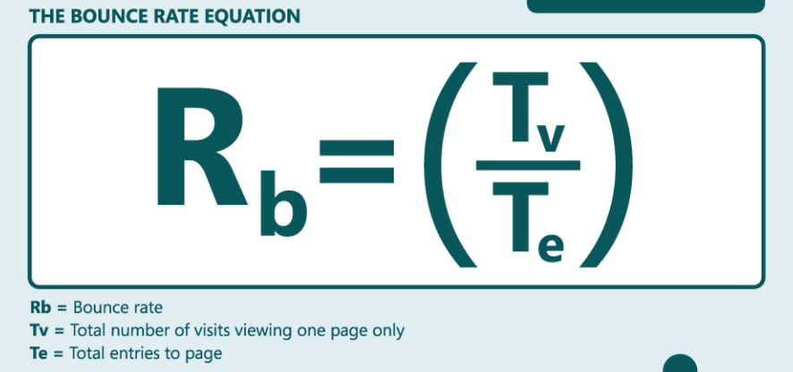
A bounce is a single-page session on your site. In Analytics, a bounce is calculated specifically as a session that triggers only a single request to the Analytics server, such as when a user opens a single page on your site and then exits without triggering any other requests to the Analytics server during that session.
The equation used to determine bounce rate is as follows, according to Kissmetrics:
Put more simply, Yoast defines bounce rate as “a metric that measures the percentage of people who land on your website, and do completely nothing on the page they entered.”
So, how do you figure out what your bounce rate is?
It is pretty simple to locate if you have Google Analytics enabled.
First, log in to Google Analytics.
Choose the site you want to see the bounce rate for.
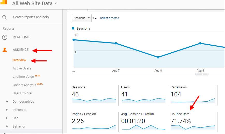
Then select Audience > Overview, and you will see the bounce rate displayed like in the screenshot below.
Pretty simple, as you can see.
But what does your bounce rate actually mean?
That is where things get more complicated.
What does bounce rate mean?
A higher bounce rate generally means that site visitors are not finding what they expect when they visit your site.
But what is considered a high bounce rate? It varies considerably based on many factors, most notably by industry.
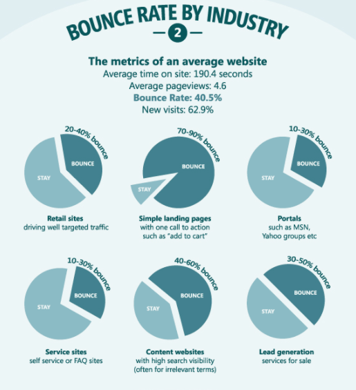
Kissmetrics ranked the average bounce rate for websites by industry in this infographic.
As you can see, service sites tend to have a lower bounce rate than retail sites. Lead gen service sites have a higher bounce rate than portal sites, such as MSN or Yahoo.
The difference in bounce rates in these cases is by design — the sites are used differently, which means the average bounce rates will vary.
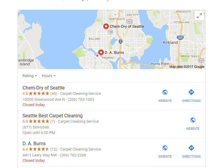
For example, let’s say I am looking to get my carpet cleaned before my family comes into town.
I go to Google and type in “carpet cleaner Seattle.”
Google provides a list of services, and I decide to click on the top one.
I look at their website, and I’m generally impressed with what I see. So, Idecidede to call to schedule an appointment.
What is right at the top of their site? The phone number.
There is no need for me to go to any other page on their site.
I dial the number on my phone and bounce off the page.
But, I didn’t leave their site because I didn’t find what I wanted. In fact, I found what I wanted so fast I didn’t need to dig.
This is a good thing, but it also might result in a higher bounce rate.
You have to consider how users interact with your site.
With that said, a higher-than-average bounce rate compared to other sites in your industry is a huge problem and one that I have talked about extensively.
One of the best solutions to lower your bounce rate is to publish high-quality content, which has the added bonus of increasing your overall site traffic.
What I want to focus on today are quick, easy ways you can decrease your bounce rate in the next week.
The following tips are designed for site owners who are short on time, and maybe even resources, but still want to give their site visitors the best experience possible.
Each of these tips will take most of you 20 minutes or less to implement, and you should start seeing results in a week.
Let’s dig in.
Move your opt-in below the fold
If you have spent more than a few weeks in digital marketing or web design, you’ve likely had it hammered into your head that opt-in should always go above the fold.
The reason for this is pretty simple.
Back in 2010, Nielsen Norman Group released a study that said, “Web users spend 80% of their time looking at information above the page fold. Although users do scroll, they allocate only 20% of their attention to below the fold.”
Meaning, most users don’t scroll at all on a website, and those who do don’t pay attention to what they see.
So, why would you move your opt-in down, away from eyes?
And why would you do this if I don’t even follow my own advice?
If your bounce rate is high, it may mean you need to spend more time building a relationship with your audience before you go asking for information from them.
Which is not to say that opt-ins should always go below the fold, but that it is a strategy to test if your bounce rate is higher than the rest of your industry.
For most site owners, moving the opt-in is as simple as relocating a widget in WordPress or emailing your developer.
A simple change, but it could make a huge difference in your bounce rate.
Moving your opt-in lower allows you to use more of that valuable above-the-fold space to show off your product, share how your business is different, or show what you stand for.
Leverage that space, and you will find that people are more willing to opt in.
Make your content easy to read
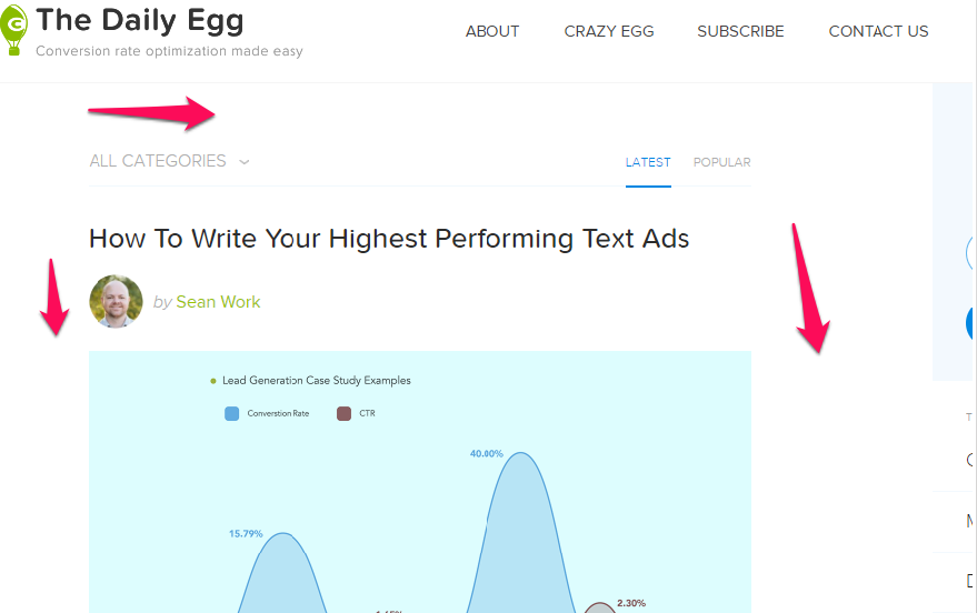
Head over to the Crazy Egg blog, and you will notice something pretty striking.
There is a lot of white space.
The left side and the right sidebar have nice, big open spaces.
The font is clean and simple.
All of these decisions were made to keep the blog uncluttered and easy to read.
Your eye knows where to go. It knows what to look at next.
Based on our testing, this contributes to a much lower bounce rate.
Think about the retail store example I opened with — have you ever walked into a store and immediately felt overwhelmed?
The stores that come to mind for me are clothing stores targeted at 14-21-year-olds. The stores have low lighting, stacks of sweatshirts and jeans everywhere, and loud music pumping.
That type of atmosphere may work for their target audience. (I suspect it does.)
But a loud, crowded atmosphere likely won’t work for your website.
Here are some quick changes you can make to your site to make it easier to read:
- Make sure your font size is at least 16 pixels (some browsers default to this display size but not all).
- Use an easy-to-read font, like Open Sans or Josefin Slab. These were ranked as the most popular fonts by Awwwards magazine, in part because they are simple and easy to read online.
- Leave space between page elements, and allow for plenty of white space to make your site easy on the eyes.
- Declutter your sidebars.
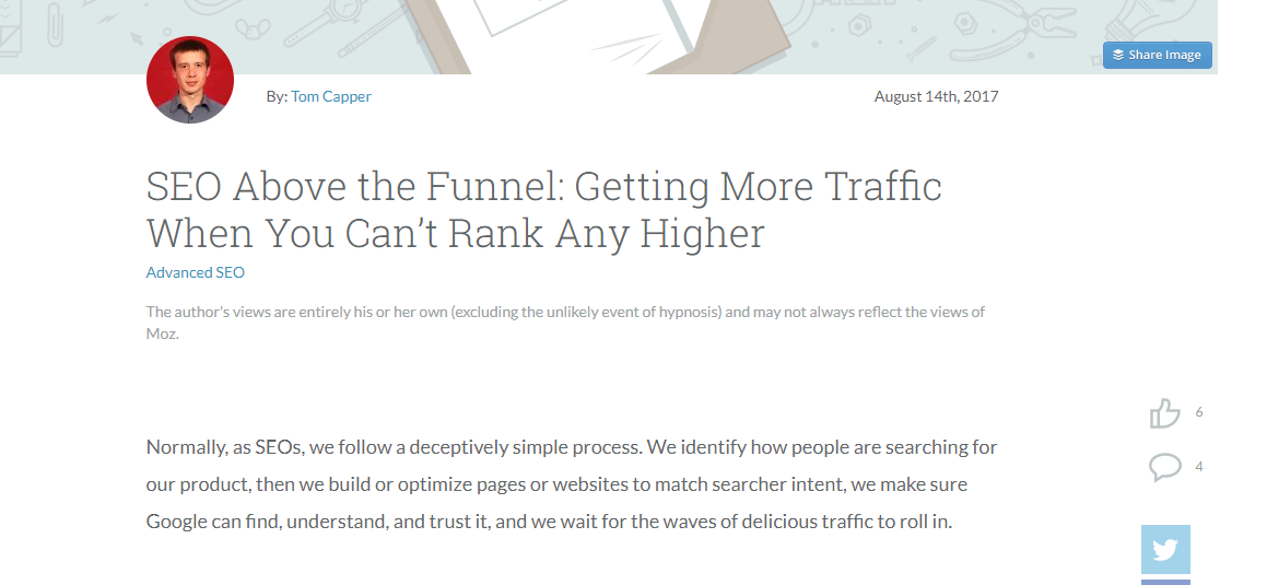
Another example of a site that does a great job of making their content easy to read is Moz’s blog.
Note the use of a clean font, nearly empty side bars, and plenty of white space.
For most site owners, making just a few tweaks to your site layout will allow you to offer your readers a similar experience.
Add internal links
One of the key components to calculating bounce rate is the number of people who only view one page on your website.
It follows, then, that one of the easiest ways to lower your bounce rate it to keep people on your site.
Internal links are the simplest way to do this.
Every post I publish on NeilPatel.com has at least one internal link, ideally three.
Why?
It isn’t because I just think I’m super awesome and want to toot my own horn.
It’s because I want to provide readers with valuable information about related content.
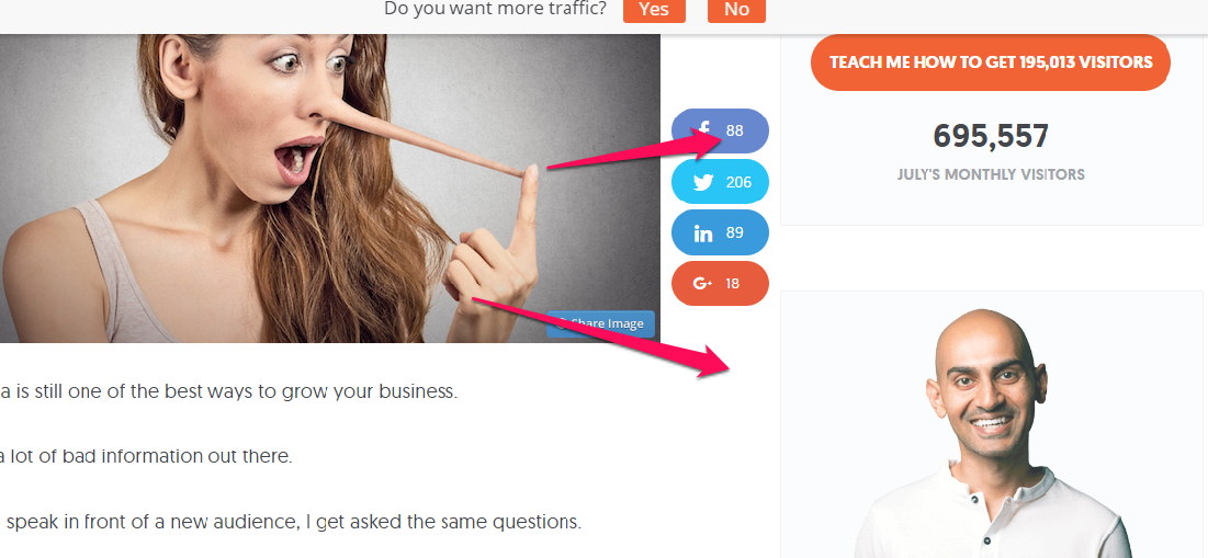
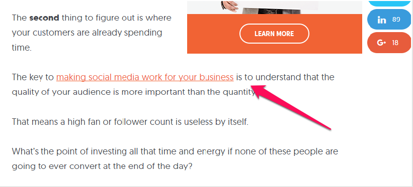
For example, look at this post about social media influencers.
That is an internal link that provides the reader with even more information about a topic they already care about.
But, Neil, you say, I can’t really implement a new, site-wide internal linking policy in a week.
Which is true.
There are two steps you can take to leverage internal linking going forward:
- First, make sure every post you publish going forward includes one to three internal links. Don’t just push mediocre content down your reader’s throat, though. Share resources that will actually help them solve a problem.
- Second, pull a report of your top 10 most trafficked pages and add internal links to those pages. Again, at least one internal link, but ideally, two to three.
In a perfect world, you would take the time to sort through all your old posts to add internal links, but that might not be a good use of your resources.
These quick fixes will start showing results immediately.
Let’s look at a few other sites that use internal linking to their benefit.
This post on Search Engine Journal has at least 10 internal links.
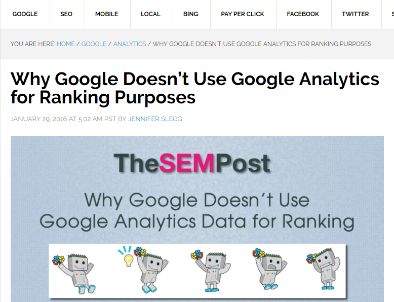
This short post on The SEM Post has two internal links, both to related posts using optimized anchor text.
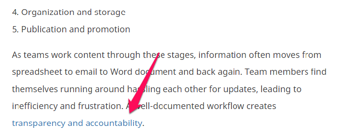
And this post on Convince & Convert hardly gets 200 words in before offering up the first internal link.
Keep in mind, the goal with internal linking is to keep your readers on your site. But, for the strategy to work you have to link to actually useful information.
And be careful not to cannibalize your rankings by linking to posts that target the same keyword.
Add other types of content besides just text
When you think of publishing content, what comes to mind?
Most people think of blog posts, ebooks, guides — all text-based types of content.
If you are only focusing on the text portion of your content, you are missing out on an easy way to lower your bounce rate.
Adding images, video, and audio files is a simple way to keep readers on your site.
Why?
We are more likely to remember content that is paired with an image.
John Medina reports, “Hear a piece of information, and three days later you’ll remember 10% of it. Add a picture and you’ll remember 65%.”
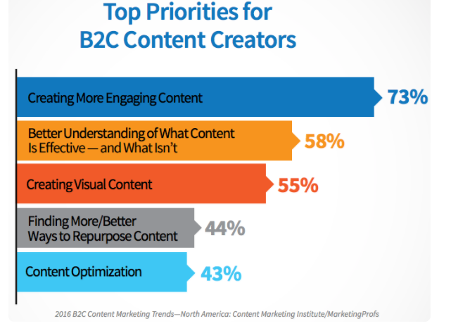
According to a 2016 report by Content Marketing Institute, 55% of B2C content creators were focused on creating visual content for the year.
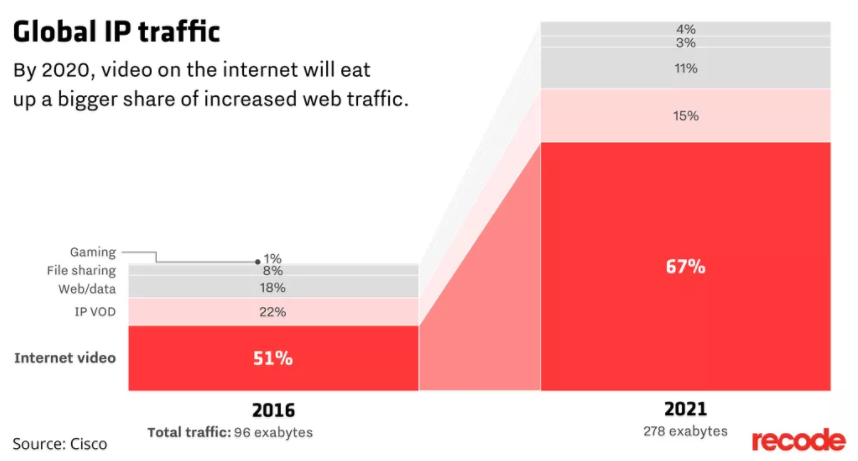
Video content can make a massive difference as well.
In fact, by 2021 video could make up as much as 82% of all internet traffic.
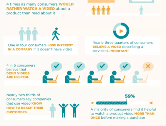
And four times as many consumers report they would rather watch a video about a product than read a bunch of text about the product.
Non-text content is the future of the Internet, and if you want to engage your audience and keep them on your website, you need to be using video, images, and audio.
What is an easy way to add visual components to your content? Here are a few ideas:
Embed videos
You don’t need a massive production budget to create useful videos. Start by live streaming on social media, and embed those videos in your blog posts.
Or record your computer screen and create step-by-step how-to videos. Simple to create, effective, and no need to break the bank.
Use screenshots
You might have noticed I use a ton of screenshots in my blog posts.
There is a good reason for this — it breaks up the text, making it seem less intimidating to read, and screenshots are an easy way to help readers understand step-by-step instructions.
Add charts to highlight data
Are you sharing a ton of data? Use an online tool to create charts and graphs to break up number-heavy text and showcase the results of studies.
Create custom images
I am not a fan of plain, boring stock photos.
Creating custom images is an easy workaround that can help you create visually engaging content without using the same boring stock photos as every other site.
Try combining images, adding text, or using a site like Canva to create images that pop.
How can you implement this strategy in the next week? Make sure all your content moving forward includes at least two to three visual images.
As you get more proficient creating your own images, aim to include some type of image every 200-300 words.
If you have the resources, go back and add visuals to your top trafficked posts. Making the changes going forward will help keep more people on your site and lower your bounce rate.
Conclusion
Throughout all this, I haven’t tackled one big question many people have about bounce rate:
Why does bounce rate matter?
Particularly considering so many factors can affect bounce rate, is it really something we should worry about?
The answer is a resounding yes.
Bounce rate is one of the factors Google looks at when it’s deciding where to rank your website.
Bounce rate can also give you insight into whether your customers are finding what they are looking for or what they expect when they come to your website.
Site owners should be more concerned with user experience than with what is technically considered a ranking factor.
By implementing the strategies I laid out above, you will be able to lower your bounce rate, improve your ranking, and better serve the people who come to your website.
That is a win-win-win.
Do you have a higher-than-average bounce rate? What steps have you implemented to decrease it?




Comments (10)