Pitching your startup idea or product to a room full of investors is extremely nerve-wracking.
I know because I’ve done it more than a few times.
But it doesn’t need to be terrifying.
With the right presentation deck, you can hold potential investors’ attention long enough to explain what your product does and why it’s a good investment.
A good presentation isn’t a substitute for a good product. You need to have both to win over a crowd of investors who hear pitches all day long.
You might think, “Why even bother?”
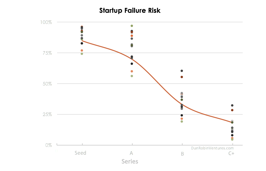
Getting early investment in your company can mean the difference between surviving and failing when it comes to startups.
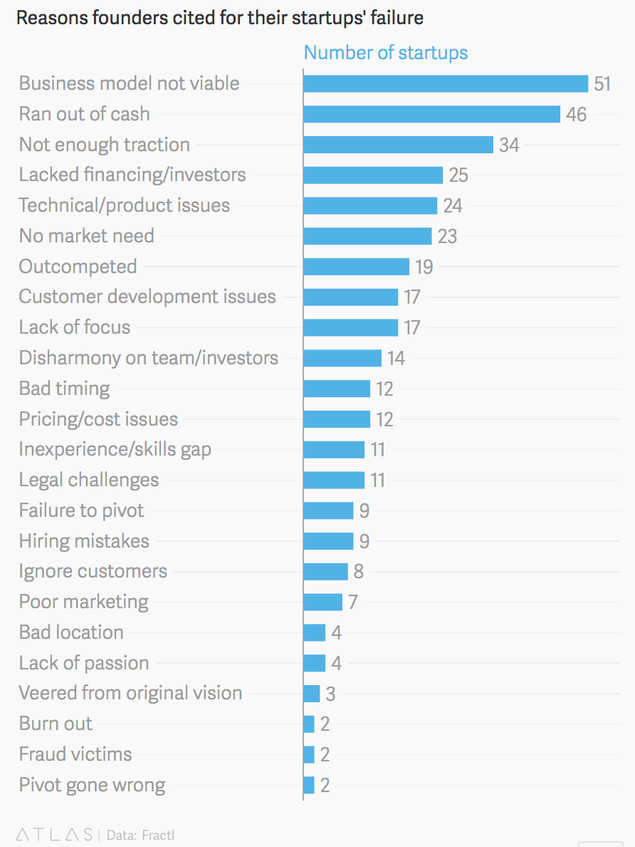
90% of all startups fail, most often for budgetary reasons.
The two main issues that top the list are an unviable business model and just plain old running out of money.
Investing in startups is risky in the early stages.
Investors aren’t sure if you’ll be around in a few years.
Even if you are, maybe you’ll have burned through all their cash and gone bust before they ever see a penny of return.
To get their buy-in during the earliest phases, you need to create a killer pitch deck.
Today I’m going to break down my successful pitch-deck formula step by step so you can copy it for your next funding presentation.
Get the necessary tools
There are a lot of ways to create your pitch deck.
You can use Microsoft PowerPoint or Apple’s Keynote, which are both readily available. Keynote is free on Apple computers.
If you’re using an iPad or just want a simple way to create a pitch deck online, Canva is an excellent tool.
It has pre-designed templates that you can customize. Your pitch also gets saved to your online account so you can work on it anywhere.
I’m a big fan of Canva, so I’ll be using it for this step-by-step tutorial. You can follow along and create your pitch deck in any program of your choice.
Let’s get started!
Step 1: Set up your document
When setting up your pitch deck, you have two options in terms of aspect ratio: 4:3 or 16:9.
Most modern monitors and TVs use a 16:9 aspect ratio, otherwise known as widescreen.
Creating your pitch deck in 16:9 will mean that t arere’s no black bars on the sides or top and bottom on a modern screen.
This chart helps illustrate the difference:
I’m going to create my pitch in 16:9 using Canva.
Log in to Canva or sign up for a free account.
Click on “More” in the Create a Design menu.
Scroll down to “Documents” and choose the 16:9 presentation.
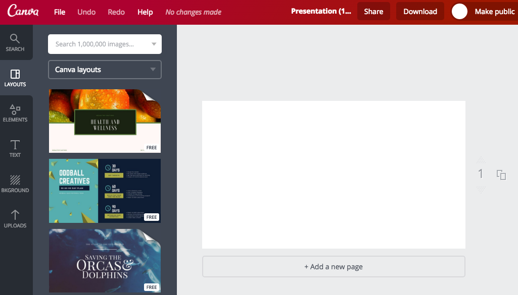
Your presentation will open in a new tab and you’ll see a screen like this.
As you can see on the left side, there are several options for graphic elements, layouts, and text. There’s also a section to upload your own photos.
I’ll walk you through how to use each section as we continue creating our pitch deck in this tutorial.
Step 2: Create a visual style
When you start your new presentation, you’re taken to the Layouts tab.
Along the left side of the screen are pre-designed templates that you can use to easily create a professional-looking pitch deck without needing any design skills.
Click through the options on the left until you find a style you like.
Some of the templates have multiple page layouts included. This allows you to easily create different page types while still having a cohesive style.
When you click a template, it will expand to show all the page layouts in that template.
Make sure the template you pick is professional and not too cutesy. You don’t want investors to focus too much on how your presentation looks.
You want them to focus on the content you include and listen to you present it!
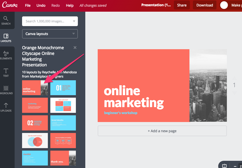
A layout with a minimal style that doesn’t include a lot of distracting photos or text is best. I’m going to choose this style.
To add the first slide, click on the slide you want to create.
It will add that template to your current page on the right.
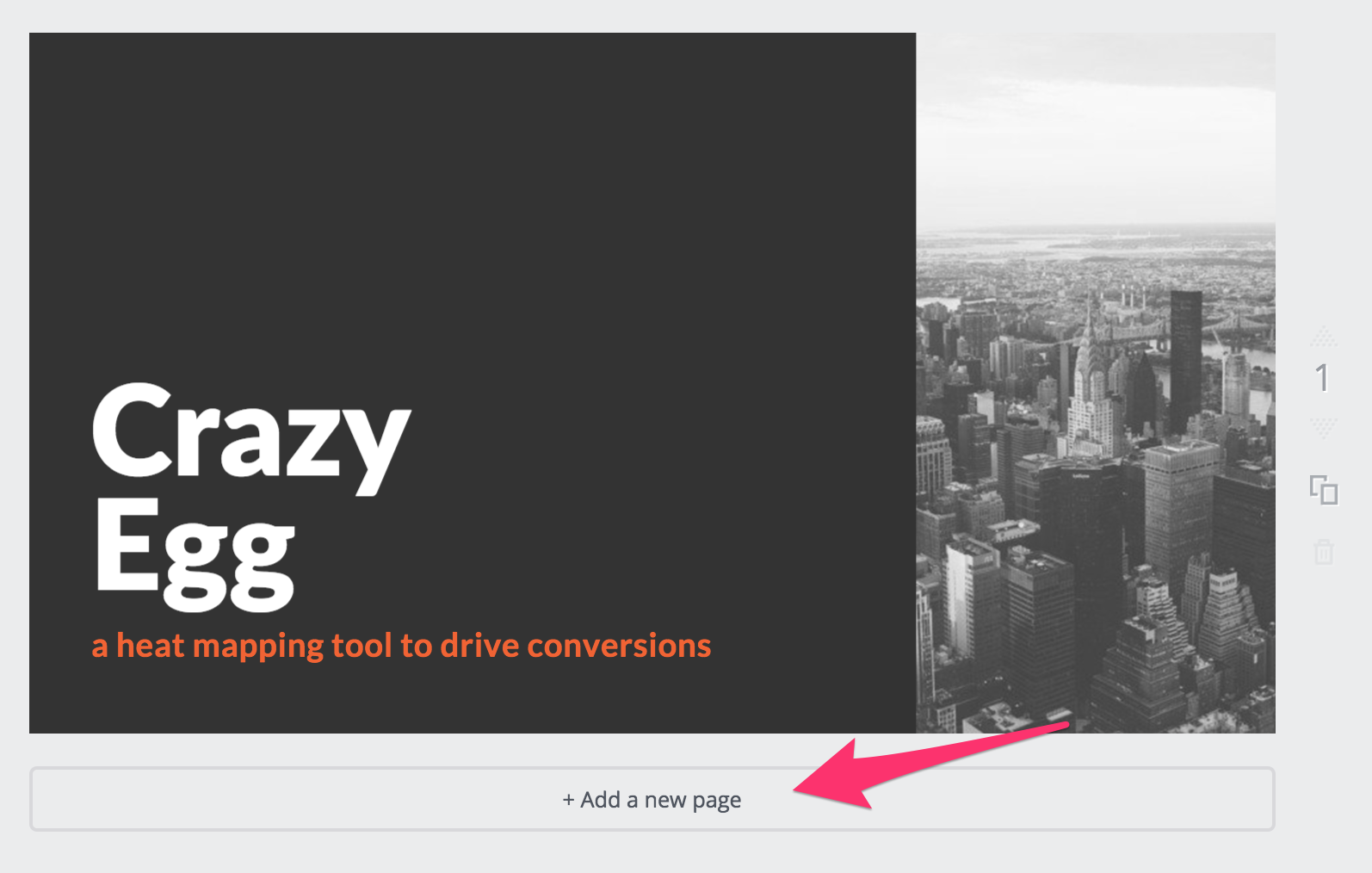
As you can see, I now have my title page.
To edit the text, just click on it.
It looks pretty good, but I’m not a big fan of those colors. The blue on orange is a little much for me!
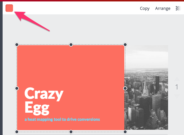
To change them, click on the orange background.
Then, you’ll see a color square in the top left corner.
Click it to choose a new background color.
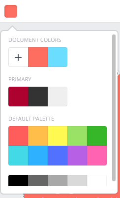
You can choose one of the default colors by clicking the square you want.
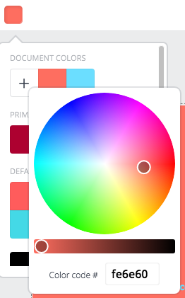
You can also add a custom color by clicking the + square.
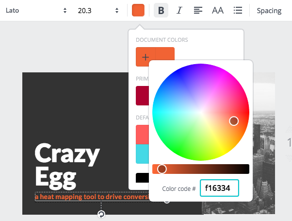
Once you’ve picked out a new background color, repeat the process to change the text color from light blue to something more legible.
I changed it to my signature orange color on a dark gray background. Much better!
It may not seem very important, but creating a professional-looking deck helps gain an investor’s trust.
82% of investors are now factoring the strength of your brand into their investment decisions.
Now that we have the basics set up for our presentation, let’s get into creating the actual slides you need to impress a room full of investors.
Step 3: The overview
This slide is exactly what it sounds like.
Your goal here is to create a very high-level overview of your product or service.
Don’t put too much text on the slide. You want to hook the investors right away by speaking about your product.
The slide is only meant as a backdrop with a few key points to have up on the screen while you’re talking.
This is where being a great storyteller comes in. I have a video about learning to be a good storyteller that you can watch below.
Keep your talk short: Shoot for a pitch that lasts less than one minute.
I would suggest creating one impactful statement that sums up your product and having that be your overview slide.
Think of it like your elevator pitch on a slide.
I’m now going to switch back to Canva and add a new page.
Click on the “Add a new page” button.
Now we want to add in a new slide layout.
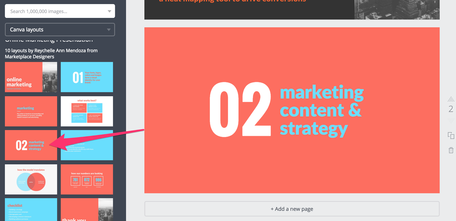
It needs to match our title page in style, but we need to make it a little different to add variety. Click the page layout you like best for the overview slide.
I chose this one:
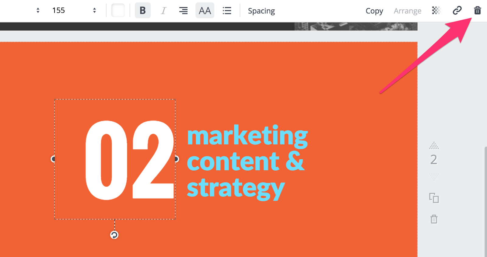
I changed the background color to my orange. I also don’t like the big “02” on the page, so I deleted it.
To do that, click on it and hit the trash can icon on the top right.
I also changed the font color, then I wrote my elevator pitch for Crazy Egg.
It doesn’t look very nice being off-center though.
Canva makes it easy to change that. Click on your text box and drag it toward the center of the slide.
You’ll see lines that tell you when the text box is perfectly aligned to the middle of the slide.
Easy, right?
From now on, add a new page and choose a page layout each time we move to a new step in this tutorial.
Step 4: The problem your product/service solves
The next slide in your deck is why you created your product or service in the first place.
You’ve explained what it does at a high level, but why does it exist?
Your slide and your verbal presentation need to answer the following:
Who does it help?
What kind of person is this product for?
In Crazy Egg’s case, it helps marketers learn how users are interacting with their websites.
What problem is this solving?
This is the crucial part you need to explain well so investors understand the true value of your product.
Crazy Egg allows you to measure the effectiveness of your website by seeing how real users interact with it and where they click, look, and visit.
This enables you to redesign your website with confidence and continually test it to ensure that users are taking the actions you want them to.
How does it solve that problem?
This is where you explain the tech piece — or the nitty gritty details.
I’ll spare you a detailed example for Crazy Egg. I would mention something about the technology behind the software and how it accurately measures user data.
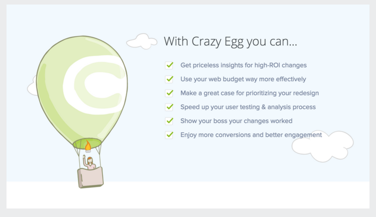
For this slide, I created a list of key features.
I would suggest going through each of the answers above verbally in your presentation.
Step 5: What your product is
Think of this like the big reveal at a magic show.
You’ve talked about who your product is for, what problem it solves, and how it works.
Now reveal what it is.
In my case, Crazy Egg is a heatmapping tool for analyzing website behavior.
You can write a simple statement like that on your slide, but an even better idea is to include an explainer video if you have one.
Video is a powerful way to communicate how something works, especially with complex technology products.
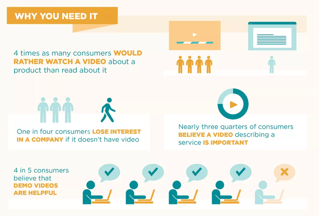
80% of consumers say demo videos are helpful.
Even more telling is that 1 in 4 consumers loses interest in a company if they don’t have a video!
Unfortunately, Canva doesn’t let you embed a video right into your presentation.
A workaround for that is to take a screenshot of your video, add it to the slide, and then create a link on the slide to your video.
You can click the link during your pitch and play the video from there.
In programs like PowerPoint, you can add a video directly into your slide.
Here’s how I made this work in Canva for my presentation:
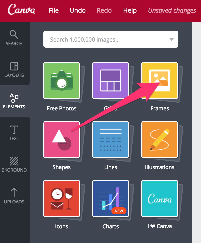
To get the video inside a laptop screen, click on Elements on the far left side menu. Then click on Frames.
Scroll down until you see the laptop.
Click and drag it onto your slide. You can make it bigger or smaller by dragging the point in the corner, like this:
When you’re happy with how it looks, grab a screenshot of your video.
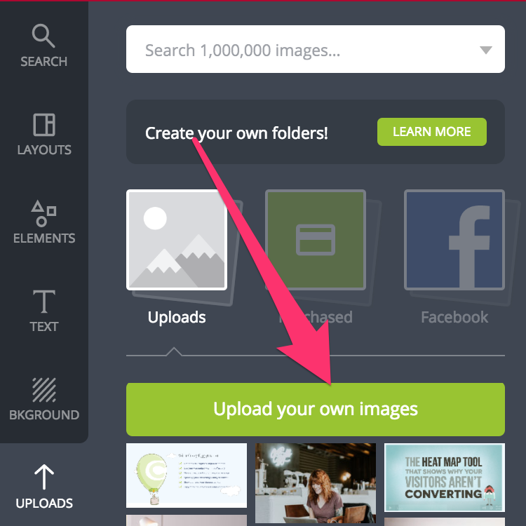
Click on Uploads on the left side menu. Then click “Upload your own images.”
Upload the screenshot you just took and it will appear below the green button.
Click on it and drag it over top of the laptop. You’ll see it pops right into place inside the laptop screen, like this:
I decided to add a “play button” icon over top of it to make it obvious that it’s a video.
You can find all sorts of icons under Elements -> Icons in the left-side menu.
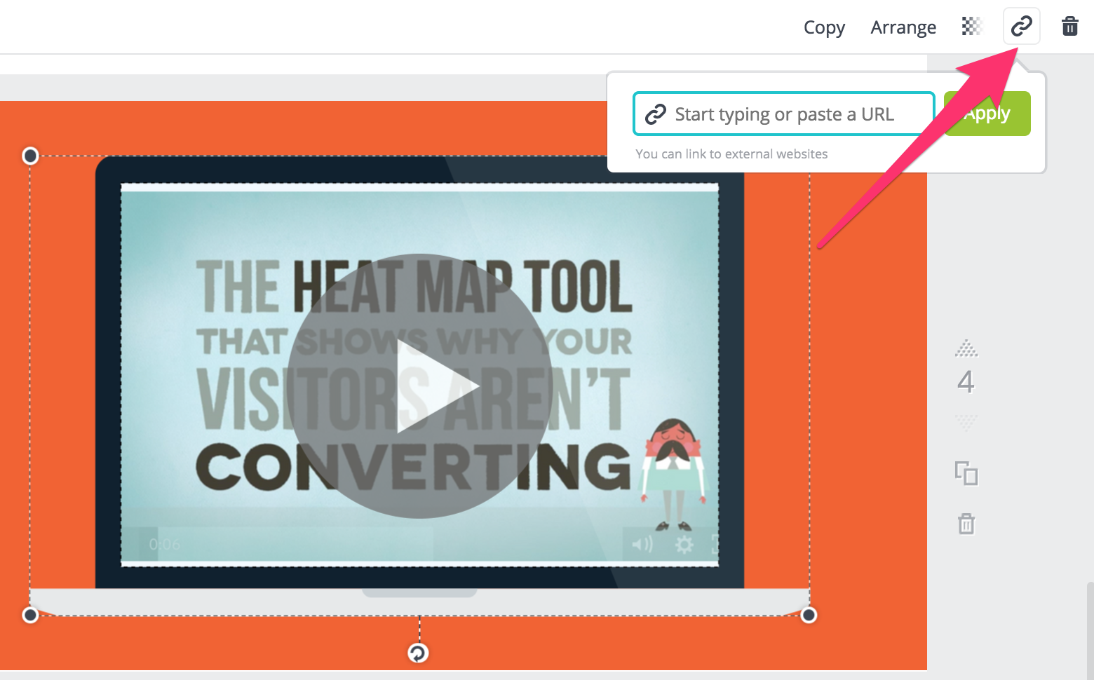
Lastly, I need to link the screenshot over to my video.
Click on the laptop so that it’s selected. Then click on the chain link icon on the top right.
A box pops up and asks you for a URL. Paste in the link to your video and click “Apply.”
Step 6: Your team
Next up, you need to include a section about your team.
Include your key management personnel here and talk about each of them in your pitch.
Mention each team member’s history, educational background, and skills, and don’t forget to describe their specific role in the company.
Have a bit of fun with it!
Explain the unique value each person brings to the project. Talk about their passion for the project and why they decided to work for a startup.
Investors like to see a team with diverse experience.
This increases the chance that the team will be able to withstand many roadblocks on their way to success.
Step 7: Market opportunity
In this slide, you need to break down what the opportunity is for your product or service.
Typically, this slide features industry revenue numbers and other key statistics.
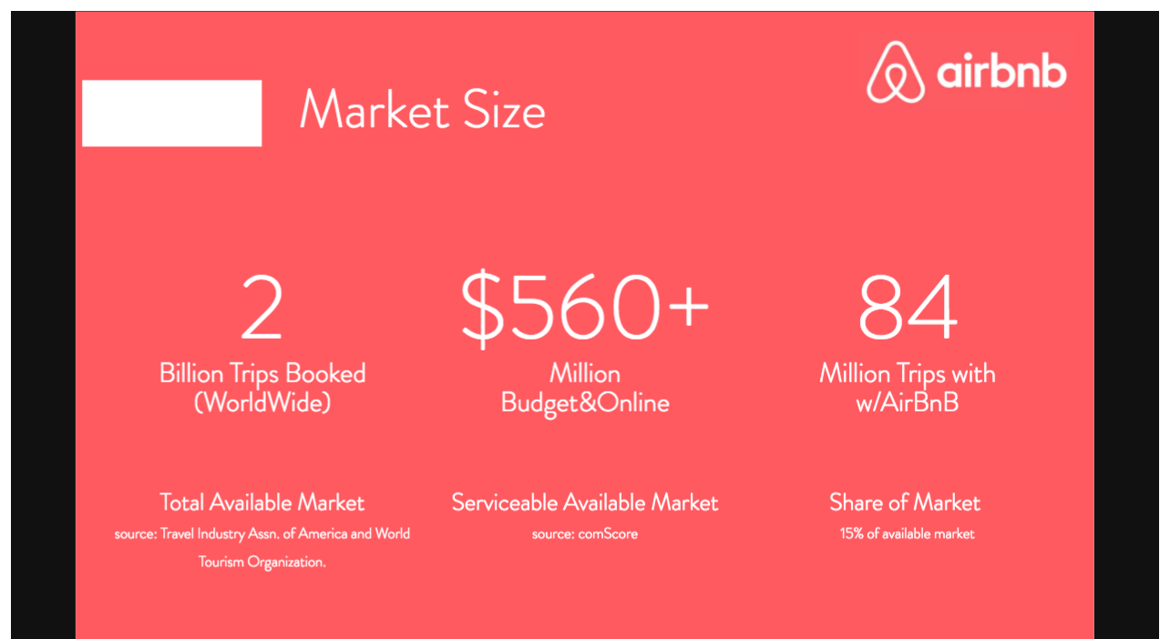
For example, in Airbnb’s pitch deck, they summarized the total size of the market, which is how many annual trips are taken.
They displayed that in a dollar figure, and then expressed the percentage of that market that they expected to attract (15%).
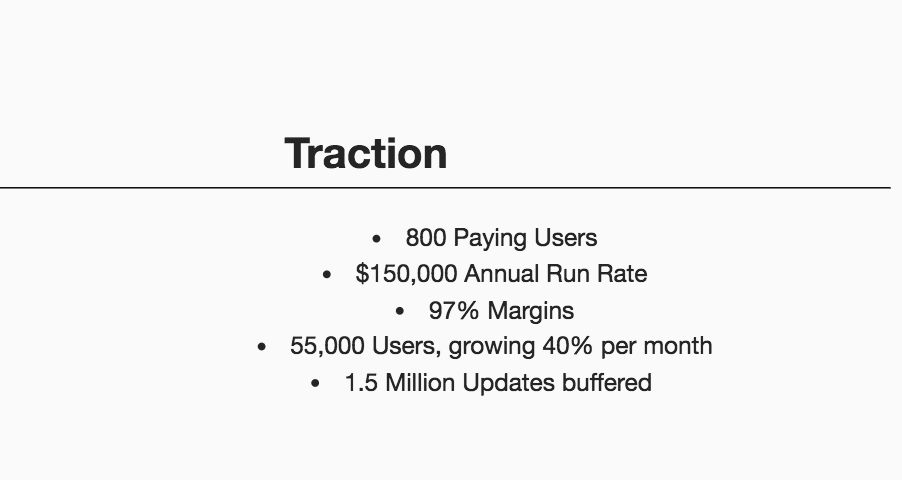
Here’s another example.
Buffer broke down their current market size based on free and paid user counts, monthly growth rates, and how many times their software has been used (“updates buffered”).
I didn’t create a slide on Crazy Egg for you this time, but hopefully, you get some inspiration from these examples.
How market size and share is calculated varies a lot depending on your product.
I can’t tell you exactly how to find your market’s size or what share of the market you should aim for.
Study your competition and see what they’re charging and how many users they have (if you can find out).
Step 8: Your marketing strategy
This slide needs to address how you’re going to get the market share you proposed in the last slide.
There are plenty of different ways to market your product.
Most likely, you’ll need to revise your marketing plan later on to tweak the things that aren’t working and scale up the things that are.
Most of the information here should be part of your verbal pitch so you can explain it in detail.
Like the first slide, this one is a summary of the key points to have up on the screen behind you.
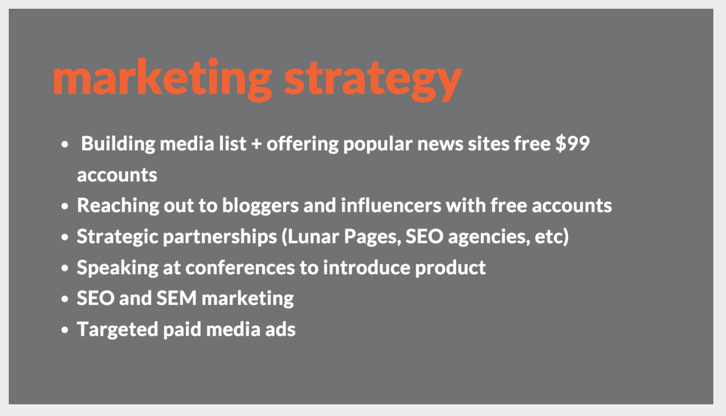
Here’s what our original marketing strategy for Crazy Egg looked like:
Make sure you talk about each point in your pitch. Mention how you’re going to carry out each part of the plan and your overall budget.
We grew Crazy Egg to 100,000 users on a small $10,000 marketing budget.
It’s possible to stretch your marketing budget a long way, especially online.
Step 9: Business model
This is the moneymaker!
You need to be able to clearly and concisely explain how your product will make money.
Investors want to know that you have a viable business model in place even if you aren’t currently making a profit.
This slide tells them if investing in you would be throwing money down a drain or not.
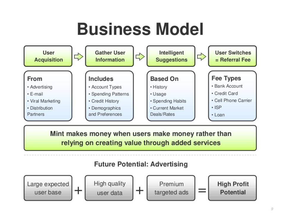
There are many different options for business models out there, but here are a few examples from famous startups.
Mint’s business model is based on a typical freemium strategy.
Their personal finance software is free to use. If a customer signs up for a credit card or other financial product from a link on their site, Mint makes money.
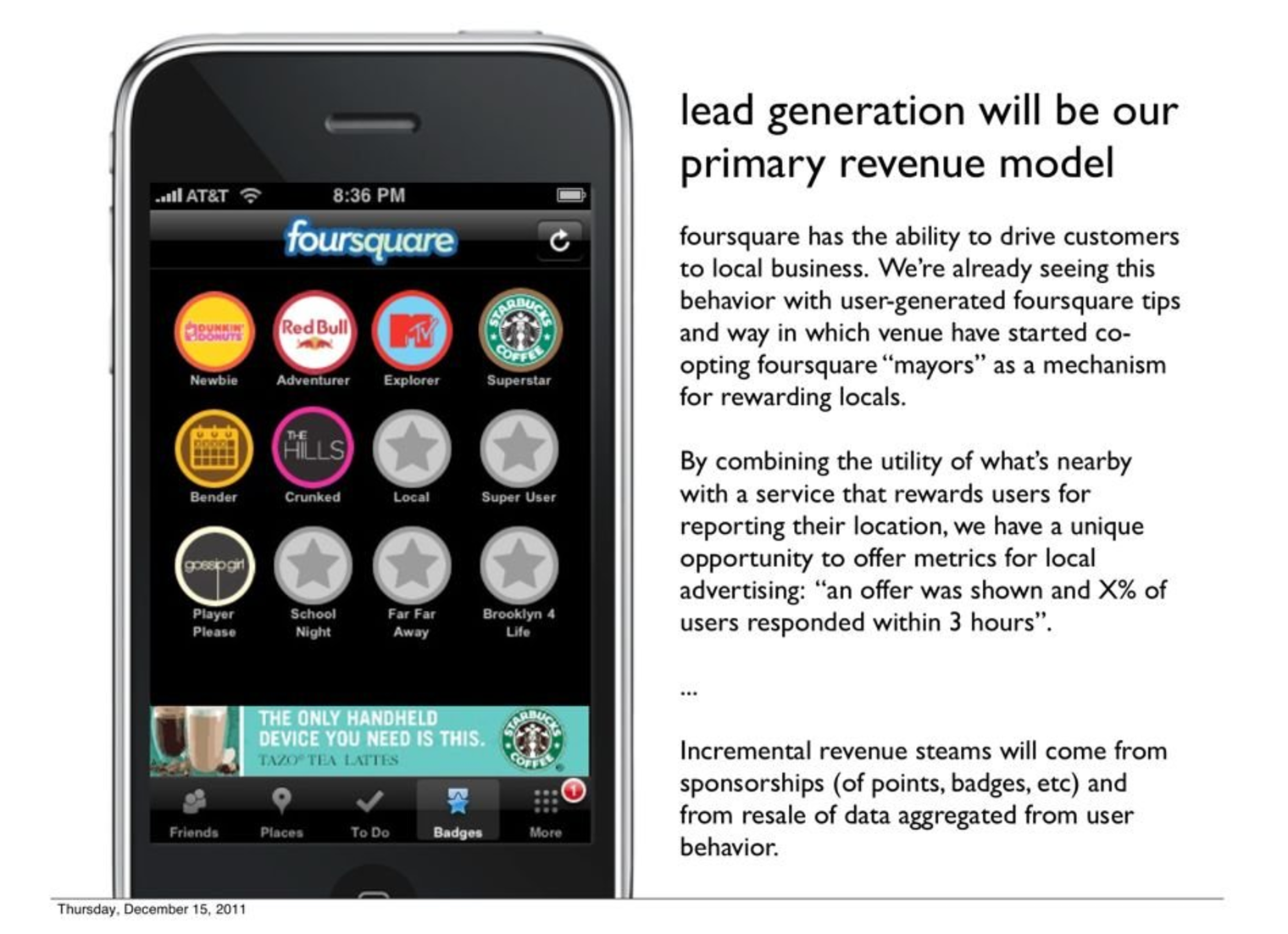
Here’s another example from Foursquare.
They chose to explain their business model in words instead of a chart.
Whatever your model looks like, it needs to clearly show a plan toward profitability.
Step 10: Financial summary
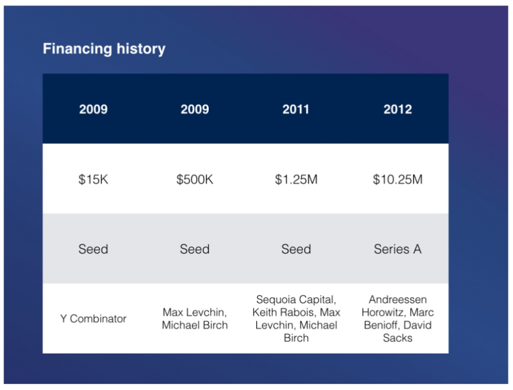
This slide should summarize any funding you’ve received so far, if any.
Here’s an example from MixPanel.
You also need to explain how much you’re looking for now and what that money will be used for.
The key is to focus on the potential ROI for the investors in the room.
If you’re trying to raise $250,000 in funding, explain how that money will allow you to launch your mobile app in just 3 months. That will allow you to up-sell items to customers and display ads.
Calculate the revenue on that based on your target audience size.
If you plan to get 10,000 app installs, figure out what each of those users are worth. Maybe it’s $10 in advertising revenue.
That means you would generate $100,000 in passive revenue.
Explain how that money will be re-invested in the company to grow even further.
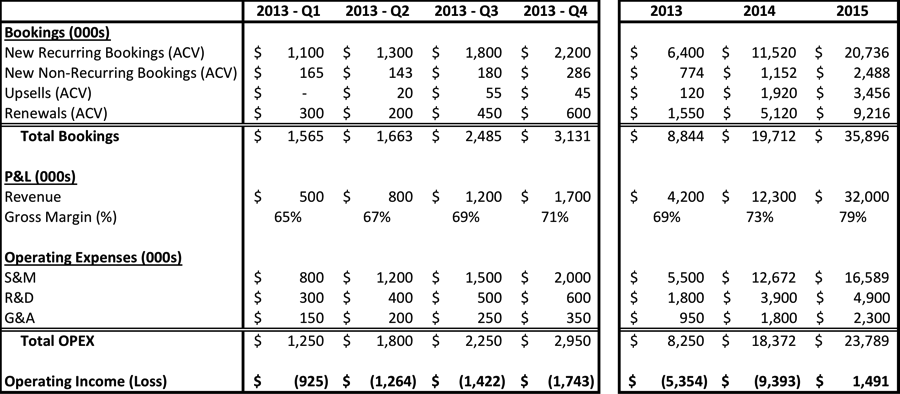
Whatever you do, don’t slap up an Excel spreadsheet on a slide, like this:
The investors in the room aren’t going to squint to read this from 20 feet away, nor would they want to.
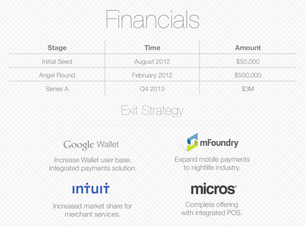
Keep it simple and visually engaging.
Here’s a good example from Flowtab:
Conclusion
Impressing investors is a tall order.
If you’re a first-time founder, you’ve probably never given such an important speech in your life.
The pressure can get to you.
Beyond the basics of practicing your pitch and knowing your business numbers, you also need to come across like a real human being.
Be engaging. Tell a story.
Capture the audience with your personality.
All in about 3 to 10 minutes on average.
You can’t razzle dazzle a crowd of seasoned investors with showmanship alone. You need to create a solid pitch deck and be able to fully explain every detail of your product or service.
Most importantly, you need to do all that and get across how your product or service will make the investors money.
At the end of the day, that’s why they’re there: to make money.
They may think your idea is great and your pitch was well put-together, but if they don’t see a way to make money from you, they won’t invest.
According to a study from the University of Bath, only 1 in 10 startup investment deals actually return a decent profit. The other 90% fail or produce minimal returns.
Investors need to choose carefully.
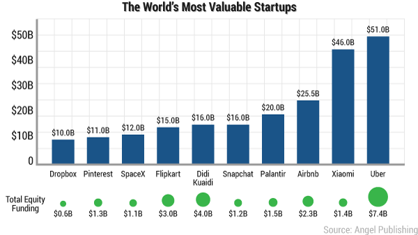
The world’s highest-valued startups are well-known, but you don’t hear about the failures.
Every item you explain in your pitch should be able to be tied to the ROI of the investment you’re asking for.
Having a plan for everything shows investors that you’re serious.
Your passion and personality combined with a slick presentation deck can help you close those important investment deals!
What are your best tips for creating a pitch deck, or pitching to investors?












Comments (12)