They say that writing the headline is the hardest part of publishing. Some people have even devised specific strategies to make it easier — ranging from fill-in-the-blank templates to waiting until the last minute to whip up something good and creative.
Whatever method you choose, these nine examples will make you rethink the way you craft headlines. Why? Because they all have several points in common that are worth analyzing from a copywriting point of view. Let’s take a look:
1. Avocode: Simple, straightforward, and to-the-point
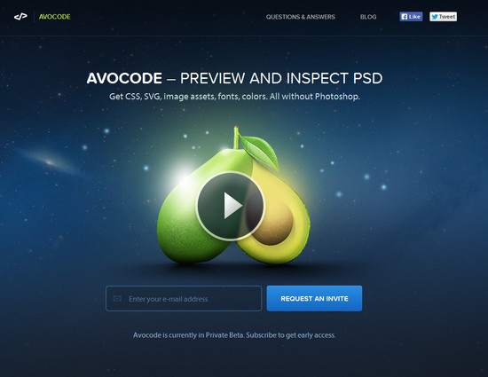
Avocode is a service that allows developers to gather important details from a PSD file without the need for Photoshop. The headline works in that it states exactly what you can do with the site and then welcomes you to request an invite. Nothing loud, pushy or overly complicated. A small “Questions and Answers” link in the upper right helps relieve any lingering doubts the visitor may have.
The sub-headline here gets into the nitty-gritty of the offer and does it flawlessly in a single sentence. Simple, straightforward, and to the point.
2. Bing: Let the facts do the talking
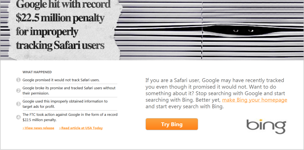
I’ve kept this ad from Bing for a while, just because it was so good. A newspaper-style clipping and a pair of sinister eyes complete the picture, and it’s easy to tell exactly at-a-glance what this is about. Google said it wouldn’t do something, and they did it anyway. Of course, Bing is not immune to having its own search records seized, but there’s no mention of that.
Bing doesn’t even go into a full-fledged bullet point frenzy over what they do better, because as we all know, you could probably count those things on one hand. Instead, it lets the facts speak for it and backs them up with the original sources. Unsurprisingly, this ad was targeted specifically at Google-using Safari browsers for the best possible targeting results.
It’s not known whether or not the usage of Bing increased as a result, but it’s a safe bet that many people were concerned about their privacy and decided to at least try Bing as an alternative.
3. Name Badges: Easy and fast
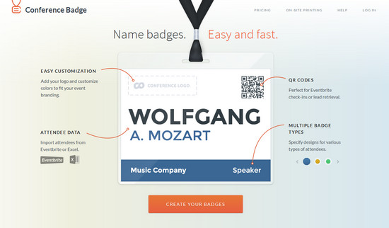
What I love about this example is that it doesn’t mince words. And when it comes to something as mundane as name badges, writing a thought-provoking, interesting, and unique headline would make most people leap into oncoming traffic.
The supporting image copy illustrates just how these conference badges are different from the typical “Hello, My Name Is” stickers, and invites the user to easily create their own badge in minutes. When it comes to designing something, “easy” and “fast” are the buzzwords that get clicked.
4. Pinterest: Create your own outcome
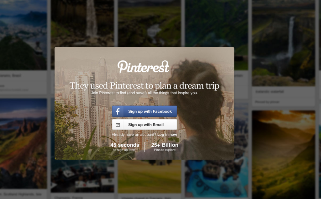
Let’s imagine for a moment that you’re not really sure what Pinterest is. Maybe you’ve heard about it, but you don’t understand why everyone’s pinning and sharing and creating. This headline makes it relevant. “They used Pinterest to plan a dream trip” is just one of many possible outcomes of using the site. You’ll have to sign up to discover yours.
Fortunately, Pinterest adds a little enticement to the headline by letting you know that it only takes around 45 seconds to sign up and that there are billions of pins to explore — so you can use Pinterest to do whatever inspires and motivates you.
5. Oscar: Make the impersonal, personal
Debuting in New York, Oscar is a health insurance company that, as its introductory paragraph describes, is doing insurance differently. The bold colors and “You & Your Family. Covered” grabs your attention, and the smaller “Hi, we’re Oscar” asks the visitor to take another look. By taking something as boring, frustrating and confusing as health insurance and making it friendly and open, Oscar has the potential to get a lot of positive attention through just the power of words alone.
6. IconJar: Get comfortable with action words
When you’re crafting headlines for your landing pages, it’s important not to lose steam after the big reveal (your offer). So what IconJar has done here is a trick that you can easily duplicate — use action words:
Store, search, preview, use. It’s easy to say something like “IconJar keeps your icons tidy so you can find them anytime”, but that’s bland and uninspiring. Instead, the copy uses action words and references them to “you” so that not only do you have these movement-inspired words, but you could actually picture yourself using this app in the process.
And if someone can picture themselves using your product or service before they’ve even hit the buy button — congratulations, you’ve already sold them.
7. Mixbook: Photo books, simplified
The idea behind Mixbook is captured brilliantly in this page — which not only has a direct, concrete headline that would appeal to anyone looking to create a photo book (100% Happiness Guaranteed), it also has a gorgeous hero shot of a family enjoying the product in close, crisp detail.
Above the headline and hero shot are supporting categories that go into a little more detail on product options and other specifics. There’s even a link to a “Get Inspired” page where you can view tutorials and gift guides.
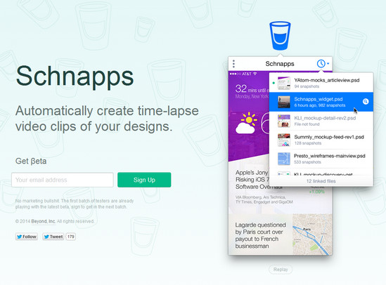
8. Schnapps: Clear headline and time-lapse imagery
Schnapps is an app that lets you create time-lapse videos of your design work. This would be a great addition to a portfolio in order to illustrate the start-to-finish production work that goes into making a beautiful, elaborate design of any kind. The headline is simple and says in just a few words exactly what the program does.
A bold image (that is actually a time-lapse video!) shows you exactly what Schnapps is capable of.
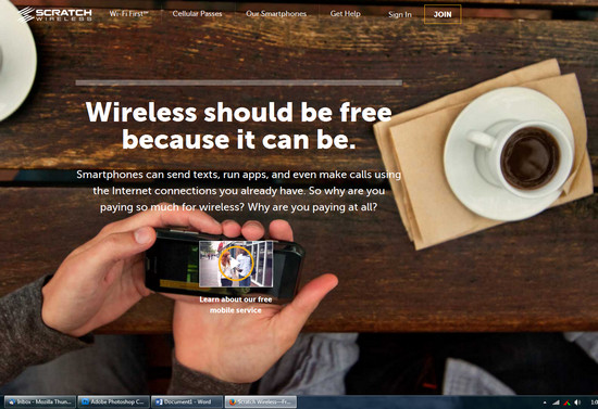
9. Scratch: Making you think
Scratch Wireless’ headline makes you think — wireless should be free. Its sub-headline is where it hits that light bulb moment — look at all the things wireless can do using your existing internet. Why are you paying so much for it, in fact, why are you paying at all? (emphasis mine)
Scratch’s philosophy in its headline seems to be that just because “we’ve always done it that way” doesn’t have to mean we have to keep doing it. Rather than just talking about “free wireless,” which could make a visitor’s B.S. detector shoot straight up, it throws a question right back at the visitor — why?
So what can you learn from these headlines?
Hopefully, by now you’ve come away with some great “headline ammunition” that you can use when crafting your landing pages. Just remember these bite-sized points when you write:
- Keep your headline straight, simple and to-the-point. The best headlines don’t need to be witty, clever, or complex. Simple sells.
- Let the facts speak for you. If your company was featured in the news, you’ve created an amazing case study or otherwise “made headlines,” use that information to make your own headlines!
- Put the user in control. Just because people use your service one way doesn’t mean it’s the only way. Put the control in the user’s hands and let them explore everything you have to offer.
- Make it personal. Whether you’re selling lingerie or lawnmowers, there’s a part of your business that many people might find intimidating, frustrating or confusing. How can you make the process friendlier and more welcoming to them?
- Don’t forget the supporting cast. Although your headline will do most of the selling for you, don’t forget that great visuals, strong “feature pillars” and a clear, concise sub-headline add so much more.
- Ask questions that make people think. If you’ve got a feature that others might term brilliant or revolutionary, why not ask the kinds of questions that make people think? Jolt them out of their rut and make them start questioning. They’ll thank you for the insight.
What are some of your favorite headlines?
About the Author: Sherice Jacob helps businesses improve website design and increase conversions with user-focused design, compelling copywriting and smart analytics. Learn more at iElectrify and get your free conversion checklist and web copy tune-up.

Comments (17)