You might have great content to share with your site visitors, but if you don’t help them find it, then it might as well not be there. This article is going to help you plan your site layout, architecture, navigation, and wording. The aim is to make your site more interesting, less confusing, and in turn, more click-worthy.
What does “click-worthy” mean? Besides the general “worthy of clicking and viewing/reading,” it means that users are able to find the information you want them to find and take the actions you want them to take.
1. Start with Your Site Goals
Before you start making a website or even opening up Photoshop to begin designing, please stop. Ask yourself “What is this site supposed to accomplish?”
For example:
- Are you trying to increase sales of a product on an e-commerce store?
- Are you trying to get people to book an appointment?
- Are you trying to attract more readers to your blog?
If three different business owners have the above example goals, they should create three vastly different types of websites. The layout, content, architecture, and even the technology they choose for the sites should be different.
After you’ve figured out your overall goal, dig deeper with more questions, like the ones list below. Do not – I repeat, do not – start looking for a WordPress theme or plan out a wireframe until you’ve brainstormed the answers to these vital questions. Note how the different sample answers below can change a site’s design considerably:
Sample Question 1: If my visitors can do one thing, and only one thing, when visiting my site, what is the one thing I want them to do?
Sample answer from “John Doe”:
I want them to find a product within a large catalog, and then buy that product.
Versus the answer from “Jane Doe”:
I want people to book an appointment to come and see me. Once they’re in my office, the sale is a sure deal.
Sample Question 2: How am I going to help my visitors do that one thing?
John Doe’s answer:
- Since my store has 300 products, I’m going to separate them into distinct categories and allow users to drill down to the type of product they’re looking for with e-commerce filter searches.
- I’m going to have a search bar in a very noticeable spot.
- I’m going to put the cart in an easy-to-find place.
- I’m going to feature product categories on my home page.
- I’m going to give less priority to site pages that talk about my company, while not ignoring them all together.
Versus Jane Doe’s answer:
- My home page is going to have a clear call to action “above the fold.”
- I will ask people to fill out a booking form on every page of my site, without a pop-up or annoying element that will get in their way or discourage them from staying on my site.
- I will make sure my booking form is not too long, so people aren’t discouraged from filling it out.
- I will use well-written pages to describe my services in detail and explain any FAQs people may have right off the bat. That way, I can remove any reasons to NOT fill out my booking form.
- I will have a photo gallery with before and after photos of my services, so people will see that, by contacting me, they can get the same results.
Sample Question 3: When my visitors land on my site, how am I going to let them know where they are, what I do, and why they should care?
John Doe’s answer:
- I am going to have a tagline beneath my logo that says exactly what I sell. It won’t be cute, use puns, or contain words that are meaningful only to me. It will be so specific that it will even send away users who don’t want what I have.
- My navigation labels will be organized by product category name, so people will know what they’ll find in my e-store.
Versus Jane Doe’s answer:
- I am going to put a verb-based introductory headline on the top of my home page, followed by a short teaser that explains what people will get if they fill out my booking form.
- I will use strong photography and video to demonstrate my credibility and show what I can do to help people.
Sample Question 4: Can I answer the above question with a one-sentence statement?
John Doe’s answer:
“The Widget Store – X widgets, Y widgets, and Z widgets, shipped free!”
Versus Jane Doe’s answer:
“Book now to get X absolutely free, and I’ll throw in Y!
Space is limited, but you won’t regret making this booking because you’ll get _______ and that will change your life by improving ____________.”
Of course, the above are just samples, and rather over-simplified ones at that. There are several more questions to ask before beginning a website design. To truly accomplish site goals, you’ll also need to focus on other things, such as your copywriting. This brings us to our next point.
2. Use Clear, Unambiguous Copywriting
Headlines are critical to a website’s success. The best way to be sure you are specific enough in your headlines, navigation labels, or even your body copy, is to ask yourself if your words could mean something else in another context. If they can, then you probably are being too vague.
Continuing with this thought, ask yourself: “Would a 15-year-old understand what I do or sell? If someone landed on my site and knew nothing about my industry, would they ‘get it’ if I used only words like ‘innovative,’ ‘diverse,’ ‘strategic,’ or ‘industrial’?”
“Industrial” can refer to myriads of companies and trades. “Innovative” and “strategic” are over-used hype words that don’t mean anything anymore. Twitter was innovative and so was the creator of this natural diaper ointment, yet they are vastly different. All good companies have strategies, so they’re all “strategic.” You get the point.
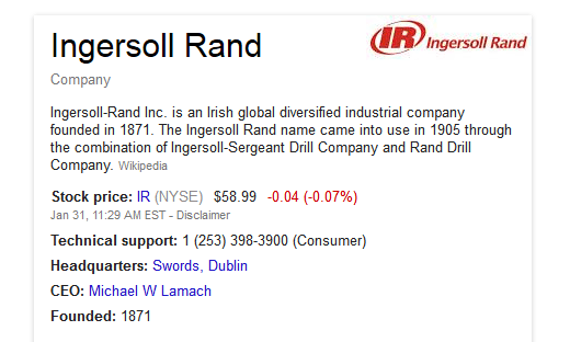
Looking at a real life example, see how this company is described on a Google info card, extracted from Wikipedia:
If you’ve never heard of this company before, this description won’t help you understand what they do. All you’ll learn is that they are Irish, they operate globally, and, at one point, they had something to do with drills. Whether they did drilling or sold drills is not clear. Do they still do this? We don’t know. But, hey, we do know they are “industrial” and “diversified.”
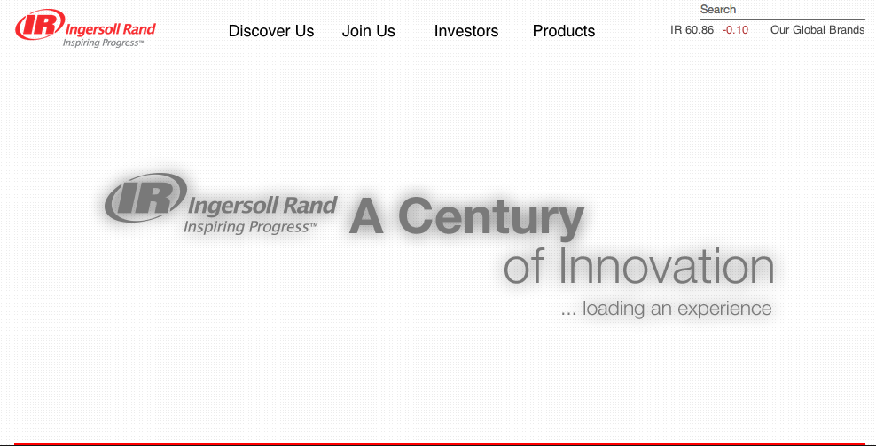
Going to their website doesn’t help much, either. The first thing you see is a logo with a headline that says “A Century of Innovation.”
That disappears quickly, but you still don’t know what this company does or why you should care, let alone who else should care.
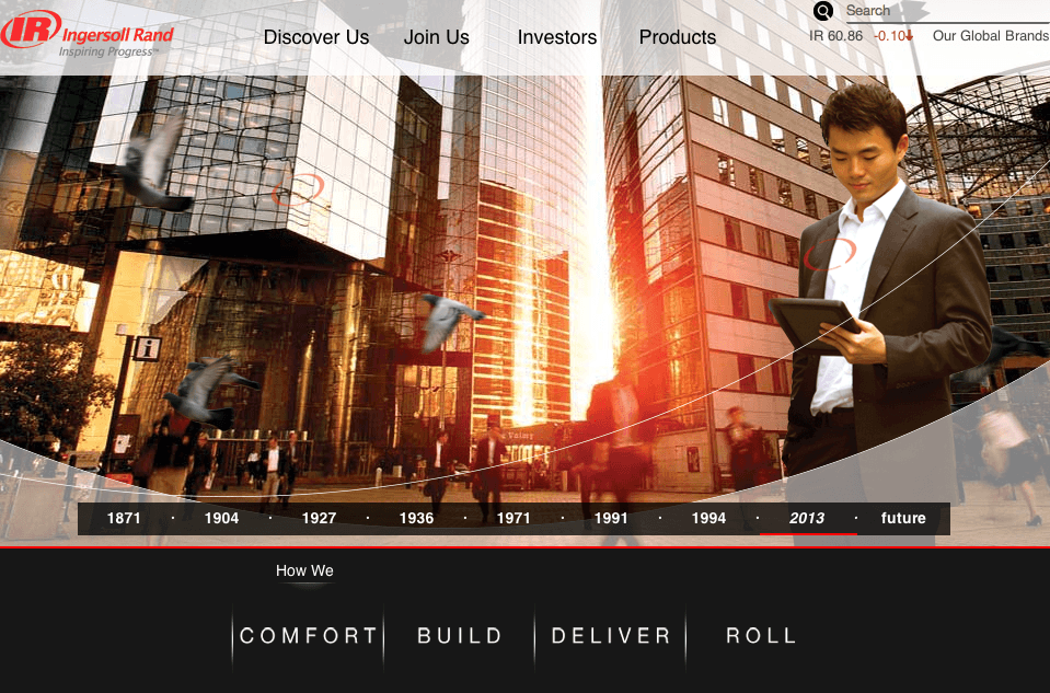
After the “innovation” headline goes away, a user sees a photo of a man holding a tablet in a big city. This occupies a huge portion of the “above the fold” area on the home page.
Are they a technology company now?
We still don’t know what this company does.
The top navigation says “Discover Us,” “Join Us,” “Investors,” “Products.”
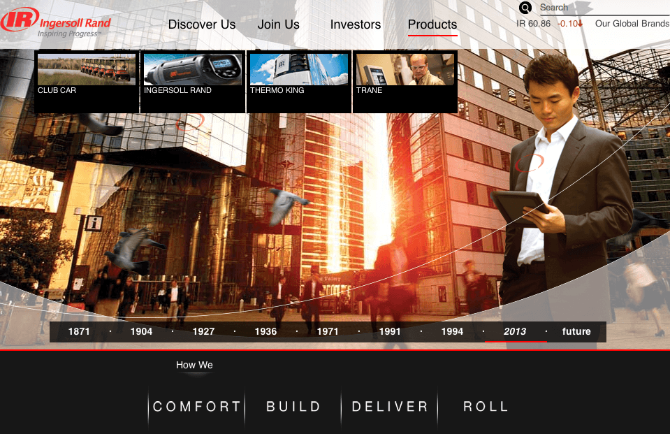
Hmmm…what’s under “Products”?
“Club Car,” “Ingersoll Rand,” “Thermo King” and “Trane.”
Sigh. Ok. Let’s try to digest this.
“Club Car” – Is this a car service? Or do you sell cars?
“Ingersoll Rand” – Isn’t that the company name? Or is that a product name now, too?
“Thermo King” – Sounds like a mattress warmer.
“Trane” – That’s a spelling mistake. Right?
Let’s leave the navigation menu. Let’s see what it says under that big photo.
“How we
Comfort | Build | Deliver | Roll”
Ingersoll Rand, you have really lost us now. What do you make comfortable? Are we back to mattresses now? What do you build? What do you deliver, and to whom? Are you like UPS? And what’s this about rolling?
Labels here don’t help. So let’s try hovering over each of these “How we” menu items.
We just get logos. We are done with this website. Time to leave.
In this example, we see that newly written labels, actual headlines, and product photos might be a start at making this webpage relevant, let alone interesting, for unlearned users. This site likely was made for internal staff and management as its primary audience, not new customers.
However, lest this turn into a user interface (UI) article, we’ll stop here and go back to our original point:
Be very clear about what you sell with your words, not just your photos or design concepts. Don’t depend on your brand awareness to do the heavy lifting for users. They may have never heard of you.
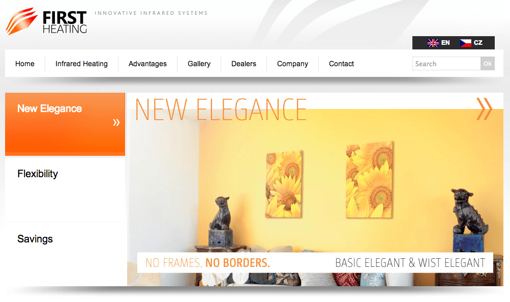
In cases where your product or service is emerging as a trend, or is a new player in an existing market, writing unambiguously becomes extremely critical. Compare the home pages of two different companies that sell virtually the same product. One leaves no question about what they sell, while the other makes you think they are selling “elegance”:
Which one are you more inclined to buy from? The one that explains its product and tells you the benefits, or the one that uses the word “elegance” and tries to sell something that looks like interior design with pictures of sunflowers?
3. Use Verbs, Lots of Verbs
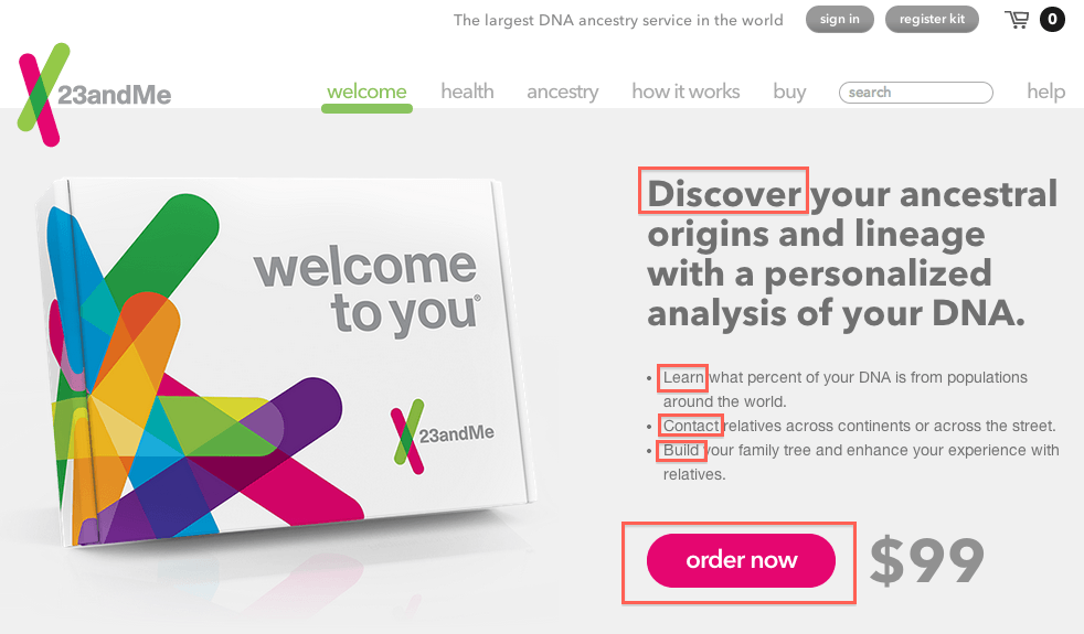
One of the best examples of excellent conversion-focused copywriting I can think of is on the 23andMe website.
Many of their headlines start with a verb, asking the user to “do” something. And every page has a call to action with a noticeable button that asks people to “order now,” which also is an action-oriented verb.
This reduces passivity on the part of the user. They know what the intent of the website is and what the company wants them to do, specifically. Even the layout of the site draws the eye to their calls to action. (The rest of the information on the 23andMe website is peripheral, but it’s there if the user wants it.) There is no doubt the main goal of this site is to get people to order a DNA test kit.
It seems obvious, but you’d be amazed at how easy it is for companies to forget their website goals in their verbiage and design, thus leaving users without a “target” to aim at or a “road map” to follow.
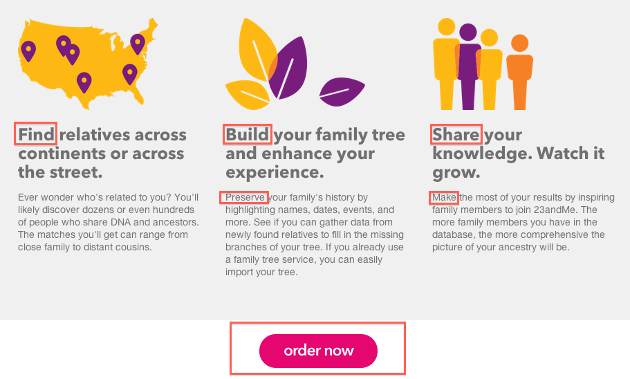
Further to this, the 23andMe home page takes the lead with this concept, and it also follows all the “rules” we’ve outlined above. See the red boxes in the screenshot below, indicating verb usage:
Notice a tagline is shown in the top header of the site that describes exactly what this company does and offers (see rule #2 above). The introductory headline explains to users what’s in it for them. This website does not go on and on about how “innovative” the company is. It focuses on the benefit to the user. It cuts to the chase by asking people to do one simple thing – order now. Then it keeps giving more reasons to do that one thing, such as:
Another great area to use verbs is in your navigation menu. Many articles giving advice about navigation menus will tell you not to veer from web naming conventions. This is true, but if you remain unambiguous and obvious, you still can take advantage of verb-oriented navigation menus.
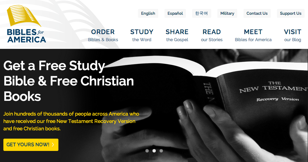
The site that first inspired me to do this was Bibles For America. Through an interview, I learned that this site underwent over a year of planning and brainstorming. One of the most fascinating items, to me, is the way the main navigation menu uses verbs, making each clickable item a call to action:
The important thing to note here is that this navigation menu uses two lines. The second line gives a further explanation of what a user can find under each verb. In this case, the verb-menu would not work without the additional words on the second line.
For example, if the verb “visit” was a stand-alone link, the user would have to ask, “Visit? You want me to visit your office?” But the second line makes it clear that the place to “visit” is the blog.
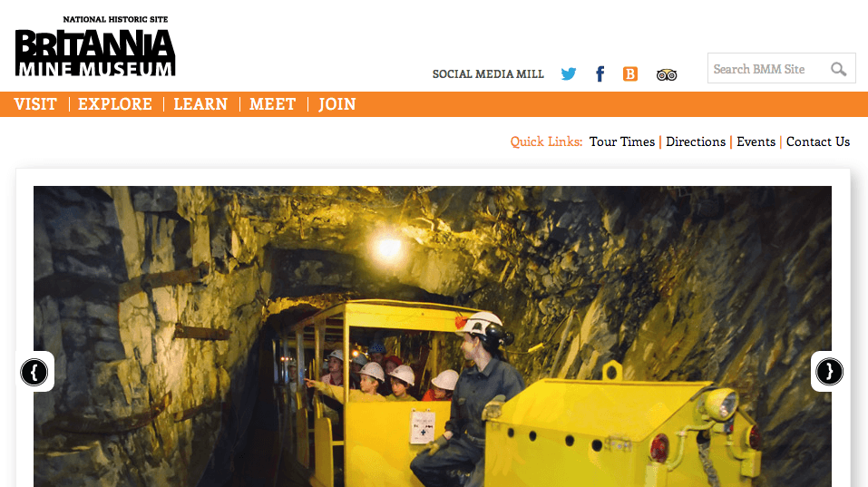
Sometimes a one-word verb link without a second-line explanation could work, but it can be confusing if the verbs next to it are not different enough, or are too ambiguous:
Here, when the verb “visit” is used, there is no question that the site is asking the user to visit the museum. Museums are known to be educational places that attract in-person visits.
However, the menu gets confusing when it uses the verb “explore” next to it, without a second-line explanation. “Explore the museum? Isn’t that why I would visit the museum? Are you asking us to do the same thing twice?” It takes further investigation on the part of the user to know what “explore” is referring to, and so on.
4. Use Layout Conventions to Your Advantage
An alternative title for this section could be “try not to be too trendy for the sake of being trendy.” In other words, stick with conventional website layouts unless you really know what you are doing. If you have not passed a user interface design course, your safest bet is to go with the norm, because the norm is what has been proven to work well for users.
Don’t try to be different by putting your navigation menu at the bottom of your home page or by making the menu disappear on some pages. Don’t try to put your logo in the top right corner instead of the top left. Don’t remove your sidebar if you don’t know enough about typography (going over a character limit per line causes a loss of focus). In short: don’t step outside the “safe zone” of conventional web design.
Remember, your layout should not please you. It should make it as easy as possible for your users to find what they are looking for and take the action you want them to take. And users don’t have a lot of energy, concentration, or time to learn how to use your new “trendy” layout.
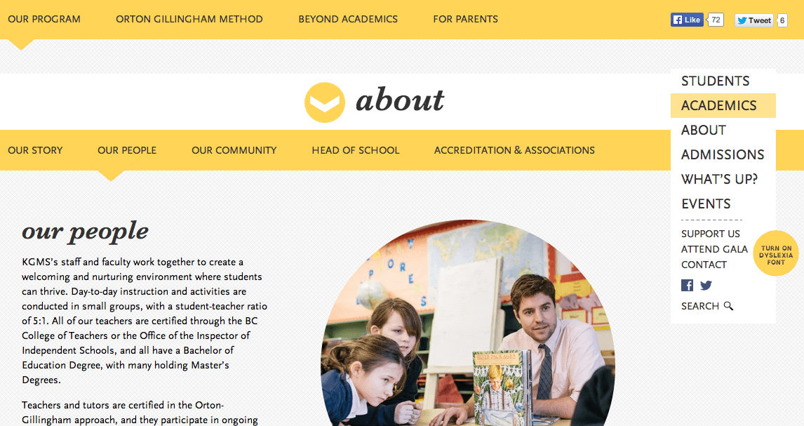
One website that confuses me very much is kgms.ca. After you figure out that the right side box is the website’s main navigation menu and click on one of its items, you are scrolled to a new section of what seems like a one-page site; but, in fact, it is a brand new page on a new URL two sub-folders deep.
On this level, you get another menu across the top, but this is not a top-level menu; it is a sub-menu. If you click on one of those sub-menus, which are in the top-level menu position, you are taken to a new page.
If you want to go to the home page from here, you can’t, at least not with any visible “home” button or link. The top left logo has disappeared, so that is out of the question as a “second guess” for reaching the home page.
The only thing you can do to try to get to the home page from here is scroll up or down. If you scroll up, you are taken to a section of the site that looks just like the home page, but it’s not. The URL clearly is a sub-sub level page. If you click on another link on the side menu, you come to a new URL where text appears. That’s great, but then, without notice, a large photograph slides in from the left, and you don’t know where your text went.
If you are confused by the above, well, now you know how I feel.
The point is, don’t do things like this. Yes, you may have demonstrated your ability to make a website “swish” and “slide” a lot, and, sure, the aesthetics are nice. But ask yourself: “Is a ‘nice’ design and an over-use of ‘cool’ technology worth all of this confusion?”
Can you veer “outside the box” sometimes? Yes, of course, but first know what you’re doing. Also, remember your site’s goals (rule #1 above). For example, the new Moz.com website is new and trendy, but not confusing. Every page on their site introduces a new layout, because it helps highlight the content. But the top navigation stays in place to help users get from page to page easily (except in the blog areas, which force users to use browser “back” buttons sometimes).
5. Don’t Try to Copy What Someone Else Does
I find it very baffling when I work with clients who suggest (or even insist on) an idea only because they saw a competitor doing it, not because it was based on any research or e-marketing principle. Your competitor may not have a clue about design or what gets more clicks, and could very well have been “winging it.”
Now, we’re not contradicting rule #4 above. This is not referring to web conventions. If your competitor, or a big brand, follows a web convention and it works effectively for them, then yeah, you should do that, too. But that’s not “copying.” In reality, you would be following a well-established principle.
What you should not do is copy a layout or feature just because you see it on another site, without an understanding of how it works, why it was placed there, and what other solutions are available to meet your site’s goals (see rule #1 above).
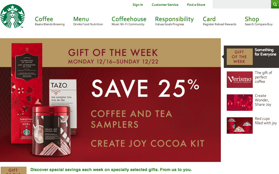
For example, don’t try to use navigation menus like Starbucks, just because you think Starbucks is a big company and, therefore, must know what they are doing. Do you see what’s wrong with their current navigation menu?
This navigation menu uses two lines, except that the second line is trying to squeeze in three separate “sub titles,” creating words that run into each other as though they are part of one sentence. This is not how you use a two-line menu!
For example, the label “Coffeehouse” in itself is confusing, because there clearly is no coffeehouse inside this website (unless Starbucks has found a way to serve coffee virtually). The user has to rely on the second line in that navigation label to understand what “coffeehouse” refers to. This would be fine except, in Starbucks’ case, what do users get? “Music Wi-Fi Community.”
Oh, interesting. Starbucks has a “music Wi-Fi community.” Is that where we talk about music over the Internet on their website? Or is it some kind of new social network?
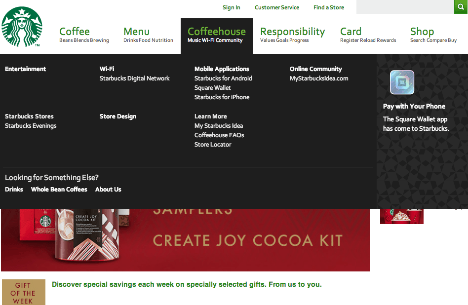
Nope, it’s neither. If you read the other menu labels, you’ll see they are trying to list three distinct words and are doing it poorly. If you hover over the label, you’ll see a “mega menu” that separates into distinct sub-areas of their site. Normally, mega menus work well to help large sites organize their content for users in one centralized location.
However, this mega menu needs some simple re-labeling and possibly re-organization. None of these areas use the word “music,” as in the second-line label. And how do any of these sub-sections relate to the word “Coffeehouse”? Do they mean things that happen inside their stores? But, if so, why is the “online community” here? And why are they advertising mobile apps in this section?
This site likely has outgrown its original intentions and goals. It seems like an attempt to stretch its virtual lifetime with content updates that should call for a site overhaul. If you copy this “big brand” now, you’ll be behind in your web strategy, piggybacking on what was a good idea years ago. Better to stick with what’s current today by hiring a real content architect, e-marketer, and UI designer.
To Conclude, What have we learned?
If you want to make your site more click-worthy, you need to:
A) Identify your goals as a first step:
- Ask yourself the right kinds of questions before beginning a design.
- Ask yourself how you are going to meet your goals, and what strategies are best given your objectives.
B) Use the right kind of copywriting:
- Use specificity in your writing. Make sure you are not being ambiguous and that you are stating exactly what you do, what you offer, and why people should care, in words that anyone can understand.
- Don’t assume people have heard of you before when writing your web copy.
- Avoid “buzz” words that can be used by almost anyone in any context. In other words, don’t use words like “strategic” and “innovative” when you could be saying things like “We sell X to people who love Y.”
- Use verbs and action-oriented titles. You can do this in your menu, too, as long as you have room to be both concise and descriptive enough.
C) Apply common sense in your design and layout decisions:
- If you’re not a UI designer, don’t try to be “trendy” with your layout. Stick to conventions that people are used to; it’s always safest.
- Don’t try to copy a competitor or “big brand” just because you think they might know what they are doing. You could be copying a mistake or outdated strategy. Stick to your site goals, and get professional advice for your unique website needs.
Do you have anything else to add? How do you make your own sites more click-worthy? Do tell your stories!
About the Author: Joyce Grace writes about WordPress, SEO, marketing, and other related topics at ManageWP, the WordPress management dashboard for managing any number of WordPress sites. In her other life, she runs a small Internet marketing business in Vancouver, Canada, where she helps clients market their companies online by performing SEO, copywriting and making websites.

Comments (27)