Your email list is your biggest asset!
Before you can use email marketing to reach your audience, it’s imperative to build a strong list. But there’s a problem: listing building often annoys people.
The technique we choose to request emails often affects the user experience. Sometimes it affects it so badly that users decide to leave our site.
For example, the most popular list-building method is the pop-up, right? Matthew Woodward ran an experiment to see how pop-ups affect user behavior. He set up a pop-up to execute in the 7th second of a visit. The results were a 9.29% drop in Pages/Visit and a 10.20% drop in Average Visit Duration.
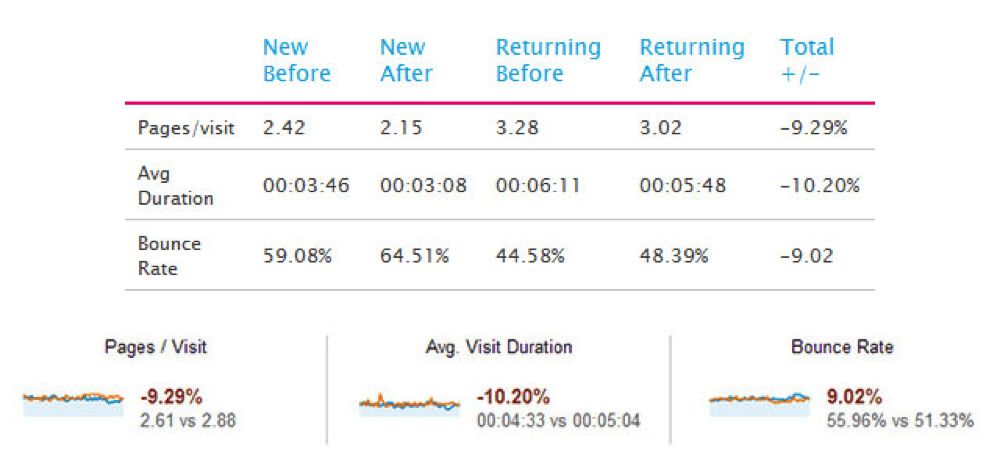
The pop-up prevented users from reading the content just as they were getting started. The truth is that people do not like to see a pop-up, especially when it looks like an obstacle.
How to Ask for Emails Politely
Isn’t it possible to create an email list without disturbing visitors? Of course it is. All we have to do is be careful to ensure that our practices don’t look like a content barrier.
Here are some methods you can use to ask for emails without disturbing your visitors:
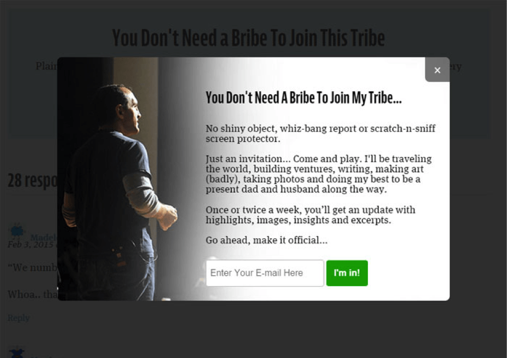
1. Present a Pop-up at the End of Your Content
If you’re not getting enough email leads, the biggest leak in your website may be that you’re not asking for emails at the end of your content.
Most visitors decide whether to subscribe or not after reading your content. By triggering a pop-up as soon as they reach the bottom of your content, you will be asking them to make the decision right away. Thus, it converts well; and sometimes it converts users who were unwilling to subscribe at the beginning.
Since this pop-up triggers when users finish reading the content, it works like a CTA and gives them direction. For that reason, it doesn’t look like a barrier.
I’m using the WP Subscribe Pro plugin in WordPress, and it is effectively doing this job.
Example: Jonathan Fields is using the same thing, and it has increased his conversions.
2. Introduce a Pop-up When a User Signals Exit-intent
Do you want to increase your subscribers in five minutes or less? Then arrange for a pop-up to appear when a user signals an intention to exit.
Exit-intent is a relatively new technology that is used to determine when a user is about to leave a site. Some list-building services have integrated it into their businesses because it works like a charm.
This is what happens: When someone is about to close or leave the browser tab, the action triggers a pop-up. As a result, the user will stop to see what just popped up.
Exit-intent pop-ups for email subscriptions get very positive results. You can use the method to convert your outgoing visitors. Set up an exit-intent pop-up with an appealing invitation to subscribe.
Example: OptinMonster provides excellent pop-up services, including this exit-intent feature.

3. Slide in a Request after a Page Scrolls
One of the gentlest methods for capturing emails is to slide in a request to subscribe once someone scrolls down #% of a page. The subscribe box can slide in from a bottom corner. This type of entrance is very gentle but eye-catching, so it works perfectly.
Slide-in subscribe leads often have a much better conversion rate than any regular pop-up. For example, you may find that sliding in after 80% of a page scrolls is the best converting area.
Here’s an example of an ecommerce brand using a page scroll pop-up to remind the consumer that they have items in their cart.

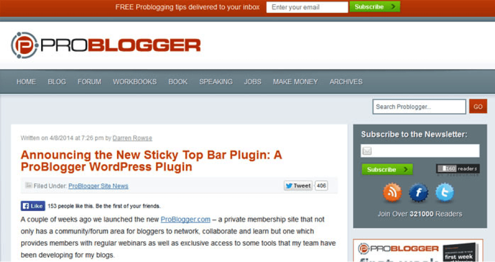
4. Display a Sticky Top Bar
Display a relatively simple, noticeable bar that stays at the top of the screen and scrolls with the page so that it remains within a user’s sight all the time. It will get attention and convert more.
The message we usually use on the bar is a call to action, but the results are pretty good using it as an invitation to subscribe, too.
A sticky top bar is a perfect, high converting place for your subscribe form, which you can use to increase your email conversion rate faster.
Hello Bar provides top bar services. It performs well and has already acquired many authoritative customers “DIYthemes” is one of them and has gained 1,180 extra email subscribers in just 30 days of using Hello Bar.
Example: ProBlogger has effectively used a sticky top bar to boost its subscriber count.
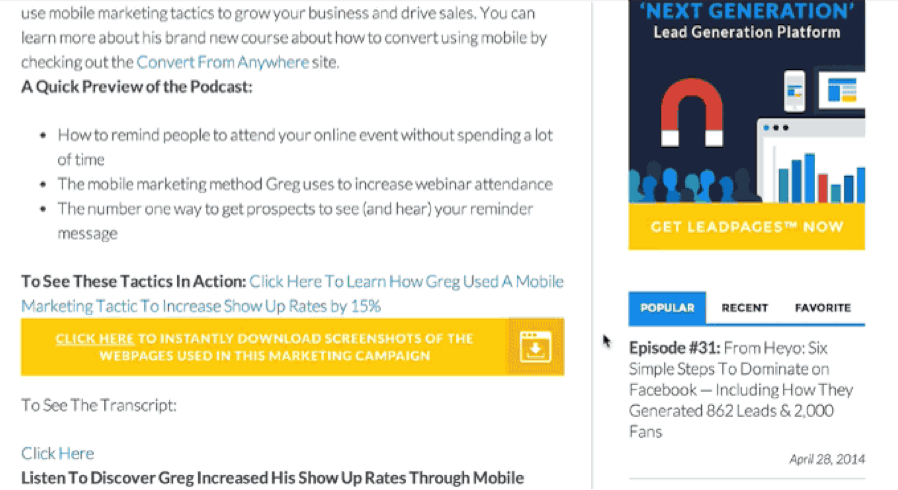
5. Offer a Content Upgrade
A content upgrade is a link magnet that provides upgraded value to content as a reward for subscribing.
Suppose you’re planning to write a post “Top 3 Ways to Get Organic Traffic.” You also have a resourceful PDF “30 Different Sources of Getting More Traffic.” What you can do is offer readers a chance to download the PDF from inside the new post by opting in (giving you their email addresses).
So, try providing upgrades to your content as subscribing rewards and see how it improves your conversion.
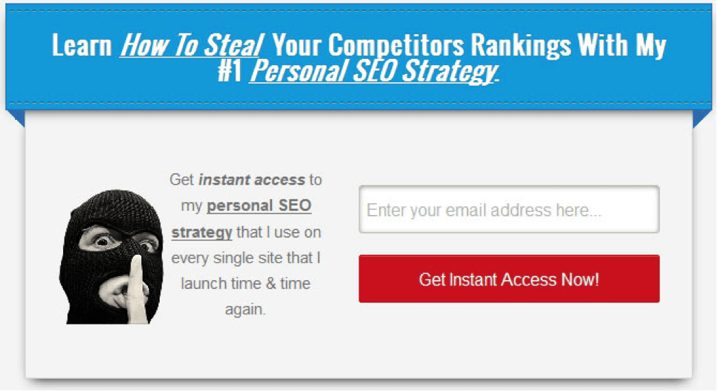
Example: LeadPages is one of the best landing page solutions. They also have a content upgrade feature. Here is a sample:
6. Stage a Welcoming Home Gate
The homepage is the most authoritative page, and sometimes the most visited page, of a website. You can leverage it to get subscribers.
The home gate or the home featured box can be used to stage a warm welcome for visitors. You can attract them right on the spot by providing a bribe to subscribe. Your homepage usually has better traffic. For that reason, you will have a chance to increase your subscription rate by up to 51.7%.
Example: When I thought of home gate, Smart Blogger came to my mind first.

7. Add a Sidebar
A sidebar provides additional navigating value to users. It usually appears on all blog pages, and it’s a good place to include a subscribe form.
By setting up an appealing subscribe box on your sidebar, you can gently attract visitors to subscribe. In fact, the top of your sidebar is the best converting position for the form. It can lead to a 26% increase in subscribers.
Example: Single Grain’s simplistic sidebar, complete with multiple subscribe options, is both attractive and engaging.

8. Launch a Dedicated Landing Page
A dedicated landing page for email marketing can lift your conversion rate.
Create an optimized landing page for email subscriptions. To make it a high converting one, you can apply the following tips:
- Offer something appealing that will attract visitors.
- Design it beautifully with contrasting colors and placement.
- Include reviews or social proofs to gain trust.
- Adorn it with images or insights that will attract attention.
- Make the subscribe button noticeable. Try a colorful button like red, green, or blue.
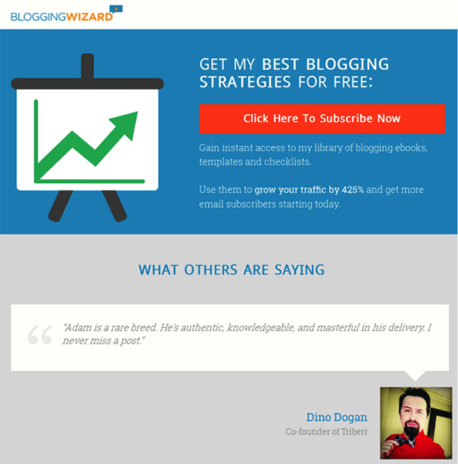
Example: Adam Connell designed a beautiful landing page with an appealing offer, colors, images, and testimonials.
9. Position a Subscribe Box at the end of Your Content
This method is similar to the first one, “Present a Pop-up at the End of Your Content.” The only difference is that the subscribe box won’t pop up. It will stay in place as a normal subscribe box right underneath the content.
If you think that pop-ups at the end of your content will annoy people, here is the solution. Set up a regular subscribe box at the bottom of your content. It will serve the same purpose, but it won’t grab as much attention as a pop-up.
Example: Matthew Woodward has one under all his blog posts.
10. Submit a Survey
Surveys are used to gather insights or votes from users. But with a few tweaks, a survey can be used as a powerful list-building weapon.
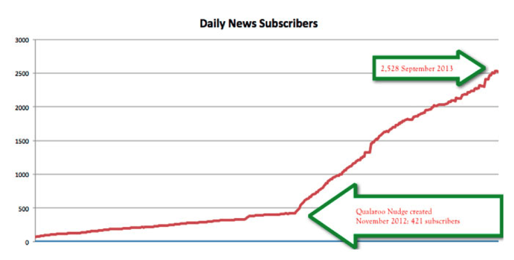
For instance, Qualaroo is an insight marketing tool. They have an interesting feature to generate email leads through a survey. What I like about it is that the method is unique. Also, it’s not at all annoying and is very effective. You will be amazed to know Qualaroo increased The University of Alberta’s subscribers by 500%.
You can set up a survey subscribe form using a tool like Qualaroo. The form should remain in the screen’s bottom corner. Undoubtedly, it will increase your conversion rate.
Selection, Timing, and Behavior
Work smarter, not harder! That’s what comes to my mind when I think about these three points: selection, timing, and behavior.
Selection: Which method will work for you? There are no straightforward recommendations because all websites are not the same. Each one varies from the others. So this is the best practice:
- Conduct a heat map test.
- Find the areas with the most clicks.
- Choose the best 2-3 methods around them.
Timing: Subscribing materials shouldn’t appear before 60 seconds has passed. If they appear before 60 seconds, you will have a significant drop in conversion rate. Conversely, if you wait too long, you will miss a large number of visitors. So the best timing is at least 60 seconds or a little after this period.
Behavior: Why should you control the behavior? Here are the reasons:
- Stop annoying visitors
- Stop people from leaving your site
- Stop losing conversions
To prevent showing subscribing materials to the same person again and again, you should use cache. You can set the cache to 15-30 day, so the visitors who see the materials once won’t see them again in the same period. Of course, some of the standard forms that don’t annoy anyone, such as sidebar, home gate, top bar, and so forth can appear all the time.
Over to You!
List building is a game of understanding your audiences and looking for opportunities to capture emails.
My suggestion is to choose some of these methods wisely, according to the tastes of your users. Also, be sure to test the methods you decide to try.
About The Author: Abrar Mohi Shafee is a digital marketer and blogger by passion. He is determined to guide people on “how to blog in an artistic way.” Check out his blog or subscribe for regular updates, or follow him on Twitter @shafee219.
Comments (27)