Steve Jobs steered Apple to success with his obsession with perfection, such as limiting how many screws should be in a laptop and taking six months to finally sign off on the scrollbars for Mac OS X.
Yes, Apple certainly committed itself to create innovative products, but its website could use a little work. To attract an audience, a website needs more than just glossy photos and tech specs. Here are 10 noticeable conversion mistakes that are costing the tech giant customers and sales.
The Homepage Contains Only One Product
On visiting Apple’s homepage, you’ll notice that a significant chunk of it (one full screen width) is devoted to showcasing a single product, such as the iMac or iPad.
This is interesting since most of Apple’s revenue comes from the iPhone, which isn’t presented anywhere on the homepage. That may be because a lot of their sales come from cell phone stores, but I bet there are a lot of online sales as well.
Also profiled on the homepage is the iMac, which accounts for a very small portion of Apple’s overall sales. So, if most of its income is from the iPhone, and a significant chunk is from things like the MacBook Air, you’d think the company would want to show a more inclusive lineup of all of its products, rather than relegating them to the navigation bar above.
Small, Infrequent Call-To-Action Buttons
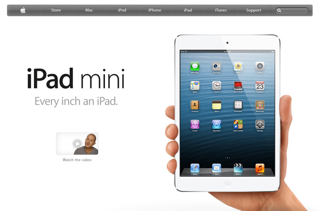
On the iPad mini homepage, there is a single call-to-action (which is nearly drowned out by the large hero shot of the product) – a link to “Watch the Video.” On the sub pages, such as for the MacBook Pro, they dive right into the specifications and small details that truly help set the products apart from the competition. But if you’ve read enough and you’re convinced you want to buy, you’ll have to scroll all the way up and find the tiny Buy Now button in the sub-navigation on the page. A better idea would be to strategically place Buy Now buttons after every piece of story description that Apple indulges in as you scroll.
Proprietary Media
As stated above, there is a single call-to-action on the homepage, which is a link to a video. Here, Apple stays true to its proprietary roots (which, consequently, locked it out of becoming a major computing player in the 90s), by forcing you to download QuickTime in order to view the video if you don’t have it installed already:

While QuickTime is an Apple product and it’s understandable why they’d use it, this method shuts out anyone who doesn’t have the program. It forces them to abandon what they were looking for, download the software, install it, restart their browser, and then slog through the usual hassle of updates. Not the best first impression for someone considering switching from PC to Mac!
Too Many Tech Specs
Apple is big on dazzling customers with lots of specifications and large, picture-perfect images. And while these definitely are good to have on the site, they don’t translate into benefits for the end user. It has a 32 gigabyte hard drive? Great! How many movies will that hold?
On its product customization page for the iPad, Apple showcases the different options that customers can select, such as between 16 and 32 GB hard drives or between Wi-Fi alone and Wi-Fi plus various cellular providers.
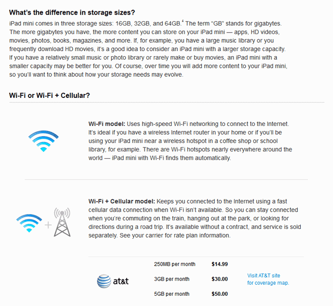
When customizing a product as detailed as an iPad, these are necessary steps. However, they don’t translate into something meaningful for the customer until you scroll down past the gushing descriptions of the Retina display, the warranty, and the huge library of apps. That’s when you’ll finally see a description of what the different storage sizes mean and what sort of connection you’ll get with Wi-Fi alone or Wi-Fi + Cellular.
Beyond this brief description, it would be a good idea to include various typical sizes of memory-intensive things like movies. Let customers know that by upgrading from the 32 GB to the 64 GB version, they could essentially store up to 30 more movies on their device.
How Do I Work This Thing?
Apple also could stand to improve things in the ease-of-use department, starting with the huge image on the front page. Not only does it not contain relevant ALT text, the gallery function doesn’t have any clear method of navigating from one photo to the next:
In navigating photo slideshows, users generally expect to see arrows (which you won’t see in this gallery unless you move your mouse to the very far side of your screen) or smaller thumbnails below the main image to demonstrate what’s next in the series. Apple’s website gives you glass dots instead.
Poor Social Media Presence
Finding Apple’s social media icons is a real challenge, considering that it keeps them well-hidden deep within the pages of its site. Apple itself has numerous branches of social media for its various products, such as @ibookstore, @itunestrailers, and @itunesmusic, but they’re all entirely self-promotional, with no responses to customer inquiries, complaints, or other problems.
This goes back to Apple’s strong need for control over every aspect of its online presence. If you have a problem with a product, you’ll need to pay for Apple Support to look into it. Possibly, that’s because if everyone had their issues resolved by Twitter or Facebook, there would be far fewer tech support calls and less cash coming in.
Or, perhaps Apple believes it doesn’t need much of a presence on social networks because it’s Apple, and its fans do the majority of promoting for it. But maybe Antennagate wouldn’t have generated such a firestorm of angry customers and lawsuits if Apple had been honest about the issue to begin with and simply communicated it clearly over social networks.
Lack of Reviews and Ratings
Beyond social media links, other things you won’t find on Apple’s website are reviews and ratings for Apple products. There certainly are ratings for accessories in the Apple store. But if you want to know what people really think about the iPad mini or the latest iPhone, you’re going to have to scour Amazon or another third-party site. For a company that prides itself on having a high level of customer satisfaction and a drive for ultimate perfection, what are they afraid of?
It could be that they don’t feel the need to include reviews or ratings because, as with social media, their customers take care of it for them. They camp out overnight by the Apple Store to be the first to blog about a new product, review it, and cover it in detail, in turn, generating buzz for their viewers and more sales for Apple.
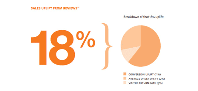
Still, reviews and ratings do affect conversions. A study by Reevoo indicated that 61% of customers read reviews and ratings before making a purchase online. And sites that do include reviews enjoy an 18% uplift in sales, which ripples out to higher conversions, larger average orders, and higher visitor return rates. By neglecting to include them, Apple is distancing itself from generating more rapport with its customers and fans.
Lack of Up-Sells with Social Proof
Apple includes up-sells on its site; however, it doesn’t include any compelling reason to buy the items.
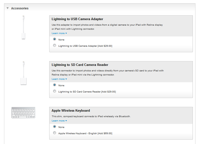
It would be much better to include reviews and ratings of these accessories and add social proof, such as 300 users added the Lightning to USB Camera Adapter to their order. When you see how many people purchased the product before checkout and what they thought of it, your inclination to purchase it goes up as well.
No Guarantees
While Apple has built quite a following in the last decade based on the reliability, performance, and design of its products, it might attract many more hesitant users into the fold if it tested some sort of guarantee as many other computer and device retailers do. Even something as simple as a 30-day money back guarantee could ease a lot of the uncertainty for first-time Apple purchasers.
Behind the mobile curve
Apple didn’t have a serious mobile presence until mid-2012, far behind the curve of its competition. Then, to its credit, it didn’t just acknowledge the growth phenomenon of smartphones, it sank its teeth deep into optimizing for mobile, giving it high scores in a recent customer satisfaction survey. Of course, it could leverage this technology even further with mobile updates on new releases or deals via text, QR codes, and other smartphone technologies that are growing in popularity.
Conclusion
It could be argued that Apple doesn’t need any of these conversion fixes simply because their brand does the selling and promoting for them. But Apple is no stranger to slip-ups. And a few problems, made worse by a lack of communication via social networks, could make a small problem mushroom into a serious PR catastrophe. With Apple raking in billions of dollars per year, adding these conversion-boosting suggestions could only increase its appeal to reluctant buyers and firmly cement it as the creative, supportive, forward-thinking brand that it is.
What would you add to help improve the Apple site? What are some things they could do differently that might earn your business?
Comments (18)