When thinking about optimizing conversions for a SaaS or subscription service, do you focus only on sign ups? What about after the sign ups? Do people make it through any setup you have? Do your users come back? What about revenue? What about churn?
Let’s slow down.
Working with marketing data means there’s a rabbit hole – one you can keep going down, digging for data endlessly, or at least until you don’t even remember what you were originally analyzing because of all the possible angles.
A lot of people call this “Analysis Paralysis.”
I’ve found that the most valuable skill you can learn is to determine what level of analysis is needed to solve any problem. What happens in analysis paralysis is that you find interesting things, but not things that deliver business value.
When I need to report to my team on what’s happening after a product launch and do some data storytelling, I often break down a situation by using three different analyses. Here’s how to keep yourself moving forward:
1. The Spot Check
The spot check is short and easy. It’s also great as a “sanity” check.
Example 1: We want to know the adoption rates for a new feature that just launched.
Example 2: We want to know the engagement rate for an existing feature because we’re designing a new layout for it and want to baseline the current levels.
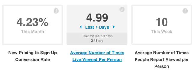
These metrics show all the time so they are right up front without any other querying needed.
Not very much analysis is needed. This is more “pulling” data, and the metrics are pretty straightforward and need very little explanation. I can shoot these numbers over in chat or take a screenshot to link in an email. I spend anywhere from thirty seconds to no more than five minutes.
2. The Look Up
The look up is probably the most common analysis I do. It’s pretty run of the mill – something that may look very routine to marketers.
Example 1: Look at our new pricing conversion rates by traffic source. Do customers on new pricing and certain traffic sources have higher retention?
Example 2: What is the average number of times a feature was used per person? Are certain plan levels, business models, or industries more engaged than others?
Example 3: Are our support articles and documentation helping to reduce the number of tickets we see per week? Which articles are trending? Are people searching for articles that we currently don’t have?
It can be very easy to ask even more questions. You may have noticed that my questions started trailing into longer questions, and this is where the danger of analysis paralysis starts. The data here needs to be not only retrieved, but also provided with some notes or comments to help explain what is going on. It may or may not come with recommendations.
I leave these more open ended so that my team members can decide what strategies to execute, but I can at least present the facts broken down into interesting parts. This sort of analysis usually gets sent in an email or written into our internal Wiki for reference. It takes me anywhere from five minutes to fifteen minutes to do this.
3. The Deep Dive
Deep dives are needed for major initiatives like new onboarding experiences, feature overhauls, flow re-designs, or growth experiments.
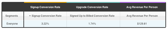
I start deep dives by plotting important SaaS metrics in a Report to see how performance is for everyone. This is aggregate data with no segments or slicing at all.
The first order of business is to establish a baseline, which could be one metric that we want to move the needle on, or two or three metrics that are part of a larger flow (Trial Signup Conversion Rate, Upgrade Conversion Rate, Average Revenue Per Person).
We do this to account for a couple of possible outcomes:
- Experiments can improve signups, but ruin upgrades
- Experiments can ruin signups, but have a higher average revenue per person
- Experiments can improve upgrades, but have lower average revenue per person
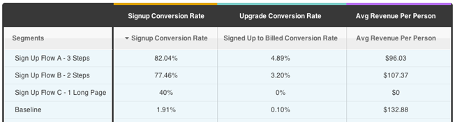
This report lets me compare multiple metric performance levels for each experiment I’m running.
- Flow A has higher signup conversion rates, higher upgrade rates, but lower average revenue per person.
- Flow B has slightly lower conversion and upgrade rates, but higher average revenue per person.
- Flow C performed poorly as it did not get any upgrades at all.
Our baseline has a very low conversion and upgrade rate, but the highest average revenue per person.
Being locked into signups can tunnel your vision. It wouldn’t be smart for the business if your bottom line is performing worse. If I had to choose one, revenue is usually a big driver for subscription services and e-commerce. For mobile apps, content, and social sites, it’s more engagement. Adapt as needed for what really matters for your business.
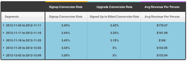
Plotting week-over-week data, I’m able to see that I’m optimizing my Signup Conversion Rates by incremental percentage points at the cost of decreasing my Upgrade Conversion Rates and Average Revenue Per Person. This is an early warning sign that my tests are not having a positive impact on the business.
The majority of the work involved for this is figuring out the right metrics to focus on, interpreting how that metric could be moved, and then walking away with some actionable recommendations (possible changes) to address the use case (onboarding, feature overhaul, etc.).
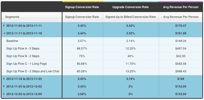
Digging further into the week-over-week data shows me how each experiment is performing. My newest experiment D looks promising.
Pulling reports for this data takes me about fifteen minutes to half an hour max. These reports are based on the same configuration, and I just add a time variable and expand a row by clicking. Any new tests (like Sign Up Flow D above) are automatically added to the data set and calculated.
The longer part of this analysis is actually involving my teammates and other stakeholders on possible product changes, design interactions, and front-end engineering.
Saving Yourself
If you want to understand a problem from every direction, with every tool, and write up a long report with graphs, charts, and more, you’re probably spending too much time thinking about the problem instead of trying to solve it. Remember to move!
Next time you have a problem in front of you, ask yourself what you need to figure out and how deeply you need to go to get actionable data. You’ll get the data that you need faster. You’ll make more decisions with your results. Your team will thank you. And, you’ll thank yourself for saving yourself.
Analyze This is a series that provides practical tips for data analysis techniques, data-driven processes, and workflows.
About the Author: Chuck Liu (Twitter) wrote this post.
Comments (3)