“I can’t afford that.”
Price is one of the most common objections your visitors will have.
Few businesses want to compete on price. And no marketer wants their product to be thought of, first and foremost, as either “cheap” or “expensive.”
Price shouldn’t be the point. We want the conversation to be about value. We try to steer it in that direction with great benefits messaging, clear explainer videos, and outstanding social proof.
But, inevitably, when it comes time for our prospects to lay down their credit cards, they can’t help but return to worries about price and affordability again.
So, what can you do about it? If you know you’re product is priced appropriately, don’t rush to drop your price or offer discounts. Instead, use a handful of the following price-positioning and anchoring strategies on your site, and win a few more conversions from your most budget-conscious visitors.
1. Introduce a More Expensive Product or SKU
If you want to make a house look big, put a tent next to it.
If you want to make a house look small, put a skyscraper next to it.
That’s the contrast effect at play, and it can work wonders for positioning your prices. If you want to make the price of the product you want to sell appear to be very small or reasonable, position a similar, but more expensive, product next to it.
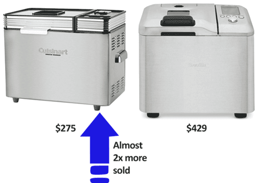
In a now-classic study published in the Journal of Marketing Research and repeated in the excellent Yes! 50 Scientifically Proven Ways to Be Persuasive, Williams-Sonoma had a $275 bread maker listed in their print catalog, and almost no one was buying it. When they introduced a similar bread maker for $429 and positioned it next to the $275 bread maker, sales of the $275 bread maker nearly doubled.
If you’re in SaaS or information marketing, creating that more expensive product is relatively easy; if you’re a retailer or reseller, it can be a matter of bringing in those product lines or brands you’ve always believed to be too expensive for your audience. The goal is not to sell the new expensive product – although you just might – but rather to make the price of the original product look small, so you sell more of those.
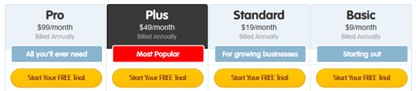
For best results, try leading with the most expensive product. This is price anchoring at its most basic. It leverages a decision-making principle called primacy effect, where the first thing a person sees, especially in a list or lineup, sets their expectations for what follows. If the first price they see is very expensive, then they may be pleased to see the less expensive price that follows.
37signals has been doing this to anchor the price of Basecamp for years:
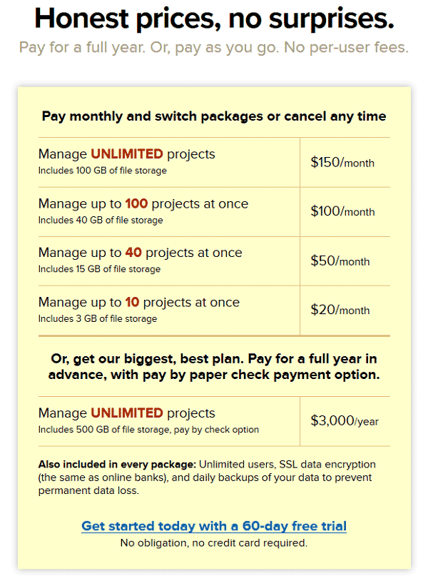
After seeing $150/month, suddenly $100/month doesn’t look so bad. But if the first price you had seen was the lowest-priced option of $20/month, wouldn’t $100/month seem awfully expensive?
2. Divide a Large Fee into Daily or Monthly Prices
To be clear, this is a copy change, not an actual change in your pricing. Marketers have been doing this for decades, and you’ll probably recognize the strategy best from sponsor-a-child commercials in the 80s and 90s, where the common line was this: “For less than a dollar a day.”
In fact, you weren’t going to send in a dollar every day. You were going to pay a monthly or annual fee.
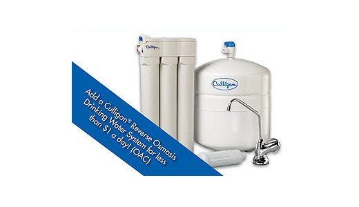
But if the commercial had said, “For just $29 a month,” the effect certainly wouldn’t have been the same because parting with $29 is much harder than parting with $1. It’s a great strategy and one that businesses in a range of industries have been capitalizing on. Check out this snippet of a Culligan print ad:
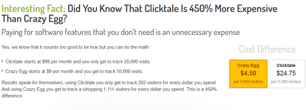
Crazy Egg does a great job of dividing a larger price into smaller pieces. On their much-tested home page, they message their pricing at one point as “$9 per month” in order to help the visitor make better sense of what Crazy Egg costs versus what the competitor charges:
In fact, their price is charged annually – not monthly – as we can see here:
Hiten Shah and his team have tested their home page and their pricing page thoroughly, and the controls you see above continue to beat all tested treatments. So there is reason to believe that dividing a large fee into smaller pieces in your messaging – even if the person won’t pay those smaller prices – is worth testing.
3. Divide a Large Fee into Smaller Pieces and Compare It to Something Tangible
Similar to the preceding price-positioning strategy, this one has you divide a large one-time monthly or annual fee into its price-per-day; but instead of messaging the dollar value, you “spend” that dollar on something tangible that your audience is likely to waste money on. Why? Because it can be hard to visualize $1.50, but it’s easy to visualize a crummy cup of coffee.
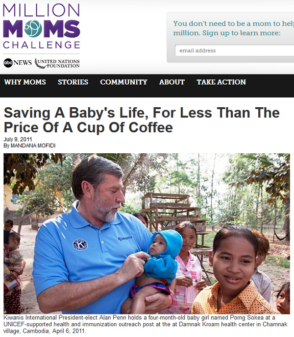
Here is an example: “For less than the price of a cup of coffee.” That’s how the Million Moms Challenge is positioning donations to their cause:
When I was copywriting at Intuit, my long-form sales pages frequently used this strategy. We would compare the price of Payroll to the price of one latte a week or to what the average small business spends on printer paper each month.
Be sure to compare the price of your excellent, high-value product or service with the price of something most people would consider a waste of money or an irritating cost, something frivolous or unnecessary. Don’t compare it to the price of a necessity or something with lasting value.
If your audience is comprised of small businesses, the prices for things like printer toner and water for the cooler can be irritating costs that lack the value your offering has. If your audience is comprised of university students, things like a box of cereal or getting a manicure may register as non-essential.
4. Increase the Perception of Value within Your Product
There’s a copywriting technique called the “value prism.” The idea is to shine a light (not literally) through your product to dazzle people with everything that went into creating it. Make them see the previously unseen value at its core, so that your product feels much more valuable and your price much more reasonable.
Simply list everything that went into creating your product or that makes your service so valuable.
A box of software isn’t a box with a disc and a booklet inside. It’s the product of a team of 11 Stanford PhDs, 21 engineers, 4 tech writers, and 7 designers from the Rhode Island School of Design. It’s the culmination of 370 years of education, all completed in the last 2 decades at impossible-to-get-into schools. It’s fourteen months of 20-hour workdays for a team of 40 experts. It’s 29 independent user studies, with improvements made after each study. It’s 3 utility patents and 5 design patents. It’s over $7 million of pure innovation.
But if you’re failing to tell your prospects about all of the value within the box, then, as far as your prospect can tell, it’s just a disc. To your prospect, $490 is a lot to pay for a disc. But $490 is a steal to get the product of the greatest engineering and design minds of our time.
Dyson has claimed 27% market share in the U.S. vacuum cleaner space with their story of the years of thinking and experimentation that went into redesigning vacuums and the patents that were obtained. They detail everything behind their products on their About page, explicitly referencing the following:
- 5 years of prototyping
- 5,127 prototypes
- Experiments held in “development laboratories”
- 1,000 Dyson engineers and scientists in Britain, Singapore, and Malaysia
- Engineers in disciplines like Fluid Dynamics, Aerodynamics, Turbo Machinery, and Acoustics
And their product sales pages focus heavily on the patents behind their products:
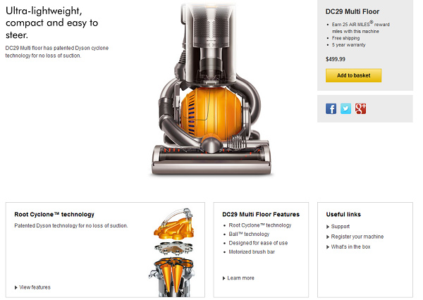
Once you know what’s really inside a Dyson, that $499.99 price tag seems more manageable.
In the digital space, here’s how Linked Influence uses the value prism technique:
An extension of this strategy is to list everything that a customer gets when they choose your product. Don’t hold back. Think of your prospect as putting out her hands, and it’s your job to fill those hands until they’re overflowing.
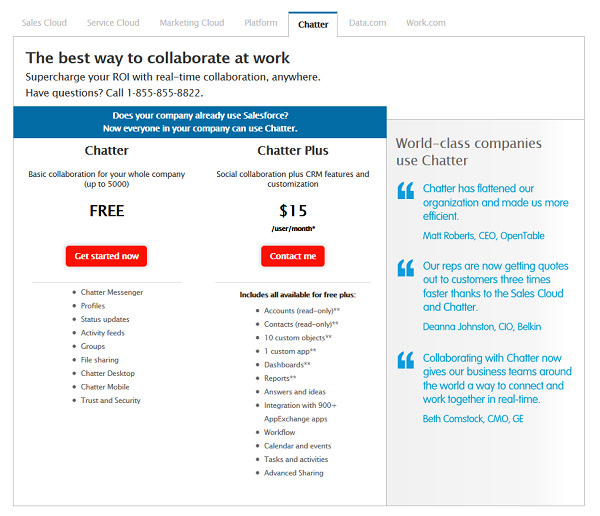
Salesforce does a great job of this with one of their lower-priced offerings, Chatter, where a prospect can clearly see that, for just $15, they get a lot:
And, as this 2012 study in the Journal of Marketing Research shows, the less utility your product has, the more effective it can be to list a lot of product attributes. If you are selling a luxury item, consider creating the effect of a large number of features.
5. Introduce a Calculator
We conversion rate optimization consultants and copywriters often calculate the long-term payoff or incremental revenue of a split-test win, and then we show that number to our clients in order to minimize the perception that we’re “an expense” when, in fact, we are a critical value-add.
If the winning treatment I created brings in an additional $25,000 in sales every month for my client, then my $10,000/month fee starts to look extremely reasonable, especially if my next test brings in another $25,000 per month. But if I fail to explicitly tell my client how much I earned for them – perhaps because I’m afraid of being guilty of praising my own work – then the only number they see is -$10,000 in their bank account. Is it better to lose a client (and, in turn, have them miss out on money I could help them get) or to be that egotistical chick who makes them all that money?
Now, what if you’re selling expensive B2B software?
Here, the goal is to make an annual fee look lower by calculating the dollar value of the time users will save with this particular B2B software:
Relying on words alone can be a little clunky. An actual on-page calculator that the visitor fills out could make the story – and, more importantly, the money they’ll save – much more real for your visitor.
6. Remove the Dollar Sign ($) and Make the Numbers Physically Smaller
A study reported by Cornell found that diners were more likely to spend more when the dollar sign was removed from the prices listed on the menu. Notably, this was a study of diners reading menus, but it’s interesting nonetheless and test-worthy if you’re trying to make your high price more palatable.
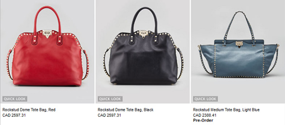
Neiman Marcus doesn’t use dollar signs when trying to sell their pricey items, like Valentino handbags:
Another study, discussed here, found that a sale price is more palatable when it is written in a smaller typeface. A price that is physically large may create a perception of being “more.” After all, things that are big are big; things that are small are small. Big prices should be big; small prices should be small.
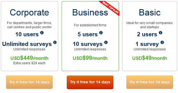
CustomerSure takes the focus off the price of their software by keeping the font size small and by positioning the price away from the factors that users should be more concerned with, such as identifying the right business (plan) type and selecting the number of users and surveys:
And never underestimate the power of subtracting a penny, aka using “charm pricing.” It may sound hokey, but $19.99 continues to register as less expensive than $20, and $99 continues to register as more reasonable than $100. Even better? Use a 7 instead of a 9, as in $97 instead of $99.
7. Make Intangible Products or Services Tangible
Why do long-form sales pages use photos of stacks of DVDs and booklets even when the product they’re selling is only delivered digitally? Because people are more willing to exchange their money for something they can hold than for something they can’t.
When you buy a membership to a gym like Curves online, what are you really getting? Everything is digital. It’s not until you go into the gym itself that you’ll be able to see what your money is getting you. So, how do you generate interest in memberships online, knowing people have an easier time spending money on things they can hold? Check out what Curves does:
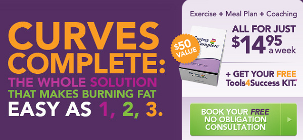
Now, for $14.95, you get the Curves weight-loss experience, and you also get a box of stuff. You’re paying the exact same membership fee, but the sense is that you’re exchanging your money for something tangible.
8. Make It Seem like Everyone’s Cool with Your Prices
What if you could normalize spending $250 on a pair of jeans? What if you could normalize spending $60 a month on social media software? The best way to normalize something is to make it appear that the whole world is doing it. The best way to do that? Use social proof.
Social proof in the form of testimonials, ratings, and numbers of users is one of your best friends when you’re writing copy. And it can go a long way toward making price concerns seem foolish. After all, if 100,000 people are using the solution and they didn’t think it was too expensive…
ProProfs uses this strategy in the headline of their Plans & Pricing page:
The combination of masses of people using the solution and an already-low-price virtually eliminates the price objection.
9. Create a Visual Perception of Luxury
If you walked into Walmart to buy a pillow and saw that the average price was $200, you’d walk out. If you walked into Ruby Tuesday and saw that chicken fingers started at $25, you’d walk out.
It’s hard to sell expensive products in environments that feel cheap or perfunctory.
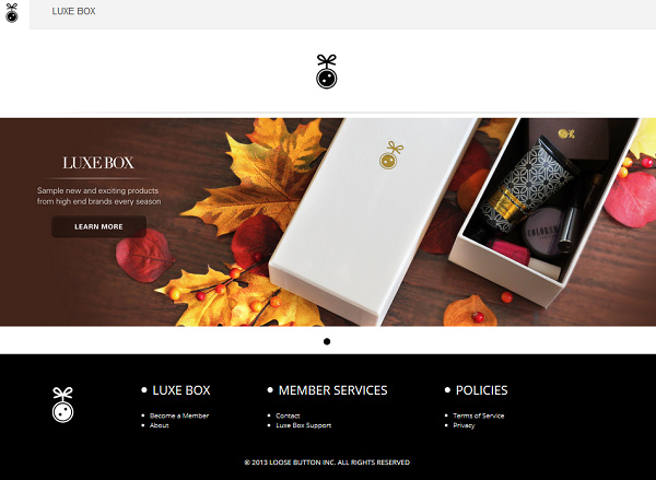
Existing luxury or high-end brands, like Tiffany, don’t have to do much on their sites to build a sense of luxury. The brand itself is luxury. But new luxury-as-a-service brands, like Loose Button – which is a subscription service for makeup and fragrance samples – need to craft a sense of luxury on their sites. It’s only for the sake of luxury that you would pay for something you can get for free at the drugstore makeup counter. Enveloping your prospect in luxury throughout their experience makes paying for the indulgence more palatable, which probably is why all of my female friends are obsessing over Loose Button:
Blue Apron is a subscription service that will deliver recipes and ingredients for a delicious meal for $9.99 per person, per meal. It sounds reasonable until your visitor starts to do the math:
“$10 per person in a house of four, with three meals per day and seven days in a week.
So we’re paying these guys $840 every week for food? We don’t pay that much in a month right now!”
To help neutralize the perception of expense or lack of affordability, the Blue Apron site uses a beautiful site design that showcases their attractively packaged products and the high quality of the ingredients.
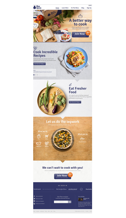
Blue Apron could take things further, of course, and use not only a luxurious visual design but also sprinkle in some comparisons to what $9.99 normally buys you (greasy fish and chips, a 2,500-calorie burger meal).
About the Author: Joanna Wiebe is a conversion copywriter and the founder of Copy Hackers, where startups learn to convert like mofos. You should follow her on Twitter here and sign up for her free weekly website teardowns and tips here.
Comments (36)