Building a useful and beautiful website is difficult. It takes a lot of time, thought, and energy. And in the end, visitors might not even like it.
Here, I will break down what some of the best SaaS (Software as a Service) companies do with their websites. I won’t be telling you how to build your website. Instead, I’ll be giving you some ideas to keep in mind during your first build or redesign.
1. Above the Fold Value Proposition
The value proposition simply communicates: What makes your business unique? What do you do better than everyone else? It’s your one-sentence selling point to the visitor that sums up your entire product.
Here are examples from a few well known SaaS businesses:
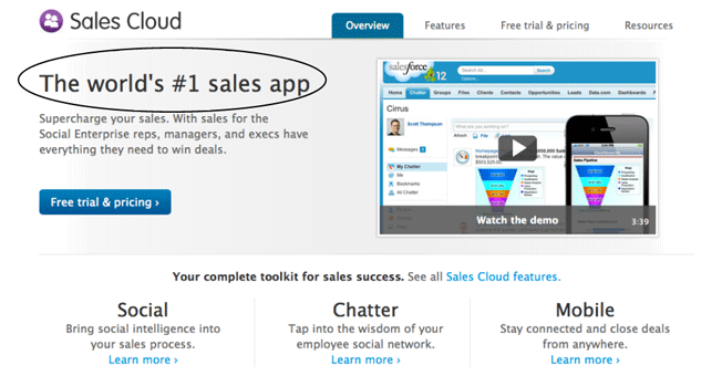
Salesforce:
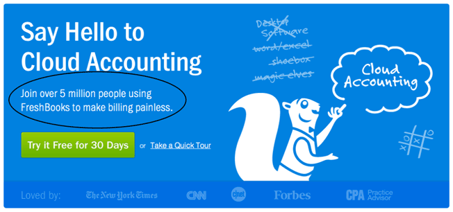
Freshbooks:
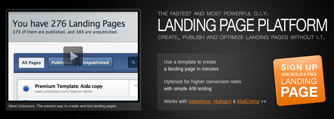
Unbounce:
To form your value proposition, follow this formula:
Combine what your business does and what it does best in one sentence. In other words:
what you do + why you do it best = value proposition
Here’s an example from Sendgrid:
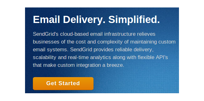
What do they do? Email delivery. Why are they the best? It’s simple.
Here’s Picplum:

What do they do? Print photos. Why are they the best? It’s quick.
Take time and think about your unique value proposition with your team. Come up with a list, and narrow down some of your favorites. Then, A/B test them. Find the one that converts the best and stick with it.
2. Call to Action
A website’s call to action tells the user to do some action. Typically, most websites use their call-to-action button to tell the user to sign up. Most buttons say “Sign Up Now.” Let’s look at a few examples:
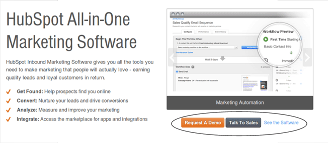
Hubspot has two buttons and one link. All three take the visitor to different areas of the website:
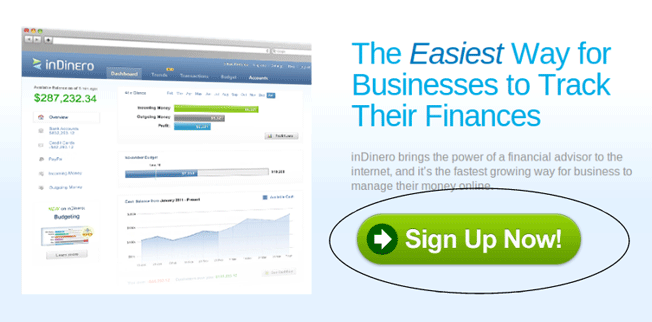
inDinero has a rather large green “Sign Up Now” button below their value proposition:
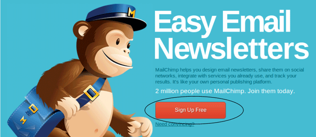
MailChimp uses a big red button and includes the word “Free”:
Test your call to action; some like to ask for an email address, which leads to a free trial. Others ask users to log in using Facebook or Twitter. Still others have a “See Our Pricing” button. Finally, you’ll also see some that have a “Get Started” button.
Do some testing and see what call-to-action message works best!
3. Pictures of the Product
Can you imagine yourself ever buying a product without actually seeing it? I certainly can’t see myself doing that, and I doubt I’m in the minority. That’s why your website needs pictures of your software.
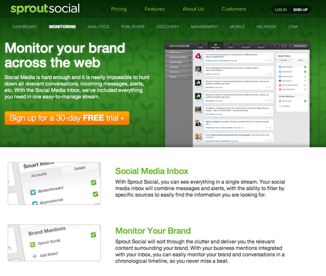
Take a look at Sprout Social, where users can see each feature of the product along with its screenshots:
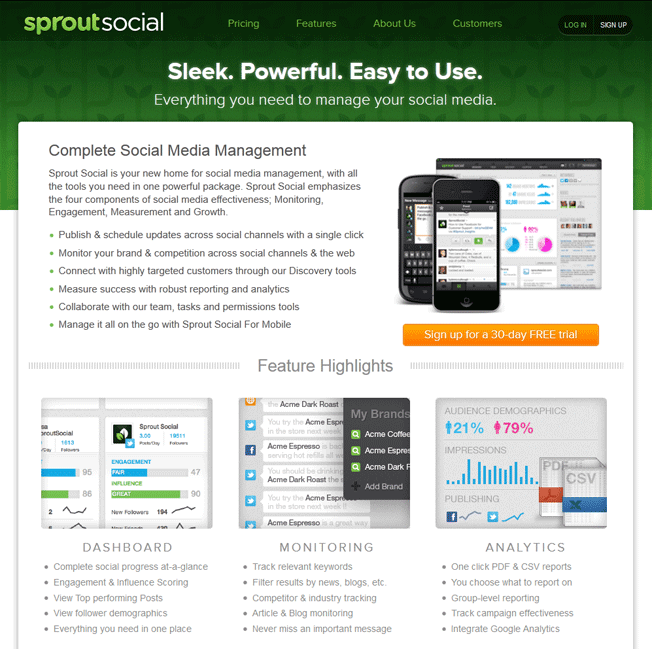
If a user clicks on the “Monitoring” feature, they see this page:
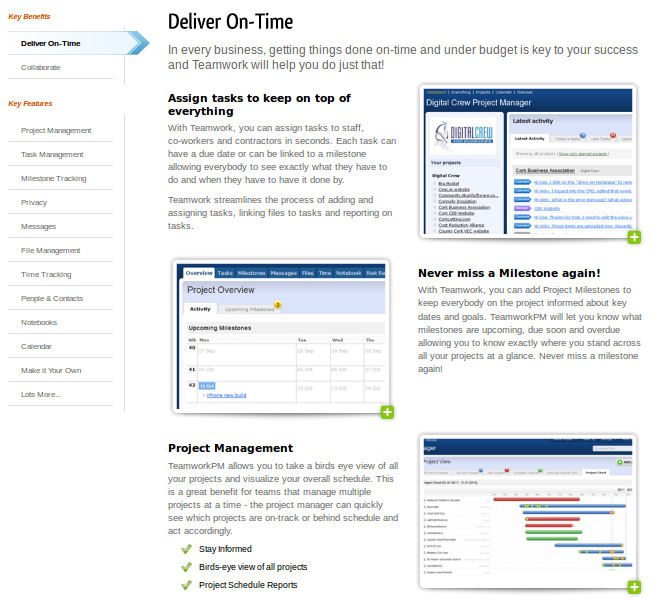
Teamwork PM tells users of their features with a short text description as well as a screenshot:
Some people will want to read about your features, while others will want to see them, but most want both. Write about a feature, and then show how it looks with your software.
4. Video
Video does things that pictures and words cannot. They allow the visitor to watch, instead of read. Many premium video hosting services also offer analytics, so websites can know how much content the visitor took in. A well-produced video can also enhance the user experience.
Finally, a short 30 second to one minute long video can get the user to understand your product much quicker than words and pictures can.
Dropbox is a company that, from the very beginning, used only a video on their homepage:
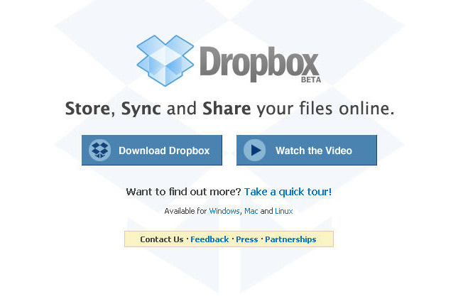
To this day, Dropbox uses one video to illustrate their product.
TribeHR places a video right below their value proposition:
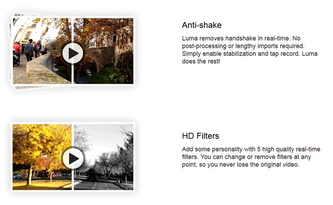
Luma app has a video to show each feature:
Video doesn’t have to cost any money. A computer microphone and screen capturing software will do.
When Drew Houston was starting Dropbox, he made his own video:
If your company doesn’t want to pay for video hosting and analytics, you can use free services such as YouTube or Vimeo.
Be sure to check out our infographic on how to increase video viewership. There are some great tips on how to create a video that keeps your visitors interested within their short attention span.
5. Easy to Find Contact Information
Not everyone who goes to your website is going to spend time looking for your “Contact Us” button. For many, if they cannot find it right away, they’ll simply leave your website. This is why it’s best to clearly highlight your telephone number on your homepage. You may increase conversions and sales. Let’s look at a few examples:
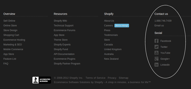
Near the bottom of the Shopify homepage, they list all of their contact information in a single column:
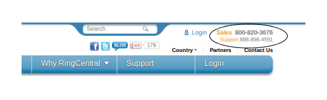
RingCentral posts their contact information at the top right of every page:
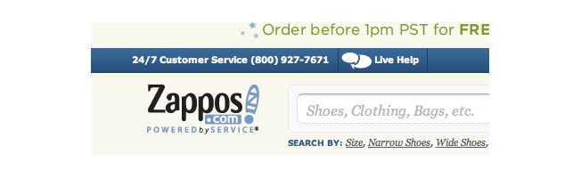
Zappos posts their telephone number and a live help link by the logo:
Typically, contact information is posted at either the top or bottom of a webpage. Wherever you decide to post yours, make it visible and clear. Visitors should be able to find your telephone number quickly, hopefully without even looking for it.
6. Demo
Some visitors want to try your product right away without having to sign up for a trial. Visitors want the ability to immediately try out a product without having to go through the technical work.
To see a great demo of a product, check out the Ubuntu demo of their operating system.

Generally, demos are best served when they’re just a click away. First time visitors should be able to access your demos within a few minutes of entering your site. Make it clear, easy, and simple.
For users who use your demo, try upselling them by having a small text box reminding customers that they can sign up for a free trial.
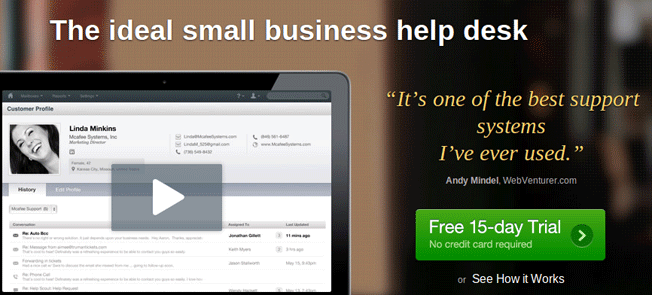
7. Free Trials
For those who do want to use their data and test your product with their business, there are trials. Most trials are two to four weeks and don’t require a credit card. Netflix is a company that has long let users try their product for a month before they decide to continue the subscription. It’s also common for nearly all SaaS companies to offer a trial.
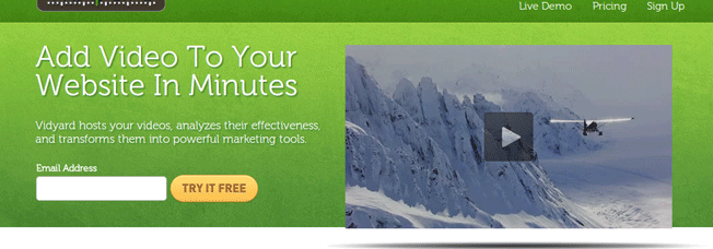
If you’re wondering where to place your “Trial” button, take a look at these examples:
Here’s Help Scout’s homepage, featuring a big green call-to-action button:
Vidyard doesn’t mention a trial, instead asking users for their email address on a yellow-ish “TRY IT FREE” button:
Talkdesk tells us their unique value proposition; then they have their call to action:
Backupify places their trial button in a different place. Instead of the center, they place it on the top right:
What’s interesting is that this pink-ish button is on every page. Most companies place it on the homepage, landing page, and/or pricing page.
8. The Essentials
Okay, so your SaaS product is the best thing money can buy. It does everything better than your competitor, costs less, and has a much better user interface. But what about everything that goes along with the product? The service, speed and uptime, team, and security? All these are players in the goings-on of your product. They’re attached to your product and must be taken care of. In some cases, they can also be used as a selling point.
At the end of each section, I’ll have a “Some ideas” list that will give you ideas about what you can implement on your website.
Service
How often do you hear people rant about poor service? If you’re like me, it’s probably pretty often, nearly every day. Whether it’s online or offline, people will tell others about poor service. The fascinating thing is that you don’t hear much praise for service, simply because good service is expected. Companies seem to be praised only for service when they go above and beyond the typical threshold that’s expected.
If I asked you:
What companies are great at service?
You’d probably come back with an answer like Rackspace, Zappos, L.L. Bean, or a business that you have dealt with personally. What you probably won’t think of are companies like Target, Best Buy, or Netflix. Why? Because these companies are good at customer service, not terrible and not great. They do their job and get you what you want.
Simply put, you have to be on one end of the spectrum or the other to get noticed. Either bad or excellent. Good is fine, but people won’t repeatedly mention your service, and you won’t become known for it. You’ll just get by. It’s certainly better than having bad service, though.
This is why service matters: Visitors to your website want to know what type of service they can expect. Write nothing, and visitors may assume you don’t put much emphasis on it.
Some ideas:
- Post service testimonials on your support page.
- Show pictures of the people behind your service and support team.
- State the channels for reaching you (i.e., telephone, email, social media, etc).
- Share any service awards that you have earned.
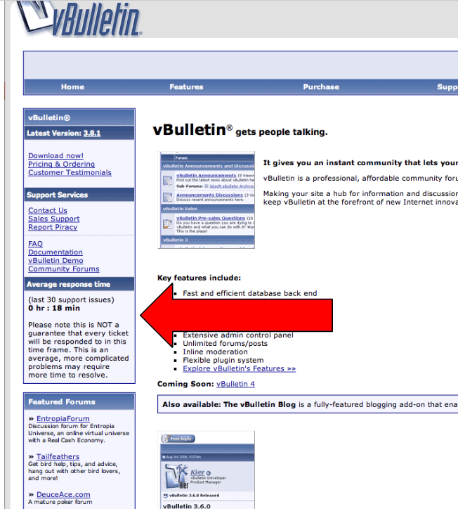
- Tell the visitor your average response time and average resolution time. Vbulletin has done something similar in the past:
Your service should be something to be proud of, and it should be shown off. Use your service to your advantage and let people know how it is before they buy. Or use it as a selling point, like Rackspace does with their support team.
Team
It’s likely that team isn’t crucial to most people’s buying decisions. However, it is nice to get a glimpse of the people behind the product. Who’s the CEO? Who are the developers? Who runs support? What makes these people the best for the problem you’re tackling? Remember, your team is part of the product. It is the product. Some people need to be sold on team before buying.
Some ideas:
- Generally, pictures of the team along with a short description of what they do at the company is common. It’s important to keep this updated, as you don’t want an employee who’s been gone for a few months still on your “Team” page. People may Google their name and find out that they haven’t worked for you for months. This will make your website look outdated and unmaintained.
- Many companies also post the list of investment firms who have put money in their business.
Security
SaaS companies host important data that belongs to businesses and individuals. They’ll want to know that it’s secure and protected. A security breach can cause a storm of bad PR, as we’ve seen with LinkedIn, Dropbox, and Zappos.
At the least, visitors and customers should know what you do about security. They don’t need to know every aspect of it, just the general principles and technologies that are in place to make sure their data is secure.
Some ideas:
- Tell the user of your use of HTTPS and the security encryption you use. What is it comparable to? Bank security? If you use the AES-256 standard, then it is.
- What security measures does your host (i.e., AWS, Rackspace, etc) provide?
- What is your security record?
- Is user data backed up? How often? How secure?
All these listed characteristics do not make a great SaaS product or even a great website. This information is not meant to be a manual for making a website. Making a website requires thought, great design, testing, and listening to customers. These points are meant to give you ideas to consider for your website.
Anything you would like to add or take away? Let me know your opinions in the comments!
About the Author: Zach Bulygo is a blogger, you can follow him on Twitter @zachcb1.
Comments (19)