
The biggest companies in the world should have the budget for a great landing page, right?
Well, if you thought that, you’d be wrong.
Oftentimes, the biggest conglomerates struggle to create compelling landing pages. Their conversion rates are far from perfect.
And despite multi-million-dollar budgets, they can’t seem to create a simple, easy-to-use website.
Instead of clear calls to action and a high opt-in rate, what you ultimately get is a lot of customers shrugging and giving up in sheer frustration
Here are some puzzling and unusual landing pages you won’t believe are built and run by the world’s largest companies.
1. Delta SkyMiles
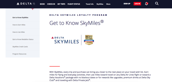
If you Google “SkyMiles,” this is the first page that shows up.
Of course, I’d assume someone searching for Delta’s signature loyalty program is interested in becoming a member, but this landing page doesn’t make that easy.
First off, there is no signup button above the fold. You have to scroll down to find the “Apply Now” link. The large photo is beautiful, but it’s not worth over half the screen real estate.
To make matters worse, there’s a confusing sidebar menu that takes up almost a third of the page. It’s confusing—it’s almost a combination of a landing and FAQ page.
Of course, that’s just an odd and puzzling combination. It combines marketing information about the product, along with technical details for current members.
The lesson to learn here? If you’re going to create a page for people interested in your product or service, explain the benefits clearly and quickly, and put a call to action up top.
2. Xfinity
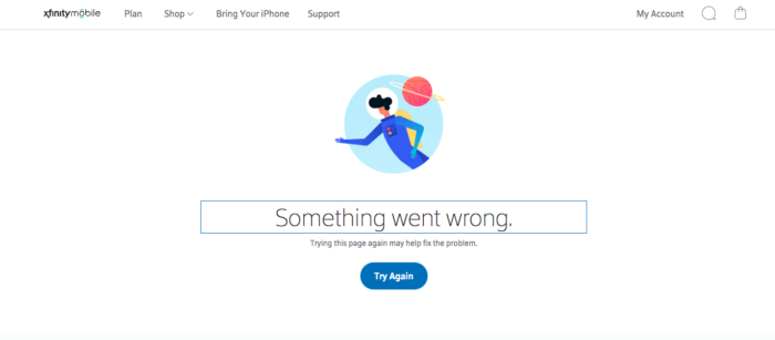
Okay, perhaps I’m cheating a little bit with this one because it’s not really a landing page.
But still, if you click on the ad on Google for “Xfinity Mobile,” it goes straight to… an error page?
A little research on the ad in Ahrefs shows that this is indeed the URL.
Incredibly, Xfinity is showing this ad to about one-third of a million people each month, and paying $2 per click.
I guess when your parent company spends over $5 billion a year on advertising, you can afford to throw away money.
And when you’re running over 12,000 Google Ads as Ahrefs says, a few can slip through the cracks.
But it still brings up so many questions. How long has this been an error page? Was the ad directed here intentionally, or did someone just take down the page?
And if someone took down the page, do the advertising team and landing page teams not talk to each other before deleting pages?
So many questions, so few answers.
Needless to say, the lesson to learn here is to make sure that your landing page actually works. Otherwise, you’re just wasting time and money.
3. Cruise.com
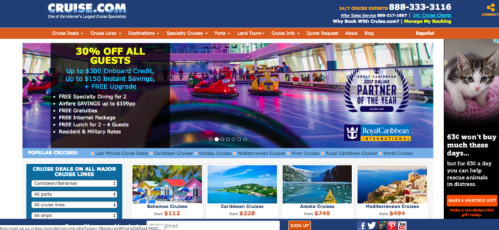
Here’s the homepage for Cruise.com, which is one of the first results for the Google search “cruise.”
With so many people looking to learn more about cruises, why doesn’t Cruise.com make this easy? Instead, the homepage is cluttered with a thousand things to see and do.
If you’ve just come here, there’s no single action to take. For example, most airline homepages have a form to help you choose a flight.
Here, the equivalent search is squeezed into a corner.
Plus, there isn’t a consistent call to action.
In addition to booking a cruise online, they want me to call them, sign up for their email list, and visit their Facebook, Twitter, Google Plus, Pinterest, and YouTube pages.
Plus, there’s an ad for an unrelated product in the sidebar.
The lesson here—keep your homepage simple. Decide what the single most important user action is, and focus everything on that.
Oh, and if you sell a product and you’re tempted to put an ad on your landing page, ask yourself: would you sell a potential buyer for a dollar?
Because that’s essentially what an ad is doing—paying you to divert traffic away from your site.
4. Apple
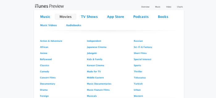
Now, usually, I love Apple’s landing pages. They’re sleek, professional, and well-designed. But this is really inexcusable.
If you Google “itunes movie,” this is the top ad result.
It’s a simple ad that explains what you’ll get. But if you click on the link, it takes you to a landing page that can hardly be called a landing page.
Instead, it’s a list of dozens of movie genres, everything from “Musicals” to “Concert Films” to “Turkish.”
It’s exactly what I’d expect if I clicked on “browse movies” in iTunes, but straight from Google, it’s downright confusing.
How do I start playing a movie? Does this connect to iTunes somehow? Where is the explanation of what’s going on?
But let’s play along and select “Action & Adventure.”
Now, we get a list of what appears to be every single title in the genre on iTunes. There are no pictures, no ratings, and again no explanation.
Let’s click “Mission Impossible: Fallout” just to see where this ends up.
There we go—some information about the movie, a description, and ratings from different sources.
But the call to action? “View in iTunes.” Clicking that link asks if I want to open iTunes on my computer, then pulls up a similar preview page in the app.
Perhaps I’m missing the point, but if I already know how to browse films in the app, wouldn’t I have just gone there first?
If I’m searching, doesn’t that mean I’m looking for an explanation, promotion, or details—not just an online version of the app?
When designing your landing pages, make it clear what the user gets in the end. Don’t force a visitor to keep clicking, all the time wondering where things are leading.
They probably won’t stick around that long.
5. Chase
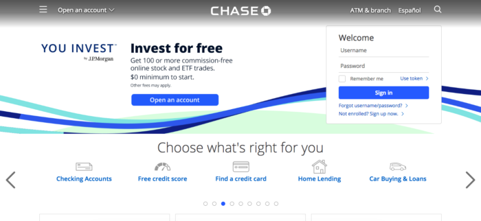
I’ll give Chase a little bit of slack here. To be fair, they don’t know what someone coming to their homepage is really looking for.
But couldn’t they take a few guesses, and simplify the options?
Right now, there are no fewer than eight different calls to action, with everything from signing in as an existing user to applying for a car loan.
A better version of this page might be to focus on one call to action, like opening an account and have a smaller “Sign In” link in the menu.
Right now, Chase is trying to help everyone do everything, and as a result, it doesn’t really accomplish much.
The takeaway? Choose a single user action—even on your homepage—and optimize for that.
Sure, you can include links to other features. But if you’re promoting everything, you’re promoting nothing.
How to create a landing page that stands out and converts
Studying the landing pages of some of the world’s biggest companies can be fun, but it’s only a valuable exercise if you take something away from it and use it to improve your work.
So, what lessons can we learn from these pages?
First, have a clear goal in mind. A landing page that isn’t directed toward a single, specific action isn’t a landing page, and it won’t convert like one.
If you’re not sure what this would look like, imagine the one action you’d want the user to take. Perhaps this is downloading a report, entering their contact info, or calling you.
Second, implement the basic principles of design. This means using research on user behavior to improve conversions.
For example, make your call-to-action buttons prominent and make them visible soon after the user visits the page. Put important buttons and benefits near the top of the page.
Use appealing images with people’s faces, attractive product photography, and design elements that fit together.
Next, understand the visitor’s frame of mind. Tie the landing page into the ad you’re promoting, and make sure it makes sense.
The last thing you want to do is confuse a possible lead or customer.
Confusion usually means a poor conversion rate, so ensure your ad and landing page are as clear as possible and directly tied together.
Finally, make sure your landing page works! This should seem like common sense, but if you’ve included a dead link or are sending visitors to a 404 page, you’re wasting money.
Check, double-check, and check again to make sure that your page is working. Keep testing to refine and tweak your landing page for better conversions and sales.
Conclusion
Studying internet marketing, and want to learn from the best?
Well, sometimes “the best” doesn’t mean the biggest or most impressive. Oftentimes, the bigger the company, the less attention they give to every single landing page.
But of course, those small details do matter—especially for those of us spending less than a few million a year on advertising.
Thankfully, there’s a lot we can learn from these giant companies. By studying their landing pages and seeing what works and what doesn’t, we can get better at our own site design.
What have you learned from the landing pages of big companies?
About the Author: Sherice Jacob creates beautiful, high-converting landing pages, in addition to designing blogs and writing compelling content. Learn more at iElectrify.
Comments (42)