When you’re buying from an online store, you’re putting a lot of trust in the merchant.
You probably haven’t met any real person from the business or had the chance to touch, feel, or try on the products.
Even though I live and breathe online business, it’s not unusual for me to have purchase anxiety when I shop online.
Every step from the homepage all the way through checkout, I want to be reassured that I’m making the right choices and the seller is trustworthy.
If you have an e-commerce business, you understand the multiple user interactions involved in the process.
Just one hiccup, miscommunication, or error along the way can cost you the sale.
If you want to sell more on your online store, you need to examine each step of the user path and plug the leaky bucket.
The good news is that you can start today to improve your conversion rate.
6 tips to optimize your homepage
Your homepage is the show window that gives visitors the first impression of your online store.
In just a few seconds, shoppers will decide whether they want to stay and shop.
If your homepage fails to draw in the right customers, you won’t be selling anything.
Let’s look at how you can improve your home page.
Show timely products and content.
Outdated content — like showing bathing suits when it’s Halloween — makes visitors wonder if you’re still in business.
When you add new products or run seasonal campaigns, update the homepage to drive traffic to the featured items.
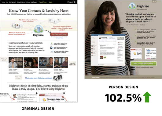
Feature a photo of a person.
Just by using a photo of a “happy customer,” Highrise increased their conversion rate by a whopping 102.5%.
Include a photo of a smiling customer (or a model your visitors can identify with) to help shoppers picture themselves enjoying your product.
State your value proposition.
What problem do you solve for your customers? What’s your unique selling proposition?
Simply put, why should the visitors care about your products or services?
Be concise and don’t overload shoppers with too much information.
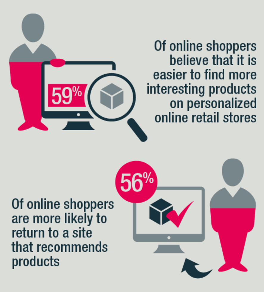
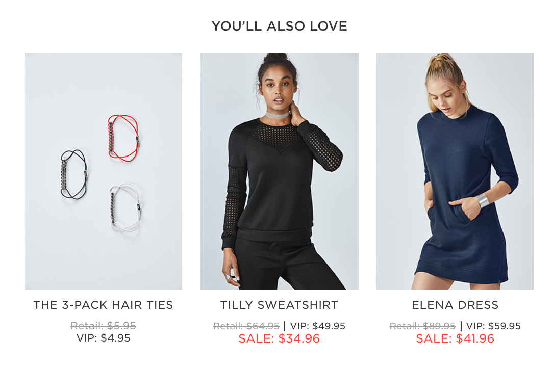
Display personalized content and product recommendations.
For returning customers in a logged-in state, displaying personalized content and product recommendations can help improve the user experience.
By featuring products based on your customers’ preferences, habits, and history, they’re more likely to find what they want and make a purchase.
Improve navigation.
Your website’s structure and navigation affect the user experience of the entire site.
The menu helps acclimate visitors when they’re on your homepage.
Your menu items should display the range of products, yet not become so overwhelming that it’s impossible for shoppers to find the items they’re looking for.
Minimize load time.
You can still lose customers even if you have the perfect homepage if it’s so fancy that it takes forever to load.
“Forever,” in Internet time, can mean just a few extra seconds.
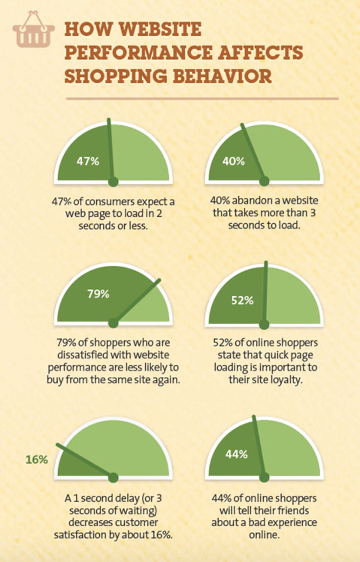
In fact, 40% of shoppers will abandon a website if it takes more than 3 seconds to load.
That’s not a lot of time for any page and particularly challenging for homepages because they typically have more bells and whistles than interior pages.
You can minimize load time by:
- Reducing HTTP requests by streamlining the number of elements, using CSS, and reducing the use of scripts.
- Enabling compression and browser caching.
- Minimizing resources and streamlining the code.
- Optimizing images by cropping to the correct size, using the right file format, and removing image comments.
- Prioritizing above-the-fold elements to load first.
- Reducing the number of plug-ins and redirects.
7 ways to create effective product pages
One of the biggest challenges for online stores is that customers can’t hold, touch, and try on the products.
You have to rely on your product pages to convert your customers.
When designing your product pages, make sure visitors can easily find all the information they need, such as sizing information, shipping details, and return policy.
An effective product page will not only generate more sales, but it will also help reduce costs by lowering the return rate.
Here’s what you need to know when creating product pages.
Write compelling product descriptions.
Don’t just take the manufacturer’s copy and dump it on your product pages.
Not only is it generic and often boring, but search engines also consider it as duplicate content, so it will hurt your SEO.
Your product descriptions need to be succinct, compelling, and relevant.
They should reflect the specific needs of your ideal customers and speak their language.
Use short paragraphs and bullet points to make them easy to read. Incorporate your brand personality to make the copy unique and relatable.
Don’t shy away from providing robust product descriptions and complete item specs. Use tabs or accordions to organize the information so it doesn’t appear overwhelming.
Use images and videos.
Show, don’t tell.
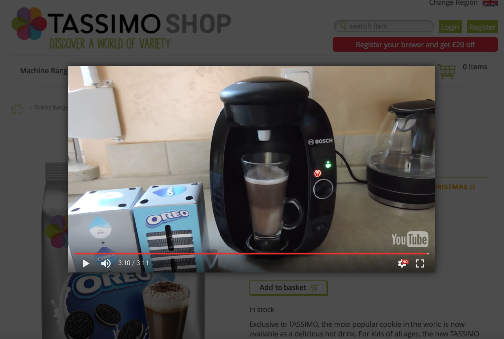
Visual content, such as high-quality photos, 360-degree rotating images, and demo videos are powerful ways to showcase your products.
Brands that use custom visual content have conversion rates seven times higher than those that don’t.
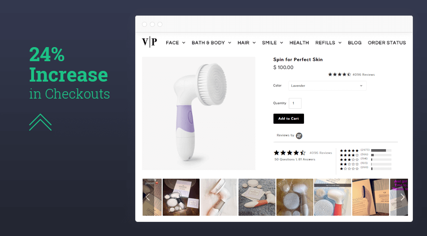
Also, you can encourage customers to submit their own photos.
Vanity Planet increased conversion rates by 24% after adding Instagram photos from customers on its product pages.
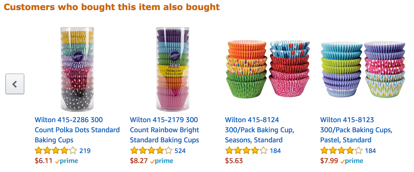
Include product recommendations, bundles, upsells, and cross-sells.
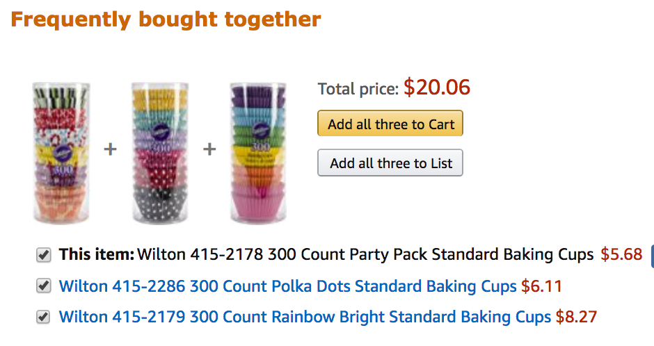
Showing other relevant or complementary products can entice customers to buy more and increase the average order value per customer.
You can base the recommendations on what seems to be the most logical upsell or cross-sell. It can be a different product or a “value pack” of the same item.
You can offer suggestions by mapping other shoppers’ purchasing history to the customer’s browsing behavior.
Make it easy for visitors to buy more by grouping similar items or creating bundles with special pricing.
Use reviews and testimonials.
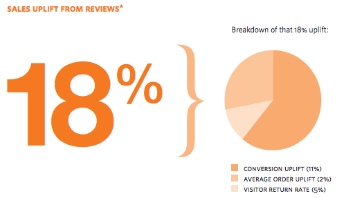
61% of customers read online reviews before making a purchase, while 50 or more reviews per product can mean a 4.6% increase in conversion rates.
In addition, user reviews make your product pages more engaging and your website more useful to visitors.
Reviews are considered fresh and relevant content by search engines.
They contain phrases that will help your site rank well in long-tail keyword searches and drive more visitors who are looking for the exact products you’re selling.
Here are a few keys to getting and utilizing customer reviews:
- Use a third-party review provider.
- Email customers post-purchase to ask for a review.
- Ask for a review on product pages.
- Make the submission process as simple as possible.
- Incentivize customers to leave reviews.
- Display average review score at the top of the product page to show the rating at a glance.
Add urgency.
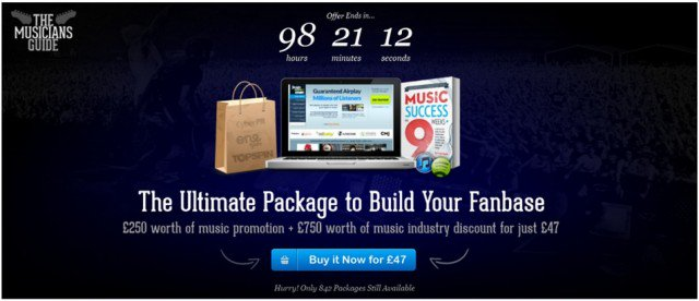
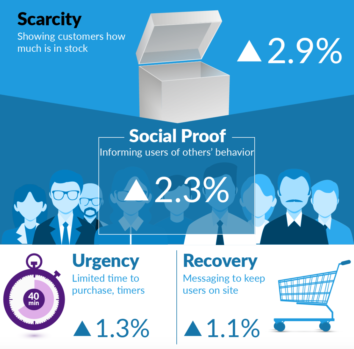
Creating a sense of urgency and scarcity is a tried-and-true way to increase conversion rates.
Show the time left for a special pricing with a countdown timer or display the number of items left in stock on a product page.
Don’t forget the call to action.
Your goal is to get your visitors to make a purchase. Don’t leave it up to chance.
There are lots of distractions on the Internet. You need to take charge and tell customers what they need to do next with a clear and strong call to action (CTA):
- Use persuasive and compelling language.
- Start with a verb (“buy now”) to make it action-oriented.
- Use first-person (“claim my offer”).
- Leverage urgency (“get it now”).
- Increase conversion with extra information (“free two-day shipping”).
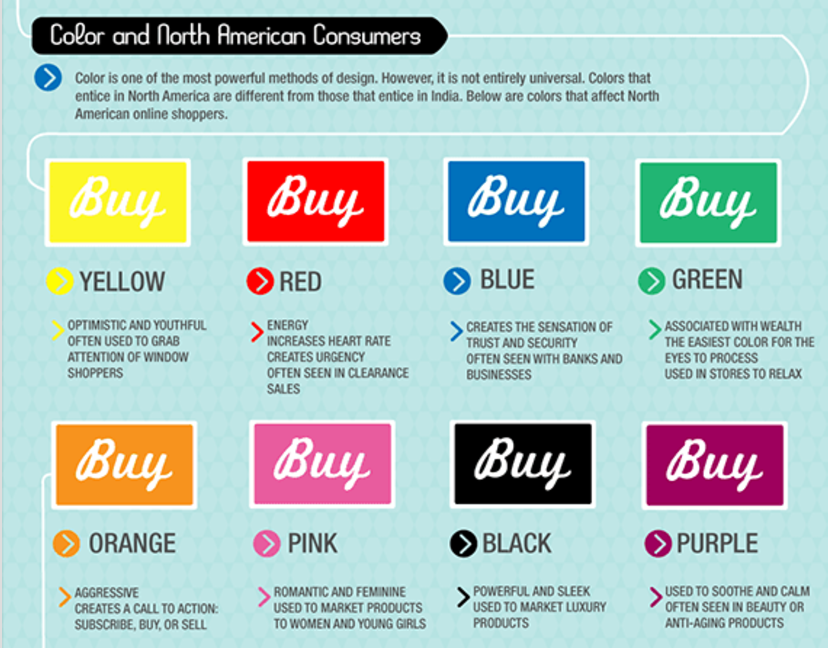
- Use eye-catching graphic treatment (strong contrasting color).
- Minimize choice by focusing on one action.
- Make the button look clickable.
- Keep the copy short and simple.
Optimize product pages for SEO.
You’ll have a much better chance of making a sale if visitors are already looking for the kind of products you offer.
To get in front of these potential customers, you need to optimize your product pages for SEO to get more organic traffic:
- Optimize keywords or phrases for each product page.
- Use keywords in the page title and meta description.
- Use relevant, engaging, and high-quality content such as well-written product descriptions, demo videos, and 360-degree product views.
- Optimize mobile user experience.
- Include local business information if you have a physical store.
- Get listed on Google Shopping.
- Add a sitemap to the store to help search engines index your website.
- Build back links from other websites.
9 strategies to plug the holes in the checkout flow
The average cart abandonment rate is almost 70%. Getting to your checkout page doesn’t mean a visitor is going to complete the purchase.
Another study has found that an improved checkout flow can result in a 35.26% increase in conversion rates, which translates into $260 billion worth of lost orders.
To optimize your checkout process, target the most common reasons why shoppers abandon their carts and focus on improving speed and ease.
Remove checkout obstacles.
Your checkout process should be as smooth and seamless as possible.
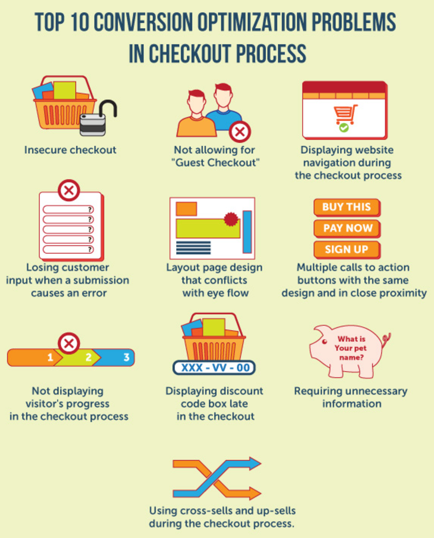
Anything that doesn’t contribute to customers staying within the flow and completing the transaction should be removed.
Hide any popups (such as newsletter signups) and don’t display cross-sells or upsells that will cause customers to click away from the checkout process.
Remove website navigation, banners, or ads on the checkout pages.
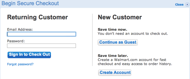
Allow customers to check out as guests and register for an account after they’ve made the purchase.
Streamline the checkout process.
Don’t make your customers jump through hoops to pay you!
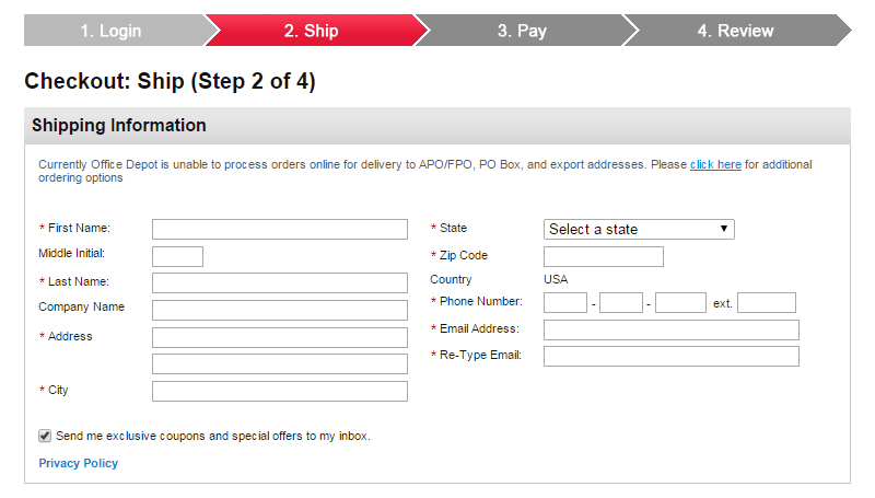
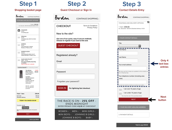
Only ask for the minimum amount of information required to complete the transaction. You can always gather more customer data through a post-purchase survey.
If you choose to use a single-page checkout, make sure the fields don’t look cluttered or overwhelming.
If you have a multi-page process, include a progress bar that will encourage customers to finish the transaction. Make sure the CTA to get to the next step is prominently displayed.
Required fields should be clearly indicated to minimize errors.
Help text should be available on the page to provide instruction without having the customer leave the checkout flow.
You can also offer one-click checkout for registered users who are already logged in.
Make your checkout mobile-friendly.
62% of smartphone users have made a purchase online using their mobile device within a 6-month period.
And this number is only going to grow.
You’ll be leaving money on the table if you don’t optimize the mobile experience of your checkout flow:
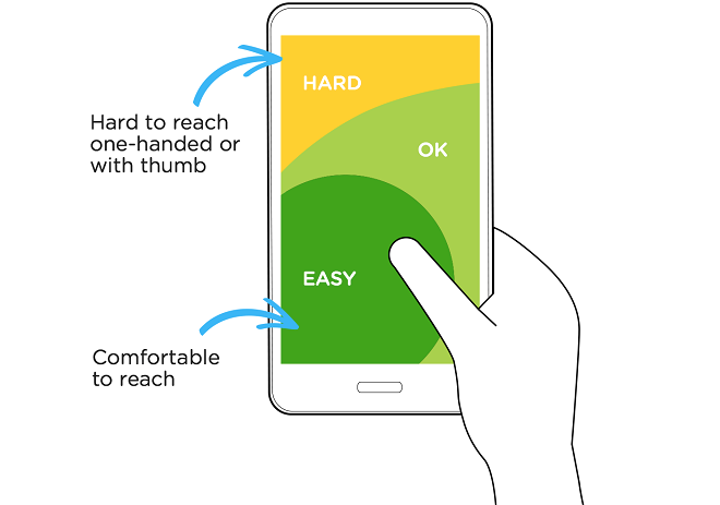
- Design for touch. Make it easy to navigate the interface by placing the critical elements (such as the CTA) within easy reach of the thumb.
- Break up the checkout process into multiple screens to avoid endless scrolling.
- Make all the buttons thumb-friendly. They should be big enough and stretch the width of the screen. If you have two buttons next to each other, make sure there’s enough space between them to prevent users from tapping the wrong button.
- Improve page speed to avoid frustration.
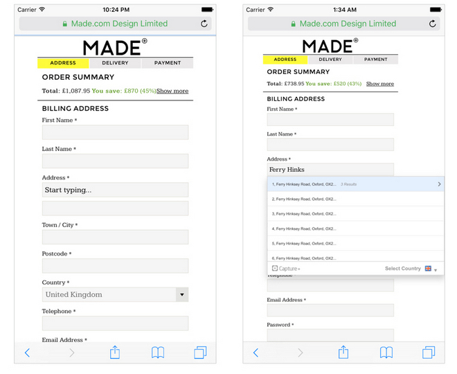
- Use auto-detect and auto-fill features to minimize typing.
- Use geolocation to pre-fill cities and zip codes or use an address finder so customers don’t have to type in the full address.
- Add a click-to-call feature so shoppers can get assistance on the spot to complete the checkout process.
- Trigger numeric keyboard for credit card and phone number entries.
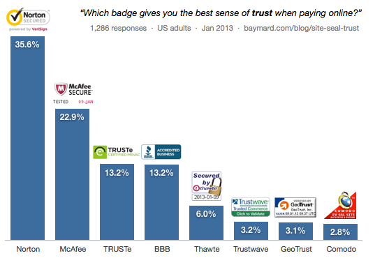
Add trust seals.
Before your customers hand over their credit cards and personal information, they need to know that it’s safe with you.
Displaying trust marks has been shown as an effective way to improve conversions.
In a split test, conversion rates increased by 42% after a trust seal was added.
However, not all trust seals are created equal. Some are found to be more effective than others when it comes to inspiring confidence.
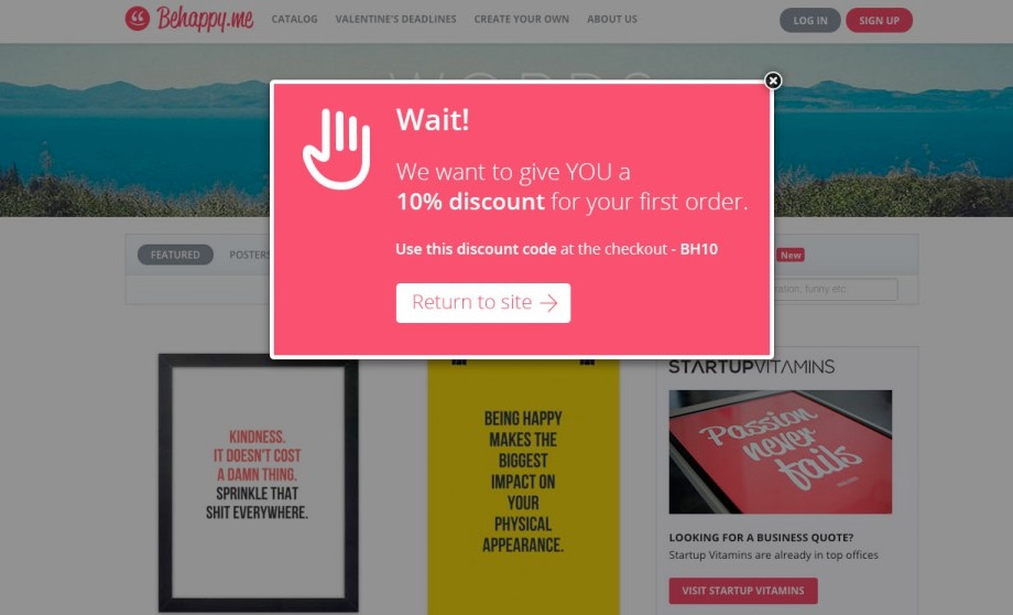
Use an exit popup.
The only time to introduce a pop-up during the checkout process is when a customer is about to abandon the cart.
Use an exit popup to get visitors back into the checkout flow with a special offer or a reminder of a time-sensitive deal.
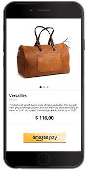
Offer a variety of payment options.
Make it easy for your customers to pay you by including more payment options.
Besides credit cards, you can accept PayPal, Google Wallet, or Amazon Pay.
Offer an in-store pickup option.
Consumers like instant gratification.
If you have a brick-and-mortar store, you can offer in-store pickup of online purchases so shoppers can get their orders faster.
Use in-cart messaging during the checkout process to let customers know about the option if you have a local store in the area.
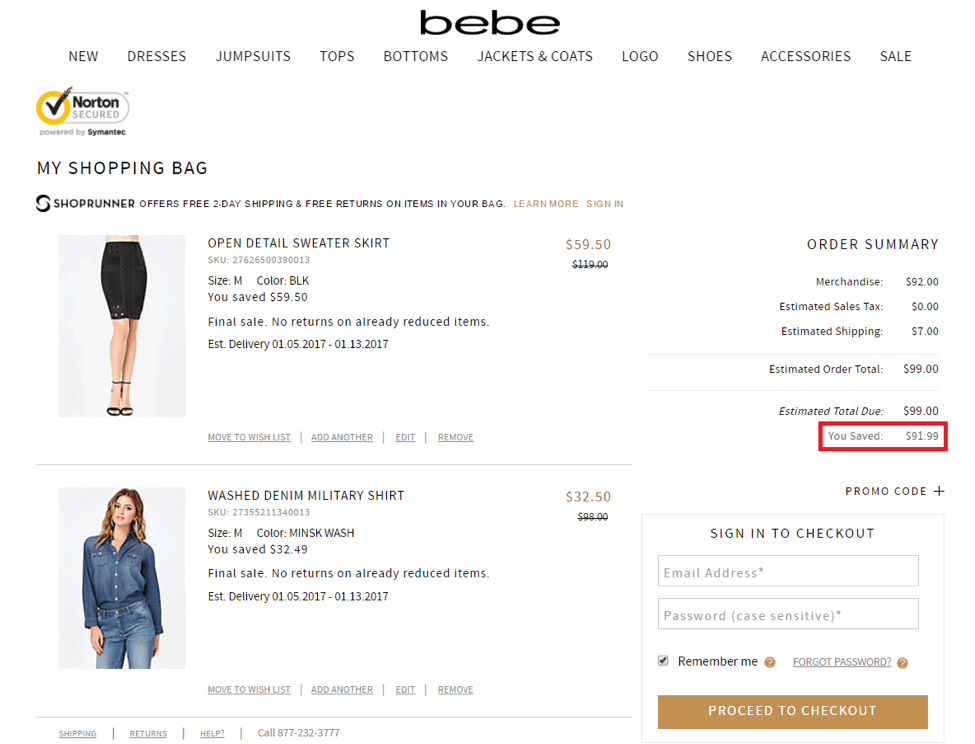
Show the amount of savings.
Who doesn’t like saving money?
You can entice customers to buy more by showing them how much they’re saving.
Customers are likely to buy more (and feel less guilty) when they see their savings piling up.
Not only will you increase your average order value, but you’ll also improve customer happiness.
Advertise free shipping.
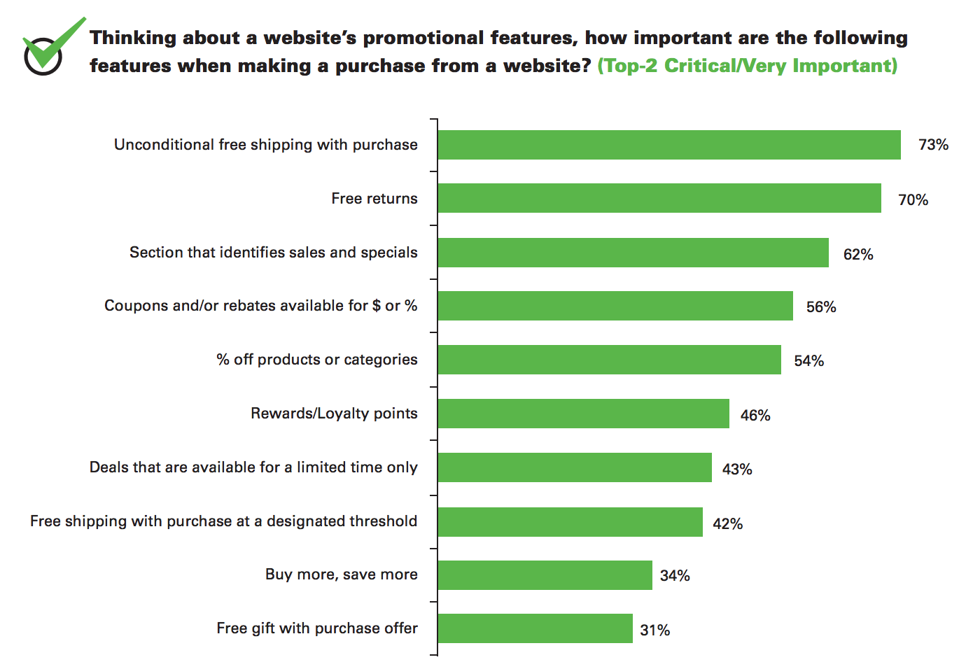
In one study, 73% of participants indicated unconditional free shipping is the #1 criteria for making a purchase.
Many consumers abandon carts because of high shipping costs, so offering free shipping will make them more likely to complete the purchase.
In addition, orders with free shipping average around 30% higher in value. This is not the place to nickel-and-dime your customers.
Promote your free shipping offer throughout the website and don’t forget to reiterate it at checkout.
4 ways to beef up customer support
Customers are more likely to buy from you and come back for more if they get an outstanding customer experience.
Consumers want to get information and assistance whenever and wherever they need it and in the way they want it.
When customers get in touch, they’re showing interest and are much more likely to convert. Don’t lose the sale by leaving them hanging.
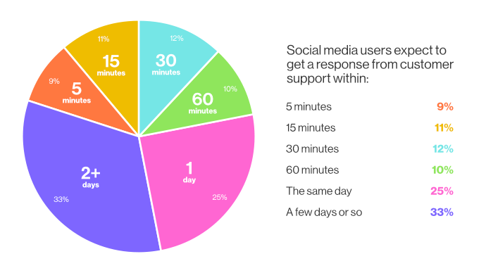
Simply having a contact form on your website is no longer enough. Your customer won’t sit around and wait 24 hours for a reply.
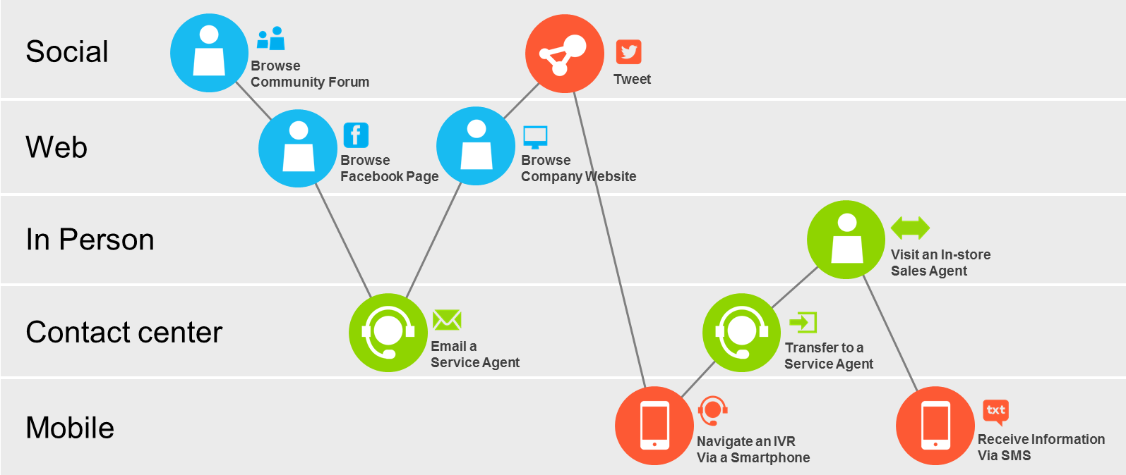
Implement an omnichannel customer care strategy so shoppers can get seamless assistance across all touch points as they consider your products and complete a purchase.
Live chat
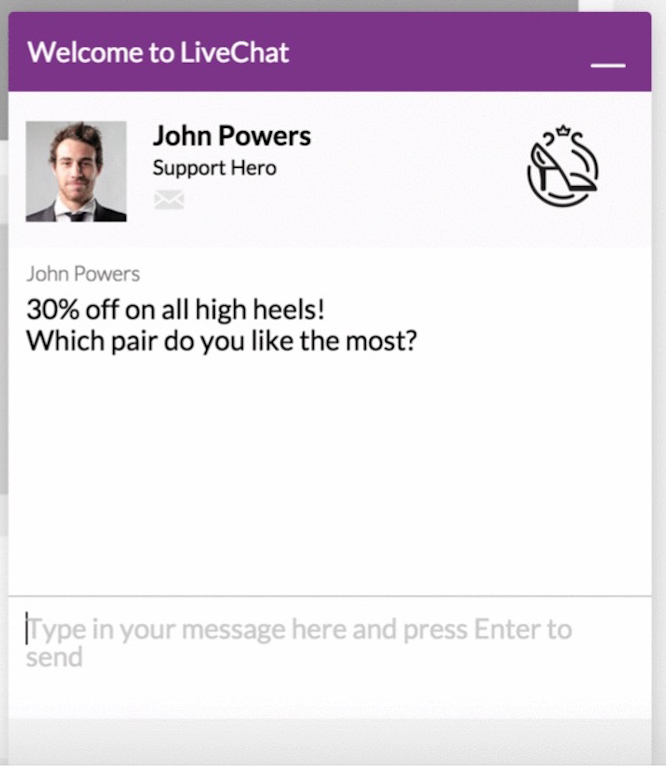
Visitors invited to chat are 6.3 times more likely to convert than those who were not.
Here are a few ways to use live chat to increase sales:
- Automate chat greetings that invite visitors to use the chat function anytime they have a question. After all, the feature is only effective when the customers know that it exists.
- Add a personal touch by addressing customers by their first names whenever possible, referring back to previous interactions, and including a photo of the agent.
- Use chat invitation during the checkout process to reduce cart abandonment. Program the software to detect certain behaviors, such as when a customer goes back and forth between a couple of items, a short message will appear to invite her to start a chat.
- Leverage post-chat surveys to get feedback that will help improve your products and services.
Contact page
When customers want to get in touch, most will start by looking for a contact page.
Make sure your contact page is easy to find and designed to provide helpful information:
- Label the page so it’s easy to identify such as with “support,” “help,” or “contact us.”
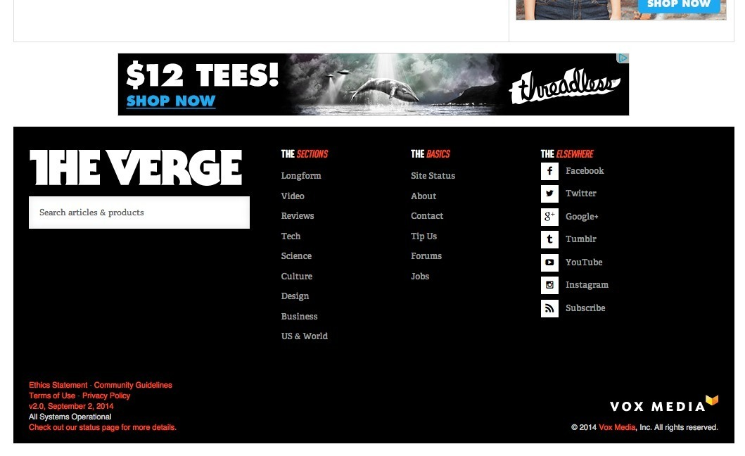
- Include the link as a persistent navigation element, either in the header or the “fat footer” link block.
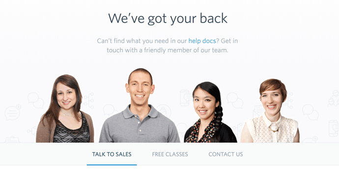
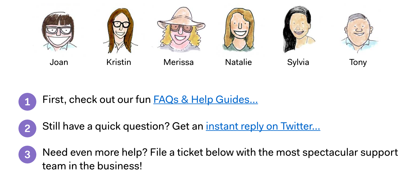
- Humanize your customer service team by including photos of team members on the page.
- Ask customers to categorize their issues so you can show the most appropriate information and inquiry form.
- Give customers the option to self-service by including links to your FAQ page, knowledge base, and community forum.
- Offer steps and options for customers to get the right help.
- Set expectations for response time.
Social media
In a survey of over 23,000 online customers, 67% of them have received customer service via social media.
Also, companies that ignore support requests on social media see an average churn rate 15% higher than those who don’t.
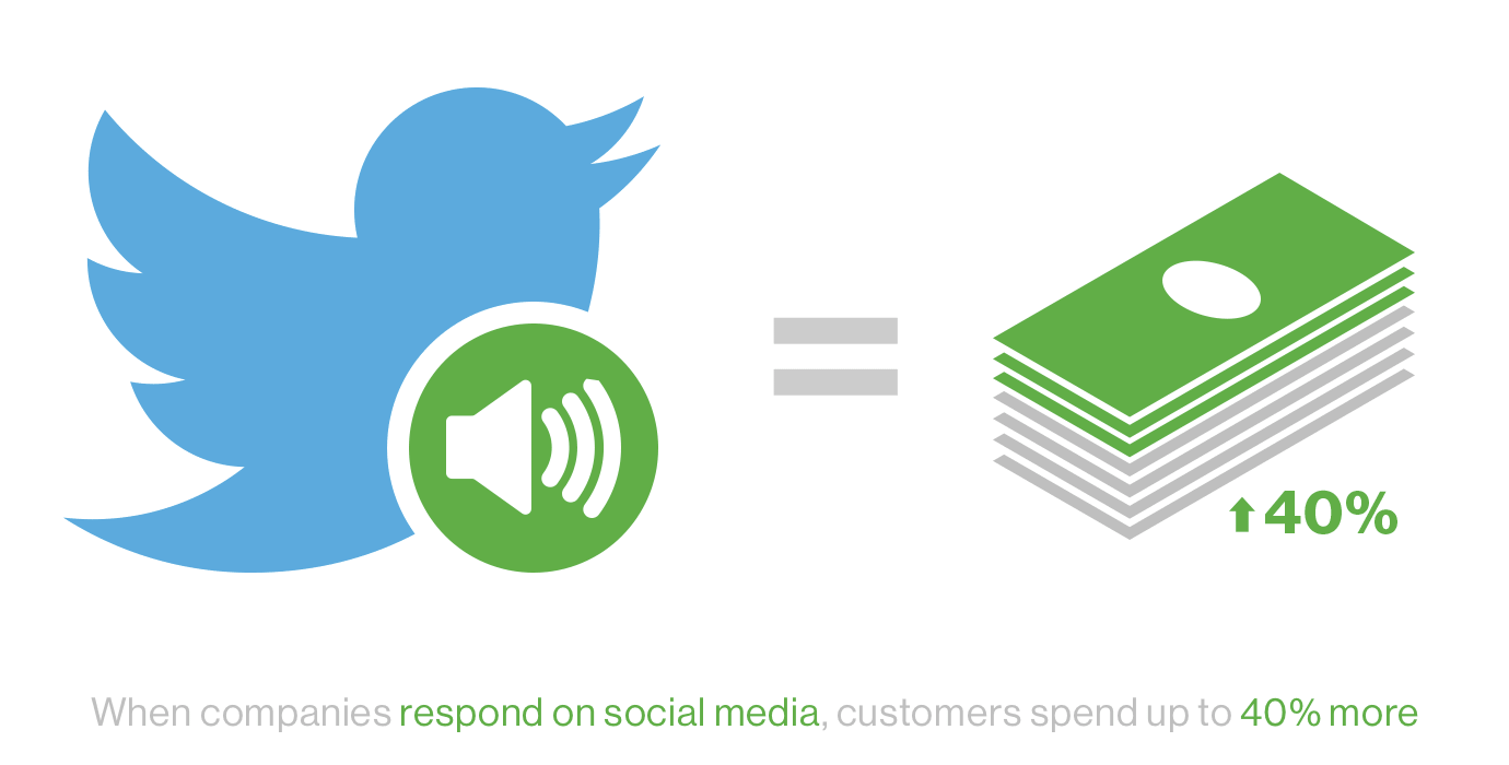
On the other hand, sellers who respond on social media see an increase of 20-40% in customer spending.
You can sell more by including social media in your customer support arsenal. Here’s what you need to know:
- Pick the best social media platforms for your business and customers. Don’t spread your team too thin by being everywhere all the time. Select a few platforms on which to focus your resources.
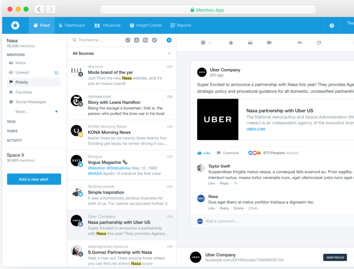
- Monitor social mentions using tools like Mention to make sure nothing falls through the cracks.
- Commit the resources to provide timely responses. You may need a customer service team that’s spread across different time zones so there’s always someone available to offer assistance.
- Use the right tone of voice that not only reflects the brand identity but also matches the situation.
- If you have to transfer customers to another department, make sure they don’t feel like they’re being passed around.
Be transparent with shipping, return, privacy, and tax policies.
Being transparent is the best way to gain the trust of your customers.
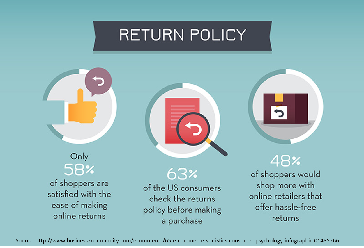
Most online shoppers want to know about the return policy before they make a purchase.
They also want to know that their information is safe with you.
Make sure it’s easy for customers to find out about your shipping cost and store policies. For instance, make it a persistent element in the footer navigation.
The goal is to ease purchase anxiety and make your visitors feel completely comfortable with buying from you.
Policy pages aren’t just there to make your lawyers happy.
Use them as an opportunity to induce trust and confidence:
- Don’t use a boilerplate template without customizing it for your business model or target audience.
- Use plain English. Customers won’t trust you if they can’t understand what you’re saying.
- Don’t make anything sound complicated. Make your return process as simple as possible.
- Outline what next steps customers can expect. When they return a product, they can indicate if they want a refund or replacement.
- Educate your staff to make sure everyone is up-to-date with the latest policy.
Conclusion
There’s no one-size-fits-all strategy for optimizing online stores.
Instead of blindly following tactics or chasing bright shiny objects, always keep the customers experience front and center when designing your eCommerce website.
There are many steps involved in the purchasing path, from arriving at your website to successfully completing the transaction.
Take the time to walk through every interaction to make sure you’re delivering the most frictionless and seamless user experience.
When you’re implementing new tools and technologies, don’t forget to A/B test the new interface to see what works for your audience.
Most importantly, always listen to your customers. This is the key to keep them coming back and helping you improve your online store to attract more of your ideal buyers.
What have you tried to increase sales on your online store?






Comments (8)