Conversion rate optimization isn’t an easy game to play, especially if you’re a new kid on the block. There are some great resources to help you, though, like MecLabs and MarketingSherpa.
The real problem with CRO is in knowing how to start and what to test. This post covers the latter.
But, first, there is one thing to keep in mind: testing every random aspect of your website can often be counter-productive. You can blow time and money on software, workers, and consultants, testing things that won’t increase your website revenue enough to justify the tests in the first place.
So, if one of the following tests makes sense for your specific business, go ahead and run it. If not, try another one.
Typography
Typography is proven to affect conversions in a major way, but casually testing each Google font won’t get you anywhere. There are a few aspects of typography you need to test first before getting specific with typefaces.
1. Serif vs. Sans Serif
Serif typefaces are accented with various widths for each line in a character and contain flourishes (for example, Times New Roman). Sans serif typefaces are just the opposite, plain with a consistent width (like Arial).
Web Designer Depot recommends using sans serif, but interestingly, Georgia (a serif typeface) is by far the most popular typeface on the web.
Try both varieties to see which works best for your website.
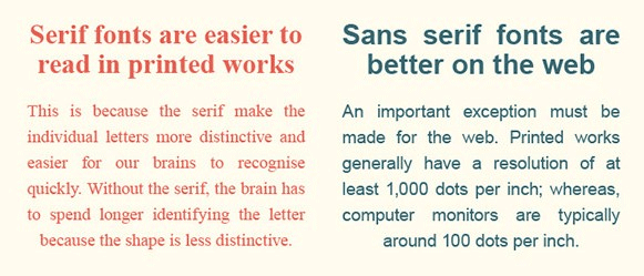
As per a WDD infographic, sans serifs are best for the web, and serifs for print.
2. Colors
For your blog, your long-form copy, and most of the text on your website, always go with black (dark) text on a white (light) background. It’s a traditional color scheme our eyes are accustomed to.
For your calls to action and other smaller, more impactful text elements, however, test each of the basic eight colors (or whatever colors fit with your design). Always remember this principle: what stands out gets clicked.
3. Font Size
Tahoma is most legible at 10 px, Verdana and Courier at 12, and Arial at 14 px (Wichita Psychology).
Whatever typeface you choose, make sure that you test the differences in user engagement and click-throughs according to the size of the font.
4. Typefaces
Finally, we get to the most tedious typography test – typefaces. Take this one with a grain of salt. Don’t test each of the 700+ Google fonts available. Doing so would be very counter-productive. Only test a few of the major ones that harmonize with your design.
When testing these, you’ll also want to go with an A/B/C/D/etc. test. Test multiple typefaces at a time.
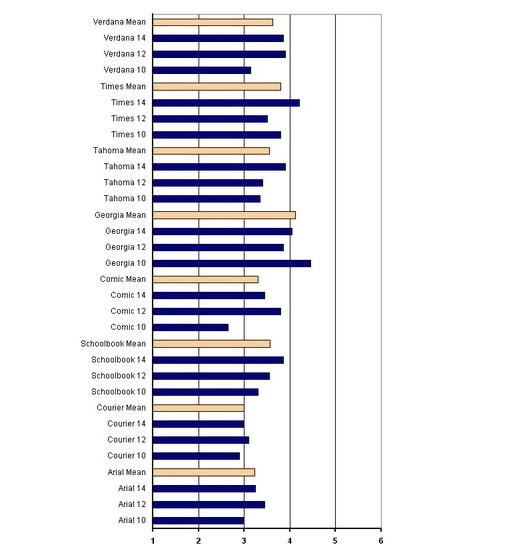
A graph representing the legibility of different typefaces at different font sizes
Calls to Action

Lightship Digital’s (awesome) CTA
Your call to action (CTA) is the most influential element on your landing page. Period.
As such, it requires a substantial amount of experimentation. Here are a few of the main call to action “ingredients” you need to test.
5. Position
Too often, web designers put the call to action button in the middle of the landing page above the fold, and just leave it there, because it’s what you’re “supposed” to do.
But did you know that locating your CTA below the fold could increase your conversion rate by 304% (Content Verve)? Don’t take anything for granted: test above the fold, below the fold, in the middle/left/right of the page, and relationship to text elements.
6. Color
No surprise here – color is a biggie in most CRO tests. Many have read this post on HubSpot about how a red CTA button beat a green one with a 21% increase in conversions. But a similar test in the Content Verve post (linked to in test #5 above) detailed how a green “add to cart” button got 35.81% more sales for an e-commerce store than a blue one.
So, again (as in test #2 above), a contrasting color that is distinct and stands out from the other elements on the page seems to work best. Experiment to see what works for your CTA.
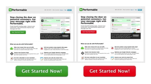
For Performable, a red CTA button produced more conversions than a green one.
7. Text
As the most crucial copy on your landing page, your call to action button text needs to be tested heavily. Try out various lengths, pronouns, power words, and action verbs. Back when the 2007 U.S. election campaigns were in progress, Obama raised an extra $60 million just by changing his CTA button text from “Sign Up” to “Learn More” (Optimizely). Yes, that’s a 60 million dollar test.
Don’t miss out on those potential returns.
Pricing Schemes
This section encompasses more than just what price you set for your product/software. You also have to think about free trials and money back guarantees.
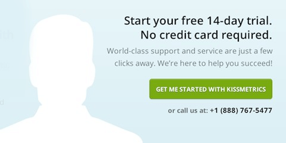
8. Freemium vs. Free Trial vs. Money Back Guarantees
To allow prospects to try products (and yes, product demos are important), vendors usually offer at least one of three models: a very basic freemium product with limited features that can be used forever, a time-sensitive free trial that allows users to experience all the bells and whistles, and a time-sensitive money back guarantee.
Changing from a freemium software model to a 14-day free trial increased Acuity Scheduling’s paid signups by over 268%. Try each model to see which works best for your business.
Generally, free trials induce more conversions than money back guarantees.
9. Free Trial Length
If a time-sensitive free trial is what works for your website, then how long should that free trial be? 7 days? 14, 21, 30? Test it!
This post on Sixteen Ventures mentions how shortening a 30-day free trial to 14 days proved to be a profitable choice for a SaaS company. Depending on your particular niche, the results may vary. As you can see below, for Crazy Egg, a 14-day free trial is the sweet spot.
Free trial of 30 days or 14 days? For Crazy Egg, the sweet spot was 14.
10. Pricing Each Plan
Finally, don’t forget to experiment with your pricing plans. Not only should you try out different prices for plans (should your price by $x9 or $x7?), but you also should play around with the features of each to make your higher-ticket plans convert better.
Oh, and don’t forget: decoy pricing models are the bomb.
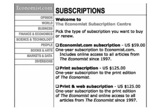
For the Economist, the decoy print-only subscription pricing was a bottom line booster.
Landing Page Copywriting
The art of persuasion through words on a page – copywriting – is another essential part of a landing page. Great copywriting is never great on the very first draft; it requires careful testing to ensure maximum impact.
11. Short-Form Copy vs. Long-Form Copy
From a philosophical point of view, short-form copy should work better than its longer rival. After all, humans have a shorter attention span than goldfish, right?
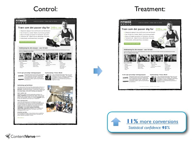
Unfortunately, that isn’t a set-in-stone rule at all. For example, after testing his personal website, Neil Patel found that long-form copy produced 7.6% more leads (better-quality ones as well). On the other side of the spectrum, a Scandinavian gym chain got 11% more conversions with shorter copy.
The takeaway? TEST to discover what works for your business.
Your landing page copy: short-form or long-form? TEST.
12. Video vs. Text Sales Pages
Video copy is both difficult and expensive to create; hence, the general preference for text-based copywriting. But could you be missing out on potential conversions by failing to test video copy? Maybe so.
Depending on the size and capital of your business, you’ll have to decide whether a video sales page is worth it (and don’t forget text and video combinations).
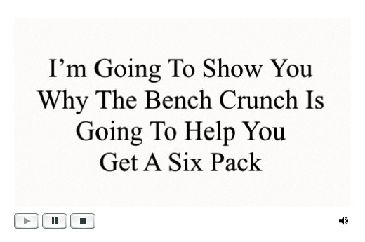
This video landing page helped Six Pack Ab Exercises improve conversions by 46.15%. What could a video do for your business?
13. Actual Text
As with typefaces, testing hundreds of different versions of your text-based copy, each with only a small change from its predecessor, can be a fruitless waste of time and money.
So, while you should continually edit and experiment with your copy, remember to look at the bigger picture. Don’t get hung up on every other word.
More General Tests
The following are various A/B tests that don’t fit in any of the above categories. They fall under sales funnels, website design/structure, and more.
14. Number of Columns
Multiple-column landing pages definitely look a whole lot cooler than those with single columns.
But in CRO, coolness doesn’t count.
In fact, a SaaS company increased their conversion rate by 680.6% when they changed their two-column pricing page to a single-column page (Marketing Experiments).
15. Background Images and Patterns
Your landing page background (a solid color, pattern, or image) has a very consequential subliminal effect on your readers. If you haven’t tested different background varieties yet, you’re leaving money on the table.
Dell changed the background of their conversion page from solid white to a people-centric image and watched conversions skyrocket by 36%.
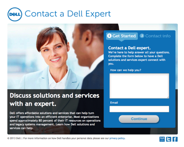
Don’t leave money on the table by forgetting to test background images.
16. Navigation Links
Your navigational menu’s presentation affects how and if you can get visitors to your money pages (your pricing page, contact form, etc.).
Test the number of links, the color of the menu, its position, etc.
17. Link Color
Trying to get visitors to click links from your blog post to your money page? Test the link color.
The presentation of your internal links isn’t something that most people associate with CRO right off the bat. But when you think about it, internal link color really can have a huge impact on the number of visitors that get into your sales funnel.
Take Beamax, for example, which increased link CTR by 53.13% by changing their link color to red from the standard blue (Visual Website Optimizer).
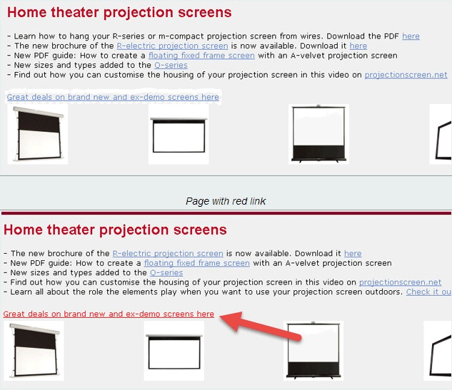
What stands out gets clicked.
18. Contact Form Fields
If your objective is to get contact/quote requests from your website, then the format of your contact form is critical to your conversion rate.
Test the number of fields (bare minimum is usually best) and the types of fields (checkbox vs. drop-down) to elicit more form submissions.
Neil Patel changed the number of contact form fields from 4 to 3 for a 26% boost in conversions.
19. Number of Steps in Your Checkout Process
Case study after case study has proven that single-step checkouts will almost always convert significantly better than multi-page checkouts. If you’ve never considered a single-step checkout before, it’s time to test one.
The 10 Weirdest A/B Tests Guaranteed to Double Your Business Growth
Sometimes it’s not the most obvious A/B tests that drive the most growth. Instead, it can be the unconventional tests, the ones you would have never thought would make an impact, that prove to be the most valuable.
About the Author: Stephen Walsh helps website owners make more money through conversion rate optimization and advanced PPC management. Say “Hi” on Twitter.
Comments (21)