Would you like to know how I persuade site visitors to opt-in to my email list? I use some simple strategies that don’t annoy my readers – and I’m going to share them with you in this article.
Email marketing is here to stay and it can help you generate more visitors and increase your income.
“The money is in the list” has been a common mantra for years in the internet marketing world, and there’s a good reason for that.
When you consider the intensity of the noise on Facebook, Twitter, and other social media networks, it becomes clearer that the best place to communicate with potential customers is via their inboxes.
There are several benefits to having a list, but it all boils down to this: email outperforms display advertising and social media advertising combined.
Yes, my blog generates lots of free traffic from Google and other search engines, but search traffic takes more time to kickstart. In fact, depending on your strategy, it may take anywhere from 24 to 72 hours to get Google to index your fresh content page.
But, you can send an email and, within 2 minutes, hundreds, if not thousands of people will visit your site.
Without further ado, here are 15 quick tips to help you persuade more people to opt-in to your list.
1. Encourage Subscribers to Forward Your Emails
[youtube https://www.youtube.com/watch?v=3WX54dRt0CU]
No matter how many subscribers you currently have, you can increase that number by encouraging your subscribers to forward your emails. Motivate them by offering so much real value that they want to do you – and their friends – a favor.
Not all email marketing solutions allow suggestions of forwarding, but you can check with your autoresponder provider.
If their terms of service allow it, do it. If not, find an alternative way to get your current subscribers to spread your content. Recipients of those forwards are more likely to subscribe themselves, because they got a recommendation from someone that they trust.
2. Leverage QR Codes for Mobile
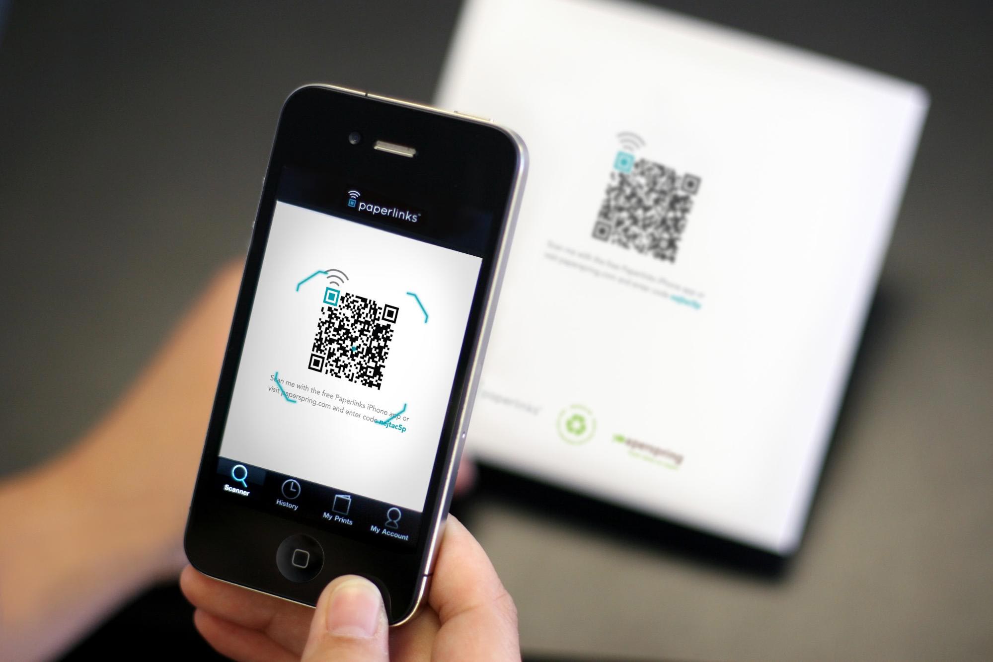
With QR codes, your mobile site users gain the opportunity to access your campaigns, including opt-in forms. QR codes – those 2-D barcodes that anyone can create – cater to everyone who wants flexibility.
QR codes usually consist of black and white squares (although you can render them in color and with graphics, to make the codes more visually appealing). Each of these squares is referred to as a module.
When a QR code is generated, some specific modules must be uncovered and unedited, or else the code won’t function effectively. Here, they are all highlighted in different colors:
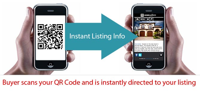
So, let’s assume you’re a real estate company. You want mobile users to easily find your listings. You can make a code with one of the QR code generators and make it readable (so that users can scan it to reveal what’s behind the code).
Then, when real estate users scan your QR code, they see your listings.
In the same vein, you can create a QR code for your opt-in box, so that mobile users can scan it to reveal the form or the offer (ebook, online course, software) that you’re giving away.
You can create a QR code free at: qr-code-generator.com or qrstuff.com
3. Place Opt-In Forms at Strategic Locations
Every section of your site is important for building links, but the more opt-in forms that you strategically place on your site, the more chances you’ll have to convert visitors into subscribers.
There are many places where you can put your opt-in form to convert more visitors into subscribers are:
- Below your single posts
- At the site footer
- Within the article body, using the content upgrade strategy (more on this later)
- On your “about” page
4. Remind the User They Can Unsubscribe at Any Time
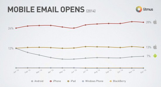
Email is indispensable – and even mobile email is rising in popularity and use. That means that your subscribers are being wooed by lots of brands. Your responsibility as a content marketer/blogger is to ensure that your site visitors are protected.
The average unsubscribe rate for most small businesses is less than 1%. The truth is that most people are not willing to unsubscribe when you give them the opportunity to do so. And, trust me, if they decide to stay on your list, they’ll expect your emails and give them more attention.
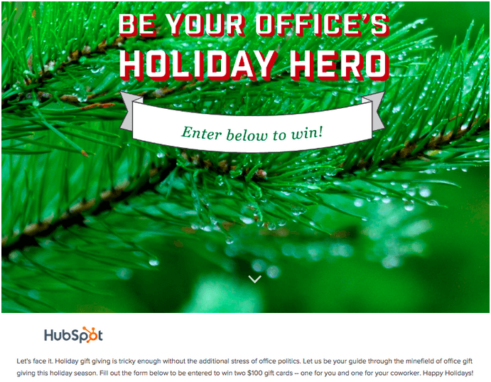
5. Invite Your Social Media Fans to Opt-In With a Contest
People like to participate and compete with other people. This is also one aspect of “social proof,” which involves doing what others are doing, in part because they’re doing it.
A social media contest exposes your site and message to many people, some of whom are your ideal prospects. Then, you can easily bring them back to your site.
Before you run a contest, you have to choose a platform. Contests can be run successfully from Facebook, LinkedIn or your own blog. Todd Giannattasio grew his email list by 254%, after running a contest on Facebook
You can offer multiple prizes to persuade your site visitors to join your list. Research shows that when you offer multiple prizes, you’ll see a higher conversion rate than you would with a single prize.
So, instead of giving away $500 to a single winner in your Facebook contest, you can break it down like this:
- First prize: $250
- Second prize: $150
- Third prize: $50
Don’t forget that the purpose of your contest is to invite people to come check out your site and, from there, to persuade them to join your email list.
6. Use Leadboxes Within Your Content
Immediately telling your site users to subscribe to your list can chase them away. Most users don’t like the opt-in form, because they’ve had bad experiences with get-rich-quick marketers who constantly bombarded them with new offers.
But, if you instead gently lead users from Point A to Point B, without pushing them to subscribe, they’ll respond positively when the opportunity is eventually presented.
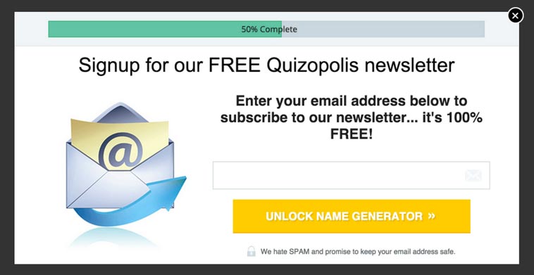
In order to avoid chasing your site visitors away on their first visit, use a LeadBox to convert them into email subscribers?
What is a LeadBox?
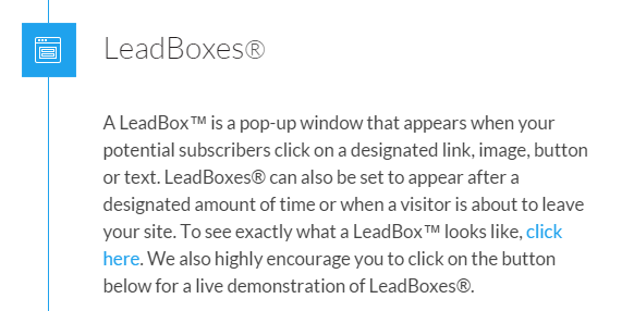
Here’s how the company defines it on their product’s page:
LeadBoxes can triple the size of your email list if you use them the right way.
Getting people to opt-in may be easy, but ensuring that those subscribers are high-quality is a big challenge.
You can place a LeadBox anywhere on your site with a single shortcode.
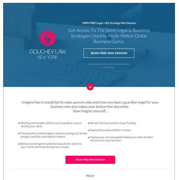
Many marketers and professionals in different industries use LeadBoxes to increase their opt-in rates. Jana Gouchev, owner of Gouchev Law, a business law firm in New York City, used a lead generating box to increase her conversion rate from 12% to 42% – a 250% increase.
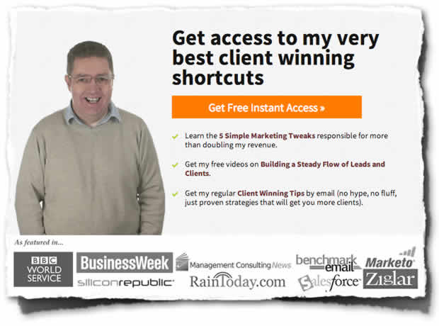
Ian Brodie, author of Email Persuasion, also uses lead generating boxes on his landing pages. By driving traffic to a simple landing page with Facebook ads, coupled with a compelling LeadBox opt-in, he increased his email sign up rate by 91%.
Generating qualified subscribers is where the hard work is. But, you can make it easier by placing opt-in boxes at vantage positions where your users frequently click. So, how do you know which areas on your site receive the most clicks?
Most site owners assume that the best place to put the opt-in LeadBox is above-the-fold. Sure, this will work and you’ll probably catch your user’s attention, but there might be other areas on your blog that command more attention.
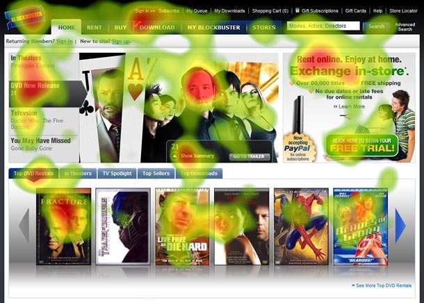
Heatmap services, like Crazyegg, will help you visualize the behavior of your site users. You’ll know exactly what spots get the most clicks. Then, you can place LeadBoxes in those areas, to get more subscribers.
Most marketers prefer to not use a leadbox on their landing page since it’ll not show the form that users need to complete unless they click on a button or anchor text.
The location of your Leadbox may well determine how many subscribers you add to your list. John Lee Dumas, founder of Entrepreneuronfire.com, uses LeadBoxes on his homepage.
There are many strategic places where you can place your LeadBox, including below each post or on your “About” page.
Bear in mind that to maximize your ROI, you have to identify with the 3 key personalities attracted to your business: Leads, Prospects, and Customers.
Each of these people requires a slightly different approach. That’s why placing LeadBoxes beside the right information pays.
7. Strategically Use “Content Upgrade”
Marketers understand that content is the lifeblood of every online business. If you want to make your mark as an online entrepreneur, you have to invest in high-quality content.
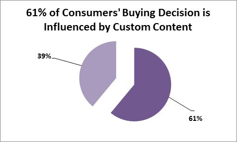
You have to consistently produce custom content that appeals specifically to your target audience – not the world at large. Recent statistics from Dragon Search Marketing show that 61% of consumer buying decisions are influenced by custom content.
The content upgrade has been proven to be one of the most effective ways to turn readers into email subscribers. It puts useful content at the forefront, before anything else and it clearly shows value to your prospects.
When you get subscribers through content upgrades, you can build a loyal audience out of them, because they’re already pre-sold on your idea or product. And, as soon as you’ve built an audience that trusts you, your ROI will increase.
So, what exactly is a content upgrade?
It’s simply a way to upgrade your valuable content with lead-generating functionality. In other words, you strategically position an opt-in box or a LeadBox in your content, so that readers can easily subscribe to your list and get a specified benefit.
Basically, with a content upgrade, you ask readers to download the same content that they’re reading or (preferably) an upgraded version. For example, in the above screenshot, Brian Dean gives an exclusive bonus: a step-by-step checklist that will show you how to improve conversions using the “content upgrade strategy.”
“A content upgrade is a bonus download that goes with your blog posts. It is more specific than your generic email opt-in offer and that’s precisely why it’s so effective. It’s extra content that is directly related to the blog post that your readers are immersed in at the moment.”
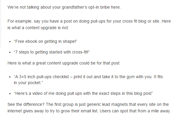
You’ve got to be really specific when using content upgrades. Devesh Khanal, from the Crazy Egg blog, gives you an example:
In other words, your offer should be relevant, valuable, immediately usable and right for the current readers.
Also, keep it tightly related to the content on the page. It makes no sense to offer an ebook on keyword research when your post is about increasing sales. Knowing how to research keywords will not directly affect how many sales you close.
I’ve also found that if you can re-purpose your content, it helps you build your list. For example, you could re-purpose your article into a presentation and ask users to access it – after they subscribe. You could also re-purpose your videos, to make them more easily digestible.
A few guidelines to make your content upgrade work:
- Make sure that your content is high-quality.
- Use a content upgrade to fill a need that isn’t filled by the post (e.g., a PDF checklist version of the post’s tips).
- Give away helpful resources that are related to your content.
- Be concise. Tell people exactly what they’ll get by joining your email list.
8. Split Test Your Opt-In Forms
Split testing is not optional. It’s a necessity, when you want to boost conversions.
Testing is not a fun or easy thing to do. It requires a tactical understanding of numbers and how those numbers correlate with what the ideal customers are looking for.
Your email opt-in form is an important factor for converting visitors into subscribers. If the form is not well-designed, you know what would happen – it’ll be frustration all the way, even though you’re receiving a lot of search visitors or referral traffic.
So, you have to make sure that the forms you’re asking people to fill out are optimized for conversions. That’s the whole essence of conversion rate optimization.
“One accurate measurement is worth more than a thousand expert opinions” – Admiral Grace Hopper
You have to be able to estimate how many opt-ins your form is able to generate, based on the number of visitors that your site gets on a daily basis. And, making a few changes here and there can make a great difference in encouraging or discouraging people from subscribing to your list.
Conversionista noted that conversion rates improve your objectives and your users’ goals, as well. Remember that you’re not just trying to improve opt-in form submissions for kicks – you’re doing it because your business revenue needs a lift.
Personally, I like to run an A/B split test on my landing page, as well as blog pages, before writing about my results on the blog. A few years ago, I tested the effect of removing form fields on my Neil Patel landing page (that was before I started this blog).
My submission form had four fields:
- Name
- URL
- Revenue
I had always thought that having four fields was fine because they’re easy to fill. But, I was wrong.
First, I ran a test to see what results I’d get by changing “revenue” to “what can we help you with?” To my utter surprise, that change didn’t produce any measurable result.
Then, I decided to remove the “revenue” field altogether, leaving only three fields – Name, Email, and URL.
This small change meant an improvement in my conversion rate of 26%. Who would have believed that removing a field could yield such a significant result? At that moment, I realized that I can never take anything for granted. Little things matter.
It’s not just about form fields, but also where the form itself is placed. Most content marketers use above-the-fold positioning because they believe it’s the most viewed section of a landing page.
But, it’s not necessarily the same for every site and industry. Sometimes, the most focused-on area of a page is beneath the fold. Remember ABT: Always be testing!
Another important design factor is a distraction-free form. Make it easy for your users to subscribe, free of any obstruction. By removing noise on the landing page, especially around the form, you can quickly increase your email sign up rate.
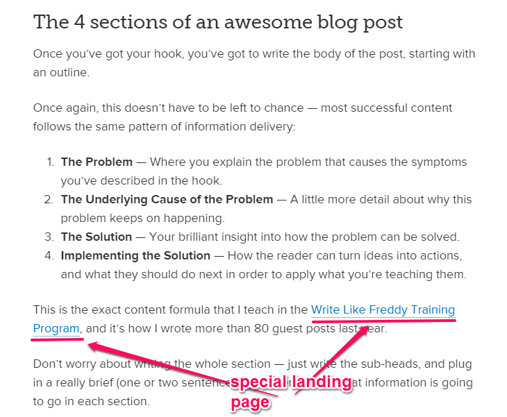
9. Set up Separate Landing Pages for Guest Visitors
When I say “guest visitors,” I’m talking about people who read your guest post on another site, found it valuable and followed you back to your own site.
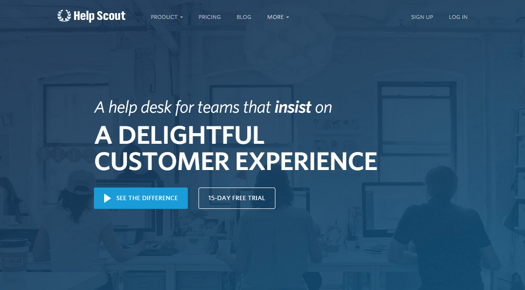
An effective guest blogging strategy can help you get scores of new subscribers. Danny Iny built his FirePole Marketing blog from scratch, using the power of guest blogging. And, Gregory Ciotti generated over 35,000 email subscribers for Help Scout, through guest blogging.
I still contribute to authority sites, like Forbes and Search Engine Journal, because I’ve seen how much traffic you can generate for your site by being consistent.
When I write a guest post on other blogs, I usually set up a landing page specifically to welcome visitors. It also serves as a resource for those who want to learn more about me.
You can do the same with a simple landing page with lots of white space (great for user experience). Or, you could use a landing page builder, like Instapage or Unbounce, to set up a separate and relevant landing page for your guest visitors.
If you’ve written an in-depth article on your blog that’s relevant to your guest post, you can link to it in your author profile or reference it in the post. Since your goal is to persuade visitors to subscribe to your list, there is no need to link to your home page, if it’s not optimized for visitors.
Remember that your guest visitors are already qualified. All they need from you is a nudge to join your list. So, be relevant with your offer and use separate landing pages tailored to them.
Danny Iny does this very well. When he writes a guest post, if the target audience members are mostly writers and content marketers, he’ll link to a page on his writing course page, to convert those readers into subscribers.
10. Persuade Using Multimedia Long-Form Content
It’s time to give your content marketing a multimedia boost. Many people believe multimedia, long-form content is the next big thing for content marketing.
Multimedia content marketing caters to the preferences of every user, no matter what that preference may be (e.g., video, article, audio, ebook or online course).
It’s not a shortcut to acquiring thousands of customers. But, the more long-form, multimedia content that you create for your business, the more impressive your results will be.
“Good enough” content – whether it takes the form of blog posts, articles or videos – is no longer sufficient to help you dominate your niche. There’s just too much “good enough” content out there. You have to go beyond good-enough – you have to make your content great.
Anyone can launch a WordPress blog within 15 minutes and start cranking out generic articles. Smart marketers have mastered the art of multimedia, long-form content, as part of their marketing strategy to grow their business.
They’re combining infographics, videos, Slideshare presentations and other content forms into a single content machine. Even in the offline business world, people are using a multimedia content strategy to attract more users.
Your content has to be high-quality, practicable and – as much as possible – evergreen. Leveraging multimedia helps you achieve all three.
You can combine multimedia with a content repurposing strategy, by taking an old piece of content and repackaging it into a new format, thus breathing new life into your old work.
For example, you can create a short video based on a high-performing blog post, perhaps further explaining a specific point, then upload it to YouTube and share with your social media fans.
Or, you could reformat older posts into ebooks, articles and other publications, then upload the new format to Scribd.com. By formatting your blog post into any of those sellable assets, you can create a new revenue stream, while simultaneously driving traffic back to your landing page to collect email leads.
Content marketing isn’t just “blog posts,” or videos or podcasts. You can combine all of them. Let’s say that you want to create an exclusive piece of content to teach people about “email marketing”:
- Write a 2000+ word article.
- Create a 15 – 37-page slide presentation and upload it to Slideshare.
- Create a short 5-minute video to explain what email personalization is about.
- Record an audio file or podcast to answer questions on an email follow-up sequence.
- Package your article in PDF ebook format and submit it to Scribd, Docstoc, and other ebook directories.
- Create an animated video on PowToon to reach more visitors.
- Share a tweetable quote from the article with your followers.
- Grab the same tweetable quote and link it to your Facebook page.
- Create an infographic based on this experiment to show what works.
Remember that the best way to connect with potential customers is through storytelling. When you create multimedia content, make sure to convey your message properly. You can use storytelling to connect your infographic, article, video, and podcast.
11. Pre-Sell Your Upcoming Content
Customers may not want your ads – but they’ll flock to your branded content, as long as it solves a problem for them. If you want more subscribers, then start pre-selling that content. Pre-selling is simply educating people on a particular product, even before pitching or asking them to buy.
Before you send people to your sales letter, educate them first. Product reviews are one way to pre-sell, but not necessarily the most effective. Brian Clark, founder of Copyblogger, has been pre-selling with high-value content.
He believes that teaching sells. This means that the more you teach, the more you’re seeding your target audience. They’ll jump at your offer when you present it to them.
Eben Pagan uses pre-selling with his online courses. Here’s what he usually does, based on my observations as one of his subscribers:
He’ll create 3 high-quality videos:
- The first video makes you aware of the opportunities to achieve a specified goal (e.g., grow your list or increase sales).
- The second video shows you examples and case studies of people who failed to achieve the specified goal because they didn’t apply the right techniques.
- The third video shows you exactly how to apply Eben’s tips to your own business and how to replicate your results.
After the third video, Eben will open up his online course and get an amazing response. People enroll right away.
He continues to follow up with valuable videos, worksheets, and more professional advice to get you hooked. That’s pre-selling at its very best. Consumers need education before making a purchase or subscribing to your list and you’re the best one to provide it.
So, if you’ve got a product that you intend to launch within a few months, start pre-selling your target audience early. Educate them for free. Don’t worry about whether they’ll buy when you launch the product.
When the time comes, they’ll buy – because you’ve earned their trust.
For just about any task or goal, a savvy user can probably find sufficient information online for free. But, it takes time to find that info and most people don’t have that kind of time. They prefer a packaged product where all of the information that they need is readily available from one source and is easy to digest.
Pre-selling helps you fill that need and increases your list subscribers to boot.
12. Reward First Time Commenters, Redirect Them to a Thank-You Landing Page
You’re undoubtedly familiar with consumer rewards programs – but did you know they can motivate consumers to shop more and tell their friends about your new product?
You can encourage your site visitors to join your email list by rewarding first-time commenters. I’m sure you’ve seen lots of first-time/only-time visitors who find your content useful and leave a comment – but are never heard from again.
Don’t just let these folks go. Instead, install the First Comment Redirect plugin that sends first-time commenters to the landing page of your choice. For example, you can redirect them to your “About” page, a special squeeze page or a webinar registration page.
Ramsay Taplin, who has over 17,000 subscribers on his email list, redirects his first-time commenters to a thank-you page, where he encourages them to sign up for his list.
By taking advantage of this simple strategy, you’ll convert lots of users into email subscribers. At present, only a few marketers and bloggers actually use it.
Outspoken Media achieves the same result with Yoast’s comment redirect plugin.
13. Understand and Use the Psychology of Colors
Colors have the intrinsic power to persuade your site visitors. If you haven’t carefully selected the colors on your landing pages, it’s time to change that.
A few weeks ago, I wrote an in-depth article explaining the psychology of colors and how the right colors can increase conversions.
Over 600 people shared that post. That tells me that a lot of content marketers are interested in learning how colors can improve their conversions.
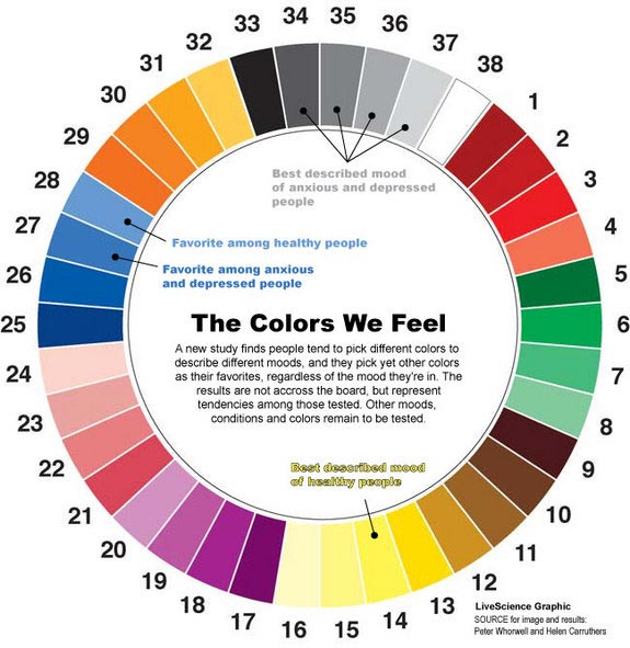
According to Live Science, colors affect moods and influence people. Getting site visitors to join your list when they’re not ready (maybe because of bad experiences that they’ve had with other marketers) will not be that easy. But, if you can change their moods or perceptions, you can more effectively influence them.
Jovan Will, founder of Advisor Internet Marketing, tested the impact of colors on a webinar landing page. Initially, the webinar landing page looked like this:
After the landing page went live, his friend Ford Stokes called him and suggested that he change the landing page header color from blue to black, which he did:
So, what impact did the black color make? Well, in Jovan’s words:
That’s a 62.5% increase in lead conversions – all from changing the color of the header on a landing page.
Dmix got a 34% conversion boost on their CTA, by changing the color from blue to red.
Always use the right colors on your landing page. Above all, keep testing, because that’s the only way to know what works and what you should ignore.
14. Influence Visitors With Social Proof
In his book, Influence: The Psychology of Persuasion, Robert B. Cialdini highlighted the 6 principles that will help you persuade the right people and get what you want:
- Reciprocity
- Commitment/consistency
- Social proof
- Authority
- Liking
- Scarcity
Cialdini defined social proof as “people doing what they see others in their field, profession or social circles doing.” Social proof can help you persuade people to take the action that you want them to take – in this case, to opt-in to your email list. Social proof relies heavily on numbers.
In other words, people do what they see other people doing. For example, we’re more likely to attend a birthday party, if our best friends are attending.
So, how do you use social proof on your site to get more email subscribers?
You can use testimonials from your customers – ask them to share their success stories.
Another kind of social proof could also work for you. For example, you can display your media mentions – the places where your content or product has been mentioned. Doing this will pull more people to join your list.
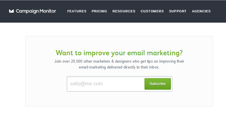
For example, you can display the number of your total subscribers on your landing page or in your LeadBox, to convert more visitors into subscribers. Campaign Monitor does this on their site very well.
Note: It’s possible that some people might fake the number of subscribers, by inflating it. That shouldn’t be your goal. Be honest. It pays dividends.
15. Use Hellobar to Channel Visitors to Your Opt-In Page
Ramsey Taplin, John Chow, Darren Rowse, Derek Halpern, Chris Ducker, and many other top bloggers use the Hellobar plugin to grow their email list.
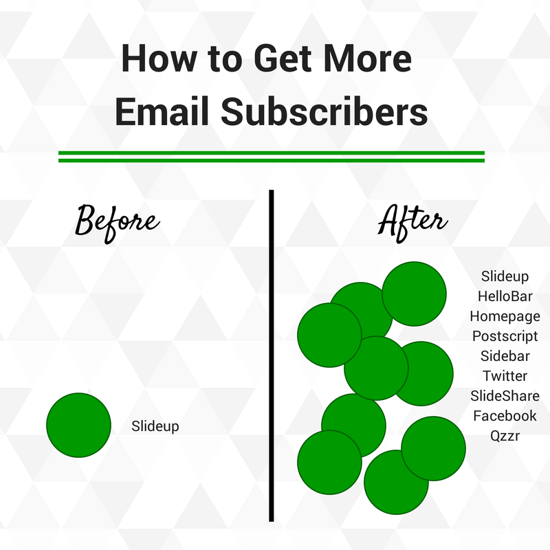
Often, the best way to double your email subscribers is to use several lead generating tactics and deploy them throughout your site, not just in the sidebar.
For example, Brian Carter got 9x more email subscribers by implementing the Hellobar and testing the right color.
If you’re not using Hellobar on your WordPress site, get started today.
Conclusion
Smart marketers take email marketing seriously. They won’t do anything outside of their list, because that’s where the real engagement begins and ends.
Whether you’re just starting out or are an experienced marketer, use social media marketing, search engine optimization, native advertising, and other proven content marketing best practices to drive visitors to your blog. Also, be ready to convert them into list subscribers.
Building relationships and selling products online is a lot easier, when you target your intended audience. And, it’s very rare to find a targeted audience, right off the bat, without any form of engagement. This is why email makes the difference.
The more qualified subscribers you have on your list, the more traffic you’ll generate to your content. And, consequently, you’ll make more money in the long-run.
What other strategies have you used to grow your email subscriber list?










Comments (55)