It used to be that you could get major attention just by using infographics.
Today, that’s not the case. Everyone is making infographics. Now, you’ve got to make infographics that are better than the next guy’s infographics. That’s not easy to do.
I’ve been creating infographics for quite a while. I’ve made mistakes, but I’ve also figured out a few tips. Here are some of the tips that can save your infographics from disaster.
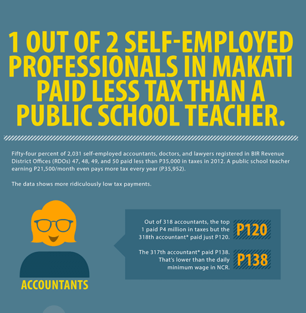
1. Create your infographic for your target audience.
Coming up with an infographic idea is half the battle to creating a killer infographic. And the way to come up with great infographic idea is to figure out what your audience wants.
The infographics with the most traction, most attention, and most virality, are ones that meet your target audience right where they want it most.
One mistake that I’ve seen people make when creating an infographic is that they try to choose something that is generically popular rather than specifically relevant to their audience.
This infographic has a target audience — public school teachers.
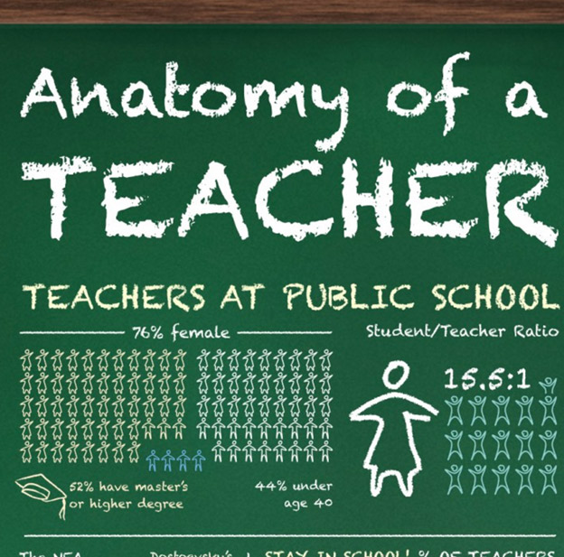
Your goal is to create an infographic for your audience, not necessarily for the whole world. Keep it specific, relevant, and targeted.
2. Keep it simple.
One of the advantages of infographics is that they can distill advanced ideas into a simple visual form.
But the inherent advantage of infographics can be their demise. An infographic can become needlessly complex, creating a mind-numbing cognitive overload rather than an “Oh, I get it” experience.
Like everything else in life, infographics are better when they are simple.
This infographic would work better as four or five infographics.

Simplicity wins. Always.
3. Keep it focused.
Simplicity, discussed above, is ultimately about focus. Don’t just make your infographic a potpourri of facts and figures. Make it a streamlined and focused on a single topic.
Infographics are not attempts to randomly assemble all the data you can compile. Instead, an infographic is intended to drive a single, focused point.
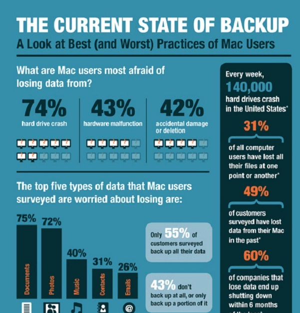
This infographic is focused on a single topic — backup practices of Mac users.
4. Show things visually.
I’ve seen infographics that are short on the “graphic” and long on the “info.” The best infographics are ones that have a good balance of visual information with written information.
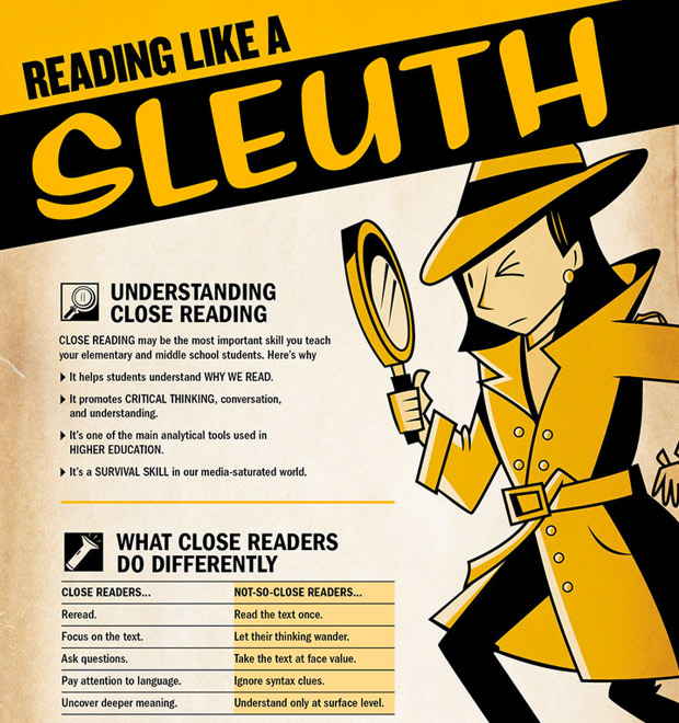
This infographic uses a few icons and an image, but not a whole lot of other visual elements. To qualify for the “graphic” in infographic, it needs some more visual pizzazz.
5. Promote it.
Major revelation: Infographics don’t automatically go viral.
If you want your infographic to explode in popularity, you will have to promote it. You do so in the same way that you’d promote any other valuable piece of content:
- Reach out to influential sources in your niche and ask them to feature your infographic.
- Make your infographic shareable with social plugins.
- Ask users to share it.
There are a lot of great infographics out there languishing in obscurity, because the creators never took the time to promote it. Don’t let your infographic die that soon. Promote, promote, promote.
6. Make it easy to view.
Sometimes, an infographic gets lost in its resizing.
The designer makes it huge, then the developer has to downsize it. In the process, the readability gets lost.
Many infographics have a variety of font sizes. Make sure that the smallest font on your infographic can be seen without too much difficulty.
The words in the infographic below have become too small to read easily.
The infographic should be easy to read and view, whether the user clicks to enlarge or not. 600 pixels wide is a good width to aim for.
7. Make it a manageable length and size.
Infographics are supposed to be big. We get that. But go too big, and you’ll start losing people
I recommend a limit length of 8,000 pixels. Anything longer, and you’ll start to presume upon your user’s attention span.
This infographic, at 24,575 pixels, is probably approaching too long.
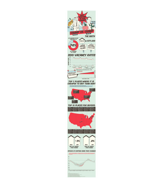
Along with a length limitation comes a necessary size limitation. Users might be on a slow connection, so be courteous, and keep your infographic to 1.5 MB.
8. Add white space.
An infographic is an exercise in graphic design best practice. Any graphic designer will tell you that white space is important.
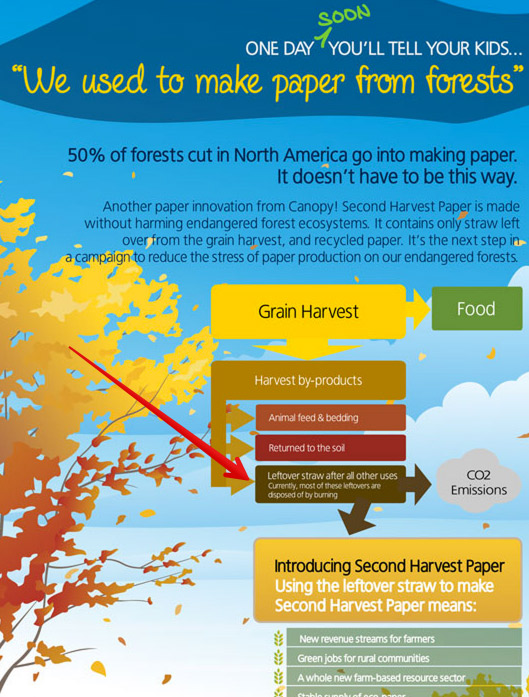
There’s not enough white space in this infographic (which might be its point).
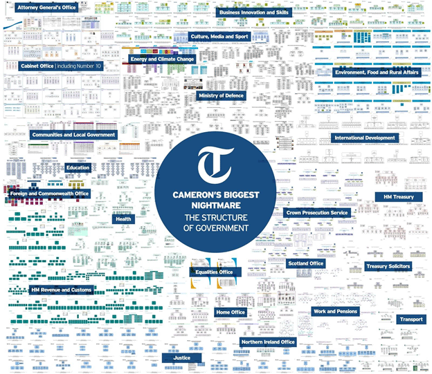
Good infographic design includes a balance of visual elements with the necessary negative space to help guide the viewers as they look at the infographic.
9. Create a killer headline.
Your infographic’s headline is extremely important. This principle is the same as with a great blog article. The infographic doesn’t get any attention if it doesn’t have a great headline.
Good headlines will have these features:
- They describe the infographic
- They grab the user’s attention.
- They are short enough to understand at a glance. 70 characters is a good length.
If you don’t have a powerful headline, your infographic simply won’t get viewed. That’s all there is to it.
This infographic, for example, has a wordy title that might not get the level of attention it wants.
You need to put in the brainwork on the front end to make sure that you have a really strong title. Your designer isn’t going to improve upon the title itself when she puts it into visual form. You’re going to have to make the title explosive and powerful yourself.
10. Focus on the flow.
The greatest strength of an infographic is that it can flow both cognitively and visually.
An infographic is like a good story. It has the ability to convey an idea by taking you from one phase to another, sequentially and seamlessly. The dots are all connected, and the ideas integrated.
There’s power in being able to move a viewer through a thought process. But some infographics falter on this very point. Instead of moving the viewer through a thought process, they simply throw a bunch of information into graphical form.
When you create an infographic, do so by creating flow. The flow will help the user pay attention and to be persuaded by the message that you are presenting.
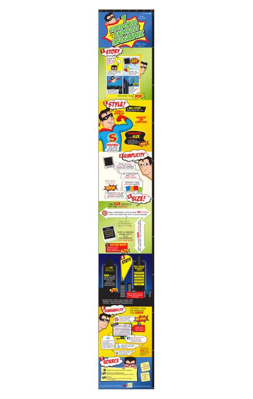
Even when this infographic is viewed from far away, it has obvious flow. Each section has a number, a headline, and a different color background. It’s comic book style helps us to better read each section. Every one of the visual elements serve to create a more powerful flow.
11. Check your facts and figures.
Many infographics focus on presenting data. It’s a smart idea. Our minds can process stats and percentages way better when we see them, rather than just look at a number with decimal points and percentage signs.
But make sure that you’re being accurate, by focusing on these three oft-overlooked areas:
- Make sure that the statistics themselves are true.
- Make sure that your sources are reliable.
- Make sure that your graphical representation of the data lines up with the number (if you have both)
If your infographic relies heavily on numbers and data, it pays to give this area special attention, double-checking, and rechecking.
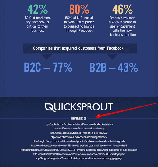
12. Cite your sources.
Just because you’re making an infographic doesn’t mean that you’re released from needing to cite your sources. Where did you get your data? Cite it.
Try to use sources that are as up-to-date as possible. Using old stats, especially in an industry where information is always changing, makes you seem out of touch.
I usually cite the source of my infographic data at the very end of the infographic.
You can also cite sources within the body of the infographic, as long as it doesn’t distract from the flow and visual of the infographic.
Conclusion
Infographics are still alive and well. If anyone is saying infographics are dead, they are either seriously misguided or just haven’t seen any really good ones.
You can make a really good infographic. Just keep these tips in mind, and you’ll spare yourself a lot of wasted effort.
What else can you add? What are some infographic tips that you wish you knew a long time ago?
Comments (39)