Usability testing is a technique to evaluate a product or service by testing it with users. The users work on tasks while observers take notes, listen, and learn.
After taking more than 100 usability tests (I took them all on Usability Hub), I’ve noticed some interesting things about how people are using usability tests today.
For starters, take a look at what to avoid when creating your own usability tests. Jared Spool’s 2005 article on Seven Common Usability Testing Mistakes is a good primer.
So, what do people do with usability tests now in 2014? Have we learned to avoid the pitfalls?
1. People Test Color Choices for Their Website

What do you want me to do here exactly?
The goal of a usability test is to find the critical problems that prevent people from completing tasks. Unfortunately, this test doesn’t clearly state a task that I need to complete. It asks which background color is the nicest.
This is more of a brand identity question that helps answer things like “Does the color match what the website is about? Does the color go with the emotion the product is trying to invoke?” I believe topics like this really should be defined by a creative director who oversees the brand identity, or the designer should work more closely with the client to determine if the colors represent the brand values.
2. People Make Tests Too Difficult for Users to Complete

It’s really hard to read anything here.
This is a very straightforward click test to measure where I will click. However, since I can’t easily read any of the selections, it’s hard for me to correctly click where I want. I think if the screenshot were more zoomed in, I’d be able to correctly provide the tester with the information they want. I know what I’m supposed to do, but there’s just not any good way for me to see what I’m clicking.
3. People Test Which Logos Are Preferred
![]()
Not sure if this counts as a usability test…
Is this logo presenting a critical problem internally? What does the business need to learn about the logo? I think the problem I have with the logo choices in usability tests is that I don’t understand what could be learned that would affect the outcome of the design. Here, I’m asked what I prefer, which I think is highly subjective.
Do you remember the Gap logo fiasco? Logos have long-term impact on a brand’s identity. I think random usability testing on a logo presents risks because the results will be meaningless if the business or client does not know whether a logo is a good representation of their values.
For example, if I’m being shown an architectural firm here, I could care less which logo I pick because I may just prefer colors over large text. But the impact of my decision goes far into the brand identity of this company even though I may never interact with them. I think that’s a risk that is too much to put into the hands of testing with a random demographic. If a company cares about its brand identity, it should take great care in choosing a logo among its partners, customers, and other stakeholders, rather than letting the random demographic in Usability Hub determine it.
4. People Crowdsource Logo Design from Scratch
![]()
This shouldn’t be a usability test. It can really endanger your business by soliciting logo design from random people not in your target demographic.
This one was surprising. I didn’t expect to see a usability click test to select which design I liked better as a logo and whether the letters should be lower case or upper case.
As I mentioned in the previous example, it’s more appropriate to take these considerations to prospective customers or clients of the company, not random people. Come up with a few logo ideas and show them to a small representative group of potential customers to see how they react. What you care about is how your potential or existing customers or clients react to your logo.
5. People Should Test what’s Best for their Business
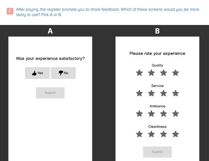
I’ve worked in customer support for over 4 years and have seen variations of this screen many times. In this case, I don’t think a usability test is the right way to measure customer feedback about a transaction or store experience. That’s because the critical business metrics shouldn’t be determined by a usability test. What they really should be asking is why they want to show this screen at all.
For example, let’s say the Yes/No screen wins the click test because it’s simpler and quicker for the user to select. Then, whenever the business needs to figure out what to improve, all they can see is how many customers responded Yes or No to the survey with no other qualitative information. The Yes/No screen doesn’t help the business improve because it doesn’t provide information on what it is that needs improvement.
6. People Test Options that are nearly Identical
In the test below, I didn’t notice the difference until I looked at it twice.
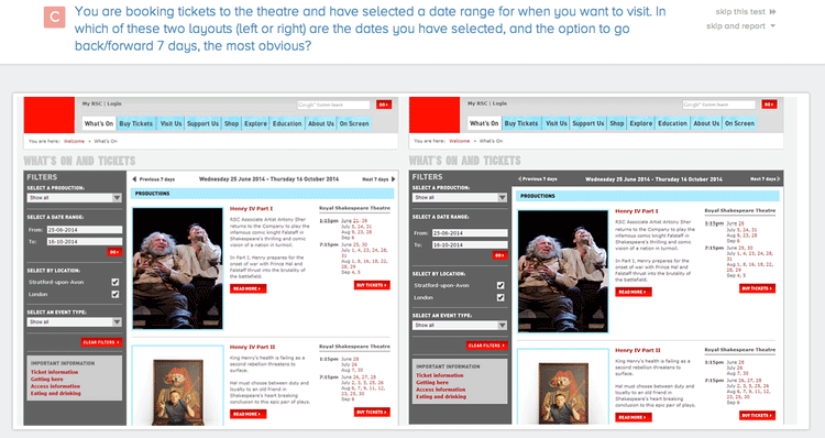
Can you see the difference?
The left Filters column has a gray fill color. In the right variation, the gray fill color expands along the top of the right column. It’s very subtle. I don’t find the difference “obvious” at all, which is what the test was telling me to pick. I was expecting a whole different layout to make those interactions more obvious.
Tests like these often leave me frustrated when neither choice is obvious for the user. There should a more dramatic difference in design between choices.
7. People Use Usability Tests When They Should Use A/B Tests

This click test changes only one element – the copy on the green call-to-action buttons. I argue that this should be A/B tested in order to come up with even better results than a usability test.
Why?
With an A/B test, you can test each variant’s performance instead of waiting for a usability test to be completed. You also can test with real potential customers instead of random usability test takers who may never see the product.
8. People Don’t Set Up Usability Tests Correctly
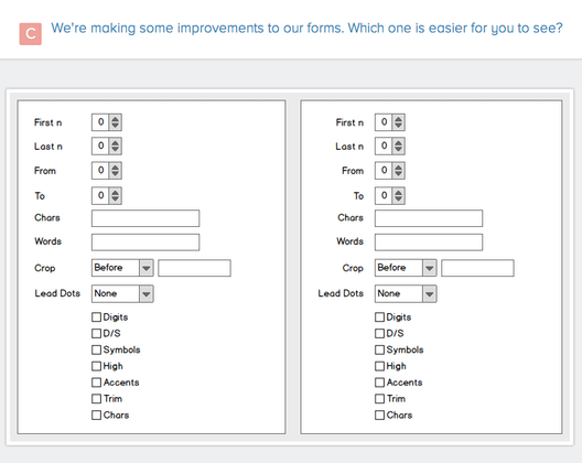
If this is an improvement, I don’t see how…
First, framing the situation is really important so a user knows what the situation is. You can accomplish this with an “Imagine that you are [doing something] [in a location/state of mind/occasion]” statement.
Example: Imagine that you are shopping for a dress for a wedding.
Second, stating a task is important so a user knows what they should be doing. For a five-second test, generally the user is asked to recall what stood out or if they could tell what the company does.
Example: Could you tell what services or products this company offers?
For a click test, the task is related to what a designer thinks a person should click on.
Example: Click where you would find the sale section.
In the above test, there is no framing of a situation nor is there a task stated. It’s really hard for a user to figure out what form is easier to see if we don’t know what we’re supposed to be doing in the first place.
Aside from the above test showing two of the same images (so there’s really nothing to choose from), the setup of this test also failed to define what the test was even supposed to accomplish. This doesn’t help a business.
9. People Don’t Select the Right Test to Use
This question in a five-second test really should have been a separate click test.
I took a five-second test where I stared at a website, but the subsequent questions asked me where I would click.
A five-second test helps you fine tune your designs by analyzing the most prominent elements of your design. It also tests first impressions and how easy your design is to understand.
A click test is used for placement/layout and helps determine if people can do what you are asking them to do.
The above test should have been separated into a five-second test and a click test. Because the question about where to click was lumped together with the five-second test, I wasn’t able to accurately describe where to click because I couldn’t see the image anymore nor did I remember where the element was to describe it thoroughly.
10. People Love Testing Headline Copy

I saw a lot of headline copy tests, more than I would have expected. Also, they were all five-second tests, so I’m wondering if they were made by the same person. In five seconds, it was hard to read all the headlines before the timer expired if there were more than two headlines.
If these were to be made into Google AdWords links, I would say just list them all and see which performs the best at generating clicks and maximizing for the metric of how many additional content pieces were read as a result of the link coming in.
If these were being tested for a content site, I would assume an editor would have the role of deciding which headline to run. If you want to learn how to write great headlines, head on over to Copyblogger.
11. (Bonus) People Test to Choose Domain Names
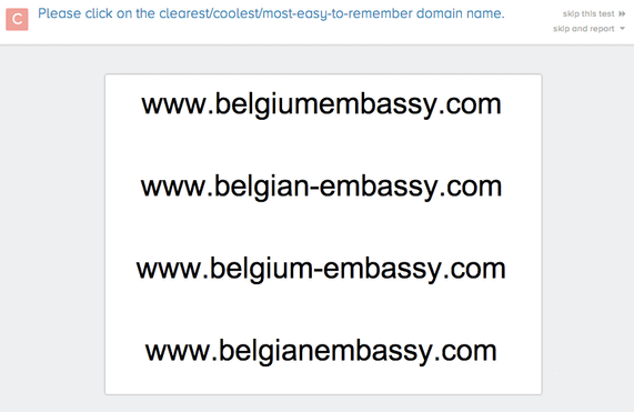
I’m not sure how to explain this one, especially for something as important as a Belgian embassy.
Takeaways
About one of every three usability tests I took had some issues or questionable reasoning behind the test. I think we’ve learned quite a bit since Jared Spool’s 2005 article, but successful usability testing still seems to be far from perfect.
Make sure you know why you’re testing and that you’re testing with the right audience. More sensitive items like logos should be put in front of a targeted demographic rather than a random demographic like Usability Hub. Setting up the right test is just as important as what you will do with the test results. Also, make sure the tasks you design are in line with what you want to learn.
Usability tests are great for identifying problems. Use them to find existing problems with your product or service. Just make sure to test again after you implement solutions to see if you’ve solved the problem.
Happy testing!
Have you done any usability tests yourself? What did you test? I’d love to hear about them and what you learned.
About the Author: Chuck Liu loves to cook in his spare time. Find him on Twitter @chuckjliu and Quora.
Comments (9)