SlideShare is a powerful content distribution platform. Research by Column Five Media suggests that SlideShare marketing could work for any type of business.
Creating slide presentations can appeal to your ideal customers, too.
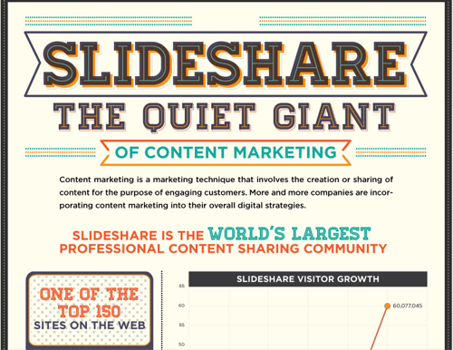
With over 60 million unique visitors to SlideShare, you can’t afford to ignore this site. If you’re a content marketer, public speaker, blogger or freelancer, you can take advantage of this platform to get more leads and drive more traffic to your site.
In a recent Social Media Examiner marketing report, SlideShare was ranked as the 8th most commonly used social media network.
I like SlideShare presentations because you can embed them in posts or any HTML document for easier distribution, thereby driving targeted visitors to your landing page and engaging your audience.
I’ve seen complete beginners to internet marketing create and upload slide decks and – without any promotion – generate thousands of views to their slides, drive traffic to their sites and move their business to another level.
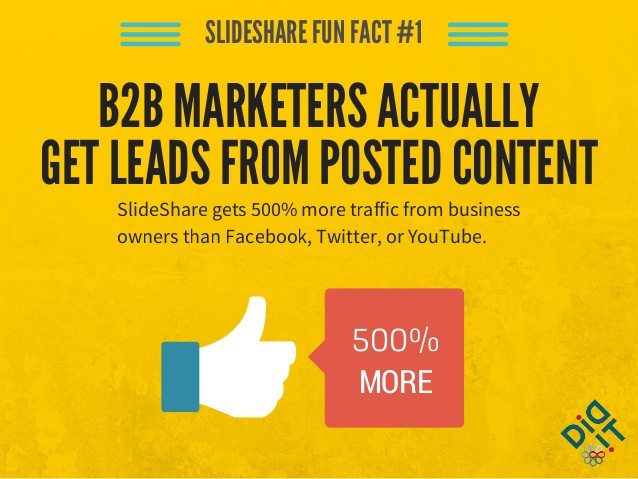
If you think Facebook and Twitter drive more targeted leads than SlideShare, think again. One study by Did It found that SlideShare gets about 500% more traffic from business owners than Facebook, Twitter, or YouTube.
In this article, you’ll learn step-by-step strategies to drive qualified traffic with SlideShare presentations.
The strategies are simple, but the results will astonish you. Let’s get started:
Getting Started with Slide Presentations
The first thing you need is research. You need to collect a lot of data to support your slides, no matter what your topic might be. Presentations that garner thousands of views and social shares weren’t created on the fly – the people who made them spent adequate time researching their topic.
i). Conducting your research: Before you create the presentation, you’ll need a plan of attack. Primarily, you’ll need to …
- Pick a topic
- Know the topic inside and out
- Read experts’ views about the topic
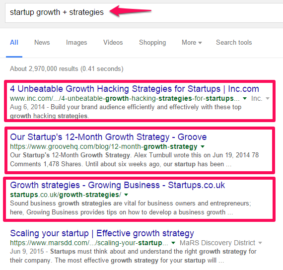
Google search is the place to start. Just input your “topic + strategies” into the search box and see what comes out.
Make sure that you use credible and authoritative blogs, sites, books and academic papers when researching your topic.
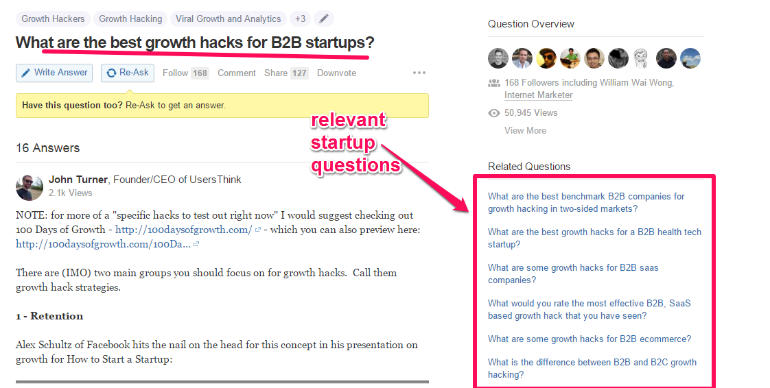
You can also find helpful questions and corresponding answers from experts on Quora.
ii). Sources for accurate data: Another vital element you’ll need in your presentation is data. Data makes your visual content trustworthy in the eyes of readers and prospects.
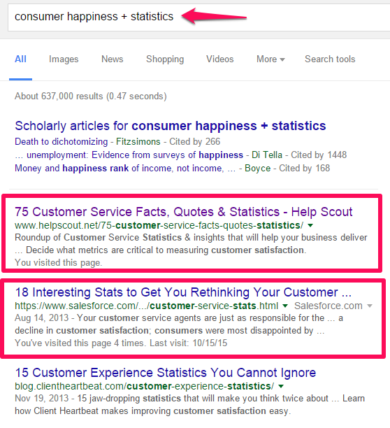
Again, you can get relevant data by searching Google. Just input your keyword + statistics (e.g., “consumer happiness marketing + statistics”):
Note: When you use data from other sources (e.g., blogs, books, etc.), make sure that you credit the source accurately! If you don’t, this could get you into trouble. It’s also unprofessional.
Creating Compelling Slides
Like any serious content marketer, I like to explore new opportunities that can help me drive more traffic to my blog, acquire more leads and make more money. But some marketing channels are already saturated.
That’s not the case with SlideShare, though. When it comes to reaching a target audience, slides are still underutilized.
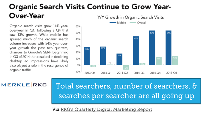
It doesn’t take much effort to create a slide presentation that drives organic traffic, especially knowing that organic traffic continues to grow year-by-year for brands and companies that consistently create the right content (e.g., blog posts, articles, videos, infographics, podcasts, etc.).
As bloggers and content marketers, we might be tempted to only create “text-based” content, because it seems much easier to put together, especially when it’s not data-driven.
But in reality, users want something unique. They want content that appeals to them in all aspects, not just what you think they’ll like. Slides are visual content, even when text is placed on images. Slides, at their roots, are very similar to infographics.
Customers can understand your message better if you communicate through visuals. We’re all visual creatures. According to Copyblogger, “we can get the sense of a visual scene in less than 1/10 of a second.”
Looking at visual content, slides are easier to create and unlike infographics, you can create them all by yourself.
If you don’t have the budget to hire someone, you can make a good looking slide presentation yourself. It doesn’t require any graphic design skills.
Creating infographics, on the other hand, can be complex if you don’t know at least the basics of graphic elements like typography, colors and wireframes.
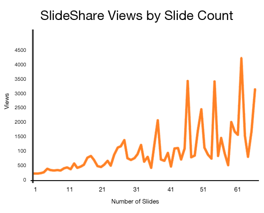
We know that companies that blog continually generate 126% more leads. In the same vein, companies that create slides regularly will drive more organic traffic. The more slides you create, the more views you’ll get.
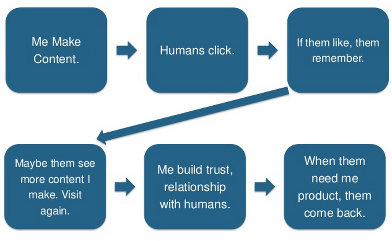
The reason why I love content marketing is because of the concept and approach. It’s all about creating content that gets people to like and trust you. Buffer App captures the approach in a fun way:
People are wired to like other people. And once they like you as a person, they’ll come back for more.
When creating slides for SlideShare, follow these tips:
i). Make it irresistible: There were times when I couldn’t resist an infographic or SlideShare presentation until I read it. That compelling force is what makes content stand out and generate thousands if not millions of views within a short period of time.
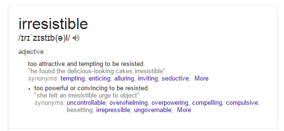
You may not fully understand what I mean by “irresistible.” Let’s see the definition from Google:
Did you see that? “Too attractive and tempting to be resisted.”
That’s should be the goal of your SlideShare presentations if you want to get featured on the homepage, generate an avalanche of views and drive the right visitors to your site.
SlideShare is a visual social network that flies under the radar, when compared to Facebook, Twitter, Instagram and LinkedIn. It’s part of why I like SlideShare so much.
I’ve seen the impact it can have on a business, if you create and promote the right slides. If you’ve ever created blog posts that made your audience crave more, use the same strategy to create your slides.
If you take a moment to browse through the featured slide decks on the homepage, you’ll gather some fantastic ideas to improve your own presentations. Slides that are featured on the homepage are usually high-quality, useful and truly irresistible.
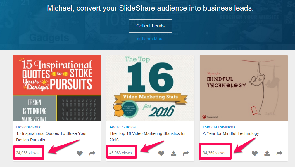
When you glance through the featured slides on the homepage, you’ll notice that within 24 hours they have generated over 30,000 views.
These views are from people who couldn’t resist. Initially, the slides were not on the homepage, but through the activities (e.g., clicks, views, shares, embeds), they were given maximum visibility.
That’s basically what happens to search results, too. Results that are ranked on Google’s first page are irresistible. People find them useful and willingly clicked, shared, linked and promoted them.
How do you make your SlideShare presentations irresistible?
a). Tell a story: We’re living in an age of information saturation. Except when a new technology comes out, virtually every topic has been covered and covered and covered again.
Only by telling a compelling story can you overcome this challenge. Your customers want better stories – not another blog post.
Tell a story of how you faced your own doubts and went ahead in spite of the fear – how you ultimately succeeded in overcoming a challenge or obstacle.
Consumers are struggling to sift through the output of content mills. According to HubSpot, “the average consumer processes 100,500 digital words daily.” You should make it easier for them.
Use storytelling techniques to give meaning to your content. Remember that you’re communicating a complex or complicated message in a condensed way – therefore, you have to provide a logical sequence.
Telling a story doesn’t mean you’ll relate your high school experience with people in your slides. That would be an odd approach.
Storytelling in marketing means that you find creative ways to simplify your topic and present it in a more digestible pieces while infusing your personality. The solution, in the words of Pixar’s Andrew Stanton, is simple;
Don’t give them 4, give them 2+2.
Storytelling also means that you break down long content into shorter “chapters.” This helps your readers digest your content more easily.
ii). Use brand characters. The idea behind an irresistible piece of content is to give people information in a way they won’t be able to find anywhere else. In your SlideShare presentations, you can use characters to give your brand a voice.
A brand named Stinson recently used Jay-Z as a kind of character for the brand. They created a presentation entitled “12 Things Jay-Z Has Taught Us About Style.” The presentation generated over 3,000 views and many leads.
Even if Stinson acquired only 10 leads who eventually became customers, it’s a sign that brand characters work in visual content marketing.
iii). Push where it hurts: Do you know the pain points of your audience? If you want them to notice your slides, capitalize on that. Use the customer’s own words to describe their problems and frustrations.
iv). Set them up: After describing their problems using their own words, let your customers know that the solution is right in the slides. You’ll be amazed at the number of clicks and views you’ll get.
v). Position your Unique Value Proposition: Your UVP is the only reason why your slide presentation is different from others. If nothing stands out, your content will be perceived as “nothing special.”
There’s got to be a better way of presenting your idea. According to Steve Blank,
UVP is a single, clear and compelling message that states why you’re different and worth buying.
vi). Make it simple: Your SlideShare presentation should be simple. Nothing annoys people more than a complex idea that isn’t broken down clearly. People are busy and unlikely to respond to anything that disrespects their time.
Use simple, common words that people are familiar with. Your first slide (which performs the function of a book cover) should be clear and the fonts legible.
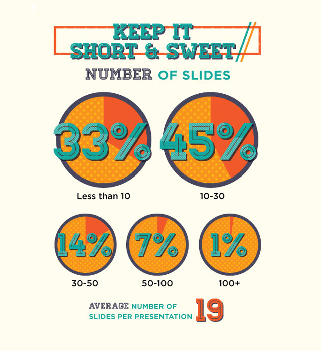
You don’t need a lot of pages. In fact, 45% of slide decks that perform well contain 10 – 30 pages. The average number of slides per presentation is 19.
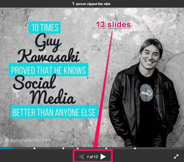
One recent slide on SlideShare’s homepage contains only 13 pages, but has been viewed more than 14,000 times.
However, in that case, one of the factors that made it so successful was the topic. It was irresistible, because of the influencer – Guy Kawasaki, an expert who’s known for his social media prowess. The font is the same one used by Guy and people already recognized it.
vii). Make it beautiful: In this age of automation and innovation, caring for your customers has never been more vital. You can’t afford to lose them, especially considering the fact that acquiring new customers could cost you far more than the cost of retaining current ones.
You can help potential customers fall in love with your slides and products by making them beautiful, or at least aesthetically pleasing. Walt Disney said it best:
Do what you do so well that they will want to see it again and bring their friends.
Creating beautiful slides, like the one below, can help prompt the kind of positive word of mouth that’s absolutely priceless.
A company that offers tremendous customer value will in turn develop a winning customer-focused culture.
The reason why so many business fail when it comes to customer experience isn’t because their product is bad or their customer support untrained, but rather because the product itself lacked appeal.
In her book Survival of the Prettiest: The Science of Beauty, author Nancy Etcoff argues that the pursuit of beauty is a learned behavior. She asserts,
Beauty is … an essential and ineradicable part of human nature that is revered and ferociously pursued in nearly every civilization–and for good reason.
Implement these simple tips to make your slides beautiful:
- Use clear, readable fonts
- Use contrasting colors (e.g., white on red, or yellow on black)
- Use professional photos (ideally, use handcrafted images as they tend to perform better)
- And always bring an experience to life
To learn more about making your SlideShare presentations beautiful and visually appealing, this post will help:
3 Ways to Amplify Your Presentations with Photographs
viii). Stay consistent with your brand: No matter what industry you’re in, your brand acts as your voice and identity, whether online or in the real world.
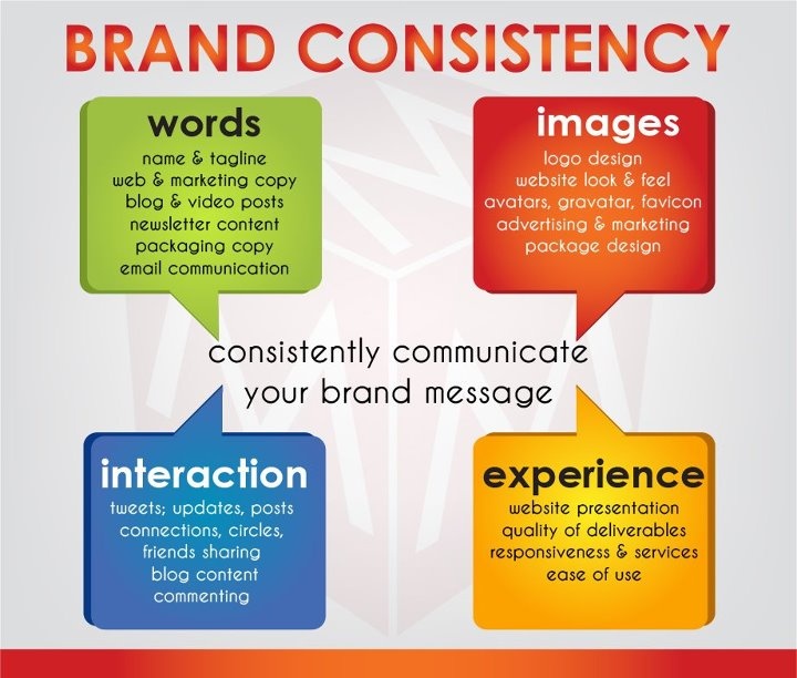
Brand consistency means a uniform approach to words, images, colors and the overall experience that you use and create in your presentations.
What you say also defines your brand image, and it’s critical to the success or failure of your brand. A study by Bop Design found that “45% of a brand’s image can be attributed to what it says and how it says it.”
So every slide should contain carefully selected words, images and flow. The more value you deliver, the more consistent your slide presentation will be, and, consequently, customers will know that your brand is worth sticking with.
Brand consistency is a pillar that holds up your marketing campaign. Without it, customers will not take you seriously. It’s critical to know when your brand consistency is off so that you can fix it quickly.
Branding consistency matters, says Melanie Perkins, co-founder and CEO of Canva.
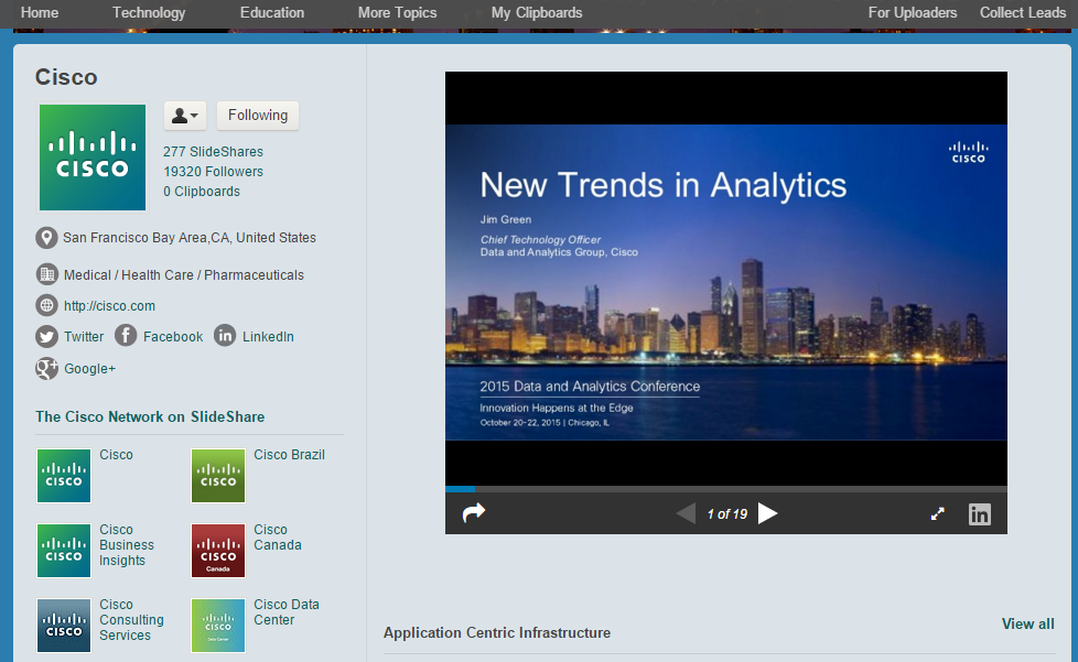
Take a look at Cisco’s SlideShare page. You’ll notice the consistency of branding elements, including the logo and color schemes, in every slide deck.
Make sure that your customers and prospects can recognize your brand in every slide you create. Whether it’s a 10-slide or 30-slide presentation, make it a culture.
Some of the things you can do to ensure brand consistency are:
- Use professional slide templates that look similar to your site.
- Create congruency between your site and every slide, so that when people click on the link on your slide and visit your site, they won’t be confused.
- Use your logo, colors, trademarks and symbols consistently. (If you put your logo on every slide, make it small and unobtrusive for the body slides and use larger versions on intro and final slides)
- Communicate in your voice. If you like to add humor or analogies to your blog posts and you have been consistent, your target audience is already familiar with that, so make sure you use them in your slides.
ix). Make your slide mobile optimized: The future of the web is mobile. Google knows this – that’s why it decided to reward mobile-friendly web pages. Optimizing for mobile devices should become a habit, regardless of which social media platform you’re using.
Optimizing your presentations allows prospects and customers to view the appropriate version of your presentations using SlideShare’s iOS and Android apps.
And besides, when you optimize your presentations for smartphones and tablets, you’ll reach more people, drive more views and acquire more customers.
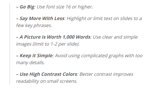
Specifically, SlideShare recommends:
Case Studies: Brands Driving Traffic with SlideShare Presentations
We’ve sung the praises of slide presentations enough. It’s time to see some in action.
Whenever I recommend to my clients that creating useful slides and uploading to SlideShare.net is a great way to drive leads and sales, they usually ask, “which brands have succeeded with it?”
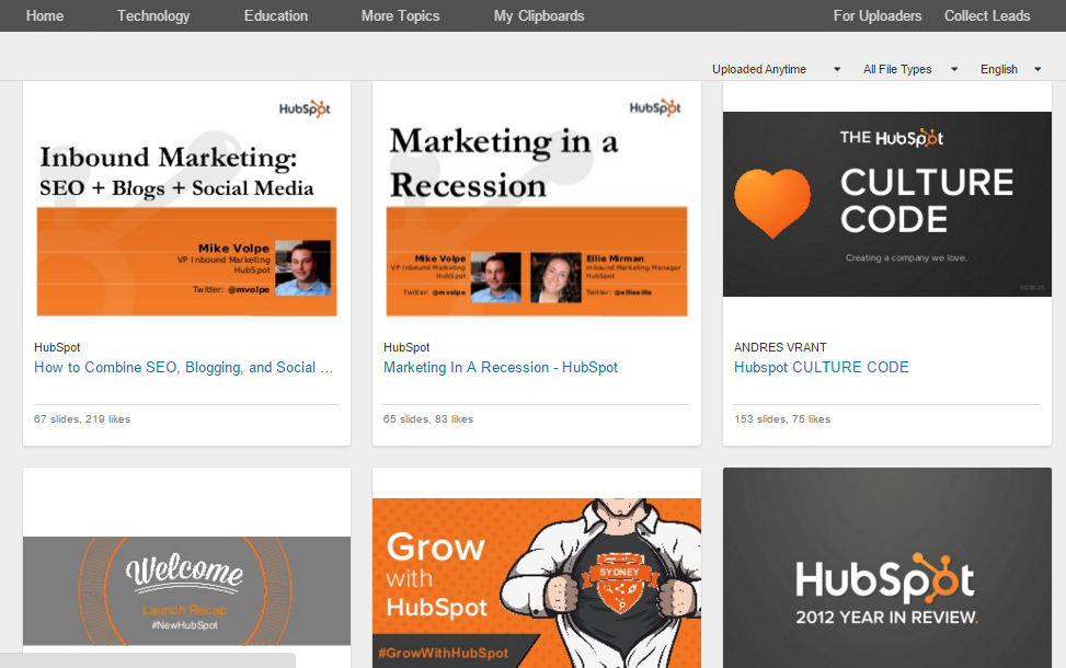
There are brands that generate lots of visitors and leads from SlideShare. HubSpot, Content Marketing Institute and MarketingProfs are just a few that I can point you to.
Facebook, Twitter, LinkedIn and Pinterest are pretty popular. Global brands spend 45-75% of their social media time on Facebook. Yet, “there are 2.1 million negative social mentions about brands in the U.S. alone, every single day.”
Why is that?
The reason is because you can’t really create useful content on Facebook, Twitter or Pinterest. These social media platforms are used to distribute content you created elsewhere.
In the eyes of your customers and target audience, clicking on a brand’s website link doesn’t mean the brand is doing something good.
On the other hand, SlideShare.net is a unique visual social network. You don’t use it to distribute content that you have created and published somewhere else. Rather, you publish it on SlideShare and distribute it elsewhere, embed it in your posts and share on other social networks.
So, which brands are successfully driving traffic with SlideShare marketing?
1). Brand of Innovation generated 2.5M slide views: The thing that makes slide presentations great is the concept. As I said earlier, it takes creativity to nail a winning presentation.
The competition is strong on SlideShare, especially when you want to get on the front page, but it’s totally doable.
I know a lot of people who have successfully appeared on the front page and stayed there for up to a week. Even after their slides dropped off the front page, they continued to generate views.
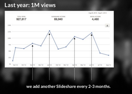
Nick Demey, co-founder of Brand of Innovation, shared a case study presentation a while ago on how he generated 2.5 million views on their SlideShare channel.
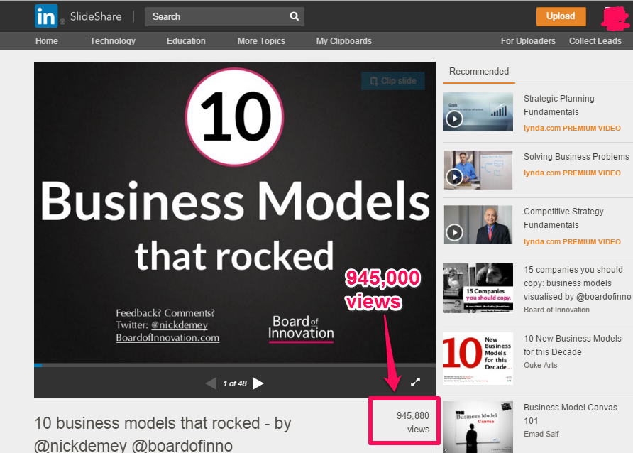
One of their presentations has generated over 940,000 views since 2011 and it was on a topic that has already been covered by many people in many ways.
Some of the tips they used include:
i). Unique angle: Yes, there may not be many new topics to cover, but you can always approach a topic from a unique angle. If you notice, this has been Nick’s ultimate strategy.
ii). Consistency: Every 2 – 3 months, Nick and his team usually add a new SlideShare presentation.
iii). Invest time: One of Nick’s SlideShare presentations generated 150K views. Nick recommends you invest time to create something unique, useful and professional. Don’t settle for something “quick & dirty.”
iv). Craft a great cover: Get started by writing 10 – 15 headlines that you can use in your first slide. Nick says he maintains a list of 100+ interesting keywords to make more compelling headlines (e.g., “secrets,” “should know,” “amazing,” “what would x do,” etc.).
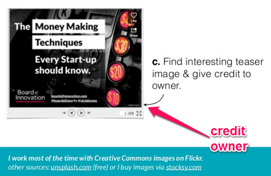
v). Continue with your cover: Check if your design works for small thumbnails, because this is the first thing people will see. Find an interesting teaser image and give credit to owner.
vi). Desaturate the background: Nick advises against busy backgrounds, even if they’re visually striking. He says,
The focus should be on the headline, not the background, and that your background should not grab attention. Some ways to do this:
- Blur backgrounds
- Make them darker or greyed out
- Make the text more visible and readable
vii). Call to action early: In your cover slide, add a call-to-action (e.g., link to your website, landing page or store).
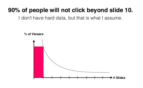
Nick says,
Adding a call-to-action to your cover slide is critical if you want to drive clicks to your site because “90% of people will not click beyond slide 10.
viii). Give, Give, Give: The “give” principle will help your SlideShare presentations shine. Don’t be stingy. Talk more about others, not you. Pack your slides with links to other cases, people & resources to follow.
Let people shine,
says Nick.
Those are the vital steps that Nick Demey implement and generated 2.5M SlideShare views. But there are other steps. Check out the presentation below to learn more:
How I Got 2.5 Million Views on SlideShare
2). Framebench Used SlideShare to Get 500 Signups in 3 Days: Growing a business begins when you start getting leads, because targeted leads will become customers when you nurture your relationship with them.
In a study, 360leads.com found that “out of the 78.5% of companies that have active sales lead generation programs, only 17.3% are reaching their targets.”
If you want to attract people who will join your programs and buy your products, you need to be where they are.
Facebook and other social media networks are saturated, unless you have money to spend on PPC ads. But SlideShare is different.
According to Curatti, SlideShare is one of the top 150 sites on the web. In fact, SlideShare is the world’s largest professional content sharing community.
Framebench, a file collaboration site, turned to SlideShare and got 500 new signups in 3 days.
Rohit Agarwal, founder of Framebench.com, shared a case study of how they used SlideShare for content distribution.
In September, Framebench created and uploaded their first slide presentation. It was based on a blog post, which was repurposed into a visual presentation. Fortunately, it generated about 8,000 views. This was enough of a signal to Agarwal to dig deeper into SlideShare.
Next, they spent time designing better graphics. The second presentation, titled “How To Manage Client Feedback for Designers,” was a homerun. It garnered 400,000 views in just two weeks.
Agarwal promoted the presentation on Twitter, LinkedIn (owners of SlideShare) and Facebook and he reached more people.
The presentation generated over 500 shares. Interestingly, SlideShare also gave the presentation extra visibility by promoting it on the front page as featured content, because it was trending on social media.
Being on the front page gave it additional visibility. The number of visits to Framebench increased and over 500 new signups were recorded in 3 days.
3). Marketo got over 600,000 views from SlideShare: Throughout 2012, Marketo experienced significant success using SlideShare as a channel to promote useful visual content.
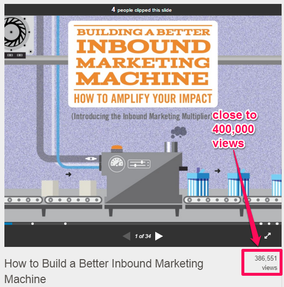
Working closely with Column Five Media, they created a presentation titled “Building A Better Inbound Marketing Machine.” In about 4 weeks, the presentation generated over 380,000 views and hundreds of social shares.
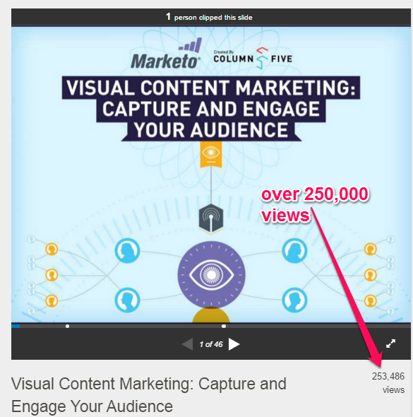
With that kind of traction, Marketo created and published their second presentation a few months later, using the visual content marketing formula. This also achieved dramatic results, with more than 250,000 views so far.
It doesn’t matter how many visits your site gets right now. Maybe you’ve created a presentation before that didn’t work. If so, why not give it another shot, using the tips and strategies I’ve shared here?
The truth is that you can acquire more leads from SlideShare than you would with Facebook, if you take the time to create useful and share-worthy presentations.
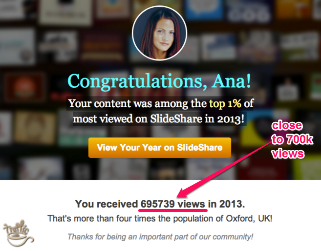
Useful presentations get featured on the front page where over 50,000 monthly visitors can easily access them. When Ana Hoffman’s presentations were featured on the front page, she went from 0 to 243,000 views in 30 days. And in 2013, her presentations generated close to 700,000 views.
1). Tools used to create slide presentations: There are quite a few tools that you can use to create your slides. But don’t waste time learning and using them all. Pick one and learn how to use it to its fullest potential.
Some of the tools are:
i). Microsoft PowerPoint: You should already have this one installed on your PC if you’re using a Windows OS.
For beginners, PowerPoint is easy to learn. But don’t stop there, because there are better alternatives out there. You can learn more from this article, “7 tips to beautiful PowerPoint presentations.”
ii). Canva: There are so many design apps out there, but thousands of content marketers, online entrepreneurs and bloggers prefer Canva.
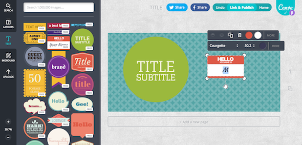
Whether or not you enjoy graphic designs, Canva makes it easy for you to “drag and drop” images, and, within 2 minutes, you can design graphics for your presentation or any other type of visual content.
Canva also has all the professional photos you need to create your presentations. The photos and tools are located at the left side. To add a photo to the design area, all you have to do is drag and drop or double click the photo. If you want to add text, click on the text tool. It’s as simple as that.
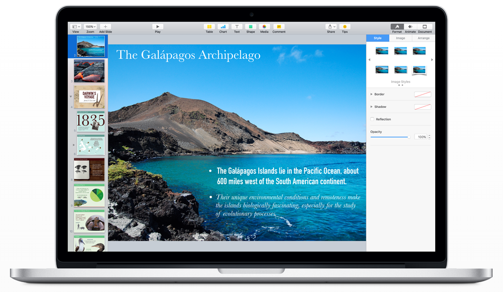
iii) Keynote: Whether you’re creating presentations for your next seminar, workshop, webinar or SlideShare, Keynote can help get the job done.
You can use Keynote for Mac to create and deliver beautiful presentations, developed with powerful tools for dazzling effects that create a memorable experience for your audience. Keynote enables you to work seamlessly between Mac and iOS devices.
iv). Google Slides: Google has tools for everything you’ll ever need when doing business online. Google Slides is special, because it lets you create inspiring presentations quickly. With Google Slides, you can create, edit, collaborate, and give presentations anywhere, for free.
Google Slides gives you a lot of flexibility with a variety of presentation themes, animations, embedded video, fonts, etc.
v). Haiku Deck: If you’re ready to create presentations that inspire, you may want to try Haiku Deck. It’s a relatively new software that makes telling your brand story simple, beautiful, and fun.
Whatever your idea – say, a mini-manifesto, or a photo slideshow for your site – you can use this powerful software to bring ideas to life.
In fact, if you don’t have a topic to create a SlideShare presentation on, you can browse the gallery and get inspired by the week’s best decks.
Watch some of the instructional videos to learn how to make presentations that convert viewers into leads and customers.
To maximize your SlideShare presentation and get more views and traffic to your site, the resources below will help:
Increase Slide Deck Visibility on the Web
Like many networks that are just gaining mainstream traction, SlideShare has been a marketing weapon for many brands. HubSpot, Marketo, Starbucks and other brands have succeeded with SlideShare because they’ve used a proven strategy.
To increase the visibility of your slides on the web, there are a few simple things you can do:
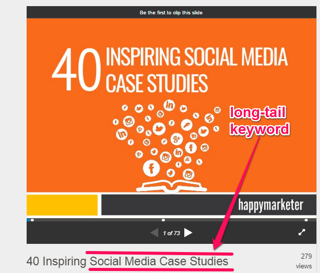
i). Research and target long-tail keywords to drive organic traffic: Don’t over-optimize your presentations with keywords – but don’t ignore keywords, either.
Here’s an example of a presentation that targets the right keyword in the title:
Always use a long-tail search term in your SlideShare title to boost your chances of driving organic traffic.
ii). Choose a user- & search-friendly filename: Filenames are important to Google and can impact search performance. When uploading your presentation, make sure that your filename is both user- and search-friendly. The shorter, the better.
iii). Make your title and description enticing and keyword rich: The title and description on the cover slide is what people will see first. 8 out of 10 people will read it, then decide whether to view more.
Ideally, add the keyword you’re targeting in the title. But more importantly, make sure your title flows smoothly and is interesting. Here’s an example slide on “how to teach grammar.”
iv). Be relevant. Write a persuasive transcription. An all-important rule of marketing is to “be relevant.” Your images, words and especially your copy must be relevant to your audience.
v). Embed in your blog posts: To create better engagement for your next blog post, embed one of your SlideShare presentations. You’ll increase your views, get your readers excited and boost your search visibility.
Conclusion
There you have it – the step-by-step strategies to drive qualified traffic with SlideShare presentations. Remember to track your SlideShare content reach. You can use the analytics provided on your dashboard.
To get the most out of SlideShare, upgrade to SlideShare Pro and you’ll be able to add a lead generation form into your slides to collect email leads.
If you review the case studies I shared here carefully, you’ll discover that none of these brands approached this content marketing channel with a half-baked approach.
Whether you’re going to focus on creating more engaging blog posts, videos, or presentations, you should understand that sustainable results only happen when you stick to it.
Is it possible to create a presentation that no one views? Of course. I’ve created presentations that generated no more than 20 views and not a single clicked link.
There’s a learning curve. When you master the art of designing SlideShare presentations that convert and you learn how to promote them, you can’t fail with SlideShare.
You’re already a brand even if you’re just starting out. Your ideal customers want to connect with your brand, and the only way to do that is to continually deliver tremendous value.
Customers are looking for actionable content that will answer their questions. Dare to be the go-to expert who provides solutions with attractive and compelling visual content.
Have you generated qualified traffic with SlideShare presentations? Share your tips below.














Comments (68)