“Let’s test button color today. It has been so long since we changed it.”
Wait! Testing random ideas that are not based on well-thought out hypotheses can waste your time, money, and website traffic. To develop a successful test hypothesis, you need to find problems/concerns that your customers struggle with when they are completing the conversion goal of your website.
So, let’s get into some powerful research methods to discover what’s keeping your visitors from turning into customers, and how you can use those points of friction to formulate viable hypotheses (theories) to test.
1. Usability Testing
Watching people use your design can help you find multiple usability issues and technical glitches. But, in order for you to find the real issues from your usability testing, you must guide your test participants correctly and make sure they are comfortable enough to express themselves freely. It all comes down to asking the right questions.
Avoid Asking Leading Questions
Your language can have a huge impact on the responses or interactions of your test participants. And if you’re not careful about the way you are framing your questions, it can skew your test results. It is thus recommended that you pen down the questions exactly the way you want to address them to your test participants. For example, you might write this question:
“We’ve spent months building this website. Can you please tell me what you think are its positives and negatives?”
But, to the participant, this is a leading question that reveals the answer you would like. It means, “I’m looking for praise. If you say anything negative, you might hurt my feelings.”
Instead, neutralize this question to obtain a genuine response by saying:
“If you get stuck anywhere, it’s absolutely fine. Do whatever comes naturally and speak your mind.”
This would mean, “Don’t worry about sparing my feelings. Feel free to express your thoughts.”
You must assure your participants that the test is not to judge how good they are. There’s nothing they can do wrong. The purpose is to judge how good the usability of your website is.
Frame Your Questions Broadly
Instead of mentioning an exact task, give test participants a scenario. For example:
“Contact a live chat agent.” – Wrong
“If you have to contact us for a query, what would you do?” – Right
This will help you check whether your visitors are able to locate your live chat widget or other contact details easily.
Also, try not to use the exact words from your call-to-action buttons or links. Let’s say you have a “central community and parking maps” link on your website. In this case, you can frame your question like this:
“You have to visit the University Museum tomorrow and wish to know the nearest place to park your car. How would you find out?”
Notice how I did not use the exact phrase of the button “central community and parking maps” in the question here.
Ask General Questions First
Decide your test structure carefully when arranging the order of your questions. For instance:
First tell me – “Have you ever seen a monkey?”
Next question – “Which is your favorite fruit?”
Wait…did you just think of bananas? I know you did. See what I did there?
The first question influences the answer to the second question. To make sure this doesn’t happen, ask general questions before getting into questions that are specific to page elements. For example, you might ask a question about navigation, followed by a question that asks something like, “What are the three things you remember on the homepage?” Many will mention something about navigation.
Ask Questions about Your Homepage, Navigation, and Pricing
Questions related to homepage, navigation, forms, and checkout process can reveal a number of objections. Conduct a 5-second test, and ask your participants the following questions about the homepage:
“What do you think the website is about?”
“What are the first three things you noticed on the homepage?” (Things like your value proposition, most compelling discount offer, primary call to action, trust signals, or contact number, etc. are the most important things visitors should notice first on your website.)
As you move ahead with your usability test, you can ask questions like:
“Were you able to interact with the drop-down menu/product filter without any problem?”
“Do you have any suggestions to improve navigation?”
“Did you easily understand the words used in the navigation menu/product filter?”
“Did you get confused/stuck at any form field?”
“Did you feel that the form is too long? Or, if any form field is unnecessary?”
“Did you feel confused or annoyed anywhere in the process?”
SaaS businesses can ask questions like:
“Do you think our pricing is clear?”
“Is there anything else you’d like to know about our plans before signing up with us?”
“Does our website look trustworthy to you?”
Observe Behavior of Test Participants
If participants stop/get stuck anywhere, or if they take a non-traditional route to complete a task, add them to your notes. Formulate hypotheses that might solve any problems they faced.
For example, if a participant stops to do a calculation in his head to complete a transaction, perhaps it would be better to provide a calculator on that page. Easy calculation on the website will give visitors a clearer picture of the amount that needs to be paid and most likely will improve your conversions.
Don’t forget to add the time taken by participants to complete each task. If they are taking more time than you think they should, you have an opportunity for improvement. Frame a hypothesis to reduce the time it takes to complete a task. A/B test it and see how it goes.
2. Insights from Losing Test Results
You do get negative lifts with A/B testing, even if you are an expert. That’s the truth. But, that being said, what you learn about customers from every test is what counts. Failed tests can sometimes reveal powerful customer insights.
The thing you need to understand here is how to get that valuable customer insight? Asking the “why” questions to unravel the underlying psychological reasons will help you find useful customer insights. For example, you might test these two headlines:
“Book this limited-edition, sun-roof Audi A6 now”
v/s
“Book your Audi A6 today and get $10 off”
If the second headline loses, you can theorize “why” that headline lost? Audi A6 customers probably are not too concerned about the price. Limited-edition excites them more.
Ask yourself this: “What” does this make you understand about your customers? Here you can say exclusivity matters to them more than the price. Now, that’s customer insight you can use to tweak your marketing message.
So, your next hypothesis can be: changing the emphasis from price to exclusivity in the copy and images will improve conversion rate for the Audi landing page of the automobile website. Once proven to give you a winning result, sometimes profound customer insights can be tested site-wide or even in offline marketing offers to generate multiple lifts.
Losing test results don’t mean you’ve hit a wall. You still can change them into a win. All you have to do is think of a reason “why” your customers buy or don’t buy. The more you understand their motivations and behavior, the higher the winning potential of your hypotheses.
A recent conversion test started out with disastrous results—30.27% fewer conversions. But after another adjustment, that shifted to a 29.5% increase in conversion and a 48.69% lift in sales.
As you look for solutions to reduce friction and roadblocks in your conversion process, you will develop multiple hypotheses to test.
3. Customer Surveys
The previous two research methods will give clues to many of your customers’ subconscious problems, but asking them straight will give you an understanding of problems they are well aware of. All you have to do is ask.
But, asking the right questions is an absolute must for finding the insights you can act upon. When conducting surveys, it is important to decide who you are targeting. Dr. Karl Blanks of Conversion Rate Experts explained in a webinar that you can divide your target audience into three types:
- Qualified no’s – Visitors who meet your customer demographic but decide against buying from you.
- Recent customers – People who just signed up or placed an order with you.
- Existing customers – Loyalists who are your repeat customers.
The purpose here is to convert qualified no’s into recent customers and recent customers into existing customers.
Once you know the objections faced by your recent customers (even though they overcame them and signed up with you), you can address the objections in the design/copy of your website.
Ask New Customers Open-ended Questions
Set up an autoresponder mail that contains a small survey for customers who just bought from you. If you want to know more than you already know, ask open-ended questions.
Soon after someone signs up, you can send them an email asking these questions:
- “Where exactly did you find out about us?” (This will tell you websites/marketing channels where you should focus.)
- “Please list the top 3 things that persuaded you to buy from us rather than a competitor?” (Keep this open ended. Let them tell you what they found most compelling about your offering.)
- “Which of our competitors, both online and offline, did you consider before choosing us?” (This will help you understand your position in relation to your competitors.)
- “What was your biggest fear or concern about using us?” (Open ended again. This will tell you the objections they had in mind before they decided to go ahead with you.)
Remember that asking too many questions can considerably reduce the number of responses you get. For each question, you should have a very clear purpose of how the answer can help you.
Ask Casual Visitors about Their Interests
Casual site visitors probably will not be interested in your product yet. Their behavior will be somewhat different from your customers as they still are in the exploratory phase. Your job is to make them your customers.
Remember that these people most likely will have the same objections your recent customers had before they signed up with you. Insights from the survey answers of your recent customers should give you many hypotheses you can test about how best to nudge the casual visitors into the conversion funnel.
For example, a customer may say he wasn’t sure at first if the payment method on your site is trustworthy. So, he Google searched to check your reputation online and then decided to go ahead.
To solve this issue, your hypothesis to test can be: adding a trust seal to the payment step should reduce customer anxiety and improve conversions.
See how Kellogg School of Management tries to obtain objections of potential students through their on-site surveys:
Learning about motivations of these casual surfers also can give you a great starting point to find potentially rewarding hypotheses. Ask them this:
“What brought you to our site today?” This will help you understand user intent. Of course you can add some quick choices for them. For our Visual Website Optimizer site, the choices below are appropriate:
I want to learn more about A/B testing.
I want to sign up for your tool.
I want to find test ideas to improve my website’s conversion rate.
Any other? Please specify ____.
You also can set the trigger for the exit button. As soon as a visitor is about to click it, you can ask them: Were you able to complete the task you came to do? Yes | No. Please mention why not _____.”
A SaaS company also can ask:
What kind of a website do you have?
Travel
SaaS
eCommerce
Publishing
Any other, please specify ___.
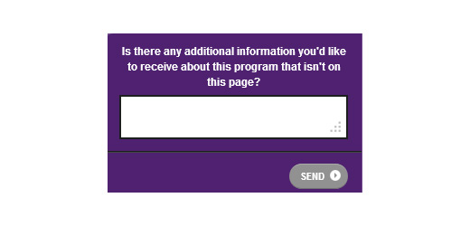
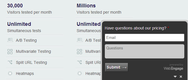
Pricing pages often get targeted traffic with prospects who are likely to sign up for a software/service. Thus, we recently decided to run a small survey on our pricing page.
We asked people if our pricing is clear for them or if they have any questions to ask, and this has given us some great insights about the questions we have left unanswered for our prospects. We will be addressing those questions in our copy soon and run an A/B test to see how it goes. You must try it out, too!
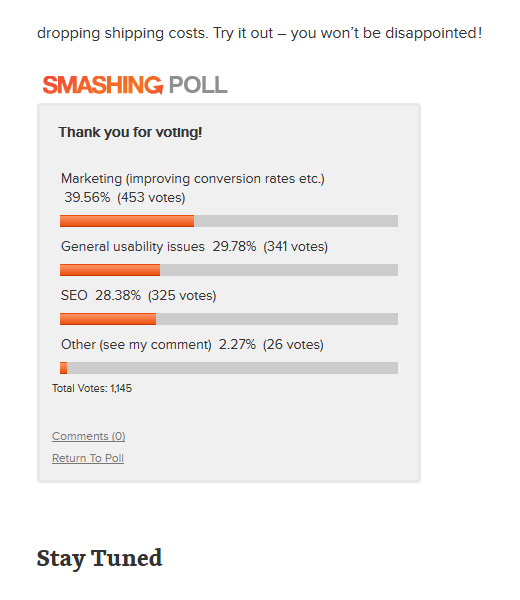
“What kinds of topics would you like to read more about? Mention 4-5 topics that you cover on your blog.”
Smashing Magazine asked their visitors a similar question. You can see their poll results below:
Notice how this takes guesswork from your strategy.
If a customer is taking longer than required to complete the payment process, you can add triggers to simply pop up a question such as:
“Is there anything stopping you from completing this order? Kindly let us know ____.” A site once figured their cross-browser issue this way, which was costing them a lot of revenue.
Don’t ask your site visitors more than 1-2 questions or you might annoy them. Web Engage, Qualaroo, and Survey Monkey are some great tools you can use to conduct surveys.
Ask Existing Customers What They Like about Your Business
“What are the three things you like most about our product/service/website?”
“How would you describe our product/service to a friend?”
“Have you praised/criticized us to a friend in the past six months? If yes, what did you say?”
Loft Resumes conducted a product/market fit survey and designed an alternative landing page based on survey responses they received from their existing customers. The new page was pitted against the original. The test results marked a clear win for the new page that improved Loft Resume’s sales by 64.8%. You can read the complete case study here.
4. Heatmaps
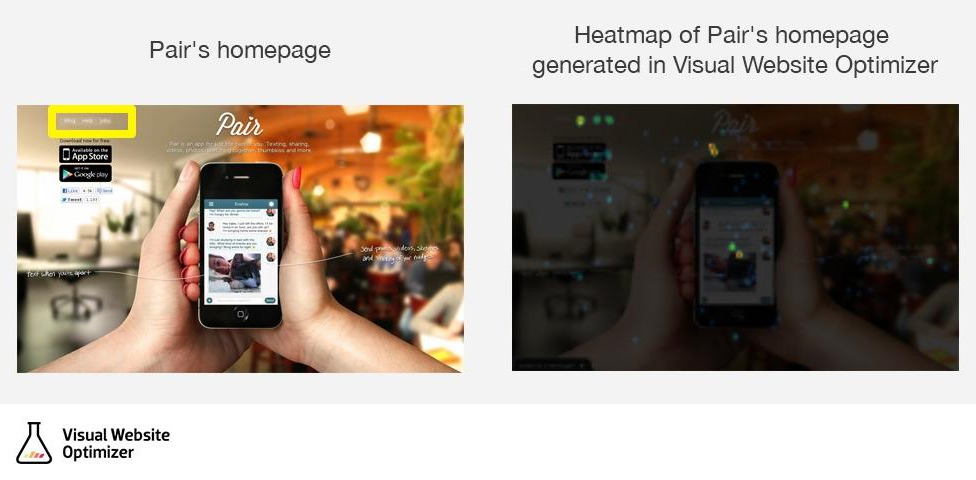
Heatmaps tell you which elements are attracting the most attention from customers and which ones are being completely ignored by them. While data can tell you “what” happened, heatmaps many times can tell you “why” it happened.
One of our customers generated the following heatmap for their homepage:
They realized that, even though the navigation on the top left is almost subdued with its translucent look, it’s still attracting a lot of attention. Thus, it is distracting people from downloading the app, which is the main conversion goal of the page.
They hypothesized that removing the navigation bar should improve conversions. The A/B test finally proved the hypothesis to be correct. Removing the navigation bar improved conversions by 12% for Pair’s website.
Sometimes your heatmap may reveal unnecessary page elements that are drawing people away from the conversion goal or getting too much attention. You can test removing them or replacing them with elements that act as supporting elements to nudge people further toward the conversion goal.
5. In-site Search
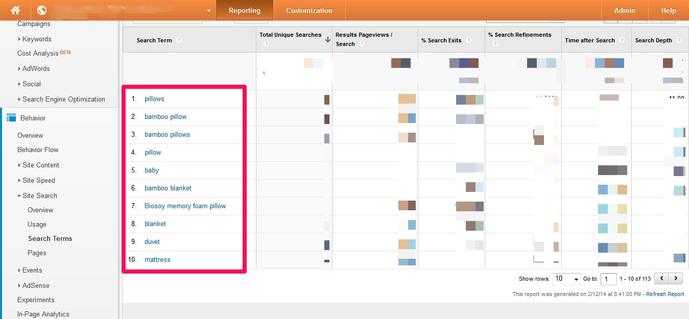
Behavior > Site Search > Search Terms. Follow this path in your Google Analytics. It will look something like this:
This is the small repository that is your key to understanding visitors’ intent and even the exact words they use to find things on your website. Use the same words as your customers in your copy. It often boosts conversions. Test it out!
Sometimes you might notice that a lot of people are searching for a particular product in your site search. But since you don’t have it, you are losing sales. In that case, you can try adding that product to your arsenal. Or, if that’s not possible, you can suggest the product category to find similar products instead of showing them the sad “Product not found” page.
Also, if you notice that a lot of visitors are looking for a common range of products, a hypothesis can be: adding a separate category for this product range on the homepage will boost sales.
Each change you make on your site should be your hypothesis. Don’t make the mistake of implementing a website change without testing it. Since all of these hypotheses will be customer-centric, it will increase your odds of winning immensely.
Finally, it’s important that you choose a page that receives good traffic. All this might seem like a lot of work, but nothing comes easy. Invest your time in research methods, and not only will you have tons of test hypotheses, but they will be hypotheses that convert into wins.
About the Author: Smriti Chawla is a content marketer with Visual Website Optimizer, A/B testing software with built-in heatmaps. To generate heatmaps for your website, you can sign up here for a free 14-day trial. Read more articles about A/B testing and improving website conversion rates on their split-testing blog.
Comments (9)