Facebook is the biggest social network in the world, but that doesn’t mean it’s a marketer’s dream solution.
I spend a ton of money on Facebook fans. I analyze my page’s performance all the time. I obsess over every detail of my campaigns.
But, for all the expenditure, effort and work, there’s one thing that I can’t overlook.
It’s easy to overlook, but deadly if you do.
If you’ve done Facebook marketing, you know there are tons of little nuances and hacks at work. In fact, marketers are still figuring out how to optimize performance on Facebook.
I’ll often get questions about improving a Facebook marketing strategy. But, most of the time, it’s not even the marketing that’s the problem––it’s your page.
I’ve seen lots of companies that pour hundreds or even thousands of dollars into Facebook marketing. They run targeted ad campaigns, interactive events, giveaways––the whole nine yards.
But, these same companies that put so much money into marketing haven’t even bothered to optimize their actual page.
In most cases, your page will be how someone comes across your company on Facebook. Consider your page to be a brand representative.
That’s why it’s so crucial that you optimize your page for maximum engagement. You want users to be hooked from start to finish.
Your brand isn’t boring and your Facebook page shouldn’t be either.
I’m going to take you step-by-step through the process of improving your Facebook page. I’ll go through each section or your page and tell you exactly how to make it better.
Pull up your Facebook page and let’s go!
Learn how I generate 195,013 visitors a month through Facebook without spending a dollar in ads.
1. Your cover photo
Your cover photo will be the first thing that people see when they visit your Facebook page, so having an awesome cover photo will make a great first impression on your visitors.
First, you have to choose the photo that you’ll use. This sounds simple, but it’s actually fairly complex.
You have to consider how you can use a photo to capture attention to your brand immediately and you also want to stand out from your competition.
Ideally, your cover photo should:
- Be visually appealing
- Promote a clear message
- Appeal to visitors’ emotions
- Tie into your brand or a specific product in some way
Let’s take a look at some companies that have great cover photos and break down why each photo is so good.
Second, you have to decide what the objective of the photo is. There are a few different approaches that you can take here.
Let’s look at a couple of cover photos to see these approaches in action.
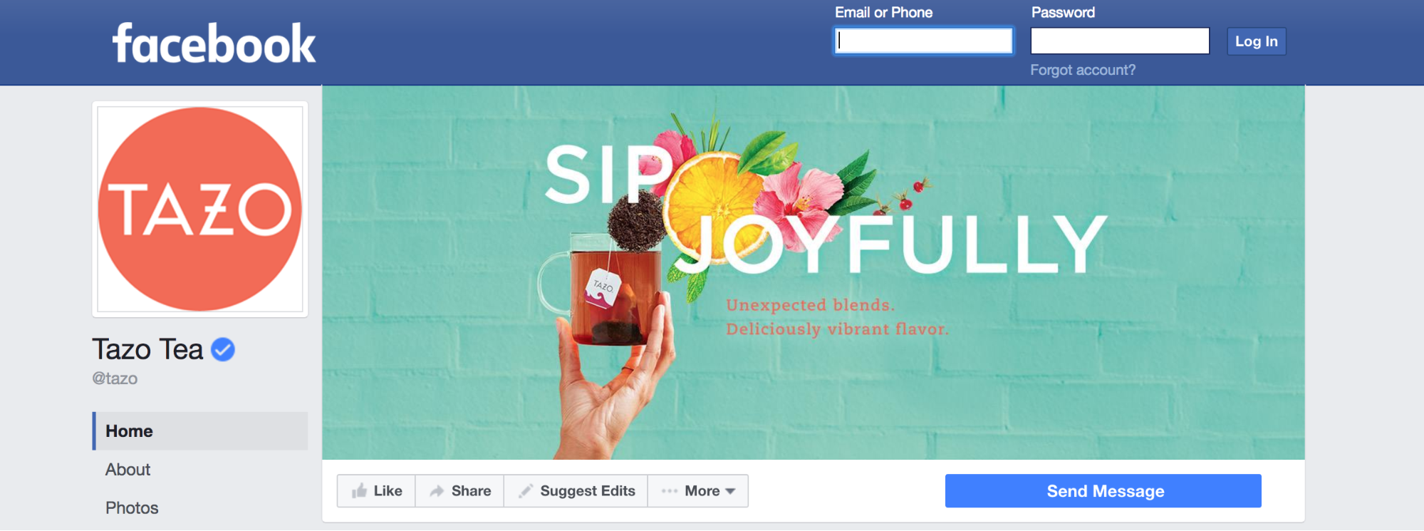
Here’s Tazo Tea’s Facebook cover photo:
It’s simple and unobtrusive, but it’s also vibrant and gets your attention. Its colors and design also align with Tazo’s branding.
This cover photo is literally promoting a clear message by using text. That’s a great choice, if you have a slogan or mission statement that you can use. This tells visitors what you’re all about, before they even click on anything on your page.
Tazo isn’t trying to be revolutionary. It’s using the cover photo as a sort of welcome mat to greet visitors.
But, that’s not to say that you’re limited to using the cover photo as a way of saying hello. You can do much more with it.
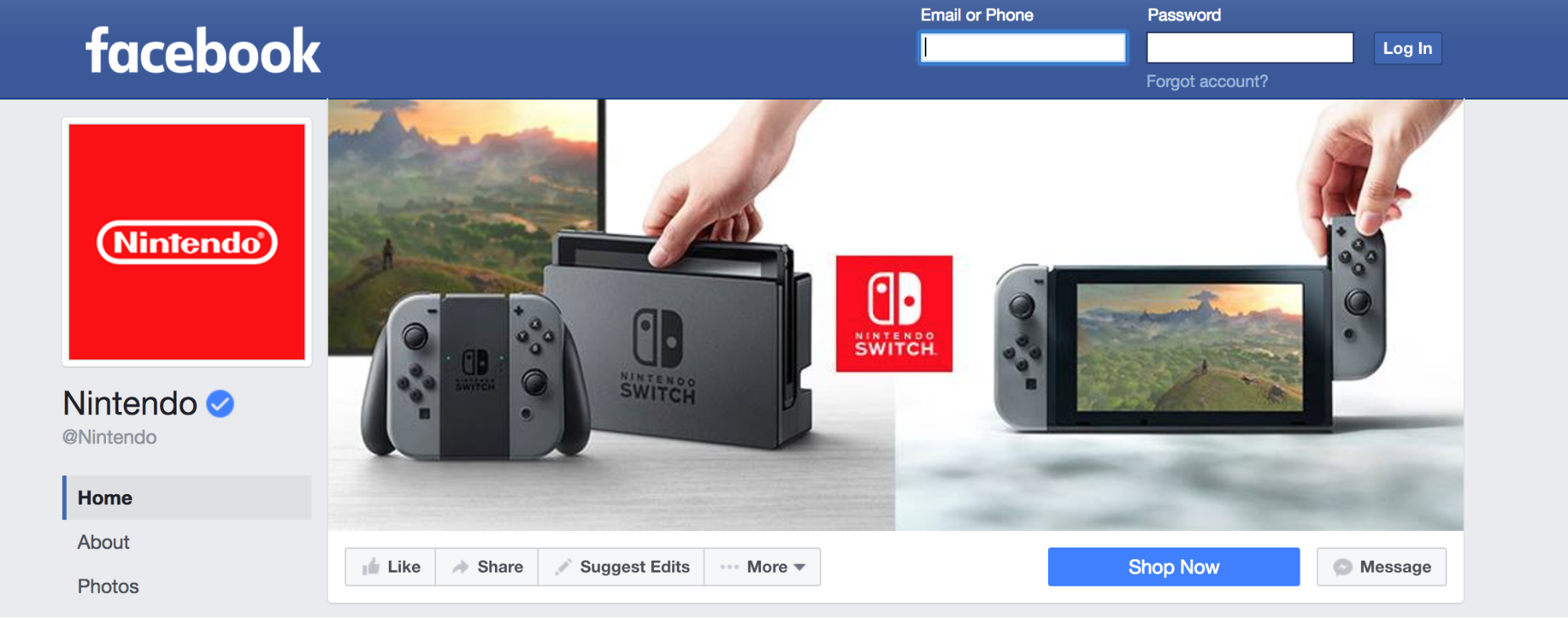
Check out Nintendo’s cover photo:
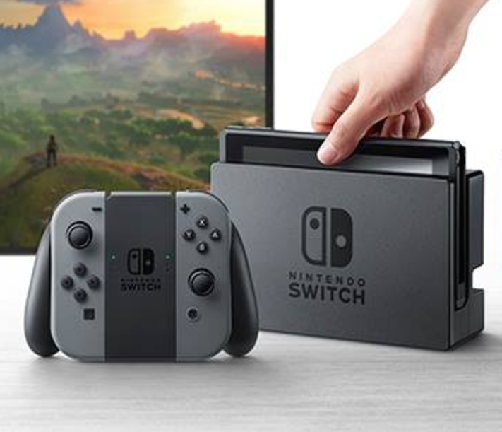
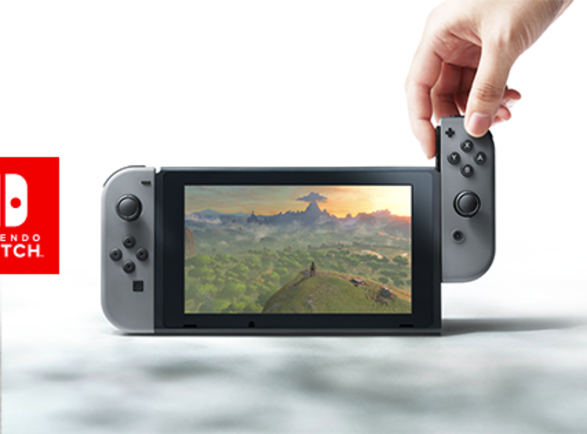
This cover photo is actually doubling as an ad. Since Nintendo is releasing a new game console, they’re making sure that everyone knows.
The photo is also an excellent example of demonstrating product usage. The first photo clearly shows the entire product:
And, the second shows it in action:
Between these two images, visitors will get a clear idea of the product. Showcasing your newest product or service is a good idea, whether you’re a local or global business.
Notice the CTA Nintendo uses just below their cover photo:
Nintendo’s Facebook page is acting as a makeshift landing page. And, you can bet that their tactics will bolster their conversion rate.
There’s a lot more you can do with your cover photo. For example, you could use it to promote a contest or share a special offer. The only limit is your imagination.
Don’t forget to change your cover photo if you’re running a specific ad campaign or promoting a specific product. Nintendo, for instance, is showcasing their newest console right now, but they’ll change that in the future.
The cover photo section is flexible. Change it as your marketing strategy changes.
Remember, your cover photo is your first impression. Don’t be afraid to spend time finding the perfect cover photo for your business.
2. Your About page
When people are on Facebook and want to find any information about your company, your page’s About section is most likely where they’ll go.
If your About page doesn’t have relevant, helpful information, your users are likely to bounce.
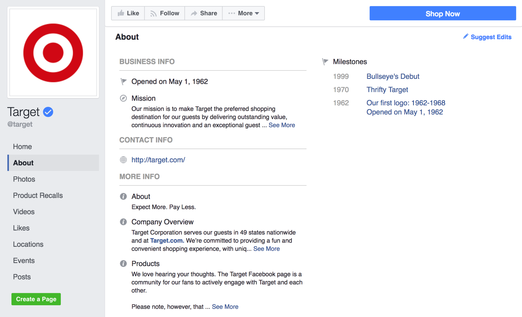
Let’s look at Target’s Facebook About page for this section:
We’ll be analyzing this page to see just how optimized it is.
A great About page has three sections full of useful information. You can use more than three sections, but you should have at least these three filled out and optimized.
Before we start, keep in mind that your page category will determine what kind of information you can add. If something doesn’t match up exactly with what you’re seeing, look for a similar section or option.
First, there’s the Business Info section. This is where you should write about your mission statement and who you are as a company.
This section is at the top of the About page, so you need to hit a home run here.
Let’s face it––no one wants to read your company’s history. They want to know what your company stands for and, ultimately, why they should be interested.
This is a great place to include a short version of your brand story. But, make sure that you involve the customer. How do they play into your grand vision?
If someone’s purchase will help make your vision come true, explicitly say so.
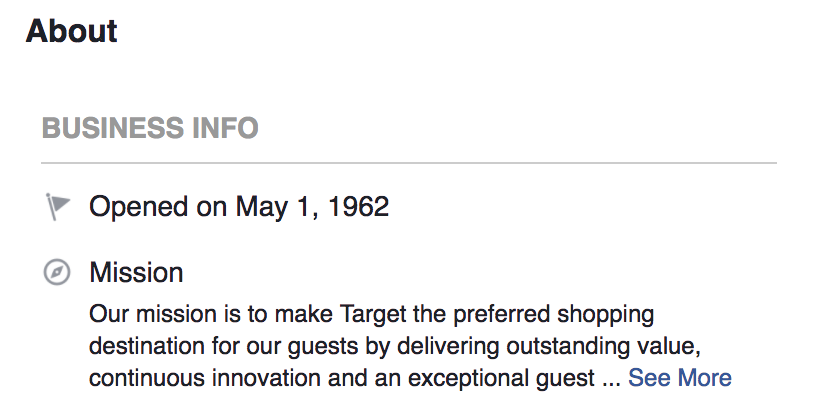
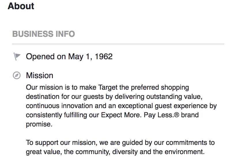
Target’s Business Info snippet does just this:
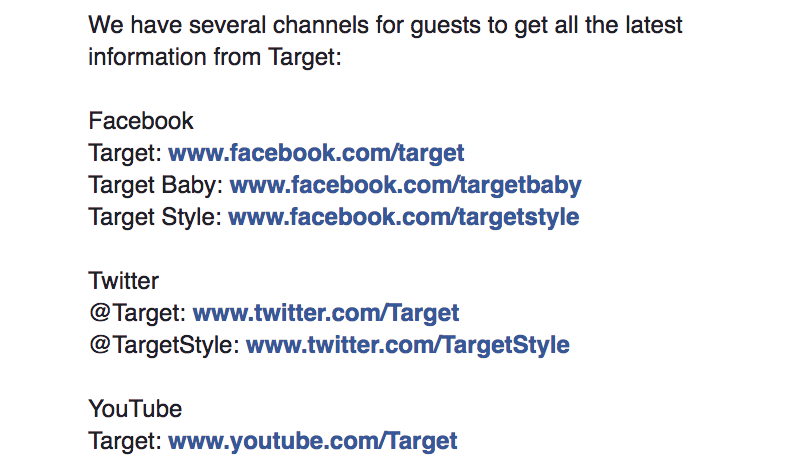
It also includes links to their other profiles:
This is a great Business Info section. It gives the reader a basic overview of the company and how to find more about it.
If you’re a smaller or local business, you can use this section in the same exact way. Every company, big or small, needs a mission statement.
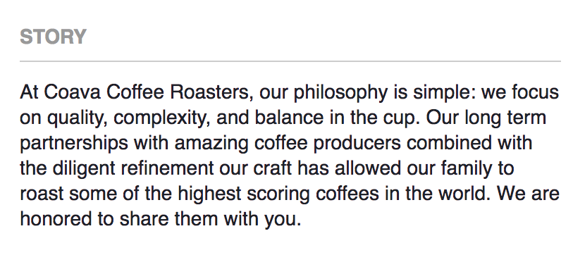
Coava Coffee, a coffee shop and roastery in Portland, Oregon, has a Story section for the same purpose:
This tells the reader what the company stands for and what its values are.
No matter how you tell it, you need this information on your About page.
Next up is the Contact Info section. This is a must-have for your About page. If someone wants to visit your site or contact you outside of Facebook, they need to know how to reach you.
Coava does an excellent job of this:
It includes a phone number, email, and site address. It’s all easily accessible for everyone.
I would highly recommend at least providing a contact email or phone number. The more contact options someone has, the better.
This is another good spot to place your social media links. (Don’t forget to encourage people to follow you!)
Finally, there’s the More Info section. You can include a variety of information here.
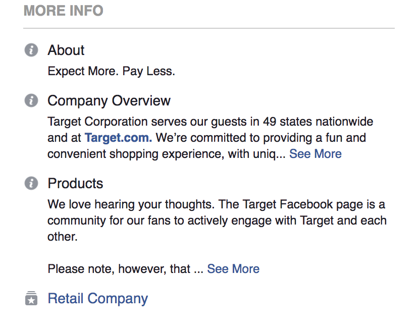
Target, for instance, has About, Company Overview and Products:
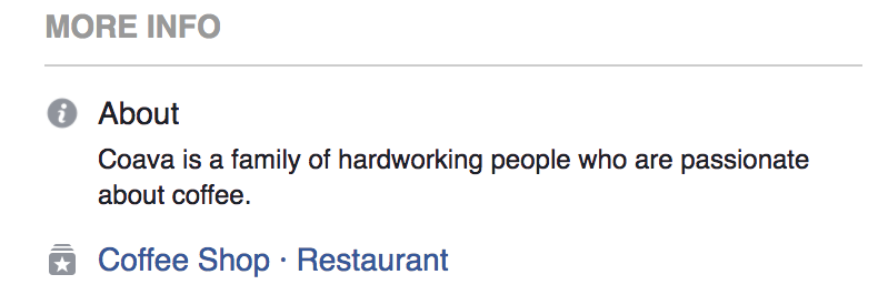
On the other hand, Coava has a simple About section:
Like I mentioned, your page category will determine what you can add.
Whatever you include, make sure that it ties in with your brand. Think of your Facebook page as one unified landing page. Everything should be consistent.
Having a bad About page can be a deal breaker. Optimize your About page and you’ll see some great results.
3. Your sidebar tabs
Having eye-catching sidebar tabs is the icing on the cake, when it comes to Facebook page optimization.
This little section can make a big difference in how people interact with your page. It can turn good engagement into great engagement.
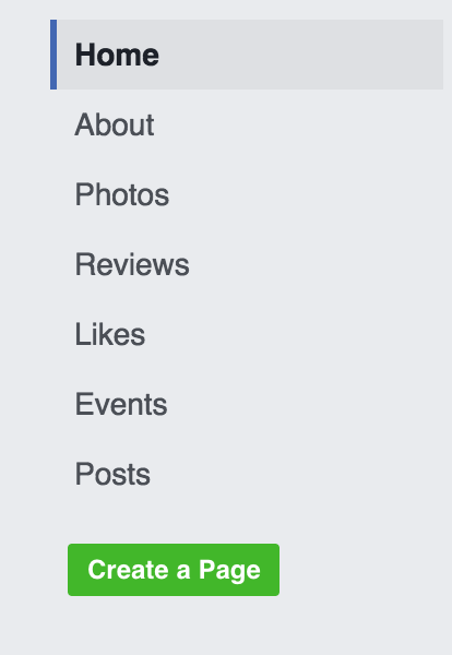
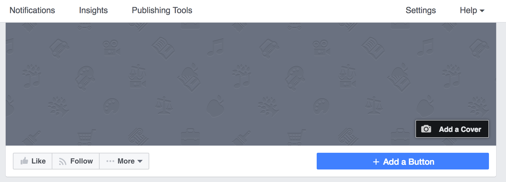
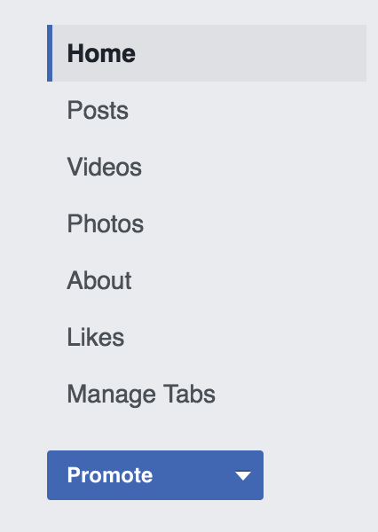
The usual sidebar tab section looks something like this:
You’ve most likely seen this section before. And, if you have, you know that this is the standard Facebook sidebar. There’s nothing wrong with that, but it’s not the best it could be.
Facebook allows you to make custom tabs that give your page a unique twist.
You can use these tabs to get people to sign up for your email list, enter a contest and almost anything else you can think of.
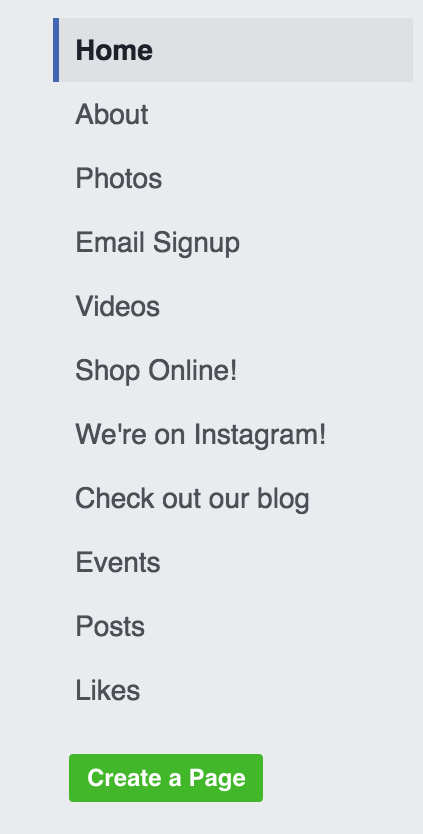
Let’s take a look at Coava’s tabs:
This is an awesome use of tabs to take a page to the next level. If someone is browsing Coava’s page and wants to perform a specific action, they can do so right from the tabs.
Think about the benefits: You can essentially cut out an entire step (or more) from your user’s journey. You’re making it super easy for them to take whatever action you want them to.
There aren’t enough companies thinking about the effect of sidebar tabs on their Facebook pages and that’s all the more reason why you should.
Let’s say that you want to add a sidebar tab that will take readers to a blog on your Facebook page. (To create other sidebar tabs, you’ll go through a similar process.)
First, you’ll want to find an app that does what you want. Here’s a list of 25 apps to get you started.
In our case, we’ll use Facebook’s Notes app to create a blog.
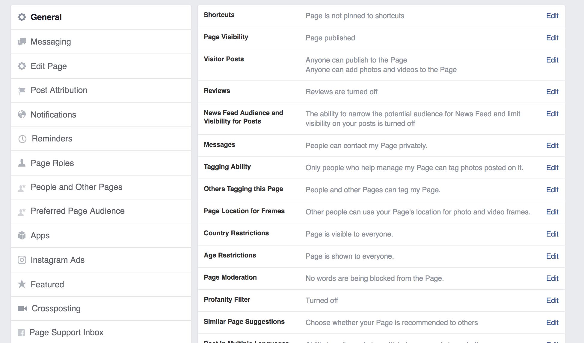
Click “Settings” at the top of your page.
It should look like this:
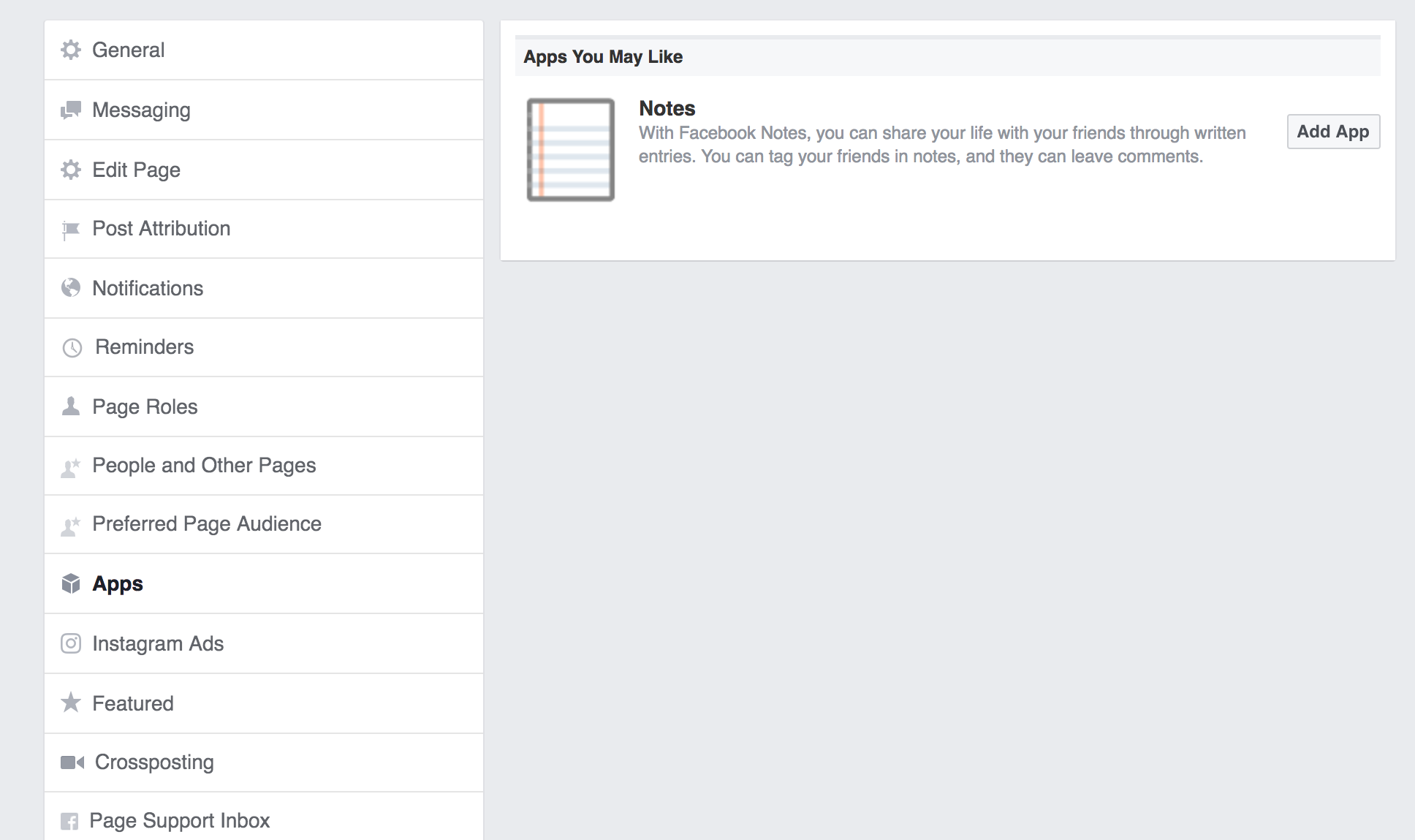
Click on “Apps” in the left sidebar. You’ll see the Notes app in the right hand pane:
Click “Add App.”
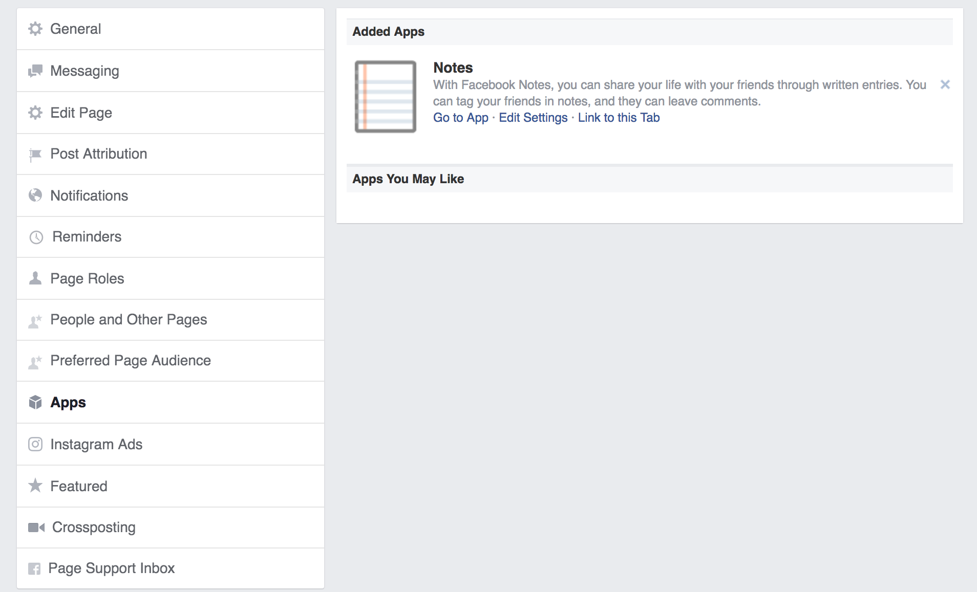
Once you’re done, you can refresh the page and edit Notes by clicking “Go to App.”
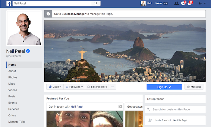
Head back to your page and click “Manage Tabs” in the left hand sidebar.
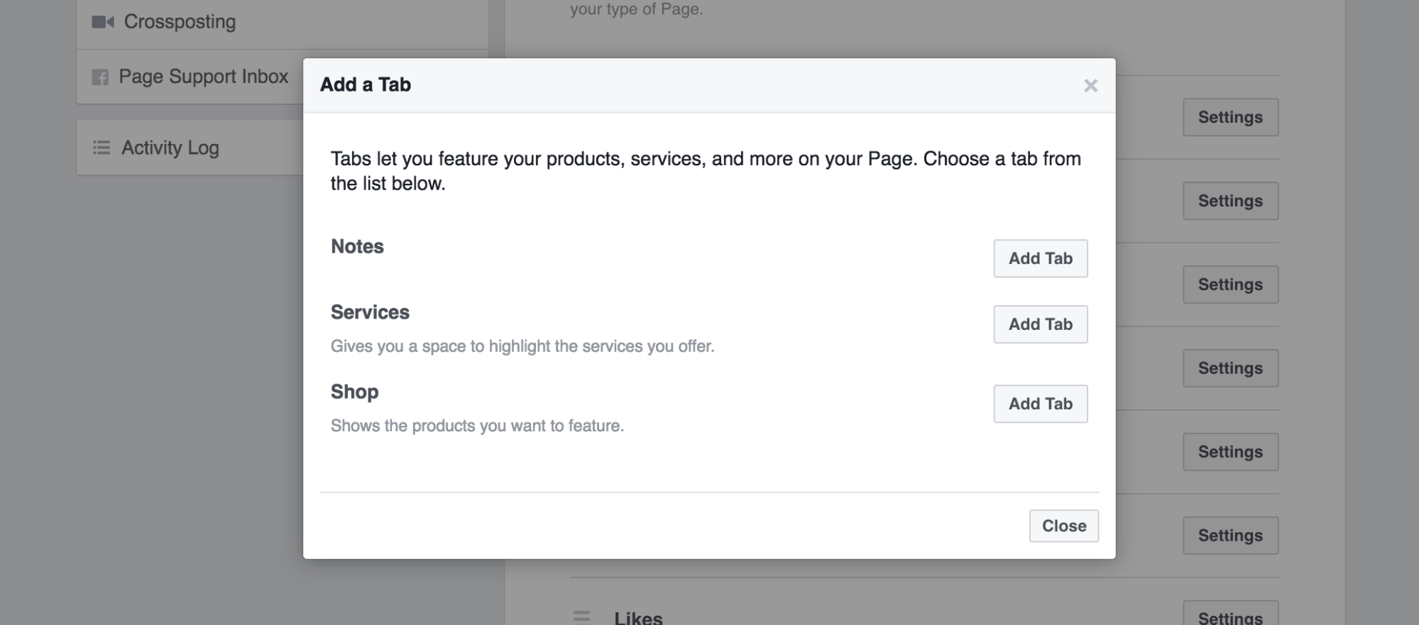
On the next screen, scroll all the way down and click “Add a Tab.”
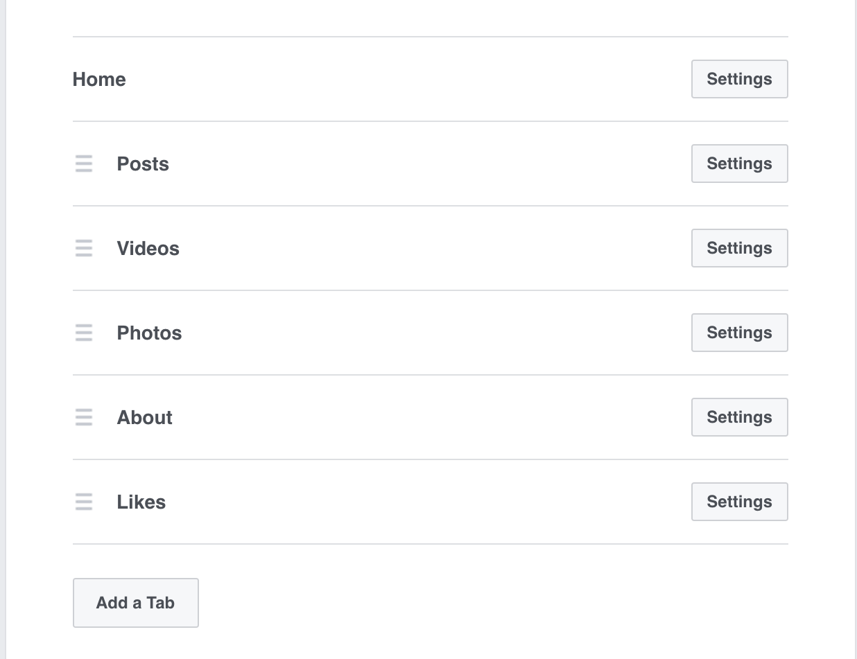
Hit “Close” to exit the menu.
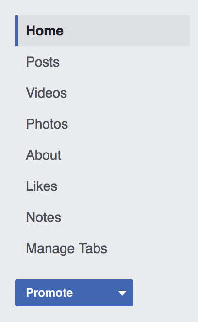
When you visit your page, you’ll see a new sidebar tab:
There you go! Now you’ve got an easily accessible sidebar tab.
There are lots of popular services, like Shopify and MailChimp, that work with Facebook.
Dig around for a little bit and you’ll likely find that the services and tools that you use now will seamlessly integrate with your Facebook page.
The sidebar tabs are small additions, but they make a huge difference. You’re making your user’s journey a whole lot easier and, as a result, you’re making the converting process easier.
Conclusion
Marketers often think that ads are the best way to utilize Facebook. I happen to think that Facebook ads are a phenomenal way to use Facebook.
However, your Facebook page itself has to shine, otherwise your ads will fail.
Your Facebook page is what will determine your success on the platform.
It’s a vital part of your overall digital footprint. If your page isn’t optimized, you won’t get the kind of results you want.
I’ll be honest––sometimes it’s hard for me to tell two Facebook pages apart. They all look the same after a while. But, when one stands out, it really stands out.
Your page has to be one that really stands out. Otherwise, it’ll get lost among the millions of other Facebook pages.
I tell people all the time how powerful an excellent Facebook page can be. The problem? Most businesses don’t take the time to make their page excellent.
Your Facebook page can serve many purposes. It can send people to your website or persuade people to follow you or share your content.
Optimizing your page increases the chances of those things actually happening.
Don’t underestimate the power of a well assembled Facebook page.
What are your favorite Facebook page tricks for increasing engagement?

Comments (66)