With so much attention spent on landing pages, it can be easy to forget about one of your most important pages – the pricing page! It’s not just your pricing strategy that matters, but also the design of the page.
In this article I’ll go over some of the keys to a good pricing page. There’s not a one size fits all approach, so it’s important to test and see what works best for you.
Highlighting One Option
Go on almost any pricing page and you’ll see an option (usually in the middle or end) that highlights the most popular plan. What’s the reason behind this?
Roughly five years ago, a case study was presented that showed:
- By highlighting the profit maximizing plan on your pricing page, you would attract more visitor click-throughs and therefore generate more revenue.
- If you “snuck” your most profitable plan in the middle of your pricing page, visitors would most likely pick the middle option because that’s where they generally click, on average.
So where’s the link to this case study? I couldn’t find it and it really doesn’t matter. The reason why is because you should be testing your own pricing page like crazy! Don’t just copy what other companies are doing. You need to be collecting your own data and testing your own pricing page.
Here’s what you should be doing:
- Determine your profit maximizing plan. You may have to test your pricing page to figure this out. This will require a lot of iteration and is most likely non-linear.
- Test the price of your lower and higher end plans. This will also affect the outcome of your click-throughs.
- Test the order and location of your profit maximizing plan.
- Test the number of plans you offer.
- Test colors, calls to action, font size, and just about everything on the pricing page.
- Consider testing trust elements, testimonials, and even videos.
That’s a lot of testing right? Well it IS one of the most important pages on your site isn’t it?
What if we don’t get enough daily traffic to test?
This does present a bit of an issue. The answer is to test bold changes, don’t focus on minor changes. Use revenue at your indicator (not click throughs).
Make The Pricing Page Easy For Users
Imagine that you’re a first time visitor going to your pricing page and you have no idea what you exactly want. Wouldn’t a suggestion help?
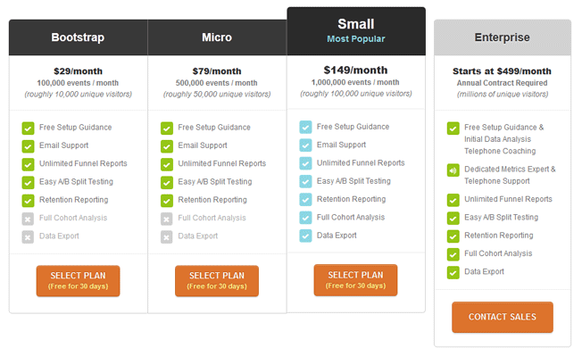
A nice overall layout with the most popular plan clearly visible.
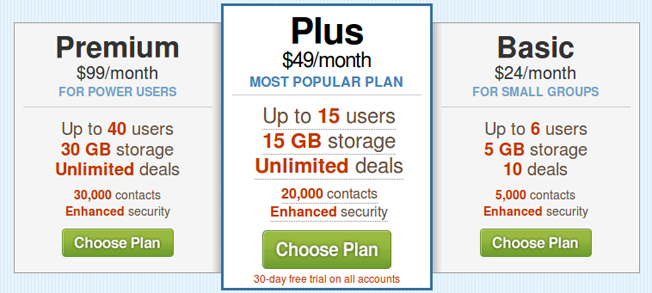
It doesn’t have to be the most expensive option either. Take a look at 37signals’ Highrise pricing page:
It’s in the center, larger and highlighted.
Notice the language they use on the highlighted plan: “the most popular plan”. By using language that makes it easy for the visitor to choose, your pricing page copy can help increase click-throughs on your profit maximizing plan.
It may not be as effective if there’s 10+ plans or if it’s a specific plan where the user knows what he/she needs. Mailchimp is a good example of this:
The user already knows how many subscribers they have, so there’s no need to decide or mull over a plan.
This isn’t just reserved for web companies. Some restaurants will display their most popular items. Banks will show you their most popular plans to assist you in selecting a plan.
Assuring the Buyer
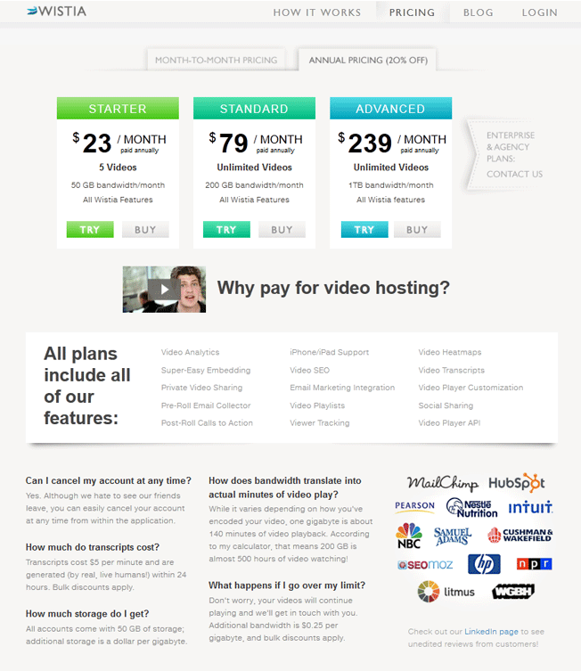
If you’re a startup, it’s very important to show the credible companies that you’ve worked with. Other positive reinforcements like a security seal, number of customers served or a money back guarantee can help. Wistia’s pricing page is one of my favorites:
They feature the logos of companies they’ve worked with as well as a link to their unedited customer reviews page. They also feature common questions and the accompanying answers. As an added bonus, they answer the prospects main hesitation: Why should I give you money when YouTube is free? With an answer from a customer, not Wistia. To finish it off, they added a “Ask a question” widget to make it easy for the prospect.
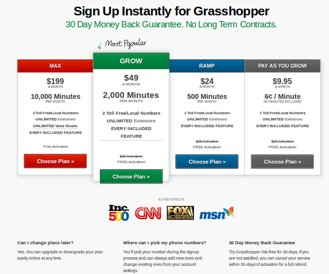
Here’s one from Grasshopper
Their headline emphasizes a free trial with no contracts. Below the pricing, you’ll see where they’ve been featured.
The main takeaway is that you want to assure the buyer that their security is taken seriously by featuring your credentials and removing any risk. Almost all SaaS companies offer a free trial, so what can you do to give the prospect assurance with your brand?
Make it Easy
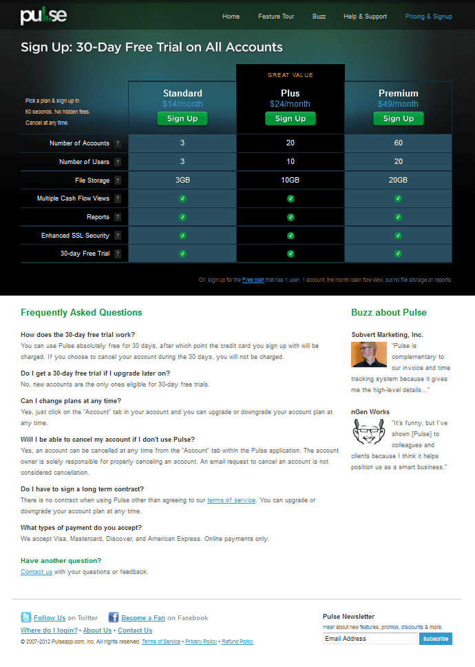
Make it easy to compare options, to see common questions, to see who your customers are, easy to understand pricing, etc. It also means a simple web design. Take a look at Pulse’s pricing page:
The options are easy to compare and the FAQs are placed below. If one of their questions isn’t answered, Pulse makes it easy to contact them. Be sure that you also let the prospect know how long the signup or set up will take. Many pricing pages include notes like “Signup in as little as 30 seconds” and “Get started right away”.
There’s a mantra in web usability that says “Don’t make me think!” It’s important to have an easy to use website that is clear to the user. It’s the websites job to adapt to the user and speak their language, not for the user to adapt to the website and learn how to navigate the website. There are no flaws in simplicity.
Being clear throughout your funnel is key. Messages that are clear from the ad to the landing page have had strong conversion rates.
Call-to-Action
The call to action button is important and not something to be taken lightly. Test different messages like ‘Choose Plan’, ‘Add to Cart’, ‘Buy Now’ or ‘Get Started Today’. Always be testing to see what works for you.
Put your pricing out there in a simple format, assure them of their security and then let them decide if they want to do business with you. In the end, it’s their decision. So don’t get in the way by complicated pricing or a skeptical looking website.
A few final takeaways:
- Test your pricing page! Don’t copy from other companies because you’ll end up losing revenue.
- It sounds obvious, but remember to keep your pricing options above the fold.
- In general: unnecessary cells on your pricing page increase the chance of losing customers at sign up. By having too many choices, customers tend to make no choice at all.
- Lessmeeting is just one company that had success by simplifying their pricing page.
- Ash Maurya improved his conversions by having a simple pricing plan with Cloudfire.
- “Putting the highest price to the left is the way to go, because of buyer psychology. The first
price we look at is one the left, it sets the value point for the rest of the page.” -Scott Miller
You don’t see this very often, but Vidyard follows this methodology:
Do you have any tips or suggestions regarding pricing pages? Let’s hear them in the comment below!
About the Author: Zach Bulygo is a content writer, you can follow him on Twitter @zachcb1.


Comments (10)