As you know, landing pages are the perfect tool for getting a segment of targeted traffic to focus on one action. But most websites are severely underusing landing pages as a tool to convert everyday traffic into leads, followers, fans, and (even more engaged) customers.
Here’s the problem:
Most websites have “leaks”, or areas where the most obvious next move for a visitor is to leave your website. This is not the best outcome for you, because most of the time there is still an opportunity to engage that visitor further.
The solution to this problem is a dedicated landing page for every type of traffic you generate. These landing pages will talk directly to each kind of visitor you get – whether they are coming from social media, Google, a product page, a blog post, or something else – and offer them a customized next step that will keep them engaged with your website and business.
Here are 7 types of landing pages that anyone can use to make their website stickier:
1. Email List Opt-In Landing Page
Did you know that one of the most effective spots to place an email opt-in form is not on your home page, not in your side bar, and not on your blog? (Although, opt-in forms in these places are helpful, too).
The most effective place to put it is on a dedicated landing page.
Creating an email list opt-in landing page gives you the room you need to tell people why they’ll benefit from giving you their contact information.
It means you can focus your visitor’s full attention on signing up and, by removing all other distractions (like the navigation), you’re forcing them to choose: opt-in, or miss out.
How to set it up:
Creating an effective email opt-in landing page is pretty straight forward.
Start off with a strong headline – something that features the benefits you’re about to offer.
Then you’ll want to flesh out the details: what do people get in exchange for their email address? Is it a weekly newsletter (like our example above)? Or maybe you’re offering some type of free download, like an eBook or special report.
If you are offering a free download, consider creating an image for it (aka digital packaging), to give your page some visual appeal.
And finally, the most important piece: your opt-in form.
Your form should be short and simple for optimum results. The fewer fields you include, generally the better your conversion rates (there are of course exceptions, so it’s a good idea to test). It’s also important to create a strong call-to-action for your ‘submit’ button – try something other than “subscribe”.
Instead give variations like “Get your free eBook now” or “Send me my stuff” a spin.
2. Content Guide Landing Page
Inbound marketing – and pretty much any online marketing period now – is all about content.
If you blog, vlog, or create free info products for your audience, you can get even more value from that content by organizing it on its own landing page.
Think about it: your blog is great for featuring your latest posts and, sometimes, there’s a search feature so readers can look up topics of interest. But a lot of your great content from way back is probably getting a little dusty from lack of attention.
You can easily remedy this problem and give your visitors a world-class tour of your best stuff by creating topic-specific content landing pages.
How to set it up:
This is probably one of the easiest landing pages to make.
Decide which topics you’ve you want to feature, then create a landing page for each one. Include a short introduction to the topic and then link to each post/video/download you’ve created on the subject.
That’s it. Now promote your content landing pages by linking to them from your website, social media profiles, and emails.
3. Start Here Landing Page
Your website performs a lot of duties for your business: it tells people about your brand, let’s them get in touch with you, offers information, sells your stuff, and more. So when someone lands on your website for the first time, there are multiple directions they can go in.
But the direction they choose isn’t always the best one. They might land on information they aren’t interested in or be put in front of an offer that have no desire to take (yet).
But what if you could custom create an experience aimed just for first-time visitors? An experience that will give them the ultimate first impression of you, and show them all the info and links they need to get the most out of their first visit.
A “start here” landing page can do all of that.
How to set it up:
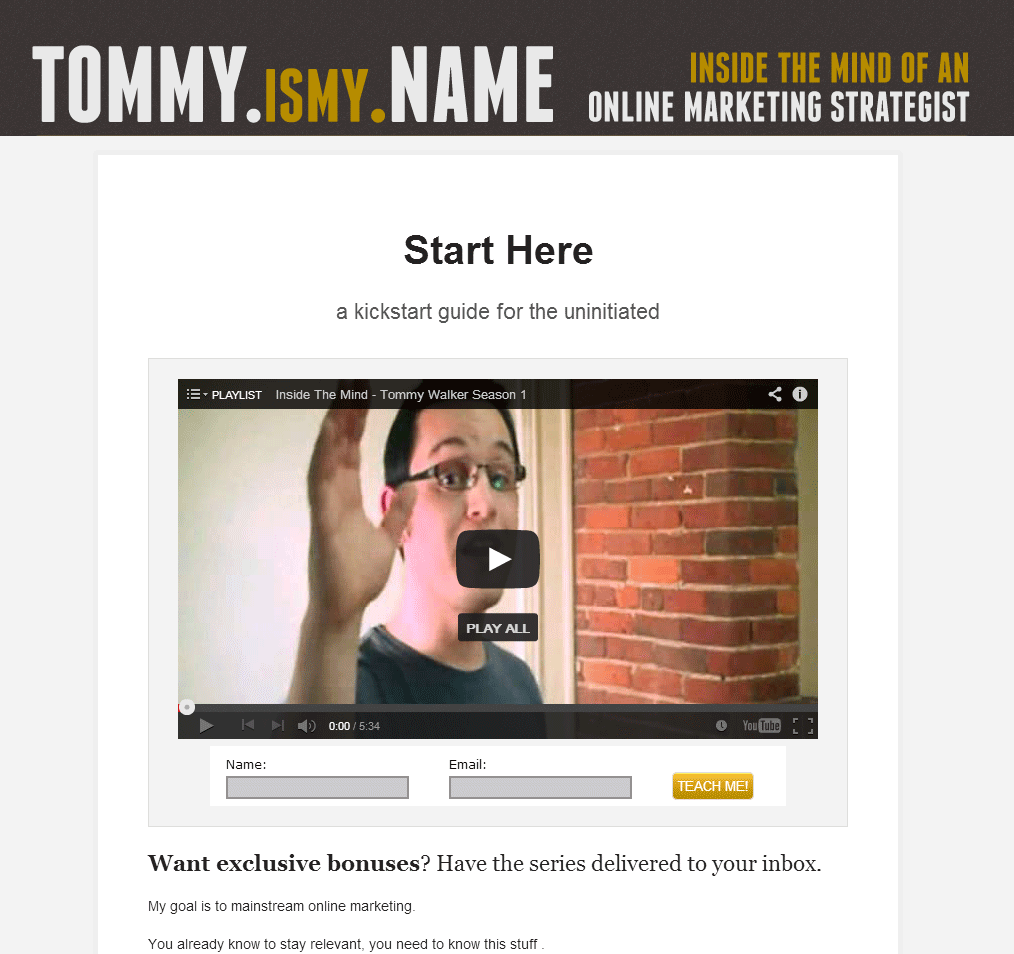
A “start here” landing page is often included in the navigation so new visitors can easily find it, no matter where they enter your website.
The page itself generally includes a welcome note or introduction, filling people in on what’s so great about your website and business, and giving them a hint of the cool things they’ll discover.
Some, like the example above, include a welcome video.
After you’ve made your introduction, it’s important to point first-time visitors toward the information and pages that will be most relevant to them. Should they check out your email list and free offer? Do you have a blog post that’s always a hit with first-timers? Should they look through your FAQ’s?
Link to the appropriate pages, and remember to give strong calls-to-action so your visitors know what to do next.
4. Coming From [social network] Landing Page
When you find someone interesting on Twitter and click on their website link, where do you end up?
Most of the time, you end up on their homepage. Which is okay. But it’s not great.
The homepage is rarely the best place to send any traffic; the more customized you can make the experience, the better.
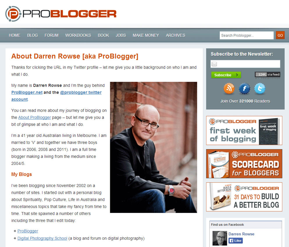
When I clicked on ProBlogger’s URL in their Twitter profile, I landed here:
This page feels personal. It addresses where I’m coming from and provides the information I most likely want (background info, what they’re all about, how to get in touch).
How to set it up:
If someone follows you from a social networking profile, you want to take that interest and turn it into something long-term. Serve up the information they want, and then give a relevant call to action (ask them to get on your email list, subscribe to your blog, or connect with you in some way.)
5. Guest Post Landing Page
Guest posts do a lot of wonderful things for you and your website. But probably the most valuable thing is the traffic they can send your way.
But if you’re not actively directing that traffic to the right spots, you’re missing out on most of the value (like getting more email subscribers).
If you’re like most guest bloggers, you use that precious little byline link to send people to your home page.
Your home page is absolutely not the best place for these visitors.
You’ve built up a lot of momentum by delivering a valuable post that they loved (if they didn’t, they probably wouldn’t be reading your byline). You want to keep that momentum going and use it to build an even stronger connection with this person – not kill it off by sending them to your homepage where they have to decide for themselves if you have anything else to offer them.
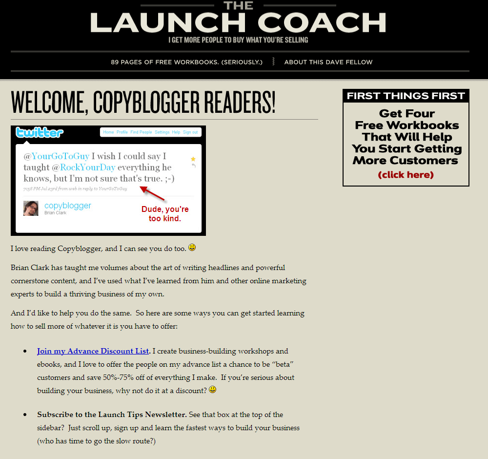
Use a custom guest post landing page to carry the conversation from the host blog to your own website, like this page from thelaunchcoach.com:
How to set it up:
The most important thing your guest post landing page does is maintain a consistent vibe for your readers. You want this page to feel really relevant to whatever your visitor was just reading.
The example above does a great job of this by welcoming his visitors using the name of the blog they came from and transitioning the conversation from that blog (and the post’s topic) over to the other things his website offers, like his Advanced discount mailing list. (For another example of a guest post landing page, check out the call to action link in my own bio below this post).
6. Thank You Landing Page
One of the biggest wasted opportunities on your website is the Thank You page.
This is the page people are redirected to after they opt-in to your email list, sign up for an event (like a webinar), or purchase a product.
A thank you page usually consistent of the obvious: a thank you message. And nothing else.
When you land on a page like that, there is literally nothing left to do but leave. This is a massive waste of some of your most valuable, targeted traffic.
Anyone who lands on your Thank You page has indicated that they are interested in what you offer to some degree. At that moment, they are highly engage with your business, and it’s the perfect time to push that relationship a little further.
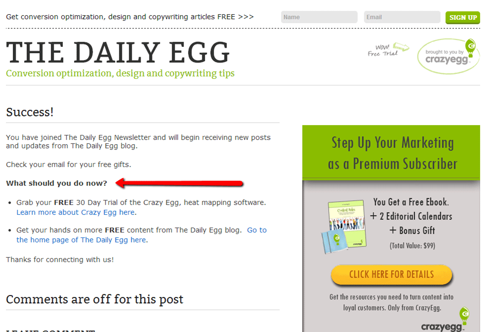
Take a look at this Thank You Landing Page from the Daily Egg, which I was redirected to after subscribing to their newsletter:
Notice that little section titled “What should you do now?” It’s giving new email subscribers an easy and compelling way to get more involved with the company.
They are capitalizing on the momentum that new subscriber has by making an additional offer.
How to set it up:
In the case of our Daily Egg example, the additional offer they made was for two other free opportunities. It’s important that your additional offer lines up with the action your visitor originally took.
So, since I had just opted-in to their free newsletter, Daily Egg presented me with some more free options (one of which – the free product trail – happens to lead directly to a paid conversion opportunity).
A Thank You landing page that follows a purchase might include an offer for another product at a special discount. Or maybe you give a social share call-to-action after someone signs up for your free webinar.
More ideas: ask people to fill out a short survey, provide some feedback, check out your most popular blog posts, or follow you on a social network.
7. Unsubscribe Landing Page
Admit it: when someone unsubscribes from your list, it hurts a little.
But just like most relationships, an email list break-up can often be salvaged on some level. But not if you’re giving your former subscribers the cold shoulder with a generic, indifferent “good-bye” page.
Have you actually looked at the page your readers are redirected to after unsubscribing?
Most email hosts (like Aweber and Mailchimp) have boiler-plate templates for this page that unsubscribers are sent to automatically. But you can switch it out for your own custom page, and you really should. Here’s why:
When someone unsubscribes from your list, they may just totally hate hearing from you. But more likely, there’s still a small attraction to your content and your business. So give them other options.
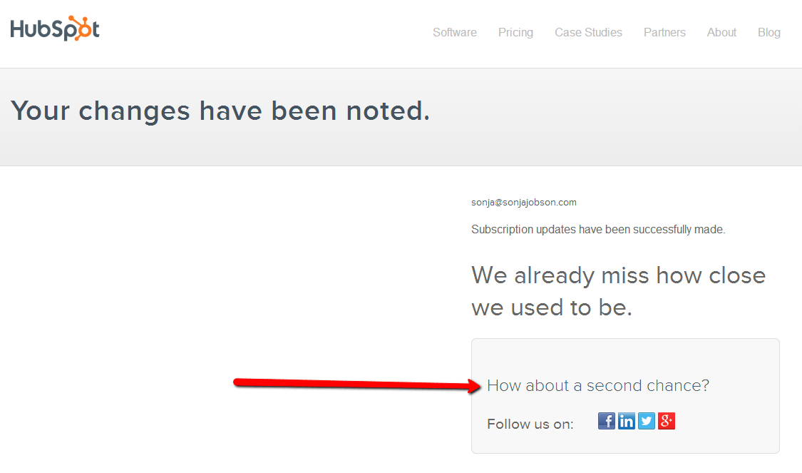
Check out HubSpot’s unsubscribe landing page, where they ask deserters for a second chance by connecting on a social network:
How to set it up:
Maybe getting your weekly newsletter is too much for them: would they be happier just receiving your special announcements?
Maybe your stuff just isn’t relevant enough right now to justify a spot in their clogged up inbox: would they like to stay connected on Twitter or Google+ instead?
Acknowledge their desire to break ties, but let them know how much their attention means to you. Give them quick and easy options to adjust their level of interaction with your brand without completely moving on. And of course, always give a clear and easy way to totally unsubscribe from your mailing lists for those that are truly set on leaving.
If you remember one thing, remember this:
Landing pages are focusing agents. They help you accomplish one, specific goal – whether that goal is selling something, growing an email list, spreading brand awareness, or something else entirely.
For optimum ROI, you should connect each and every traffic generating opportunity to its own dedicated landing page.
Because, really, why would you send anyone to your homepage when you could give them a warm, conversion-optimized welcome that will result is more business growth for you?
About the Author: Sonja Jobson helps small business owners and entrepreneurs become incredible on the internet with content marketing.
Comments (54)