If you’re like most owners of e-commerce companies, just thinking about writing your “About Us” page is enough to make your head spin, your knees buckle and cause you to take to your bed for a week – or even two – with a cold compress.
OK, maybe that’s a bit of an exaggeration, but crafting a powerful pitch and a compelling story ain’t easy.
That’s why it’s important to keep in mind that you only have one chance to make a great first impression – one chance to build a relationship with your customer and gain his or her trust.
The About Us page of your online store is extremely important and if you use it right, it will help you increase sales. E-commerce shoppers want to know more about who they’re buying from and the only place they’re really going to get that information is on just one web page – your About Us page.
The bottom line: People want to buy from companies they trust – companies that tell their honest stories and show why they stand head and shoulders above the competition.
These 10 tips will help you craft a sizzling e-commerce About Us page so you can stay ahead of the pack.
1. It’s Your story, So Tell It – Honestly
Your customers want to know what your e-commerce company is all “about,” so your About Us page should tell them what you do and why. Give consumers the information about your company in a compelling, yet honest way. Make them laugh . . . or cry. Let your customers know where you’ve been, where you are and how you got there. What problems did you face? How did you overcome them?
Don’t forget to explain to consumers how your e-commerce company solves their problems. Keep in mind that it’s not important to detail your top company values or your mission – but you can talk about your goals using easily digestible language. Tell customers about the products you currently sell and your plans for the future of those and other products. Remember, just be real. If consumers believe in your story, then they’ll become your customers. They’ll buy your products, listen when you have something to tell them, and recommend your e-commerce company to their family and friends.
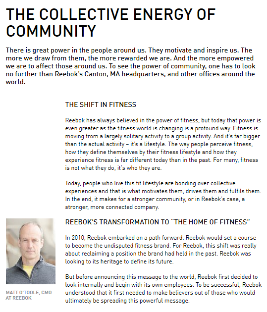
Here’s how Reebok tells its story:
2. Find Your Voice – And Use It Consistently
Finding your tone of voice really has nothing to do with what you have to say, but rather how you say it. It’s the words – 50-cent words or $5-words, your choice – and how to you construct your sentences. Your voice and the words you choose offer your potential clients a window into your personality. The copy for your About Us page should be clear, consistent, distinct and, of course, relevant to the people you want to convert into paying customers. But that voice has to be consistent with the voice you use on the rest of your website; when you write emails; and craft press releases, white papers and other content.
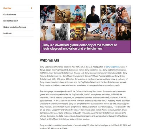
This is Sony’s story in its own voice.
3. Plug Your People
Customers want to know the names and faces – so include their photos – behind the companies whose products they buy. Who’s on the team? What do they do? What are their backgrounds? What are their qualifications? Do they belong to professional organizations? Have specific product-related certifications? These things let consumers know that they can trust the people behind your product.
To keep those bios interesting for your potential buyers, you can also offer some offbeat details about your team. For example, is your marketing manager a champion ballroom dancer? Is your CIO a whiz at solving the Rubik’s Cube?
4. What Your Fans Are Saying
In the B2B world, customer testimonials can be very effective additions to your About Us page to help you build rapport with potential clients. Certainly, for SEO purposes, it makes sense to have a separate page dedicated to the good words your favorite customers have to say about your company. However, it’s still a good idea for your potential customers to see your B2B e-commerce in a positive light when they’re reading your story. So let them hear from one or two of your best clients – it could help turn them from potential customers in paying customers. You can also put links to any awards your company has received.
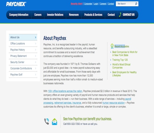
Paychex, a provider of payroll processing services for business, has links to information about the recognition it has received on the right side of its About Us page.
5. Illustrations, Photos, Videos – Oh My!
Instead of just crafting an About Us page that’s purely text, jazz it up a bit. Try adding illustrations, videos about your product (s)– video is even a great way to feature a customer testimonial – and photos. Pull out a quote from your customer and feature it prominently on the page. Be sure to integrate these elements in a way that makes sense and enhances your story. Don’t just throw up some pictures for the sake of adding photos.
B2B company Fastenal, a distributor of industrial, safety and construction supplies, includes a video on its About Us page.
6. Keep in Touch
Always include a way – or two or three – for your customers to get in touch with the right people in your company. Include names; email addresses; department information; as well as office and mobile phone numbers so buyers can call rather than send emails if they need fast answers.
Williams-Sonoma includes a slew of information for customers, including a link to contact information, on its About Us page.
7. Follow the Social Media Icon Buttons
By including social media icon buttons for sites like Facebook, Twitter, and LinkedIn on your About Us page you can enable users to help promote your business on social networks and generate some buzz. Customers expect to see this information on the page that talks about your company. So, even if you include these buttons on other pages, you should add them to your About Us page, as well.
Office Depot includes social media buttons at the bottom of its About Us page.
8. Don’t Play Hide ’N Seek
Make your About Us page easy to find for people. They shouldn’t have to search high and low for it. Of course, you have to balance the need to make sales with your company information. So design your homepage to feature your current promotions, and links to your products and services, but be sure to add a simple link to the About Us section. It could be at the top of the page – right or left, in a left-hand navigation column or even at the bottom of the home page. Just remember not to hide it.
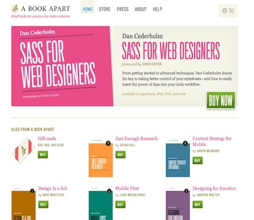
A Book Apart prominently displays its About page at the top of its home page.
9. One Size Does Not Fit All
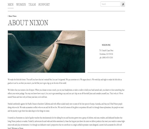
There is no template or sample About Us page. Why? Because no two companies are alike. So stay off the search engines. Even if there was a template, why would you want to craft an About Us page that’s the same as the About Us pages of a million other e-commerce companies – boring. Your About Us page should reflect the personality of your company.
Watch company Nixon Inc.’s About Us page is all about its personality. The first sentence says it all.
10. Update, Update, Update
One of the worst things that can happen is for your potential customers to get information that’s outdated or no longer accurate. The info on your About Us page should also match up with your messaging and your products. Take some time every couple months to check that the details on your About Us page are still applicable and correct.
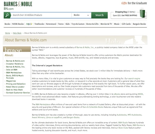
Barnes & Noble.com has embedded links to some of its product pages in the text on its About Us page. The information on those pages must be constantly update to ensure the accuracy of the products that are displayed.
More Examples of Groovy “About Us” pages.
Recently, SearchEngine Journal looked at the About Us pages of 25 creative and engaging e-commerce websites.
Here are the About Us pages of three of those companies.
BodyShopBids (now Snapsheet)
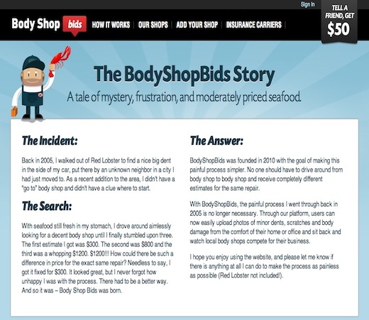
As SearchEngine Journal notes, the personal anecdote is a fun way to tell consumers how the company was founded. The company’s owner had a problem – one most of us can empathize with – and he wanted to ensure that no one else would have to endure such a painful process. And as he says, “Body Shop Bids was born.” He carries the tie in to Red Lobster from the beginning of his story to the very end. Not to mention that the little mechanic guy at the upper left is waving a lobster around. Such fun. “That all makes for one of the most relatable About pages out there and helps to establish an emotional connection,” according to the article in SearchEngine Journal.
If you visit the company’s About Us page, you’ll meet the management, the team and the board. Then if you click on the photos of the management and the team and you’ll see a pop-up window with their bios. They’re hysterical. No bios of the board, however. But they don’t run the day-to-day operations so that’s not really important.
Here’s an example of the bio for Matt Pulley, the VP of Technology.
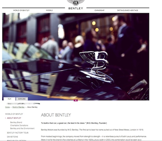
Bentley Motors – yes, that Bentley Motors.
A sleek, elegant About Us page that’s pleasing to the eye – just like the prestigious Bentley itself. As SearchEngine Journal rightly notes, the image is absolutely stunning. And if you click on the links in the navigation bar below the photo, you can learn more about the company, its charitable endeavors, its factory tours and you can also read the latest news.
Yellow Leaf Hammocks is out to change the world with its hammocks. On its About Us page, the founders use incredible word images to tell you just how they plan to reach that lofty goal. According to the About Us page, every Yellow Leaf Hammock is 100% handwoven by hill-tribe artisans in rural northern Thailand. Weaving these hammocks enable the weavers to earn a good living for their families.
The page also offers some fun facts about the company’s co-founders – “two crazy kids who get a kick out of calling themselves ‘hammock-preneurs.’”
But it’s not all about fun – the story of how co-founder Joe Demin discovered the hammocks – and the data the owners offer about poverty in the area where the weavers live – should be compelling enough to get you to buy a hammock.
Check out SearchEngine Journal for a look at the other 22 super-cool About Us pages.
Finally, if you follow these 10 tips and take a page (pun intended) from this peachy-keen About Us pages, you’ll be showing the world the awesomeness of your e-commerce company in no time.
About the Author: Linda Rosencrance is a freelance writer/editor in the Boston area. She has written about information technology for over 15 years. Her articles have appeared in such publications as Computerworld, ITWorld, CIO magazine, Tech Target, MSDynamicsworld.com and others. She has over 20 years experience as an investigative reporter, writing for many newspapers in the metropolitan Boston area. She is also the published author of five true crime books.






Comments (11)