It’s easy to make a confusing website. It’s hard to make a simple website.
The things that we create — websites, user interfaces, business plans, articles — are the product of our minds. How we think impacts how our product looks, feels, and functions.
When making a website, things can get dicey. So many different groups are providing their input, making requests, asking for changes, insisting on features, and making the whole thing pretty darn complicated.
By the time the website gets to the end user, the website a hopeless, confusing mess.
It’s time to change all of that. The KISS rule helps to stamp out confusion and turn your website into a simple, seamless, powerful, well-oiled machine. (Your users are going to love you.)
The Surprising Truth About Simple Websites
First off, let me whet your appetite for simplicity.
You’ve probably heard that smart people love simplicity.
Einstein, who discovered that E=mc2, was a major fan of simplicity. There is nothing simple about mass-energy equivalence or special relativity, but Einstein was able to express it in five characters.
What does Einstein have to do with your website?
It’s simple. You can distill the complexity of your website into something way more simple. Humans love simplicity. Our brains are wired to love simplicity.
Simplicity Makes People Happy
In one study, scientists asked subjects to pick up a two types of objects: easy-to-hold objects (simple), and hard-to-hold objects (complicated). The subjects were hooked up to electromyographic equipment to measure facial response to the objects. Scientists found that the easy-to-hold objects made people smile slightly. In other words, simple objects made people happy.
Simplicity Makes People Think Better
Another test discovered that simple fonts and print helped people reason more clearly. The more complicated or hard-to-read the font, the harder it was for subjects to process information and impaired reasoning skills. Another way of saying it is that simplicity makes people smarter.
Simplicity Makes People Spend Money
A final study should convince you. Yale researchers in partnership with Stanford and University of Michigan scholars wanted to find out if people were more likely to spend money in response to complicated descriptions or simple ones. As you would assume, the simple options won. If consumers felt that an option was simple or easy, it made them more likely to spend their money.
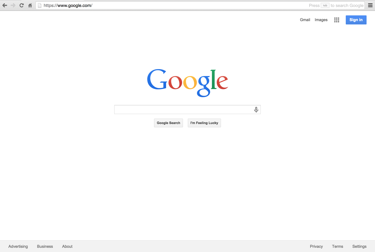
Google’s research discovered that simple websites — those with low visual complexity and high prototypicality — were much more appealing than complicated websites. One of the most surprising findings of the study was that people can tell whether a website is simple or complicated in 50ms (just .05 of one second).
Maybe that’s why Google, the most-visited website on the planet, is also one of the simplest websites on the planet.
Yep, that’s it — the most popular website of all time:
The concept behind simple websites is cognitive fluency. Cognitive fluency is “a measure of how easy it is to think about something.”
As you’d guess, we like to think about things that are easy to think about. Our brains get tired easily. If there’s an easier way to think about something, we choose it.
Take a simple example: Stocks with easy-to-pronounce ticker symbols outperform those with hard-to-pronounce ones. BABY is going to perform better in the stock market than, say, JWXEV based on the name alone.
In the face of such evidence, why would you not make your website simpler?
Scientists can throw around terms like “cognitive fluency” and they can run complicated tests with electromyography. But me? I like to measure the stuff that matters to my business — dwell time, conversions, revenue.
Guess what. I’ve come to the same conclusions, with a sharper point. Simple websites convert better, too.
Let me say it as simply as possible: A simple website will make you more money. Period.
Here’s the Rule: KISS
KISS stands for “keep it simple, stupid.”
A less abrasive version is “keep it simple and straightforward.”
The idea has many iterations among engineers, developers, designers, architects, and programmers:
- Simplicity is the most important consideration in a design.
- It is more important for the interface to be simple than the implementation.
- Don’t repeat yourself (DRY).
- You aren’t gonna need it (YAGNI).
- Do the simplest thing that could possibly work (DTSTTCPW).
I prefer KISS.
Keep it simple, stupid.
Here’s How to Apply the KISS Principle
None of this matters unless you actually implement it.
Redundant acronyms aside, here’s how to do simple.
1. No ads. None. Period.
Ads on your homepage are a major no-no. Unless you’re running a site whose primary purpose is ad revenue, then ditch the ads completely.
Ads inject tons of complexity into a website. Only use ads if your business is ads.
2. Reconsider the Sidebar
Do you really need a sidebar?
Brian Dean, conversion guru, used Crazy Egg to discover that a paltry 1.9% of his visitors clicked on his sidebar.
This was a problem. Why? Because that sidebar was his conversion goal — a social squeeze page.
I’ve wondered if the sidebar — a fixture of most blogs (even one of my blogs) — is actually a distraction.
3. Make Your Homepage a Place of Absolute Simplicity
The page that matters most is your homepage. Your homepage should set the tone for the rest of the website — simple, clear, and free of distraction.
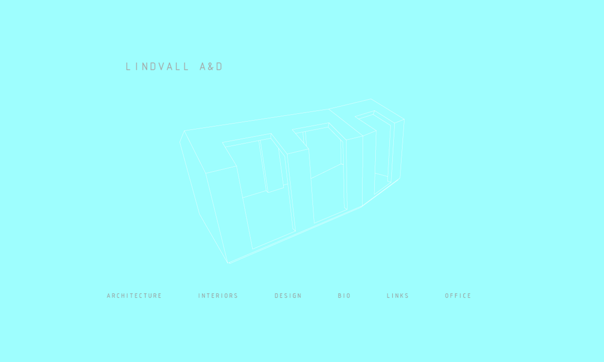
Look at the website of designer Jonas Lindvall. It takes minimalism to the nth degree, and showcases an extremely subtle design (look for it).
The beauty of the website is its simplicity. The user knows what they should do next.
4. Use Your Above-the-Fold Real Estate For One Thing
An easy way to apply the principle of simplicity is to think of it like this: What is the one thing I want the user to do when they are on this page?
If you were to ask people in your website what they want users to do on the website, you’d get tons of different responses:
- We want them to start a free trial.
- We want them to read the blog.
- We want them to enter their contact information so we can add them to the mailing list.
- We want them to find out about our team.
- We want them to click the “products” menu.
Clear the table and start fresh: What is the one thing that you want the user to do?
Find out, and then design the website around that one thing. You can still provide a menu, giving the user flexibility and option, but don’t force them to think hard. Give them simplicity, and they will be more likely to do what you want them to do:
I’ve tried to make my website, Neilpatel.com, very simple. There is a menu, but you have to scroll below the fold to see it.
5. Limit Your Menu to Seven Items
The short term memory can hold only seven items. To make your website as simple as possible, limit your menu to seven items or fewer.
Many websites try to give their users as many options as possible, but this only confuses them.
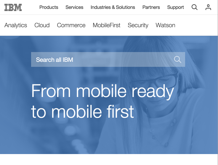
IBM, for example, has 11 menu items, plus a couple of other things I could click. That’s way too many.
Keep it simple, like this.
Four menu items. Much better.
6. Use Lots of White Space
White space, or negative space, is the area of your website that doesn’t have stuff — no menus, no text, no images, etc.
The space doesn’t need to be literally white. In fact, it can have a subtle design, like in the image above. The clouds and horizon are red-tinted, and they have texture. But it’s safe to call it negative space because it’s not an area of the page that is competing for the user’s attention and action.
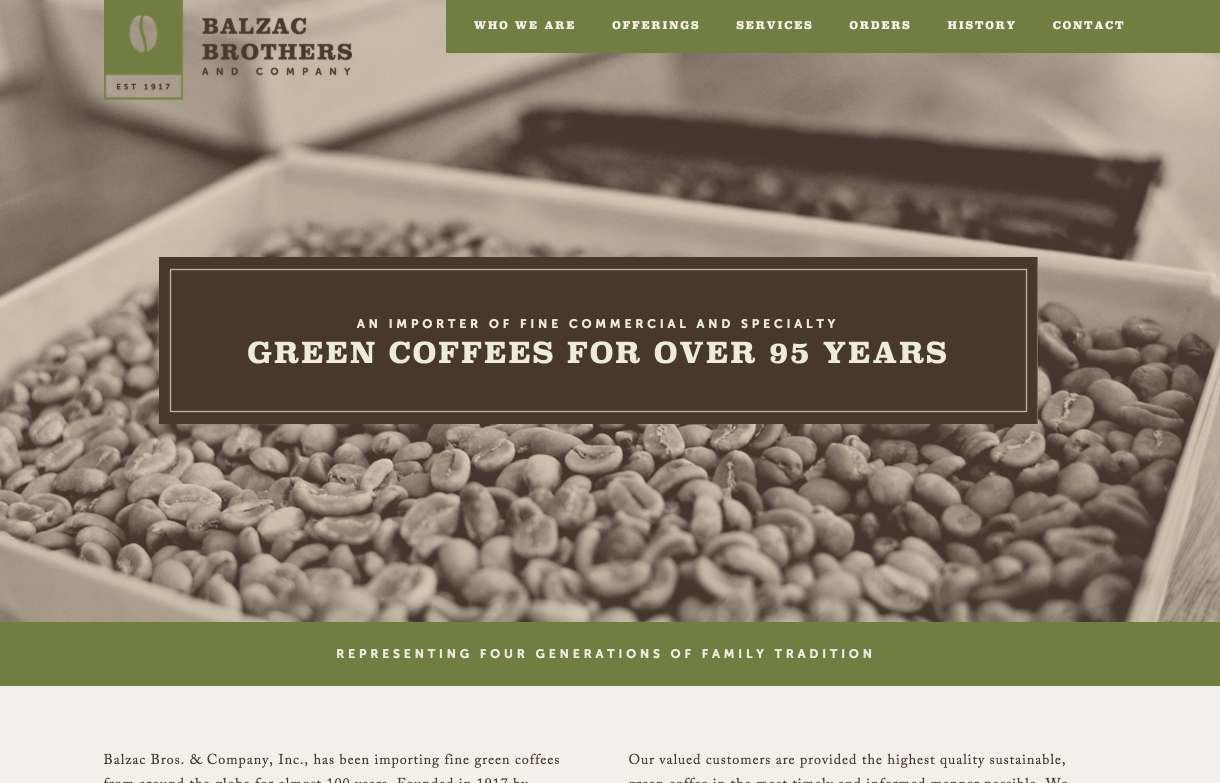
In the website image below, the white space would be the background image of the coffee beans. There is an image, but it’s not distracting. The website uses white space in order to create a sense of simplicity.
A site like the one below uses lots of negative space to focus attention on the central point of information.
White space is not wasted space. It’s a valuable ingredient in creating a simple and elegant website.
7. Make The Structure Intuitive and Shallow
Site structure has a lot to do with simplicity, too. Make the navigation easy to understand for a user who knows nothing about your business.
Don’t require that a user click menu after menu. Give them all the information that they need in one or two clicks.
8. Avoid Drop-down Menus
Drop-down menus seem like a good idea. They save on space. They allow you to add more information.
But many times, drop-down menus can produce added complexity to a website. I would avoid them if possible.
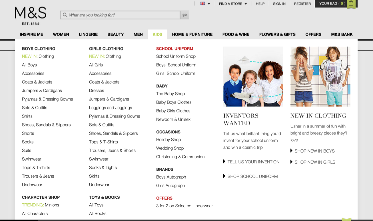
The e-commerce website below has created massive drop-down menus that cover the entire page, a clear violation of the KISS rule.
If you must use dropdown menus, use them carefully and sparingly.
9. Reduce Choices
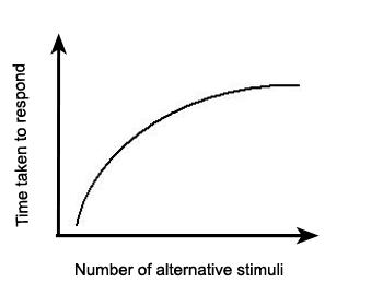
Hick’s Law states that the more choices a person has, the longer it takes them to make a decision.
In other words, too many choices is a bad thing. Reduce the number of choices on your website, and you’ll improve your simplicity and conversions.
10. Use Minimal Color
Color is a good thing, but not too much of it. Some of the best website designs keep it simple by using a single color or very limited colors.
11. Kill Stuff That’s Not Clicked On
If people aren’t clicking on certain parts of your site, get rid of those features. An easy way to tell what people are clicking on is by analyzing your site using a heatmap tool like Crazy Egg.
12. Use Lots of Images
Images are easy on the brain. Your brain can process images faster and easier.
The more images you add to a website design, the more enjoyable it is for people to look at.
Plus, it makes your website feel so much simpler and intuitive.
13. User Testing
Finally, test your website. Every target audience is going to respond differently to color, design, imagery, layout, and functionality. Test your website early and often, and make sure that you’re adapting to what users need and want.
Conclusion
We all want a website that “looks good.” But what makes a “good looking website?” It’s simplicity.
Simple websites work better, look better, feel better, act better, function better, respond better, appear better, and are better.
Follow the KISS rule, and you’ll make your website the kind of place that users want to spend time on.
How have you applied the KISS principle to your website?






Comments (3)