Did you know we trust attractive people more than unattractive ones?
Illogical, but true.
We like people who are nice to look at—and we want to say yes to people we like. Not only that, but we actually think beautiful people are smarter, kinder, and more trustworthy.
Personally speaking, I was once suckered into paid membership with an organization I’m ideologically opposed to because the young woman selling subscriptions was, well….let’s just say I bought it. True story. On the other side of the coin, I was pretty suspicious of famed internet marketer Bob Bly when I first saw his photo.
But don’t take my word for it — Dr Robert Cialdini wrote all about it in Influence: The Psychology of Persuasion.
WEB DESIGNERS AUTOMATICALLY GRASP THIS PRINCIPLE AND APPLY IT TO THE WEBSITES THEY CREATE
And good for them. Research from Melbourne University vindicates their instinctive belief that attractive websites are more trustworthy—and thus more likely to convince prospects to buy. It shows that consumers are 20% more trusting of websites than they were five years ago—largely because websites today are prettier than the websites of 2006:
As aesthetically orientated humans, we’re psychologically hardwired to trust beautiful people, and the same goes for websites. Our offline behaviour and inclinations translate to our online existence … With websites becoming increasingly attractive and including more trimmings, this creates a greater feeling of trustworthiness and professionalism in online consumers.
All great news—we can rest easy knowing our desire for a flashy, sexy, all-singing and all-dancing website is actually going to increase sales as well as our egos. Right?
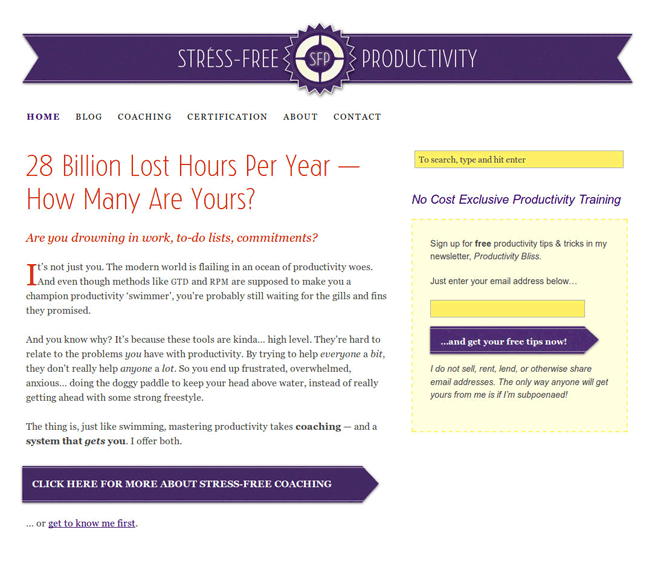
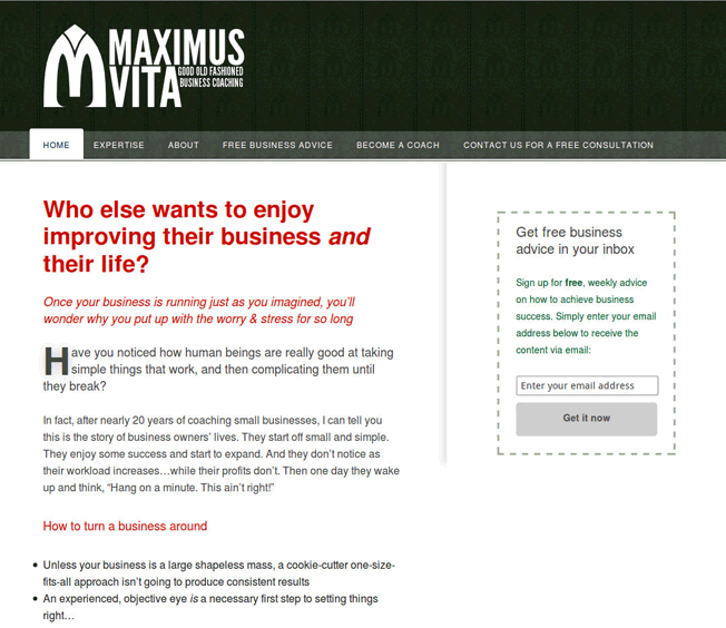
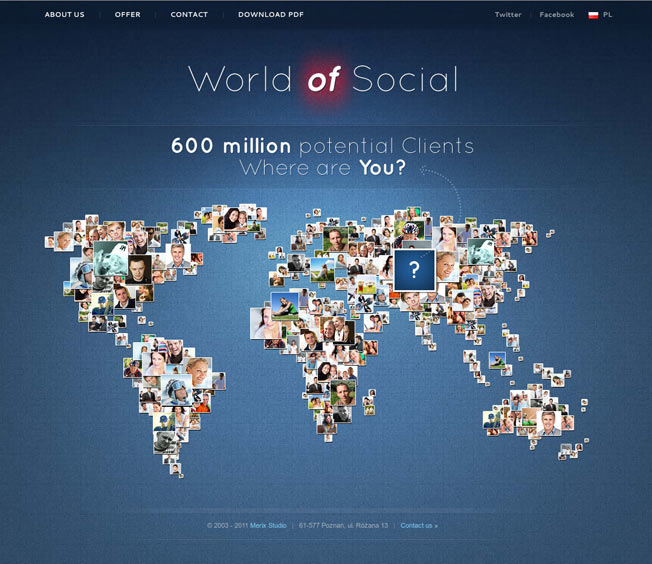
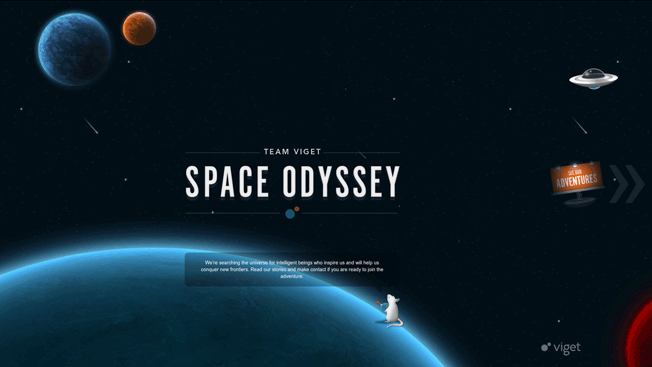
OKAY SMARTY-PANTS, THEN WHICH OF THESE WEBSITES IS MORE TRUSTWORTHY—?
If you’re like me, you probably feel World of Social and Space Odyssey have a lot more sex appeal than Stress-Free Productivity and Maximus Vita. It’s not that the latter sites are unattractive—just that the former are way sexier.
BZZZT
The problem is, as it turns out, that while our intuition about attractive websites being more trustworthy is dead on…our understanding of what “attractive” is—well, let’s just say it’s not all there.
In a video discussing the research I mentioned before, its author Dr Brent Coker explicitly explains…
By attractive we mean very well balanced, and following conventions such as logo top left, navigation across the top, search on the right, nice colors, nice quality design.
When I quizzed him further, Brent added that “well balanced” means most importantly that the site conforms to the Golden Ratio—as well as having a carefully-selected color palette:
This is a site I created. The spiral is known as a Fibonacci Spiral, and the boxes show the Golden Ratio, which is found in many things we consider particularly attractive. As you can see, fitting the elements of a site into the Golden Ratio does involve compromise—in this case there were technical limitations behind the scenes. Nonetheless, the general width and placement of the elements feels pleasing because of their conformance to the spiral.
In other words, what average users find attractive is not what we like to think of when we envision our new website. You know, the one that will wow our customers and win awards. Something that hasn’t been created before?
What’s important to the average web user is that the site is not original. At least, not too original. If it’s not similar enough to other websites, problems arise.
The Space Odyssey site above is a perfect example. It has no standard navigation—and little to no textual information is visible either. To interact with the site, you must hit a button that is easily mistaken for part of the decorations.
World of Social has even less text; just a huge number of images that move when you mouse over them—but aren’t clickable.
Obviously the designers intended these problems to be features—so why are they “bugs”? Well, as web usability expert Jakob Nielsen put it, all the way back in 1996,
Don’t assume that users know as much about your site as you do. They always have difficulty finding information, so they need support in the form of a strong sense of structure and place. Start your design with a good understanding of the structure of the information space and communicate this structure explicitly to the user.
THINGS HAVEN’T CHANGED
In case you’re thinking that web users are more savvy today, or at least more willing to experiment and play with unusual designs, let me reassure you: they are not. Discussing his recent research, Coker says:
The biggest source of frustration for web surfers appears to be the ability to find relevant information on a website—that’s the biggest killer, the biggest driver of dissatisfaction. As soon as a web visitor is dissatisfied they will leave that website and defect to a competitor. And the best way that website owners can stop that or reduce that is by increasing the relevancy of information.
In other words, the major challenge for websites is helping users to find what they want straight away. As Coker says, “you need a very good map to help people get around”. And Nielsen has discovered the same thing in his own research:
Uncovering navigation shouldn’t be a major task: Make it permanently visible on the page. Small children like minesweeping (passing the mouse around the screen to see what’s hidden), but teenagers don’t like it, and adults hate it.
JUDGING AESTHETICS STARTS WITH WHAT WE KNOW
Web designers are in a very privileged position, aesthetically speaking. They have a highly developed sense for what is attractive and what is not. They’re aware of design trends, and can see immediately that one website looks dated, while another looks generic. They judge aesthetics on that basis—as in the examples of Maximus Vita and Stress-Free Productivity above.
And we tend to take our cues from them. Indeed, there are dozens of web design galleries online showcasing all kinds of sexy sites. And we take for granted that that’s what really good websites are like. We want something like that. Not something basic, unoriginal, even bland-looking.
But that is not how most people’s minds work.
To draw a somewhat geeky analogy, web designers are like Starfleet officers in Star Trek. They encounter a huge variety of alien species, and many of them have a very sophisticated sense of beauty. Jadzia Dax marries Worf, the Klingon.
Would you marry Worf?
To the average person, human faces are attractive, and Klingon faces are not. They’re too alien. And the exact same thing is true of websites. Sites without the logo and navigation at the top, search on the right, and elements fitting into Golden Rectangles are just too alien to judge. They also tend to be terrible at presenting the information users need.
To make your next web design successful, you need to tether your web designer firmly to the ground. Keep them in touch with reality. You must remember that the average web user doesn’t even know what a design gallery is—and is oblivious to anything except whether they can immediately find what they’re looking for.
If they can, then they have a foundation for judging the site’s aesthetics. Provided it falls basically into the Golden Ratio and meets some basic guidelines for color, they’ll almost certainly decide it’s a good-looking site. An attractive site. A site to be trusted.
If they can’t find what they’re looking for—if they don’t immediately see text explaining where they are and what they can do, and they can’t understand how to find that text—it doesn’t matter one iota how smoking hot the site looks to you, its proud owner.
Because they’re not even going to get as far as asking whether it’s pretty. They’re going to run to the back button just as fast as if a Klingon wanted to marry them.
About the Author: Bnonn is the author of a free course on 5 website changes you can make today to bring in more sales. Known in the boroughs as the Information Highwayman, he helps entrepreneurs sell more online by improving both their web copy and design. When he’s not knee-deep in the guts of someone’s homepage, he is teaching his kids about steampunk, Nathan Fillion, and how to grapple a zombie without getting bit.


Comments (17)