Homepage SEO.
It’s a simple concept, right?
You’ve probably been optimizing homepages as long as you’ve been doing keyword research.
It’s one of the basics of SEO. Use keywords. Write copy. All good. Pretty simple.
Not so fast.
There’s been quite a bit of debate as to what constitutes effective homepage optimization.
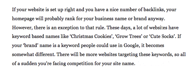
There’s even an article from Yoast that asks whether or not homepage SEO exists at all. Here’s an excerpt from the article that explains the inherent issue with homepage optimization.
The logic here is that since many sites have keyword-based names, it can be incredibly difficult to rank favorably if your brand name happens to be the same as one of those keyword-based names.
And when you think about it, having a brand name such as this can create a huge challenge.
Now you see how things can get complicated?
This isn’t just pie-in-the-sky theory for the SEO talking heads. This is a real world issue that you might be facing right now with your business!
Even though your homepage will usually be the most authoritative page on your site, you may not even reach page one of the SERPs if you’re up against big competition.
Yoast suggests that you shouldn’t even try to rank your homepage and to not bother setting a focus keyword.
And I see their logic. I really do.
But I have a slightly different take on things.
Although I do agree that it’s quite possibly futile to try and rank for just one keyword (depending upon the level of competition), this doesn’t mean that you should raise the white flag and give up on optimizing your homepage.
It just requires a different approach.
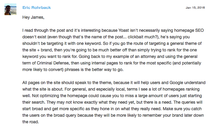
I was reading through a thread on the Moz Q&A Forum and came across a particular comment discussing the Yoast article.
Here’s one that really resonated with me.
I think this really hits the nail on the head.
In my opinion, failing to optimize your homepage could result in you losing out on a lot of high-quality traffic.
So, therefore, you should be keyword conscious and make an attempt to rank for certain keywords.
It’s just that you shouldn’t devote all of your energy for ranking for just one keyword — your branded keyword.
When you break it all down, the goal of your homepage should be to let Google know what the underlying theme of your site is and what type of product you’re offering.
Now that we’ve gotten that out of the way and established some framework of logic, I would like to cover the essentials of creating an SEO-friendly homepage.
As usual, my suggestions are based on research and my own personal experience.
How I generated over 100,000 visitors a month through SEO.
Your primary goals
The way that I look at it, you should have three main goals when constructing your homepage.
- Explain to Google and human visitors what your company/product does.
- Facilitate intuitive navigation – Efficient site structure helps visitors find what they need and is a critical aspect of SEO.
- Answer key questions visitors will have and quell any fear/skepticism they may have – This is done largely through rich content and social proof.
The interesting thing is that accomplishing these goals kills two birds with one stone.
Just think about it.
By including key components like keyword optimized headings, intuitive navigation, and rich content, you can appeal to search engines and human visitors.
It’s a win-win situation.
How do you accomplish these goals?
Although there’s a lot of different components that go into an SEO-friendly homepage, it’s pretty simple when you really get right down to it.
There’s a particular Whiteboard Friday on Moz that addresses the core components of a well-crafted homepage.
It discusses the old way of constructing a homepage versus the new way.
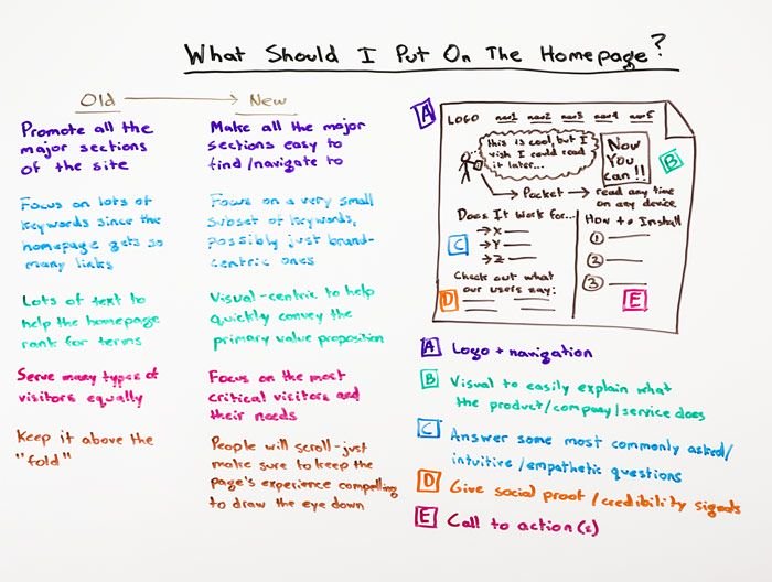
Here’s an overview of Rand Fishkin’s whiteboard that shows us the big picture.
You can disregard the “old way” because it’s not applicable to this discussion.
What I want to focus on is the five key points A through E.
If you include all of these elements, your homepage should be fairly SEO friendly and positioned for success in the SERPs.
I would now like to break down each of these elements and discuss them in further detail while providing relevant examples.
Logo and navigation
I’m not going to spend a lot of time here because it’s pretty self-explanatory.
You obviously want to include your logo because it reinforces your brand identity.
As for your navigation, you want to include all of the major sections of your site.
This allows visitors to quickly narrow their search and find what they’re looking for and lets Google understand the overarching theme of both your site and brand.
And I see no reason to get “too cute” with this.
Just make your navigation easily visible and in a logical sequence.
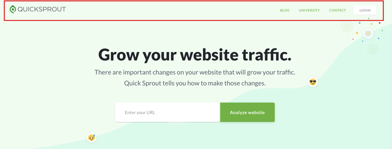
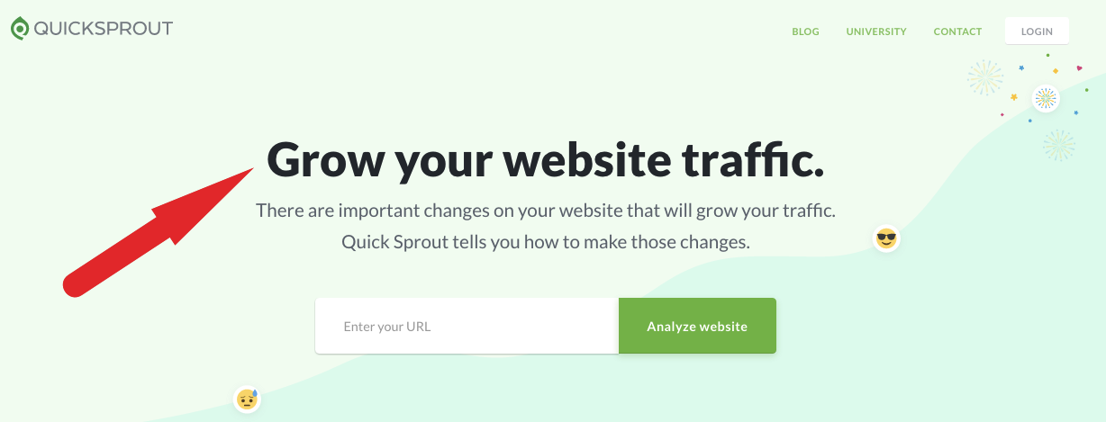
Notice how I keep things extremely simple on the Quick Sprout homepage?
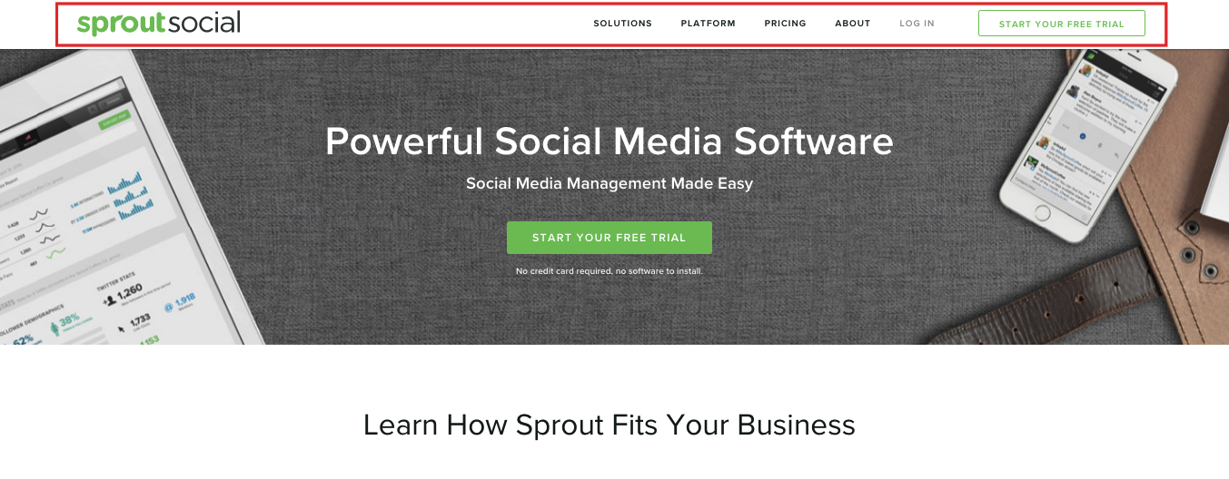
I think that the Sprout Social homepage does a great job at following this simple formula as well.
Explaining what your company does
This one is huge.
You need to clearly and concisely explain exactly what it is your company does and the product you’re offering.
You’ll want to keep two important things in mind when doing this.
First, you want to make your offer crystal clear for visitors.
There should be absolutely no doubt in their mind as to what your offer entails.
Here’s a great example from Cloud Bakers.
It’s instantly apparent they’re offering a cloud-based system for email, online file storage, file sharing and so on.
As for Quick Sprout, I made sure that there was no confusion for visitors.
The bottom line here is that you want to quickly establish your unique selling point (USP).
In addition to that, you want to include a reasonable amount of rich content.
This provides you with an opportunity to expand on your USP to crystalize your offer for visitors and help Google better understand the general theme of your site and brand.
So what would be considered a “reasonable amount” of rich content?
Well, Business 2 Community recommends including at least 400 words of quality content to your homepage.
And that’s a pretty good number to shoot for.
However, I don’t think that you necessarily have to hit quite this length.
In fact, some of the more epic homepages I’ve seen have had a considerably shorter word count.
The most important thing is that you adequately explain your company/product and what you’re offering.
Don’t try to use more words just for the sake of hitting a higher word count.
Just do whatever makes the most sense.
Incorporating keywords
So here’s the thing about keywords.
I mentioned earlier that you shouldn’t try to rank for just a single, branded keyword.
While you can’t say for sure that you couldn’t end up ranking well for that keyword (it’s definitely possible), you’re selling yourself short if you take this route.
In my opinion, a better approach is to take Rand Fishkin’s advice:
Focus on a very small subset of keywords.
Just target a small handful of keywords that you want to rank for and use those.
Also, make sure that they tie into the theme of your site and brand.
This should serve as a cue to Google and strengthen the overall SEO of your homepage.
I think that Business 2 Community offers a great example.
“Make use of the natural opportunities to insert your keywords. For example, a home builder’s website could swap out the term ‘new communities’ for a more powerful term that shows up in more search results, like ‘new home development communities in Toronto,’ and so on.”
Just make sure that you’re incorporating keywords in a natural way and that they build upon your brand.
And this should go without saying, but you definitely don’t want to do any keyword stuffing.
Duh!
How can you come up with a subset of keywords?
Here’s a formula that works for me.
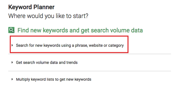
Use Google’s Keyword Planner to search for keywords.
Type in your main keyword.
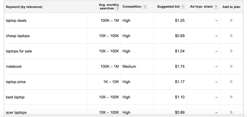
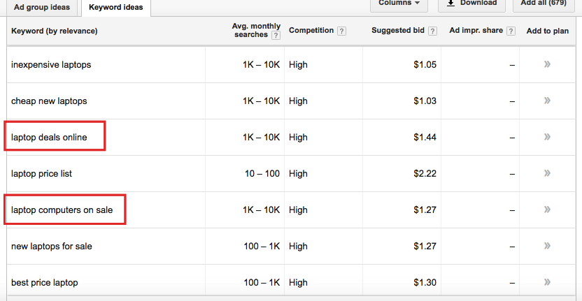
Let’s just use “laptops” as an example.
Here are some of the results that pop up.
From there, you’ll simply want to browse through the results and choose some other relevant keywords to weave into your homepage.
Ideally, you’ll find a few long-tail keywords
For instance, I might target “laptop deals online” and “laptop computers for sale.”
It’s a straightforward technique and should help you come up with a viable subset of keywords.
Headers
Headers play a fairly big role in SEO.
So of course you’ll want to take full advantage of them on your homepage.
Ideally, you’ll work in a few of your targeted keywords into your headers in a natural way.
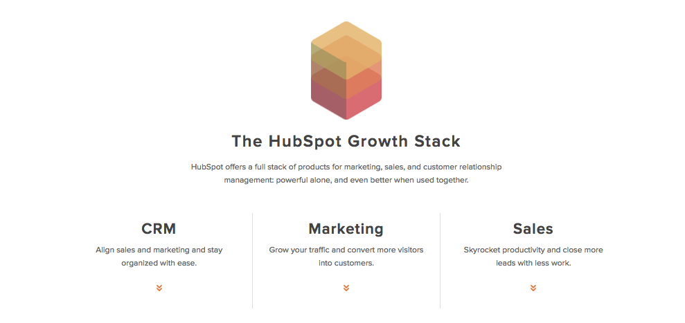
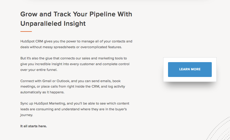
I think that HubSpot’s homepage does this very well.
But what sized headers should you use?
Here’s what I recommend.
Use only one H1 tag toward the top. This should be highly relevant to your brand and general theme.
From there, you can use H2s, H3s and even H4s as needed so long that it creates an effective hierarchy and logical flow.
Using visuals
We all know that the vast majority of humans respond better to content that’s visual-centric rather than completely textual.
So it’s a given that you’ll want to include at least a few images on your homepage.
But allow me to elaborate.
What I recommend is using images in conjunction with small blocks of text.
Here’s a good example from Quick Sprout.
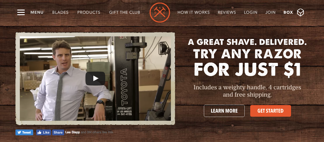
Here’s another from Dollar Shave Club.
The combination of images with smaller bodies of surrounding text accomplishes two important things:
- It provides visitors with some nice eye candy while simultaneously providing details about your company/product
- It’s an excellent opportunity to create additional rich text
Videos
If you want to take it one step further, you could even consider using a video.
I’ve noticed that this has become more of a common practice as of late, and it’s actually something I use for the NeilPatel.com homepage.
So does Dollar Shave Club.
And if your video resonates with visitors (like the way Dollar Shave Club video did), it could potentially lead to some serious backlinks.
Or at the very least, it will drive home your USP and connect the dots for visitors.
Offer social proof
As Rand points out on his Whiteboard Friday session, social proof/credibility signals are an essential component of a homepage.
Whether it’s testimonials, reviews from satisfied customers, or icons from clients you’ve worked with, social proof is going to have a positive impact.
In some cases, the impact can be quite dramatic.
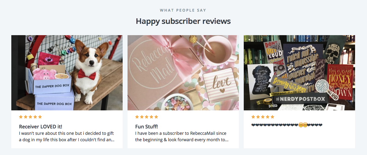
Allow me to offer a couple of tangible examples of companies that have seamlessly incorporated social proof into their homepages.
First there’s Cratejoy.
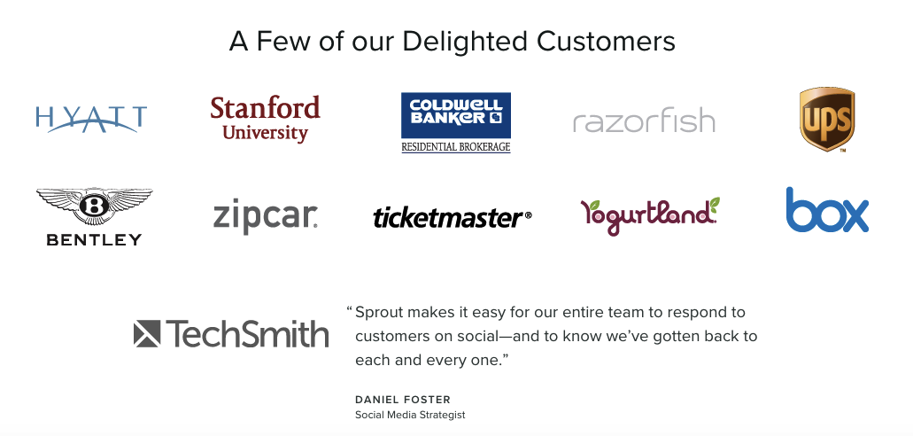
Then there’s Sprout Social.
They actually managed to include the icons of companies they’ve worked with as well as a testimonial.
Well done.
This is yet another way to naturally include rich text to appease search engines while at the same time proving to potential leads that you’re a company worth doing business with.
Links
So you’re probably wondering about links.
More specifically, you’re probably wondering how many internal links you should include (if any).
After all, internal linking is an integral part of SEO.
Here’s my take on links.
I think that it’s good to include a handful of relevant links if it makes sense for your homepage.
These will typically be located toward the bottom and will serve as streamlined navigation for your visitors.
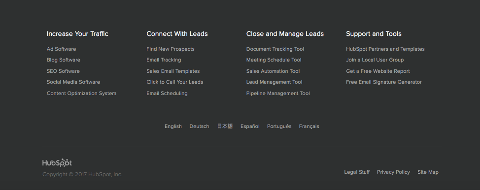
I feel like HubSpot really pulls this off well on their homepage.
It’s a nice little footer menu that serves a genuine purpose — to help visitors fully explore their various offerings and learn more about HubSpot.
It’s in no way spammy and isn’t simply there as a means to generate some more “SEO juice.”
Here’s another example from MuleSoft.
Notice that this section contains links to various pages on their website as well as links to products.
MuleSoft presents these links in a very natural way and makes it simple for visitors to learn more.
However, it doesn’t detract from the user-experience.
The bottom line with links is that it’s fine to use them and should help make your homepage even more SEO friendly.
But here’s the thing.
You should make sure that they’re extremely focused on the theme of your site and brand and don’t flood your footer.
In other words, they shouldn’t create useless clutter.
Meta description
Let’s not forget one simple but incredibly vital detail — the meta description of your homepage.
You definitely want to include your company name at least once along with a concise yet thorough explanation of your company and what you offer.
You’ll also want to include a few words that capture the essence of what your customers can achieve by purchasing.
Here’s the meta description for Quick Sprout to serve as an example.
And here’s the meta description for Crazy Egg.
Notice how they both matter-of-factly provide an overview of what the site is about.
This helps search engines better understand the theme of each site and gives potential visitors a quick glimpse of what they can expect by visiting either of these sites.
CTA
Last but not least, there’s the CTA.
Although it’s a simple element of your homepage, it’s something that you’ll want to put a lot of effort into.
You by no means want to just slap up some mediocre CTA that fails to fully embody the specific action you want your visitors to take.
So what are some characteristics of a great CTA?
- It needs to be conspicuous
- It needs to be direct
- It needs to be clear
- You should use A/B testing to determine the ideal color scheme, positioning, etc.
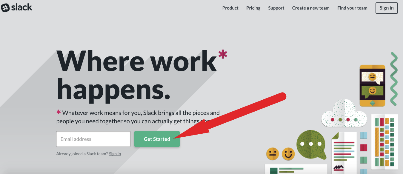
Slack pulls this off well on their homepage.
If possible (and if it makes sense), I suggest incorporating words into your CTA that tie into the theme of your overall website.
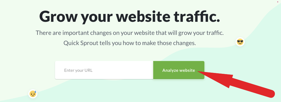
For example, on Quick Sprout, the CTA is “Analyze Website.”
For more on creating a great CTA, check out this other post from NeilPatel.com.
Is it still important to keep key content above the fold?
I’m sure you’ve heard countless experts say “keep it above the fold.”
If you put key content too far down on your homepage, a good percentage of visitors may overlook it.
But Rand Fishkin makes an interesting point in his Whiteboard Friday session.
He explains that people tend do more scrolling than they used to, which is largely due to the widespread use of mobile devices.
Just think about it.
If you’re using your smartphone or tablet, do you just open a homepage and strictly look at the top without ever scrolling down?
It’s unlikely.
I know that I’m somewhat of a “compulsive scroller” and like to work my way to the bottom of sites that I’m interested in.
I just feel like there’s unfinished business if I don’t make my way below the fold.
I think that Rand offers a great piece of advice in regards to the positioning of key content and whether or not you should place any of it below the fold.
People will scroll. Just make sure to keep the page’s experience compelling to draw the eye down.
My own personal formula involves placing the absolute essential points above the fold and then elaborating on them more completely further down the page.
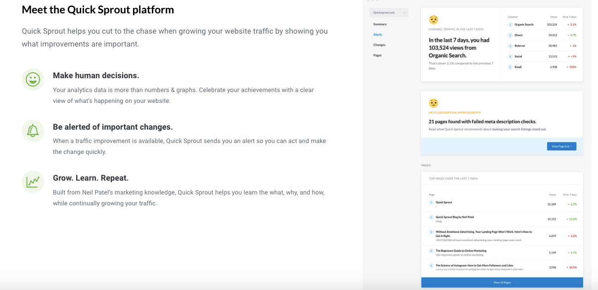
For instance, here’s what visitors see when they scroll down a bit on Quick Sprout.
Keep it clean and crisp
I would like to make one last major point about creating an SEO-friendly homepage.
Like most other aspects of web design (and design in general), less is often more.
That’s why I don’t recommend getting too crazy with your homepage.
You want it to be simple and to the point.
What you don’t want is for it to be long-winded, complex, or needlessly convoluted.
Although I’m definitely a proponent of long-form content, this just isn’t an approach you want to use with your homepage.
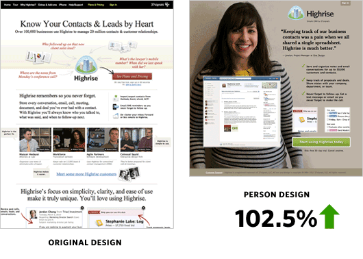
In fact, Signal v. Noise performed a study on design for a CRM company called Highrise.
What they did was some basic A/B testing on two different designs.
The first design was fairly “busy” and had a lot going on.
However, the second design was much more simplistic and included an image of a woman smiling.
Here were the results.
The second design saw a 102.5 percent increase in sign-ups!
That just goes to show the power of keeping it simple.
So keep this in mind when structuring your homepage.
Conclusion
I know that I’ve thrown a lot at you with this post, so let me recap.
You shouldn’t target a single, branded keyword on your homepage.
Instead, you should look to target multiple keywords to establish an overarching theme for your site and brand.
You need to do everything within your power to help search engines understand what your company and product are about while at the same time giving visitors your USP and answering FAQs.
The way you go about this is by including plenty of rich content and following SEO best practices (e.g. using headers, a great meta description, including relevant links, etc.).
Images and videos along with smaller blocks of text can enhance the look of your homepage, connect the dots for visitors, and allow you to create even more rich content.
It’s also important to provide at least a bit of social proof and a rock solid CTA.
Keeping key content above the fold isn’t usually necessary as long as your content is compelling enough to motivate visitors to keep scrolling down.
And when it’s all said and done, you want your homepage to be aesthetically pleasing and not overly cluttered with needless information.
After all, presentation is everything.
Just make sure that you’re satisfying the search engines by providing the content necessary for them to understand your company/product, providing your visitors with a great experience, and answering their key questions.
What do you think is the most important element of an SEO-optimized homepage?






Comments (108)