Getting the best results from your landing page doesn’t depend solely on the landing page.
As often as not, it’s the overall campaign — the sales message that leads up to the landing page and your follow-up messaging, in addition to your landing page — that determines whether people will buy now.
So how do you optimize an entire campaign?
Let’s look at an email marketing campaign by Hewlett-Packard for some seductively simple lessons that can generate more sales with less copy.
The HP Slate campaign
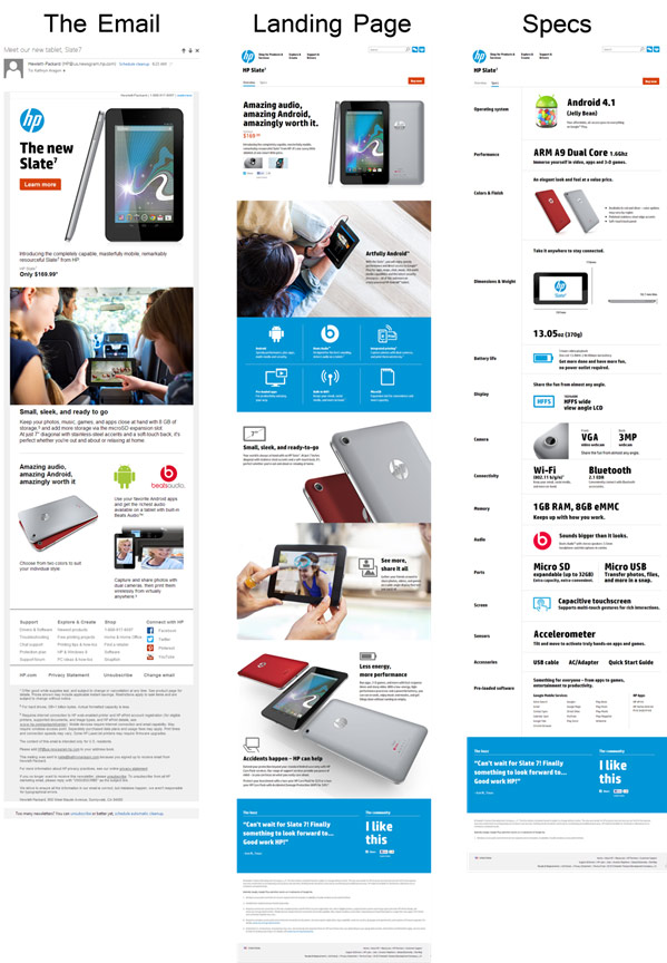
HP’s campaign comprises three elements:
- An email
- A landing page
- A secondary tab on the landing page, giving specs
Looking at all three, it’s easy to see that these three pieces not only belong together, but belong to HP.
An overview
The overall campaign is well branded, relying on a simple color scheme of HP blue and orange. All three pieces use a modular design with lots of white space, creating an open, interesting design that draws people deeper into the sales copy, even if they already like what they see.
The sans-serif font is the same one used throughout HP’s website. This builds user trust since there’s no doubt that this offer comes from a reputable brand they’re already familiar with.
In particular, notice that the same design and presentation act as glue to hold the entire campaign together. There’s a strong similarity between the email and the landing page. The image is almost identical and, in both cases, the HP logo is on the left, with the image on the right.
To establish a strong sense of continuity, icons are repeated on all three pages. And the same testimonial block is placed at the bottom of both landing pages.
The importance of branding to your conversion rate
HP is a big brand, and they likely have employees whose only job is to oversee the brand and make sure their campaigns look and feel like HP. Do smaller brands need to have this same level of attention to detail?
Yes.
No matter what size your business is, you do want to produce a strong brand that has a unique color scheme, font, personality, and overall style. Because, over time, people begin to associate that look and feel with you. When that happens, your design alone is enough to make them want to buy from you.
If you think that’s an overstatement, just think about the power of brands like Apple and Amazon.
Consumers don’t worry about whether buying from these brands is a good decision. They already trust them, so their only real question is whether to buy now or wait.
How you can do it
When designing your campaign, don’t just focus on the landing page. Decide on the pieces that will go into your campaign, and then use similar copy and design in each of them:
- Place your logo at the top of each page.
- Use your brand colors and font in the design of all pieces.
- Make sure each piece ties into your overall campaign concept, drawing from the same benefits and key messaging.
The email
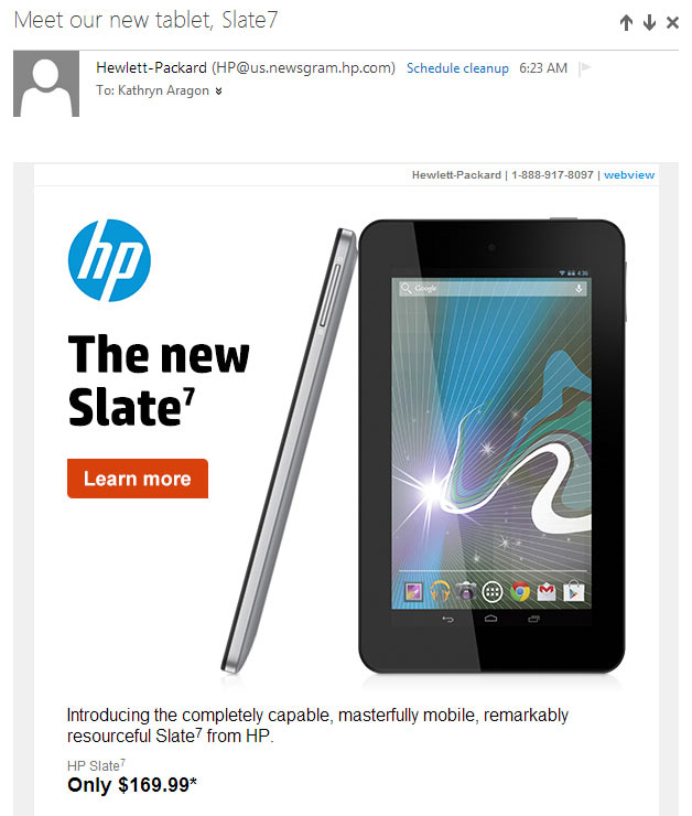
The email is the first touch in this campaign and does a good job of getting attention.
Sent to previous customers, it presumes they’re interested in technology in general and HP products in particular. That’s why the subject of this email works so well:
“Meet our new tablet, Slate7”
If people see the top of the email, that might be enough to make them click through. It’s simply the HP logo, the words “The new Slate7,” a “Learn more” button, and a hero shot of the tablet.
Below this is a short description of the tablet and the price.
Notice the adjectives in the description:
- Completely capable
- Masterfully mobile
- Remarkably resourceful
Even in business writing, there’s room for creativity, as you can see here. The three points are made in adverb-adjective combinations that deliver a lot of information in just six words, and the alliteration makes them stand out.
Then the price, at under $200, is a definite attention-getter. This alone is enough to make someone want to click through, but HP doesn’t stop there.
What follows is a short list of benefits, reinforced by images that communicate those benefits.
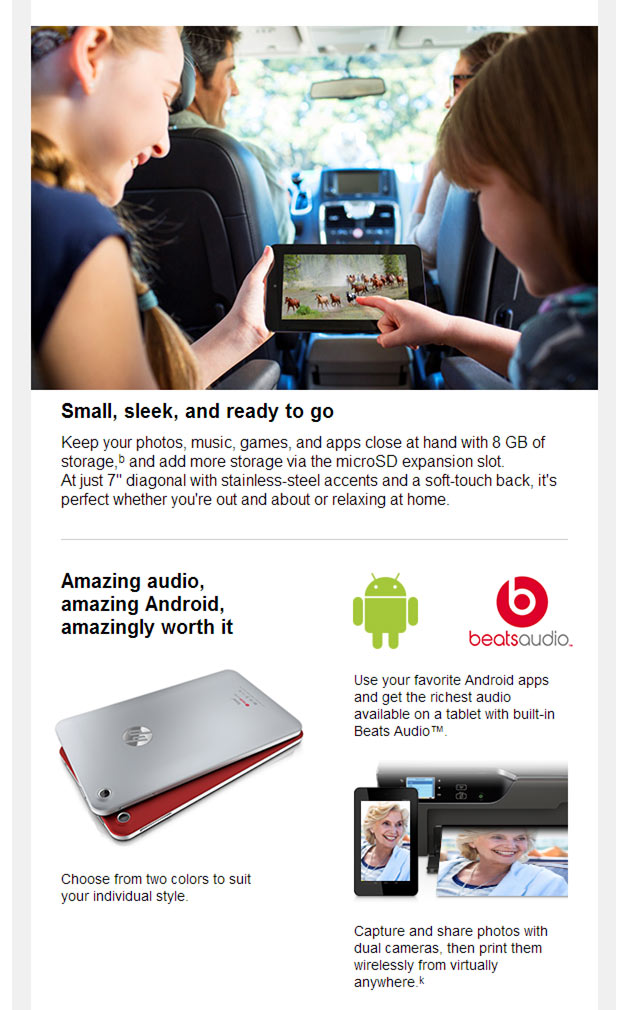
Above the words “Small, sleek, and ready to go” is an image of two children enjoying the Slate while on a family outing. The impression? One of two things:
- The Slate is easy to use and provides entertainment that everyone in the family can enjoy.
- Or, more compelling, your children won’t fight in the back seat when they have a Slate to play with.
Below that, is another sales pitch: “Amazing audio, amazing Android, amazingly worth it,” along with an image of color choices and icons of Android and BeatsAudio, so readers get the message at a glance, even without reading the text.
Everything is clickable
If your goal is click-through, as it generally is with email, it helps to provide plenty of opportunities to click. That’s just what HP does here.
Not only is the “Learn more” button clickable, the entire top image is. When a viewer hovers over it, there is a call to action: “HP. The new Slate7. Learn more.”
The text below the image is also clickable, including the price.
Another call to action appears when hovering over the picture of the family: “Shop, explore, and get inspired with products, tips, and innovative solutions from HP.”
The sales copy below this image is also clickable, as is every block of text, image, and icon below it.
Creating a clickable email
Providing loads of links isn’t the key to a clickable email. Instead, you need to hook your readers and provide them reason to click.
Your subject line must resonate with your readers and pique their curiosity. Your first few lines of text should hook them, making them want to know more.
To do that, you need to know your audience.
HP knows that its customers love technology. They respond to updates about new products and low prices. So that’s what this email leads with.
The word “introducing” makes it clear that this is a new product, and the price is reasonable enough that practically anyone can afford it. By following with a picture of a happy family, it’s clear that HP is targeting families who may want the latest technology but don’t have the budget for high-ticket items.
How you can do it
Find the hook that is most likely to connect with your target audience. Provide a way for people to respond right away, but include a few benefit statements in case they need more.
The Main Landing Page
Banner
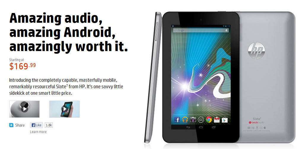
The header of the landing page tells visitors immediately that they’re in the right place. Just as in the email, there is the HP logo, with the product, HP Slate7, below it.
Just under this header, however, is a design element that’s worth noting right away. This page has two tabs: Overview and Specs. To the right of these tabs is the “Buy now” button.
Because the email was so compelling, it’s possible that people will arrive at the page ready to buy. HP makes it easy. Customers simply click the orange button, and they’re taken to a sales page where they can add the tablet to a cart.
If they scroll down, they lose the top of the header, but the tabs and “Buy now” button stay visible.
So, no matter when someone decides they’re ready to buy, they don’t have to hunt for the Buy button. It’s right there.
Above the fold
The landing page opens with the sales pitch from the bottom of the email and the hero shot from the top of it, providing a nice flow from one piece of the campaign to another.
The price is printed in orange, with compelling sales copy below that. This is a good strategy for any landing page. The above-the-fold sales copy should be enough to drive sales even if people don’t scroll.
It’s a short sales pitch with enough information to persuade anyone already interested in your product.
But, in case they need more information, you have long copy below to answer questions and drive sales.
Below the fold
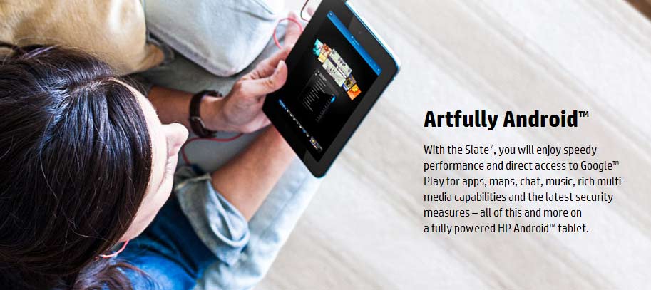
When visitors scroll down, they are greeted with this image/text block:
The subhead “Artfully Android™” doesn’t supply information. Instead, it creates a personality. Remember, the leader in tablet production is Apple, which is, bar none, the leader in creative technology.
This subhead takes direct aim at the idea that Apple owns the market in creativity. Then, in the text, there is a litany of benefits:
- Speedy performance
- Direct access to GoogleTM Play
- All the things you expect from a tablet: apps, maps, chat, music, media, and security
- And the AndroidTM OS
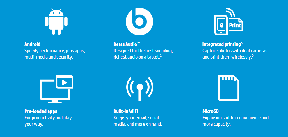
The next module is a block of icons with benefits, making it easy to see why this tablet may be just what someone is looking for:
Consumers don’t have time to read, so this is a great way to graphically present your benefits. Notice that each block has an icon that represents the benefit. Then the benefit is given in bold, followed by a short description in regular type.
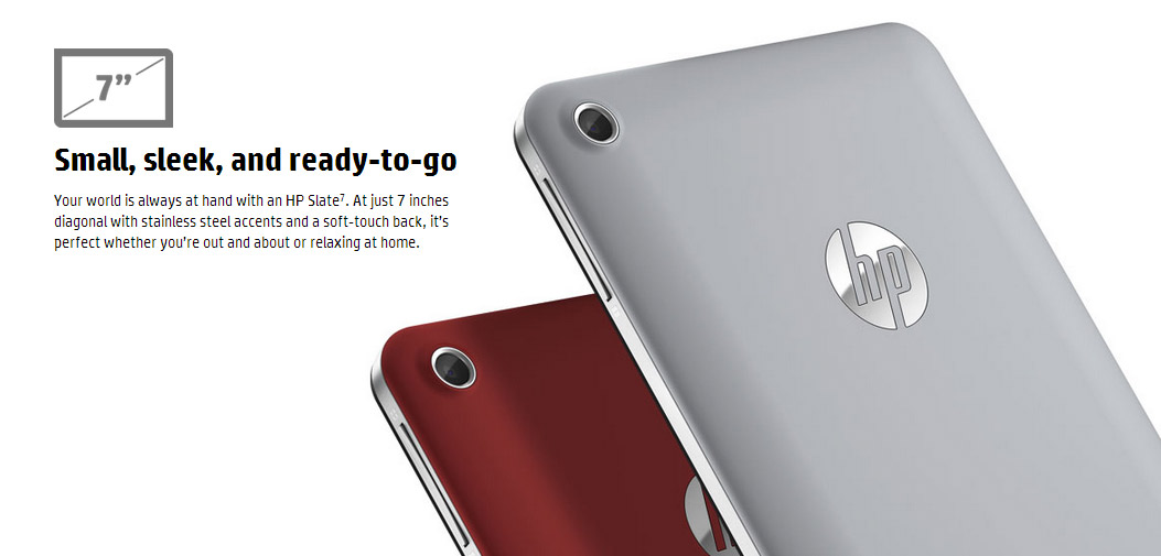
Next comes of stack of three images, each with a benefit statement:
This shows the two color options, and an icon shows the small, sleek size.
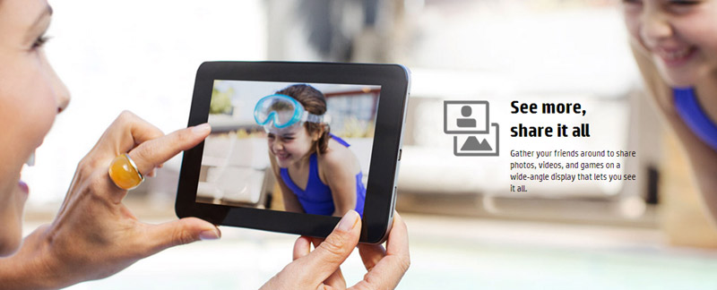
This shows a mother and daughter enjoying quality time because of the tablet. It ties in with the image in the email that made the tablet seem fun for the whole family. The implication? You’ll have more quality time with your children (and they with one another) if you have the Slate.
The subhead “See more, share it all” reinforces the idea.
Finally, there are more images of the tablet from different angles and two key selling points: It uses less energy, so run time is longer, and the HP warranty, which serves here as a guarantee. If anything happens, buyers haven’t wasted their money.
All the persuasive elements a landing page should have
In order to create a powerful landing page, you need key persuasive elements:
A strong headline that connects with your target audience — This landing page does that with the three “amazing” statements. This audience loves technology, but not usually because of the advanced features. They want something that’s easy to use and… Well… Amazing.
They want to impress their friends. This tablet promises just that.
Benefits, and how they’ll impact users’ lives — People don’t buy products. They buy solutions, enjoyment, and entertainment. HP’s landing page presents each key benefit as a way to spend time with family and be more creative. That’s something worth investing in.
Guarantee — One of the biggest reasons people don’t buy is because they are afraid of making a mistake. With technology, they have an additional fear: it may break and they will lose their investment. The statement “HP can help” puts a band aid on that fear.
Notice that, though this is technically a long-form sales page, it isn’t text heavy. People don’t always have time to read, so it helps to present as much information as possible graphically, with icons and images.
How you can do it
Especially when your landing page is introduced by an email, make sure you include design elements from the email to assure visitors that they’re in the right place.
You want to keep the interest and trust levels high, so you don’t want to do anything that confuses your visitors or causes them to ask questions. By carrying over images and text from your email, you create a flow that keeps people moving forward, not stopping to ask questions.
How do you do that? Lead with a strong statement that repeats or continues a thought that was introduced in your email. Then provide strong benefits, with statements (or images) that show how they will impact your customers’ lives.
Finally, make it easy to respond. If you aren’t able to construct a header that stays in place, put Buy buttons throughout your copy so visitors don’t have to hunt for the button when they’re ready to buy.
The Specs tab
This tab isn’t necessary for most products. But if you sell technology or other manufactured equipment, and if people want to see the specs of your product before buying, HP sets the standard in this landing page.
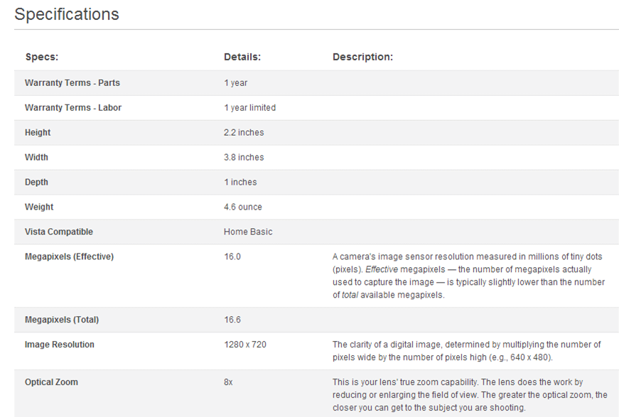
Most specs pages look like this:
Can you say boring?
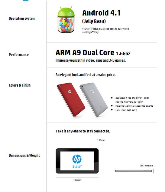
Now take a look at the way HP presents specs:
If you remember, the target audience for this landing page is families, not geeks. So why present dry, boring specs?
HP outdoes themselves here, putting the feature in a column on the left, then an image or bolded spec in the right column. Additional information is put in a bulleted list.
Presented like this, the specs are accessible and easy to understand even by average consumers.
How you can do it
Always review your sales copy from the perspective of your target audience. Be willing to question everything.
Rather than blindly adopting the format that’s traditionally used in your industry, consider alternatives that might communicate more clearly.
If your visitors have to think too much to understand your specs, they’ll delay purchase or not purchase at all. So, format all features in a way that’s easy to grasp at a glance. Large text and lots of white space make it easy for people to understand what they’ll get with a purchase.
The Sales Page
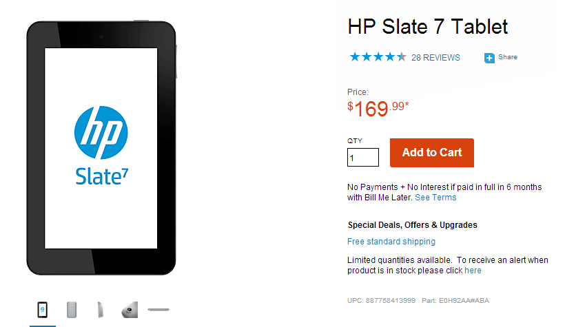
Click the orange “Buy now” button, and you land here.
Above the fold, there is an image of the tablet, with the “Add to Cart” button on the right.
Notice that all the sales elements are present to remove last-minute jitters.
- The product name is printed in large letters next to an image of the product.
- Social proof is given in the form of stars and a link to reviews.
- Price and “Add to Cart” button.
- Terms that begin with “No Payments – No Interest.” That’s compelling.
- Special offers, namely, free standard shipping.
Each of these elements helps build trust, so the buyer won’t abandon the purchase after coming this far.
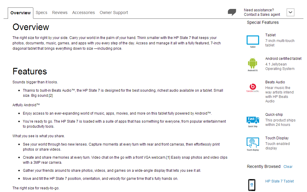
But, in case they do have doubts, below the fold is a summary of everything presented on the landing page:
Tabs across the top allow people to easily find information they need to feel confident that this purchase is right for them.
To the right, is a drop-down box with links to talk with a sales agent.
There’s even a column on the right with icons and benefits, in case someone needs a quick review.
All in all, it’s a persuasive sales page.
How you can do it
Even after people have decided to buy, the least bit of doubt can cause them to abandon the purchase.
Your goal, then, is to remove all last-minute doubts and keep visitors moving toward the sale.
Definitely include an image of your product, with a clear statement of what people will get when they make the purchase.
Elements that can help build trust are social proof, guarantee, and total transparency on your part. So lay it on. Give people what they need. If that’s a total review of your sales copy, give that as well, like HP does here.
Follow HP’s example
Crafting a compelling landing page isn’t always enough. By developing an entire campaign, with a unified message from email to landing page to sales page, you often can create a more compelling message.
The idea is to layer your message, using repetition of core statements and benefits from one piece of the campaign to the other, composing a far more persuasive message that’s much harder for people to resist.
Be sure to test!
Paying attention to brand consistency and good design practices are important. Doing so will instill trust in future customers and helps to provide a seamless experience for current customers.
While we can deconstruct HP’s marketing, we don’t know what kind of results they got from this campaign, or whether this style of layout performs better than any other their previous campaigns. The only way you can know what works for your product or service, your brand, and your audience is to properly test your campaign.
Then, test some more on each subsequent campaign.
Because, bottom line, trends in marketing don’t matter. Nor do tactics of big brands like HP. All that really matters is what gets results for you.
About the Author: Kathryn Aragon is managing editor of The Daily Egg and publisher of the C4 Report. She is committed to helping businesses communicate, connect, convert… and capture their market. Follow her on Twitter and Google+.




Comments (27)