From DIY solopreneurs to enterprise software companies, SaaS has proven to be elastic, scalable, and progressive. Some of the most successful SaaS ideas include sales and employee management, gamification platforms, analytics, and time management solutions. According to the Gartner Group, worldwide SaaS revenue is projected to reach $22 billion by 2015, a 52% increase from 2012.
With the industry showing no signs of slowing down, it has become a very attractive space. However, getting into SaaS with an idea is one thing, but being successful with it is a beast of its own. While there are numerous articles detailing the development of successful SaaS, the focus of this article is pricing strategy analysis.
From the broader strokes of comparative value pricing to best practice pricing display (ending with a 9, or $39 instead of $40), we’ll take a look at what’s working for distinguished and unique SaaS companies.
1. Salesforce
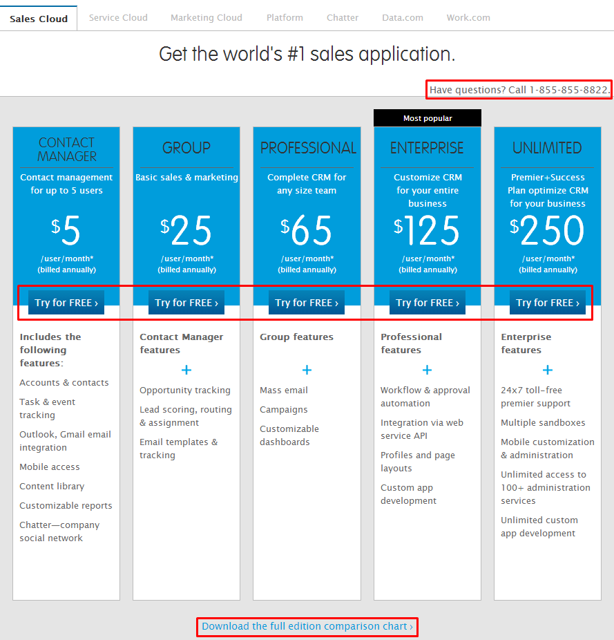
In the screenshot below, we’re looking at the real-time sales collaboration tool from Salesforce, the default service when navigating to the pricing page.
Salesforce offers free trials for every plan, starting at 7 days and increasing to 30 days for the Enterprise and Unlimited plans. They provide multiple paths to conversion, such as the available phone call, downloading the complete comparison chart, and of course, the free trial.
An important part of their pricing strategy is separating the plans into 5 categories. (They actually A/B tested with 4 and 5 categories, with the Contact Manager plan omitted in the 4-plan test.) Each of these categories specifically dictates a role and ability.
Takeaway: Presenting 5 plans clearly enforces the level of seriousness, capability, and value increase by price plan, without doubting higher price points. Also, adding simple CTA conversion paths helps validate services.
2. Freckle
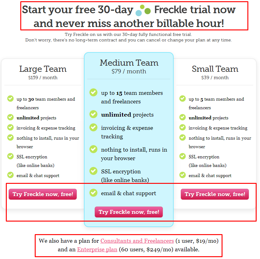
In the screenshot below, we’re looking at the fun and sleek time tracking service, Freckle. This pricing page is found after scrolling through validation media including quotes, product features, and a snazzy GIF demo.
Similar to the 30-day free trial model of Crazy Egg, Freckle’s pricing page flaunts free trials for 3 middle plans. Deviating from the 5-plan display of Salesforce, Freckle has included only references to the low and high-end plans (Consultants and Enterprise, respectively) in separate CTAs underneath the 3-plan display.
Also deviating from the Salesforce strategy, Freckle’s main plan categories are specific team sizes, not roles. The actual price per plan is positioned and sized neutrally, while stressing the more important plan features (number of team members).
Takeaway: Focusing on team size directly validates price differences. Also, keeping a plan description simple and clutter-free allows potential customers to easily consider options.
3. Concur
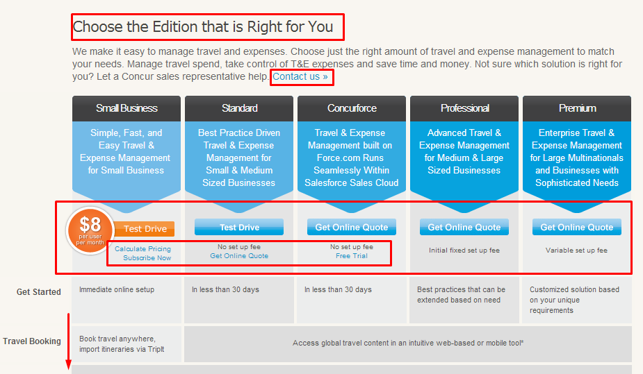
In the screenshot below, we’re looking at the integrated travel and expense management service, Concur. This is the top half of their pricing page, which extends into a list of product features per plan.
Here, we instantly see the 5-plan similarity, but also differences compared with the first 2 examples. Concur’s primary stress point is the orange Test Drive, which also appears on their navigation bar. Additionally, the Contact us CTA is one more possible conversion path besides Test Drive, Calculate Pricing, Subscribe Now, Get Online Quote, and Free Trial (the same as Test Drive).
Their cheapest plan, the Small Business option, seems like a steal, as $8/month is a common price for a personal plan. This juxtaposition signifies a higher value proposition for the subsequent options. After the Small Business plan, we must request an online quote to determine the price.
Takeaway: Pairing a free trial with necessary quotes allows potential customers to experience the service first-hand and validate higher-priced plan propositions.
4. HubSpot
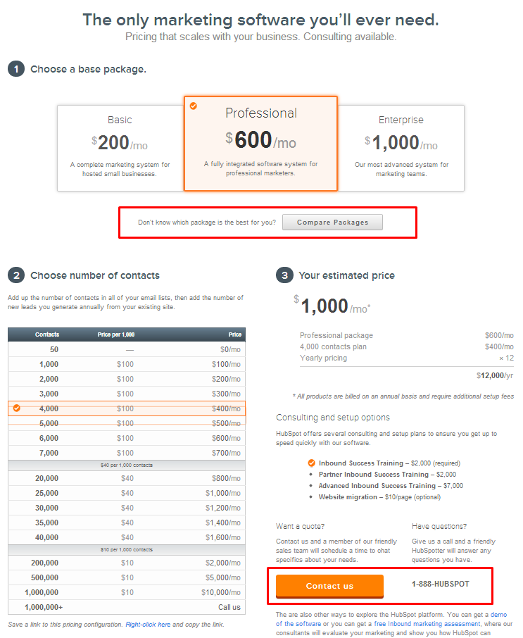
In the screenshot below, we’re looking at the popular marketing service, HubSpot. Their pricing strategy completely deviates from the previous examples.
We immediately notice there are only 3 plans (compared with the frequent 5). A short description of plan abilities dictates the level of consulting and setup options. Additionally, potential customers have the option to Compare Packages for a detailed feature evaluation per plan.
The most unique element of HubSpot’s pricing strategy is the ability to customize a price based on the number of appropriate contacts. Additionally, CTA conversion paths include the regular Contact us button and phone number. Underneath these CTAs are even more CTAs, including a free demo and marketing assessment. Combined, their pricing strategy is incredibly clear and user-friendly. Price is influenced by individual situations, not by over-arching sets.
Takeaway: Transparency and customization in pricing information allow potential customers to determine an appropriate plan and increase comfort level.
5. AppFolio
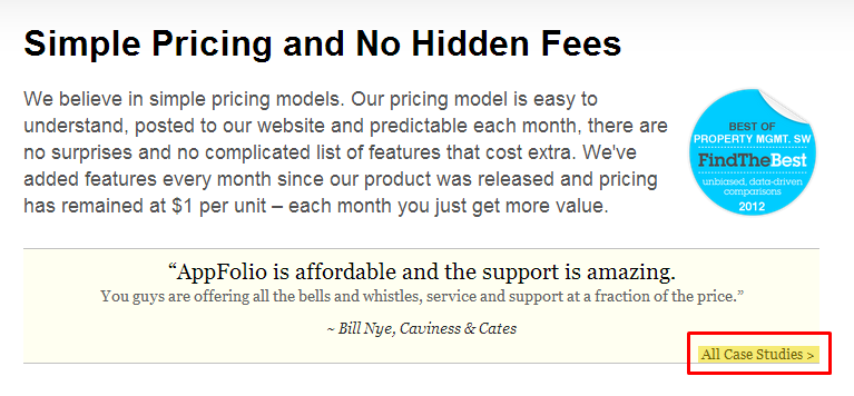
In the screenshots below, we’re looking at the renowned property management service, AppFolio. Their pricing page kicks off by testifying to transparency, with a Case Studies CTA for validation.
Following the promise of transparency, we arrive at their pricing strategy.
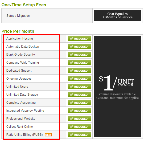
Every feature description in the red box pops out upon hover. We see the column title as Price Per Month; however, we don’t see any costs. What gives?
AppFolio has strategically assigned a mystery value cost to each feature, continuing to state all 13 features are INCLUDED as a bundle cost. We also see AppFolio’s smartly placed One-Time Setup Fee described as 2 Months of Service.
AppFolio stresses the price point of $1 per unit and validates this in their initial copy. Beneath their standard service are Optional Services:
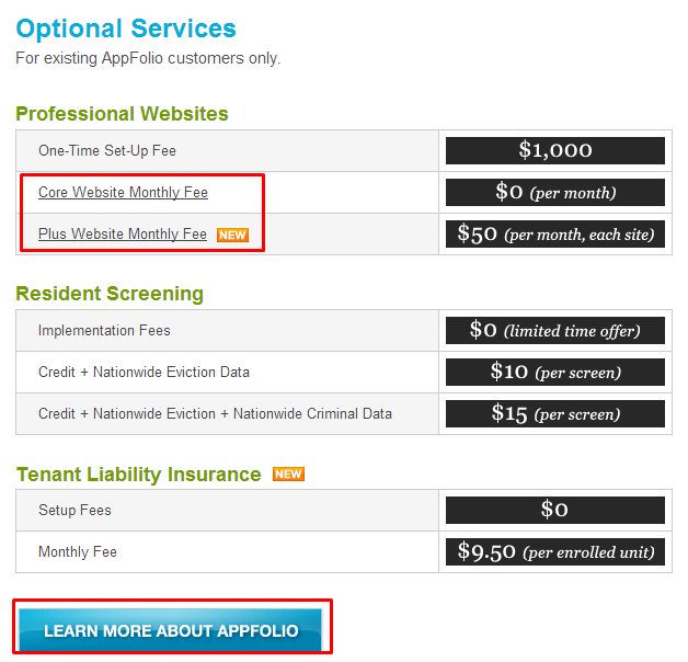
This is the only area on their pricing page where actual value costs are listed. In these additional services, we see 3 instances of a free ($0) feature plus the informational CTA, Learn More. AppFolio understands potential customers may not have the resources to build a professional website, screen residents, or offer tenant liability insurance. By capitalizing on this market gap, AppFolio can integrate additional services into their pricing strategy.
Takeaway: Strategically assign mystery value to product features, and enforce with a price per individual item plan. This dilates potential customer interest and increases proposition value.
6. Visual Website Optimizer
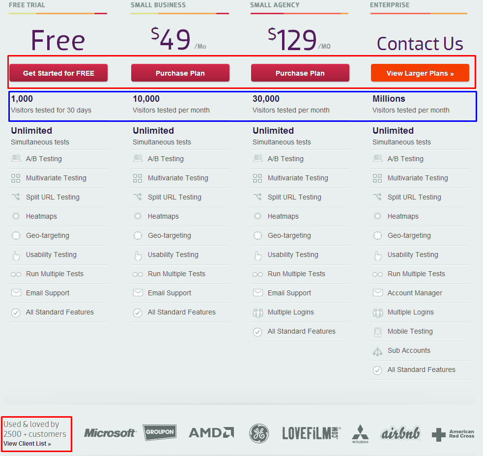
In the screenshot below, we’re looking at the noteworthy A/B testing service, Visual Website Optimizer. Their pricing page takes a slightly different approach from what we’ve seen thus far.
This time, we’re observing a 4-plan strategy, with 3 CTA options indicative of value: the standard 30-day free trial, purchase plan, and view larger plans. If we decide to View Larger Plans, we’re directed to 4 more plans, differentiated only by price and number of visitors tested, all with purchasing options. The final option, for over 1 million visitors, requires a phone call.
The company’s pricing strategy incorporates the common 30-day free trial with 8 levels of value proposition. Their higher price points are validated by client logos and testimonies (CTA conversion paths). Having reached such a high authority level in the market, they are able to meet many needs derived from visitor size.
Takeaway: Don’t be afraid to leverage popular clients to enforce higher value plans. Also, segmenting plans by visitor size helps potential customers determine where they would fit.
7. Bridgei2i
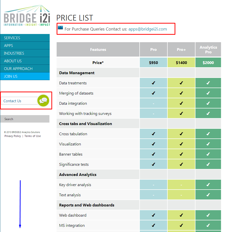
In the screenshot below, we’re looking at the business analytics service, Bridgei2i. Their pricing page is segmented into a 3-plan strategy.
Bridgei2i differs from every pricing strategy we’ve seen so far. They do not offer a free trial or extended plan options.
Instead, they completely focus on the value cost comparison of plans, indicative of features. Rather than validate the price comparison with a metric such as visitors, Bridgei2i expresses confidence in the value of their features. Additionally, we see two Contact Us CTA conversion paths. The pricing page extends to show a few more feature comparisons.
Takeaway: Uphold simplicity and tradition by validating plan costs with feature values. If you’ve done the research and you’re potential customers usually have a good sense of the features they need, stressing the value will help validate plan costs.
8. HasOffers
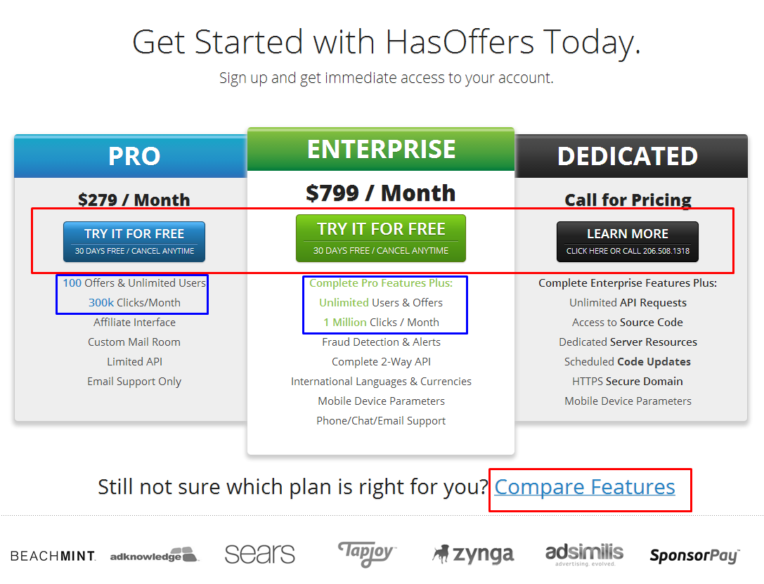
In the screenshot below, we’re looking at the pricing for attribution analytics service, HasOffers.
It’s another 3-plan option, except this time we see the return of free 30-day trials. HasOffers follows a very simple pricing plan on this primary page. We can see only 2 costs, the $279 and $799, both of which are much higher than any small or mid-sized options. If we navigate to Compare Features, the plans become very detailed.
The company’s pricing strategy is a nice mix of everything we’ve seen. They keep the number of plans at a simple 3, offer free trials, enforce value proposition with big brand logos, and validate plan costs with highlighted metric values such as Offers, Users, and Clicks/Month.
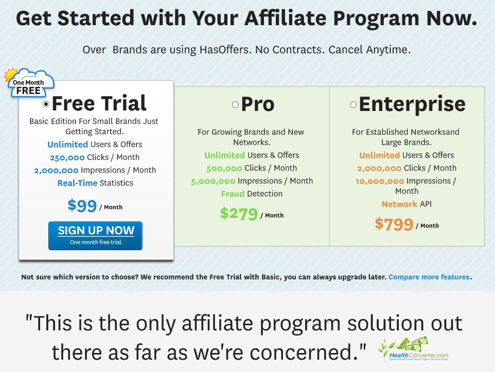
At this point, I’d like to point out how a pricing strategy evolves. I initially thought, “There’s no way they started off with a $279 minimum plan.” So I fired up Wayback Machine and put my concern to rest. These are what their options used to be:
While a $99 minimum plan is still high, they strategically defined their market with small businesses on the low end (as opposed to the “personal/individual” plans). Now, comparing the two pages, we see the basic $99 option has been eliminated and the Dedicated high-end plan has been added, along with an impressive client logo list.
Takeaway: Startup pricing does not have to follow a low cost, minimum plan model. By identifying clear customer targets and segments, SaaS companies can dictate higher value per plan. Also, as SaaS companies grow, they don’t need to change the prices for existing customers. Instead, they can offer a higher-end option like the Dedicated plan.
9. Basecamp
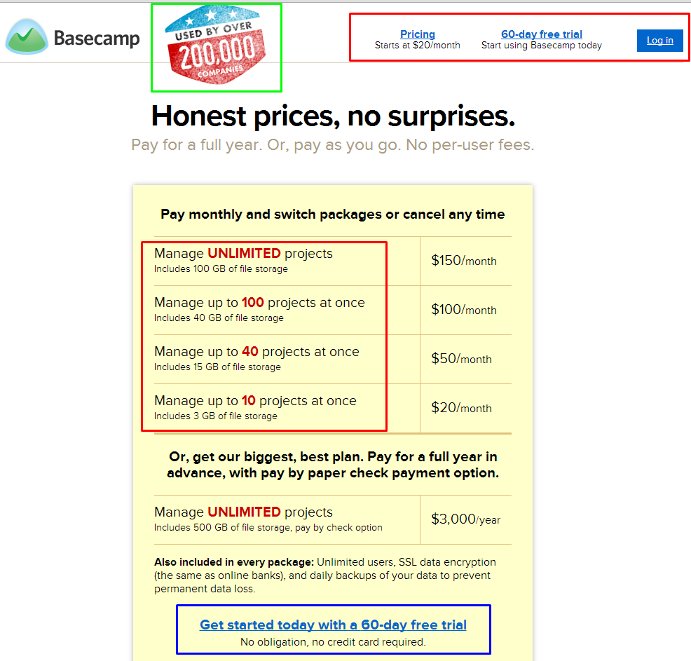
In the screenshot below, we’re looking at the pricing page for Basecamp, a popular project management service created by 37signals.
Just like the HasOffers example, Basecamp’s pricing page originally did not include the fifth, high-end plan. Also, their free trials used to run 45 days, and now they run 60. Here are the unique factors of their current pricing strategy:
- “Sandwich Order” list of prices starting with the penultimate high end, working down to the low end, and then ending with the granddaddy.
- All plan features are consolidated into one list, as opposed to the normal “column comparison charts.”
- Plan value proposition is clearly indicative of two metrics – the number of projects and the amount of file storage space.
Takeaway: Increase the value of a metric by consolidating all other features as a standard per plan. Also, by offering double the length of the industry standard for free trials, potential customers have more time to grow dependent on the product, inevitably turning into a conversion.
10. BigDoor
In the screenshot below, we’re looking at the pricing page for BigDoor, one of the most successful gamification services.
That’s odd… Where are the prices?
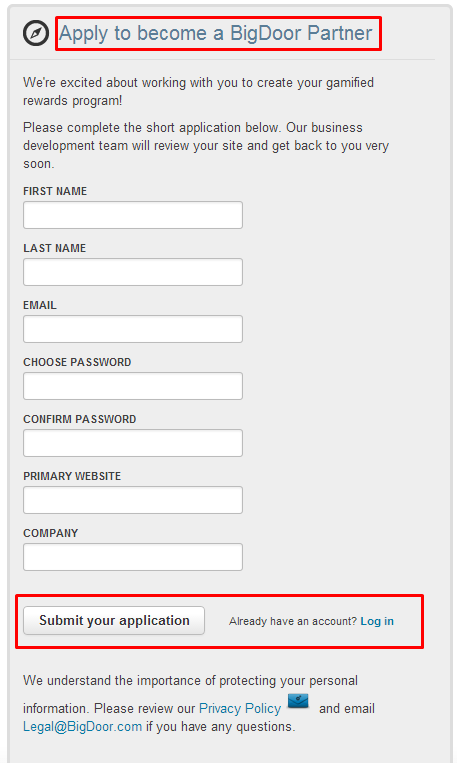
Well, for SaaS companies like BigDoor, when you reach a certain level of success, you can be a bit more “prestigious” with pricing strategies. Potential customers have to “Apply to become a BigDoor Partner” and click “Submit your application.”
Not learn more, add to cart, or get started, but submit your application. This is the definition of commanding value; but, to really gain some insights into their pricing, we need to go back in time again.
- In 2000, the site was actually a “dynamic information pod for people in Arizona.”
- In 2009, the domain was for sale. The same year BigDoor Media went public beta with website monetization solutions. The gamification element became their thesis and went live in late 2010 – early 2011.
BigDoor originally shined a big red button “Free to Get Started,” but that still directed visitors to a Sign-up page.
Takeaway: Focusing solely on registering accounts with free trials increases dependency and ultimately, conversions. This sense of exclusivity and integration of white-label solutions creates a competitive pricing strategy with high-end value.
11. BlackStratus
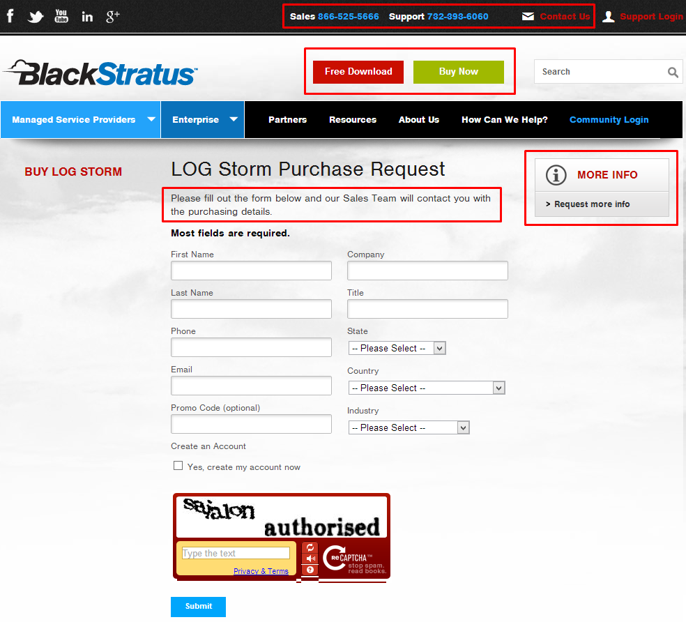
In the screenshot below, we’re looking at the pricing page for the security information and event management SaaS, BlackStratus.
Similar to BigDoor’s pricing strategy, BlackStratus focuses on registering accounts prior to purchases. Potential customers have the optional Free Download; however, they still must create an account to complete the download. Additionally, there are various CTA conversion paths, including the Sales and Support numbers, the More Info button, and the Free Download button.
This pricing strategy enforces a major tenet of their product – security. It’s an experiential strategy, where potential customers trust BlackStratus with basic information and get escorted through a secure sales process.
Takeaway: Pricing strategies don’t always have to be 100% up-front and transparent. Adding registration as a pre-requisite to purchasing enforces product tenets, such as security.
12. Evernote
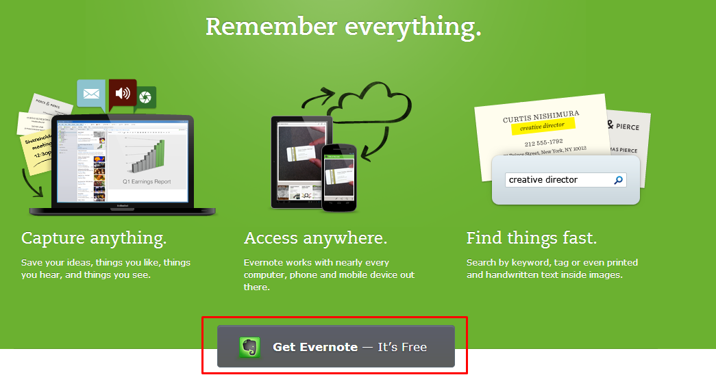
Finally, in the screenshot below, we’re looking at the pricing page for the well-known Evernote.
Freemium models work for SaaS companies, and Evernote is one of the best examples.
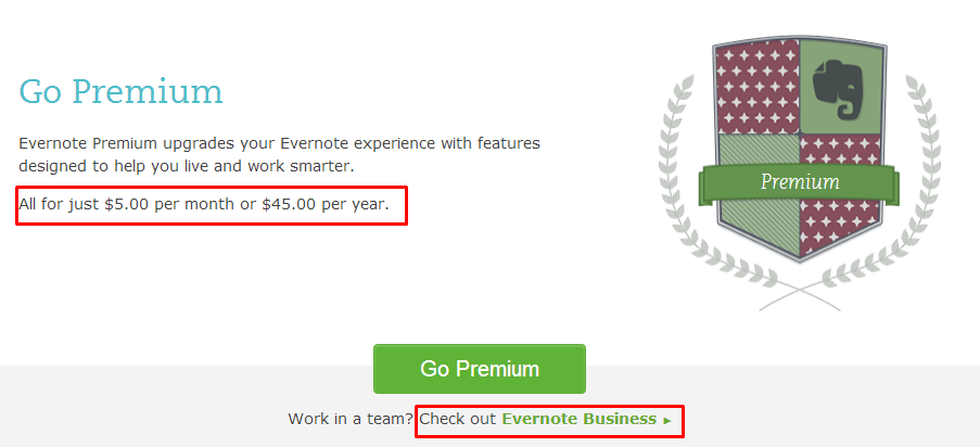
There is a clear premium option to upgrade, which is incredibly cheap compared with the other SaaS we’ve seen. Evernote also adds a top tier plan for businesses.
Here’s where freemium models work their magic:
- Level 1: Free
- Level 2: $5 per month
- Level 3: $10 x [number of users] per month
For 100 employees, that’s $1,000 per month, which is still relatively cheap. But if we look at the mid-level and enterprise solutions of previous SaaS pricing plans, it fits right in.
Takeaway: Freemium models can be dicey for SaaS companies. To succeed with freemium, we must completely understand the relationship of product value and customer needs. This means identifying and creating product restrictions and feature solutions that free users or teams will inevitably crave.
Thanks for reading!
Which SaaS pricing did you like? Have any personal favorites to add? Please share in the comments below.
Cheers!
About the Author: Jesse Aaron is a community manager at WebpageFX, has a passion for homebrewing, and writes on a variety of topics on his blog Mashbout. Follow Jesse on Google Plus.

Comments (18)