Back in September Flowr set off on the Grasshopper / KISSmetrics Phone Number Challenge. The idea was that they were going test placing a phone number on their home page to see if they could increase sign ups. The hypothesis was that by having a visible phone number on their home page, the trust factor would increase and therefore sign ups would too.
Jonathan Kay from Grasshopper Virtual Phone Systems, proposed the original concept of this challenge. He believed that:
“People feel more comfortable with brands that they can put a face behind. Even though you might purchase a product exclusively online, having a phone number on your site and the ability to talk to a real person (who cares) in turn makes you feel more comfortable taking out your wallet (or recommending someone else to) for this brand.”
TheFlowr.com Home Page Variants
Before we get into the results of this simple A/B test, let’s quickly look at the differences between the two home pages.
The image below is the original Flowr home page. If you look closely, you will see that there is no phone number on the page.
In the next image, you will see a screenshot of the home page variant with a phone number and the call to action “Want to have a chat? Call us at..” (look for the red asterisk).
The Results
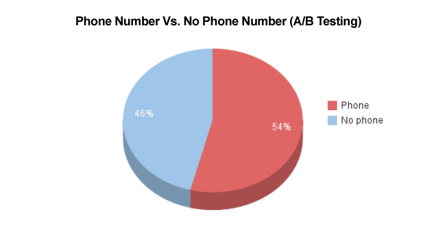
Flowr ran a simple A/B test with one home page variation. Again, the only difference in the variation home page was the addition of a small phone number and some supporting call-to-action text. The results were as follows:
Test Conditions
- Test Duration: From September 9, 2011 to October 24, 2011. (approx. 6 weeks)
- Test Item: Website home page of Flowr vs. home page variation.
- Test Type: A/B Test (only difference between variation was a phone number and associated call-to-action).
- Test Goal: Increase software sign ups from home page.
Results
- 53.96% of sign-ups originated from the home page variation with the phone number.
- 46.04% of sign-ups originated from the original home page without a phone number.
- Conversion Increase: +.5% (half of a percent increase)
Statistical Significance
We didn’t hit a statistically significant threshold during the allotted time for the test. However, we like the trend that we saw and we’re going to try another test with a bigger phone number next.
Conclusions
The first thing we would like to mention is:
The Flowr didn’t follow instructions and they still got some sign up lift!
The rules explicitly said to have a highly visible phone number on their home page variation. As you can see the phone number is tiny (at least it was above the fold). But even with this tiny phone number, Flowr was able to increase their sign ups.
Davorin Gabrovec from Flowr concluded:
“Even though we didn’t receive a lot of calls I believe that having a phone number visible on the website gives more credibility to our product and trust to our visitors. When we re-design our website we will definitely include appropriate space for a bigger phone number.”
The bottom line is that having a phone number does bring peace of mind to consumers and people you do business with. If, at the very least, it instills trust in your visitors and removes any “fly-by-night-operation” fear they may have. If you run a Software as a Service (SaaS) business, we encourage you to try testing a phone number on your site (and let us know what happens!).
About the Author: Sean Work is the former Marketing Director at KISSmetrics.


Comments (22)