You know the feeling when you pour your heart and soul into a promising new A/B test, only to have it flop like an entrepreneur’s first startup?
I certainly do.
Last year, I ran all product and brand marketing for an edutech company. For the first few months, things were amazing. I improved the CTA button, optimized the headline, and removed distracting links. The conversion rate just kept growing.
In fact, our conversion rate doubled in less than a year. Then, suddenly, the flood gates closed. I kept running tests, but for months nothing worked. At best, I could eke out a small, barely significant 3% bump.
That’s when I realized I needed a way to predict which experiments could have the largest effect before I ran them.
Studying behavioral psychology, I started evaluating and ranking potential tests based on informed predictions, and my experiments again began returning significant boosts in conversion.
With websites like Optimizely and Visual Website Optimizer, the actual experiment setup isn’t too difficult. The real work comes in choosing which tests to run.
By applying the following five psychological principles to your testing plans, you can uncover the big gains, too.
1. Law of Pithiness
One of Gestalt psychology’s central principles is the Law of Prägnanz. This law (literally, the “law of pithiness” in German) says that we tend to order our experiences in a symmetrical, simple manner.
We prefer things that are clear and orderly, and we’re afraid of complex, complicated ideas or designs. Instinctually, we know that simple things are less likely to hold unpleasant surprises.
This is why we’re terrified of credit card terms of service, and we embrace simple return policies.
Now, how can we leverage this principle to improve our conversion rates?
Case Study #1: The Sims 3 (128% increase)
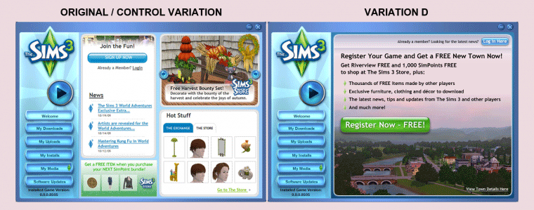
Despite having one of the best-selling computer game franchises ever, The Sims 3 manufacturers knew there still was an opportunity to improve conversions.
The original design included four primary calls to action:
- Sign up (or login)
- Browse the store
- Read the latest company news
- Get free stuff
To improve conversion rates, they tested six new variations, each of which focused on just one call to action.
Ultimately, Variation D won (offering a free town after registration), but all six of the simplified variations improved conversions by at least 43%.
So, if you’ve got dozens of amazing features, congratulations! But don’t throw all of them at your potential customers.
Just choose the one that is most powerful.
Case Study #2: Device Magic (35% increase)
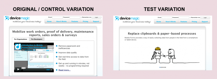
Mobile business company Device Magic had built a beautiful homepage filled with lots of bullet points, options for organizations and developers, and even an introductory video explaining how everything worked.
Concerned that it might be too technical and complex, they decided to test a simpler homepage. Free of the video, the bullet points, and even the developer and organization options, this test variation simply featured a short value proposition and a set of clean image sliders.
The new design made it easier for new visitors to understand the product (with none of the jargon), and click-throughs to the signup page shot up by 35%.
Case Study #3: Highrise (37.5% increase)
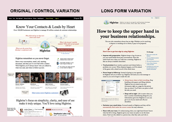
When 37signals wanted to improve the conversion rate for their popular Highrise CRM software, they decided to test a few dramatic changes.
In this test, they compared their original design with a long form, copy-heavy design. What do you think stands out most about these two designs?
The original design on the left is filled with lots of images, arrows, and headlines. Your attention is directed to twelve different places at once. It’s complicated.
The new long form design couldn’t be more different. The headline grabs my attention before I follow the single arrow to read the exciting details. It’s simple.
Make life easy for your customers by designing your pages with clear hierarchy, and focus on one target action per page.
Case Study #4: Daily Burn (20.45% increase)
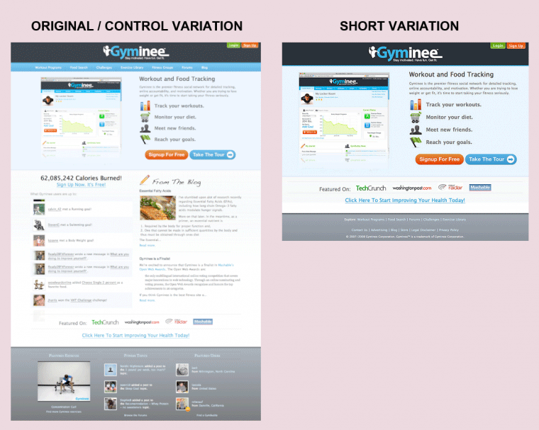
Daily Burn (formerly Gyminee) designed a beautiful homepage complete with screenshots, visualized features, and even a fancy live calorie ticker.
Since the entire company at the time was just two founders, they didn’t have the people resources necessary to do any big complicated redesigns.
Instead, they tried the simplest split test possible: they just deleted part of the page.
Over two tests, they removed various parts of the page (including the latest blog post, the live calorie ticker, and the extended footer), gradually focusing the page more on one essential element: the sign-up button.
Each of these two simplification split tests improved conversions by an average of 20.45%.
What unnecessary elements on your website distract visitors from your main goal?
Case Study #5: DesignBoost (13% increase)
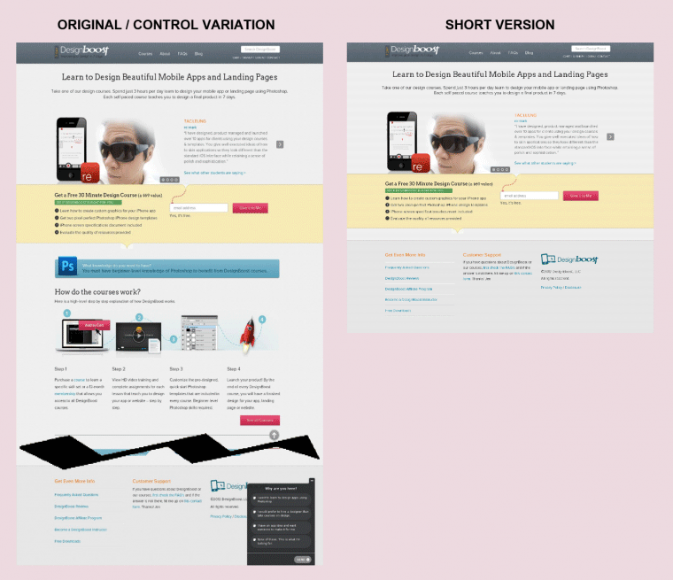
When DesignBoost launched, they knew they had lots of A/B tests ahead, and they wanted to start with the tests that could give them the largest gains.
They’d heard that shorter pages generally perform better for free offers, so they decided to test a shorter, simplified page first.
(Side note: Notice the word “generally” above. While general principles like simple design hold steady across websites, tactics like page length or specific trigger words bring in dramatically different results for different websites/audiences. That’s why we test them.)
Just as they had hypothesized, the shorter page did boost signups by 13%.
But here’s the really interesting part: with large changes like the deletion of most of your landing page, you can’t really attribute the results to one factor. Sure, the landing page is shorter, but it also lost the fourth headline, the comparison chart, and the third product image.
Macro changes can achieve large results, but micro changes likely will contribute more and better knowledge for your overall strategy.
2. Law of Past Experience
Also known as the concept of mental models, the law of past experience finds that our previous experiences contribute to our interpretation of current experiences.
This law is a little trickier than most for two reasons. First, past experiences are highly personal, so what may influence one person might have no effect on the next. Second, past experiences actually hold a weaker influence over our perception than most other psychological laws, so it can be overridden fairly easily.
Still, many past experiences – such as the notion that chairs are for sitting – are both universal and powerful.
Case Study #6: Fab.com (49% increase)
A major e-commerce retailer, Fab.com knew that even a small increase in click-through rate (CTR) on their “add to cart” button would significantly impact their bottom line.
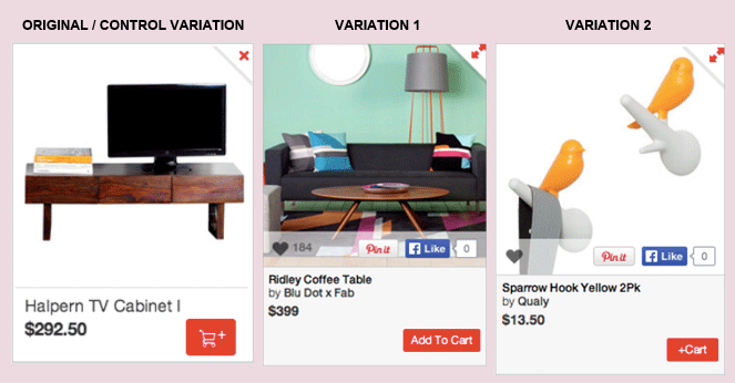
Complete with an expandable product image and a fashionable cart icon for the “add to cart” button, the starting layout was actually quite well designed, but they knew they still had room for improvement.
The variations essentially modified two elements:
- Manufacturer attribution (“by Blu Dot x Fab” and “by Qualy”)
- Call to action (“Add To Cart” and “+Cart”)
Variation 2 (with the extra descriptive text and a slightly modified CTA) led to a 15% increase. Modest, but still statistically significant.
Variation 1, however, was the real shocker. Simply adding descriptive text and creating a button with the words “Add To Cart” increased clicks by fully 49%!
What could have caused such a large increase?
Actually, it’s quite simple. While the fashionable shopping cart icon is clever and cute, it’s also confusing. Based on a couple of decades of online shopping, we expect the checkout button to say “add to cart” (go look at Amazon!).
Breaking from this mental model may well be a design improvement, but it also confuses potential customers.
Your customers are not a tabula rasa.
Case Study #7: TycoonU (130% increase)
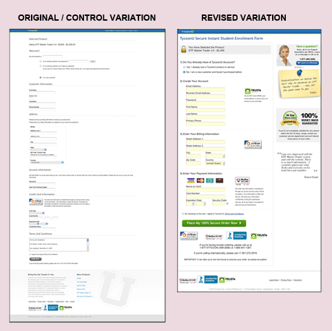
TycoonU had a big problem: 80% of potential customers left during the checkout process.
That’s a fairly large number for a step late in your conversion flow, so they knew there had to be a way to improve it.
After reading an earlier study by 37signals, TycoonU decided to completely redesign their checkout flow.
Before we get into the interesting details, just compare those two designs from a distance. What stands out?
To me (and this is where past experience is personal), the original design bears a striking resemblance to a Google form. The redesign looks like a normal checkout page.
When most people see a survey design on a checkout page, they think it is unsecure and unprofessional, not the kind of place you can comfortably put your credit card.
In the redesign, this company matched dozens of mental model triggers:
- Another column (fixes the survey look)
- More security badges (increases trust)
- Instant chat (answers last minute questions)
- Phone number (increases trust and answers questions)
As with most tests, this can’t be cleanly attributed to just one psychological principle – it’s a blended mix of dozens – but two primary principles cover most of the changes. First, the overall design plus individual elements (like the credit card images and the terms of service checkbox) all conform to the average customer’s past experience. Second, the McAfee badge, the BBB approval, and all the other third-party seals help improve trust.
Case Study #8: AMD (3600% increase)
As a computer parts manufacturer, AMD doesn’t use its website for consumer sales. Instead, they’ve designed their website to build publicity and support customers.
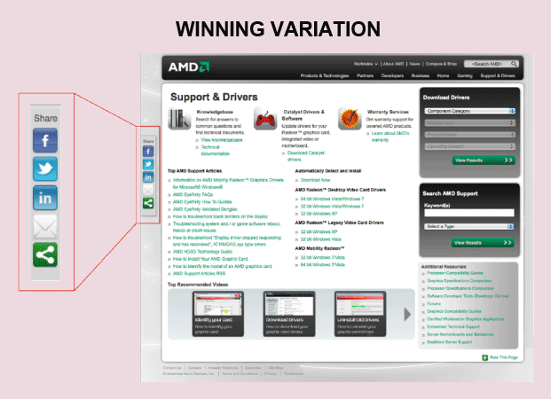
They had a set of social sharing buttons on their website, but AMD’s marketing team began to wonder whether they might be able to increase social sharing by moving or changing the buttons.
As a frequent internet user, you unconsciously expect to find sharing buttons in certain places. For instance, you might be less likely to use sharing icons in a website’s footer than you would floating buttons in the sidebar.
To isolate the optimal presentation of social sharing buttons on their website, AMD tested different variations. Specifically, they tested for placement (left, bottom, and right) and share icon (icon + link, small chicklet, and large chicklet).
The winning version (left with large chicklet) performed about 37x better than the original footer configuration.
How did such a minor change trigger this dramatic effect?
First, the new icons and placement meet user expectations better. Since many sites use a similar configuration, we as internet users are used to sharing with these icons.
Second, floating left icons simply achieve higher visibility. Many people never even scroll far enough to see icons hiding in the footer.
Finally, placing these icons on the left side of the page coincides with the “F” shaped eye movements of the average internet user. (Side note: If you’re in a country that reads right to left, you’ll probably be better off with a right side placement.)
Case Study #9: Veeam Software (161% increase)
What if it were possible to significantly improve conversions by simply changing two words?
Veeam Software wanted to increase their conversion rate, but they didn’t just race into changing random elements on their page and hoping for a small boost. Instead, Veeam took the smart route by thoroughly studying their users before testing.
Using Qualaroo (an amazing live survey platform), they asked their website visitors a simple question: “What other information would you like to see on this page?”
Looking at the results, they noticed many users were asking for pricing.
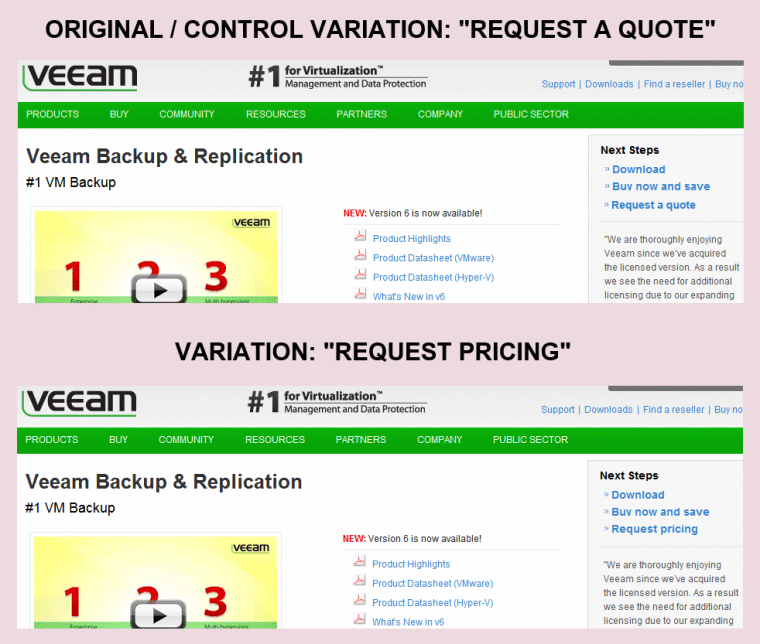
But wait! Veeam already had a “request a quote” link, so why would people be asking for pricing?
Realizing the importance of using the customer’s language, Veeam Software decided to run a very simple test: they changed the words “request a quote” to “request pricing.”
Changing those two words increased CTR to the sales contact page by 161%!
So, what’s the science behind this improvement?
Your customers aren’t blank slates; as they read your site, they have specific questions and interests.
Some might want to learn more about you; they will look for the word “about” in the header or footer. Others might want to contact you; they’ll look for the word “contact” or “email” in the header or footer. Still others will want to sign up; they’ll look for words like “sign up” and “pricing.”
Just as the most powerful martial arts moves are often the most subtle, many of the most successful A/B tests you’ll run won’t be the flashy, complicated site overhauls.
Backed by solid research and behavioral science, you will discover large conversion boosts in some of the smallest website changes.
3. Principle of Cost/Benefit Analysis
Elliot Shmukler (of LinkedIn and Wealthfront) once said that all growth can be boiled down to three primary levers:
- Increase exposure (reach more people)
- Decrease friction (make it easier to take the target action)
- Increase incentive (create a better benefit)
The principle of cost/benefit analysis explores the interaction between the last two of those levers. Human behavior is heavily influenced by the relationship of an action’s perceived benefit (downloading an ebook) versus the perceived cost (entering an email address).
This is why people will gladly give you an email address to get a useful ebook, but they’re unlikely to fill out a 60-page survey for that same ebook.
So, how can the principle of cost/benefit analysis be applied in website design?
Case Study #10: Official Vancouver 2010 Olympic Store (21.8% increase)
In 2018, as many as 80% of eCommerce shopping carts are abandoned. The Official Vancouver 2010 Olympic Store was no exception.
Looking for ways to improve the checkout conversion rate, the Olympic store decided to focus on the second growth lever – decreasing friction.
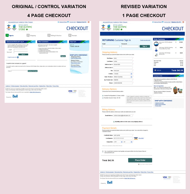
The original checkout process featured four separate pages: sign in / create account, shipping information, billing information, and confirmation.
The new checkout process featured one page to purchase, with a second page after purchase encouraging account creation.
Both checkout processes required the same shipping and billing information, but the psychological impact of putting it all on one page reduced the mental friction. You could argue that this isn’t a “real” decrease in friction since all the same information is required, but mental friction is just as real as actual friction, and the results reflect this.
In addition to cutting the mental friction, they also brilliantly moved the account creation prompt to the end of the checkout process. Doing this increases purchases since the account creation option isn’t distracting the customer prior to purchase, and it also likely increases account creation since, after you’ve already entered your information during checkout, creating an account just takes a single click.
Combined, these two changes increased conversion rates by a solid 21.8% by decreasing friction, thus improving the cost/benefit ratio.
Case Study #11: Meebox (121% increase)
Many A/B tests focus on buttons, copy, and design, but what about an A/B test of the business model?
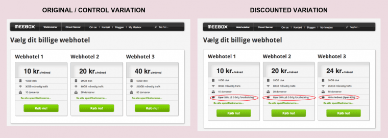
Meebox, a web hosting company in Denmark, wanted to increase revenue, so they decided to test their entire pricing structure.
Adding to their original three plans, Meebox tested offering steep discounts (up to 40%) for users who joined for two years.
The discounted variation saw a 112% increase in revenue (51% increase in conversion rate, 46% increase in average order value).
Why did this work so well?
The discount slashes the risk a customer takes in purchasing; thus, making the benefits of joining look even better.
And because more people join for the discount, Meebox will have a larger customer base for future upsells and recurring revenue. In general, it is much easier to get a current customer to buy more than to convince a new customer to make their first purchase.
Case Study #12: Soocial (28% increase)
Soocial, a former contact management company, acquired many of their new customers through a large sign-up button on their homepage.
Since they knew improvements to the top of the growth funnel often have the largest impact early in a company’s life, the founders decided to test a simple change to the sign-up button.
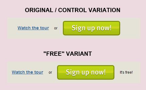
The initial version simply had a large button reading “Sign up now!” The variation didn’t change the button text, but added two words next to it: “It’s free!”
By improving the benefit side of the cost/benefit ratio, these two simple words increased click-through rate (CTR) by 28%.
“Free” is a powerful word, but you will need to be careful of two things if you try it on your product:
- If the product isn’t actually free (or if just a tiny part is), you’ll create a lot of frustrated customers, and maybe attract the FTC.
- “Free” can often imply “cheap.” If your value proposition is built around quality, using the word “free” might bring you the wrong type of customer.
Case Study #13: Expedia ($12M increase)
If you make a field optional, it shouldn’t hurt your conversion rate, right?
On the contrary, Expedia found that even optional fields contribute to friction.
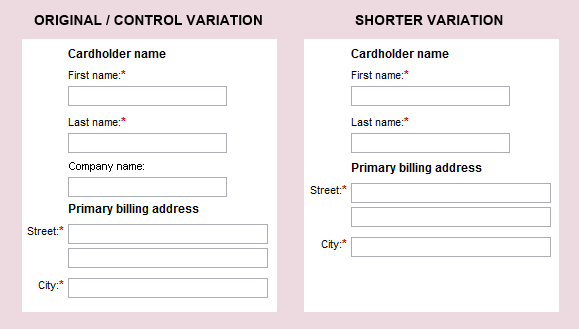
In 2010, Expedia decided to test two variants of their billing address fields. The original option required the user’s name and billing address, with an optional field for company name. The variation just required the user’s name and billing address, without any optional fields.
This one simple change – removing an optional field – increased revenue by $12,000,000.
So why did it work?
Even though the field was optional, it still contributed to friction. It made the form look longer, and every user had to read it and decide whether to answer.
Also, because many users aren’t used to seeing a “company name” field in a billing address form, this field clashed with their mental models, triggering even more friction.
4. Fitt’s Law
We all know that page load time dramatically affects conversion rates, but what about the time required to take a desired action?
Fitt’s Law proposes that time required to move your mouse to a target area (like a sign-up button) is a function of (1) distance to the target and (2) size of the target.
In general, this means you can increase CTR to a desired action by making the target large (i.e., a button rather than text) and placing it near the expected mouse location (i.e., across a multi-page form, buttons should be placed in the same position to minimize mouse movement).
Inversely, you can decrease undesired actions, such as cancellations, by using a small target (text link) at a distance from the starting mouse position (near the bottom of a page).
If you’ve ever used WordPress, their UX follows Fitt’s Law admirably. Frequent actions like “Publish” use large buttons while less frequent actions like “Move to Trash” use smaller text links.
Case Study #14: Hyundai (62% increase)
The car manufacturer Hyundai created a website to generate test drive and brochure requests in The Netherlands, but they had a problem: very few people signed up.
To remedy this, Hyundai’s marketing agency decided to try a three-pronged approach:
- SEO-friendly text (if it didn’t hurt conversion rates, they could use it to increase traffic)
- A larger image (more graphically appealing)
- Two large CTA buttons
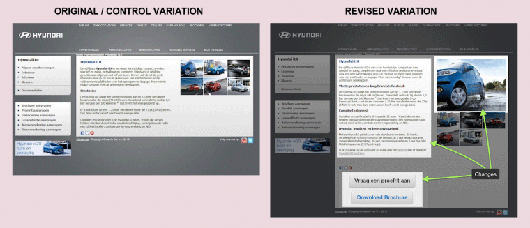
Prior to the test, a website user could book a test drive or order a brochure (the two target actions) only by clicking a small text link in the left sidebar.
In the new variation, users got two large CTA buttons above the fold.
Combined, these changes resulted in a 62% increase in total test drive and brochure requests with a 208% increase in CTR.
(Side note: This is an example of proper multivariate split testing. Rather than simply making three changes and never knowing where to attribute the increased conversions, they ran eight different variations, combining one or more of these changes. In the end, the variation with all three changes drove the highest conversions.)
While the larger buttons follow one aspect of Fitt’s Law, the distance to the buttons still is fairly large. I would suggest that in the next test, they should try moving the CTA buttons to the top of the page (and probably removing the social sharing icons entirely).
Case Study #15: Obama for America 2012 Campaign (22% decrease in unsubscribes)
In the 2012 election cycle, President Obama’s email campaigns generated about $500 million in donations.
He also had an amazing optimization team that tested everything.
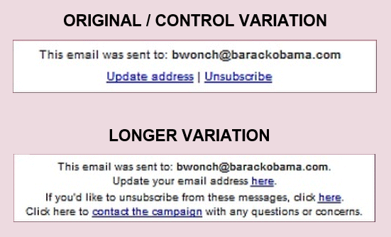
In one particular test, they decided to experiment with a couple of different variations of unsubscribe links in the campaign emails.
The starting unsubscribe rate was already startlingly low (195 unsubscribes out of 578,994 recipients!), but when they applied Fitt’s Law by making the unsubscribe link smaller (“here” instead of “Unsubscribe”) the unsubscribe rate dropped 22% lower.
Aside from Fitt’s Law, the decreased unsubscribes on this variation also can be attributed to an inverse application of the Law of Past Experience. When a person thinks about unsubscribing from an email list, their brain automatically starts scanning for a link labeled “Unsubscribe,” just like it looks for a “Contact” link on a website. By changing their text to “If you’d like to unsubscribe from these messages, click here,” they increased mental friction required to unsubscribe.
Sometimes, you actually can use the same psychological principles to decrease actions you don’t want your users to take.
Case Study #16: SAP (32.5% increase)
Enterprise software company SAP wanted to increase trial downloads of their Crystal Reports® software.
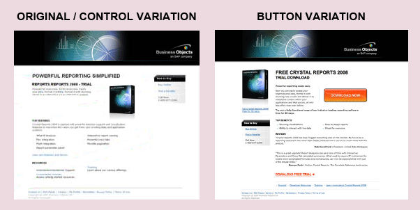
The original page looked like a normal corporate website – fairly formal with lots of text. In fact, the download link also was text.
To improve this design, they tested a couple of variations that followed conversion best practices while still meeting the corporate branding requirements.
The winning design featured a number of important changes (including removing distractions and adding a second CTA at the bottom of the page), but one in particular stands out: the download button is clearly differentiated from the rest of the page.
Instead of forcing potential customers to find and click a small hyperlink, this new variation invited downloads with a large, easily located button.
The result? Trial downloads increased by 32.5%.
Interestingly though, bigger isn’t always better. In my experience with A/B testing, larger buttons definitely drive higher CTRs, but eventually you reach a tipping point where the button looks like a box and people start getting confused.
Case Study #17: The Vineyard (32% increase)
So, A/B testing is great for all these internet companies, but what about normal offline businesses?
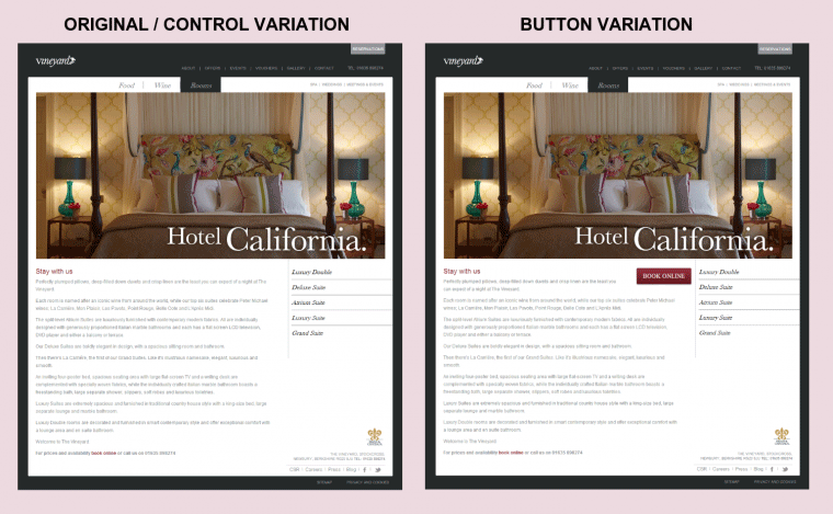
The Vineyard, a luxury hotel near London, decided to find out by running a test on their website. For this particular test, they focused on variations that offered a high chance of improving their conversion from website visitor to booked guest.
The original page featured a large beautiful photo of a room with copy telling the story of their hotel. Then, at the very bottom of the page, they added a small link to “book online.”
The test variation left everything the same, but simply added a red “Book Online” button at the top of the page.
Adding that one button increased CTR by 32%.
Because this is one of those rare case studies where they changed only one element, it’s possible to clearly attribute the increase directly to Fitt’s Law.
In this case, they moved the CTA to the top of the page (shortening distance to click), and they used a button instead of a text link (increasing the size of the target).
A/B testing can be applied to great effect even on smaller websites. You just have to be more selective in choosing high potential tests.
5. Facial Recognition
As humans, we subconsciously watch for other humans. When we come across a human face on a website, we will (1) immediately jump to it and (2) assess the emotions showing on the face. None of this is intentional, and we might not even realize that we do it.
So, now, your visitors will notice if you put a face on your website, but will it improve conversions?
Human faces can increase conversions in two ways:
1. Attracting Attention
Since faces grab attention better than nearly anything else, you can use them to direct your visitors’ focus to the key elements on a page. Even better, if you use a face that’s looking at your CTA, most visitors will follow the person’s gaze to see what they’re looking at.
In the 1960s, a group of psychologists completed a study on human behavior where they had different sized groups of people stand on public sidewalks and stare up at nothing with rapt focus. A single person looking up drew almost no attention (4% of passers-by joined), but a crowd of 15 gazing up together drew nearly 40% of passers-by.
2. Conveying Emotion
We’re all experts at reading human emotion, and the emotion we find displayed on faces subtly influences our feelings about a website. If a person looks genuinely happy or sad, we’re likely to feel similarly, but be wary of stock photos. Overly exaggerated emotions likely will be off-putting and seem fake.
Studies have found that most sharing is driven by positive emotions (amusement, interest, surprise, etc.). On the other hand, hormones released by empathetic sadness may increase donations. Choose an emotion that will best affect the CTA on your particular page.
Case Study #18: Highrise (102.5% increase)
Remember Highrise from earlier? After their first test landed a solid 37.5% increase in signups, they didn’t rest on their laurels.
Instead, they launched another A/B test, this time based on facial recognition.
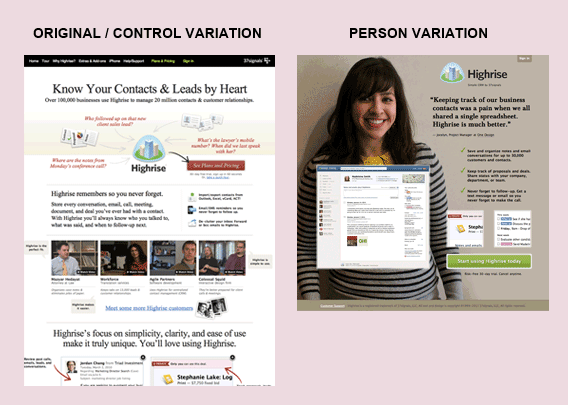
The control in this experiment was their original design: a fairly normal, busy website with lots of details and distractions.
In the test variation for this experiment, they condensed everything to three primary elements: a large screenshot, brief sales copy, and a large background image of a smiling customer.
Not only did this new variation still have the Law of Pithiness on its side, but the smiling, genuine face immediately grabbed the attention of new visitors while simultaneously making them happy.
This variation increased conversions 102.5% vs. the original baseline.
After seeing the success of this test, Highrise went on to test a few other faces in the same design. Although some landed small 5% improvements, they found that the specific face mattered less. Putting any customer’s mug shot on the website produced essentially the same result.
Case Study #19: Medalia Art (95.4% increase)
Boutique online art shop Medalia Art listed some of their artists’ profiles on the homepage. Then, new visitors could click through to an individual artist’s page, where they could browse paintings and purchase.
Because many of the conversions occurred over the phone, Medalia simply wanted to increase the CTR from homepage to artist page (though they could have used something like CallRail to track phone conversions).
In their test variation, Medalia simply replaced the painting icons on their homepage with profile pictures of their artists.
The result? A quick 95.4% increase in CTR to artist pages.
Human faces draw attention, so in a situation like this where the photo actually links to the next step, human faces can produce amazing results.
Also, people never just buy the product; they buy the story. Using artists’ faces on their homepage helped Medalia start telling the story immediately.
Case Study #20: Harrington Movers (45.45% increase)
Remember when I mentioned that human faces in stock photos aren’t as effective as authentic people?
Harrington Movers originally used a stock photo of a smiling couple holding boxes. Looking for opportunities to boost their conversions, they decided to test two variations of this image: (1) replacing it with a photo of their moving crew, and (2) swapping it for a photo of their company moving truck.
Both tests significantly improved conversions (45.45% and 45.05%, respectively).
So, again, using photos of human faces can increase your conversion rate, but don’t assume all photos are created equal. We’re pretty good at spotting stock images these days, and we often find them inauthentic.
But, while the variation with the photo of the crew makes sense, why would a photo of a moving truck in front of a house also increase conversions?
I would speculate that this photo helps for two reasons:
- It builds trust – the company logo on the side assures customers that this company actually exists.
- It helps customers visualize – “that could be my house getting packed into that truck!”
Conclusion: Use Behavioral Psychology to Guide Tests, but Test Everything
Behavioral psychology “laws” are really just useful theories that have worked thus far. But, it doesn’t mean they’re flawless. Also, they can overlap. While you are applying one law, you may be simultaneously (and inadvertently) violating another.
As a result, psychological principles provide amazing guidance in discovering and planning powerful A/B tests, but you still need to run the tests to make sure your particular implementation works.
Sometimes videos boost conversion, often faces help, and occasionally strange button colors do the trick. Always, the results vary from website to website.
So, go plan some high potential split tests and start improving your conversion rate!
About the Author: Nate Desmond enjoys experimenting with the best ways to find and engage amazing customers. He shares many of his favorite growth learnings on his blog. Subscribe to his email list to get a free ebook sharing the exact content marketing tactics he’s used to drive over half million visits to his blog.


Comments (33)