Let’s admit it. We’d love for people to line up to buy our products on launch day.
But the hard reality is we need to work our socks off to attract attention to our products.
We need to work bloody hard to get people to buy our products.
Do you sometimes wonder if there’s an easier way? Do you want to know if there is a way to prevent web visitors from bouncing? Would you like to find out if there is a method for turning those visitors into customers?
Let’s have a look at how Apple engages and enchants.
Today’s 7 lessons will help you persuade your customers to buy. These lessons work even if you think your products are boring. Boring products don’t exist (more on that later).
Let’s start with the first Apple lesson for persuasive web content.
Lesson 1 – Write for Scanners
Do you know how web visitors read web copy?
They usually don’t.
Web copy is scanned or glanced at, not read.
According to research by Jakob Nielsen, only 16% of test users read web copy word by word; 79% of test users scan a page by picking out individual words and sentences.
How can you write for scanners? Apple copywriters follow these three rules:
Rule 1: Use headlines in giant fonts to highlight one big idea:
MacBook Pro with Retina display. The world’s highest resolution notebook.
Rule 2: Entice scanners with sub headlines before every two or three paragraphs, or even before each paragraph. Make scanners curious. For instance:
Why you’ll love an iPad.
Rule 3: Follow the principle of the inverted pyramid. Start a paragraph with your most important point, followed by less important points. The least important points should be last. So, when scanners read only the first sentences of your paragraphs, they still will get your key points.
The inverted pyramid: The sub headline tells you the keyboard is backlit. The first sentence tells you the keyboard is full size. These are the two main messages of this paragraph.
The inverted pyramid rule applies to the order of sentences in a paragraph and to the order of the paragraphs – put your most important paragraph first.
The fourth rule for scanners is to write fascinating bullet points. But Steve Jobs NEVER used bullet points in his presentations, and it seems his ideas prevent Apple copywriters from using bullet points on web pages, too.
Quick tips for easy-to-scan web copy:
Don’t waste your visitors’ time. Tell them quickly what you’re about in your headline. Entice them with seductive sub headlines. And if you’re not worried about incurring the wrath of Steve Jobs, use easy-to-scan bullet points.
Lesson 2 – Write for Readers, Too
Apple’s seductive sub headlines entice scanners to stop skimming and start reading. And reading is made to be as effortless as possible with:
- Short paragraphs. Feel free to use one-sentence paragraphs occasionally.
- Short sentences. Want to start a sentence with But, And, or Because? No problem! It keeps the average sentence length short.
- Simple words. Use words that are short and easy to understand.
Apple copywriters use difficult words only when they want to impress readers with technical product information:
With tolerances measured in microns, mono-crystalline diamond-cut edges, and sleek metallic finishes, iPad mini was designed and engineered to incredibly high standards.
As legendary copywriter Joe Sugarman suggests: “Providing a technical explanation that a reader may not understand shows that we really did our research, and if we say it’s good, it must be good. It builds confidence in the buyer that he or she is indeed dealing with an expert.”
Remember: technical details boost your credibility.
Quick tips for readable web copy:
Use short paragraphs, short sentences, and simple words (unless you’re presenting a technical explanation).
Lesson 3 – Use Design to Create Interest
Copywriting for the web isn’t only about words.
Like yin and yang, web design and content interact and strengthen each other. Both impact readability. Both impact the perception of who you are. Both can make your products more desirable.
Apple’s web designers use several design techniques to create interest and encourage visitors to continue reading:
- Use white space to make content stand out. It prevents the reader from feeling overwhelmed and encourages reading the next snippet of information.
- Alternate images and text – from left to right and from right to left – to create interest. Readers can be lulled to sleep by one long column of text, so break it up by having paragraphs of text in the left-hand column first, then in the right-hand column next, and, after that, in the left-hand column again, etc.
- Highlight calls-to-action in a different color. Apple consistently uses blue for calls-to-action and adds a small blue arrow, too.
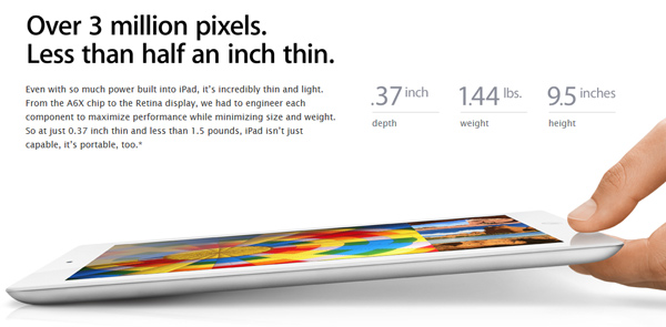
- Use larger font sizes to draw attention to specific product details. The Apple team likes to highlight numbers to add credibility.
Apple draws attention to specific figures to increase credibility.
Quick tip for web copy design:
Are you a copywriter? Don’t send your copy to a web designer and expect your job to be done. Copywriters and web designers should work closely together. Writing and designing a web page is not a sequential process.
Lesson 4 – Understand the Rules of High-Converting Copy
You need to entice scanners to become readers. And you need to entice readers to take action.
Maybe you’d like your web visitors to click through to a product page, sign up for your newsletter, or buy a product. How can you encourage your readers to take the next step?
The following are the persuasion tricks Apple copywriters use:
Trick 1: Use hypnotic words like you, because, and imagine. These words are persuasive because they bypass the critical mind of the reader:
Email is fun? On iPad it is. Because you can flick through your inbox. Tap to open attachments. Pinch to zoom. And turn iPad from portrait to landscape to change your view.
And you can sense that every time you pick it up. It feels beautifully made. Precisely because it is. (iPad mini)
Imagine sidesplitting, adventure-filled, must-see flicks produced by you and shot on iPhone 5.
Trick 2: Overcome objections. If you’d like your readers to buy your products, you need to overcome any reasons they might have to NOT want to buy. Apple realizes that customers are concerned about batteries running out of power:
iPad features a 3.1-million-pixel Retina display and an advanced A6X chip. How much of an effect does that have on battery life? Almost none. You still get up to 10 hours of power to read, watch, play, write, and create whatever you want, all you want.
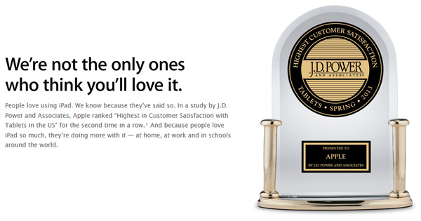
Trick 3: Provide proof. When possible, let others brag on your behalf. Even the mighty Apple shows off their awards to enhance credibility.
Apple provides proof of customer satisfaction.
Trick 4: Respect the stage of the buying process your visitor is in. He or she may not be ready to buy. For buyers, Apple suggests going to a store or online. But for those not ready to buy, Apple suggests they either compare various models or telephone to ask questions.
Quick tips for persuasive web copy:
Help buyers justify their purchase with rational arguments. Also, overcome objections and provide proof.
Lesson 5 – Treat Each Page Like a Landing Page
Are you treating your web visitors like human beings?
Maybe that’s wrong.
Jakob Nielsen has compared web visitors with wild animals. Web visitors are hunting for information or a product to buy, just like a hungry tiger hunts for his next meal.
When a panther sniffs a scent, he quickly decides: will the trail lead to a good meal, and will it be an easy catch?
Your web visitors consider the same two things: does your website offer what they’re looking for, and will they find it easily?
Now, take into account the fact that your web visitors are likely to land on any of your pages, not just your home page, and that this is especially true if your website is well-structured and optimized for SEO.
That’s why each web page requires a headline to create interest and quickly tell a reader what you have to offer, a value proposition, and a call-to-action.
Quick tips for writing web copy:
Treat each web page as a billboard. Get your main message across quickly and entice web visitors to read on. Don’t forget to include a call-to-action on each page.
Lesson 6 – Mesmerize Your Readers with Beautiful Copy
Apple copywriters understand the beauty of language. They know writing copy is an art. They use poetic techniques like rhyme, rhythm, and repetition to make their copy sound good, grab attention, and be more memorable.
Rhyme is a powerful technique. The smooth sounds of rhyming words make them easier to remember (as in nursery rhymes):
iPad isn’t just capable, it’s portable, too.
The world’s largest – and smartest – collection of apps.
Alliteration is the repetition of sounds at the beginning of words. It’s also called head rhyme:
A display that’s not just smaller. It’s smarter. (iPad Mini)
Repetition is the deliberate re-use of a word in one sentence to add emphasis:
And because it’s so easy to use, it’s easy to love. (iPad Mini)
Rhythm is the repetition of patterns of stressed and unstressed syllables. A sequence of sentences or phrases with a similar rhythm can emphasize your statements:
iPad can be whatever you want it to be. It’s your web browser. It’s your inbox. It’s your favorite novel.
Apple’s copy often includes a short series of staccato-like sentences:
Expanded view. See it. Play it. Explore it. (iTunes)
Analogies and metaphors can help to make abstract concepts concrete and clear:
iPhone 5 is made with a level of precision you’d expect from a finely crafted watch, not a smartphone.
Contrast draws attention and makes your statements stand out. Apple copywriters use contrast especially to highlight technical ingenuity:
Over 3 million pixels. Less than half an inch thin. (iPad)
Quick tip for enchanting web copy:
Delight your readers with beautiful web copy. Steal techniques from poets to make your copy more memorable.
Lesson 7 – Show, Don’t Tell.
The Apple website is designed to create desire for their products.
Large pictures almost make you forget you’re looking at only pictures, not real product. The products are the heroes on each web page.
Think your product is too boring? This is what advertising legend David Ogilvy has to say about boring products:
“Whenever you can, make the product itself the hero of your advertising. If you think the product too dull, I have news for you: there are no dull products, only dull writers.” ~ David Ogilvy
On the Apple website, even a picture of a “boring” product like the fan in the MacBook Pro looks good.
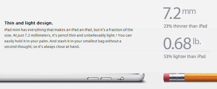
Apple’s use of imagery goes beyond product shots and videos. They use images to reinforce features. Do you know of a more powerful way to show how thin an iPad is than by putting it next to a pencil? And stressing that it easily fits in your bag?
Quick tip for creating web content:
Remember: most people don’t read, but rather scan, web pages. Cut the number of words on your web pages drastically. Where possible, use images instead of words.
The Truth about Creating Persuasive Web Content
I’d love to tell you that creating persuasive web content is easy.
I’d love to tell you that all you need to do is follow a few formulas.
But creating persuasive web content isn’t just about choosing the right words, selecting a readable font, and having nice product pictures.
You need to do much more than that.
Combine beautiful words and powerful visuals to dazzle your audience. Create desire by appealing to both emotion and logic. Design an enchanting experience for your web visitors. Because that’s how you win more business.
About the Author: Henneke Duistermaat is a marketer and copywriter. She’s on a mission to stamp out gobbledygook, and she helps companies earn business with engaging e-newsletters and persuasive web content. Sign up for free copywriting and content marketing tips at Enchanting Marketing.


Comments (35)