It’s a story wrought in the deepest pit of marketing despair.
You work hard to get a #1 ranking. Maybe it takes you a matter of months, or maybe it takes you years. But it definitely didn’t happen overnight.
It was a grueling process of moving from page 3 to page 2, then from result 10 to result 5, and finally, to result 1.
After all of that time and hard work, it’s finally paid off.
You sit back, stare at your analytics dashboard, and wait for the leads and conversions to start rolling in.
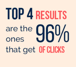
After all, you know that 96% of clicks go to the top 4 results, and you’re #1. So it’s time to receive your dues.
A few days pass and you’ve had an increase in traffic, but no extra sales. You double check your rankings, and you’re still number one.
Hmm.
“Maybe it will just take some time to pick up,” you think to yourself.
A month passes and then another month.
Still, no extra sales.
What gives?
All the SEO stats promised you that a #1 position would generate more leads, conversions, and traffic.
It works for everyone else, but it’s not working for you. Meanwhile, you’re stuck thinking about all the potential that you’re missing out on.
93% of online experiences begin with a search engine.
And 75% of users never scroll to page 2.
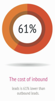
Plus, inbound leads are supposed to cost you 61% less than outbound leads.
But, again, you aren’t reaping any of those benefits.
Despite everyone telling you their SEO winner stories, it’s not working for you.
I’m here to tell you that there’s a problem. Here are the four things that might be wrong if you’re not gaining conversions from a #1 SERP spot.
1. You’re targeting the wrong keywords
The keywords you use on your website and content are super important.
Without doing keyword research and including the right phrases, your chances of ranking well are minimal.
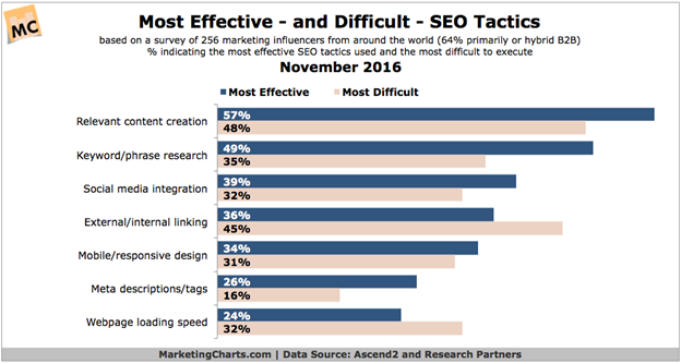
That’s probably why 49% of marketers consider keywords to be the most effective SEO tactic.
But we’re not talking about how to rank well, are we?
No, we’re not.
We’re talking about conversion problems when you already rank well. So what part do keywords play in that scenario?
Well, if you’re in the #1 position and you’re not seeing increasing sales of your product or service, the problem might be that the keywords your website is ranking for are the wrong keywords.
For example, if I want to find a place to get my haircut in town, I’m probably going to type in something like “guys haircut” or “haircut for guys.”
I’m probably not going to type in, “The best haircut in town.”
And those keywords can make the difference between a #1 ranking that converts and one that doesn’t.
If you’re in the #1 position for the keyword “the best haircut in town,” but no one is typing that into Google, then your #1 position doesn’t do you a whole lot of good.
What you want to rank for are high-traffic keywords.
But how do you determine which keywords are high-traffic and which ones are a waste of time?
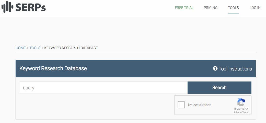
Go to SERPs Keyword Database.
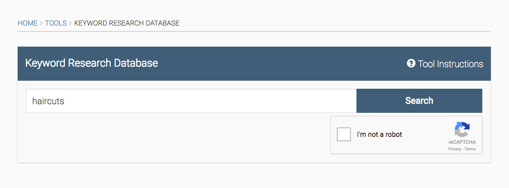
Type in the keyword niche you’re trying to focus on.
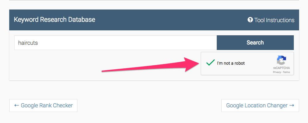
Then click the “I’m not a robot” prompt.
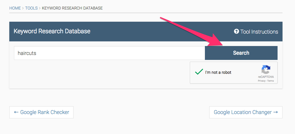
Now click “Search.”
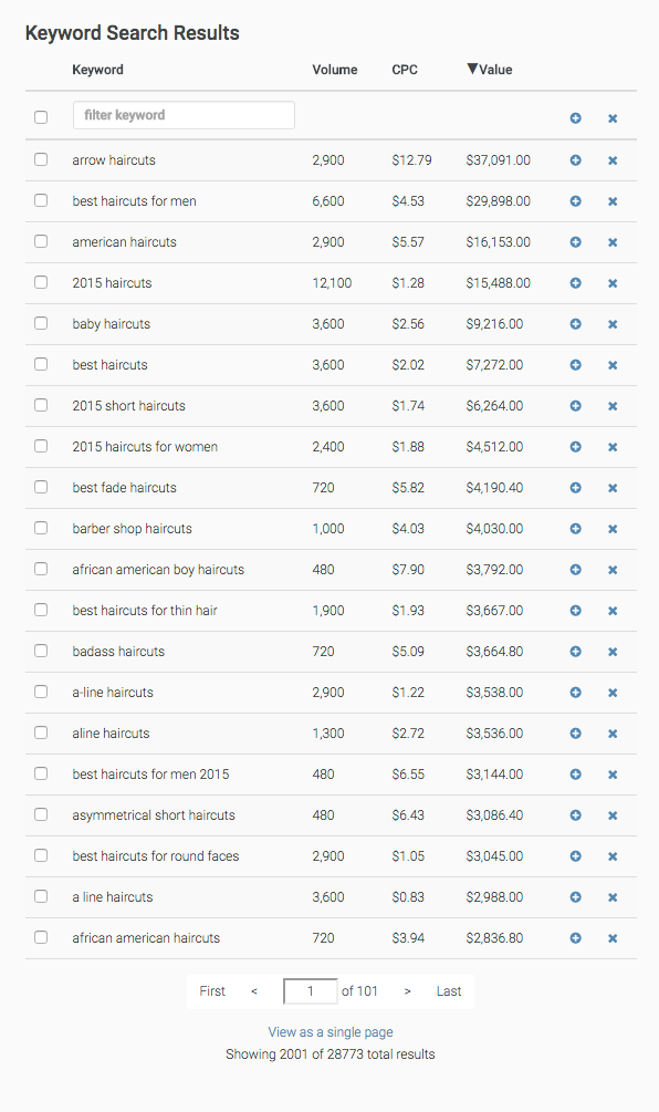
What you’ll see is a list of the most-searched keywords that include the word or phrase you typed in. It will even show you the volume, value, and average cost-per-click of that keyword.
Here are the results for “haircuts.”
If I specialize in men’s haircuts, then I might want to consider targeting “best haircuts for men” because it has the most search volume surrounding it.
Here’s a good test to run on your website. Type in the exact keyword that you have a #1 ranking for and check out the search volume.
You might find that the keyword you spent all that time targeting isn’t bringing you conversions because no one is searching for it.
But don’t fret. Just change the target keywords to a higher-volume phrase.
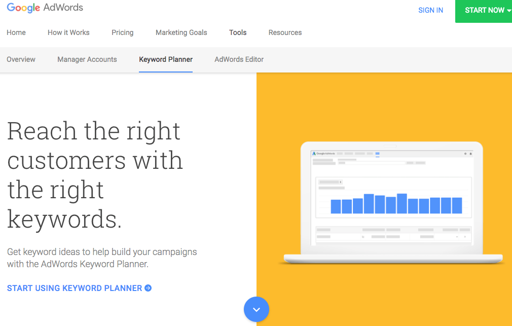
For additional keyword research, you can check out Google’s AdWords planner.
Now there’s one more thing we need to discuss when it comes to keywords.
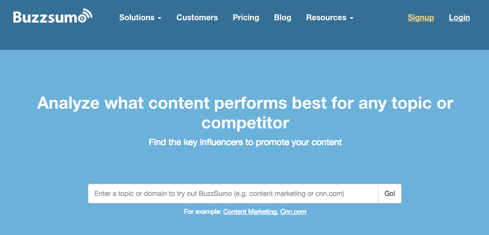
If you’re wondering how the competition is performing with their rankings and content, head over to BuzzSumo.
You can enter a competitor’s URL and examine the content that is generating the most social interaction for them.
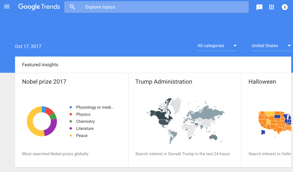
Or, for a more holistic view, you can go to Google Trends and discover the topics that are currently the most popular.
BuzzSumo and Google Trends will help you understand which topics are hot right now and which aren’t. Focus on high-volume topics and high-volume keywords and your #1 ranking will thank you for it.
2. Your website isn’t set up for conversion
It’s one thing for your website to rank well. It’s quite another for it to convert visitors.
In the end, traffic generation does absolutely nothing for your business if it’s not turning some of that traffic into cold, hard cash.
Unfortunately, many people market well in one regard and then fall short in another.
Such is the case when you have the #1 ranking for your target keywords, but your website is too dysfunctional to convert all of those people flocking to your content.
But how do you set your website up to convert visitors? How can you ensure that you’re really making the most out of your #1 ranking?
To answer that, let’s consider some landing pages that are set up well for conversions.
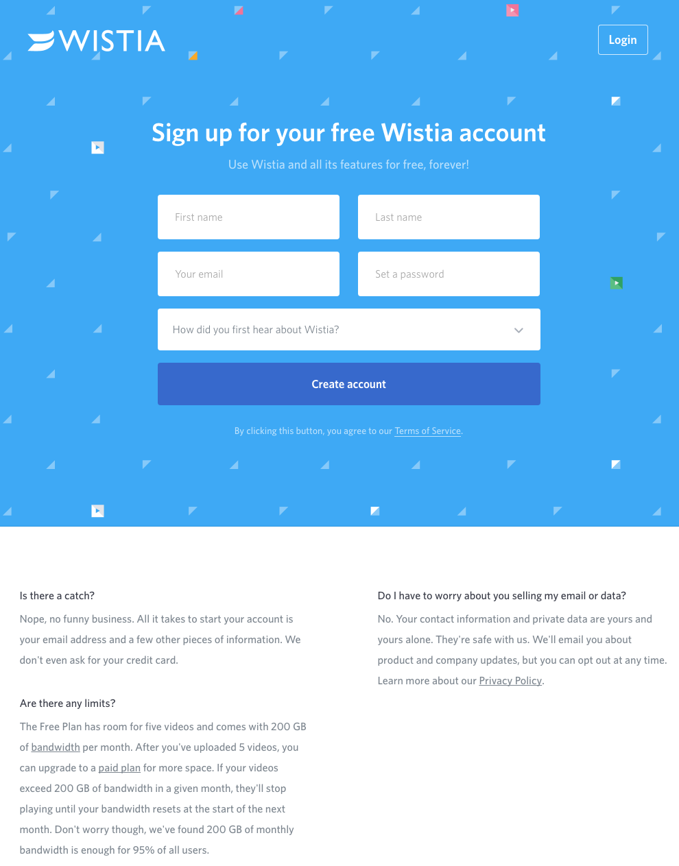
Like this landing page from Wistia.
What I love the most about this landing page is that Wistia keeps it dead simple.
They have a form that is wildly easy to fill out. They have a basic blue background that works wonders for not distracting from their CTA.
And they have answers to questions on the bottom in case someone is hesitant.
When you don’t know what to do with your website wording and design, always err on the side of simplicity.
Blank space and simple design won’t ever hurt your conversion rates, but too much text and cluttered, distracting aesthetics will.
Simple doesn’t necessarily mean boring.
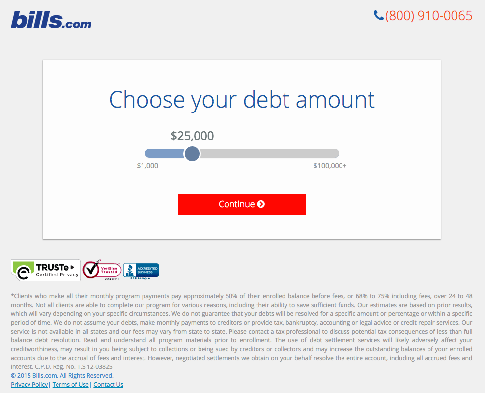
Now take this landing page from Bills.com.
Instead of trying to convince the visitor to purchase with some savvy sales copy or eye-catching design, Bills uses an interactive landing page to catch their visitor’s attention.
Then, they include reputation-building logos on the bottom left.
When people can interact with a brand that they trust, they feel like they’re getting free value.
With interactive elements, you can cut right to the problem that your audience is experiencing and solve it for them instead of fiddling around with design and sales copy.
Keep the design clean, make the copy simple, and allow visitors to interact immediately with your product or service digitally.
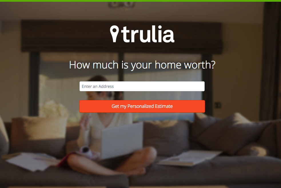
Trulia’s landing page is a wonderful example.
The design is simple but elegant. Instead of a blank background, they use a blurred picture that adds a nice touch to the personal feel of the website.
They also make their CTA stand out by coloring it red. Since nothing else on the page is that color, it immediately draws the visitor’s eye to it.
Their landing page is also great because it only requires one piece of information for the visitor to opt in: their email address.
Generally speaking, the fewer fields you have on your opt-in form, the better the conversion rate you’ll experience.
If you can, also try to make your website personal to your brand’s voice.
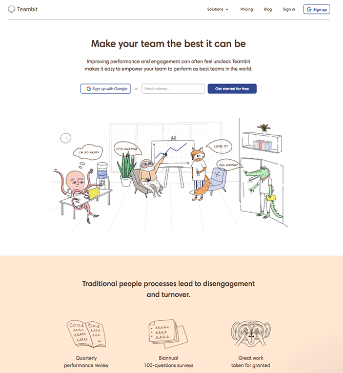
Take Teambit’s page, for example.
Some websites are far too formal to get away with having a cartoon on their landing page. But for Teambit, it works.
Teambit’s voice is playful and friendly, and its landing page continues with this tone.
The more consistent your voice throughout your entire website, the more people will trust you.
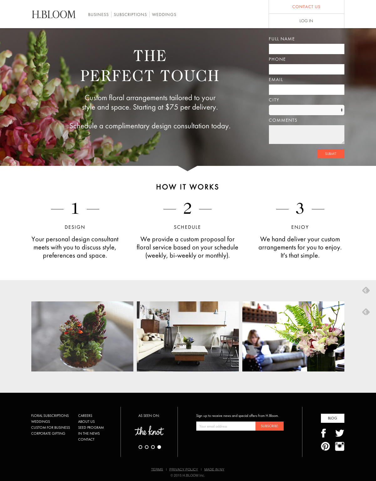
This is something H.BLOOM does well.
Not only is it beautiful, but the entire thing is consistent with their brand. It also has the CTA at the top, exactly where it should be.
And it has a dead-simple “How it works” section.
A lot of times, businesses lose out on sales because they don’t clearly explain what they have to offer.
By including a simple “How it works” piece like this one, you’ll ensure that you don’t lose clients or customers because of poor communication.
If you make the process seem really simple and easy to implement, but promise staggering results because people will want to try it out for themselves.
It worked for Airbnb, didn’t it? They are taking over the world of lodging one location at a time.
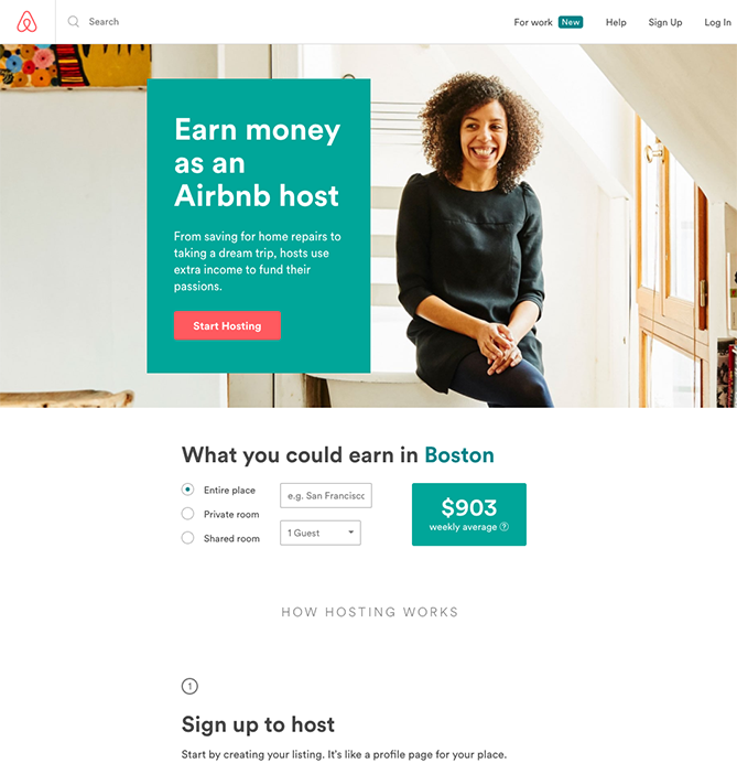
Check out their landing page.
Airbnb can’t survive without its hosts — people who are willing to use the app to rent out their houses to travelers.
Because of that, this landing page caters directly to people who are interested in renting out their houses using Airbnb.
The biggest motivation for someone to do this is the amount of money it can make them, so their landing page is wildly compelling.
$900 per week is no small amount of money.
That, in and of itself, could probably convince a lot of people to live in several houses throughout the year, renting out each when they aren’t living there.
So ask yourself about the biggest reason that people would use your product and stick that on your homepage.
Another great way to generate additional leads and customers is by creating a lead magnet.
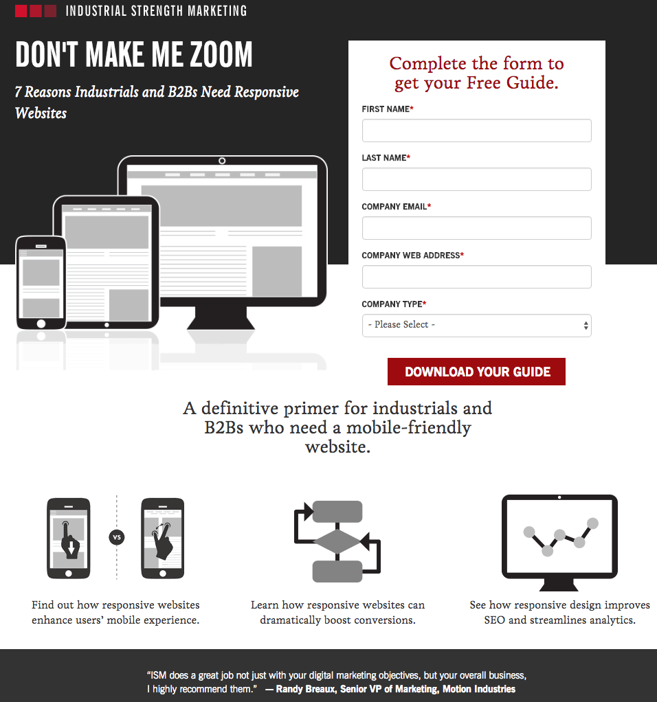
Industrial Strength Marketing does this on its landing page.
By offering a free guide or resource download and a simple opt-in form, you can easily increase your lead generation overnight.
If you don’t have a ton of time to create a resource, there’s a simple solution. You can turn some of your old blog posts into a PDF, make it look pretty with some design elements, and then give it a compelling title.
Allow visitors to download the PDF if they opt in and voilá! You’ve won some extra leads.
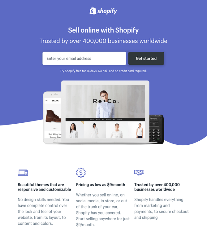
As a final landing-page conversion tip, add social proof to your CTA, much like Shopify.
Where’s the social proof?
It’s in that wonderful little phrase above the email address box: “Trusted by over 400,000 businesses worldwide.”
Generally, people don’t want to be pioneers. They want to find a trusted solution.
Tell visitors that plenty of other people have tried your product or service and loved it. They won’t be the first, and if your website is set up to convert, they won’t be the last.
3. Your website is broken
The last thing you want is for all of your SEO hours to lead to a great ranking, but a broken website.
What do I mean by a broken website?
Well, I don’t mean that you haven’t optimized it for conversion. I mean that something is broken on the technical side.
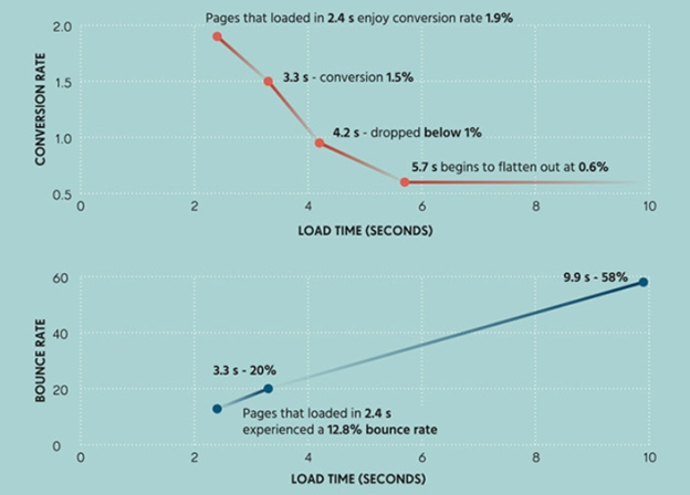
If, for example, your website’s load speed is too slow, statistically, you’re going to generate fewer leads and sales.
But don’t go to your website, grab a stopwatch, and try to calculate the load time. The speed of your computer will influence part of the load time as well.
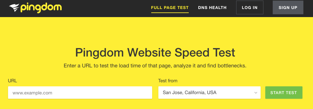
Instead, go to Pingdom.
Type in your website’s URL and select the location you want to test from.
Click “Start test.”
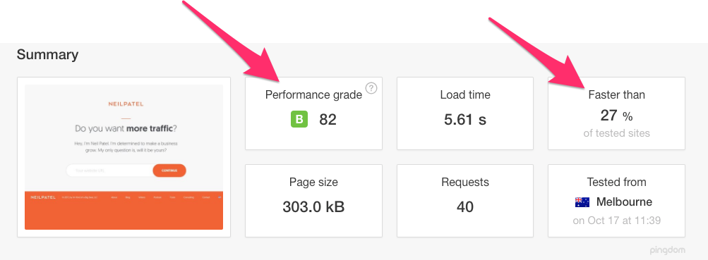
For free, Pingdom will give you a diagnosis of your website. Most notably, it will tell you what percentile you rank in for the average website load time and your overall performance grade.
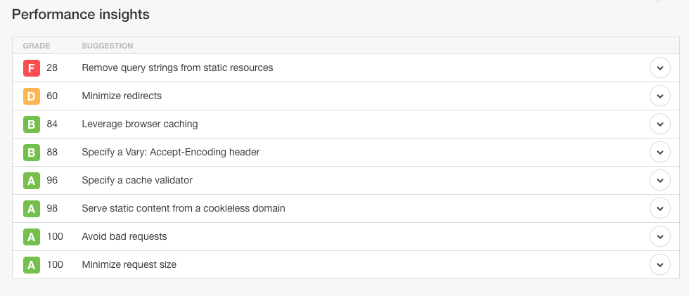
Additionally, it will give you a nifty checklist at the bottom for your own reference. You can then take this and work on the necessary pieces of your website to improve the load time.
If your website runs too slow, it can ruin people’s motivation to buy from you. And you definitely don’t want to lose sales because you took too long.
4. Your meta description ranks, but doesn’t sell
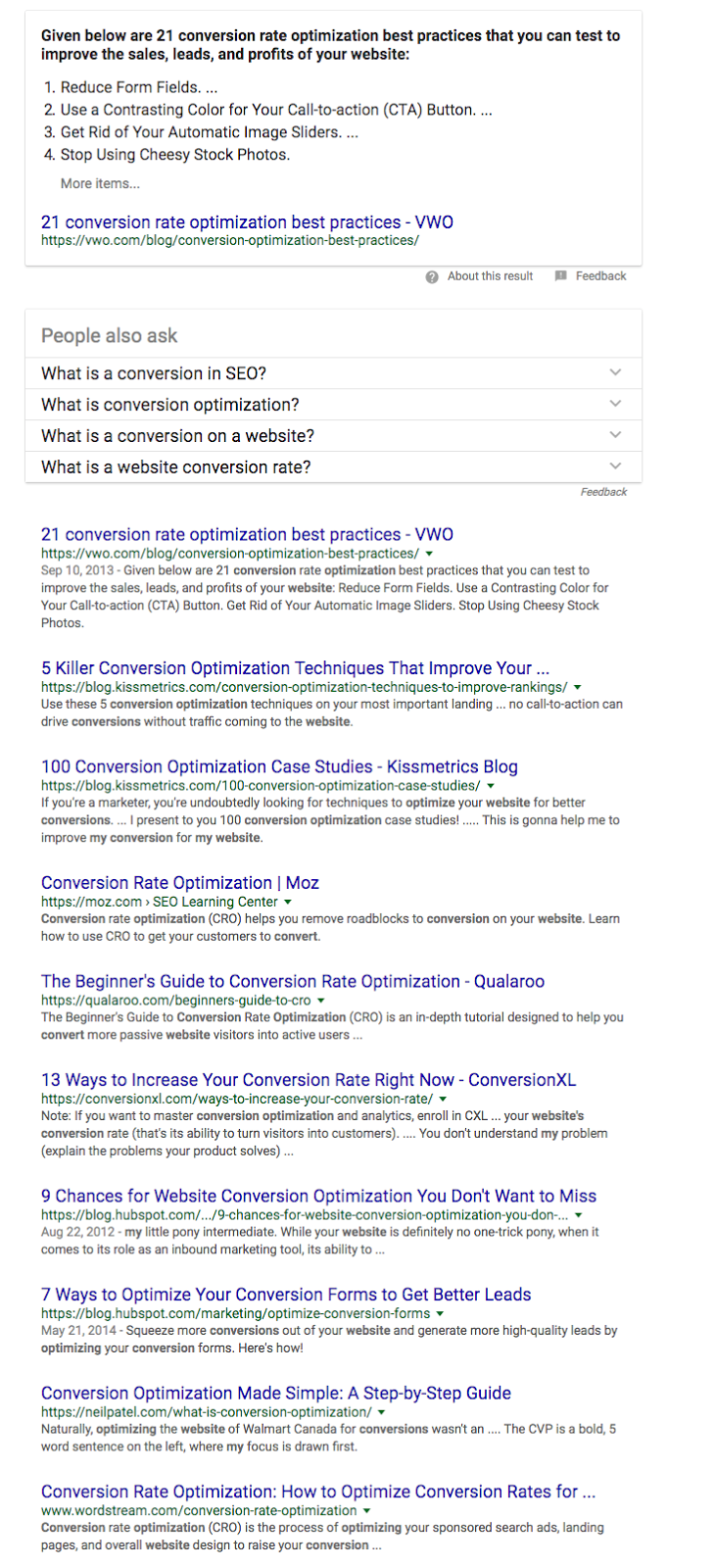
When people scan through the results after typing something into Google, they are looking for a solution to their problem.
Maybe, for instance, they typed in, “How to optimize my website for conversion.”
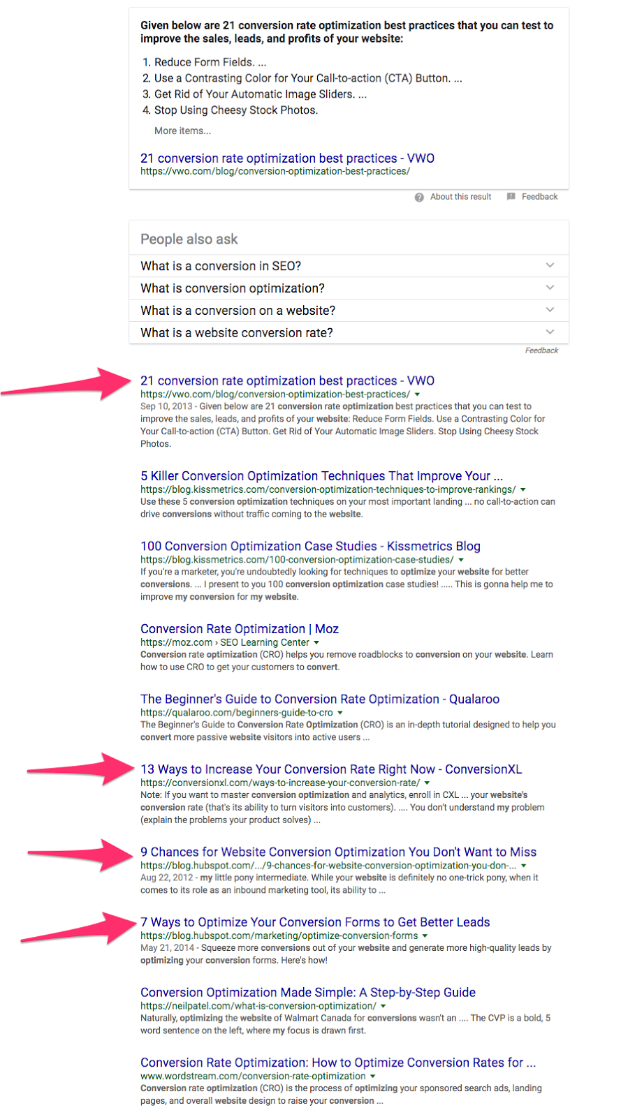
And, as you can tell, some of these results are more appealing than others.
These are the ones that stand out the most to me.
Yours might be different.
I tend to like when numbers are in titles, but I also am heavily influenced by meta descriptions.
And you probably are too.
Think about it: Have you ever searched on Google and struggled to find what you were looking for?
You try one keyword and another and another and still can’t seem to communicate to Google what you want?
Well, the SEO title is what quickly tells you if the result is going to discuss the topic you’re looking for.
But the meta description is where you browse when you’re trying to decide between multiple results or find a particularly difficult topic through Google.
And while your meta description might be phenomenal at grabbing you the #1 position, if it doesn’t sell the “click” to your website, then you won’t be converting any new traffic.
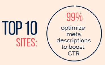
In fact, 99% of websites in the top 10 results in Google optimize their meta descriptions to boost their click-through rate.
And you should too.
You got that #1 position for a reason, right?
You want to generate more leads with less work. You’re hoping to sell more of your product or service, and you probably want to run a thriving business.
But that ranking is only as good as your meta description.
In other words, if your meta description doesn’t convince people to click, than your #1 ranking is worthless.
But how do you write a meta description that convinces people to click through to your website?
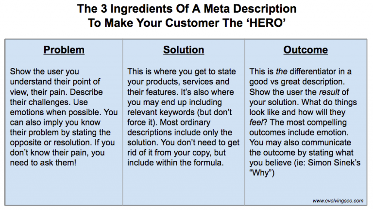
Well, Evolving SEO has this nifty chart depicting the requirements of any great meta description.
That’s all fine and dandy. But how do you actually implement those?
Here are a few examples of meta descriptions that get it right.
Take MailChimp, for example.
They add powerful social proof by mentioning that they provide email marketing services for more than 14 million people. And they quickly illustrate what they offer when they say, “Send better emails, connect your e-commerce store, and sell more stuff.”
If you’re searching for email marketing services, you’ll probably click on this result simply because it’s clear about what it’s offering.
Similarly, Slack’s meta description does a great job of illustrating the solution they provide.
Ultimately, Slack allows for remote teams to communicate easily. And that’s exactly what their meta description shows.
You also want people to know how easy your product is to use. If they think it’s difficult, then they’ll abandon before they buy.
This is something Asana does well.
Not only does Asana claim that it’s simple to use, but they also mention that it’s free, removing another barrier to entry for the potential client.
In the end, your meta description should be similar to a great sales page. It should mention the problem you’re solving, the solution, and the outcome for those who convert.
It’s your first piece of sales copy that many people will see. Use it wisely.
Conclusion
SEO is important.
Ranking well on search engines will generate passive leads and increase conversions.
But that promise comes with a caveat.
It’s not enough to rank well. You have to rank correctly.
In other words, you need to target the correct keywords, optimize your website for conversions, test your website regularly, and leverage the sales copy of your meta description.
A great ranking will generate business, but only if you’re ready for it.
If you’re struggling to convert traffic, then something in your pipeline is broken.
All you need to do is fix it and start reaping the benefits of a #1 position.
Why do you think that #1-ranked websites lose business?







Comments (36)