If you run an e-commerce site, your product pages are the moment of truth for your business. Either they convert your visitor into a customer or they don’t. This is not new information. Everyone knows that successful product pages are important to a successful e-commerce website; so why are there so many bad ones out there?
Each visitor that makes it to a product page represents the heavy lifting and money spent to get them there. The product page is not the time to squander that hard work. It’s up to you to create a user experience that gives the visitor what they need to become a customer.
So what’s the definition of a good product page user experience (UX)? Simple: one that provides the information, assurances and motivation the visitor needs to become your customer. This definition will vary from site to site and industry to industry, so it’s up to you to test and find the mix that works best for your business.
To help you get started, we asked the UX pros at digital-telepathy, a user experience design company, to identify things you can do right now to improve the user experience of your product pages. Below are seven ways to get more from your product pages, with examples from some of their favorite e-commerce product pages and insight into what makes them work so well.
Note: What works for these sites might not work for yours. It’s up to you to test features and functionality against your existing product pages to determine what works best for your business.
Tip One: Cut the Clutter
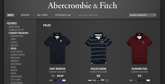
Whether it’s because they’re not sure what page elements drive sales, or because the website owners can’t agree on what’s important, businesses end up cluttering product pages with dense text and frivolous functionality. It’s up to you to fight for simplicity on these pages. Sure, it often makes sense to have recommendations, reviews and other functionality; but they shouldn’t muddle the call to action that helps move the sale forward. Jessica from digital-telepathy likes Abercrombie & Fitch for just this reason.
Abercrombie & Fitch – “Abercrombie & Fitch has a great minimalistic and clean product browsing experience. Only the essential browsing elements (such as search bar, navigation, and product color variations) are visible. Even the color theme is simple and optimal for easy browsing.” ~ Jessica
Tip Two: Clear Calls-to-Action
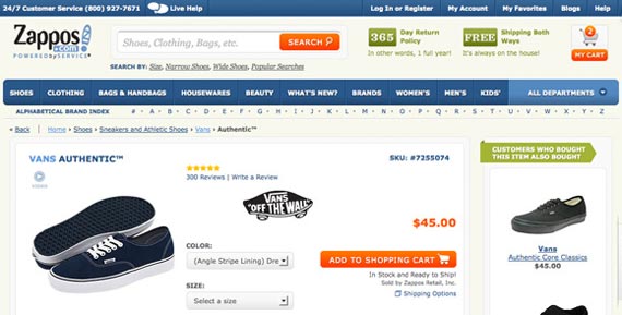
At this stage of the game confusion can kill. Make the “Add to Cart” and “Proceed to Checkout” buttons clear, consistent and highly visible. And please, these calls to action (CTA’s) should be a button. Online shoppers have been conditioned to look for a button – text links and other non-standard UI will create confusion at exactly the wrong time. Dan from digital-telepathy likes Zappos for their clear calls-to-action, that stand out from the other page elements.
Zappos – “Zappos uses bright orange to clearly distinguish CTA’s and other important information like price and the shopping cart.” ~ Dan
Tip Three: Think Speed
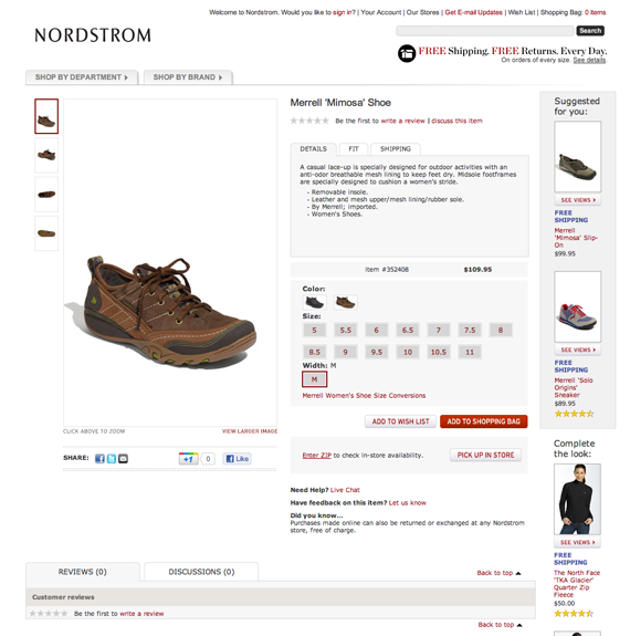
Product pages need to be snappy and responsive. Laggy pages can kill confidence and breed impatience, both conversion killers. Ditch the overly designed pages for ones that load fast and respond even faster. Nordstrom is one example of a site that takes product page speed seriously.
Nordstrom – Nordstrom’s pages load very fast because of the economical use of CSS styles for background and border elements.” ~ Orville
Tip Four: Awesome Product Photos
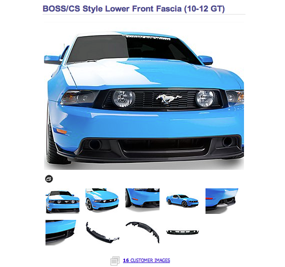
Product photos, particularly for physical goods like gadgets, apparel and home goods are critical for building confidence and giving the user a strong grasp of what it is they’re actually buying. Invest in good photography up front, and be sure to highlight and provide access to multiple views and photos in the UI. Matt thinks that the combination of pro shots and customer photos make American Muscle a great example of using product imagery the right way.
American Muscle – “American Muscle not only has a great collection of photos for almost every product from every angle, on and off the car, but also allows customers to upload their own pictures. These customer shots are often better than the corporate shots and include angles that customers really want to see.” ~ Matt
Tip Five: Concise Copy with Conviction
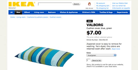
You can’t get very far without copy on your product pages. So let’s make sure that the copy you put on each page is top notch and working hard to help your potential customer. The table stakes for great product page copy are things like price, shipping options and information, availability, sizes/colors, sizing charts, and more. Make sure you’ve got the basics in place. Keep copy concise and highlight the high points. Use bullets to help visitors read and digest them quickly. In other words, do as Ikea does.
Ikea – “Ikea uses nice typography and is short and sweet with the item information and descriptions. It offers a “read more” link for users who want to dive deeper into the product.” ~ Dan
Tip Six: Build Customer Confidence
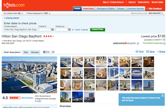
Reduce anxiety and build confidence by communicating product quality, sizing, return policies and customer service commitments that will make your visitor comfortable buying from you. Provide product reviews and testimonials from other customers who have purchased the product and surface useful reviews to the top. Adding more social cues to the user experience lets visitors know that they are not alone in their purchase. Hotels.com plays off this social dynamic:
Hotels.com – “Hotels.com has a pop-up that shows how many times a specific hotel was booked in the last 24 hours. It creates confidence through social proof; other people are actually booking this hotel. It’s also valuable because it creates urgency. Only so many rooms are available, act now.” ~ Matt
Tip Seven: Provide Options
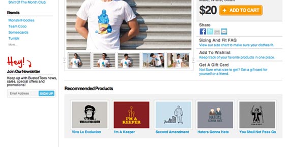
Close but no cigar is never an outcome you want at purchase time. What if your visitor would’ve bought the digital picture frame if only it had a rechargeable battery, or 16 gigs of memory instead of 8? Providing related items in an easy-to-locate manner will let more visitors complete their purchase without having to exit the funnel completely. BustedTees does a good job giving their customers options when shopping for a tee shirt.
BustedTees – “BustedTees has a great recommended products section just below the individual item content. Related t-shirt styles/humor are typically along the same line.” ~ Dairien
Putting it All Together
Product pages can make or break your websites. It’s up to you as a UX professional to create an experience that converts as many visitors into customers as possible. By experimenting and testing with these seven tips you’ll be able to identify the main conversion drivers on the product pages for your website. Have more great tips or sites that have best-in-class product pages? Let us know in the comments. And if you test out any of these tips on your site, come back and let us know how they worked for you. We hope you’ll find that your conversions increase right along with your customer satisfaction. Mission accomplished!
About the Author: Jason Amunwa is a Product Manager at digital-telepathy, a user experience design company that aims to improve the web by introducing new design standards.
Comments (17)